A lot of authors are likely entirely unaware of common book design mistakes. People often ask me, “How can you tell if a book has been designed by an amateur? I mean, it’s just a book, right?” This reminds me of the author whose book I was designing...
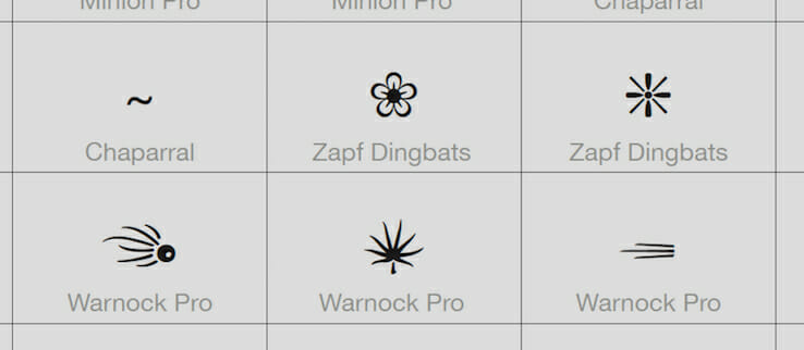
Using type ornaments in your book design can add a pleasing pictorial element to your typographic pages. Depending on the tone you’re trying to establish with your design, there’s likely to be a choice of ornaments that will complement the other choices...
Two recent projects have reminded me of just how much attention book designers have to pay to details. With a complex book, every detail counts. What makes a book “complex”? It could be very long manuscripts, books with footnotes, endnotes, annotations,...
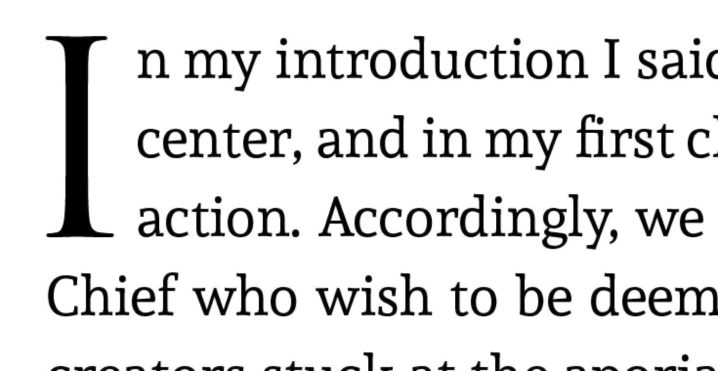
When book designers or typographers talk about book page color, they don’t mean the colors printed on the page. In fact, this term often comes up in discussing purely black-and-white typographic layouts. In this case, “color” means the overall gray...
I read on a grammar blog recently that “…the em dash is named after its length—it’s about the same width as the capital letter M.” This is a common error that arises from the fact that in many fonts, the capital M is the widest letter, often the same...