


I read on a grammar blog recently that "...the em dash is named after its length—it’s about the same width as the capital letter M."
This is a common error that arises from the fact that in many fonts, the capital M is the widest letter, often the same width as the em dash.
However, the em dash—technically, a printing term—has nothing to do with the width of a capital M. It's based on an entirely different and dynamic measurement: the point size of the typeface itself.
So for a typeface being set in 12 point, an "em" is 12 points wide, and so is an em dash. If you change the type to 14 points, the em changes to 14 points as well. An em is simply the horizontal measure exactly corresponding to the type size.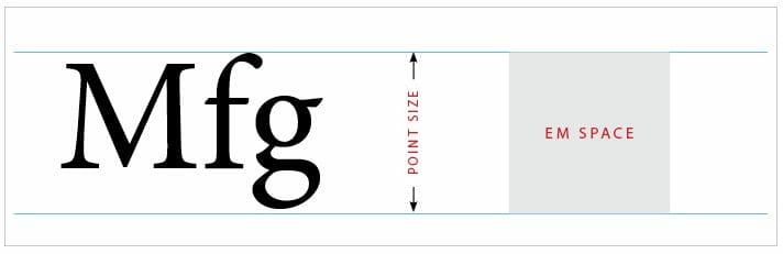
You can see why the "capital letter M" method isn't logical in this example of two capital letter "M"s from two different fonts. The em dash in both instances is exactly the same width, even though the capital "M"s are very different:

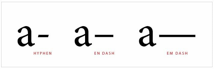
Now that you understand this very old printer's measurement, we can dive into the three types of dashes commonly used in written works. To make sure we're all on the same page, here are each of the three marks under discussion, each next to the letter "a" to provide a point of reference:
In the normal course of things, your editor will be correcting any errors in dash use and indicating where each type of dash should be used. For instance, a manuscript might come back with markups like these: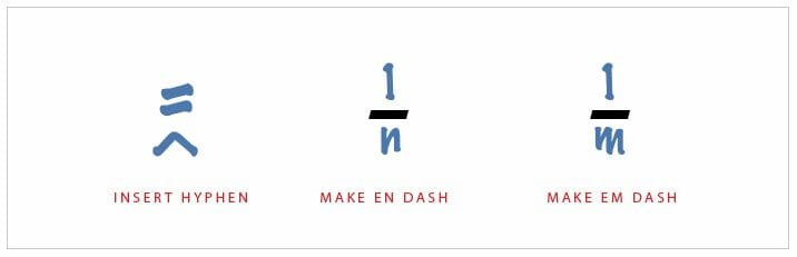
Because self-publishers are responsible for everything that ends up in their books, you need to know what each of these characters means, the differences between hyphens, en-dashes and em-dashes, and how to get them into your book in the right way.

Varieties of the Dash Experience
Hyphen: As the Chicago Manual of Style (CMOS) says, the hyphen "connects two things that are intimately related, usually words that function together as a single concept or work together as a joint modifier." Examples include op-in, tax-free, one-third, and so on. Hyphens are very common in English, and the hyphen key is easy to find on the keyboard. The problem with hyphens arises when they are used where another mark—the em or en dash—might be more appropriate.
The hyphen has a dedicated key on both Mac and PC: it's on the top row between "0" and "=."
En Dash: According to CMOS, en dashes (which are half the length of the em dash) "specify any kind of range, which is why they properly appear in indexes when a range of pages is cited (e.g., 147–48)" and this is also true for date ranges like the period 1948–1960.
To insert an en dash, press Ctrl+Hypen on a PC or Option+Hypen on a Mac.
Em Dash: That's the long dash, and as Grammarist says, "Em dashes set apart parenthetical phrases or clauses in a sentence. In this use, em dashes are similar to commas and parentheses, but there are subtle differences. For example, em dashes are used when a parenthetical remark contains an internal comma or would otherwise sound awkward if enclosed by commas. Perhaps a useful way to think of the em dash is as a pause or parenthesis with somewhat more emphasis than a comma and somewhat less than parentheses."
To insert an em dash, use Ctrl+Alt+Hyphen on a PC or Option+Shift+Hyphen on a Mac. Typing two hyphens in a row also works in most programs, and that makes it a lot easier to use.
If you're working in Adobe InDesign, on Mac you can use the shortcuts listed above, and on any version of InDesign you should also be familiar with the Type/Insert Special Characters/Hyphens and Dashes because you'll get a whole list of characters you can use as well as your em and en dashes.
En and Em Dash Spacing
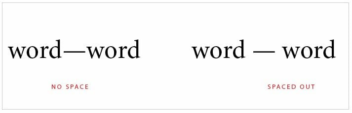
While an en dash almost never includes spaces around it, there is some disagreement about the proper way to employ the em dash. While I've always used the dash without any space around it, many other people place a space before and after the dash.
According to The Punctuation Guide, "Most newspapers — and all that follow AP style — insert a space before and after the em dash." The Chicago Manual of Style (the style manual most often used for book publishing), on the other hand, states that em dashes should not have a space around them.
Here's the difference between no spaces and spaces:
Of course, this will introduce the possibility of having a line break just before the dash, and that's not a good solution. In InDesign or similar layout programs, you could add a "non-breaking" space, then the em dash, then a normal space to make certain the line would never break without the em dash attached to the text preceding it, but that's a lot of work.
Although these are small punctuation marks, they can make a big difference in how enjoyable your book is for readers, and how well it conforms to standard book typography.
For both these reasons, it's worth it to keep your hyphens, en dashes, and em dashes straight.
Ready to publish your book? Be sure to download our Advanced Publishing Starter Kit!
