• Skip to primary navigation
  • Skip to main content
  • Skip to primary sidebar
  • Skip to footer
  • Self-Publishing
  • Author Blogging
  • Sitemap
  • Fonts/Typography

The Book Designer

Practical advice to help build better books

by selfpublishing.com

COACHING


PUBLISHING


WRITING


PRODUCTION


FREELANCE


WRITING JOBS

  • Home
  • About
  • Articles
  • Contact
  • Shop
You are here: Home / Book Design / Learn About the Color of Type Pages in Book Design

Learn About the Color of Type Pages in Book Design

by Joel Friedlander on April 16, 2018 5 Comments

When book designers or typographers talk about the “color” of a page of type, they don’t mean the colors printed on the page. In fact, this term often comes up in discussing purely black and white typographic layouts.

In this case, “color” means the overall gray tone of tall column of type that constitutes almost all book pages.

Different kinds of type color can be achieved through a variety of tools at the designer’s disposal:

  • Font selection can be critical, because font designs vary in their relative “darkness” even in regular weights depending on how thick the individual letter forms are.
  • Fonts also vary in their set width, which describes how closely together the letters are spaced in the font’s design. Tighter set widths create darker pages since there’s more black ink on the page when letters are closer together.
  • Line spacing (or “leading”)has a big effect on type color since the more space there is between lines, the lighter the page will appear.
  • Non-text elements like page numbers and running heads can also have a big influence on the overall color of the type page.

Examples of Type Color on the Book Page

Let’s look at some samples. These are all set on a 6″ x 9″ book page with standard margins.

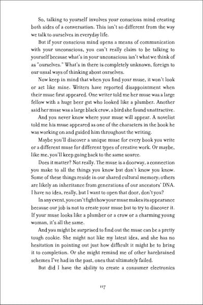
Here’s a generic book page with only a page number (this is a “drop folio” meaning the page number is at the bottom of the page). This sample uses the Filosofia font, an elegant oldstyle design.

The type is set 12/16, which means it’s 12 point type with 16 points between lines, as measured from the baseline of one line to the baseline of the next.
book design
Filosofia 12/16

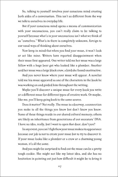
This yields a typical page as far as the color of the type column. Watch what happens when we simply add a little space between each line. In this case it’s 12/18. The 2 extra points amount to 1/32 of an inch, but make the entire page much lighter.
typography
Filosofia 12/18

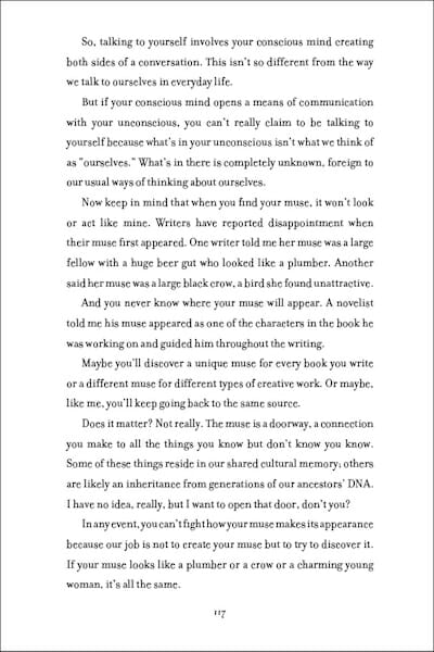
And if we expand the leading to 12/20, the entire color of the page changes:
book design
Filosofia 12/20

Here’s an example of the exact same page set in Adobe Minion Pro, 12/16. Minion carries a little more weight than Filosofia, can you tell?
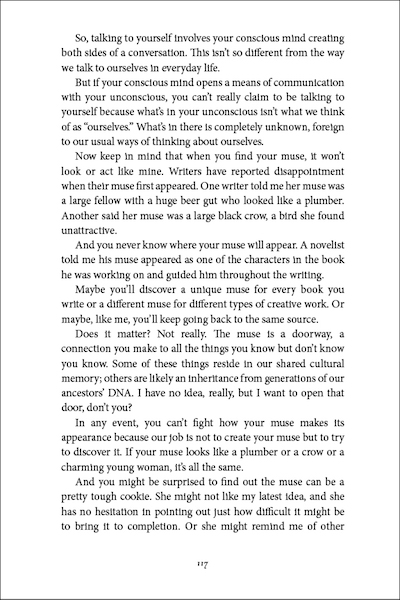
book design
Minion 12/16

One of the most popular typefaces for book design is Garamond. This example is set in Adobe Garamond Pro in the same 12/16 specification. Garamond, while a bit lighter than Minion, also has a narrower set width, and you’ll note this page, even though it has the same number of lines, actually fits about 2 lines more copy in the same space than the Minion sample, since this font is more space efficient. This makes Garamond a great choice for long books, or where space is at a premium:
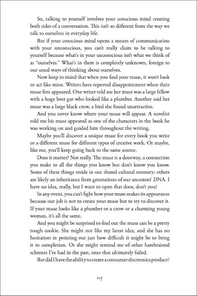
book design
Garamond 12/16

On the other hand, here’s our page again, set in Cochin, a font more often used for headings. Note the very wide set width and relatively short height of the lowercase letters (this is the “x-height”). Wide fonts like this can work for books where the text is sparse, like a book of photos with captions, or inspirational quotes. Here, although we still have the same number of lines, less copy fits on the page, and the overall color of the page is quite different from the Filosofia, Minion, or Garamond samples.
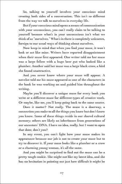
typography
Cochin 12/16

Finally, adding a running head can subtly shift our perception of the color of the page. This is the Garamond page with a typical running head.
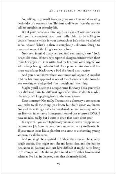
typography
Garamond 12/16 with running head

Is type color something to be concerned about? That depends on what kinds of books you’re publishing, and what your readers are looking for. But it is something to keep in mind if you’re doing your own page design, and something I always consider when creating new book designs.

[yellowbox]You can see and download full-size PDF samples of dozens of beautiful book page designs at Book Design Templates. Each template comes with the fonts you need and with complete instructions that are easy to follow. Check them out here: Book Design Templates[/yellowbox]

Filed Under: Book Design Tagged With: book design templates, Cochin, Filosofia, Garamond, Minion, typography

journal marketing

Reader Interactions

Comments

  1. Michael N. Marcus says

    April 16, 2018 at 2:36 am

    Also: serif faces produce darker pages than sans serif (but sans serif faces are seldom used in printed books).

    Reply

Trackbacks

  1. Das Jahr im Rückblick Januar bis Juni 2018 - Wieken-Verlag Autorenservice says:
    December 30, 2018 at 1:40 am

    […] April: Joel Friedlander: Learn About the Color of Type Pages in Book Design […]

    Reply
  2. Top Picks Thursday! For writers & readers 04-26-2018 | The Author Chronicles says:
    April 26, 2018 at 10:03 am

    […] Self-publishers need to understand all aspects of the business. Stephanie Chandler discusses Amazon out-of-stock issues and the pros and cons of publishing with IngramSpark vs. CreateSpace, and Joel Friedlander explains the color of type pages in your book. […]

    Reply
  3. Writing Links…4/23/18 – Where Genres Collide says:
    April 23, 2018 at 4:03 am

    […] https://www.thebookdesigner.com/2018/04/learn-color-type-pages-book-design/ “In this case, “color” means the overall gray tone of tall column of type that constitutes almost all book pages.” […]

    Reply
  4. Die Woche im Rückblick 13.04. bis 19.04.2018 – Wieken-Verlag Autorenservice says:
    April 19, 2018 at 11:01 pm

    […] Joel Friedlander: Learn About the Color of Type Pages in Book Design […]

    Reply

Leave a Reply Cancel reply

Your email address will not be published. Required fields are marked *

This site uses Akismet to reduce spam. Learn how your comment data is processed.

Primary Sidebar

Get the Advanced Publishing Kit

Topics

  • Audiobooks
  • Author Blogging 101
  • Book Construction Blueprint
  • Book Design
  • Book Printing
  • Book Production
  • Book Reviews
  • Cameras
  • Contributing Writers
  • Cover Design
  • E-Books & Readers
  • Editorial
  • Guest Posts
  • Interior Design
  • Interviews
  • Journey of a Book
  • Legal Issues
  • Marketing
  • Podcasts
  • Project Focus
  • Reports
  • Reviews
  • Samples
  • Self Publishing Basics
  • Self-Publishing
  • Social Media
  • Training
  • Video
  • Webinars
  • Writing
Self Publishing Platform
Self Publishing School

COACHING

Self Publishing

PUBLISHING

The Write Life

WRITING

The Book Designer

PRODUCTION

Make a Living Writing

FREELANCE

Freelance Writers Den

WRITING JOBS

Footer

  • Home
  • About
  • Articles
  • Contact
  • Shop
  • Self-Publishing
  • Author Blogging
  • Sitemap
  • Fonts/Typography
Terms of Service
Privacy Policy
Comment Policy
Guest Author Guidelines
Why?
"Writers change the world one reader at a time. But you can't change the world with a book that's still on your hard drive or in a box under your bed. This blog exists to help you get that book into people's hands."
—Joel Friedlander

Copyright Self Publishing School All Rights Reserved. © 2022