A lot of authors are likely entirely unaware of common book design mistakes. People often ask me, “How can you tell if a book has been designed by an amateur? I mean, it’s just a book, right?”
This reminds me of the author whose book I was designing a few years ago, who asked me, “Book design? What’s there to design? You just put the page numbers on, right?”
Well… no, actually.
Most of us have grown up with books, becoming familiar with them even before we could read. They become such commonplace objects in our world, they seem dead simple.
It’s not until you try to create a book of your own that the complexity starts to rise to the surface.
So to help out, I’ve gathered together what seem to me to be the 5 most common book design mistakes that authors make when they start to design their own books.
When you’re writing your own book, you don’t want to worry about how to lay out pages, what fonts to use, which pages go where, and lots of other nagging details. These decisions can begin to overwhelm the unprepared.
Ah, but you are reading this blog, aren’t you? That means you don’t want to be unprepared. (That also means you can pick up the freebie I’ve linked to at the end of this article. It will solve all these problems.)
I see most of these formatting mistakes in self-published books, but even occasionally you’ll see them in traditionally published books. Just by eliminating these errors, your book will start to stand out from the tidal wave of books being published every day.
So here they are, with illustrations to match.
Table of Contents
Top 5 Book Design Mistakes to Avoid
1. Extra spacing when text is justified

This is a problem you see over and over again with books produced in a word processor. In the thousands of lines in a typical print book, there will be some that have to open huge spaces between words, like those shown here, to get the lines to justify. Those big holes are unsightly and a sure sign of an amateur production.
2. Rampant running heads

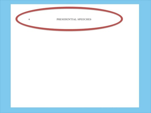
Unfortunately all too common, it looks like the author couldn’t figure out how to have running heads on some pages and not others. Or, they thought every page should have one. But display pages, like this chapter opening page, doesn’t need and shouldn’t have, a running head.
3. Unblank blank pages

Yep, here it is again, that running head that just won’t quit. This error is surprisingly common, but the rule is easy to remember: if the page is blank, that means it’s blank and nothing–no page numbers or running heads–should appear on the page.
4. Mangled margins

Sometimes it looks like the author was trying to save money at their print-on-demand (PoD) supplier, since most PoD vendors charge by the page. But this isn’t the way to solve that problem. It can also happen if you only ever look at your book on screen, where the pages probably look fine, and never see the bound book. But type that disappears into the gutter (spine side) or that leaves no space for fingers to comfortably hold the book, doesn’t show your work very well.
5. Rag right composition

I know some will disagree, and I don’t mean to say there are no books that can be set rag-right instead of justified. Art books, poetry, cookbooks, and others can be set rag right with no problems. But your typical book that’s most or all text should be typeset with justified margins.
If you don’t believe me, walk over to your bookshelf and start pulling books off. I’m betting it’s going to be long time before you find even one (not printed in Europe) that’s set rag right.
The worst part about the example above is seeing all those hyphenations. A hyphenation between lines should rarely, if ever, occur in your manuscript. This single page has three (and we can’t even see the rest of the page).
Of course, there are other errors that amateur designers and book formatters make. Widows, Orphans, Runts, and Rivers are just a few. More on those typesetting terms here.
My Gift to You
Okay, there are all five, illustrated and explained. To avoid these kinds of errors, pick up your free copy of my Book Layout Template, you’re going to like it.

Photo: bigstockphoto.com


