You’ve spent the last however-many months (or years) writing and editing your book and you’re finally ready to self-publish it. Congratulations! That in itself is a huge accomplishment! Now that you’re ready to self-publish, you’re probably wondering about all the...
What catches a potential reader’s eye when they scan through rows of fantasy books? The short answer is that it’s the book cover design. Often, it’s the font on the cover that makes a crucial first impression. Great fantasy fonts do more than just...
Is it important to maintain consistency in your book series design? Let’s have a thought experiment. If someone bought one book from your series, how will they be able to recognize other books from that series in the bookstore? Of course, they can research your...
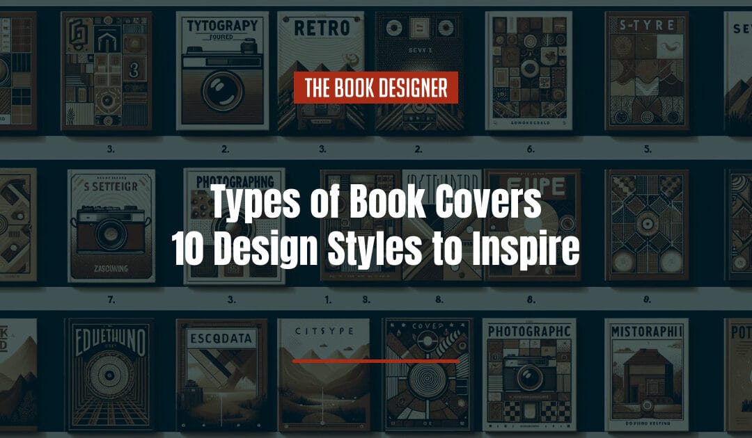
In the world of books, the cover is the first thing people see. It hints at the book’s story, characters, and themes. Successful jacket designs also manage to grab people’s attention and be remembered. Different styles of book covers are popular at...
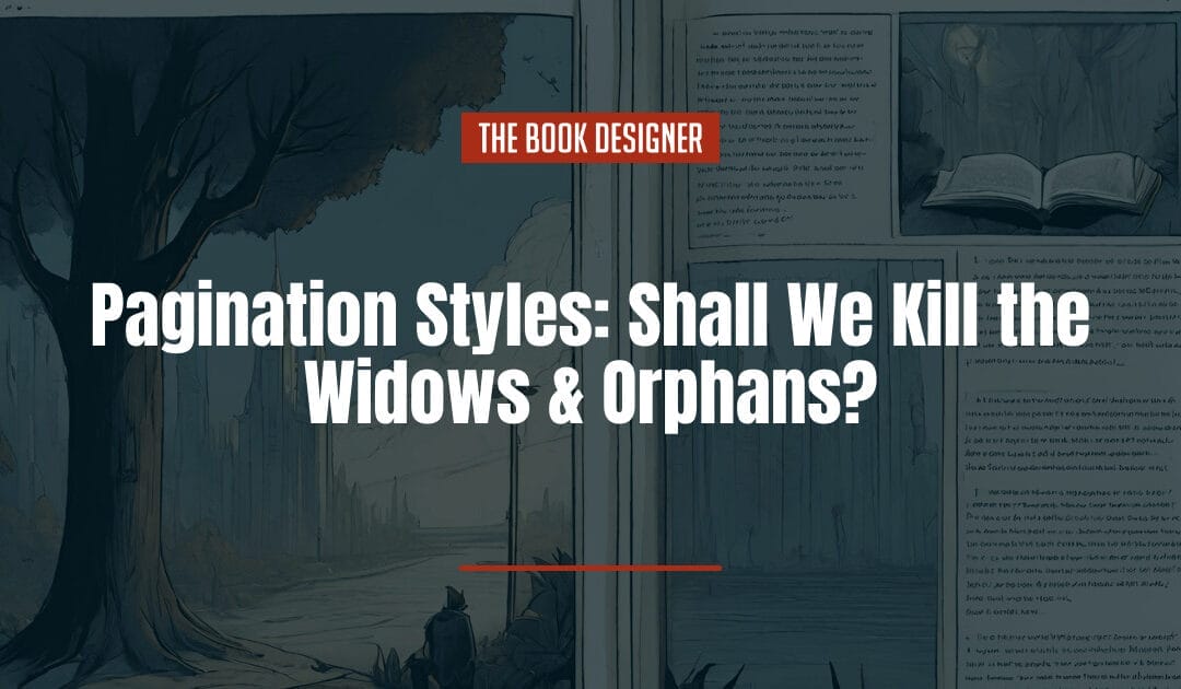
In Brief: In book design we have to decide which style of pagination to choose: whether to keep widows and orphans or allow the bottoms of our pages to be slightly misaligned. This article presents both so you can make an informed choice. People often seem to divide...