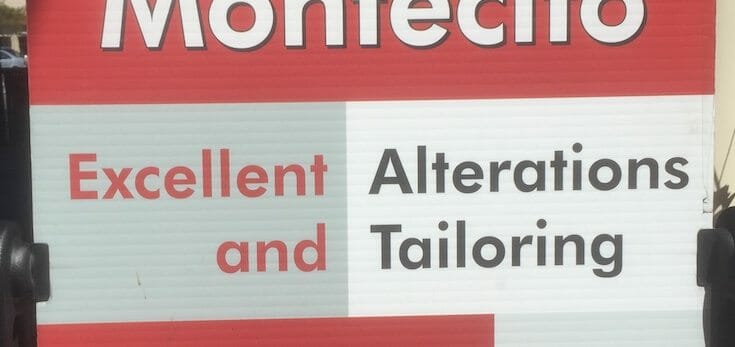
Editor’s Note: As more examples of “bad typography” appear, I’ll continue to update this article. And hey, you can send me your own examples for inclusion, too. (See the end of the article. Last edit on June 15, 2017.) Typography of one sort or...
I’ve been waiting a long time for today. It was back in 2010 when I first started thinking about providing do-it-yourself authors with the tools to produce professional quality books on their own, using professional quality tools. But life never works out the...
Recently I was asked to contribute an introduction to print book design for a publication that will be out soon. I decided to address the piece to an author who was thinking about self-publishing, but wondering whether it’s worth doing a print book. Here’s...
Between the grace and rhythm of oldstyle typefaces, with their serifs inspired by the pens of calligraphers, and sans serif typefaces, with their uniform strokes and modern look, there are several other groups of type designs. One of the most popular, and most useful,...
The first sans serif typeface I lived with was Univers, and I fell hard. It was first love, after all. At some point I got entranced by the dark charms of the hybrid Optima, an infatuation which had to run its course. Optima was so versatile. Eventually things had to...