

Editor's Note: As more examples of "bad typography" appear, I'll continue to update this article. And hey, you can send me your own examples for inclusion, too. (See the end of the article. Last edit on June 15, 2017.)
Typography of one sort or another is all around us. And that's why bad typography is also everywhere. I see this often on the book covers submitted to our monthly Ebook Cover Design contest.
But to be honest, because I've been designing with type for most of my life, bad typography has been irritating and, in some cases, downright confusing.
One of the principal uses of design---and typographic design especially---is to solve communication problems. That's why we want to eliminate confusion, get rid of ambiguity, and create clear, concise messages.
Bad typography stands in the way.
Elements of Bad Typography
When looking at typographic design, there are five elements where you can potentially go wrong. Any one of these, if not handled properly, can create confusion where there should be none.
- kerning which refers to the way specific letter pairs fit together
- letterspacing or tracking both of which mean spacing applied to all letters
- word spacing is exactly what it says, the spacing between whole words
- font choice can help or hinder attempts at clear communication
- typographic errors can sabotage even the best designs
Making bad decisions or outright mistakes in any one of these five areas can result in bad typography. The best way to understand the problems that await the unwary or inexperienced type designer is by seeing them in action.
Let's look at some examples.

Bad Typography In the World
You can find lots of examples of mistakes in typographic communication online, and I've linked to a whole bunch of resources for you to pursue at your leisure.
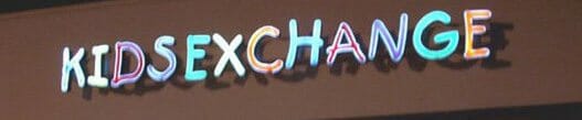
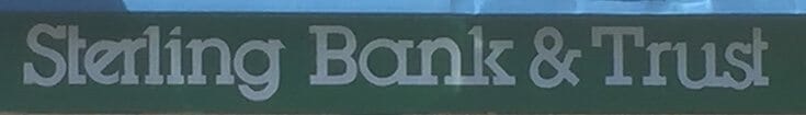
Here's a classic example of bad word spacing. At a glance, what does this store sign seem to say?
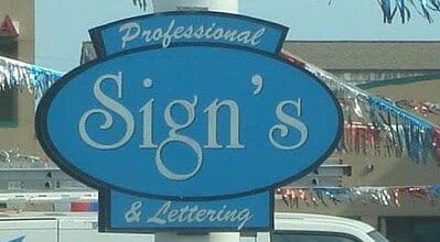
How about an example of a typographic error that's just plain embarrassing—or should be. Does the word "Signs" need an apostrophe? I think not.
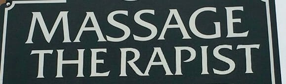
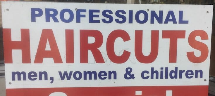
How about an example of terrible kerning? Remember, kerning involves the spacing between specific letters. In this sign for a massage therapist, the space between the "E" and the "R" is way too big, leading to an unintended ambiguity about what is actually being offered, and shows that these kinds of typography errors can create serious misunderstandings:
These examples are frequently cited in online articles, and for good reason. Here are some examples from closer to home.
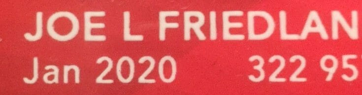
I just received a new AARP membership card, but when I opened it, I wondered if it was really for me, since I'm not known as "Joe L. Friedlander."
Last week, during our promotion for the Book Launch Toolkit, we gave away a special bonus. But when I saw it, I initially thought it was something "Grand." This also makes clear that when you're choosing fonts, it pays to set up your own title to make sure that the characters you're going to be using meeting the requirement for instantaneous recognition:
Here's another example of poor letter spacing or tracking. These letters are so squashed together, the words are in danger of becoming "blobs" instead of clearly defined shapes that carry meaning:
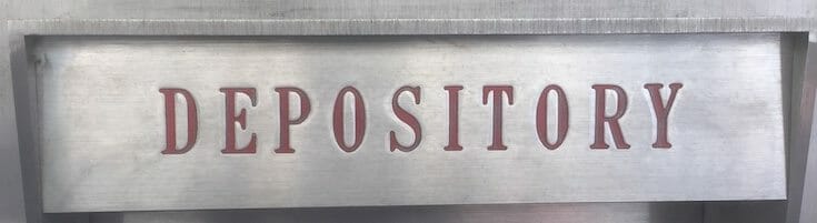
Another, more subtle, example of uneven kerning. Authors who design their own covers should watch out for this, too. Here, the spaces around the "O"s appear much larger than other spaces, especially the space between the "E" and the "P."
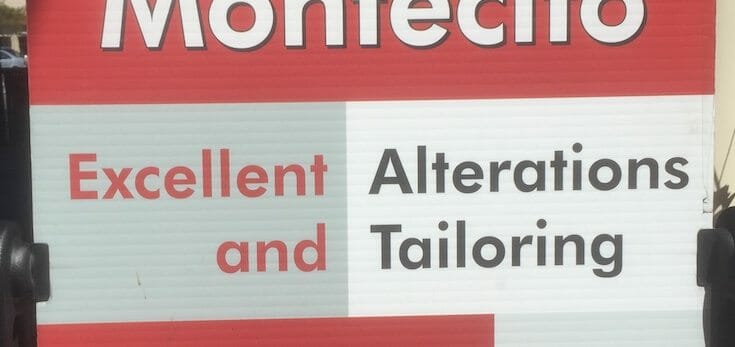
These two might be more accurately called layout mistakes, but the problems are clear. First, a pretty gratuitous use of color in both the gray panel and the confusing "color breaks" of the type itself. This completely disrupts the natural reading order of these words, which almost seem to say "Excellent and Alterations Tailoring."
Here's one I'm at a bit of a loss to explain. There's nothing particularly bad about the font choice, letter spacing, or kerning. But how do you end up with this hand painted sign that's inexplicably bleeding off the left side (where you assume the painter started, right?):
How about television graphics? This one, from a feature on Seth Meyers' show, creates confusion where none is needed. Note the very strong element that seems to spell out "ALL" reading vertically. This was created by lining up the "A" on the top line and the "L"s below. This is responsible for creating an unneeded and unwanted word right in the middle of the title. Why did they do that?
A Request
I hope you've learned something from these real-world typographic disasters and mistakes. Picking an appropriate font, making sure it is spaced properly and clearly communicates shouldn't be that big of a challenge.
Do you have examples of "bad typography"? I'd love to see them, and if you send them in we'll publish them in a future post with full credit to you. Use our contact form to send us the URL for your example, it's that easy.
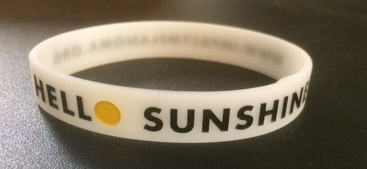
Here's a submission from writer Joyce Peterson, who says, "This is supposed to say “Hello Sunshine!” but the yellow “o” fades into the background (more so than this photo suggests). The point of this bracelet is to change color when it (and the wearer) are in full sun as a reminder to wear sunscreen. So it’s not that big a goof after all!"
Thanks!
For a fun and instructive way to learn something about kerning and letterspacing, try The Kerning Game and see if you can beat my best score so far: 90. Tip of the cap to Max for pointing this out to me.
