Between the grace and rhythm of oldstyle typefaces, with their serifs inspired by the pens of calligraphers, and sans serif typefaces, with their uniform strokes and modern look, there are several other groups of type designs. One of the most popular, and most useful, are the square serif typefaces, also known as Egyptians or slab serifs.
A lot of people tell me they can’t tell the differece between one typeface and another, but you won’t have any trouble recognizing square serif typefaces.
Like oldstyles, they have serifs, and their serifs are even more pronounced. And like sans serif typefaces, they usually have uniform stroke weights.
You might wonder why these designs are called Egyptians. The term derives from a fad for everything Egyptian in the early nineteenth century, following Napoleon’s Egyptian campaign. Apparently typefounders jumped on the bandwagon, and called the new square serif typefaces used for advertisements “Egyptian” and the name stuck, except in England, where they already had an “Egyptian” typeface. They used the term “Antique” instead.
Four Varieties of Square-Serif Typefaces
There are four distinct varieties of these typefaces, each with a different origin.
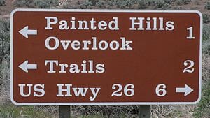
- Clarendon—This famous British typeface has more varied serifs than the usual slab-serif typeface. You might be familiar with it from signs like this in the National Parks. Note that Clarendon has variation in its stroke weights, one of the ways to recognize it.

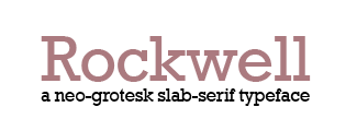
- Neo-grotesque—These typefaces are characterized by even stroke weights and plain serifs. The letterforms work well as sans serif styles also, and are modeled on the Grotesque typefaces of the early part of the twentieth century.

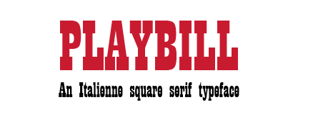
- Italienne—Here the serifs become much heavier in relation to the stroke weight of the letters, which gives the designs a very dramatic effect. One example is Playbill:

- Typewriter—Yep, the plain old typewriters that are still in use almost always use slab-serif typefaces, which are highly legible and generally simple letterforms. The most common, of course, is good old Courier, but typefaces like American Typewriter, probably the most graceful typewriter-style square serif, are also derived this way.

More on Square Serif Typefaces
Some other notable square serif typefaces are Memphis, Serifa, and the graceful, transitional typeface Chaparral. Each of these type designs shares in the character of the square serifs: they are solid, strong, full of purpose, powerful. What they trade in gracefulness they make up in emphasis.
Square serif typefaces give an air of solidity and stability to your design. They blend easily with sans serif faces. The more graceful square serif fonts can be used for body copy, and in their bolder variations make impressive display fonts.
Sometimes even one letter of a square serif font can be powerful enough to represent an entire brand, and square serifs are often used to convey stability in the corporate world.
For a good example of the masculine force of these typefaces, check out this look at Chunk Five, one of my very favorite display faces:
If you haven’t tried square serif fonts in your book designs, give them a try. To get started, here are some free fonts you can download today and use for experiments. These are all from the useful FontSquirrel.com site for free fonts.
There’s almost no limit to the ways you can use square serif typefaces. In their light weights, they have a grace and purity of line. In their heavier weights, they communicate density and power better than any other fonts.
One of the most enjoyable parts of graphic design is trying new fonts and finding new ways to present valuable material. Although I recommend old style typefaces almost exclusively for book text, the display elements in books—title page, chapter and part openings, opening pages of front matter and back matter—are wide open for experimentation and invention in communicating your message to your readers.
It’s in that role that square serif typefaces really shine. Get to know one today, you’ll be glad you did.


