

Is it important to maintain consistency in your book series design? Let’s have a thought experiment. If someone bought one book from your series, how will they be able to recognize other books from that series in the bookstore?
Of course, they can research your name and bibliography and order a book online. Or they can casually browse a bookstore, recognize a familiar design, and then happily find your name on the cover. Bonus points if this name is also written in a font they remember.
Consistent book design doesn’t just add readers’ recognition. It also helps you build your product’s brand—in this case, your book series brand—and your author’s brand identity. This means that when someone mentions your book to a reader, they imagine what its cover looks like—because it’s embedded in their conscience. And, of course, design can also complement your narrative visually.
Lastly, consistent book series design gives you a competitive advantage. You probably have seen memes about how book reading and book buying are two separate hobbies. Many readers prefer to see a beautifully designed book set on their shelf rather than a number of mismatched design volumes by the same author. The truth is that a lot of readers appreciate books’ aesthetic appeal no less than their content.
In this article about book series design consistency, we’ll discuss:
Elements of Design Consistency
There are four main types of elements that can ensure design consistency: typography, color scheme, imagery, and composition. Let’s have a closer look at each.

Typography
In the world of book series design, typography is more than just the style of the text; it plays a crucial role in establishing the series’ identity. Consistent typography creates a distinctive brand and makes each book immediately recognizable as part of the series. This consistent typographic style fosters a sense of familiarity and brand loyalty.
A great example is the “Millennium Series” by Stieg Larsson. The series is known for its gripping crime narratives, which is reflected in the typography on its covers. The consistent use of bold, clear fonts across the series complements the tense and engaging nature of the stories. It also ensures that each book is instantly recognizable as part of the series, even if it uses a totally different color scheme. Here, typographic consistency helps maintain a strong and unified visual identity.


Color Schemes
Color schemes are equally important in book series design. The choice of colors can set the tone and mood for a series, creating an emotional connection with readers even before they open the book.
“The Southern Vampire Mysteries” by Charlaine Harris is an excellent example of using color schemes effectively. The series blends mystery, fantasy, and romance elements. This is reflected by dark, moody cover colors that evoke a sense of the supernatural, complementing the stories’ themes and enhancing the mood. Consistent color scheme across the series makes the books immediately identifiable to fans and new readers. The strategic use of color emphasizes the series’ identity and helps it stand out.


Imagery and Artwork
Using recurring images or art styles in a book series design is crucial in crafting a unique visual narrative that complements your text. This visual aspect of the storytelling can greatly enhance readers’ experience. Vivid cover art offers an immediate, visceral connection to the story. As the renowned American graphic designer and illustrator Milton Glaser once said: “There are three responses to a piece of design—yes, no, and WOW! Wow is the one to aim for.”
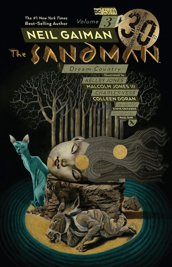
Neil Gaiman’s “The Sandman” is known for its detailed and expressive artwork. The art captures the essence of the fantasy and myth themes, adding depth and feeling to the story.


Similarly, Terry Pratchett’s “Discworld” series is identifiable by Josh Kirby’s iconic illustrations. Kirby’s vibrant and whimsical style perfectly captures the humor and eccentricity of the Discworld. This type of illustration works well with Pratchett’s witty and clever writing.
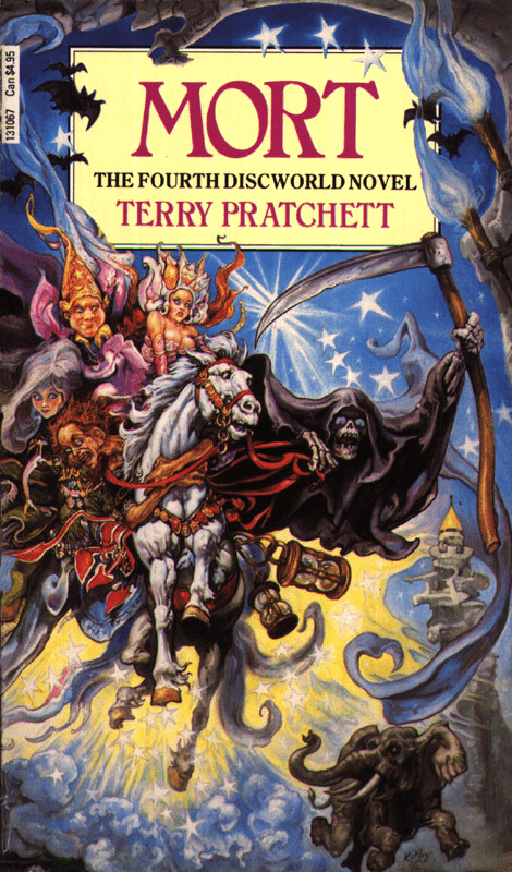


In both cases, the artwork is essential to the series’ identity. It makes the storytelling richer and pulls readers into the imaginary worlds created by the authors.
Layout and Composition
The layout and composition of a book cover are important for making a series look unified. A similar design for all the books in a series builds a strong brand and makes it easier for readers to recognize them.
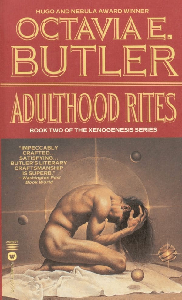
Octavia E. Butler’s “Lilith’s Brood” is a great example of using a consistent design in a book series. All the first edition books have a similar style on their covers, with the author and the title in the top part and artwork at the bottom. The imagery evokes themes of alien life and human evolution. This consistent design makes each book easy to recognize as part of the series and keeps a uniform look across all the books.


Individual Book Identity
Finding the right balance in a book series design is tricky. It’s about making sure each book looks like it belongs to the series but also has its own special look.
Alexander McCall Smith’s “The No. 1 Ladies’ Detective Agency” series is a great example of this balance. Every book has a similar design that shows off its setting in Botswana with bright colors and African patterns. But each book also has its own unique images and colors that match its story. This way, every book fits in the series but also stands out on its own, making readers curious about each unique story.


Evolution of Design in Book Series
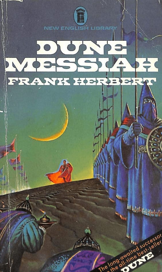
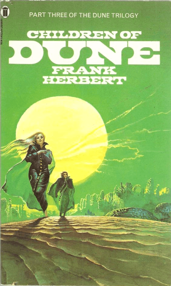
Book series design often changes over time, reflecting new cultural trends and publishing standards but keeping the series’ main identity. For example, the “Dune” series by Frank Herbert shows this well.
The original 70s-80s covers by Bruce Pennington were bold and dramatic, fitting the sci-fi style of that era.

The current US paperback series style designed by Jim Tierney gives a simple look with refined typography and less obvious images.
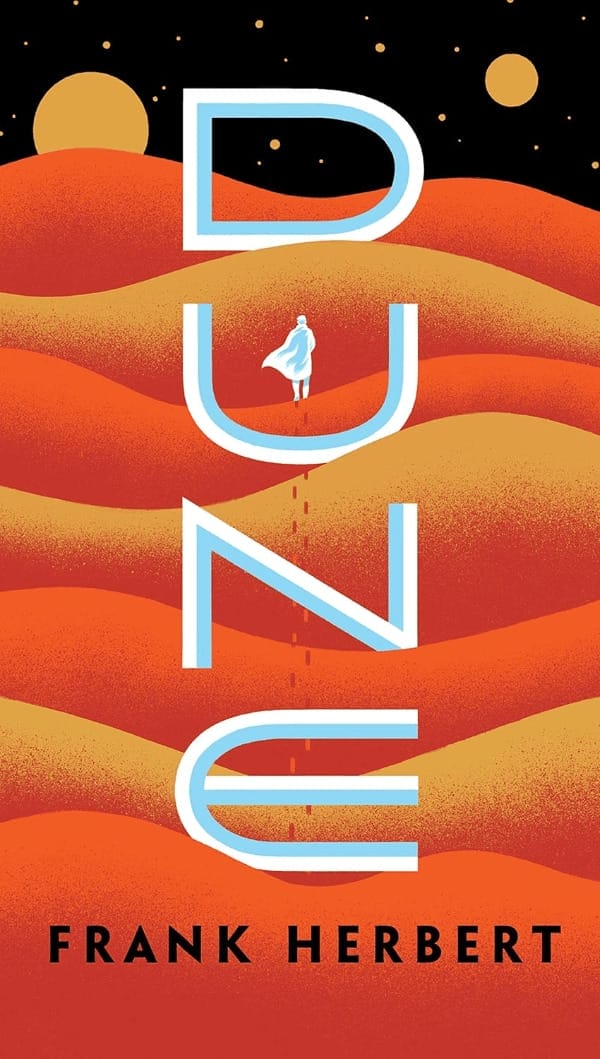

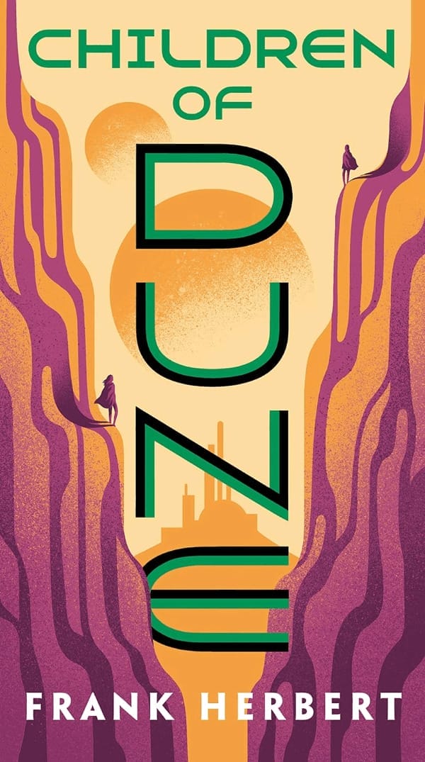
These changes keep “Dune” fresh and up-to-date while keeping its groundbreaking science fiction feel.
Final Thoughts
Consistent book cover design is crucial when planning a book series. It builds a strong brand for the whole series, helps readers recognize it, and connects each book’s unique story to the series.
As the publishing landscape evolves, so do design trends. Writers should be aware of these changes but ensure the series stays true to its main visual style. This flexibility helps keep readers interested and makes the series stay popular. The book cover is often the first thing your audience sees, so making a good impression is important.
