


One of the worst mistakes self-published authors make is deviating too far from the conventional standards of the publishing industry (aka, what readers have come to know and expect). And one of the most common areas in which they do that is when choosing book fonts.
For over a century, print books have used similar fonts regardless of what publisher they came from. Those fonts were generally serif, easy to read, and either transitional or old style (more on those terms in a bit).
All too often, though, self-published authors decide to use a font that’s less common but that they feel is more “fitting” to the mood or tone of their book. The result, unfortunately, is often dissatisfaction among readers who find the font unexpected and hard to read. These books give an impression of low quality and are often the subject of poor reviews.
In this article, we'll cover:
Industry Standards for Book Fonts & When to Get Creative
Fonts have a sound.
At first, you might think that sentence is crazy, but hear me out. What happens when most of us read? We hear the words in our heads.
THAT’S WHY EVEN USING ALL CAPS MAKES IT SOUND LIKE THE TEXT IS YELLING.
Unless you’re one of the few people who don’t have an internal narrator in your head, you will hear the words. The font used will dictate the tone of what you’re reading. This is powerful in branding, especially if you get it wrong.
Take this viral example of how much font can change the tone of the simple sentence: You’ll always be mine.

Now, it’s a terrible idea to write a whole book using a decorative font, but the opportunity exists to strategically use fonts in creative ways to add to the tone of your story.

Before we dive into those industry standards and what to use as the main font for your book, let’s look at some examples of how you can be creative with book fonts used to add character to certain elements in your stories.
Here are instances where you might want to use alternative fonts, with examples:
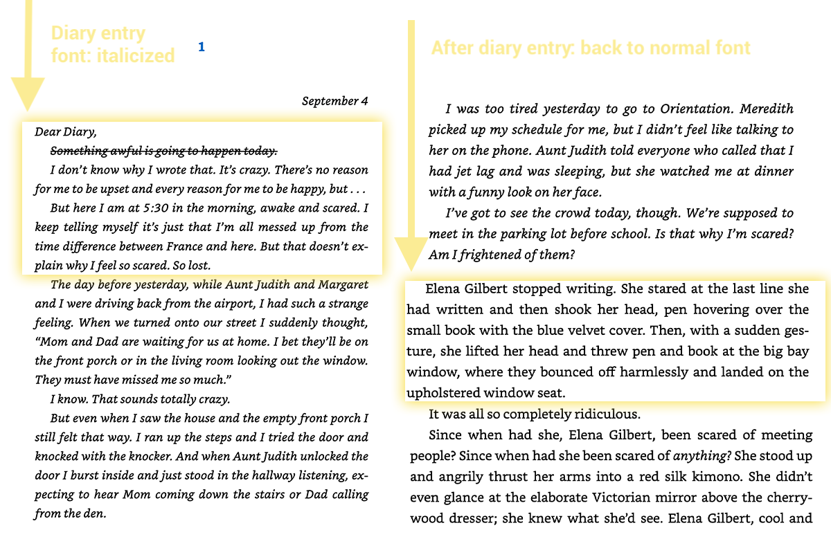
1. Diary or Journal Entries
Diary or journal entries are very common elements in fiction but can also be used to reference personal journal entries in nonfiction. It gives us a closer look at the protagonist’s inner world. It brings us closer to them. But if you’re not writing an epistolary novel or are using a first person point of view in fiction, you need a way to differentiate the entry from the normal narrative.
This is commonly done in two ways:
- Italicizing the main font and created larger margins
- Using a handwriting font to make it look more realistic
Look at how author L.J. Smith has done it with the now-famous novels The Vampire Diaries.
2. Narrative Stories Within a Nonfiction Book
Nonfiction often gets the reputation of being boring or not creative. That’s not true. If you’re writing a nonfiction book, you can easily make it entertaining and creative with the type of font you use.
In Matthew Emmorey’s The Detourist, he uses a different font to showcase made-up stories inside his head, among other types of fonts in the book for call-outs, scripture, and even calls-to-action (which is detailed below).

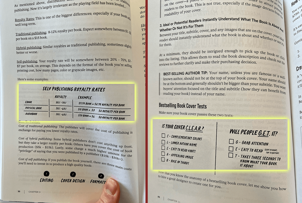
3. Quotes, Pull Quotes, Tables, and Charts in Nonfiction
While novels have fairly standard formatting (even when including variations like the journal entries above), there’s a lot more room for creative page layouts in nonfiction. Some authors choose to take impactful sentences or phrases from their nonfiction writing and create a pull quote, enlarging it and embedding it within the text.
In Chandler Bolt’s Published, you’ll see charts, examples, quotes, and even acronyms listed in a different font so they stand out from the rest.
4. Calls to Action in Nonfiction
This isn’t just for nonfiction, though it’s most common here. If you want to grow your email list or platform through your nonfiction book, then you’ll want to place calls to action within the book to do that.
Jenna Kutcher does this in droves in her nonfiction How Are You, Really? Here, there is a colored block with a slight variation on the body font to break up chapters or sections:

5. Epistolary Narratives
An epistolary book is one in which the story itself is told from journal entries or even letters to and from someone. There are many books of this nature (like Name Of The Wind) that use the same fonts throughout the book.
But there are also some that include more than one character’s epistolary style narrative. In these cases, the fonts sometimes change between chapters to not only represent the change in perspective, but to give more depth to each narrator’s characterization.
Take this example from the dystopian novel Young World, where each main character is displayed in a different font that gives insight into their personalities

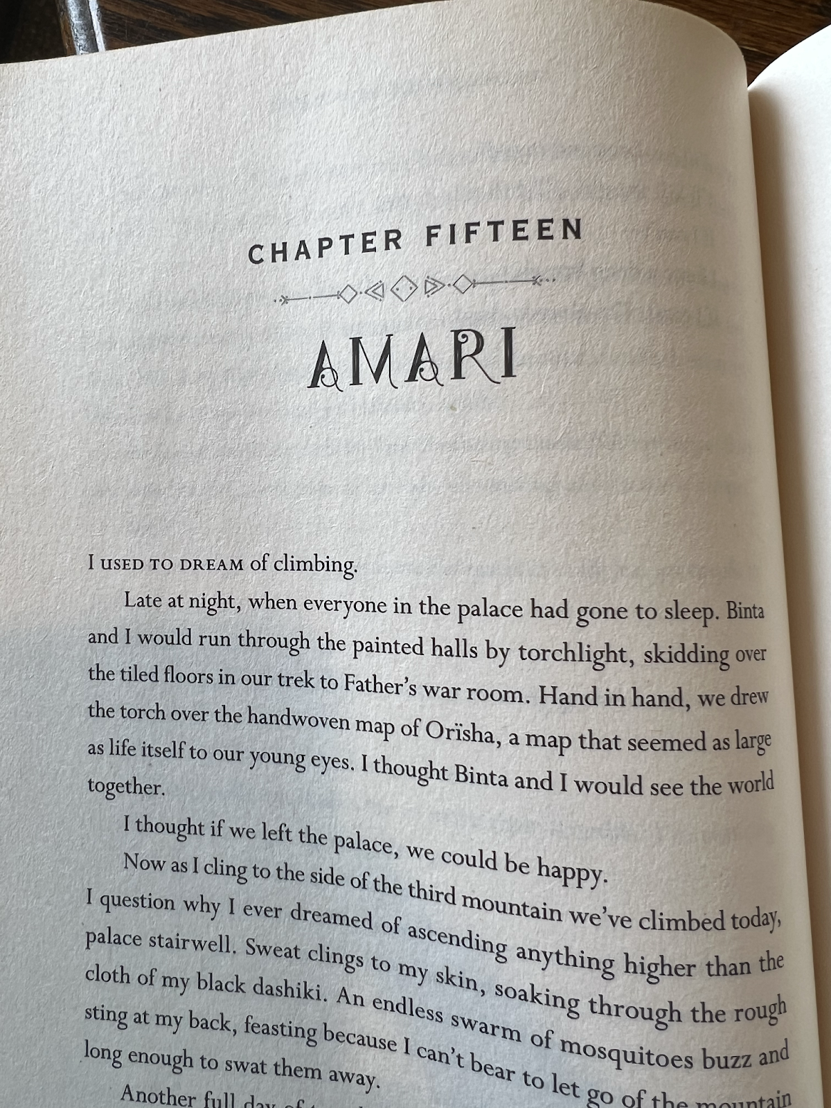
6. Chapter Titles and Subtitles
Chapter titles and subtitles are a chance to get really creative with book fonts. While using display fonts or fonts that are hard to read at small sizes is an awful idea for the body text of your book, using display fonts for your chapter title and subtitles is an excellent way to add character to your book and to reinforce the tone or mood.
In Children of Blood and Bone, author Tomi Adeyemi uses a unique font for the name of each chapter’s perspective character and it fits the tone of her world, a tribal-based culture of African inspiration. This helps build the world with a seemingly small element reinforced for each chapter.
Understanding Book Fonts & Typography
The design of your book has a critical part to play in how readable it is, how well it communicates the ideas you’ve taken such effort and care to write.
Whether you’re designing the book yourself, or hiring a professional book designer, it pays to understand the basic building blocks that books are made of: fonts and the way they are arranged on the page—typography.
After deciding on the size of your book, the next big design decision is picking a type font for the body of your book. Although many classic book typefaces look similar they can have a sizable effect on the overall look and readability of the page.
There are thousands of typefaces available for digital typography, most of which are available for download at various type foundries on the web. But very few of these are used as book fonts.
Most Commonly Used Book Fonts
When we think of industry standards for books, we think of what the traditional publishing industry has agreed is the right format to use. There’s a reason Arial isn’t the primary font used in a book.
Most of the typefaces we use for books are classic typefaces, either old-style or transitional designs. The designs of these book fonts trace their roots to the very infancy of printing (in the mid-1400s), in the years when printing with type first spread from Germany throughout the rest of Europe.
It was in Italy that the earliest type designers and book printers created many of the letterforms that influence us today. You could say that our culture has grown up, grown literate, and learned through the agency of these typefaces, and I think that’s one of the reasons they have such a firm place in our cultural history.
Just take a look at this example of a side-by-side comparison of what an opening chapter looks like with four different fonts and what it does to the tone of the writing
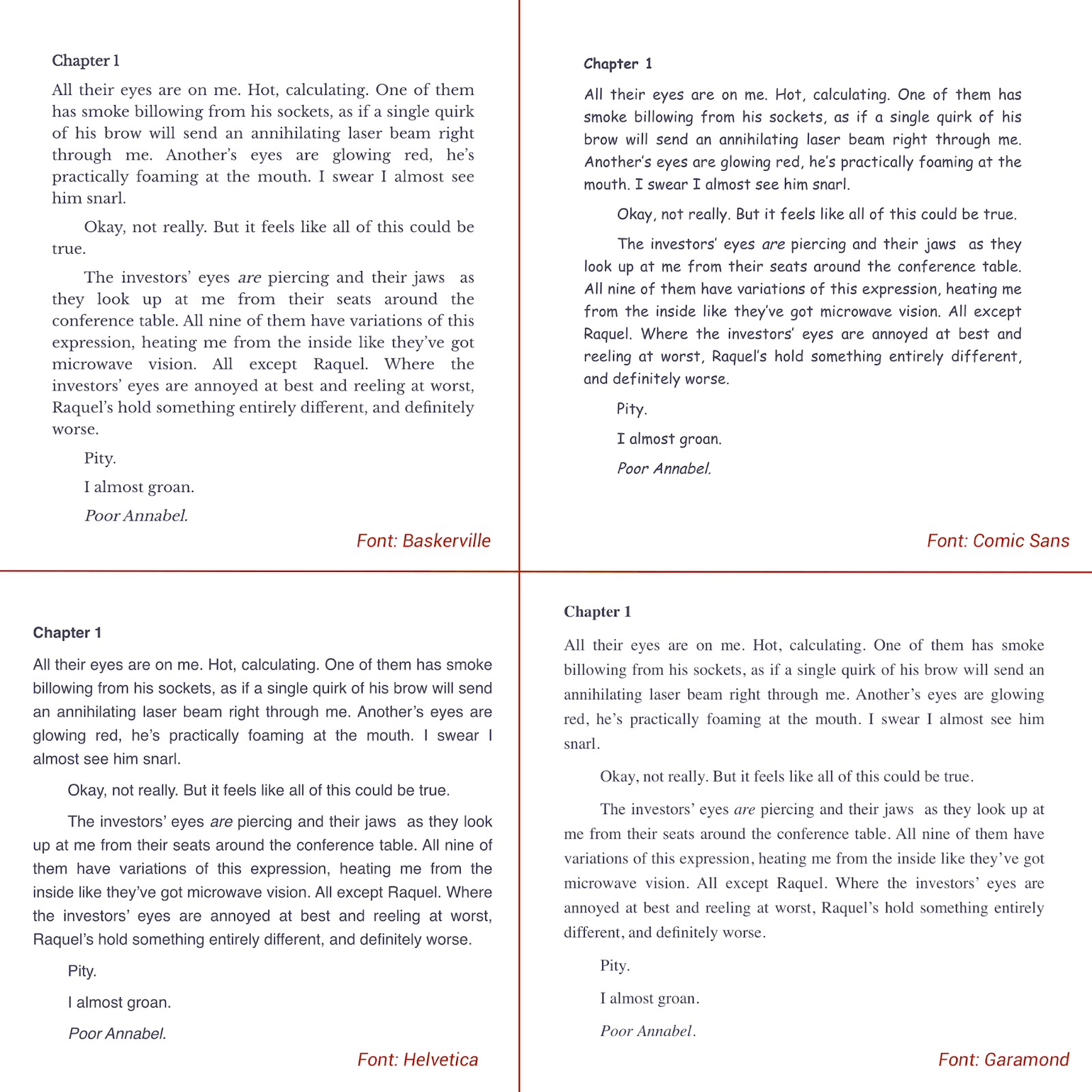
As you can see, the mood of each page is wildly different (although the Baskerville and Garamond versions are more closely related). Side note: please don’t ever use Comic Sans in book layout, or even on a cover. If you must use a “comic-style” font, there are better options available.
That said, the most common book fonts used are as follows:
- Main book content: Baskerville, Garamond, Crimson Text, Jenson, Palatino
- Letters / Text exchanges: Italicized main font, Courier New or a similar monospaced font for texts
- Handwriting: Bradley Hand
A Word of Caution About Using Free Fonts
It’s easy to find free fonts online. Just search for “free fonts” and you’ll find tens of thousands of search results. But using free fonts is not always a good idea. In fact, some of those “free” fonts are actually illegal to use in your book!
It all comes down to licensing. Most free fonts are only free for personal use. That means you could use them to make a birthday card for your mom, but you can’t use them to make a line of birthday cards you plan to sell. Using fonts on something that’s available for sale or otherwise used to make money is commercial use. And that requires a different kind of license.
So how do you find free fonts that can be used for commercial purposes? One of the most fool-proof sites to find free book fonts for commercial use is to use Google Fonts. All of the fonts included there are offered under a commercial license. If you want to find free fonts elsewhere, just be sure that you check the licensing agreement to verify that commercial use is okay.
Font Sizes to Use in Your Book
Not only does the font type matter in your book, but so does the size. You don’t want to use too big of a font—especially for a novel—because it’ll grow your page count and make your printing costs higher (and your royalty rate lower). But you don’t want to make it so small that your readers have to squint and get a headache from reading it.
As a general rule, a font size between 10 and 12 points is commonly used in Adult, YA, and Middle Grade books. For children’s books, 14 to 18 point type is normal (and can go even larger depending on the exact book).
The size font you choose can have a startling impact on the length of your book. For example, a 200 page book formatted with a 10-point font may grow as long as 250 pages if the font size is increased to 12 point. If you’re trying to be economical on printing costs, then shrinking the font size by .5 to 1 point can make a big difference. On the other hand, if you’re writing in a genre where longer books are the norm, increasing your font size by a point can increase your number of pages to be more in line with the genre standard.
Remember that when it comes to ebooks, font size is irrelevant. Readers will be able to adjust the font size according to their own preference. The same is true for the font, with the exception of embedded fonts (generally only used for things like chapter titles or special formatting on things like letters, journal entries, etc.).
8 Examples of Using Fonts Creatively in Books
If you need a little inspiration and are up for the challenge of using fonts creatively in your book, there are many options to draw inspiration from.
These are some fiction books to learn which book fonts work well for certain types of books:
- Legend by Marie Lu. The book is formatted not only with different fonts, but also with different colored text.
- Shatter Me by Tahereh Mafi. This book makes creative use of strikethrough text, something rarely seen in novels. Just beware of overdoing it, as it can interrupt the reader’s flow.
- House of Leaves by Mark Z. Danielewski. Perhaps one of the most famous unconventional book interiors, text is written at odd angles and in varying shapes, different fonts are combined, and the book’s format is just as much a part of the story as the actual writing.
- Unwind by Neal Shusterman. The font used for chapter titles fits the tone of the story well.
- Shades Children by Garth Nix. Mixes display, sans serif, and serif fonts to create a fitting mood for the story.
- More Than That by Anthony J. Alexandre. A poetry book that not only uses different fonts, but also combines pages with black backgrounds and white typography.
- Delirium by Lauren Oliver. Beautiful typography for the chapter headings combined with an italicized version of the main body text for the epigraphs that start each chapter.
- The Knife of Never Letting Go by Patrick Ness. Uses a distinct display font for writing certain thoughts within the book.
There are thousands of books out there with beautiful typography. Peruse your favorite books or take an afternoon to look at new releases at your favorite bookstore or local library to get ideas. Just remember that the typography of a book should put the reader experience first and foremost.
Ready to publish your own book? Get our free Advanced Publishing Starter Kit now!
Editors note: This article combines the best of articles about book fonts and typography originally written by Sarah Rexford, Joel Friendlander, and David Kudler.
