What are minimalist book covers? Good question. If you’re familiar with minimalism’s “less is more” philosophy, then you already have a good starting point for understanding how to design minimalist book covers.
The focus of minimalist book covers is to either:
a) offer the bare minimum interpretation of the book’s title, theme, or content.
Or,
b) exclude specific elements to create a question in the mind of the reader that the book will answer.
The 15 books in this list include fiction and nonfiction. Each cover offers its own unique spin on minimalism while creating a visually engaging image that piques the readers’ interest.
Many of the covers below were new to me, so right or wrong, I offer my first impression of what the cover design could mean.
Here are 15 minimalist book covers to give you ideas for your own covers:
1. Inward
Author: Yung Pueblo
Genre: Hispanic American Poetry, Inspirational & Religious Poetry (Books), Emotional Self Help
Description (snippet): “a collection of poetry and prose that explores the movement from self-love to unconditional love, the power of letting go, and the wisdom that comes when we truly try to know ourselves,”
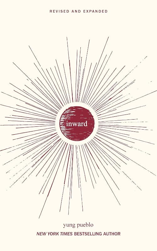
Standout features: With this simple 2-color design, the eye is immediately drawn to the center where the title rests and a sunburst radiates behind it.
Interpretation: The simple design represents the life and joy that can be found during introspection and self-reflection.
2. The Creative Act: A Way of Being
Author: Rick Rubin
Genre: Creativity (Books), Popular Psychology Creativity & Genius, Personal Transformation Self-Help
Description (snippet): “ The Creative Act is a beautiful and generous course of study that illuminates the path of the artist as a road we all can follow.”
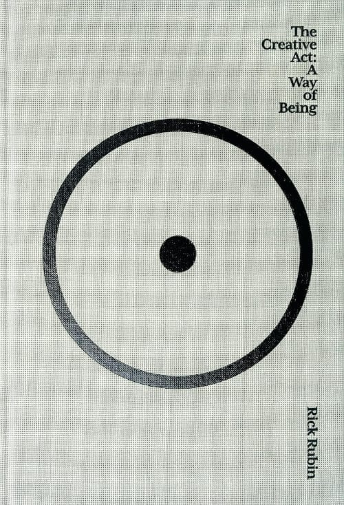
Standout features: concentric circles—one open and one closed
Interpretation: My initial impression was that the cover reminded me of a bullseye and that when artists are true to themselves, their focus becomes clear—targeted. But, the more I looked at it, the more I saw the circle within a circle as the limitations that we put on ourselves as creatives. I’m sure there are many more interpretations, which makes this a great example of minimalist book cover design.
3. Happiness: The Science Behind Your Smile
Author: Daniel Nettle
Genre: Emotions, Medical Cognitive Psychology, Cognitive Psychology (Books)
Description (snippet): “ Bringing together the latest insights from psychiatry, psychology, and philosophy, Daniel Nettle sheds light on happiness, the most basic of human desires.”
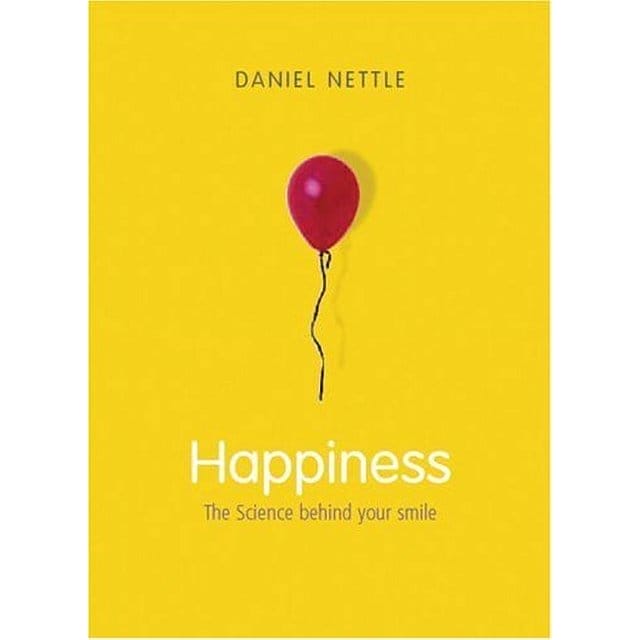
Standout features: yellow background, red balloon
Interpretation: Yellow is viewed as a “happy” color, but red can have contrasting meanings like anger on one side and love on the other, so what does the red balloon on this cover represent? Maybe the duality of happiness, in that it’s not always what it appears to be.
4. All You Need is Less
Author: Vicki Vrint
Genre: Sustainable Living, Stress Management Self-Help, Home Improvement & Design Books
Description (snippet): “ We live such busy lives, rushing from one thing to the next, that we barely give ourselves time to catch our breath. But what would happen if we aimed for less?
This little book, filled with practical tips and ideas, covers a range of topics that could lead to a simpler way of life…”
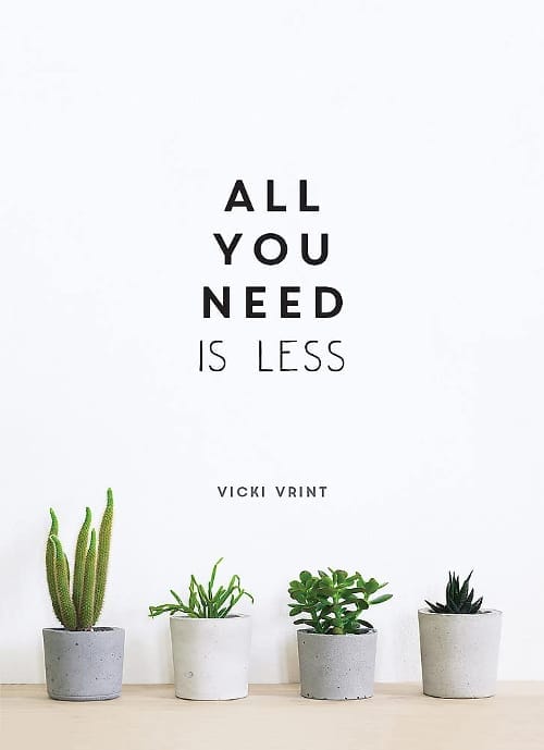
Standout features: 4 small succulent plants on a clean background
Interpretation: Minimalism focuses not only on minimizing stuff. It also embraces finding ways to make life easier to manage. What better way to represent an easier lifestyle visually than plants that can survive with little human intervention (except the occasional drink of water)?
5. Heal. Grow. Love.

Author: Pierre Alex Jeanty
Genre: Inspirational & Religious Poetry (Books), Motivational Self-Help (Books)
Description: “ Written with love and soul, “Heal. Grow. Love.” is a collection of poetry and prose penned to fuel your healing while inspiring you to grow and love. ”
Standout features: White typography on a black background.
Interpretation: The black-to-white contrast represents how emotionally life can get dark, but there’s always the possibility for it to get better—a complete 180° turnaround. Just as with all poetry, the words on this cover are enough.
6. Love, Stargirl
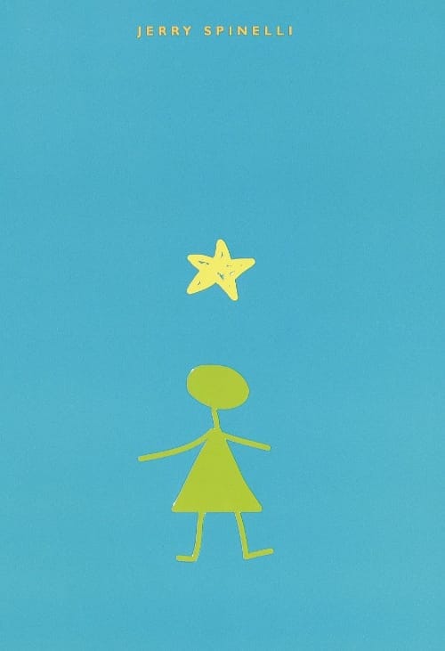
Author: Jerry Spinelli
Genre: Teen & Young Adult Loners & Outcasts Fiction, Children’s Books on Peer Pressure (Books), Children’s School Issues
Description: “From the day she arrives at quiet Mica High in a burst of color and sound, the hallways hum with the murmur of “Stargirl, Stargirl.” She captures Leo Borlock’s heart with just one smile. She sparks a school-spirit revolution with just one cheer. The students of Mica High are enchanted. At first..”
Standout features: a star, a girl, an author’s name
Interpretation: This is the most minimal cover on the list that does everything right. It offers a visual translation of the title “Star Girl” with beautiful, vibrant colors that are representative of the book’s main character.
7. City on the Edge
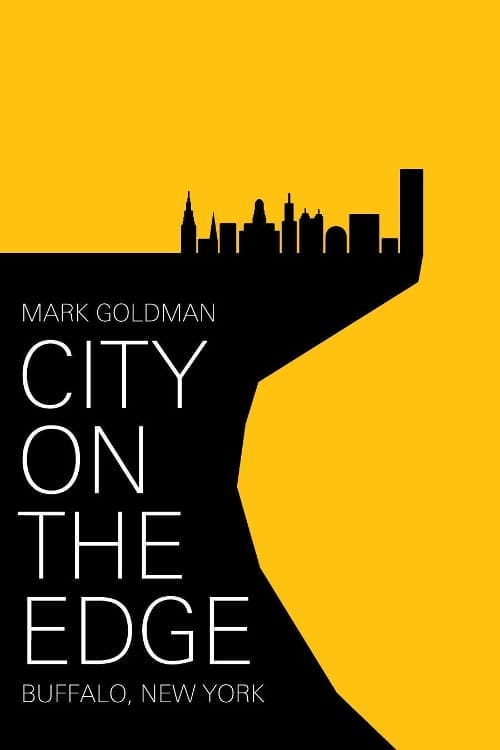
Author: Mark Goldman
Genre: Regional Politics Planning, Economic Conditions (Books), U.S. State & Local History
Description (snippet): “ Buffalo, New York is enjoying a resurgence, and has become a recommended travel destination. this book tells the story of how it got here”
Standout features: city skyline on a ledge +
Interpretation: A city on the edge of greatness? On the edge of danger? A mix of the two? The hard angles and stark contrast create a feeling of uncertainty. It begs the question, “So, what does the future hold for the great city of Buffalo, New York?
8. The Crow’s Vow
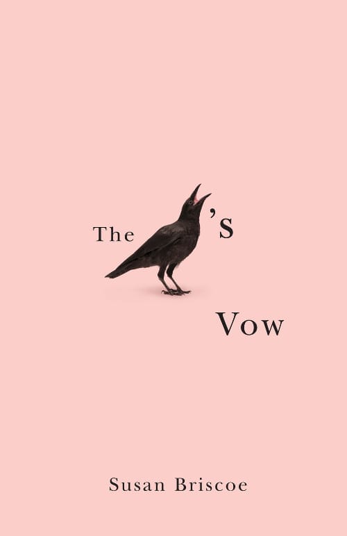
Author: Amy Hempel
Genre: Canadian Poetry, American Poetry (Books)
Description (snippet): “Intricately constructed and brimming with resourceful linguistic play, these poems are elemental odes on the end of love and its eventual renewal.”
Standout features: A crow and a title
Interpretation: As humans, we are wired to try to figure things out. If you can grab a potential reader’s attention with a word puzzle like this one, they’ll stop skimming through their book feed which is the ultimate goal of marketing—getting a potential reader’s attention. Like the previous book cover, Stargirl, the use of images in place of words is a great way to engage the reader.
9. Leviathan: Or, the Whale
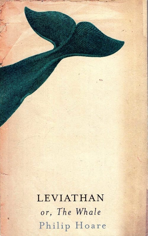
Author: Philip Hoare
Genre: Mathematics (Books), Nature & Ecology (Books)
Description: “The story of a man’s obsession with whales, which takes him on a personal, historical and biographical journey – from his childhood to his fascination with Moby-Dick and his excursions whale-watching.”
Standout features: a tail
Interpretation: You don’t have to stretch far to guess the subject of this book. For the front cover, they chose just a glimpse of the tail. Is the book about the whales’ physical elusivity? Or perhaps it’s about being able to grasp the gravity of what the whale (metaphorically) represents in our own lives.
10. After Freud Left: A Century of Psychoanalysis in America

Author: Adam Haslett
Genre: Medical Psychology History, Popular Psychology History, U.S. Immigrant History
Description (snippet): “From August 29 to September 21, 1909, Sigmund Freud visited the United States, where he gave five lectures at Clark University in Worcester, Massachusetts. This volume brings together a stunning gallery of leading historians of psychoanalysis and of American culture to consider the broad history of psychoanalysis in America and to reflect on what has happened to Freud’s legacy in the United States in the century since his visit.”
Standout features: round glasses
Interpretation: The round glasses are an iconic representation of the 19th-century neurologist and psychoanalyst—not to mention his white hair and tweed suits. It’s interesting to note that nothing else is needed on the cover to spark a conversation about psychoanalysis in America—the Freudian symbol is enough.
11. The Moon: A History for the Future
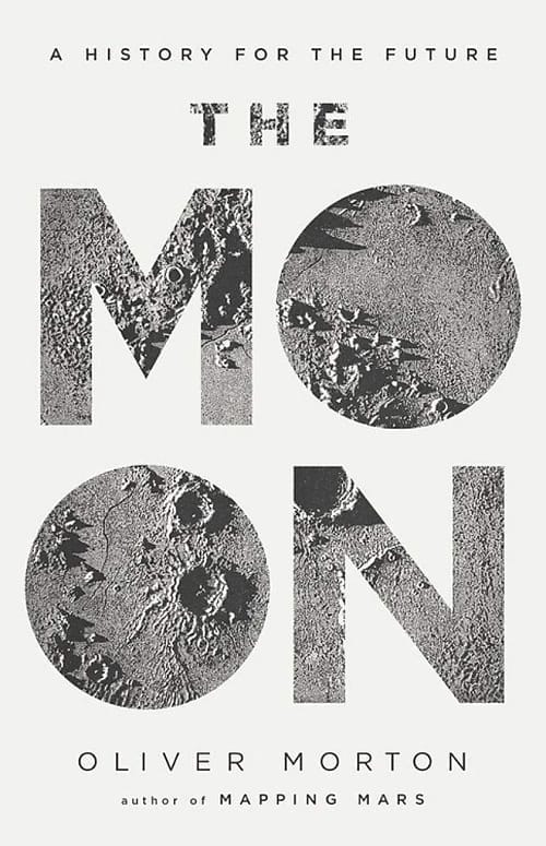
Author: Adam Haslett
Genre: Creativity (Books), Popular Psychology Creativity & Genius, Personal Transformation Self-Help
Description: “Oliver Morton explores how the ways we have looked at the Moon have shaped our perceptions of the Earth: from the controversies of early astronomers such as van Eyck and Galileo, to the Cold War space race, to the potential use of the Moon as a stepping stone for further space exploration.”
Standout features: concentric circles—one open and one closed
Interpretation: No interpretation is needed here. As far as minimalist book covers go, using the moon’s surface to add texture to the title was a smart move. It adds depth and a bit of “pop” to a monochromatic color scheme that by itself, could appear flat.
12. Time: Big Ideas, Small Books

Author: Eva Hoffman
Genre: Physics of Time (Books), Historical Study (Books)
Description (snippet): “Hoffman regards our relationship to time–from jet lag to aging, sleep to cryogenic freezing–in this broad, eye-opening meditation on life’s essential medium and its contemporary challenges.”
Standout features: Yellow background and shadow
Interpretation: The first thing I noticed was the large shadow that obscured the subtitle. This could be a literal interpretation of “the passing of time” throughout the day or possibly a metaphor for our lives and how as time passes, parts of our lives become eclipsed—fading memories, losses, and time itself.
13. The Girl Who Fell From The Sky
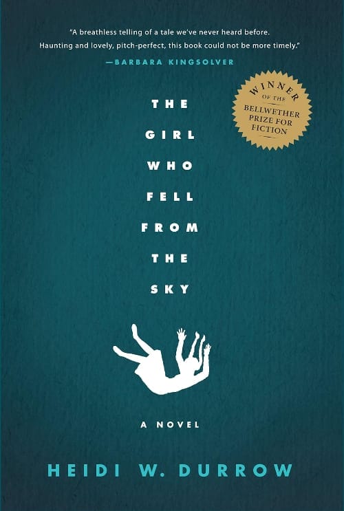
Author: Heidi W. Durrow
Genre: Cultural Heritage Fiction, Family Life Fiction (Books), Literary Fiction (Books)
Description: “ Rachel, the daughter of a Danish mother and a black G.I., becomes the sole survivor of a family tragedy after a fateful morning on their Chicago rooftop.
Forced to move to a new city, with her strict African American grandmother as her guardian, Rachel is thrust for the first time into a mostly black community, where her light brown skin, blue eyes, and beauty bring a constant stream of attention her way. It’s there, as she grows up and tries to swallow her grief, that she comes to understand how the mystery and tragedy of her mother might be connected to her own uncertain identity.”
Standout features: Vertical title, a falling girl’s silhouette
Interpretation: I wasn’t sure what to make of the image initially. This could be a girl literally falling from the sky (sci-fi, spaceship, alien abduction?), but it could also represent someone who is different and doesn’t seem to fit in the current world. The white “shadow art” of the little girl in freefall is disarming, and the use of a clipped vertical title intensifies the action.
14. The Last Draft
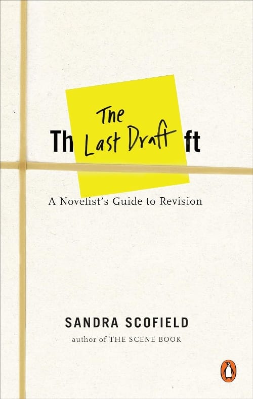
Author: Sandra Scofield
Genre: Mystery Writing Reference, Words, Language & Grammar Reference, Fiction Writing Reference (Books)
Description: “This wise and friendly guide shows writers how to turn first-draft manuscripts into the novels of their dreams. ”
Standout features: Sticky Note and rubber bands
Interpretation: The plus of this simple design is that it looks like a printed out final draft of a book with the sticky note and rubber bands to hold it together. Using an element that is personal and familiar to your reader (in this case authors), is a way to get them on board quickly. At the very least it will cause them to pause and take a closer look.
15. An Ethics of Interrogation

Author: Michael Skerker
Genre: Law Ethics & Professional Responsibility, Military Law (Kindle Store), Criminal Procedure
Description: “In this important new examination of a controversial subject, Michael Skerker confronts a host of philosophical and legal issues, from the right to privacy and the privilege against compelled self-incrimination to prisoner rights and the legal consequences of different modes of interrogation for both domestic criminal and foreign terror suspects. ”
Essentials: Hanging light illuminating the darkness at a single point
Interpretation: When I think of the stereotypical interrogation from old black-and-white movies, it looks like this cover image—a dark room with a small table. The prisoner on one side and the interrogator on the other, and there’s a single light between them dangling precariously from the ceiling. I think of shadows, mystery, tension, and the fear of what may come. But this cover doesn’t evoke that kind of tense feeling. It feels more matter-of-fact—a familiar symbol to spark a conversation.
Takeaways
In a noisy world, minimalism can offer a respite to those who are looking for an escape from life’s constant movement. Books that are minimal in design, give readers a chance to take in the pieces of an image without feeling visually accosted.
When considering the best cover design for your book, what you place on your book and leave off are equally important to your book’s story and how it makes the reader feel.
A chaotic (busy) cover can create tension. This works well for a fast-paced thriller, suspense, and other genres that keep the reader on the edge of their seats guessing. Depending on the imagery, this type of cover can also be playful and imaginative which is great for children’s books, anime, and other genres that stretch the imagination.
On the other hand, minimal design is reserved, calculated, and deliberate, leaving enough room for the reader to fill in the gaps. While minimalist book covers can also work well across multiple genres, they work differently than the more “in your face” cover designs. By leading the potential reader into the story more subtly, they extend an invitation for the reader to ask the first question and engage with the book on their own terms.
Similar to “show don’t tell” in book writing, minimalist book covers, offer just enough bread crumbs to spark curiosity rather than putting the entire loaf on the table.
Not sure which type of cover design is best for your book? Get to know your reader’s expectations, and go from there.


