


A good book cover design is one of the most important elements of creating a successful book. But what goes into an amazing book cover? What are the essential parts of a good cover?
Book cover design is part art and part science, a chance for creative expression that still needs to fit into certain parameters to be successful. In this article and accompanying infographic, we’ll cover the important things to consider when designing a book cover (or working with a cover designer).
When creating a book cover design, you'll need to keep the following in mind:
Universal Book Cover Design Tips
Whether your book is fiction or nonfiction, there are certain design principles that you’ll want to incorporate. Following these principles means that:
- Your book cover design will serve its purpose
- Your book cover will be aesthetically pleasing
Form follows function in book cover design just as with any other design project! If your book cover doesn’t convey the necessary information to potential readers, then it’s likely to be left on the shelf (whether that’s a physical shelf or a virtual one).
Create a Focal Point
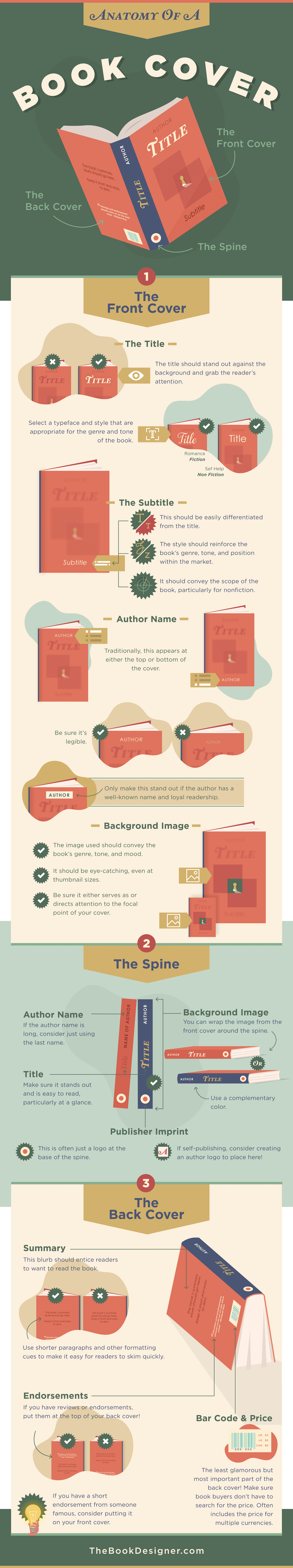
Every great book cover has a focal point: the spot on the cover that a reader’s eye is automatically drawn to. On some covers, this is the title. On others, it might be the imagery. And for certain bestselling authors (think Stephen King), it might be the author’s name.
Convey the Genre
Every genre has standards and conventions for cover designs. You’d never mistake a great horror novel for a romance novel based on the cover (or at least you shouldn’t if the cover designer did their job). Business book covers look different than covers for personal development books. Be sure that your cover follows the general standards for your genre.
Use Contrast to Your Advantage
Contrast comes in a few flavors in the design world. But the basic idea is that it’s the differences between elements. Color contrast is the most obvious contrast to create, but contrast between sizes and types of elements is also important. Contrast can be used to reinforce the focal point of your book’s cover design.
Designing a Great Front Cover
First things first: make sure that your title stands out against whatever background you’re using, whether it’s a solid color, a pattern, or an image. For the vast majority of authors and books, the title is the most important part of the cover.
(Having trouble coming up with a stellar title? Check out Selfpublishing.com’s Book Title Generator!)
For most books, the title should be your cover’s focal point. That means all of the other elements should point toward the title (either literally or figuratively).
Other elements on your book’s front cover should include the subtitle (assuming you have one) and the author’s name. The subtitle should be prominent but not compete with the title. Your author name should be easily found (traditionally either at the top or bottom of the front cover) but unless you’re an incredibly famous author, it doesn’t need to be super prominent.
Using Images on Your Front Cover
The image you use on your book’s front cover should be closely related to your book’s genre, theme, and story. This is why it’s typical to see a couple on the cover of a romance novel or a spaceship on hard sci-fi.
With non-fiction in particular, you might consider using some kind of symbolic imagery on your front cover, but be careful of being too abstract. You want the message of the book to be crystal clear to the potential reader. Don’t leave them scratching their heads.
For fiction, commissioning an artist to create a custom illustration can be a great way to make sure that your book’s genre and tone are clearly conveyed to the reader at a glance. You can find artists willing to create low-cost illustrations on sites like Fiverr or even Etsy. Just make sure that the licensing covers using the images on a book cover.
Designing Your Book’s Spine
The book’s spine is often the most overlooked part of a book cover design, but can also be the most vital, particularly if you’re going to be selling your book in physical bookstores. Bookstores display the majority of their inventory with the spine facing out, rather than the front cover. In other words: your spine is likely doing the heavy lifting when it comes to enticing readers.
There are a few things that must appear on your spine. First is your book’s title. This should be prominent and easy to read from a distance. You may or may not include your book’s subtitle on the spine. Many authors opt not to, but if your subtitle is on the shorter side, it can make sense to include it.
Second, you’ll want to include your name, although many authors opt to only include their last name on the spine, especially if their name is long. This should be less prominent than the title but still easy to read.
Lastly, you’ll want to include a publisher’s logo, generally at the bottom of the spine. If you’re self-publishing and haven’t set up a separate publishing imprint to publish your books under, you may want to create an author logo. This will make sure your book spine looks similar to others on the shelf, including those published by the big traditional publishing houses.
As far as imagery on your spine, you have a few different options. You could opt to have the image from the front cover continue over the spine. This creates a nice sense of continuity. Alternatively, you could use a color from the front cover or even use a contrasting color if it fits the mood and tone of your book.
Designing the Book’s Back Cover
A book’s back cover is a lot more pragmatic than either the front cover or spine. While the spine and cover are there to get a reader’s attention, the back cover is there to make them take the next step and purchase the book.
There are a few essential elements that every back cover should include, depending on whether it’s a hardcover or paperback book. On paperback (or casewrap) books, your book’s description or blurb will be placed prominently on the back cover. On a hardcover, it’s more traditional for praise for the book to appear on the back cover (and the description or blurb goes on the inside of the book jacket). A solid book blurb can make the difference between a reader buying your book or putting it back on the shelf and moving on to the next one. Don’t overlook this key part.
If you have a particularly compelling endorsement of your book, you may want to place that just above or below the blurb (typically in a different but complementary typeface).
Your book’s back cover will also have more practical information, like your book’s barcode, ISBN, and pricing information. Be sure that the price is easy for readers to find (the most obvious place is to put it near the barcode). This area also often includes your book’s top-level genre or category info (like “horror” or “self-help”), as that helps booksellers know where to place your book on the shelves.
Want a more visual look at how a book’s cover is typically designed? Check out the infographic below! And be sure to share or embed it!
Share this Image On Your Site
Copy and paste the code below to share this infographic!
