Welcome to this edition of the e-Book Cover Design Awards. This edition is for submissions during April, 2012.
Here’s what we received:
82 covers in the Fiction category
11 covers in the Nonfiction category
Award Winners and Listing
I’ve added comments (JF: ) to many of the entries, but not all. Thanks to everyone who participated. I hope you enjoy these as much as I did. Please leave a comment to let me know what you think, too.
Now, without any further ado, here are the winners of this month’s e-Book Cover Design Award.
e-Book Cover Design Award Winner for April 2012 in Fiction
Masha du Toit submitted The Story Trap designed by Masha du Toit.

JF: Terrific. There are very few authors who can draw well enough to do something like this, but writer and artist Masha du Toit gets it perfect here. The simple but enigmatic drawing combines seamlessly with the typography to create a really good ebook cover.
e-Book Cover Design Award Winner for April 2012 in Nonfiction
Clay Rivers submitted Walking Tall: A Memoir About the Upside of Small and Other Stuff designed by Clay Rivers.

JF: The author is also an actor and graphic designer, and his skills at layout and typography are on display here in the cover for his memoir. Great job.
Fiction Covers
Elizabeth Barone submitted A Maid’s Best Friend (A Short Story) designed by Elizabeth Barone.

Virginia Kelly submitted Against the Wind designed by Kim Killion, Hot Damn Designs.

JF: A simple and effective ebook cover that might be even better without the fancy type effects.
Eleanore MacDonald submitted All The Little Graces designed by Wendy Spratt/Lorraine Gervaise.

JF: Completely charming and perfect for this format. Simplicity really works well here, and the lettering perfectly complements the content and cover illustration.
Barbara Appleby submitted Around The Universe in 1,000 Years designed by Barbara Appleby. “This is the cover I did for Jerrold Pope.”

T.D. Rizor submitted Attic Juice designed by T.D. Rizor. “ATTIC JUICE is a scary adventure aimed at readers ages 9-12. Going for fun, spooky, and eye-grabbing. (I have to say, your website has been incredibly helpful, Joel. The cover awards posts in particular have guided me along the way.) Thanks.”
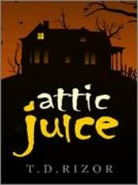
JF: Fantastic job T.D. Simple elements combined well yield maximum impact. We can tell exactly what to expect from this book.
Julia Barrett submitted Beauty and the Feast designed by Winterheart Design. “Thanks for the opportunity. This is a work of erotic romantic comedy -Food related. Lex Valentine of Winterheart Design and I worked closely together on this cover. Thanks. Julia”

JF: Wow. That’s chocolate, right? Now holds the “most tongue on cover” award. Hard to look away, isn’t it?
Micki Street submitted Before the Daisies Grow designed by Karri Klawiter.

JJ Marsh submitted Behind Closed Doors designed by JD Smith, James Lane. “The artist made a video documenting the process of creating the cover. Maybe of interest? https://www.beatrice-stubbs.com/video.html”

JF: This is a very beautiful cover that loses quite a bit of texture and legibility when reduced to ebook preview size. Simply reducing a cover is often exactly the wrong way to create a cover for an ebook, as we’ve seen.
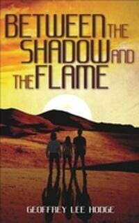
Geoffrey Lee Hodge submitted Between the Shadow and the Flame designed by CreateSpace. “The CreateSpace team did a nice job with this. The color palette islimited but eye-catching, the font suggests the science fiction theme, and the illustration works the main symbolism into an image that works as a thumbnail and in grayscale.”
Heather Jensen submitted Blood And Guitars designed by Ronnell D. Porter.

Mark Eyre submitted Burnfield designed by Matt Maguire. “Hello this is the cover to my literary horror novel ‘Burnfield’ It’s a simple yet striking design, with colours that really stand out. I also like the use of the quote, which seems to create a kind of inverted triangle, with the title, then the author name above it. ”

JF: You see, the problem is that there’s no size at which you can easily read that little type, that’s the problem. So why put it there if this is an ebook-only publication? Many people do this, and it mystifies me.
A. D. Cooper submitted Callum of Drakkar Coven designed by A. D. Cooper. “Commissioned by the author Leigh Jarrett to replace an old cover.”

Alan Flurry submitted Cansville designed by Don Chambers.

C. Leigh Purtill submitted Chasing the Falls designed by Maurice Jordan. “I designed this in keeping with Purtill’s other book, “Fat Girls in L.A. (Book 1: All About Vee) hoping to try and build a brand recognition with the authors work and this batch of young adult novels from Purtill.”

JF: This one continues the strong branding through illustration style and typography that typified the first, which was in an earlier edition of the ebook cover design awards.
Derek Murphy submitted Criminal Deception designed by Derek Murphy. “Criminal Deception [Kindle Edition] Lee Edward (Author)”

Steena Holmes submitted Dangerous Secrets designed by Steena Holmes.

JF: If you look at this cover within the context of the ones above and below you can see how murky and suppressed the colors are. This makes it very easy to skip over, and the illustration particularly might pop a lot more if it was brighter.
Nadria Tucker submitted Darwin, Singer designed by Jamie Harper. “The cover of this dystopian YA novel has a deco look that adds a bit of mystery. The illustrator highlighted the main character, her love interest, their state-mandated dress code, and an important piece of technology that drives the plot forward.”

JF: Quirky and appealing, and I love the colors, a really good cover.
Steena Holmes submitted Demon Ryder designed by Steena Holmes.

Alex James submitted Depth of Exposure designed by Jun Ares.

JF: An interesting ploy, playing off the “depth” in the title places the elements of this cover on 4 or 5 layers, but risks some visual confusion.
Jenny Twist submitted Domingo’s Angel designed by Caroline Andrus.

Shawneda Marks submitted Embracing Myself Now designed by SC Creations In House Designer.

Rachel Hunter submitted Empyreal Fate (A Llathalan Annal) designed by Peter Bradley. “Peter Bradley worked with me on creating the design, asking my opinion on what I felt truly portrayed my novel and elven character, Amarya. Even the purple background exhibited the ethereal quality I desired; and the floating rose – representative of Fate – fit well with the story. ”

JF: A beautiful image and nice composition, but not helped by the typography which looks like the rest of the cover is overwhelming it.
Derek Murphy submitted Extinction Point designed by Derek Murphy. “Extinction Point [Kindle Edition] Paul Jones (Author)”

JF: Another gritty and accomplished cover from Derek Murphy.
Melissa M. Garcia submitted Faith Departed: Short Stories of Mystery, Crime, and Despair designed by Neri Garcia.

JF: Good example of how some skill with typography will make your cover stand out, as this one does.
Anthea Sharp submitted Feyland: The Dark Realm designed by Kim Killion. “First in a YA Urban Fantasy series~”

JF: Here you have the classic combination of a compelling image and a title that can barely be read. Every month we see covers with dark red type on a black background, and it is very difficult to get it right.
Sunny Serafino submitted Finding Amy designed by Rebecca Melvin – Double Edge Press.

JF: When I find Amy, I’m going to tell her to stop torturing her type!
Chuck Dowling submitted First to Fight designed by Rebecca Melvin – Double Edge Press.

Chris Thompson submitted Flight of the Stone designed by Jennie GyllBlad.
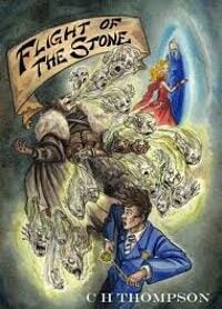
JF: Can you make it out?
Liz Long submitted Gifted, a Donovan Circus Novel designed by Erica Dickson.

JF: Can anyone actually read this subtitle?
Barbara Brooke submitted Glimmers designed by Streetlight Graphics. “Streetlight Graphics and I worked together to create a cover that would appeal to readers of women’s fiction: light colors, sentimental images, and text appearing as a handwritten letter in the background. Since the main character, Paige, is able to live moments in other people’s lives, the woman in the mirror is actually Paige’s sister. ”

Sean Patrick Traver submitted Graves’ End designed by Jamie Neese / Illustrated by Eric N. Clark.

JF: Nice allusion to pulp covers, this one seems just a little complex to me, but I love the way the shape stands out and the bright color contrast.
Robert Nagle submitted Hanger Stout Awake designed by Barbiel-Saunders Matthews. “Designed by the daughter of the author. Although this novel (first published in 1967), is a “literary novel,” it’s about a young teenage boy who tinkers with old cars. I like how Barb colorfully combines all the elements and the strange title together into a single design.”

JF: Cool.
Oliver Wetter submitted Heavy Metal Thunder designed by Oliver Wetter. “Hello, this is my entry for the next round of the e-Book cover design award, all the best, Oliver”

Cole Drewes submitted Hounds of Heaven designed by Randall Macdonald.

JF: Great genre covers know exactly who their readers are and give them what they want. The very act of including your audience can just as forcefully exclude those who aren’t interested.
Kit Foster submitted I, Putin designed by Kit Foster. “Written in the style of an autobiography, ‘I, Putin’ tells the story of Putin’s Russia.”

JF: Another great cover from Kit Foster that shows it’s skill and experience that produces great book covers, not fancy tools or special effects. This cover, designed for the paperback, couldn’t be simpler or more effective, even with an air of menace that perfectly expresses both the content and the strong title.
Jordan Castillo Price submitted Magic Mansion designed by Jordan Castillo Price. “I hooked the descender of the “g” through the “o” to reference the silver linking rings that were the protagonist’s favorite prop.”

Nymph Du Pave submitted Master designed by Kristin Mummert. “My cover artist is fantastic and I think she deserves some notice :)”

Anker Frankoni submitted Mexican Eskimo designed by Kelly Puissegur. “Thanks Joel – Heard you at the Self Pub Bootcamp: Most effective speaker in the group! Anker”

JF: A charming and unique design but with lettering that’s very difficult to read at most ebook cover sizes.
Dan Collins submitted More Cartoons That Will Send Me Straight To Hell designed by Dan Collins. “The second in the series Cartoons That Will Send Me Straight To Hell. This book marks a new phase in my epub production techniques of CSS styling using InDesign. I also have left the aggregators behind and am delivering books on my own to the sellers making me in effect a self contained publisher under the name Fun-E-Books Publishing. It has been a life-long dream of mine to be self published and the dream is now a reality. ”

Damonza submitted Music Box designed by Damonza.

Dave Cornford submitted Nanna’s Travel Tips designed by Jan Withers.

JF: Title? Author? Who needs them when you’ve got such jolly smiling suitcases?
Amanda Taylor submitted Neiko’s Five Land Adventure designed by Amanda Taylor and Kristeen. “Cover design was based off of author’s character sketches and skeletal layout and pieced together by the designer, Kristeen”

Wendy Cartmell submitted No Mercy designed by James Cartmell. “I wanted a very simple design, with maximum impact, which also related to the first story in the collection.”

Derek Murphy submitted NOVA SOL designed by Derek Murphy. “NOVA SOL (A Brief History of Humankind) [Kindle Edition] Cameron McVey (Author)”

Diantha Jones submitted Prophecy of the Most Beautiful designed by Gabrielle Jones. “Thanks!”

JF: A strong and beautiful illustration, but can you find the title and author’s name on this cover? They are both there, but unreadable even though this is an ebook-only cover.
Derek Murphy submitted Quintspinner: A Pirate’s Quest designed by Derek Murphy. “Quintspinner: A Pirate’s Quest Dianne Greenlay (Author)”

JF: Readers might check this title out on Amazon.com, where the paperback, hardcover and Kindle editions are each shown with a completely different cover. This one looks the best of the three and has a beautiful atmospheric effect. But what about those award seals? Do you think they help sell books? Because this one really obliterates a lot of the delicacy of the cover. I would be interested in any feedback from readers on this topic.
Bill Cokas submitted Ring of Fire designed by Mike Sottong.

C.S. Walkingheart submitted Sally Lightfoot’s Journey designed by C.S. Walkingheart. “Unusual for its landscape format, this cover will double as a future cover print release.”

Jim Crigler submitted Seen Sean? designed by Jim Crigler. “Seen Sean? a traditional mystery set in the Atlanta suburbs. Second in the Mason & Penfield Mysteries.”

Ellie Stevenson submitted Ship of Haunts designed by James Allwright with image by Esther McDowell. “We wanted to show that this was a ghost story, hence the silhouettes and the transparent Titanic, but the novel is also set in Australia, and I think the colours and the starkness of the tree set the scene well.”

JF: It’s always a challenge to combine illustrations effectively, and this one gets a lot of it right to create an intriguing image. A more interesting font selection might have added some balance, and the double rule is mostly a distraction.
A. D. Cooper submitted Simply Marvellous designed by A. D. Cooper. “Commissioned by the author Leigh Jarrett. She wanted a light, airy look to the cover, and provided the model at the bottom as reference. I ended up stitching 3 images together to form the top portion of the final design.”

JF: Nicely done, and a very light touch.
David Lister submitted Spellherder 2: Blood designed by Self. “As with all my covers, I have to make do with basic tools and affordable stock photos.”

JF: Please see my comments on I, Putin above.
Carrie Turansky submitted Surrendered Hearts designed by Ellen Cranstoun.

JF: This cover has a lot going for it with good photography and attractive lettering, but the whole people-floating-in-water thing is tough to pull off.
Bard Constantine submitted The Aberration designed by Bard Constantine. “Very simple design using a purchased stock image and Createspace’s cover creator.”

JF: And a pretty good job, too Bard. You might try one of the lines of type in white.
Kiran Spees submitted The Astonishing Adventures of Missionary Max designed by Tim Engstrom.

JF: A fantastic series cover from the multi-talented Tim Engstrom. I love the pulp-y look, the excitement and the way the art is “distressed” to look like it’s from long ago. Great stuff.
Damonza submitted The Cartel designed by Damonza.

Fiona Leonard submitted The Chicken Thief designed by Heather Frank. “This is truly a global design – the cover photo was taken in Ghana, West Africa and sent to Heather who is based in Australia, before being uploaded to Amazon in the US!”

Claudia Fulshaw submitted The Crimson Hour designed by Claudia Fulshaw. “The Crimson Hour is the second novel in the Timeslip Series by author Julie Tetel Andresen. Everything throughout this story flames red – the color of the traditional Chinese wedding dress, the communist flag, the tips of burning cigarettes, anger, and of course passion. The story line is constructed in circles – the largest being the circle that the story makes around the world. The choice of the Chinese lanterns evoke these circles. ”

JF: Very nice. Strong but limited colors and a few telling details add up to an impressive ebook cover.
D L Havlin submitted The Cross on Cotton Creek designed by Rebecca Melvin – Double Edge Press.

Ben Macklin submitted The Dairy of a College Rebel designed by Ferozi Dot https://pinterest.com/ferozidot/book-covers/. “This is a great design of the real Uni of Arkansas in the background with a compelling image of a guy in the foreground which portrays the story of the book.”

Catherine Walker submitted The Dominion of Kings designed by Edwin Walker.

Elle Thornton submitted The Girl Who Swam to Atlantis designed by Create Space. “Hi Joel: I learn quite a lot from your posts. Thanks for making them available to all. Good to have you as a friend on Goodreads! Elle”

JF: An arresting image and sensitive typography are all that’s needed to create this very effective cover.
Vlad Kolarov submitted The Good Luck Puppy’s Guide to Growing Up designed by Vlad Kolarov. “I love your site! Keep up the good work!”

James Bailey submitted The Greatest Show on Dirt designed by Valerie Holbert.

Alexandria Constantinova Szeman submitted The Kommandant’s Mistress designed by Alexandria Constantinova Szeman.

JF: This is the cover for a 20th anniversary edition, and it’s interesting to compare some of the other covers that have graced this book over the years. This one combines a great photo that stops you in your tracks with a whole bunch of copy you can’t read and a very weak title treatment.
Greg Pincus submitted The Late Bird designed by Bonnie Adamson (www.bonnieadamson.net). “I think Bonnie Adamson not only created a cover that’s strong on its own, but also created something that captures the spirit of my children’s poetry that makes up the book. That’s what I was most looking for… and what I think she did so, so well.”
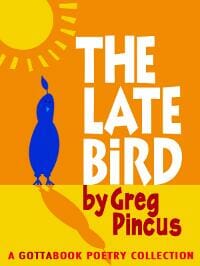
JF: Bonnie Anderson, a skilled illustrator, really gets it when it comes to ebook cover design. Simple, readable, with a touch of humor and a completely brand-able look, this cover stands out.
Christopher Geoffrey McPherson submitted The Life Line designed by Matt Hinrichs. ”The Life Line” is about “the big one” — the earthquake that levels San Francisco. One of the novel’s set pieces occurs when some of the characters are trapped in the train tunnel under the bay. The concrete cracks and water begins seeping in. The cover designer was very clever in his image choice: the single crack cutting through the book cover denotes not only earthquake damage in general but the specific tunnel crack that jeopardizes the characters. The crack also serves as a metaphor for how the lives of the characters are torn apart by events in the story. The large, spare font also helps convey the stark setting of the story. ”

JF: Outstanding. This cover benefits not only from the self-assurance of the designer, and a knowledge of typography, but from his restraint. And this cover completely occupies the “ebook” space because you would never see a cover just like this on a print book.
Ben Macklin submitted The Queen of Hamburger Row designed by Burhan. “A terrific novel of the oil boom of the 1920s in El Dorado, AK”

Marvin Arangorin submitted The Restless Warrior designed by Marvin Arangorin.

Ben Macklin submitted The Retreat of Radiance designed by Burhan. “A best seller from Australian author Ian Moffitt.”

Katherine Lowry Logan submitted The Ruby Brooch designed by Cover Art by Steena Holmes, Virtual Design Artist at The Authors Red Room. “In creating a cover design, I wanted something distinctive that provided clarity and connection. I tried white planked fences, Thoroughbreds, covered wagons, pictures of the hero and heroine, but nothing showed the distinctive character of the story, and in fact, muddied the message. What was the story really about? Not fences or Thoroughbreds, but a 14th century ruby brooch. Without the brooch, there is no quest, no love story, no happy ending. The torn curtain exposes the break in time. Written in Gaelic above the brooch are the magic words that carry the speaker through time. Below the brooch is the English translation. ”

Terry C. Simpson submitted The Shadowbearer designed by Clarence Teal.

Lorinda J. Taylor submitted The Termite Queen: Volume One: The Speaking of the Dead designed by Lorinda J. Taylor. “The author constructed the cover illustration using the drawing tools in a Word document. The genre is science fiction. The drawing depicts the Termite People’s Great Goddess, who laid the stars and oversees all creation.”

Mary Lisa Bailess submitted The Wedding Macabre designed by Mary Lisa Bailess. “I’m not sure if you would consider me the designer. I bought the illustration on istock, then I croped the image, extended the skirt on the dress, and added the typography. But I did not create the original illustration, so if you have to disqualify me -”
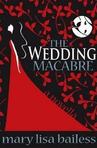
JF: No no no, you are the designer and you have qualified yourself by putting together an artful cover. You might try making the floral design a darker red, you might be surprised.
Chris Stralyn submitted This Time You Lose designed by Tirzah Goodwin.

Toni Rakestraw submitted Titanic Deception designed by Morwenna Rakestraw. “This is the cover of our first book. Two photos were blended to create the image, highlighting three important features in the story: the Titanic, an old journal, and a pocketwatch. I believe the font is Bolton Bold.”

Melinda Chapman submitted Turning designed by Melinda Chapman. “Hi Joel, Thanks for hosting such a fun and informative banter about book covers! This design focuses on the fact that the main character has been bitten/infected, and we are following her journey from there. Thanks, Melinda”

JF: Sure, Melinda. This cover is an example of a good use of photo manipulation. I bet the original had none of the menace or mystery that are infused here. Nice job!
Jim Crigler submitted Unthinkable designed by Jim Crigler. “Simple graphical elements and a quirky font for a Unthinkable, a traditional mystery set in the suburbs.”

Anya Kelleye submitted Vampires’ Curse designed by Anya Kelleye. “This book compiles all the novellas from a trilogy into one book. The cross was a recurring them throughout the novellas as was the romance between the two main characters.”

Karen Mueller Bryson submitted Where is Wonderland Anyway designed by Tony Bryson.

Anthony Lavisher submitted Whispers of a Storm designed by Jamie Wallis. “This is the cover for my Kindle Version of ‘Whispers of a Storm’ created by my good friend Jamie Wallis (released 12/4/12).”

Nonfiction Covers
Marty Safir submitted 151 Uncommon and Amazing Art Studio Secrets designed by Marty Safir. “Hi Joel, Marjorie Sarnat, is my wife and author. I designed the cover and interior of the book which was released in 2011. Best to you and thanks for your work on behalf of self-publishers. Marty”

JF: Really accomplished illustration, not sold on the black background.
Susan Pomeroy submitted Dancing Past the Dark: Distressing Near-Death Experiences designed by Susan Pomeroy. “Vast, profound, scary yet hopeful – the author has struck that delicate balance in her work, and I wanted to do the same with the cover.”

JF: A nice job of showing type on a complex background, I wonder if it would be improved by running the subtitle in black to make the title pop a bit more.
Kevin Sivils submitted Fine Tuning Your Three-Point Attack designed by CreateSpace. “I wanted a really simple design that conveyed a sense of movement and urgency. I think the design team at CreateSpace who came up with my cover captured what I wanted.”

G.R. Roberts submitted Reclaim Me! A Plea From Jesus Christ to His Followers designed by G.R. Roberts.

JF: Simple yet effective, this works.
Joanne Kaattari submitted Sister Soups: Recipes, Hopes and Prayers for Times of Illness designed by Joanne Kaattari. “Thank you for this opportunity, Joel. And for the ongoing wise and helpful advice! I tried to designed a better cover with better placed titles, colours and graphics, based on your advice. Warmly, Joanne”

Rebecca Melvin submitted Smashwords Style Guide for Idjits designed by Rebecca Melvin – Double Edge Press.

JF: I wonder if there are now more “Dummies” and “Idiots” parodies and imitators than there are originals?
Patricia C. Nuovo submitted Soul Accounting: The Power of Money and Emotions designed by killercovers. “Thank you for your consideration.”

JF: You can see the influence of web graphics in this ebook-only cover. I believe the lessons learned from banner ads and other web graphics will eventually start to show up in ebook covers, and why not? This works very well and adds an “advertising” type of look to the cover.
jose maria cal submitted the 10 secrets for cooking paella designed by jose maria cal.

Irfan Mirza submitted The Right Browser! designed by Irfan Mirza.

David Bergsland submitted Writing In InDesign Second Edition designed by David Bergsland. “This is a radically revised and expanded book so it needed a new cover and a new look. I like this one (until the next one, of course).”

JF: The curse of the designer is what I call it, David, but this one is clean and appealing.
Well, that’s it for this month. I hope you found it interesting, and let other people interested in self-publishing know about the Awards. —Use the share buttons below to Tweet it, Share it on Facebook, Plus-1 it on Google+, Link to it! The next issue is June 10, 2012 and the deadline for submissions will be May 31, 2012. Don’t miss it! Here are all the links you’ll need:
The original announcement post
E-book Cover Design Awards web page
Submit your e-book cover here
Follow @JFBookman on Twitter for news about the E-book Cover Design Awards
Subscribe to The Book Designer Blog

