
")
Every author who self-publishes should have a fundamental understanding of book cover design, especially if you want to design your own book cover.
One of the benefits of self-publishing is creative control, so whether you hire a cover designer or design the cover yourself, understanding the process and how everything comes together can give you the confidence to carry your story from its pages to the cover.
Since the first books were ever assembled, book covers have always been viewed as a form of artistic expression. Whether ornate like the hand-engraved or embossed bindings of the Middle Ages or the hand-sewn custom book covers that you can find on sites like Etsy today, book covers continue to offer authors a way to express themselves creatively and invite potential readers into their world.
A book cover not only introduces your story to a potential reader but depending on how well the cover is designed, can make or break a sale.
Great book design looks simple enough—find a great image and throw some pretty fonts around it—but the designers behind successful book covers would disagree. The best covers are well thought out. They take careful planning, attention to detail, and an understanding of color, composition, and more to make a book cover come to life.
If you want to design your own book cover or want to learn more about the process, the guidelines will give you the tools you need.
Design Your Own Book Cover Basics:
Understanding Your Book’s Genre and Audience
Why Genre Matters
The beginning of every story is a book’s cover, but a successful cover is more than professional design. Each book genre (category) has specific elements that make it unique to others, and the best covers are those that reflect the expectations of its readers.
It’s not enough for an author to simply put what they like on a cover because the success of any book is dependent upon the people who buy it. If they don’t like the cover, you may lose a sale. This doesn’t mean that you have to put your desires to the side to gratify the masses, but it does mean that giving careful consideration to what your buyers are looking for should be included in your design strategy.
Researching Your Target Audience
The best way to know what your target audience wants is by doing your research. For general research, start with online retailers. Visit their websites and look for their top sellers in your book’s genre. Save a copy of the covers into a folder and study them. What do they have in common (imagery, colors, typography)? What makes them stand out? Do they follow the normal expectations of the genre? If not, what did they do differently and why does it work? Use this information as a springboard for your own design.
In the section Getting Feedback and Iterating, we discuss how to get direct feedback on your cover from those in your community.
Key Visual Elements of a Book Cover
When designing your book cover, determining the focal point early on is critical. Will you draw your reader’s eye to your book’s title, author name, or imagery? These choices matter. For example, if you are a well-known author, then your brand is a big pull for your readers and your name should be large and clearly visible.
Think about well-known authors like John Grisholm, Colleen Hoover, or Kristen Hannah. Their names are always the top focal point or a close second to their book’s title.
On the other hand, a new author with a first book or a couple of books under her belt would benefit more from focusing attention on the book’s title or specific imagery that’s familiar to her audience like a main character.
Imagery
When selecting imagery for your book cover you want the images to fit your story as well as engage your reader, but what does this mean and where do you start?
One of the best places to start is with your book’s genre. Some genres lean more toward photography while others bend more toward illustration or graphics.
For example, with crime thrillers, you’ll see a lot of photographs of rooms that are slightly off, houses that are hidden or isolated, and creepy atmospheres (also lots of people standing somewhere alone), but they are all reality-based images.
Houses
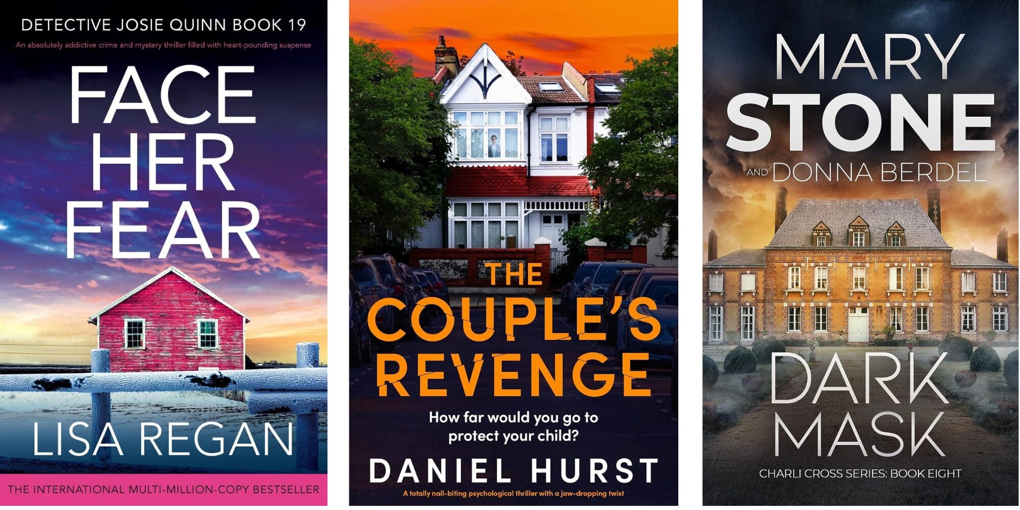
Rooms
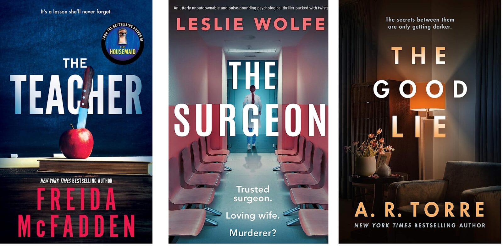
Creepy atmosphere
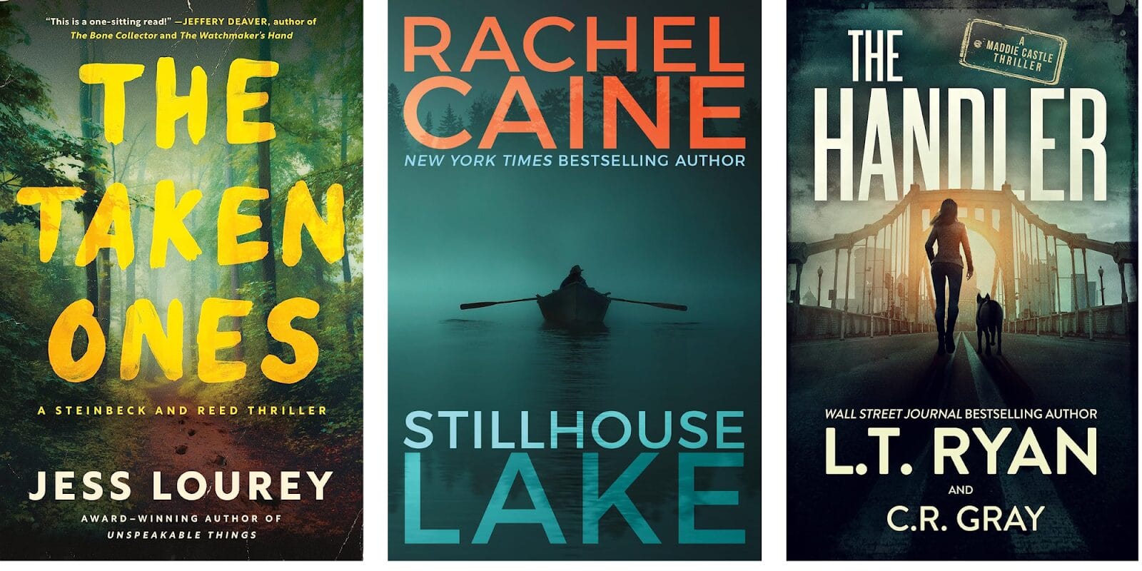
Finding out what type of images are best for your book can be as simple as a search through your book’s category on Amazon or Barnes and Noble. Find a style that resonates with you. Pay close attention to the images that were used, and then use this information as a starting point for your own images.
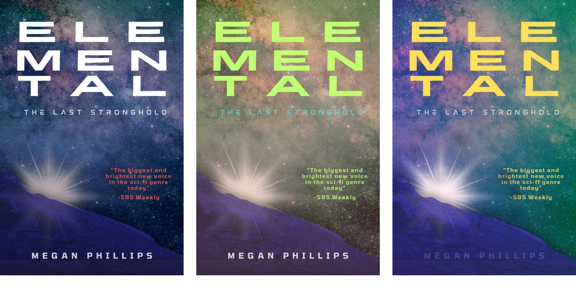
Color Scheme
Beyond adhering to genre expectations, how a book cover makes a reader feel can impact their purchase decision.
In this article, we explored how different colors can shift the tone or mood of a cover’s design. The idea behind color theory is that we are impacted by color where some colors have universal meanings like red representing anger or love, while other colors can be more personal and attached to an event that evokes a feeling.
When designing a book cover, you can’t ignore how color can potentially affect how a buyer perceives your book. Their perception of its contents can shift with a simple change in hue.
Take a look at these 3 covers below. The first one is the original sample cover created in Canva for the article Design a Canva EBook Cover in 8 Simple Steps. Based on the addition of two more color combinations, you can see that the tone of the cover changes. The smallest shift in color can make or break your design even when the elements stay the same. When selecting colors for your cover, consider how the change can affect the overall mood and feel of your design.
Layout
Layout refers to how elements appear on a page. Balancing elements for a harmonious look through the use of proper spacing and the strategic use of visual elements is easier on the eyes and makes a cover more appealing.
There are several ways to balance elements on a page like Gutenberg Diagram, F-pattern, and Z-pattern. One of the easiest formats to remember is the Rule of Thirds which we’ll cover in this guide.
The idea behind the Rule of Thirds is that a layout divided into thirds is more appealing than halves, fourths, etc. To use this method when creating your design, you simply divide the page horizontally and vertically into thirds and place your elements on the page within the guidelines.
Here are three examples of the Rule of Thirds applied to 3 popular book covers:
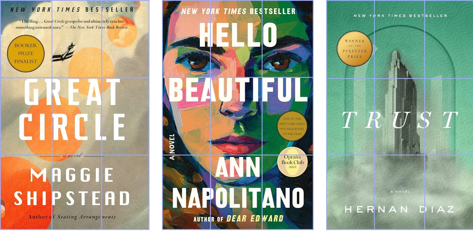
Although every designer doesn’t use this method for book cover composition, it’s user-friendly and one of the easiest concepts to grasp.
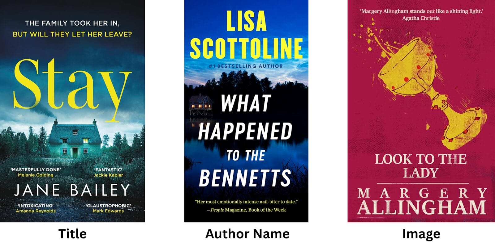
Hierarchy
Elements on your cover should never compete for attention. Hierarchy refers to creating a specific focal point for elements through the use of size, color, and fonts
Size
Eyes are naturally drawn to the largest elements on the page. One way to create a focal point is to increase the font size of elements that you want to stand out like the author’s name or title.
Color
When emphasizing an element that you want to stand out on the cover, adding a highly contrasting color (compared to other colors on the page) will highlight the areas that you want a reader to notice first. Notice in these examples how the designer used the color yellow to emphasize a title, author name, and image.
Fonts (Typeface)
When it comes to typeface, we always want to keep genre in mind, but, adjusting the font characteristics like bold, thin, narrow, etc, can play up or downplay a title, subtitle or author name. You can also consider changing the typeface completely to something unexpected. Just make sure that there is still cohesiveness with other elements in your design.
Components
In professional book cover design, there are standard items that will be on the front cover, the back, and the spine.
The front cover should include:
- blurb – an endorsement of a book, usually from someone well-known that’s used to add credibility to the work and encourage purchases.
- title – the name of a book
- subtitle – a title in addition to the main title of the book
- imagery – graphic, illustration, or photography
The back cover should include:
- tagline – one or two sentences before a book’s description to hook the reader and encourage them to keep reading.
- description – a summary of what the book is about
- blurb – an endorsement of a book, usually from someone well-known that’s used to add credibility to the work and encourage purchases.
- author bio and picture – a brief introduction to the author plus a professional photo.
- barcode and price – the white rectangle on the back of the book with vertical bars that contains information about the book
- publisher information – name and website address.
The book’s spine should include:
- book title
- author’s last name
- publisher imprint logo – the image that represents the publisher.
The Role of Aesthetics in Book Cover Design
The Psychology of Visual Appeal in Book Covers
It’s not a far stretch to imagine how visual appeal can impact a purchase decision. No matter the product, most people are drawn to things that are aesthetically pleasing and will often make a purchase decision based on that bias.
The psychology of buyer behavior is something to consider even in the world of publishing. It explains why a mediocre book with a great cover can be on the bestseller’s list and a great book with a subpar cover can take years to get noticed (word of mouth).
Across all industries, some of the best products are overlooked because of poor branding. A book cover reflects your author brand just as a product’s packaging on a store shelf represents a company’s brand.
Knowing what your ideal customer is looking for and then meeting that need will improve your chances of getting a sale. Ignore your customer’s wants, and you take the risk of your book being left on the virtual shelf to collect dust.
Achieving a Balance Between Beauty and Relevance
The tricky part of book design is creating a cover that is aesthetically pleasing to your reader without compromising the integrity of the message you want to convey. This can occur when you place what’s trending over what actually works for your book.
As shared in Coolest Book Covers: 10 Inspiring Cover Designs That Defied Trends, trends come and go, and not everyone is a good fit for your book. Take the time to understand the trend and how it can impact the perception of your book before you jump on the bandwagon.
Working with a Professional Book Cover Designer
Mocking up a Cover for Your Designer
You don’t want your designer to have to guess what you have swirling around in your head. This will make extra revisions more likely to occur until they get the design right. A better way to go into a partnership with a cover designer is to have a solid understanding of book design, what is expected in your genre, and how you want this to be interpreted in your book’s design.
Author Travis Baldree offers a detailed walkthrough of his book cover design process, including a mockup that he shared with his designer. The mockup included a template that showed how he envisioned the placement of elements as well as detailed notes (These are summarized. See the article for the full details.):
- overall tone
- instructions on what to stay away from in design
- time period and customizations
- the style of the cover imagery including the materials
- the focus
- detailed descriptions of each character
- tone
- composition of cover elements
- background recommendations
You don’t have to do as much as Baldree did for his designer. He has a background in game development and has worked with designers, so he has a good feel for design and composition; however, offering your designer a starting point will be greatly appreciated.
Tips for Effective Book Cover Design
How to Convey the Book’s Theme Visually
In this post, we talked about the importance of theme consistency when designing covers. Before you can select the right images, you have to know the what and why behind them.
- What is my book’s genre and expectations?
- What is my audience looking for in my stories? Action? Romance? Drama? How can I create that feeling on the cover?
- What are the current trends in my genre? Do I want to follow them or go against the grain?
- What type of image do I want to use? Illustration, custom photography, stock photos?
You don’t have to take a minimalistic approach to your cover’s design, but less is more when it comes to impact. You want to hook your reader with just enough to keep them interested, but not so much that they lose an opportunity to insert their own imagination.
The best stories guide our imagination and encourage us to think beyond our current reality. If you give a reader everything upfront (including on the cover), what’s the point of buying your book? Keeping it simple will go a long way.
Common Design Pitfalls
- Not designing for thumbnails: When buyers view your book online it is usually in search results with thumbnails. A book’s cover should be easy to read as a thumbnail. Small font sizes and details can be difficult to decipher. Design for a small perspective.
- No cohesiveness: All of a book’s design elements should be cohesive. Even if there’s a deliberate contrast between parts of the design, there should still be a story. Anything else will look like it’s been thrown together.
- Selecting the wrong fonts: Fonts should be genre-specific. If you make a design outside of genre expectations, make sure that it works.
- Too many fonts: as a rule, a book cover should have no more than 2-3 fonts.
- Poor design: Writing a book is not the time to test your design skills unless you’re a professional designer. A book that looks unprofessional will be perceived as amateurish which can impact sales, especially when competitors’ books look better.
- Too cluttered: As mentioned in the previous section, keeping things simple goes a long way. A book cover that is too busy is distracting.
- It’s not genre-specific: It’s okay to design outside of the parameters of a genre, but it’s a risky move, so make sure you know what you’re doing. Otherwise, stick with genre expectations. It will make your book easier for your ideal readers to find.
- No design hierarchy: The elements of a design shouldn’t compete for attention. Decide which parts should be front and center (e.g., author name, title) and then make them shine.
Getting Feedback and Iterating
Get Unbiased Opinions
It’s hard to be objective when it’s your book. You’ve put all of your blood, sweat, and tears into it, so understandably you’re protective. However, your book is not just for you. You are selling it because you want other people to buy it, and there’s no better way to know if your ideal audience would like it than to ask them.
Family and friends are a great place to start, but they may try to protect your feelings, so be aware.
If you already have a following on social media, post a few cover options and ask for their favorite. You’ll find that people are often generous in their feedback on why they like or don’t like something.
If you’re a member of a writing group, ask for feedback. If you know other independent authors, it wouldn’t hurt to see if they’d be willing to offer their thoughts.
Use Feedback Wisely
Ultimately, you want constructive feedback, so to the best of your ability, listen thoughtfully to what’s being said. Take what makes sense for your book and your audience and discard the rest.
Examples of constructive feedback would be:
- “I like the colors. They are warm and inviting.”
- “The font has all of those curly things on it, so it makes the title hard to read.”
- “Is that a dog or a cat next to the mailbox? I can’t tell. Maybe if you made it bigger.”
Examples of unhelpful feedback:
- “My friend published a book, and she had emojis on the cover. You should do that.”
- “I don’t like the color blue. It’s depressing. You should take it out and replace it with lavender, and if you make the letters yellow, that would be a nice contrast.”
- “It’s ugly.”
Offering Feedback to Designers
Cover designers are in the business of making your book cover shine. So, the more you can help them to understand your vision, the smoother the process will go. If you are not a designer and don’t know the terminology, that’s okay. If you can point a designer in the right direction, most will appreciate it. It makes their job easier and reduces the amount of revisions.
When it comes to feedback here are a few things to remember:
- Specificity is key. Saying, “I don’t like it.” isn’t helpful, but saying “I like the background, but can we lighten it up some so that the title stands out more?” or “The blurb seems crowded at the top, is there another place we can put it?”
- Give your designer the space to be the expert. This doesn’t mean that you shouldn’t offer guidance when you start the project or give more direction if revisions are needed; however, no one likes to be micromanaged. Consider your designer as a partner and trust the process.
Additional Considerations in Book Cover Design
Understanding Copyright and Permissions
Many images (unless public domain) and typefaces require licensing, and although some are free to use for personal use, others require a license fee for commercial use. Before you select an image or typeface to use, check the licensing information. Standard licensing works up to a certain number of copies of the product. Beyond that amount, an extended license must be purchased.
If you want to save money, free fonts are a great alternative, and many of them will work for different genres. Before downloading, make sure the font can be embedded.
Do want to learn more about font file types? Try this article on the Envato website.
Adhering to Publishing Platform Guidelines
Platforms for distributors (e.g. Amazon.com, Barnes & Noble) and aggregators (e.g. Draft2Digital and Publish Drive have specific guidelines for book cover files. To avoid unnecessary errors check the file specifications of your platform before uploading your files.
Final Thoughts
With so many resources available for creating great covers at affordable prices, it’s unfortunate that some authors give little thought to cover design and take the easy way out just to get their books online quickly.
If you want to design your own book cover or support a designer you’ve hired, following the basic guidelines covered in this article will get you closer to your goal of creating a great book cover. To recap, remember these important points:
- Understand your book’s genre and audience by taking the time to do your research. Pay close attention to bestsellers, and use what you learn as a springboard to designing your own cover.
- Take inventory of the key elements on your cover like the author name, title, subtitle, imagery, and blurb for the front cover and the book description, author bio, and other details on the back. Determine which elements you want to highlight and play around with color, size, typography, and placement until you find what looks best.
- Remember that buyers respond to what they find aesthetically pleasing, so use this to your advantage. This doesn’t mean that you have to ignore what you like, but it may mean compromising to get the best design.
- If you work with a professional cover designer, remember that they are your partner in the process and that their goal is to get you a cover that will sell the most books for you. You don’t have to approve everything that they do because ultimately, you have the final say, but being flexible and listening to suggestions might give you a different perspective on what will work best.
- Keep your theme in mind when coming up with a cover design. Your cover should be an extension of your story. Using specific scenes, characters, or elements from your book can make the cover more engaging.
- Don’t forget to get feedback, image permissions, and copyright permissions.
- Before you upload your cover file, check the file specifications from your chosen service provider to decrease the chances of file errors.
Don’t be afraid to embrace the creative process. Your book cover is an extension of your story and the first thing a potential buyer will “read” before they ever give up their credit card number. A high-value cover (not necessarily an expensive one) will stand out from the rest and give your book a competitive edge.
The best book covers make a reader feel something. What does your cover say?
