

")
One of the reasons book series are so successful is because readers aren’t always ready to let a character or characters go. They want to know what happens next—the continuation. If you've ever thought about someone from your childhood and thought, “I wonder what happened to so and so?”, then you get it.
It’s our natural curiosity that gets the best of us. How do other people live? How are their lives different from mine? What do we have in common?
We want to know how someone’s life unfolds, even if it’s fictitious.
When it comes to book series covers, from the first book to the last, each one should share a common thread that connects their stories. A book cover is like a door that either invites a reader inside to take a look around or repels them.
This article will cover what book series covers should have in common and how you can design them to grab your readers' attention.
Below, we'll cover the following strategies for book series cover design:
The Common Thread
When writing a book series, consistency is everything. You wouldn’t start the first book with a main character, let’s call her Marie, as a 5’1” middle-aged teacher from Nebraska, and then by book seven, describe her as a 5’7”, twenty-something actress from Texas. It would confuse your reader. Your plot, location, conflict, and supporting characters can change, but the foundational elements, like your main character, must remain consistent.
The same is true for book cover design in a series. A book cover is an extension of your story. When the books of your series are sitting on a shelf side-by-side or displayed next to each other on a retailer's website, there should also be a common thread that runs through them.
Book Series Covers: 8 Strategies
Foundations
Let's begin with the book design elements that need to remain consistent from cover to cover— books' specs, fonts, and image style.
1. Specs
Be purposeful in your book size selection. When planning a series, decide how you’d like them to look on a shelf with their spines facing out.
Keeping the length and width the same helps with uniformity and allows the books to sit flush when they are together.

On the other hand, varying book sizes offers more creative options when planned carefully.

It can’t be emphasized enough. Plan your book specifications with your entire series in mind. This will keep the collection from looking haphazard or incomplete.
2. Typography
Another non-negotiable in book cover design for a series is typography. Typography refers to the font family (typeface), font appearance (e.g. bold, thin, regular, light) and the spacing between characters and lines.
Similar to keeping the book size consistent, only change the typography for each book in a series if it makes sense for the overall story. Otherwise, keeping it the same from book to book creates cohesiveness.
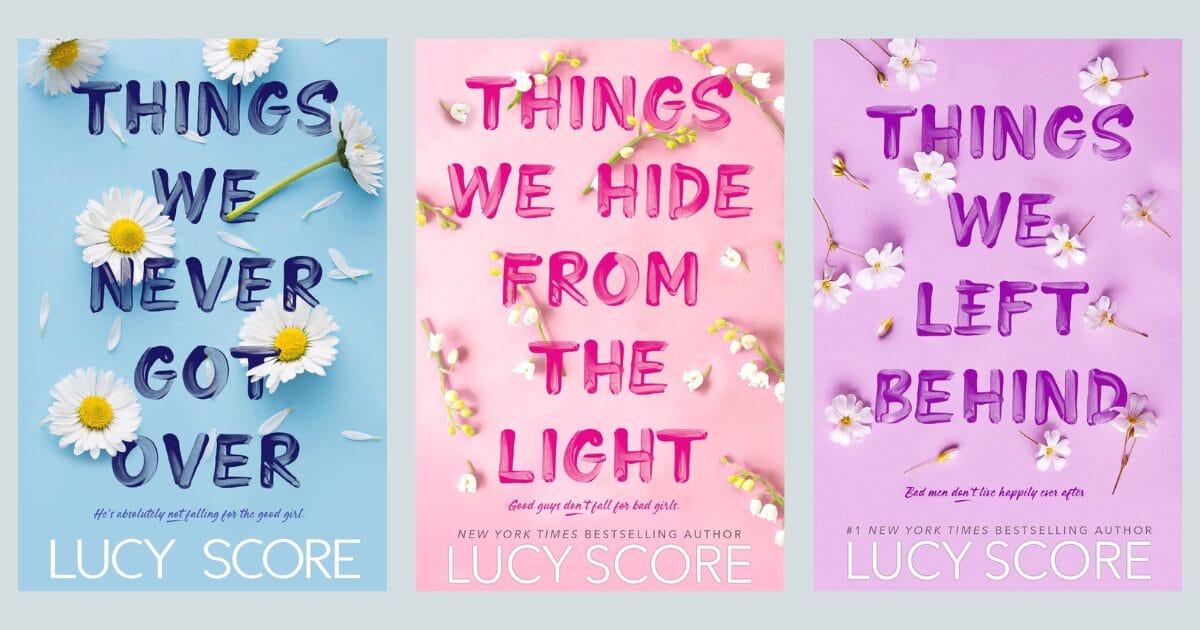
The Knock Me Out series by Lucy Score shows how typography can be used to connect the books in a series.
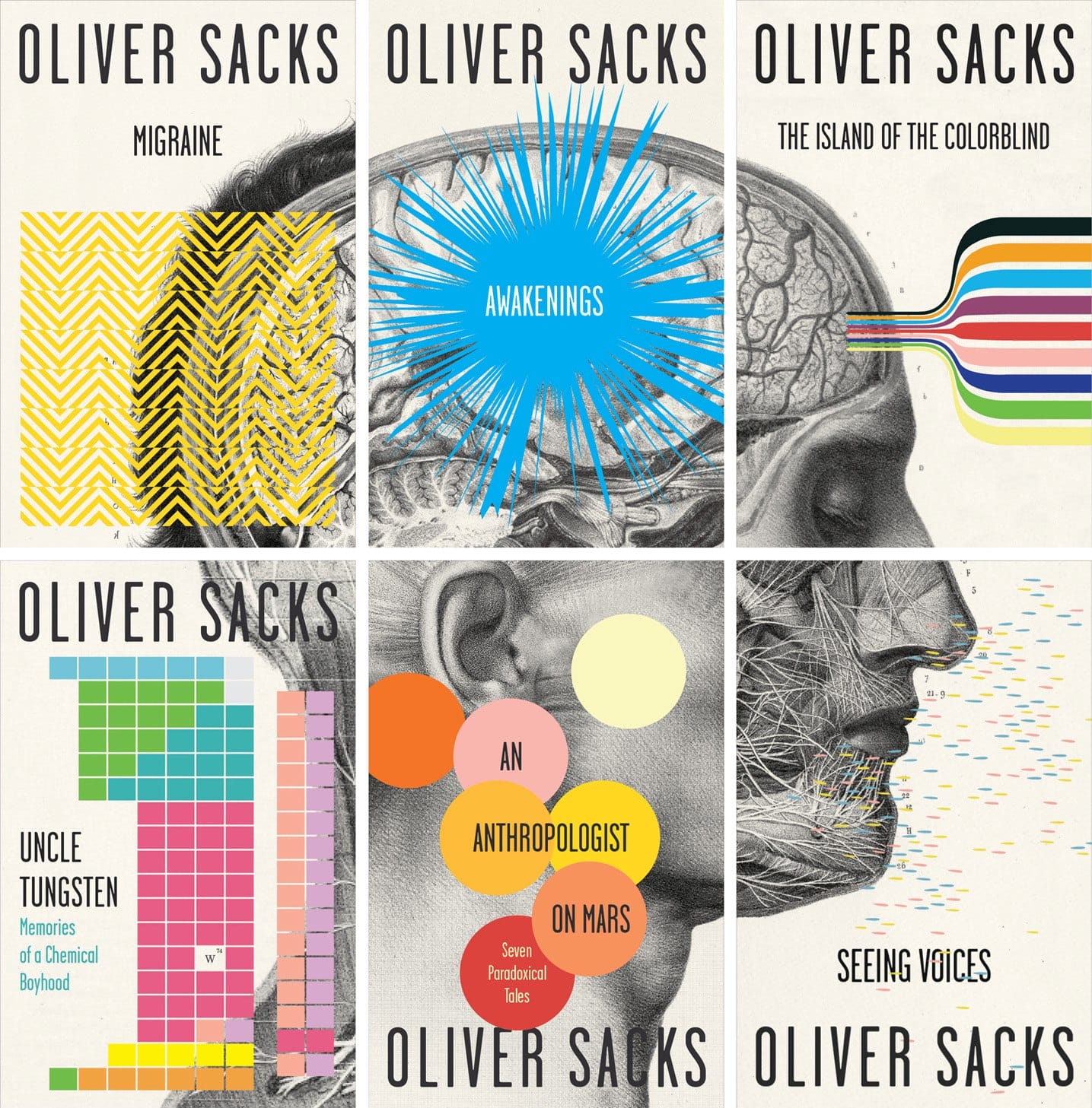
3. Image Style
Pick an art style (illustration, 3D, abstract, minimal, or no image) and stick to it throughout the entire series. Using the same art style makes the series easier to recognize. You want to make the association between books simple for the buyer.
Illustration
Whether hand-drawn or computer-generated, illustrations offer a personalized adaptation of a book’s theme. This can offer an interesting diversion from the digitally enhanced, highly stylized book covers that are standard today.
3D
Three-dimensional images are common cover art in fantasy and science fiction. You’re only limited by your imagination when using 3D tools. Giving your readers something unique and engaging can create excitement over each new cover design.

Abstract
Abstract art focuses on shape, form and color. Although abstract art on book covers can leave more to the imagination, it's not just for poetry books and literary fiction. It can work in other genres of nonfiction and fiction, just make sure using it fits your audience's expectations.
Minimal
In this article, we talked about minimal book cover design and how to create a big impact by maximizing space. Whether you use images or focus on only typography, minimal book design is all about clean lines, “white” space, and attention to detail.
Other styles to consider include, real photography, retro, typographic, and collage. Whichever you choose, make sure it’s a good fit for your genre and your audience, and use the style in on all of your series’ covers.
Variables
Although many book series elements should remain consistent, there’s still room for making each book unique. Think about the books in a series as puzzle pieces, each one looks a little different, but it still fits together with the other pieces. In this section, we'll look at the parts of the book where you have the flexibility to switch things up.
4. Colors
On this website, we’ve talked about the psychology of color and how it can evoke a visceral response (e.g. yellow with happiness, red with anger or love, etc.)
There are two ways to look at color when designing series’ covers. One is to keep the elements the same and only change the color. The Selection book series by Kiera Cass below offers a classic example. The character, pose, dress, use of mirrors, and typography are similar, but the focus on a single color makes the cover dynamic.
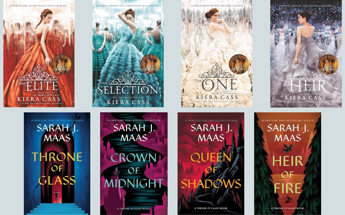
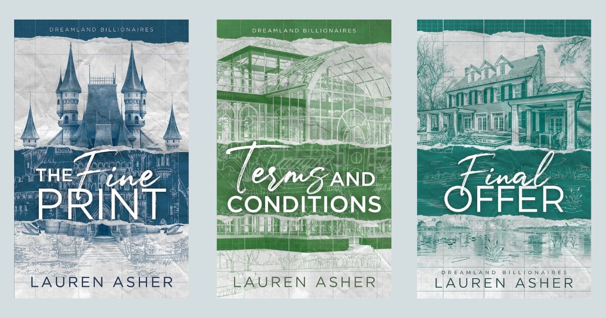
Another way to use color is to use one dominant color or multiple colors from the same palette throughout the series. In Sarah J. Maas’ Throne of Glass series, the use of a charcoal color for the imagery and many of the same colors from book to book gives them a cohesive look.
5. Characters
As previously mentioned, the style of imagery used on your cover is a foundational element and should remain constant. If you are going to use the same character on each cover, they should shift enough to keep them from looking like a duplicate of another book in the series.
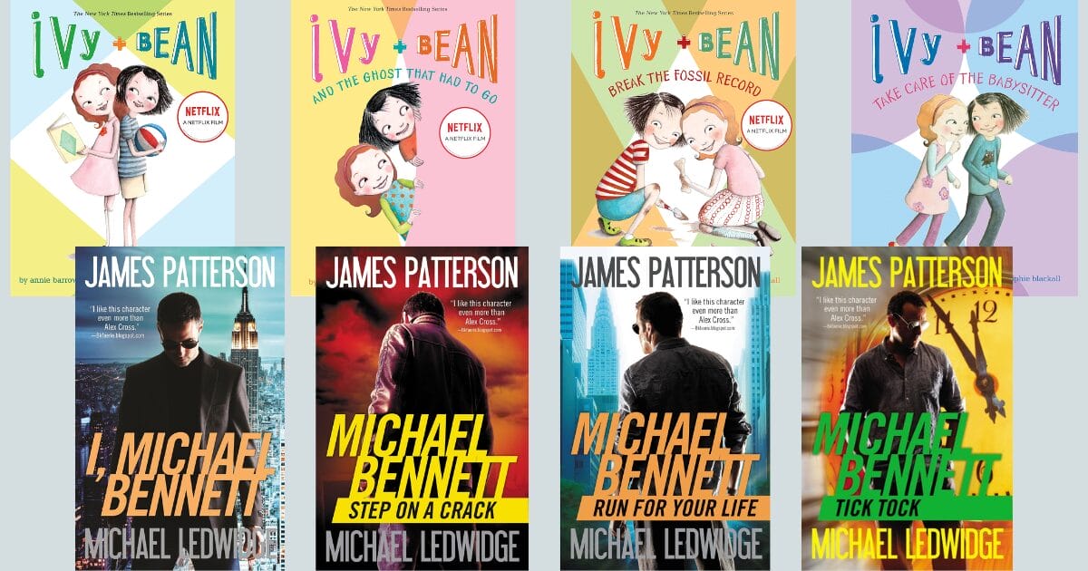
If your character is the central focus of your books, you can keep the color palette in the same family, but switch the positions and poses of the main characters like in the Ivy & Bean books by Annie Barrows pictured below.
Even if your central character is not the main focus of your cover, you can still include it as a cover element. The covers of the Michael Bennett book series by James Patterson and Michael Ledwidge focus on the book series title with the character placed behind it, but the main character is still a part of the overall composition.
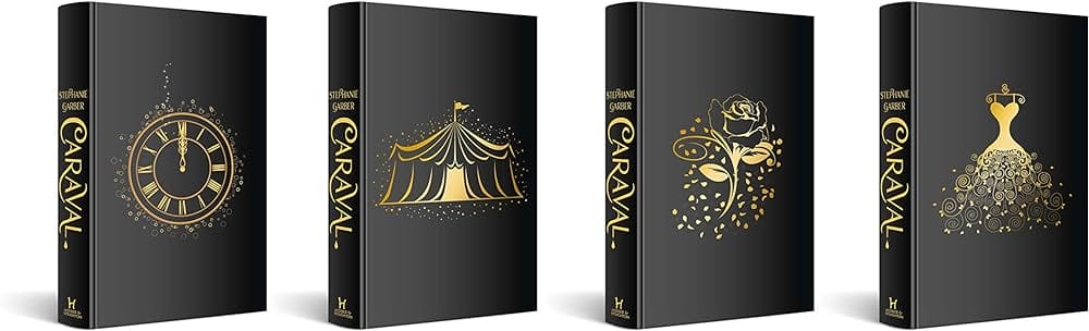
6. Repetition
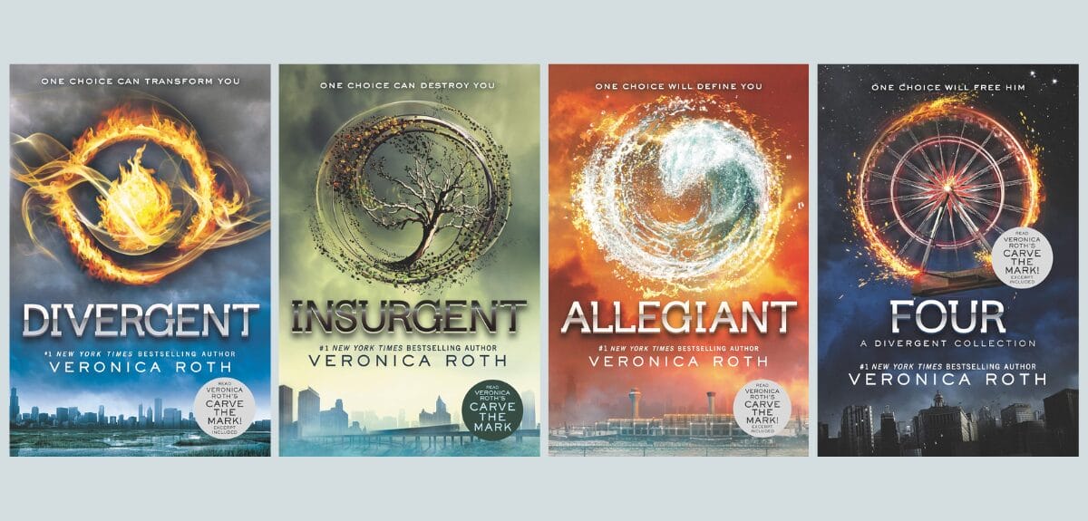
Duplicating an image but changing the elements around it can also have an impact. Just make sure that you are keeping the foundational images (fonts, binding, book size) the same. In the Divergent Book series by Veronica Roth, the books were designed with a circle as the central focus. The circle is repeated in each cover but the elements of the circle change from book to book.
7. Puzzle
Another clever way to add interest to your book covers and encourage sales is to have the entire book series create an image (front cover or spine). No one likes to have a missing puzzle piece. (So, of course, they have to buy the entire series!) This series cover design by Cardon Webb is a great example of how to use each book cover as a puzzle piece.
8. Special Editions
Some authors are taking their book series covers up a level by offering their readers special editions. These cost more but are often packaged with a signed copy and other goodies that the fan will appreciate.
TikTok (#BookTok) is filled with examples of special edition series covers like the ones below.
Final Thoughts
Writing a one-off book is great, but if you can create an engaging book series, sales are almost guaranteed. Readers know what they like, and if they fall in love with a character’s story, they’ll want to follow their journey to the end. Creating brand loyalty early on is one of the keys to book sales success.
Your book series will represent your author brand, so looking at its creative development from a business perspective is one of the keys to self-publishing success.
When designing book covers for your series, remember the following tips:
- Keep the foundational elements consistent: typography, specs, and image style. Always place the series name on the cover and the number of the book series on the spine for easy reference.
- Play around with variable elements to keep the books in a series cohesive like colors, character positioning, image repetition, creating cover puzzle pieces, and special editions.
- Include the book spine in your design.
- Place the title and author name in the same place on each book.
- Don’t flip-flop between binding types for your series. Select all paperback, all hardback, or both, but don’t mix and match.
If you are writing a book series or have already completed one, congratulations! One book is tough, but a series takes fortitude and a commitment to the process. Having a clear vision of what you want your corner of the publishing world to look like shouldn't be taken lightly. If you keep your author brand, your audience, and your story as your central focus, you'll be on your way to a successful author brand and career.
