

")
What makes a book grab a reader's attention at first glance?
- The story?
- The author?
- The blurb?
While these choices can nudge a buyer to make a purchase, it’s a fourth option that stops a reader from scrolling mindlessly through a retailer’s search results: the book's cover design.
There’s a reason why art museums draw millions of people annually. We love stories, and art, whether hanging on a museum wall or displayed on the cover of a book, invites us to peel back the layers and unveil what’s hidden beneath.
A great cover is more than a genre-aligned image. Although readers look for specific elements on a cover in their genre of choice, getting those elements right is only the starting point. Even those rules can be broken if you know what you’re doing.
Here's what you need to know about strong imagery in book cover design:
How Do You Design a Book Cover?
Great covers create a visceral response—something that connects with us on a deeper level and begs to be explored.
So, what does that look like in the design process? How can we create book covers that connect with potential readers and move them to an action (e.g. look at the back cover, read a sample, buy the book)?
You’ll find unique book covers peppered throughout this article for your consideration. What’s your first impression? Do you tilt your head to the side and think, “Hmm?”
The best covers make us pause, even if it’s for a brief moment to consider:
- “What does this cover mean?”
- "Why did they use this image?"
- “I wonder if the story is interesting.”
- “I don't like it.”
- “Wow!”
There’s more to a great book cover design than a pretty picture. As we talk about book cover design, we’ll explore the different ways covers can draw readers in through imagery.
The Psychology Behind Engaging Covers
To explore the psychology behind engaging book cover design, let’s reframe how we look at book covers.
Books are products of our author brands—the associated colors, design, and features that differentiate us from other authors. Just as General Mills has cereal, McDonald’s has fries, and Starbucks has coffee, authors have their books.
The products (books) we create will fit into one of three categories:
- generic - nothing remarkable, just the basics
- imitations of other brands - cookie cutter with little differentiation from others.
- a category all its own - it follows the rules or breaks them, but still stands out among the competition
So what makes a consumer pick one brand over another (pricing being equal)? Likely, the branding, what they see with their eyes. Word of mouth and exposure can play a part, but branding (first impressions) can trump them both.
How we package our books matters if we want someone to buy them. If it looks like everyone else’s or worse, is unprofessional, sales can suffer.
One of the reasons companies spend so much money to get their branding right is because they know consumers will judge what a product looks like before they ever consider buying it. The amount of weight they attribute to a product’s appearance can vary, but it is still an important consideration.
Color
In the article, The Psychology of Color in Book Design, we looked closely at some book cover examples to show how color can influence buyer decisions.
We learn from color psychology that people have universal responses to color (e.g. red representing anger or love) or individual responses where we associate colors with something specific. An example could be feeling positive about pink because it reminds you of the cotton candy you ate at a carnival with your best friend when you were 12, or having a negative response to pink because of the time you got food poisoning and drank an entire bottle of Pepto Bismol.
According to Emerald Insight research,
Color is ubiquitous and is a source of information. People make up their minds within 90 seconds of their initial interactions with either people or products. About 62‐90 percent of the assessment is based on colors alone. So, prudent use of colors can contribute not only to differentiating products from competitors, but also to influencing moods and feelings – positively or negatively – and therefore, to attitude towards certain products.
Universal and individual responses to color are the same whether you’re looking at a new pair of shoes or a redesign of your favorite mystery novel. Thinking thoughtfully about how a customer might respond is the first step toward selecting the right color combination.
Elements
When we refer to the elements in book cover design, we are talking about imagery. There are multiple types of imagery. They don’t all refer to what you see.
Grammarly.com breaks down imagery into five categories of senses:
- Visual: what we see
- Auditory: what we hear
- Tactile: what we touch
- Gustatory: what we taste
- Olfactory: what we smell
In book cover design we focus on the visual, but as with good writing, a great image can pull other senses into the overall impression.
For example, the right cookbook image on the cover can activate our sense of taste (gustatory). We can almost taste the juicy apples and the buttery crust of a well-photographed apple pie.
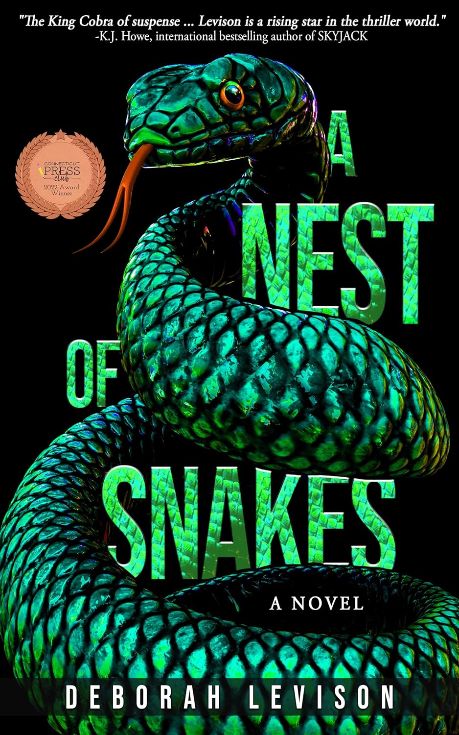
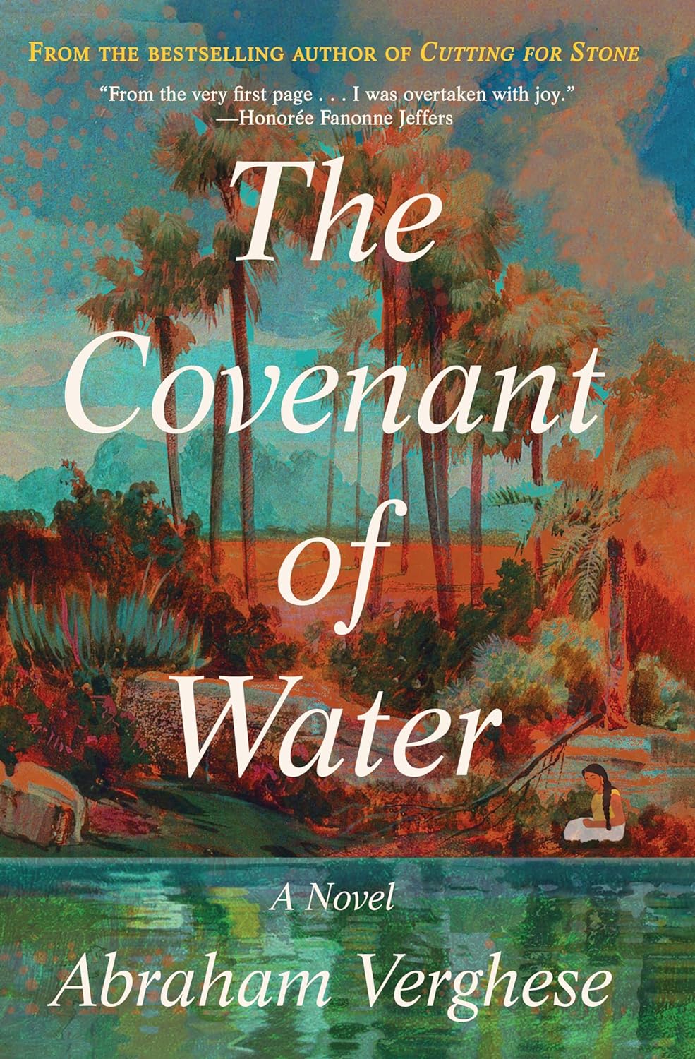
Our sense of touch (tactile) can be activated with the image of a St. Bernard (warm, fluffy, and slobbery) or a snake like the one in the cover below (cold, slick, heavy, strong).
Images for your book should be selected thoughtfully with careful consideration of your audience and how you want them to feel.
Ask yourself these questions when selecting an image.
- What are some themes from my book that will work well visually?
- What colors (previous section) can I incorporate into the image for more impact?
- When a reader looks at my book cover, how do I want them to feel?
Once you select an image, keep things simple. A single image is best, but if you use multiple images, make sure they are cohesive and don’t confuse your reader.
Juxtaposition
Make your book cover design stand out with contrasting layers (complementary colors). Not sure what complementary colors are? A great place to start is a color wheel. Complementary colors are on opposite sides of the color wheel from each other. These colors pop when they are put together because they have the highest contrast.

Book covers with contrasting colors are hard to ignore. Learn more about the color wheel and how to select the best colors for your book in this informative article by Canva.
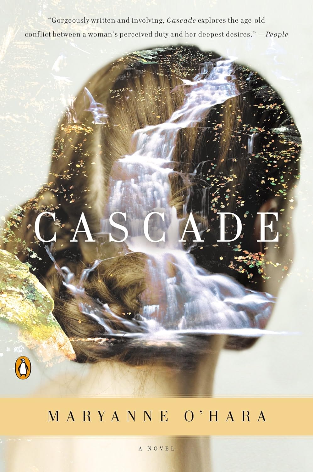
Another way to create contrast is by pairing images that you wouldn’t expect to see together like the book below by Maryanne O’Hara—a cascading waterfall merged with a woman's hair.
Typography
Part of your cover design’s imagery includes typography—the fonts, their size, color, spacing, and how everything is positioned on the cover. While some book cover mistakes can be easy to overlook, bad typography is not one of them, so you want to understand best practices before you use it.
Is your typography the focal point of the book? What is the word hierarchy? Should the title be the largest or the author’s name? What about the image? If you want your image to be your focal point, still follow the rules of typography but let the words take a back seat and enhance the image rather than detract from it.
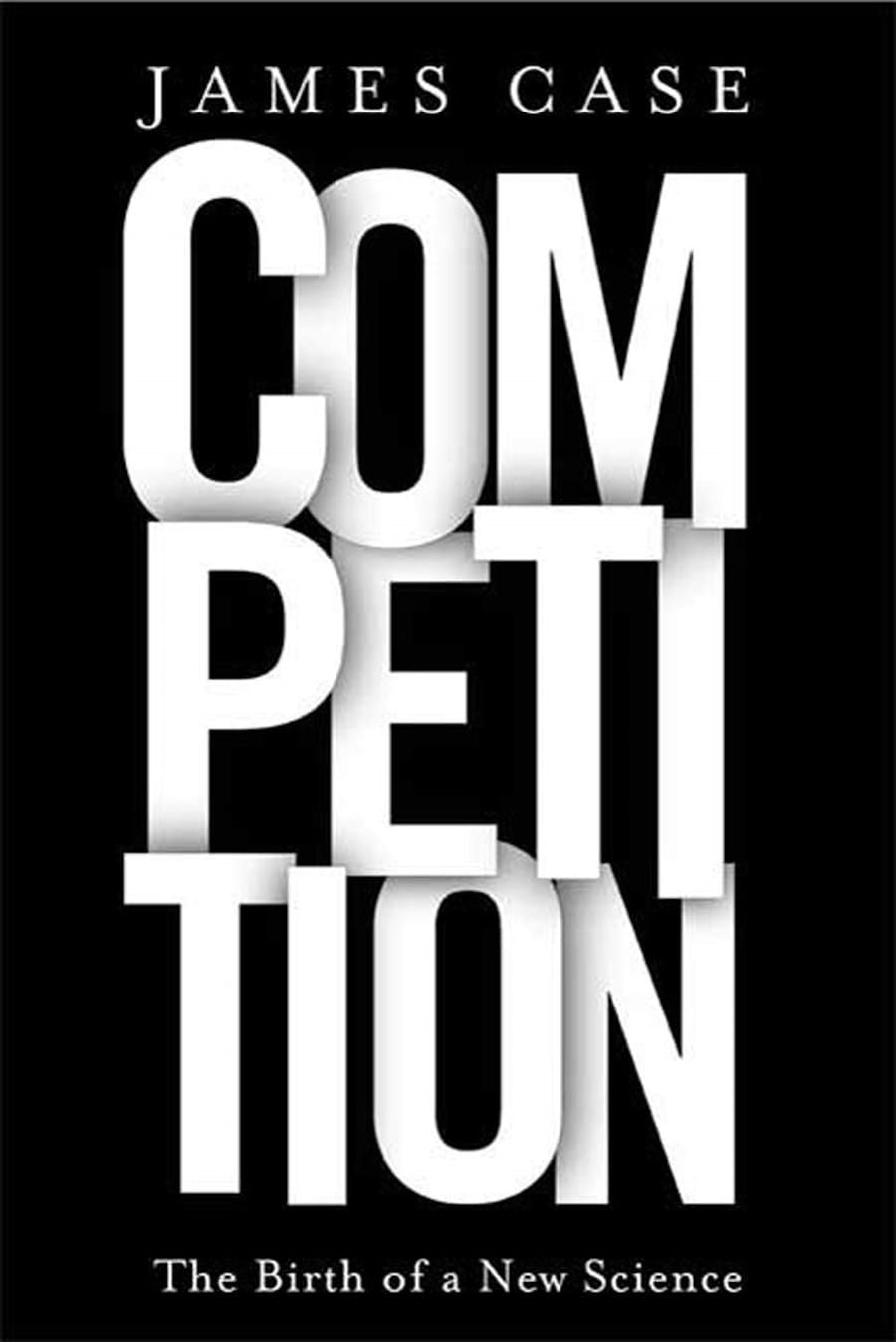
Whether you use typography alone like the book above or use it to draw the focus to other elements, how you choose to place letters on a page can boost a viewer's response and enhance their experience or leave them wanting.
How Do You Come Up with a Book Cover Design?
Follow these steps when designing your book cover to ensure that it has what it needs to engage readers and get them interested in purchasing.
- Know your genre. We’ve talked in-depth about the importance of understanding your genre and the expectations associated with it.
Every genre has certain elements that readers expect to see on the cover, just as there are specific tropes—recurring common themes like “enemies to lovers” in romances—that readers look for in stories.
When designing a book cover, consider the genre first and what it means to your readers when selecting images. You should only break the rules if you fully understand the reader’s expectations. - Give your color combinations careful consideration. Even if you take a minimalist approach to your book’s cover design, color or the absence of it matters. Once you have your book's elements (e.g., image, typography, background) in place, don’t be afraid to try different color combinations to see which one produces the best results.
Don’t stop with your opinion. Ask others, preferably those who read your genre. They can give you a gut reaction and let you know if you’re on the right track or if you need to keep trying. - Select the right image. Do your research and see what others in your genre are doing, but then do your own thing. You can let the creativity of others inspire you but don’t forget to let your own creativity shine. Search images that reflect your book’s theme and genre. When it makes sense, break the rules.
- Define your author brand. Think of your books as products that reflect who you are as an author, the genre in which you write, and your professionalism. Branding matters across the board, including in the publishing industry. Make sure that whether it’s your first impression or 50th, it’s the best it can be.
Final Thoughts
Whether you design your book cover yourself or hire a professional designer (our recommendation for the best results), understanding how to attract readers with design will give you the best opportunity for making sales. If you don’t put much stock into your cover’s design or settle for copying others, you are missing an opportunity to differentiate your book from the crowd.
