


The design of a book spine goes beyond mere decoration. It serves as the reader's first introduction to a book in a physical retail environment. In our personal libraries at home, books are typically arranged with their spines visible, making them easily identifiable and accessible. This visibility makes the spine not just a design element, but a functional tool for readers to quickly locate and select books. Its design and information contribute significantly to the ease of finding and choosing a book, enhancing the reader's experience from the very first glance.
In 2022, physical bookstores had revenue of nearly $9 billion. While that's less than they were selling in the mid-2000s, sales have been growing for the past couple of years (after a sharp downfall in 2020 when retail establishments were largely closed).
In the competitive world of book publishing, where every little advantage counts, a well-designed book spine can be the difference between a book being noticed and picked up in a bookstore or library, or passed over. Therefore, the design of the book spine is a strategic aspect of book marketing, essential for capturing the interest of browsing customers and enhancing the book's visibility on the shelf.
This market will continue to become more important to successful indie publishers who want to expand their reach beyond online sales. The vast majority of books displayed in bookstores are shown "spine out" to maximize limited shelf space. Only a few books will be shown "face out" and, of course, they will have an advantage.
However, we have no control over that, so it's incumbent on us to create a spine that helps the book reach its sales potential, and which suits the rest of the cover design, of which it is a part.
"… The facet of physical books that endow book-buying with its romance and mystery, that truly distinguishes one book from another, is … the spine."
Kari Larsen, Literary Hub
Here's what self-published authors need to know about book spine design:
Definition and Functions of a Book Spine
The book spine is the central part of a book's cover, representing the narrow or wide edge where the pages are bound. It is the physical backbone of the book, connecting the front and back covers and providing structural integrity to the book as a whole. In book design, the spine plays a crucial role, not only aesthetically but also in practical terms. It is where the pages are held together, often through methods like perfect binding, which involves milling the spine edge of the pages and gluing them to the cover. The spine thus forms a crucial part of the book's overall construction and design.
The spine's function extends beyond physically holding the book together. It is a vital space for conveying key information about the book, such as the title and author's name. This aspect is particularly important in settings like bookstores and libraries, where the spines are often the only part of the book visible to browsers. The book spine is a critical marketing tool, providing the essential information that can attract a reader's attention and encourage them to take a closer look.

Essential Elements on a Book Spine
The book spine serves as more than just a binding edge; it's a valuable real estate for key information that immediately communicates to the reader. The most crucial elements to include on a book spine are the author's name and the book title. These are the first details a potential reader seeks, guiding their choice, especially if they are unfamiliar with the author.
The spine's design should ensure that the title is the dominant element, grabbing attention with its clear and legible presentation. For authors, particularly new ones, having a prominently displayed name on the spine can be instrumental in building recognition and readership. However, it's essential to balance the use of space, as overcrowding with too much text, like long subtitles, can diminish the spine's visual appeal and readability.
In addition to the author's name and book title, the bottom of the book spine often features the publisher's identifier, such as a logo or name. This element, while sometimes optional, can add a layer of professionalism and credibility to the book. Self-published authors can use their own author logo in place of a publisher or imprint logo.
The publisher's details, typically represented by a logo or a combination of the logo and the publisher's name, can be a subtle yet significant marker for readers and industry professionals alike. The inclusion of these elements on the spine not only aids in identification but also enhances the book's overall aesthetic.
This careful orchestration of title, author's name, and publisher details on the spine plays a critical role in making a book stand out on a crowded shelf and can influence a reader's decision to explore a book further.
Design Considerations for Book Spines
The design of a book spine demands careful consideration to ensure it captures the attention of potential readers. Font choice is a critical component; it should be clear, legible, and distinctive. While decorative fonts can add a unique flair to the spine, it's essential to prioritize readability.
Avoid overly ornate script fonts that might be challenging to decipher from a distance. Remember, the spine's font should enable quick and easy identification of the title and author's name, even when the book is nestled among many others on a shelf.
Color is another crucial aspect of spine design. The chosen colors should resonate with the book's genre and the intended emotional response from the reader. Contrasting colors are particularly effective as they enhance visibility and draw the eye. The spine should stand out, inviting readers to reach for the book.
Consider the color scheme in relation to the front and back covers of the book, ensuring a cohesive and appealing design. Text positioning is also important; in many regions, including the US, the standard orientation is for the text to run down the spine. The text should be centered, creating a balanced and aesthetically pleasing look.
Challenges and Best Practices in Book Spine Design
One of the main challenges in designing a book spine is accounting for variance in spine width, which is dependent on the number of pages in the book. Unlike the front and back covers, whose sizes are standard, the spine width varies, requiring a tailored approach for each book.
It's essential to design the cover as a single, complete file, taking into account the spine's position relative to the front and back covers. This holistic approach ensures that the spine aligns correctly and contributes to a seamless overall design.
Best practices in spine design include allowing for a 'bleed' area, where no critical design elements or text are placed. This area accounts for potential shifts in the spine's position during the binding process. If the spine features unique colors or designs, extending them slightly onto the front and back covers can accommodate variance in width.
Text on the spine must be centered and sized appropriately to fit within the available space, allowing for margins on either side. These considerations are essential to avoid design elements spilling over onto the front or back covers, which can detract from the book's appearance.
Special Considerations for Thin Spines
Designing spines for books with a lower page count presents unique challenges due to their narrow width. For books ranging between 40 to 60 pages, the spine is often too thin to effectively accommodate text. In such cases, adding text to the spine is not advisable, as it becomes nearly impossible to read and can give the book a cluttered or unprofessional appearance. Instead, it's better to leave these thin spines blank or use them for simple, minimalistic design elements that complement the book's cover and back without overcomplicating the limited space.
This approach to thin spines is particularly important for authors and self-publishers who aim to maintain a clean, professional look across their publications. It recognizes the practical limitations of spine design and prioritizes the overall aesthetic and readability of the book.
For thin-spined books, the focus should shift to maximizing the impact of the front and back covers, ensuring they are sufficiently eye-catching to compensate for the lack of spine text. In the world of book design, acknowledging and creatively working within such constraints can often lead to more innovative and effective overall book presentations.
Technical Aspects of Book Spine Design
Understanding and managing the technical aspects of book spine design is crucial for achieving a professional and aesthetically pleasing result. One key consideration is the spine's width, which varies based on the total number of pages in the book. This variation directly impacts how the spine is designed, particularly concerning the placement and size of text. Most self-publishing platforms offer a spine calculator that uses the number of pages your particular book has and the weight of the paper being used (which can dramatically impact the size of your spine). Knowing the exact dimensions of your book spine ensures that the text and design elements fit appropriately and maintain aesthetic balance.
Another critical aspect is the positioning and sizing of the spine text. The text must be centered on the spine and sized so that there is at least an eighth of an inch margin on either side, allowing for any variations during the printing and binding process. This is especially important to prevent the text from bleeding over onto the front or back cover, which can detract from the overall design.
Text size is typically measured in points, with the height of the text being a crucial factor in determining its legibility and visual appeal on the spine. For instance, for a spine that is 0.51 inches wide, a 14-point font size could be appropriate, leaving enough margin to account for the bleed and ensuring that the text remains within the designated spine area.
These technical details are essential for designers and self-publishers to consider, as they play a significant role in the functional and visual success of the book spine.
Real-World Testing of Book Spines
Picking through our library at home, I arranged a shelf of books that demonstrate some of the best and worst of spine design. Here they are, with comments about how well they do their jobs.
For this article, I decided to look at only single-volume works. There are many examples of outstanding design that spread across the spines of all the books in a series, but that's a different design challenge. If you'd like to see some of these designs, check out the links at the end of this article.
First, the book spine losers:
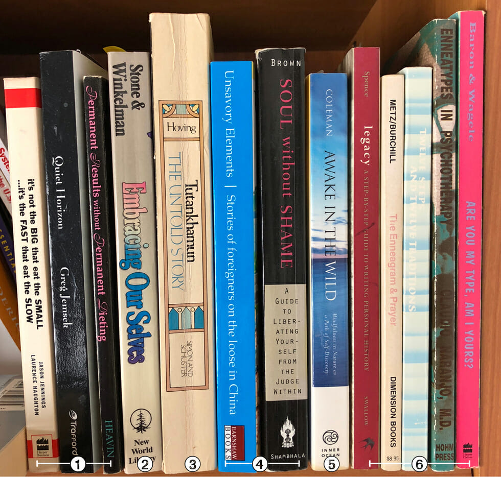
- In section 1, we have three books on which the design of the spines seems to have been completely overlooked, with just some type thrown on there for primitive identification.
- This book looks like it's stuck in the 1970s.
- Appears to have been designed for a much shorter book.
- These two books aren't bad, but a lack of contrast renders them weak from a design point of view.
- Watch out for busy backgrounds, which don't help readability.
- Lastly, 5 books whose designers apparently had no interest in allowing browsers to even read the spines.
Okay, now let's look at some book spines that got it right:
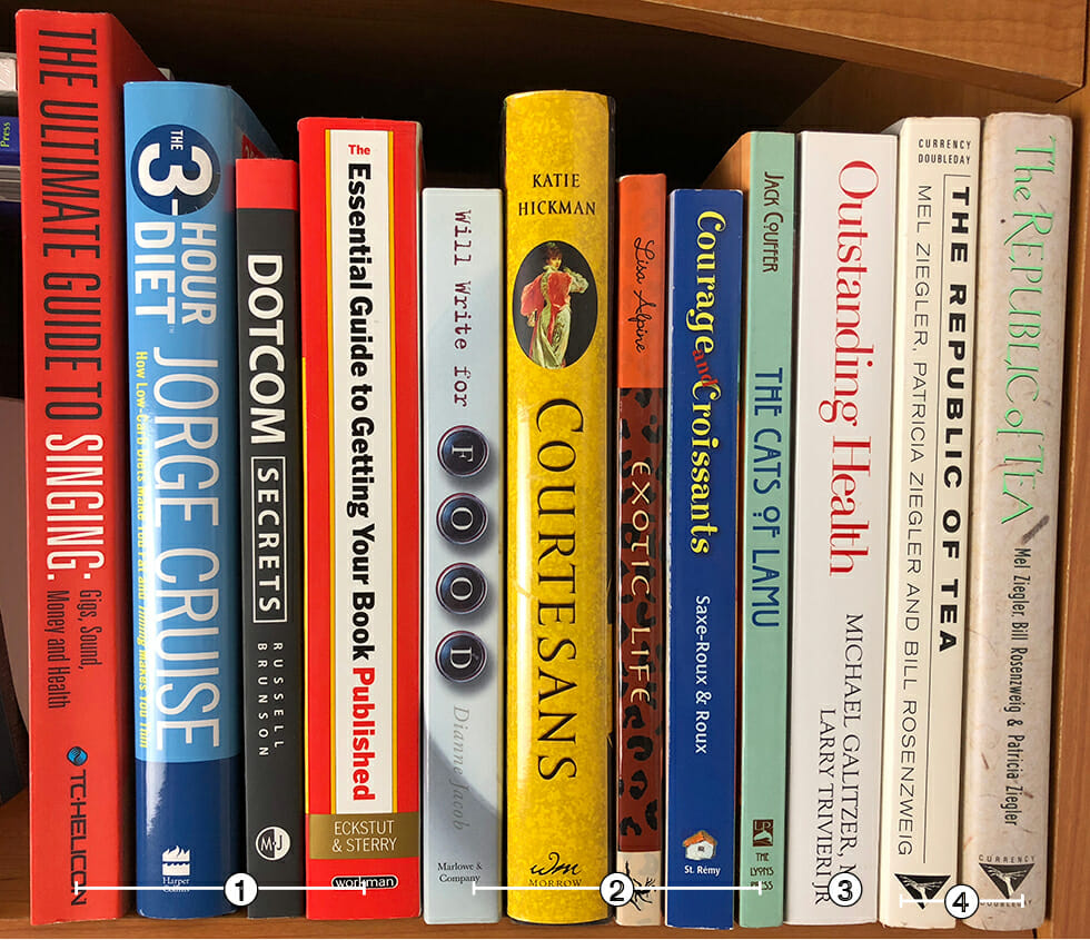
- These four nonfiction books all have clean, clear spine designs that actually help sell the books. A win!
- Each of these five books uses design elements from the front cover to bring some of the thought that went into communicating with the reader onto the spine. In consequence, each has a unique look and message.
- This book has a clear and readable spine the easily signals it's in the health and wellness category.
- These are two versions of the same book. On the right is the spine of the hardcover edition. The problem is that the light-colored title was displayed on a dark blue background on the cover. When it moved to the spine the background stayed home, leaving the title very difficult to decipher. The version on the left is the paperback that came out a couple of years later, where the publisher wanted to maximize readability, creating quite a contrast between the two editions.
Final Thoughts on Book Spine Design
The book spine is an often underestimated yet critical element in the world of publishing and design. It serves as a vital bridge between the aesthetic appeal and functional necessity of a book. A well-designed spine not only holds the book together but also plays a key role in attracting readers' attention, conveying essential information, and enhancing the book's overall visual appeal.
The careful integration of elements like the title, author's name, and publisher details, along with thoughtful consideration of font, color, and text placement, can transform the spine into a powerful marketing tool on the shelves of bookstores and libraries.
Moreover, the technical and design challenges associated with creating an effective book spine underscore the importance of detailed planning and creative execution in book design. From accommodating varying spine widths to ensuring legibility and aesthetic consistency, each aspect of spine design contributes to the book's identity and success.
Whether dealing with thick or thin spines, designers and publishers must navigate these complexities with skill and creativity. Ultimately, the book spine, in its modest yet significant role, encapsulates the essence of a book, beckoning readers to delve into the stories and knowledge that lie within its pages.
Editor's note: This article was originally written by Joel Friedlander and has since been updated and expanded by The Book Designer editorial team.
