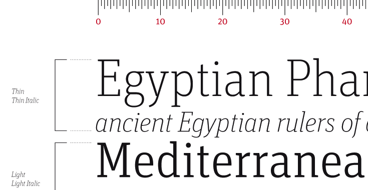
One of the first and most basic questions you need to answer if you’re going to be creating your own book design is: What fonts should I use?
Since the beginning of the so-called desktop publishing era in the 1980s which was boosted by computers’ new ability to show accurate graphics in “what you see is what you get” displays, millions of computer users have become familiar with fonts.
Ever since, computers have come bundled with fonts. This single fact is responsible for the overwhelming popularity of both Times New Roman and Arial, and that has had mixed blessings for creators and consumers alike.
Since the “default” font is usually set to Times New Roman or Arial, these fonts have spread far and wide, whether they were appropriate for the jobs they were asked to do, or not.
The Problem with Defaults
Computer engineers can be forgiven for putting these fonts in a premium position. After all, they wanted to make sure even a user who had no knowledge of or interest in fonts would still get a good, or at least an acceptable, result.
But there are problems with that approach, too. Times New Roman, for instance, is a font originally designed under the supervision of Stanley Morrison in 1931 for use in the Times of London newspaper.
Its efficient set width and other internal properties of the design were intended to be readable in the narrow columns of a newspaper, not in the more ample environment of a book.
Arial is a copy of Helvetica, probably the most popular font in the recent history of typography (and the only typeface I know of to have an entire feature film made about it) is wonderful for many uses. But it’s not really intended for readers in the United States, who are unused to seeing entire books set in sans serif fonts.
Better Solutions for Your Font Needs
Luckily, as computers have become more powerful and users more sophisticated about typography (the art of designing with type) there has also been an explosion of new fonts from lots of new designers.
So it might surprise you to find out that by far the best fonts for use in books are the oldest.
Or, if not the oldest, the fonts based on the oldest designs for fonts, those that originated in the very beginning of book printing in the late 15th century.
In fact, probably the best fonts for book design are from a family of type designs we call “oldstyle” so that will give you some idea what I’m talking about.
Recognizing Oldstyle Fonts
These fonts were based on the writing of calligraphers, the scribes who, before the invention of printing, were responsible for making copies of books by writing them out.
Oldstyle fonts have characteristics that show that origin, and which make them ideal for book composition. (For a more complete discussion, check this link to oldstyle fonts.)
There are three identifying characteristics to oldstyle fonts:
- Tilted axis–If you look closely at a round letter like an “O” or “C” you’ll notice there are thicker strokes and thinner ones. In oldstyle fonts, the axis of these letters is tilted, so that if you draw a line through the thinnest parts, it will be slightly off-center. This imitates the way the scribes would naturally write with a square-tipped pen.
- Moderate stroke variation–Look again and you’ll see that the thin and thick strokes, although noticeably different, do not vary all that much. In other words, the thick strokes are thick, but not hugely so. This is also due to the way a square-tipped pen creates a varying stroke as you create each character.
- Rounded or bracketed serifs–Serifs are the little bits of strokes like the “legs” on an “i” or the ending strokes on letters that look strictly decorative. These serifs are also due to the scribes, and the way their pens would leave a tiny flourish when they finished a stroke. Serifs help letters stick together as words, and that helps readability quite a bit.
Fonts That Work in Books
Okay, so now you know how to recognize oldstyle fonts, how is that going to help you? Let’s take a look at some of my favorite fonts for interior book design, and you’ll see.
- Garamond–There are many versions of typefaces known as Garamond, and this is one of the most popular families of fonts for use in books. A classic oldstyle font, Garamond is named for Claude Garamond, a publisher in 16th century France, and has given rise to many other similar typefaces like the also useful Sabon.
- Caslon–This font originated with William Cason, one of England’s first printers and has been popular ever since. Caslon is one of the most widely-used typefaces for text and works very well in books.
- Minion–A modern invention, Minion was designed by Robert Slimbach for Adobe Systems and has gone on to become one of the favorite fonts for book designers due to its regular color, interesting letterforms and the variety of weights and styles available.
- Janson Text–Another Adobe font, Janson is based on a typeface created in the Netherlands in the 17th century, and our recent version was created by famed type designer Hermann Zapf in the 1950s.
- Palatino–For a long time Palatino was the most popular oldstyle font of all, because it was included in the base set of fonts shipped with every new Macintosh, the original desktop publishing platform. Although it’s a beautiful font with some idiosyncrasies that designer Hermann Zapf included, I no longer use Palatino for books, exactly because it has been so over-exposed. But you might love it, so give it a try.
Putting it Together
Although these fonts have a lot in common, they will create books that look subtly different.
The best way to find out how your book will look and feel is to set some sample pages in each one. While you might have trouble telling the difference between a Caslon “e” and a Minion “e”, when you see a whole page with thousands of characters on it, they will look noticeably different.
I don’t think any one of these oldstyle fonts is more appropriate than the others for specific types of books. Much more depends on your skill as a designer, and the tools you’re using to create your book design.
Typesetting with a word processor is never going to give you the smooth color, sophisticated hyphenation, and fine control over your type that you can get with a professional-level program.
But by picking the right typeface at the beginning, you’ll ensure that your book can be readable and conform to long-standing book publishing practices.
And that’s no small thing.
More Articles on Fonts for your Book
5 Favorite Fonts for Interior Book Design
Square-Serif Fonts Pack a Typographic Punch
5 Great Fonts for Book Covers
3 Great Typeface Combinations You Can Use in Your Book
7 New Typeface Combinations for Book Design
Originally published in a slightly different form at CreateSpace. Photo by fontfont
I used a 88pt font for my children book
Do you think that is a good idea ?
Rafael, it’s really hard to say without knowing more about the project or seeing some sample pages.
well its really not hard to imagine you just have to see the page with the
88pt font on the page and realize that the words on the entire are written in large font or large words
hi I am working on a picture book for children. It’s a collection of hand painted trees and each tree is a little lesson on curiosity and that we are one love. I want to hand write each word in the manuscript. Any advice would be great.
Mireya,
No problem, you will need to scan or otherwise digitize the drawings, them place them in your book layout. You might want to hire a book designer to help you get started on the project.
Hi. I have a problem and need some advice. I have a lot of flashbacks in my novel. They are very difficult to read in Garamond italics. The font in which the italics are easiest to read is Arial. Is it okay to publish a paperback in Arial? What is your opinion.
Thanks,
Inge
Hi Inge,
I wouldn’t advise publishing a novel in Arial (or Helvetica either). Keep looking at fonts and pick one in which the italic is more readable and which still is comfortable with the Garamond text. You could even use Arial just for the flashbacks, although you will probably have to adjust the size to more closely mimic the size of Garamond, but it will be recognizable as a separate narrative. Some authors use a graphic device instead, like a long rule that separates the main narrative from the flashbacks, and that eliminates the need for a separate font.
Hi Joel,
Thank you so much for your response and professional advice.
Inge
Hi Joel,
Thanks so much for your informative piece.
I’ve published several books using the Word-supplied Garamond. In my view, the font is wonder, but has one major deficiency: it’s a bit faint printed by Createspace (and likely other printers, as well).
I’ve thus settled on Book Antiqua, although I hat the quotes (I write fiction with lots of dialog).
Do you have any (free) suggestions? Please know I’ve tried Apple Garamond, but (for several reasons) I find it hard to work with.
Do you have any suggestions?
Hi David,
Yes! Check out these 2 posts:
5 Favorite Fonts for Interior Book Design
5 Favorite Free Fonts for Interior Book Design
Thanks so much. 😉
Thanks Joel for the informative article. I have a quick question about my non-fiction self-help/personal transformation book.
I have used syirenata script font as the name of the book inside a Cloud image on the Title Page. The cloud is a symbolic representation of the story.
A few people thought it gave a non-serious, comical appeal which is contrary to my theme of the book. However, those people are not experts. Would really appreciate your expert feedback on this.
https://fontlot.com/syirenata-script.font
Thank-you
Rose, it’s hard to tell just from the font. Can you give me a link to the title page or upload an image?
Does anyone know the font used in the interior of Hex Hall by Rachel Hawkins?
Rue, you would need to either upload a sample here or provide a link, but you’d probably get a better result with one of these:
http://www.identifont.com/
https://www.fontsquirrel.com/matcherator
https://www.myfonts.com/WhatTheFont/
https://www.fonts.com/id/by-sight
https://www.whatfontis.com/
I have been trying those and they still haven’t given me the correct one. Thanks!
Joel, post script to my comment:
I had said I was interested in buying one of your templates but I also mentioned a font I was thinking of using. In retrospect, your templates probably already have pre-selected fonts, yes? So all that info I was reading up on, about the importance of fonts, isn’t really applicable if I buy a template?
Hi Joel, thanks for all the great info. I am going to be self publishing a book for the first time. I plan to purchase one of your templates for interior design and I am thinking I’ll go with Adobe Garamond Pro for the font. (I intend to publish both paper back and eBook, and use Createspace and Ingram Spark for the paper back.) My book by the way is about 97,000 words in case that’s helpful for you to know.
The book is currently with a copyeditor. I wrote it in Scrivener. When I get the copyedit back, (which the editor is doing in Word but I don’t have Word so my mac will open it in Pages) should I at that point put it into your template, or should I first load it into Scrivener and then export (to whatever format is recommended) and then put into your template? It is not clear to me what formats can be uploaded to Createspace?
Hi Joel,
I used your template to format my book – many thanks – it was wonderful!
The one I used came with Times New Roman 11pt which looks fine but my book is lengthy – 685 pages. I am wondering if changing it to 10.5pt (which I have calculated should reduce the size by approx. 80 to 100 pages) will make it difficult to read? I, myself, am annoyed by print that is too small.
Also, will it effect the process of uploading to print on demand and e-reader sites?
What is your opinion please?
Pam,
Reducing the size to 10.5 should work fine. You might also want to look at the template I created specifically for long books that will print POD: Pulp Hi-Density Template.
Joel…I’m in the middle of writing my memoir and I am considering using Nanum Myeongjo as my internal font and Trajan Pro 3 for the cover. I like the way the font looks on the page but it is a little light even in bold. Do you think this would work?
I am writing a non-fiction book. The font I selected by me is Souvenir Lt.Bt. Would
like to know your comment on this font. Or rather, can you suggest a better font.
Is Palatino Linotype a better font.
The proposed size of the book is Demy 1/4 (finished page size 135mmx215mm). Please
let me know the appropriate font size. Is it 10, 10.5 or 11 point.
Your help would be much appreciated.
I have a question in regards to copyrights, or the rights to use certain fonts. Is it acceptable to use any fonts that are have come standard (or been purchased) on my computer? And, must I cite it in some way?
I’m really struggling to find the perfect clean, yet feminine type.
I should add it is for a self-published book. Thank you for any help you can offer!
Monica, have a look at this article: “Where Can I Legally Use My Fonts.”
Thank you!
Hello,
I’ve worked for a number of years in a church office, preparing weekly the worship folder. The service of worship is created in garamond type. After the service of worship part of the bulletin is prepared, we have announcements that created. Typically, the garamond type is used in the body of the announcement. The type used for the title is Verdana bolded, but I think it doesn’t work well. Have you got an idea for a title font that could be used? Thank you.
Barb, I agree that Verdana bold might not be the best match for Garamond text. You might want to take a look at these two articles for inspiration:
7 New Typeface Combinations for Book Design
The Big Book of Font Combinations by Douglas Bonneville
Hello,
Does anyone have a link to download the font used in the Harry Potter series or that used in the mass market edition of Fahrenheit 451?
Thanks,
Resa
Resa, the Harry Potter books (in the U.S.) are typeset in Adobe Garamond Pro for the text and Able for the heads.
I’m trying to balance legibility for readers with weaker eyes with small size. Given a set number of characters in the book, size and thickness, any suggestions for which fonts are the most readable per size?
Ricky, the best general guideline I can give you is look for fonts with large “x-heights”. That means the size of the lower case letters is large in comparison to the type size. I just did a book in Andada, you might have a look at that one. Also, make sure you don’t squeeze the lines together, that really impacts readability.
Thanks for that answer Joel. Let me add another layer of criteria then. Let’s say the content of the book reads like a letter or journal eg Diary of Anne Frank but is not historical. How should the font change? I’m sure there would be thicker spacing between lines right?
Dear Joel,
I would be so appreciative if you could lend some helping advice.
I am making a book as a prop for a movie, and it needs to appear as if it was published and printed in 1955. I’m printing it and hand-stitching it myself, and I’m using vintage boockcloth to bind the book and paper from the 1950s. There will be close-ups of this book in various shots, so it needs to look as authentic as possible.
My question is: What kind of fonts were widely used for books’ body text in the 1950s? Which font can I use that will make this book look as if it just came straight out of 1955?
Thanks for your help,
MK
MK the big problem you’re going to face, if you’re trying for real historical accuracy, is that books in the 1950s were almost exclusively printed letterpress, a technology that started to go out of use soon thereafter. Today’s typefaces are going to look lighter in general than what you would see in a book in the 1950s, but you might try to find a “meaty” version of Garamond or Caslon, both book faces that date back several hundred years.
“I don’t think any one of these oldstyle fonts is more appropriate than the others for specific types of books. Much more depends on your skill as a designer, and the tools you’re using to create your book design.”
And of course 🙂 I will ask this anyway:
I am putting together a book of quotes, maybe 15-20 short quotes per page. Is there a particular font that stands out that might be “best?” And I do understand taste is involved. Skills and tools are limited to my self-taught background in web publishing and in the case of my book project, using Open Office. Thanks in advance to anyone for pointers and opinions.
Oh, it might also be helpful to know my book cover is a cartoon illustration. And 2D cartoons will be used throughout the book.
I am looking for the best font size for a book that has 8.5×8.5 dimensions. I have chosen to use Garamond as the font, but I am struggling with what size will best capture readers, especially those with eye sight ailments. Would “18” for Headings and “12” for the contents be too big for a book this size?
thank you
Anthony, it’s really impossible to answer this question in a vacuum. The sizes you’ve mentioned could work well, depending on the font, the page layout, the type of book, and the square format you’ve chosen.
I’m thinking of using an antique font such as IM FELL English for my novel (body text and cover) in order to give it an “old” look. Is this a good idea?
Thanks.
Brian, that’s rarely a good idea. What you want from your interior is to give your reader a good reading experience and allow your writing to shine. Neither of those aims would be helped by an “antique” looking typeface and, if you think about it, classics like the works of Tolkien or your own favorite authors did not need typographic devices to create a mental evironment for their stories.
Thanks, Joel! Much appreciated.
Is Book Antiqua an acceptable font to use in a book as the regular text? Also, I’m using Big Caslon for the headings, and would like to know if that, too, would work.
Thank you,
Eyes
Eyes, Book Antiqua is a little eccentric for my taste but can be used in your book as the regular text.
Good morning,
A veteran friend has typed out a memoire, along with pictures set on a sky like background. I tried to scan it as JPEG and then as a PDF. Both use a lot of memory and for me, are difficult to manipulate. Decided to type it out.
His manuscript font is much like old English, heavy with lots of curlicues …
It’s also cumbersome to read. Obviously, he likes old style flowery fonts. Any suggestions? Would like something that will also be easy to read.
Thank you,
Pat
Pat, see my reply to Brian Spaeth above: same holds true for your book.
Can I know what font is used for the story text in the Alex Rider books by Anthony Horowitz?
Try this: http://www.myfonts.com/WhatTheFont/
Yep, that’s Officina Sans. If you just open that copyright page, you will see that there is a line called ‘Typset in so-and-so-font.’
Feels good to help.
Uhm…Is Comic Sans MS a good idea for a book? I was planning to use Officina Sans CTT but then I saw that Anthony Horowitz had used it for his Alex Rider books, so I can’t use it. Another good font for a spy novel could be Agency FB, but its too small, and if you try it, a hundred page book will become an eighty page one. Please help me.
Joel,
your article is so well formatted that it converts very nicely into a PDF, with bookmarked headings and all! Compliments. Thanks for all the tips, too. I’m about to embark on a series of works for publishing.
Hi Joel, Decades ago — feels like centuries – I was at art college and studied what was called in those days, lettering. I learned to carve letters and used a scrip pen and a Chinese pen and brush. What you say above about the ‘titled axis’ and serifs brought it all back. I learned to appreciate and value these aesthetic subtleties. Three cheers! Wonderful. Thanks for making these great fonts available to aspiring authors with taste.
A background in hand lettering will give you a much deeper appreciation of typefaces and especially the oldstyle fonts that derive directly from the pens of calligraphers. Thanks for your comment, Esme.
Enjoying this page Joel.
‘A background in hand lettering will give you a much deeper appreciate of typefaces’
Just wondered, that should be appreciation, right?
Hi Gary,
Thanks for catching that. I’ve fixed it.
Shelley
Which of these fonts (and what size) do you recommend for the body text of a non-fiction (how-to style) book?
Chris,
Over the years I’ve designed and produced many nonfiction books that use these fonts, especially the first four (I’m not that big a fan of Palatino, although it remains a good choice for many self-publishers).
Although I’ve written many articles on type and typography, I generally avoid recommending specific type sizes because each book is very different, and that’s even more true for nonfiction than it is for fiction. But as a starting point, I usually begin with 11 point and adjust from there. You didn’t ask, but the leading (space from one line to the next) is just as important as your type size.
Hope that helps.
Hello from beautiful Montana,
Thanks so much for caring and sharing. Really needed to be sure that 11 or 12 was a proper size for non-fiction self-help books.
Feels good to know that I am on the right path.
Judy Helm Wright aka “Auntie Artichoke”
Joanne- Thanks so much for these recommendations! They made the finalization of my book just that much easier. I am going with Palatino because it seems easiest to read.
Michael:
What lovely choices. Charlemagne is one of my favorites. Another is Serlio. Caps only, but utterly elegant.
Maggie
I’ve settled on Minion Pro for the main text in my books. I think it works very well with my genre (history). Caslon would be another good choice, but I like Minion slight more.
In my first book, I used Charlemagne for my chapter titles and headings because I also used that as the font on my cover. That font went very well with the theme of my book, so loved it as my headings. My last book, I went boring and just used the same Minion Pro for my chapter titles and headings.
Not sure what I’m going to use this time. I might use Trajan on my cover, so I could stick with that for my chapter titles and headings. Is that a good combination? What other fonts go well with Minion Pro? (My next book is about Alexander Hamilton, if that helps with the decision.)
What are your thoughts on multiple fonts throughout a book. I’m not talking about going wild, but two or three times to convey a different mood or make an emphatic point?
My thought is to avoid it, RD. This is common in books done by do-it-yourselfers but not nearly as common in books designed by professional book designers. There are many ways to distinguish different voices or parallel text streams and, at least in my opinion, they are all better than switching fonts throughout the book.
Keep in mind that it’s the language you use and your skill as a writer that’s going to “convey a different mood or make an emphatic point” and no amount of type tweaking will or should replace that.
Ah, such a great way to begin the day. Thanks, Joel. I love articles like this, especially from someone whose judgment and knowledge I trust. May I add another favorite text font to your list: Sabon.
(from Wikipedia):
Sabon is the name of an old style serif typeface designed by the German-born typographer and designer Jan Tschichold (1902–1974) in the period 1964–1967. The typeface was released jointly by the Linotype, Monotype, and Stempel type foundries in 1967.
Hi Maggie,
Yep, Sabon is another one of my favorites. This article was written for CreateSpace, so I was trying to keep the choices to things DIY authors might realistically find practical. And Tschichold has to be a favorite for lots of us who love type!