

2021 Update – Check out the best free fonts of 2021 here!
Book design begins with typography, and the biggest typographic decision you’ll make in designing a book is selecting the text typeface.
As I said a number of years ago, as publishers “we want our books to be as easy to read as possible while communicating the author’s intent. Style and fashion also play their part in many book designs, particularly in popular niches. The accumulated expectations of 500 years of book readers also come into play. Books are pretty conventional objects, after all.
“Some fonts really lend themselves to book design while others, which look good in a brochure or on a business card or billboard, make odd, unreadable books. Any idiosyncrasy in the type design will be magnified by the repetition of typesetting 75,000 or 100,000 words in thousands of lines on hundreds of pages.
“So the choice of your basic book font looms large when you sit down to design your book.”
In that article I selected five typefaces that are favorites of mine, and that post has been one of the most popular here ever since.
Now, having spent the last couple of years designing with free fonts to create the book templates at BookDesignTemplates.com, I’ve developed a whole new list. This time, all the fonts are free and licensed for you to use freely, too.
Here are five free typefaces that have become new favorites, and which will work well in your books too. You’ll find links to the source of the fonts with each listing.
(All samples were typeset in Adobe InDesign in 17 point type on 21 points of leading and enlarged 200% for these illustrations.)
Let me know if you have a free text font you love that doesn’t appear here, I’d like to hear about it.
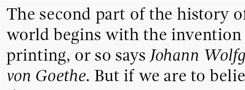
- Gandhi Serif – Designed for the Librerias Gandhi S.A. de C.V. chain of Mexican bookstores, this font has an oldstyle look that lends itself superbly to all kinds of literary works. Gandhi Serif creates a smooth book page, and was the basis for our high-density template design, Pulp. Here’s a sample: Get Ghandi Serif here
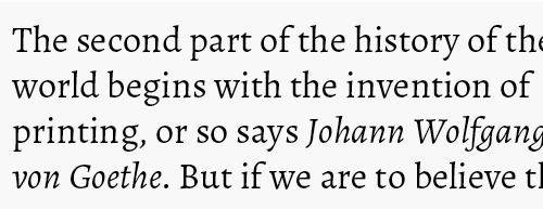
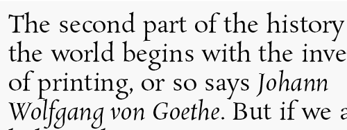
- Alegreya – Designed by Juan Pablo del Peral, “Alegreya is a typeface originally intended for literature. Among its crowning characteristics, it conveys a dynamic and varied rhythm which facilitates the reading of long texts. Also, it provides freshness to the page while referring to the calligraphic letter, not as a literal interpretation, but rather in a contemporary typographic language.” Alegreya’s stylish versatility works well in our Thrilling children’s book design as it does in the Focus nonfiction design. Here’s a sample: Get Alegreya here
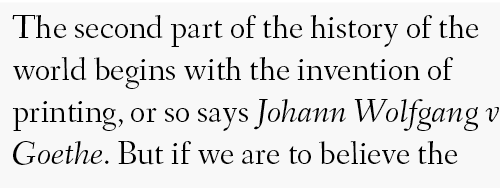
- Fanwood – Designed by Barry Schwartz. “Fanwood is a carefully crafted serif typeface with a flavor of classic roman typefaces. The font package includes roman and italic styles, both optimized for the screen. It’s an excellent typeface, making for a pleasing reading experience, including in headings and body copy.”—Smashing Magazine. We’ve used Fanwood’s elegant typeforms in our Legend and Premise templates for Adobe InDesign, and you can exptect to see more of this lovely font in the future. Note that the download package includes both the regular Fanwood, and a varaint called Fanwood Text, about which the desinger says: “Fanwood Text roman and italic are the same as Fanwood but slightly darker and reduced in contrast; I tailored it to increase readability on my Amazon Kindle 3 e-book reader.” Here’s a sample: Get Fanwood here
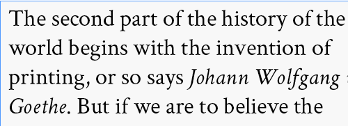
- Crimson Text – Designed by Sebastian Kosch. “Crimson Text is a font family for book production in the tradition of beautiful oldstyle typefaces. (It has lots of) little niceties like oldstyle figures, small caps, fleurons, math characters and the like… Crimson Text is inspired by the fantastic work of people like Jan Tschichold, Robert Slimbach and Jonathan Hoefler.” Crimson is a workhorse book font that we’ve used in more of our templates than any other: Affection (children’s), Brittania and Leadership (nonfiction), and Crimson (fiction). Here’s a sample: Get Crimson here
- Rosarivo – Designed by Pablo Ugerman. “Rosarivo is a typeface designed for use in letterpress printing. It is an elegant and luxurious typeface (that) works especially well in delicate editorial design. Its letterpress origins mean it has a lighter color than a typical Roman text type. Its features include carefully designed serifs, gradual stroke and marked contrast, calligraphic and humanistic forms, and large ascenders and descenders. It is designed to work well in long texts with generous line spacing.” This last statement should be heeded, since you can see from the sample the ascenders and descenders may need more than usual line spacing, but the slightly eccentric design of this face worked quite well in both our Balance and Bomber fiction templates. Here’s a sample: Get Rosarivo here
If you’d like to see full-page samples of any of these fonts, check out the corresponding templates in our template gallery. On each of the template’s detail pages, you’ll find a link to a full-size PDF showing you actual book pages made up in each font.
So what are your favorites? Got one I haven’t discovered yet? Leave me a link in the comments, thanks!
