

Welcome to the e-Book Cover Design Awards. This edition is for submissions during July, 2014.
This month we received:
110 covers in the Fiction category
22 covers in the Nonfiction category
Comments, Award Winners, and Gold Stars
I’ve added comments (JF: ) to many of the entries, but not all. Remember that the aim of these posts is educational, and by submitting you are inviting comments, commendations, and constructive criticism.
Thanks to everyone who participated. I hope you enjoy these as much as I did. Please leave a comment to let me know which are your favorites or, if you disagree, let me know why.
Although there is only winner in each category, other covers that were considered for the award or which stood out in some exemplary way, are indicated with a gold star: ★
Award winners and Gold-Starred covers also win the right to display our badges on their websites, so don’t forget to get your badge to get a little more attention for the work you’ve put into your book.
Also please note that we are now linking winning covers to their sales page on Amazon or Smashwords.
Now, without any further ado, here are the winners of this month’s e-Book Cover Design Awards.
e-Book Cover Design Award Winner for July 2014 in Fiction
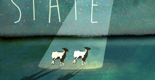
Ben Ellis submitted In A Right State designed by Emery Greer.
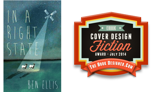
JF: A charming and allusive cover for this novel about intrusive corporate spying. Well done.
e-Book Cover Design Award Winner for July 2014 in Nonfiction
Judith Glynn submitted The Street or Me: A New York Story designed by Guido Caroti. “My book is about NYC and an addicted, homeless woman whom I rescued. I didn’t want a dark cover with people in the shadows. I wanted a NYC designer who saw the problem differently. Guido Caroti captured my story with precision and great design.”
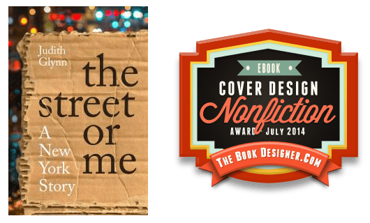
JF: A brilliant cover that shows how the creative process can offer up the perfect image to encapsulate the main thrust of the underlying story. Note also that no distressed, over processed, or effects-laden type was needed to get the point across.
Fiction Covers
AJ Navarre submitted Good as Dead designed by AJ Navarre.

JF: A good effort, needs more skill with illustration to start.
Allen Taylor submitted Sulfurings: Tales from Sodom & Gomorrah designed by Alexandre Rito. “Sulfurings: Tales from Sodom & Gomorrah falls into the speculative fiction genre. Eighteen authors give alternate explanations for the destruction of these ancient cities. There are surprises on every page.”

JF: An impressive piece of artwork that needs a stronger type treatment.
Amanda Kimberley submitted Forever Friends designed by Farah Evers Designs. “The dragonfly on the cover is a Farah Evers original design. It not only looks great, but it also ties in with the characters in the book.”

JF: That may be, but it’s very complex for a small element on a ebook cover. The leaf texture applied to a cheek is an interesting touch.
Andreas Masberg submitted Die Macht des Nimbus designed by Colin Hawk. “Licensed Elements: Eky Studio/Shutterstock.com design36/Shutterstock.com The story takes place in 17th century in old Regensburg, Germany. The blue orb shows a “nimbus”, a holy insignia which provides angles and saints with gloriole and gives them power and aura”

JF: A very effective design, with well-chosen artwork, a controlled palette of colors, and apt typography.
Andy Peloquin submitted In the Days: A Tale of designed by Andy Peloquin.

JF: Impossible for us to know what point this cover is supposed to make, or why the type has been purposely made hard to read.
Angela Oltmann submitted Ford’s Crossing designed by Angie-O Creations.

JF: Simplicity works for ebook covers, especially with the evocative details the designer has used on this cover.
Annette Reynolds submitted A Sea Change designed by Robin Ludwig Design Inc & Annette Reynolds. “A mermaid in a dream, a woman struggling with the past and being buffeted by the present, and a hidden beach community are major elements in my novel. I felt the photograph by Kiara Rose evoked all those things and brought the title to life.”

JF: A competent cover that looks a bit tortured for a love story.
C Lynn Murphy submitted The First Noble Truth designed by Charlotte Pearson. “Ms. Pearson created this image from a combination of water color and oil painting techniques, chosen to resonate with the themes of the story.”

JF: I don’t know if it was intended, but this looks like a book on Zen Buddhism.
C. Michael Lorion submitted Totem (Book 1: Scars) designed by diversepixel. “New England. 1978. Native Americans seek revenge for past atrocities.”
")
JF: There’s a lot going on, but I think it works.
Catherine Winters submitted Black designed by Colin Christie. “Black was first published by a small press with a background in graphic design. When I decided to self-publish, graphic designer Colin Christie had to create something visually appealing and original. Both are great covers, but Colin may have done a better job of capturing the essence of Black.”

JF: It’s beautiful in a graphic sense, but it doesn’t give us much to go on regarding the story.
Christina Garner submitted Gateway designed by Christina Garner.

JF: Nice art, but an odd assemblage of images and I’m not sure what they add up to.
Dane Low submitted Delta designed by Dane at Ebook Launch.

JF: Emphatic and informative at the same time.
Dane Low submitted Fortress of the Forgotten designed by Sofia at Ebook Launch. “A hand illustrated concept for this epic quest :)”

JF: A near-perfect genre cover guaranteed to draw in fans.
David Camacho Colon submitted The White Shoes designed by Meghna Doshi. “The faces represent the main characters, a man and a woman. The scribbles and the coconut are symbols of Puerto Rican folklore magic. The faces are in the shape of a broken head, which reflects the character’s struggles with psychological disease and the search for purpose in life.”

JF: Simplicity is the best thing about this cover, the illustration, while interesting, is also a bit confusing. Also, you should remove the period following the author’s name.
Decadent Kane submitted Steele Your Soul designed by Fiona Jayde.

JF: An evocative illustration with some creative typography, it really works.
Deirdre Saoirse Moen submitted The Duchess’s Dress designed by Deirdre Saoirse Moen. “I looked for design elements that would convey castles, royalty, and fantasy.”

JF: The elements are right, but they add up to a very weak ebook cover.
Demetra Angelis-Foustanellas submitted Secrets in a Jewellery Box designed by Evangelos Michalis & Sotiris Maipas. “This is Evangelos Michalis and Sotiris Maipas’ debut venture in book designing. It is also my first novel. We thank you for this kind opportunity! Demetra Angelis Foustanellas”

JF: A good first attempt, somewhat lacking in contrast. Also, you need to decide if your name is hyphenated or not.ken
E.D. Walker submitted The Beauty’s Beast designed by Simone Sadie.

Elisabeth Grace Foley submitted Left-Hand Kelly designed by J. Simmons. “The design of this cover coordinates with that of my first Western, “The Ranch Next Door and Other Stories” (also designed by J. Simmons), with a background photo evoking the setting of the book, and the gun referencing a main theme of the story.”

JF: Another ebook cover that profits from simplicity.
Erin Albert submitted The Prophecy designed by Marion Sipe. “This cover was designed for a young adult, fantasy novel. The crest displayed on the front represents the main character’s people group–The Vanguards. Readers learn a great deal about the Vanguards in the story and can refer back to the cover to better understand what the symbol there means.”

JF: Of course, the purpose of the cover is to draw people in, not to serve as a reference point for readers. From that point of view, I don’t think this works very well.
Ev Journey submitted Hello, Agnieszka! designed by Peter O’Connor. “I provided Peter a digital “painting” that I did of the heroine. He cropped it drastically, to more dramatic effect. The heroine’s passion for the piano saves her from the ravages of a repressed childhood.”

JF: The title and subtitle seem a bit small.
Evie Woolmore submitted The Salt Factory designed by Chris Wells. “Chris Wells has done the covers for all three of Evie Woolmore’s novels. As a writer of magical realist fiction, his layering style captures the mystical qualities of her writing perfectly.”

JF: Simplified colors and basic typography help with focus.
Ferran Torrelles submitted Espejos circunflejos designed by Ftmassana. “In my opinion, currently the covers of the books are too abstract. I tried to explain visually what’s inside the book, because it is the main attraction and makes a difference.”

JF: Beautiful illustration, but I find the very modern carat symbol a bit out of context.
G. Gabbler submitted The Automation designed by SOBdesigns. “THE AUTOMATION is actually written by one person, not two. The Narrator “BLA” and the Editor “G.B. Gabbler” are actually just a pen name for the anonymous Author. Venus is a public domain image. Background from publicdomainpictures.net. Hands flipping a coin are licensed through Getty Images.”

JF: Not sure what the intent was here, but I’m afraid the cover has ended up confused, and confusing, and that doesn’t help communicate with potential readers.
G.C. McRae submitted The Seven Sisters, A Fairy Tale designed by G.C.McRae. “I’m doing a series of fairy tales (7 over the next several months) and decided to do something unusual with the covers. Since the stories are completely traditional in tone, I wanted the same for the covers – but with a modern twist, as if they were portraits of people you’d recognise.”

JF: You’ve picked a gorgeous piece of artwork, and if the others match, they should be stunning. In general, you weaken the effect of the cover when you make the title vertical.
Gabrielle Prendergast submitted Once in a Blue Moon designed by Gabrielle Prendergast. “The editor specified “…sexy…with a big blue Louisiana moon” for this first cover in a new series. Both editor and author were delighted with my design.”

JF: Perfectly put together, with every element doing its job, especially the couple, who draw you into the story. ★
Gabrielle Prendergast submitted The Fifth Clan designed by Gabrielle Prendergast. “This was a cover I did for the author after he got frustrated with trying to do his own cover. The ebook is selling very well so I hope the cover has something to do with that.”

JF: Another “grippy” cover that grabs you and won’t let go, with lots of story, too. The title treatment may suffer at smaller sizes.
Heather Gilbert submitted Miranda Warning designed by Jon Day. “Jon and I wanted to convey a definite Appalachian mystery feel with this 1st book in the series, while using a template we could replicate with minimal fuss. For the next books, we will continue using bright colors, title in the middle, model at the top, and mountains at the bottom.”

JF: Considering the many confusing bands of color, the effects treatment on the title is really the wrong way to go.
Helen Christmas submitted Visions (Same Face Different Place) designed by Helen J. Christmas. “Visions is the title of the second book, in the British series ‘Same Face Different Place.’ It is a psychological thriller centred around the restoration of an English Country House. The entrance to the house is characterised by ornamental gates, hence the inspiration behind this design.”
")
JF: A confused cover with no idea of what it’s trying to communicate, and no “hook” whatsoever.
HL Carpenter submitted Walled In designed by Kelly Shorten. “For this young adult novel, the cover had to depict several things, including the feeling of being “walled in.” We found a photo we liked, added blurring and a blue tint to get the atmosphere right, and made the title stop-sign red to evoke being blocked or stopped.”

JF: It doesn’t work for me, doesn’t say “walled in” and the type is very weak.
j Stanton submitted Mousenapped designed by Jinjer Stanton. “The artwork for this cover was created by Maori Stanton (no relation). Mousenapped is a children’s chapter book about interlacing challenges faced by children, mice, and grown-ups.”

JF: Cute and well targeted at its intended readership. I don’t think I would compress that title type so severely, though.
J. Thomas Ganzer submitted Chicago Secrets designed by Group 1 Marketing. “A Federal prosecutor discovers his wife is a high-priced escort for Chicago’s jet set. The cover is the creative work of Rick Brandtjen at Group 1 Marketing in Menomonee Falls, WI. It perfectly conveys to the reader the sultry and dark aspects of the book, while ensuring the model remains an enigma.”

JF: Every month we see this same problem: dark red type on a dark or black background. Being able to read the cover, even at reduced size, isn’t that much to ask.
J.R. Rogers submitted The Way Things Were – Collected Stories designed by Dave Fymbo – Limelight Book Covers. “The design challenge was to simply depict an interesting-looking cover for this short story collection.”

JF: The interesting part is escaping me. This cover is so quiet, it’s whispering.
Jack Reyn submitted Imago designed by Alisha at Damonza. “”Imago” is a religious conspiracy thriller, and I think Alisha got the tone just right.”

JF: A bit heavy-handed, but it works.
James Egan submitted A Return to Normalcy designed by James T. Egan of Bookfly Design.

JF: Attention to detail, sensitive image compositing, and creative typography, as well as beautiful textures: what’s not to like?
James Egan submitted Spirit Legacy designed by James T. Egan of Bookfly Design.

JF: A lovely and evocative cover with just-right details, intelligent use of color, and an image designed to draw us into the story. ★
James Egan submitted With Mercy designed by James T. Egan of Bookfly Design. “This is the second book in Jeremy Lee James’s Nephilim Chronicles, so it’s designed to be consistent with book one of the series, I, Jequon.”

JF: Although I’m drawn to the printed book look, the type on this cover is overwrought for my taste.
James Finn Garner submitted Double Indignity: A Rex Koko, Private Clown Mystery designed by Airan Wright. “This book is a “Clown Noir” taking place in a ghetto of washed-up circus performers. The panthers on the cover do perform in an act, but more often they are witnesses to violence among people. That’s why I wanted them to look less realistic/more spectral here, a sort of threatening chorus.”

JF: Love the ’50s-style type in the top banner, and “clown noir” has to be the niche-category-of-the-month.
James Minter submitted The Unexpected Consequences of Iron Overload designed by Paul Shinn. “Paul’s design brief is to read the story and pull out a number of images which encapsulates the it. In addition because the book was released in 2012 – 50th anniversary of James Bond and the protagonist saw himself as a hero in this romantic, paranormal spoof thriller, Paul gave him a Bond poise.”

JF: Not sure if all those little images in the background will mean much to browsers, but I really like the cartoon-style drawing for this spoof.
James Roberts submitted The Peacemakers designed by Adam Roya. “I chose this design due to the powerful foreground image and destitute background juxtaposition. Just an all round powerful look.”

James Steller submitted Star Child: Ghosts From The Past designed by James Steller. “This is an updated cover to my Second book Star Child: Ghosts From The Past. This image relates to Mae Swain our current Heroin as she comes to terms with being a mother and a guardian of the Star Child, Her fate and destiny have changed and now she must fulfil it.”

JF: My current heroin is green tea.
James Steller submitted Star Child: Life Eternal designed by James Steller. “This is an updated cover to my first book Star Child: Life Eternal. This image relates directly something I called “The Dream State” in my book, a piece of technology that enables the sharing of knowledge.”

Jan Hurst-Nicholson submitted But Can You Drink The Water? (Droll, witty and utterly British) designed by Vanessa Burger. “The naïve working-class Turner family emigrate from Liverpool to South Africa. The cover depicts their first day in their newly adopted country. I wanted the postcard-type cover to be instantly recognisable as (British) humour.”
")
JF: Amusing and apropos.
Jan Thompson submitted Jane Austen Upside Down: A Persuasion Parody designed by Jan Thompson. “For a regency parody, I thought an upside down couch might reinforce the idea in the title: “Jane Austen Upside Down.” A shabbier couch is featured in my short story as well. I tried to keep the cover simple but give a sense of it having three-dimensional depth to draw the reader into the story.”

JF: Clever and well put together. But it is making me dizzy.
Jane Turley submitted The Changing Room designed by Gracie Klumpp. “The Changing Room is a humorous British novel. Overall, it might be best described as a women’s novel but since its comedic aspects might also appeal to men we tried to avoid an overly feminine cover and attempted to capture the comedic aspects of the book with a saucy seaside British postcard feel.”

JF: OMG, in one month, 2 “British Postcard Feel” covers? That’s a record, but I do like the humor here, it sells the story.
J. N. Race submitted The Lost Remnant designed by J. N. Race. “Thank you again for giving of your time to this wonderful effort. This title falls under fantasy > young adult.”

JF: Nice and suitably creepy.
Jason K. Lewis submitted The Bloody King designed by Jason K. Lewis. “I designed this cover for my new short story, which is a thriller entitled “The Bloody King”. I wanted it to be simple and eye catching whilst also conveying the genre of the piece.”

JF: Disembodied images floating on a circular gradient are rarely a good idea, and the color applied to the gun is pretty unappealing. If your cover looks like that, try putting a texture or muted image in the background, it might help tie things together.
Jennifer Craig submitted Mary Lou’s Brew designed by Shannon Lythgoe. “When Mary Lou stirs up her brew, she spells trouble for the Dean of the Academy of Sophists. Faculty members who tasted the brew vanish. The cover reflects the mysterious goings-on.”

JF: Terrific illustration style, but the title looks almost like an afterthought.
Jessica Baverstock submitted The Red Umbrella designed by Littera Designs. “When I saw this as a pre-made cover it captured my imagination. The cobblestones, umbrella, and hand dictated the place and characters of the story.”

JF: When I see these pre-made designs, I often wonder if authors write stories to fit the covers, and I guess they do. The title type could be a little stronger.
Jessie Donovan submitted Sacrificed to the Dragon: Part One designed by Clarissa Yeo of Yocla Designs. “I commissioned Clarissa to design four covers for my four-part serialized story about sexy dragon-shifters, set in Northern England. I gave her the character descriptions and asked for a sexy man and a dragon on the cover. This is what she came up with!”

John Neffenger submitted The Melancholy of Departure designed by Achille Gardellini. ” Cover image copyright by Tom Carter. Cover files produced and formatted by John Neffenger. Cover text set in Linux Libertine by Philipp H. Poll.”

JF: With all that talent, I would have thought you would end up with something more interesting than this cover, which really doesn’t communicate much. And I find the two alignments used for the type disconcerting and distracting.
Johnny Atomic submitted Summons designed by Johnny Atomic. “Custom painting for Johnny Eaton’s “Summons”.”

JF: Interesting way to introduce some of the characters in the story, but I think it’s weakened by their lack of interaction or relationship to each other.
Jordan Castillo Price submitted Meatworks designed by Jordan Castillo Price. “This is a gritty science fiction novel about an amputee with a robotic prosthetic. I tinkered with many ways of demonstrating a prosthetic with bits of machinery, but eventually decided that I liked the more subtle suggestion of a circuit board showing through a real hand to allude to the robotics.”

JF: An arresting cover image, and I wouldn’t have thought to use that title font for a sci-fi book. It looks good.
Joshua Clark submitted Another Day Another Name designed by Joshua Clark. “The idea for the design came from a marriage of ideas from the minimalist nature of Frank Miller’s Sin City to the distressed look of the covers found in old Pulp magazines.”

JF: Not effective or memorable, probably owing to the spare illustration and awkward typography.
K.C. May submitted Inhuman Salvation designed by K.C. May. “I submitted this book’s original title/cover (The Venom of Vipers), and your comments prompted me to seek a better title and cover for this science fiction novel.”

JF: Strong impact and a clear intention really make this one stand out.
K.P. Kollenborn submitted How the Water Falls designed by K.P. Kollenborn. “In the backdrop, the South African flag is displayed over a waterfall, identifying the symbolism of the politics and power structure. Smoke and fire are also included with to indicate conflict within the story. Water and fire are indicative to the formation of life. The faces are 3 main characters.”

JF: The flag over the waterfall was an interesting idea, buried by all the other elements. Needs a much better title treatment also.
Katharina Gerlach submitted Games of Chance: Judgement’s Tale Book One designed by Katharina Gerlach. “I needed to create this cover on a shoestring budget. It was important that readers would see it as epic fantasy and/or sword and sorcery right away. Also, I wanted to create a cover layout that I could use for creating a feel for the series.”

JF: Nice job, and it’s instantly recognizable. I’d watch out for decorative fonts like this one, which work well at large sizes, but start to “break up” when reduced, as in the series title line.
Katie Stewart submitted The Dragon Box designed by Katie W. Stewart. “This is a new cover I designed for my own children’s fantasy novel which has been out for three years. I wanted something that appealed to children a bit more than the original cover, which was a lot simpler and less colourful.”

JF: You certainly got more colorful. Appealing.
Katy Mann submitted Prey designed by Cover by Graphicz X Designs

JF: A little spare for my taste. You’ve set the mood well, what’s the story?
Kerry J Donovan submitted The Transition of Johnny Swift designed by Kerry J Donovan. “Hi Joel, What to you think of this cover? I’ve had come positive feedback so far. I chose the rather garish yellow because it features heavily in the book, although it does stand out on the bookshelves too. I’d appreciate your comments. Regards, Kerry.”

JF: Yep, yellow is a beacon all right. The cover’s okay, seems a bit claustrophobic but works overall.
Kim DDD submitted Balanced on the Blade’s Edge designed by Milo from Deranged Doctor Design. “Design for first book in Lindsay Buroker’s Steampunk romance series.”

JF: The golden tone of this cover is very attractive, and we’re drawn in by the careful combination of images. And the careful typesetting of the title adds to the effect.
Kim DDD submitted The Sandman designed by Marushka from Deranged Doctor Design. “Design for short romance story by Alex Stargazer set in a desert where a girl meets the mysterious Sandman. request was to design a cover which will attract female readers.”

JF: Two great things here: the direct look of those eyes, and the way the image fades into the dunes at the bottom.
Kyoko M submitted She Who Fights Monsters designed by Gunjan Kumar. “This one is the second novel in my series, and so I decided to have my artist use the same silhouette from the first book in order to create a brand. I also bought the background from Katie Litchfield, and the dragon silhouette from Bonny Truong.”

JF: A strong branding approach.
Lacy Sereduk submitted Discernment designed by James Dougherty. “My book is about a woman that suffers from night terrors. She literally lives in two worlds (the daylight of normal life and the fear that comes at night. The first chapter is from when she was a kid (thus the young girl on the cover). Thanks and I hope you like it.”

JF: The modern take on a Janus-like image would be attractive but it’s crying out for more robust typography.
Lorraine Devon Wilke submitted AFTER THE SUCKER PUNCH designed by Grace Amandes. “Cover photographs by author, Lorraine Devon Wilke. Thank you!”

JF: Despite its strengths, my problem with this cover is that the title has almost completely obscured the image behind it. Not sure that’s what you were going for.
Louise Findlay submitted The Demons of Old designed by Louise Findlay. “It pictures the struggle between good and evil with a angel and a demon.”

JF: A cool idea, but the type just doesn’t work at all.
Mallory Rock submitted Darla Decker Hates to Wait designed by Mallory Rock.

JF: The looseleaf edge makes a good branding statement, but how about a picture of Darla? That might make this more interesting.
Martina Zeitler submitted Doug the Dung Beetle – The long roll home designed by Martina Zeitler. “I wanted to create a cover that was colourful with the main character clearly identifiable and title text which could be read when reduced in size. Initially, I had Doug displayed just against the flowers, but then added his dung ball to ensure he was not lost.”

JF: I am so glad you included the dung ball, it wouldn’t be the same without it. A clear frontrunner for title of the month. This charming illustration could have used typography that doesn’t look like it’s from a corporate report.
Mary J. McCoy-Dressel submitted Cowboy Boss and his Destiny designed by Dawné Dominique DusktilDawn Designs. “Thanks for this opportunity. I had a vision for this cover, a photo of the cowboy I wanted to use, and the background. It was as if my cover designer looked into my mind and saw what I had envisioned. When she sent me the proof, I was blown away because it was exactly what I wanted.”

JF: Yeah. No. White type crossing a white background, and the dreaded “pasted on” look aren’t helping.
Melissa Leddy submitted The Moms designed by Bethany Starin. “My designer and I chose the font because it is romantic and whimsical – appropriate for my story, which is chick lit with a pop culture twist. The cupcake refers to the cupcakery in the story, where poignant scenes take place. The overall design evokes “sweetness plus secrets” – those sunglasses! :)”

JF: I really like the simplicy (and the font!) of this cover, but not sure that hint of glasses in the background is enough to evoke the women at the center of the story. Even a glimpse of one of them would have worked well here.
Michael T. Miyoshi submitted My Brother Trigger and Me designed by Michael T. Miyoshi.

JF: An unfortunate color palette, barely-legible type, and a confusing image just don’t add up.
Michele Orwin submitted The Clear Blue Line designed by Alan M Pranke. “Al Sprague, the author, is one of Panama’s most-recognized artists. The cover is from a painting he did for a friend, now deceased, who one of the main characters is modeled on. Al Pranke, Amp13, an artist himself, was able to give you the feeling of being right there underwater with the diver.”

JF: Totally. And notice how the eye is lead directly from the figure at the top down to the title in the bottom left. Very effective.
Mitty Walters submitted Breaking Gravity designed by MoBetter Productions.

JF: A cohesive cover that combines sci-fi interest, a hook to the story and an interesting type treatment. ★
Nada Orlic submitted Zombie Ever After designed by Nada Orlic. “The main protagonist of the story in center of cover against a destroyed San Francisco cityscape.”

JF: Well conceived and executed, it does the trick.
Nick Thacker submitted The Depths designed by Amelia Chitulescu.

JF: Everything you want in a sci-fi cover, with strong typography and a clear message about this story of an undersea city.
Nola Decker submitted Outshine designed by Rio Bougas.

JF: You don’t see many 2-color covers in this competition, but the graphical appeal of this one is strong.
Paul Duffau submitted Trail of Second Chances designed by Kit Foster. “I asked Kit Foster to develop a cover that conveyed a sense of desperation for a young woman trailrunner fleeing danger with one way out – if she’s fast enough. I also wanted him to stay consistent with the previous book to promote a sense of branding in this narrow niche.”

JF: An ebook cover that really works to draw readers into the premise of the story. Notice how the designer fades the artwork to black at the bottom to create a background for careful typography, rather than fight with the background of the illustration.
Peter John submitted Dead Medium designed by Peter John. “I drew on the dark, ghost story element, adding a night-vision green neon effect to the house. The sky represents a more sinister element to the story. The mannequin in the doorway is a reference to an object that features strongly in the book.”

JF: A very nice job creating just the right artwork for this book, but better integration with the title would give it more impact.
Piers Alexander submitted The Bitter Trade designed by David Eldridge, Two Associates. “The Bitter Trade is a literary historical novel, weaving a fast-moving conspiracy plot into a rich background of craftsmanship and coffee racketeering in the stink and noise of 1688 London. David created a textile-like background for the cover image, with a striking image of coffee beans and blood.”

JF: Lots to like here, especially the clarity with which the designer approached this book. Might be improved with more contrast between the title and the background.
Pippa Jay submitted Tethered designed by Victoria Miller (Breathless Press). “science fiction romance”

JF: Careful work on the images and typography stand out, but I still don’t like vertical titles very much, and the man in the hood could just as easily grace the cover of a medieval romance, don’t you think?
Popeye Barrnumb submitted Katydid designed by Popeye Theophilus Barrnumb. “Cover photo from Thinkstock, Photographer: Jozef Polc, used by permission. Cover and book design and production by the Author.”

Rachelle Gould-Harris submitted The Sheriff of Sorrow designed by Rachelle Gould-Harris. “A historical fiction story, the cover sets the mood of the genre with a western feel. The main character and setting of the story are represented with the images used. A hint of a grunge effect was added to give the cover a rougher look in keeping with the tone of the story.”

JF: Attractive and appealing, with deft handling of the western-style type. It works.
Rasana Atreya submitted The Temple Is Not My Father designed by Manoj Vijayan from Inkbug Designs.

JF: A beautiful and evocative cover for this novella set in India. ★
Richard Parker submitted The Serpent House designed by Richard Parker.

JF: Interesting. You can appreciate the care that went into this artwork.
Rick Febre submitted StAy designed by Rick Febre. “The graphics, both for the exterior and the interior, are meant to give a polite nod to how we perceive baseball as a fan. The warm yellow tint was added to the photograph as a nod to summer and the typography throughout the book is a bit nostalgic for old broadside advertisements of yesteryear.”

JF: Reaches out—literally—to the fan of baseball writing. The “A” in the title is a nice touch too.
Robert Gonko submitted The Servant designed by Edward Howell. “The cover features the murder weapon but the background was inspired by the plot element of a religiously-inspired serial killer. The texture is intended to look like that of a bible’s cover.”

JF: The texture’s right, but the composition doesn’t say “bible” at least to me. A clean and focused cover despite the gun’s lack of contrast with the background.
Robin Mclain submitted Death Roll designed by Robin Mclain. “impulsive colors red and yellow accented by flexed text which accents the title adding rolling motion. Background is high contrast photo of a lake with an alligator imposed on top layer, with added graphic effect to emphasis the teeth.”

Ronald J. Wichers submitted Jesus Who? designed by Ronald J. Wichers and Createspace. “The over-riding concept is simplicity. The colors were chosen to standout on the shelves – cream with charcoal blue. The large question mark is emblematic of a Catholic clergy in need of deep reform. What is to be done?”

JF: You can’t go wrong with a strong statement that will stop readers in their tracks. That’s what covers are for.
S E Gilchrist submitted Bound by Love designed by Paradox Book Design. “This was my first time used Patti from Paradox Book Designs and I have nothing but praise for her work. I feel she has captured the winsome nature of my heroine as well as the fantasy aspect of the book. The tattoos on the young woman also hint at ancient pagan worlds and sets the tone of my story.”

JF: The girl is attractive, but the typography is blasé and you can barely read the author’s name.
Samantha Coville submitted Blood Oath designed by Najla Qamber. “I love the colors in my cover and the dreamy feel that the dots and waves give it. My designer created exactly what I was looking for!”
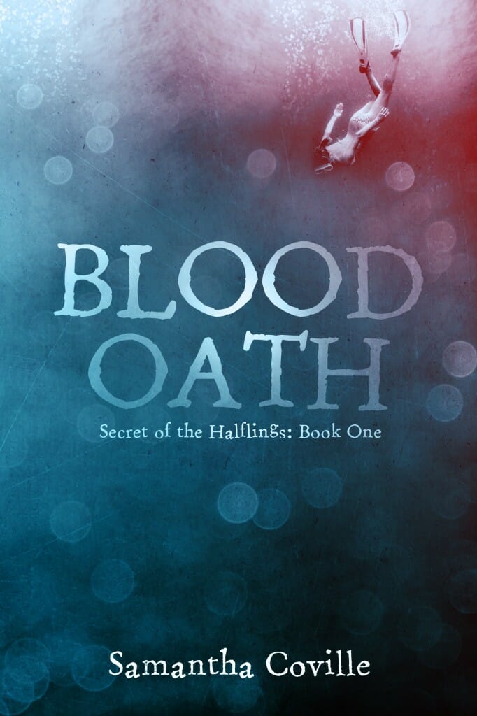
JF: I love it too, not just the colors but the title treatment and the hint of story from the diver in the corner.
Scot Bayless submitted Deceiver’s Bond designed by Scot Bayless. “This is the second in a series so there were some style and font constraints to respect, but a really fun project overall.”

Shannon Brown submitted The Feather Chase designed by Jeanine Henderson. “When I searched online for cover illustrators for my middle grade mystery, I wanted something that would be both suspenseful and fun. Jeanine Henderson’s work fit but her cost was higher than I wanted to pay. After trying a photo shoot and an artist friend, I came back to her and am very happy.”

JF: Good decision. Excellent concept and beautiful execution. The whole background is interesting and has some great texture while the feathers and strong title treatment contrast perfectly. ★
Sharon Kay submitted Wicked Flames designed by Amanda Simpson at Pixel Mischief. “My main character is a demon spy who earned his tattoo working undercover with a band of dark elves.”

JF: You can appreciate the raw appeal, but those flames look awfully got against all that skin.
Shawn McGuire submitted Sticks and Stones designed by Karri Klawiter.

JF: Although the girl is a bit generic, the floral illustration and title with type flourishes is appealing.
Shelley Adina submitted A Lady of Spirit designed by Kalen O’Donnell / Claudia McKinney. “An April 2014 release, book 6 in the Magnificent Devices steampunk series. Image based on stock photography from Shutterstock, magic applied by Claudia McKinney at PhatPuppyArt, layout and design by Kalen O’Donnell.”

JF: A strong cover, and you have to admire an author who can get to book 6 in a series. Notice the way the type frames and focuses attention on the face. The only distractions are the secondary highlight on the hands and the manipulated title type.
Shewanda Pugh submitted Love Edy designed by Claudia McKinny. “Cover designed by Claudia McKinney of Phatpuppy Art Studios.”

Simone Pond submitted The New Agenda designed by Damon Za. “The New Agenda is the 2nd book cover I’ve hired Damon Za to design. He’s a talented designer with a wide array of cover designs across many genres. He’s wonderful to work with and has a great team. I’ll keep him on for the remainder of my book series.”

JF: Atmospheric and intriguing. The large circle and city view also appear on the first book in the series: smart visual branding. ★
Stacy Claflin submitted Hidden Intentions designed by Gayle Ramage.

Stephanie Cain submitted Stormshadow designed by Art by Phuoc Quan, design by Stephanie Cain.

JF: The detailed art is great, but the title has been pushed into insignificance.
Steve Riker submitted With Empty Hands designed by Steve Riker. “We’re a husband and wife team. She writes, he designs. Would love your feedback, positive or otherwise.”

JF: Try to avoid having one image look like it’s been pasted right on top of another one that doesn’t quite match, and eliminate gratuitous texture elements like the one behind the title.
Susan Griscom submitted Beautifully Wounded designed by Susan Griscom. “The background on the cover had to pieced together in order to convert the picture it to a portrait rather than a landscape, which is what it was. The rose was added so that the picture could depict a scene taken from the book.”

JF: A visually confusing cover, and the type isn’t helping despite the “glows” used to try to make it more legible.
Tamara Leigh submitted Lady Of Eve designed by Ravven Kitsune. “The cover for my medieval romance (a “clean read” rewrite of my 1994 Bantam Books release, Virgin Bride) was created by the amazingly talented Ravven. As Lady Of Eve is the sequel to Lady At Arms, I wanted the look Ravven developed for the first book to carry over into the second. Does it ever!”

JF: Contrast this cover with With Empty Hands and Beautifully Wounded immediately above. Pretty much the same elements, but here the designer is in complete control, and every detail helps to propel us into the story; the woman’s gaze, her tentative hands, and the castle, where all our attention is directed. Distinctive typography completes the picture. ★
Thomas Drinkard submitted Devil’s Blade designed by Terre Britton. “The crazed, serial killer antagonist in the book uses a flaying knife to kill his victims. The blade is deadly sharp and hooked at one end.”

JF: Looks more like Aladdin’s athletic shoe to me, and the cool background tones don’t say “devilish” very well.
Trina Lee submitted September Moon designed by Michael Hart. “The book involves a scene with a werewolf wedding that takes place in September. I feel the artist captured this very well in the cover design.”

Van Wolverton submitted The Hidalgo Trust designed by Van W Wolverton.

JF: Absolutely no idea what’s going on here or how these elements are supposed to relate to each other. And what exactly is the reason for the vignettes?
Vanessa Stevenson submitted A Hopeaholic’s Hallelujah designed by V.L. Stevenson & David Ince. “I wanted something that immediately shouted ‘Chick Lit’ – but I still wanted it to stand out. Even though the cover went through many changes and edits, the idea of rose-tinted glasses remained.”

JF: The casual script has some charm, but that background is verging on psychedelic.
Victoria Goddard submitted Till Human Voices Wake Us designed by Victoria Goddard. “Although I’ve designed a few short story covers, this is my first novel. I was aiming at something that conveyed literary fantasy.”

Virginia Wright submitted Steampunk Alice designed by Virginia Wright. “Light, fun Steampunk adventure, loosely based on another classic Alice in a land of wonder. Wild West and pseudo~Victorian fantasy fun for all who enter these pages.”

JF: Good illustration, not sure the typography is helping much.
Nonfiction Covers
Alexander von Ness submitted Hearts, Minds, and Coffee: A Vietnam Peace Odyssey designed by Alexander von Ness (nessgraphica.com).

JF: These layered images create an atmospheric cover full of promise. The author’s name could have been larger, but overall a terrific cover. ★
Bridget McKenna submitted The Fright Factory – Building Better Horror designed by Bridget McKenna for Zone 1 Design. “Lillian asked me to follow my far gentler Writer’s Spellbook cover with something appropriately chilling. After a few rounds of design prototypes, we decided to emphasize the “fright” aspect with this design.”

JF: Hitting the “Fright” button with gusto. Although it looks like the cover of a novel, genre authors will recognize it right away.
Dane Low submitted The Courage to be Different designed by Dane at Ebook Launch. “Using elements provided by the author I created a cover that is both sad and optimistic. The child’s shimmering eyes communicate hope and the font is friendly and non-threatening. The moody sky and aged texture, give the impression that there is some heart-break in the story.”

JF: Well done. The images combine to give us a real sense of what we’ll find inside.
Dane Low submitted Who Says Grime Doesn’t Pay designed by Dane at Ebook Launch. “The empty rubber gloves shaking hands is humorous and implies there is a partnership in the story. Gloves are used to commit crimes so it works well with the play-on-words in the title. The pink sponge and script font will appeal to a female audience. The colours are bright and eye catching.”

JF: A clever and attractive cover, but one that fails to communicate what the book is about (“two zany housewives who started a cleaning business”).
Donalie Beltran submitted MURDER IS A FAMILY AFFAIR designed by Donalie Beltran. “I wrote this book about my father’s ancestry when I found out they were violent murderers. One thing they have in common is fire. Since the setting of the story is from 1850 to 1905, the western theme was appropriate. Therefore, when I designed the cover, I used the cowboy & fire in the background.”

JF: The elements work well together.
Ed Russell submitted The Family Guy Life: How Not To Pete Griffin Your Kids (A Man’s Guide To Pregnancy) designed by The Great Northern Street Artist. “I asked for a cover that reflected common perceptions of males as parents to be. My brief requested that the cover reflected my book title and demanded the attention of passing internet users.”
")
JF: Ha ha ha ha, ROTFL. (Pete Griffin is a character in an animated TV series.)
Evie Vane submitted The Little Book of Rope Bottoming (Including Suspensions) designed by Evie Vane and Mr. D. “We wanted this to be evocative in a thumbnail, since many people aren’t familiar with the term “rope bottoming.” Hopefully it conveys at a glance that it means “getting tied up for fun”! The photographer and I did it in Photoshop; we Googled “how to do X in Photoshop” every step of the way. :)”
")
JF: It’s got everything working except the “fun” part.
Joel Harris submitted Into the Heart of the Amazon in Search of Truth designed by Joel Harris. “I’m a Graphic Design student working on a new cover for my Memoir. The feather, reminiscent of a quill pen, is from a parrot. The background patterns are from tribes-people of the Amazon –where most of the book’s journal-writing and realizations take place.”

JF: Keep going, maybe hire a professional designer. For a book about travels up the Amazon, with all the tribes and jungle scenery, this cover just doesn’t have any “hook” at all.
John Neffenger submitted Wild & Woolly: A Journal Keeper’s E-book designed by John Neffenger. “Derived from print book and jacket design by Abby Johnston and Tim McCreight. Illustrations by Melissa Sweet. Cover text set in Alegreya by Huerta Tipográfica.”

JF: Neat, and shows the type well.
Joyce Villeneuve submitted Finding Forgiveness in God’s Word designed by Ray Moore. “I had a vision for the cover of the book before I had the content and chapters of the book. I wrote the book and then explained what I had seen in my vision, to my designer. He came back with about seven designs and this was in the middle of the mix. I knew right away that this was the right cover.”

JF: I like the color and the focus the designer has put on the thorns, but I find the typography underwhelming.
Kelly Kittel submitted Breathe designed by Sheila Cowley.

JF: The tree as a holistic entity is a powerful symbol. But would you be surprised to find that the subtitle, which is just about unreadable at this size, describes the book as “A Memoir of Motherhood, Grief, and Family Conflict”?
Leslie Nelson submitted Touching His Robe: Reaching Past the Shame and Anger of Abuse designed by Najla Qamber. “For my cover, I chose a stock photo. Then my designer, Najla Qamber asked me several questions about what i wanted the feel of the book to be, and worked her magic. It turned out better than I had dreamed!”

JF: A luscious cover using focus to draw us to the action in the photo, contrast to help the title’s script type stand out, and positioning to signal readers of this genre that this is a book for them. ★
Mary Jo Stresky submitted Surviving the Ring: Expert Advice for Getting in and Staying in the Tough World of Pro Wrestling designed by Mary Jo Stresky. “Each wrestler in WWE has a gimmick, a “persona” they create for their pro wrestling fans which often falls in the realm of superheroes. I created a cover utilizing the powerful colors of the WWE (red/black), the feel of a superhero, and the gleaming gold exemplifying the belts, trophies, and glitz.”

JF: A well-conceived and executed design that has lots of “pow” for wrestling fans. Strong typography often eliminates the need for effects like that on the title here.
Nikki Abramson submitted I Choose Hope designed by Nikki Abramson.

JF: A charming subject, but the obvious graphical confusion robs it of impact.
Robert Cormican submitted In 1876: Bananas & Custer designed by John Cormican. “1876 was the year in which the first telephone call was made, and Custer was killed & defeated by the old world Native American Indians. And the year when bananas became popular in the USA when they appeared at the Centennial Exhibition. That is why the cover is Custer on the banana-phone (phew)”

JF: Another candidate for title-of-the-month. My problem with this cover is that the (admittedly very funny) illustration has been allowed to bully the title into a tiny little corner, and that’s too bad.
Robert Norton submitted Pine-Wave Energy: A Guide to Conflict Resolution designed by Robert Norton. “Consists of the Pine-Wave Energy logo and associated swirl design. The swirl incorporates a similarity to the ying-yang symbol for balance with the twisted wave effect that blends with the name. The background image consists of the forest of pine trees with the energy wave superimposed.”

JF: Pretty, but the title could use more emphasis.
Russell Phillips submitted The SOTCW World War I Compendium designed by Kit Foster. “This is a collection of articles, that I compiled into an ebook for a society that I’m a member of. We wanted an element of remembrance on the cover, but had to be careful not to over-emphasise it. Naturally, I turned to Kit Foster for help :)”

JF: Good type handling and image manipulation, but I don’t think the black on red/red on black problems have been adequately addressed.
Ryan J Pelton submitted The Gospel Marinated Soul designed by Dan Cogan. “The design was to use a simple photo image of a bible and try and build a vintage look around it with fonts and other background colors and styles.”

JF: It’s a clean, effective cover that works well for its subject and the close association of title and illustration. But if you were looking for a “vintage” look, neither the fonts nor anything else indicate that.
Stephanie Collins submitted With Angel’s Wings designed by Nick Trahan. “Thanks for the opportunity to participate. ~Stephanie”

JF: A lovely and sensitive cover with just the right color palette to complement the illustration and subject matter.
Tasha Hart submitted Puzzled to Purpose designed by Eddie Nichols.

JF: Proof that a photo of a beautiful, engaging woman just isn’t enough to overcome the lack of any information about what’s inside the book, or the weak typography. At least give us a clue.
Wendy Teague submitted AFTER THE WRECK How to Navigate the Medical Circus and Legal Loopholes designed by Cathi Stevenson. “The bright red makes the cover pop! Cathi picked a great picture of me, she loved combining the Top Hat with the word Circus in the Title! Awesome cover! Even my writing coach said it was Fabulous! I had no idea there was so much involved in a cover. I learned so much from Cathi, she’s awesome!”

JF: Well, Wendy (like many submitters here) has in effect written her own critique of her cover. No surprise that she finds it awesome! I think she’s mostly right, but it might have been even more effective if the photo had been zoomed and cropped, eliminating a lot of unnecessary and distracting detail.
Well, that’s it for this month. I hope you found it interesting, and that you’ll share with other people interested in self-publishing.
Use the share buttons below to Tweet it, Share it on Facebook, Plus-1 it on Google+, Link to it!
Our next awards post will be on September 15, 2014. Deadline for submissions will be August 31, 2014. Don’t miss it! Here are all the links you’ll need:
The original announcement post
E-book Cover Design Awards web page
Click here to submit your e-book cover
Follow @JFBookman on Twitter for news about the E-book Cover Design Awards
Subscribe to The Book Designer Blog
Badge design by Derek Murphy
