

Welcome to the e-Book Cover Design Awards. This edition is for submissions during January, 2014.
This month we received:
109 covers in the Fiction category
22 covers in the Nonfiction category
Comments, Award Winners, and Gold Stars
I’ve added comments (JF: ) to many of the entries, but not all. Remember that the aim of these posts is educational, and by submitting you are inviting comments, commendations, and constructive criticism.
Thanks to everyone who participated. I hope you enjoy these as much as I did. Please leave a comment to let me know which are your favorites or, if you disagree, let me know why.
Although there is only winner in each category, other covers that were considered for the award or which stood out in some exemplary way, are indicated with a gold star: ★
Award winners and Gold-Starred covers also win the right to display our badges on their websites, so don’t forget to get your badge to get a little more attention for the work you’ve put into your book.
Also please note that we are now linking winning covers to their sales page on Amazon or Smashwords.
Now, without any further ado, here are the winners of this month’s e-Book Cover Design Awards.
e-Book Cover Design Award Winner for January 2014 in Fiction
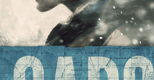
James Egan submitted Cargo designed by James T. Egan of Bookfly Design. “The design incorporates a topographic map of the survival thriller’s setting in the Andes Mountains.”
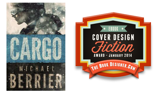
JF: We’re instantly aware of the drama and tension of the story. A very self-assured design that does a superb job of communicating with readers.
e-Book Cover Design Award Winner for January 2014 in Nonfiction
Mary Reilly Mathews submitted The Creativity & Camaraderie Club Handbook: Have More Fun, Live More Wholeheartedly, Encourage Each Other designed by Derek Murphy. “I wanted a cover that would convey a sense of dynamic, playful creative energy combined with the idea of people gathering and celebrating together (Creativity & Camaraderie). It was important to me that the title be readable in thumbnail size, and colorful enough to grab the eye.”
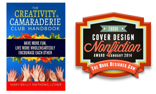
JF: I think the designer got it just right. The cover has fun, vitality, and action. You want to jump in.
Fiction Covers
A.J. Rich submitted EMOTIONAL FIRE designed by A.J. Rich. “The inspiration for the cover came from brainstorming with my photographer daughter. We used shadows and lighting on the models back to portray mystery and the glints of light off the handcuffs to represent light vs. dark. Pearls draped over the models back, handcuffs and shadows ignite curiosity.”

JF: An intriguing image that clearly deserves much better typography.
Addison James submitted The Best Bad Christmas Gift designed by Marion Sipe.

JF: Disastrous type choices create one of the hardest to read titles I’ve ever seen.
Adrienne LaCava submitted No One Can Know designed by Erica Jennings. “JFK’s assassination is just the inciting event in my tale, yet book marketing experts said I must have a recognizable tie-in image on the cover. How ?and stand out during a 50th anniv. with 100s of nonfiction titles? Subtle, suggestive drama. Notice his eyes on the back cover…”

JF: We don’t look at the back covers, sorry. And I’m not sure I would have known who the image referenced if you hadn’t told me.
Aldrea Alien submitted Dark One’s Mistress designed by AM Design Studios.

JF: Nice illustration, but the type isn’t adding much and it’s hard to read across the light background.
Amanda Canham submitted A Life Worth Living designed by Michelle Zaiter.

JF: A savvy designer who understands what readers are looking for, this cover communicates.
Andrew Goodman submitted Tiberius Found designed by proebookcovers. “I required a cover which gave a tone of loneliness and isolation. I also wanted the two ‘I’ characters as DNA strands to show that the story had a genetics theme. I gave the designers a s brief of using bold lettering but that was simple and elegant.”

JF: It’s effective.
Andy Brown submitted The Disavowed Part I designed by Andy Brown. “Using dark green tones, a distressed typewriter font and a menacing character I did my best to convey the nature of this taut spy thriller.”

JF: I love the frontal approach of this cover, it’s controlled palette and rough-hewn type, nicely done.
Anne Flint submitted Fettigrew Hall – The Biography of a House designed by Anne Flint. “The cover was developed from a favorite house, Little Moreton Hall. The painting was done in 1886 by George Theaker (in public domain). Flipping the picture using Adobe Photoshop, coloring it in sepia and adding bushes to hide a bridge in the painting makes it now look like my written description.”

JF: Nice job, but I’d like to see this with a stronger title treatment.
Chris Kennedy submitted Janissaries designed by Genesis Graphic Design. “Janissaries is the lead novel in a new science fiction trilogy. The cover stays faithful to the themes used in previous books (Red Tide and Occupied Seattle) featuring the same characters, while moving the setting to space.”

JF: Not sure what the intricate badge will communicate to browsers, but the cover does have a sci-fi look.
Colin Dodds submitted WINDFALL designed by Adam Lewin.

Dan Collins submitted Cartoons Your Cat Doesn’t Want You To See designed by Dan Collins. “I took one of the cartoons and cleaned up the eye outline and target lines and added some fun type. Simple is the way to go with cartoon ebook covers. Black is always an eye-catching color on a white kindle web page. Marks’ first ebook with Fun-E-Books Publishing. Went to #11 on kindle in 24 hours.”

JF: Great job, it really pops and lets us know we’re in for some serious fun.
Darlene Fredette submitted One Sweet Christmas designed by Danielle Maait.

JF: More genre sweetness from the talented Danielle Maait.
Darren H. Pryce submitted Four Parts of the Universe designed by Oscar Cunningham. “The book design is connected to the plot. Each element on the cover represents either a character or his/her quality. The background is filled with words that are either mentioned inside or have a representation in the story. The idea of using different fonts comes from the characters’ style.”

JF: Difficult to carry off, because you risk incoherence.
Darryl Knickrehm submitted In Dreams designed by Darryl Knickrehm.

Dave Fymbo submitted Plummet designed by Limelight Book Covers. “The perspective of the photo was paired with a vertical title treatment to give the reader an uneasy feeling.”

JF: I think it’s very challenging to make vertical type work well, as this cover shows.
David Wailing submitted Auto designed by David Wailing. “Auto is a technothriller that looks at how social media will evolve by 2022. The cover uses multiple icons to reflect that the ‘auto’ (a personal digital assistant) is capable of handling all your online activities. The progress bar shows how far into the Auto Series each book or story is.”

JF: A clever ebook cover that integrates form and message gracefully.
Deb Dorchak submitted Bonds of Blood & Spirit: Legacies designed by Deb Dorchak—Blue Sun Studio, Inc.. “The fourth and final book in the Bonds of Blood & Spirit saga.”

JF: A cover that exerts a powerful attraction, partly through the artful work on the background images.
Derek Odom submitted Gamble designed by Farah Evers. “Farah designs all my covers and has previously won awards–I can’t get enough of her talent!”

Destiny Ford submitted The Devil Drinks Coffee designed by Ink & Circuit Designs, LLC. “I researched other cover designs in the cozy mystery genre, then worked with my designer to create a design theme we could use for the whole series. The process was fun and my designer was great. The cover really helped make a difference to my sales, and made my title competitive in the genre.”

JF: “Cozy mystery” eh? Then this cover fits perfectly. Clever and nicely executed.
Donna Meredith submitted Wet Work designed by Donna Meredith. “”Wet Work” is the first in an environmental thriller series. Cover art illustrates the dual meaning of the title: a hydrogeology student confronting a corporation selling contaminated water to a bottling plant and the slang term denoting assassination. Title typography picks up bottle colors.”

JF: Although all the elements are present, they are not coming together.
Ebony McKenna submitted The Autumn Palace designed by The Masked Maven. “The designer captured the essence of the book’s magical charm and lashings of comedy with a fairy tale palace teamed with fish in a tornado. Because it’s that kind of book.”

JF: Delightful. Expertly evokes anticipation to get into the story. ★
Elisa Winckler submitted Love, In Writing designed by Danielle Maait.

Elisabeth Rose submitted Mango Kisses designed by Danielle Maait.

JF: I particularly liked how the designer used the angle of the title type to help reinforce the eyepath that leads us right to the couple kissing. Artful.
Elisabeth Staab submitted One Week designed by Babski Creative Studios. “One Week is a corporate, enemies to lovers, contemporary romance.”

JF: And this cover is right on the money, combining an evocative illustration with beautiful typography.
Elise K. Ackers submitted Dear Stranger designed by Danielle Maait.

Ellie Bockert Augsburger submitted Blackness Takes Over designed by Ellie Bockert Augsburger.

JF: I love the concept for this cover, the illustration, the font, the atmospherics, but not how difficult it is to read the title.
Ellie Bockert Augsburger submitted Hallways in the Night designed by Ellie Bockert Augsburger.

JF: I love the beautiful type on this cover, and the thoughtful opposition of images. Designers: please put a border around these white covers so they don’t “bleed” onto the page, thanks.
Ellie Bockert Augsburger submitted Surfing the Seconds designed by Ellie Bockert Augsburger.

Georgia Rose submitted A Single Step designed by Georgia Rose. “Here’s the copyright bit – Cover art creative attribution to Cover Design Studio and Eduardo Mineo. Eduardo provided the photo, I added the words. The cover shows a path disappearing into fog depicting the journey the heroine of my romance suspense book is setting out on.”

JF: Simple, but it works.
Georgie Tyler submitted Doctors Beyond Borders designed by Danielle Maait.

JF: Médecins sans frontières? Interesting strategy
H. L. LeRoy submitted The Fountain of the Earth designed by Ravven. “The previous cover designer I had, essentially became captive to a small group of authors and no longer created covers for the general public. I contacted Ravven in the U.K. and she designed the cover, spine, and back. There was only one minor change. Painless and cost effective!”

JF: Ravven hits it out of the park with this compelling cover combining a strong illustration and custom title type. I can’t see a way to improve this ebook cover. ★
Ingrid Persaud submitted If I Never Went Home designed by Jane Dixon-Smith.

JF: A clever concept, would like to see the title a bit stronger.
J Matthew submitted Ion’s Echo designed by Ethan Fairweather.

JF: A cool and appropriate sci-fi cover.
James A. Grove submitted I Still Believe in Love designed by James A. Grove.

JF: Uninteresting. Does nothing to sell the book.
James Egan submitted House of Wolves designed by James T. Egan of Bookfly Design. “The cover incorporates elements from The Gospels of Henry the Lion, an ancient manuscript that figures heavily into the plot.”

JF: Both the subtle shading of the background art and the allusive type help us to locate this book in its genre.
James Erith submitted The Power and The Fury designed by Tom Moore. “As this is the first part of the Eden Chronicles series we wanted a ‘motif’ that would run through it, hence the fantastic Tree of Life symbol. For me, Tom’s cover perfectly captures the full drama and tone of the novel.”

JF: It sounds—and looks—exciting, but not sure if your symbol is going to overpower the rest of the cover.
Jane Davis submitted A Funeral for an Owl designed by Andrew Candy and Jane Davis. “My brief to my cover designer is that my books must look like a collectable set. I provide the images and he does the rest. This is the first cover where I provided more than one image and let him play around with the result. (There are 5 images in total on the paperback version.)”

JF: It’s always a challenge to combine images well, and on this cover, despite the obvious care that went into it, these images seem totally disconnected.
Jane O’Reilly submitted The Holiday Survival Guide designed by Danielle Maait.

jennifer gibson submitted Compass designed by Jennifer Gibson. “The overall theme throughout the trilogy is finding a sense of direction as indicated by their titles – Sway, Compass and Destiny. This story is infused with inspiration as well as magical moments to help guide the hearing impaired teenager through her darkest hours and give her hope.”

JF: You’ll need to solve the problem of your type disappearing into the active background.
Jenny Harper submitted Face the wind and Fly designed by Caleb Rutherford, Eidetic. “I wanted my book to sit firmly in the contemporary women’s fiction genre, and to have a fresh, enticing feel. My story is about a wind farm engineer running a controversial local project and a gardener who hates wind farms, and I needed to include these elements visually.”

JF: Expertly done, very inviting.
Jessica Walsh submitted Seeking the Storyteller designed by Lor. “We provided a description of the book and characters to our cover artist, Lor, who came back with five designs for us to pick from. This cover was chosen for it’s eye into the action of the book, giving us a view of the heroes and the creatures they’re facing, plus the tone of the book.”

JF: Nice job, love the illustration style, and it does draw you in.
Jill Nojack submitted Magic Unbound designed by Peter Dahl-Collins. “Young adult fantasy novel (fantasy/adventure). The cover is meant to appeal primarily to female young adult / teen readers but without having a romance look. The rest of the books in the series will have the same basic design, with each having a different set of two to three story images.”

JF: Bold and beautiful.
Jim Bray submitted Tearing The Shroud designed by Danielle Maait.

Jo Michaels submitted I, Zombie designed by Jo Michaels. “This cover was chosen from three options by my readers. I love the scabby girl on the front and could picture her as my MC quite easily. Looking forward to hearing your thoughts on this YA Horror cover!”

JF: I agree, the illustration is suitably creepy, like to see you get more confident with typography.
Johnny Eaton submitted Summons: Book One of The Panachrest designed by Johnny Atomic. “Cover designed by Johnny Atomic of League Entertainment. Timeline from initial contact to finished cover appx. one month. Totally satisfied and would recommend cover designer to other author-publishers.”

JF: Great job with a challenging assignment.
Julie Loen submitted Embers at Dawn designed by Julie Loen. “I designed the cover myself. I’m a professional photographer, so it was an easy choice to take that particular job myself. The book is the first in a series. The series’ caption at the bottom is meant to be reused on the upcoming books. It’s a western novel. The face on the cover is the protagonist.”

JF: Very atmospheric cover that I’m sure will have the desired effect.
Julie Musil submitted The Boy Who Loved Fire designed by J. Allen Fielder. “The cover depicts Manny, a modern teen Scrooge, who faces 3 ghosts as he outruns arson charges, falls for his fire victim, & battles for redemption.”

Juliet Madison submitted The January Wish designed by Danielle Maait.

JF: Another solid genre cover from Danielle Maait. The designer lets us see only those carefully selected details she wants us to see, and from a perspective of her choosing. In the hands of someone who knows her readers, it’s incredibly potent.
Justin Swapp submitted Mayan Blood designed by vikncharlie.

JF: Nicely controlled atmosphere.
K. Z. Power submitted L-Theory designed by K. Z. Power.

JF: A tough task for the designer, who has done a good job, but compare to “Inheritance”.
Kate Loveday submitted Inheritance designed by Danielle Maait.

JF: Does it get better? I think not. Deceptively simple and direct, yet there are layers of story and implication. And I love the type choices, too. ★
Kfir Luzzatto submitted MICE designed by Kfir Luzzatto.

Kit Foster submitted No Human Involved designed by Kit Foster.

JF: A great series of covers (see the 2 following also) from Kit Foster that creates a distinctive brand and creates excitement at the same time. ★
Kit Foster submitted No Offense Intended designed by Kit Foster.

Kit Foster submitted Unfinished Business designed by Kit Foster.

Kit Foster submitted Peace at the Last designed by Kit Foster.

Kit Foster submitted The Page Turners: Book 1 designed by Kit Foster.

JF: Yes, I’ve had book projects that turned out just like that! Love this creepy graphic and matching distressed type, a strong hook for browsers.
Kit Foster submitted Who Killed the Candyman? designed by Kit Foster.

Lara Morgan submitted Awakening designed by Danielle Maait.

Laura Lee Scott submitted The Santa Switch designed by Laura Lee Scott & Cheryl Crouthamel. “Laura created a detailed sketch of the cover, and then Cheryl flushed out the sketch and made it look beautiful. Same goes for all of the illustrations within the book, as well as in the sequel currently in the works (“A Trip for Mrs. Claus”), which is slated for publication this coming June.”

JF: A charming effort that needs a stronger title.
Lea Darragh submitted Almost Mine designed by Michelle Zaiter.

Lee Christine submitted In Safe Arms designed by Danielle Maait.

Lena Dowling submitted His Convict Wife designed by Danielle Maait.

JF: Shows how choices in typefaces and colors can have a profound impact on the overall effect of a book cover.
Lexie Couper submitted A Sprite’s Tale designed by Danielle Maait.
![]()
![]()
Lily Aaron submitted Heart of the Nile designed by Lily Aaron. “I wanted this cover to tell people that this was a romance set in ancient Egypt. The hieroglyphic phrase at the top of the book cover is actual Middle Egyptian, and spells out the names of the protagonists. The image is from a 3500 year old tomb painting.”

JF: A clean and simple solution can work well.
Lily White LeFevre submitted A Christmastide Courtship designed by Lily White LeFevre (self-designed). “Total DIY cover: I took the photos and edited them together with GIMP. Font is purchased; I intend to use it across all my covers to help brand. I wanted the cover to say genre (historical romance), time period (Regency), tone (sweet/not explicit), and that care was taken with the book. Thanks!”

JF: I think the type placement is unfortunate, and it’s too difficult to read.
Linda Bonney Olin submitted Transformed: 5 Resurrection Dramas designed by Linda Bonney Olin. “Good covers in Christian drama, like nonfiction covers, feature bold color and simple graphics, which happily suits my personal style. The oversized “t” suggests the cross, which is integral to the book’s theme. For a consistent look, author name is at the bottom in Trajan Pro on all my books.”

Lorna Reid submitted The Septic Circle designed by Mark Reid. “I wanted the cover to reflect the fact that the book is a humourous, satirical diary-style novel, set against a paranormal/spiritual backdrop. My only stipulations were no Ouija boards or pentagrams, as they can intimidate, and that the warmth/character of the diary-style come across.”

JF: Love it. Just enough detail, a warm and comfy palette, and fully appropriate type treatments make for a solid cover.
lorraine treanor submitted The Seduction of Braulio Jules designed by Derek Murphy. “Derek Murphy submitted several ideas, but when we saw this one, we knew he understood our political/medical thriller and had found our Braulio Jules. In this first of a series of 3, our hero, gets drawn in slowly to a treacherous plot. We think Derek captured the danger and Braulio’s vulnerability.”

JF: Derek Murphy delivers a sophisticated cover that’s almost cinematic. Might be on the edge of almost too much going on, but the appeal is unmistakable.
Luis Maldonado submitted Creepy Stories designed by Yocla Designs.

JF: Appears flat and uninteresting, not the intended result I’m sure.
Mallory Rock submitted Stars and Stripes designed by Mallory Rock.

JF: Communicates its offer well despite the title having to compete with the very active background.
Mark McGinn submitted Best Served Cold designed by Derek Murphy. “I gave Derek the idea of a noose over a plate with knife and fork and he knew it was a legal thriller. This was our final iteration.”

JF: Perfectly balanced and adeptly focused.
Martin Turnbull submitted Citizen Hollywood designed by Daniel Yeager. “My third novel set during Hollywood’s golden era plays out against the fight between Orson Welles and William Randolph Hearst over Welles’ movie, “Citizen Kane.” As that movie carried a stark black-and-white cinematographic signature, I wanted the cover to replicate that feel.”

JF: It works, but you couldn’t resist using red on that “Citizen Kane” poster, eh?
Martyn V. Halm submitted Reprobate – A Katla Novel (Amsterdam Assassin Series) designed by Farah Evers Design. “Reprobate is the first book of the Amsterrdam Assassin Series. The other books and short stories use the same cover with text and symbol changes, as well as other color schemes, to provide the reader with a branded series. All covers have the ‘crosshair O’, the push dagger and the silhouette.”
")
JF: Overall it seems to work, but I’d love to see it with a stronger title treatment.
Matthew Pallamary submitted A Short Walk to the Other Side designed by Matthew J. Pallamary.

JF: The principle problem for most authors who design their own covers is a lack of understanding of how to use type as part of their design.
Matthew Turner submitted TICK to the TOCK designed by Matthew Turner (Turndog Millionaire). “This is the Design for my latest Coming-of-Age New Adult Novel, TICK to the TOCK. I love the final product (especially the Paperback), but now it’s over to you…”

JF: I like some of the choices you’ve made, but it seems a bit busy to me and the ornamented slogan in the bottom right is distracting and looks more like something you would see on a nonfiction book.
Melissa Snark submitted Hunger Moon designed by Farah Evers.

JF: A bit too “pasted-together” for me.
Michael Kingswood submitted Out-Dweller (Glimmer Vale Chronicles #2) designed by James F. Beveridge. “The second book in the Glimmer Vale Chronicles. Cover Art commissioned from James Beveridge via Lucky Bat Books. He did a great job on this one. :)”
")
JF: Nice illustration, but a bit murky.
Michael Siemsen submitted A Warm Place to Call Home (a demon’s story) designed by Michael Siemsen. “A wink-wink cover to go with the wink-wink title. An attempt to tell the perspective reader “Yes, this is a book about demonic possession, but not what one would expect.””
")
JF: Strong brand identity and a nice use of silhouettes.
Michael Siemsen submitted The Many Lives of Samuel Beauchamp (a demon’s story) designed by Michael Siemsen. “Following the motif of the first book, A Warm Place to Call Home (a demon’s story), while setting a darker tone and emphasizing the contrasts between the cavalier demon of Book 1, Frederick, and the more pensive entity, Samuel, of this story.”
")
Nicole A. Sheriden submitted A Warlord’s Baby designed by Danielle Maait.

JF: Another great storytelling genre cover.
Nicole Flockton submitted Tango Love designed by Michelle Zaiter.

Nicole Hurley-Moore submitted Dancing On Air designed by Danielle Maait.

Nina Bruhns submitted The Paris Caper designed by Nina Bruhns. “With this cover I tried to convey a sense of the story–a glitzy suspense with a hot romance. It’s one of my personal faves! Thanks for holding this contest every month. Love your comments! Nina”

JF: I’m not sure all the elements are working together, but good luck with the book!
Pamela Kelt submitted Ice Trekker designed by Marion Sipe. “Northern lights-inspired design for younger readers”

JF: Nice cover, would have liked the title to stand out a bit more.
Pamela Kelt submitted The Cloud Pearl designed by Marion Sipe. “It’s Book One of a series, Legends of Liria.”

JF: An illustration that attracts us combined with careful and apt typography.
Pat Fitzpatrick submitted Keep Away From Those Ferraris designed by Andrew Brown. “The book is set in Dublin, Ireland as the country headed for economic collapse during 2008. I wanted a cover to capture the prevailing sense of lust, danger and greed as the bubble burst and the party came to an end. I also wanted it to sit comfortably in the thriller/crime genre.”

R.L. Nolen submitted Deadly Thyme designed by Heidi Dorey. “The book cover was a collaborative effort. I told the designer what the book was about, I gave her several of my favorite suspense novel covers, and she did the rest.”

JF: Hypnotically creepy, well done.
Rachael Johns submitted The Kissing Season designed by Danielle Maait.

Rajnikant Puranik submitted The Malshej Moment designed by Rajnikant Puranik. “The photograph of “Malshej Ghat” on the cover was also taken by me.”

JF: Imagine what one of the talented designers whose covers are shown here could do with the same elements.
Rayven T. Hill submitted Justice for Hire designed by Rayven T. Hill.

JF: Cacophonous, like all the instruments started playing at once, trying to get our attention, which of course produces the opposite effect.
Rebekah Turner submitted Chaos Bound designed by Danielle Maait.

JF: The images have been well combined with the help of an overall circular texture. But this cover shows part of the risk of using stock illustrations. I’ve seen this same drawing of a man on at least 3 or 4 covers submitted to this competition, which is a small sample of all the covers produced in a month. There’s nothing against that, and in the hands of a talented designer a stock illustration can become part of a good ebook cover, but it won’t be unique and you always risk having it show up in your own genre over and over again.
Renee Barratt submitted The Reaping designed by The Cover Counts. “Book 3 in Annie Oldham’s YA trilogy, The Burn. It’s a modern, dystopian, “Little Mermaid”. The design represents both the beauty and safety of the underwater colonies and the danger of the land that has been ravaged by nuclear war. Designed by The Cover Counts”

JF: Would have been stronger without the overdone effects on the title.
Rhian Cahill submitted Secret Santa designed by Danielle Maait.

Robert Arend submitted Twins designed by Robert L. Arend. “The cover design reflects the swirl of the multi-dimensional universe around twin soulmates (created together) when reunited after separation: the power of their perfect love warps Time and Space…..”

JF: Unfortunately, none of that poetry is communicated by this cover design.
Robert Slater submitted All Is Silence designed by Pintado. “This design illustrates an actual scene from the YA Apocalyptic Novel, ALL IS SILENCE from Rocket Tears Press. The novel is set in the near future and the characters pass through Seattle. The design is by Pintado, Roger Despi.”

JF: A well-balanced and attractive ebook cover designed to draw us into the story. ★
Robin Juliet submitted Trouble designed by Tom Beck Designs. “We had a photo shoot at my apartment. Two friends modeled and my graphic designer, Tom Beck, also served as a photographer. We were looking for a sleek design that would work well in black and white.”

JF: And it would be trouble if that shoe moves a couple of inches. I love black and white covers, but not sure the pale blue nor the classic text face used for the title really belong here.
Ros Baxter submitted White Christmas designed by Danielle Maait.

Royce Day submitted Captive of the Red Vixen designed by Meg “Cheeko” Sveryud. “A cover produced for me by my friend, Meg, who got so annoyed by the crap Photoshop cover I originally made that she threw this one together for free. I love the tension/control balance here, Rolas looking like he wants to murder someone, with the title hanging over him to emphasize his oppression.”

JF: What a great piece of art for an ebook cover. The slightly humorous malevolence of that staring face almost dares us to dive right in. ★
Sarah Daltry submitted Bitter Fruits designed by Danielle Maait.

JF: Danielle Maait again makes the art of the genre romance look effortless.
Scarlett Dawn submitted King Cave designed by Danielle Maait.

Shaila Abdullah submitted My Friend Suhana designed by Shaila Abdullah. “My Friend Suhana is a brainchild of my 10 year old daughter Aanyah who is also the coauthor of the book. I am a designer by profession and she is an artist by birth. We first sketched the main characters on a paper and then produced the finished version in Photoshop.”
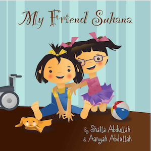
JF: An absolutely delightful illustration that just needs a little more attention paid to the title typography to really shine.
Sunny Cole submitted Riley’s Billionaire designed by Danielle Maait.

T.R Whittier submitted The Buck Pass designed by TheMfish. “The cover for THE BUCK PASS was designed using a combination of vintage photography and contemporary digital techniques.”

JF: A nice idea, but in the execution the title appears to be being crushed by all the “currency” textures and details around it. Might be just a bit too much of a good thing.
Tara Maya submitted The Unfinished Song (Book 1): Initiate designed by Tara Maya.
: Initiate")
Tracy Tomkowiak submitted Vs. designed by Tracy Tomkowiak. “Vs. is my follow-up piece to Big League Balderdash (gold star cover award winner Nov. ’13). Original illustrations are mine. Hope you enjoy it. Thanks.”

JF: I think that’s a pretty tough title to design for, but I love the vintage look of the illustrations and the well-matched typestyles.
Tristan Bowersox submitted Tales of the Incorrigible: Flummox or Bust designed by Tristan Bowersox. “The book is a sci-fi satire following the enigmatic crew of the starship Incorrigible. The design was to evoke adventure in a distinctly ‘paperback’ way.”

JF: Looks like an interesting read, but the cover is almost completely static, not what you want for an adventure.
Viveka Portman submitted The Wicked Confessions of Lady Cecilia Stanton designed by Danielle Maait.

Winifred Burton submitted Girl Out of Water designed by S.A. Hunt. “I wrote a very genre book: urban fantasy, set in Seattle. I didn’t want the cover to be an urban fantasy trope of someone’s front or backside. I asked the designer for genre, but different. I gave him a short paragraph per chapter synopsis, and this is what I got.”

JF: Ticks all the boxes, and I do like that tempting door at the top of the stairs.
Nonfiction Covers
Andrea Morrison submitted Feel Good Factor in 30 Days designed by Vic & Charlie. “We wanted to give the book a female friendly look as that is it’s target market. The cover has a slightly retro feel to remind people of happier times, when they were younger and more carefree. This ties in with the self help ethos of the book which gives tips to make people feel happier.”

JF: It’s well executed, but I wonder if a more prominent title wouldn’t help this cover?
Apostolate of the Divine Heart submitted A Voice Calling God’s People designed by Apostolate of the Divine Heart.

JF: Almost a demonstration for how to not place type if you want it to be visible.
Blake Atwood submitted The Gospel According to Breaking Bad designed by Blake Atwood. “Since I couldn’t use copyrighted material from the show, I chose an image that evokes the show, as well as a simple, subtle design that conveys my particular take on Breaking Bad.”

JF: Maybe it’s me, but I’m drawing a blank, not connecting to either “gospel” or the show or intuiting what your “take” is, actually.
Bridget McKenna submitted The Writer’s Spellbook designed by Bridget McKenna for Zone 1 Design. “For a book that teaches fantasy writers the basics of writing about magic in many different fictional contexts, I chose a “magical book” theme and a fantasy font in two colors taken from the book image, along with a script to echo the curvy shapes in the artwork.”

JF: I think there’s enough character in the title that you don’t have to sacrifice so much legibility in the subtitle. Love the effects tho.
Casey Racas submitted The Night Lite designed by Casey Racas.

JF: Looks like night, might try concentrating on the “spirital” part instead.
Cindy S Martin submitted Sequoia 6. Mysterious Caves Inside The Mountains, Of Giants and Grizzlies designed by Cindy S Martin. “This cover featuring a junior caver named Colin is from our 10 part A/V enhanced eBook series about Sequoia National Park History developed for mid-grade students. The cover tear away effect highlights, and was designed to appeal to young adventurers interested in caves, nature, and natural science.”

JF: And it looks the way these admirable books have looked for many, many years. It would be nice to see the indie publishers of these kinds of books for education adopt some of the design ideas of the fiction authors above to impart more of a modern feel to their books.
DANIELLE NEWNHAM submitted Mad Men of Mobile designed by Jason Heuer.

JF: Extremely quiet.
Ellie Bockert Augsburger submitted Nutritional Leverage designed by Ellie Bockert Augsburger.

JF: A strong, confident cover that helps to make the pitch for the book with its visual and subtitle. ★
Frances Caballo submitted Avoid Social Media Time Suck: A Blueprint for Writers to Create Online Buzz for Their Books and Still Have Time to Write designed by Kit Foster. “I think Kit Foster is a phenomenal cover designer and everyone’s reaction to this particular cover has been especially positive.”

JF: Another solidly-constructed cover from a talented designer.
Jeanette Vieira submitted Diving for Pearls: A Thinking Journey with Hannah Arendt designed by Jeanette Vieira. “Layered underwater imagery and handwritten passages from Arendt’s own writing serve as a visual metaphor for the thought provoking conversations between the author and her subject. The darkness of the sea juxtaposed with light invite the reader to dive in as this philosophical journey unfolds.”

JF: Great concept and interesting layers of imagery. I might have isolated the title so it was not part of the background effect.
Jeff Bach submitted Making a Bent Shaft Laminated Canoe Paddle designed by Jeff Bach. “This being a non-fiction book, I wanted the title and cover image to convey the theme. Hopefully the title works. For the image what better than a paddle blade, tools and wood pieces used to make a paddle. I composed the pieces in my shop, took the photo and decided on Chunk Five and Trajan fonts.”

JF: Great type choices. Like genres in fiction, different categories in nonfiction have their own conventions, and this cover is designed to appeal to other enthusiasts.
Judith Mercado submitted Peace on the Journey: Poems designed by Judith Mercado (author) and CreateSpace collaboration. “In this book of haiku-influenced poems, I wanted to honor the haiku form’s minimalism. I also wanted a peaceful image and a sense of journey to reflect the book’s title. My mockup used an istockphoto image of light moving from the bottom toward the greens and blues. CreateSpace finalized the cover.”

JF: I think I understand what you were trying to do: I don’t think this is it. Peacefulness doesn’t mandate passivity, and this cover is bit passive for me.
Marty Safir submitted Barriers to Love: Embracing a Bisexual Identity designed by Marty Safir. “I depicted various crosscurrents in this design. The optical illusion of the profiles creating a negative shape which itself is barrier-like. Self-confrontation, self-examination as the faces look at each other. There’s beauty. These qualities reflect the author’s journey.”

JF: A cover that gets its message across, especially with the smart type handling. ★
Rajnikant Puranik submitted Foundations of Misery designed by Rajnikant Puranik. “Fully designed by the author himself.”

JF: That’s apparent.
Sherry Rentschler submitted Paper Bones designed by Sean Foley. “Paper Bones refers to our lives that is made up of paper (birth certificates, marriage, death, home buying, drivers license, etc. becoming the life etched in our bones. The book of poems becomes reality in the reader’s hands, to be absorbed and etched on the readers’ bones.”

JF: Not sure how those 2 images are supposed to go together. Looks like a novel cover that made a wrong turn somewhere.
Simon Avery submitted The Backpacking Preparation Guidebook designed by I do book covers.

JF: Another category-specific cover that aims squarely at its readers, although it would not have been difficult to introduce a bit of contrast by coloring the title.
Tony Brasunas submitted Double Happiness designed by Laura Duffy. “For this China memoir, I was looking for something both bold and enticing, and I think Laura nailed it with the Tiananmen Square photo, strong typography, and use of the Chinese “ShuangXi” characters. She added the purple note in the subtitle to connect with the bold hue of the shirt in the photo.”

JF: Captures the youth and spirit of a young man’s travel memoir.
Valentine Brkich submitted Get Yourself An Inflatable Baby Sitter designed by Cassie M. Brkich. “The photo was taken on my front porch and accurately depicts my usual writing environment.”

JF: A very funny concept that could have been tightened quite a bit by focusing more closely on the man in the photo, eliminating some of the unnecessary background “noise” and doing a better job of letting the title stand out enough to communicate its offer.
Yali Friedman submitted Building Biotechnology designed by Yali Friedman.

JF: An author-designed cover that’s perfect for its category. Professional-level photography and type handling inspire confidence in the content. Think about that. ★
Well, that’s it for this month. I hope you found it interesting, and that you’ll share with other people interested in self-publishing.
Use the share buttons below to Tweet it, Share it on Facebook, Plus-1 it on Google+, Link to it!
Our next awards post will be on March 17, 2014. Deadline for submissions will be February 28, 2014. Don’t miss it! Here are all the links you’ll need:
The original announcement post
E-book Cover Design Awards web page
Click here to submit your e-book cover
Follow @JFBookman on Twitter for news about the E-book Cover Design Awards
Subscribe to The Book Designer Blog
Badge design by Derek Murphy
