

Welcome to the e-Book Cover Design Awards. This edition is for submissions during June, 2013.
This month we received:
65 covers in the Fiction category
15 covers in the Nonfiction category
Comments, Award Winners, and Gold Stars
I’ve added comments (JF: ) to many of the entries, but not all. Remember that the aim of these posts is educational, and by submitting you are inviting comments, commendations, and constructive criticism.
Thanks to everyone who participated. I hope you enjoy these as much as I did. Please leave a comment to let me know which are your favorites or, if you disagree, let me know why.
Although there is only winner in each category, other covers that were considered for the award or which stood out in some exemplary way, are indicated with a gold star: ★
Award winners and Gold-Starred covers also win the right to display our badges on their websites, so don’t forget to get your badge to get a little more attention for the work you’ve put into your book.
Also please note that we are now linking winning covers to their sales page on Amazon or Smashwords.
Now, without any further ado, here are the winners of this month’s e-Book Cover Design Awards.
e-Book Cover Design Award Winner for June 2013 in Fiction
Eric Tomlinson submitted Amara’s Daughter designed by Jane Dixon-Smith. “I almost didn’t splash out on the pro-cover, but this is awesome.”
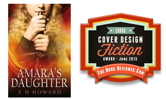
JF: Good decision, this cover is gorgeous, and I love the way the designer combines story elements with mystery, and with a sure-handed control of where we will focus our attention. With the palette of warm colors and textural details in the illustration, this cover really stands out.
e-Book Cover Design Award Winner for June 2013 in Nonfiction
Kit Foster submitted Baneful! designed by Kit Foster.
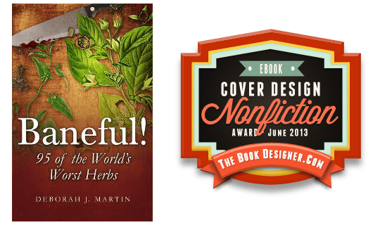
JF: Kit Foster hits it out of the park with this cover. A gorgeous illustration, careful typography, and the smarts to make his point with subtlety and a rich palette. A winner.
Fiction Covers
Andrew Fielding submitted Straylord designed by Andy Fielding. “Straylord (romantic comedy) by Nathan Bamford, “all I knew was that I wanted something flamboyant that helped to sell the style and genre of the book, and I feel that you met the brief perfectly. Nathan Bamford”

JF: Cool colors, and good impact. Nice job. ★
Andy Fielding submitted The Grind designed by Andy Fielding. “A collection of crime/horror short stories featuring: RFID brain chips, B-Movie zombies, dodgy cops, waiting rooms from Hell, intergalactic fast food outlets, voodoo magic, mobsters, bare knuckle fighting, Lots of Surreal Descriptions, time travel, twisted artistes, work, work, and more work…BREAK FREE FROM THE GRIND!”

JF: Surreal and fun, and I think the simple forms and strong colors suit the ebook nicely.
Anthony StClair submitted The Martini of Destiny designed by Bonnie Donaghy. “When working with Bonnie on the cover design for THE MARTINI OF DESTINY, we also thought ahead to future titles for this series, the Rucksack Universe. We strove for a look that could have common elements and style, so a reader could tell at a glance that the stories have something in common and are part of a larger whole. Cover elements such as the “globe olive” are a mainstay of that thinking.”

JF: Love the “olive” but it looks like it could use stronger title type.
April Adams submitted Shattered designed by April Adams.

JF: An interesting concept, but the type lacks impact or contrast and in some places is illegible.
Aria & Richard Sinsanih submitted Hunters of Omens designed by Richard Sinsanih. “This cover is from Book One of a seven book series.”

JF: A beautiful cover with some well-thought out effects, somewhat marred, to my eye, by the unnecessarily complicated and distracting shapes running along the bottom.
Catriona Troth submitted Gift of the Raven designed by Jane Dixon Smith https://www.jdsmith-design.com/. “My brief for the cover was simple, striking cover that used the art of the Haida people to reflect the book’s themes. The raven of the myth steals the sun and brings light to the world. Jane has given us the raven, against a white background, with the sun disc in his mouth. I love the clean choice of typeface for the title too. The cover drew the attention of Writers and Artists Yearbook, who remarked on it on Twitter.”

JF: Beautiful, simple, and effective. Great use of color and negative space, clearly a winning ebook cover that stands out on the page. ★
Christina George submitted The Publicist – Book One designed by Createspace (with my help). “What a fantastic service, Joel — love this!”

JF: I see where you’re going with this, and the details are strong, but that blank book looks… blank, doesn’t it? Good typography, but I wish this cover allowed us to see just a bit more of the story.
Christina Mercer submitted Arrow of the Mist designed by Chelsea Starling.
![]()
![]()
JF: Some nice individual elements, but weak type, some of which is getting lost, doesn’t make up for the lack of contrast of the main figure.
Contact Robot 1 submitted Like Clockwork – A Complete Adventure Serial designed by Paige Stendy. “An adventure for readers aged 190 – 9, featuring: fighting, robots, mystery, dangerous scrapes, perilous escapes, more robots and some sinister business. Originally published as a serial in six weekly instalments, Like Clockwork is now available as one complete volume that combines all six parts. https://www.likeclockworkserial.co.uk”

JF: I like the concept, but the execution not so much. Lots of visual “noise” can keep your message from being heard.
Damon Za submitted Running From Romeo designed by Damonza.

JF: Damon delivers another bit of magic with this cover for a YA romance. Almost by implication we’re drawn into the story and the “want to know more” by the unusual use of the image combined with an evocative title typeset with care. ★
David Bastiani submitted Blood Will Tell designed by Ben Hughes. “Blood Will Tell is the prequel to the Milo Peretti mystery series…”

JF: An effective thriller cover.
Dean Smith-Richard submitted 3024AD: Short Stories Series One designed by Johnny Atomic. “Hope you enjoy it!”

JF: I find the visual very confusing, and that doesn’t help.
Deborah Bradseth submitted Stella in Stilettos designed by Tugboat Design. “The Author, Jan Romes, was in search of a design that included the following elements: a pair of red stilettos, a pair of ladies glasses and possibly a strand of pearls. She told me it was a humorous story where the heroine is klutzy and wears glasses. She was hoping for a sexy, nerdy, yet classy feel to the cover. She instantly loved the design.”

JF: It can be challenging to include lots of plot or character elements and still end up with a cover that makes a strong statement, but this one works well, although Stella in the stilettos, even just a bit of her, might have made this come more alive.
DJ Edwardson submitted The Artificer’s Apprentice designed by DJ Edwardson. “This story is a blend of science fiction and fantasy so I wanted a cover that looked both old and futuristic at the same time. The door is not only from an important scene in the story, but meant to invite the reader in to see what might be found within.”

JF: Very effective, and you can see how limiting the colors creates opportunities for contrast and focus. Typography is a bit heavy-handed for me.
douglas Grant Johnson submitted The Picasso Problem designed by Douglas Grant Johnson. “The frame is a stock image from iStockphoto. The main title was hand-lettered by me to reflect the comedy tone of the book. The hanging wire and clips were added on another Photoshop layer from a photo of wire and clips I set up on my office wall. I thought the wire etc. was essential to the concept even if they didn’t read well as a postage stamp, but I made them slightly overscale compared to the frame, and they do seem to read in a somewhat larger size on the vendor’s catalog pages.”

JF: A good concept whose execution lacks a clear vision or the skills necessary to carry it off.
Ed Morawski submitted WOLINSKI designed by Ed Morawski. “Wolinski is a no holds barred police Lieutenant whose motto is: The end justifies the means. His one mission in life is to get criminals off the streets—at any cost.”

JF: The tough-guy image is compromised by the weak, almost feminine background texture. Title should be much more dominant on this cover, it’s competing with everything else.
Edward J. Schneider submitted The Revealing, (book 2, parallel past) designed by Janet Green and Pam Kennedy, thewordverve.
")
JF: Another cover with some interesting possibilities that never seem to emerge, and the small title is a very weak element. You end up with interesting images and not much else, and nothing to tie them together.
Ellen Dominick submitted Best Friends Forever: A Virgin Lesbian First Time Experience designed by Ellen Dominick. “The cover is for the story of two young girls who are best friends and going off to college. Their regular hang out turns into their first lesbian experience together.”

JF: Winner of most tongue of the month award. I look at this cover and think of all the ways it could have been fun, romantic, sexy, and don’t see any of that here.
Ethan Risso submitted Gambit of the Glass Crowns designed by Ethan Risso. “Cover illustration by Andrew Ryan.”

JF: Compare to Amara’s Daughter. Although this cover is thoughtful and well typeset, it has none of the other cover’s focus or cohesion.
Gordon Kessler submitted Brainstorm designed by Gordon A. Kessler. “I wanted something electrifying–the dome pulsing in the background, the title like a neon light, glowing over the roadway–something you could hear the electricity humming and smell the ozone.”

JF: The epitome of the self-published look. Although the idea is fine, the skills needed to execute it are absent.
Graeme Smith submitted Jack Shadow designed by Michelle Lee. “Title: Jack Shadow, Genre: Dark Comic/ Urban Fantasy, It is, perhaps, a cliche to say something like ‘I may not know art – but I know what I like’. However – I am most definitely not a Cover Artist (I’m the author) – but I know I like this cover. But why? Let’s start with Jack. ‘Jack Shadow’ wasn’t, in the beginning, going to be a book. It was going to be an experiment. I wanted to lay in front of my alpha readers a main character with no redeeming features – and then give the reader a choice about how to see him. A choice intended to change by the end of the book – but not because Jack changed. And so Jack. Because Jack? Jack really isn’t a very nice man. In fact – he’s really not a good guy at all. But like the cover says – sometimes a good guy is the last thing you need. Which takes me to another thing. Tag lines on covers. They’re a bit like Prologues. People seem to love them or hate them. And currently there’s a lot less love around. But I wanted the tag on the cover, to both raise a question, and set Jack in people’s heads. And Michelle was able to do it in a way that, to me at least, fitted the cover’s frame as opposed to seeming out of place. The off-centre, tilted balance of the image, the falling rain, even the smearing, rain soaked title font – that’s Jack. Not what you expect, while being exactly what you think – and nobody’s hero. But sometimes? Sometimes Jack’s just what you need. A bit like, to me at least, Lady Michelle’s cover :-).”

JF: Atmospheric cover somewhat undone by the odd choice of a western-style font, and I suggest you eliminate the period on your tagline.
Gregg Edwards Townsley submitted East Jesus, Nevada designed by Olivia Passeaux. “Loved your seven articles, describing your publishing journey! And new to your website. Here’s the first of three title covers and descriptive comments on my Facebook page. (Fingers crossed!)”

Günter Nebl submitted Das Buch der Zaramé I – Die Prophezeiung designed by Günter Nebl.

Günter Nebl submitted Das Buch der Zaramé II – Das Geheimnis des Elfenmoores designed by Günter Nebl.

Günter Nebl submitted Das Buch der Zaramé III – Krieger und Drachen designed by Günter Nebl. “Hi, this is my third submission of our trilogy “Das Buch der Zaramè” (the book of zaramé). I hope it’s okay that I submitted all three covers, because imho it makes sense. Thank you for your great job, keep on! Kind regards, Günter”

Heidi Loney submitted Ravenous designed by Tugboat Designs.

JF: Simple but effective.
J Washburn submitted ECKSDOT designed by J Washburn. “Can I just say I love your blog? I’m glad there are professionals like you who offer solid content like this. It’s seriously so helpful. Also, here’s the book blurb: ECKSDOT is the adventure of Nate and his “slow friend” Danny as they seek an oracle—an old Japanese “butterfly lady”—in the hopes of somehow stopping their horrible nightmares of ghost robots—nightmares that have been bleeding into their real lives.”

JF: Pretty cool and very electric, although I wish your title wasn’t being washed out by your illustration.
Jacqui Rankin submitted Darkness Forbidden designed by Jacqui M Rankin (author).

JF: If you were going for “eek” I think you hit it. I’m not a big fan of the ultra-compressed title, but overall this cover does a good job of appealing to its genre’s readers.
Jamie McNease submitted The Last Navigator designed by J. G. McNease. “I designed the cover myself with the help of Photoshop and stock photos purchased on BigStockPhoto.com. The cover font is Trajan which rated the highest in all of the research I did on cover fonts. The cover tells a story about the book but it doesn’t tell too much.”

JF: Good show, Jamie, but the elements need to have a more dynamic balance because a lot of the subtlety will be lost at small sizes.
Jamie Sedgwick submitted The Tinkerer’s Daughter designed by Jamie Sedgwick. “Please consider the cover for “The Tinkerer’s Daughter” for your competition. I create my own cover art -I learned to do this the hard way, and I’m particularly proud of this one. I hope you’ll agree.”

JF: Keep learning, this is a long-term project. This cover is well composed, but the font doesn’t seem right for this book, and the way your illustration is cropped leaves way too much blank black background while moving the item of interest—the girl—too far away from us.
Jan Bowles submitted Kaine’s Redemption designed by Jan Bowles.

JF: Pretty clear to see what the appeal is here, right?
Jennette Marie Powell submitted Bad Religion designed by Jennette Marie Powell. “Bad Religion is a crime thriller, in which PI Nick Kepler investigates corruption in a church, only to be pulled into a religious schism that’s closer to Nick’s past than he imagined. The goal was a simple cover that works well at thumbnail size, but has depth and texture at trade paperback size. Thanks for doing this!”

JF: Well done, Jennette, I especially liked the background texture and the way the cross focuses us on the image of the city.
JJ Marsh submitted Tread Softly designed by JD Smith. “Print cover and ecover can be compared here. https://www.beatrice-stubbs.com/tread-softly.html”

JF: Very interesting solution to the 2-format problem, and I recommend interested readers check out the covers for yourself. This one is great for ebooks, gives us both story and atmosphere. Nice! ★
Jon Marable submitted Orphans With Potential designed by Jon Marable. “I just “felt” that this was the cover for me.”

Karleen Tauszik submitted Maximum Magic: The Save Our School Summer designed by Brandon Tauszik. “Fiction for Children ages 9-12. Thanks for your fantastic site! Very informative.”

JF: Well designed, but it looks a bit cool and abstract for your age group.
Katy Pye submitted Elizabeth’s Landing designed by Author and Laurie MacMillan of Sunfield Designs. “In my debut novel, 14 yr.old photographer Elizabeth sparks Texas-sized trouble, fighting power and history to save endangered sea turtles, her family, and find home. A family saga set during the BP oil spill, the story combines multiple issues, primarily man’s relationship to the natural world and our human links to each other. Our challenge in the front cover was to represent only 3 key story components, evoke some mystery, and meet Joel’s challenge to stand out at a distance and survive reduction to an Amazon thumbnail. Thank you for this opportunity and for all you do, Joel.”

JF: Although you’ve checked the boxes, the cover seems to me to be lacking in drama compared to the story you describe. Given all the elements, it would be challenging for a pro designer, but it just looks very quiet.
Kit Foster submitted The Book of the Dun Cow designed by Kit Foster.

JF: Nice job re-imagining this classic book.
Kit Foster submitted The Second Book of the Dun Cow: Lamentations designed by Kit Foster.

KM Zafari submitted The Tangi Bridge (a very short story) designed by KM Zafari. “Since this is a very short story (and a free one at that), I could not afford a professional cover artist. So I designed this one myself. This is a period piece involving suicide jumpers off the (fictional) Tangi Bridge. I wanted it to be very cold and convey the essence of the story. I’ve read all of your contest postings and greatly respect your opinion. Any comments (positive or constructive) would be appreciated. Thanks in advance for your time and consideration. :) Best wishes, KM Zafari”
")
JF: I think you’ve done everything well except for the title which seems overpowered by the image.
Lou Harper submitted Dead Man and the Restless Spirits designed by Lou Harper.

Malia Jacobs submitted Lust designed by Malia Jacobs.

JF: Dramatic but somewhat oversimplified.
Mallory Rock submitted Third Willow designed by Mallory Rock.

JF: A lovely idea and I like the visual, but I wouldn’t use this distressed script for your title because I think it takes away from the overall impression rather than adding to it.
Marek Jacisin submitted Tournament designed by Marek Jacisin. “I designed this cover for the book Tournament.”

Maria Novillo Saravia submitted A cold dark place designed by BEAUTeBOOK. “This book belongs to the Chiller Thriller Series by NYT Bestselling author Gregg Olsen”

JF: All three of these are effective genre covers that will be instantly recognizable by the author’s fans.
Maria Novillo Saravia submitted A wicked snow designed by BEAUTeBOOK. “This book belongs to the Chiller Thriller series by Gregg Olsen”

Maria Novillo Saravia submitted Heart of ice designed by BEAUTeBOOK. “This book belongs to the Chiller Thriller Series by NYT Bestselling author Gregg Olsen”

Mark Matthews submitted On the Lips of Children designed by Keri Knutson.

JF: Interesting and suitably creepy design for this horror novel, heightened by blacking out the face of the female figure.
Nicola Furlong submitted The Will of God designed by Nicola Furlong and Donna Casey. “Hi Joel, Thank you for this opportunity. As a published mystery author and ebook publisher, I love seeing a variety of covers each month and reading your helpful comments. This is the cover for my short story about fate and forgiveness. After surviving a vicious assault, a nun plots revenge but…is this the will of God? Cheers! Nicola Furlong”

JF: I like it, but it doesn’t look like a mystery to me, more like a historical or theological work.
Pam Kennedy submitted Front Porch Lemonade designed by Pam Kennedy.

JF: Charming and lighthearted concept, but watch that background that’s making some of the type hard to read.
Pamela Kelt submitted Dark Interlude designed by Marion Sipe.

JF: Every month we see covers created by compositing images together, but I think this would have been stronger if the woman was brought forward so her face isn’t pockmarked by another image. And the script type is too weak to carry the weight of all the imagery in this cover.
Richard Thomas submitted Staring Into the Abyss designed by George Cotronis. “In this collection of short stories Richard Thomas shows us in dark, layered prose the human condition in all of its beauty and dysfunction. ”

JF: Some interesting elements, but that huge ornament is really competing with the title. And why?
Riley Hill submitted Deep Naked designed by Damon Za. “I love this cover by Damon Za! This hybrid book includes elements of paranormal, sci-fi/fantasy and adventure. I wasn’t sure how the blend of the black ops and chained fiddle-playing girl would work, and yet still capture the tone of YA/NA, but I think he did it. The colors used in the book evoke suspense and mysterious elements, without being cliche fantasy (flashing lights, etc.). The single helicopter complements the other hard element (the chain) and lends credence to the adventure story aspect. Damon included a model who is holding the instrument correctly (which was important to me) and the wind blowing her hair adds to the motion in the picture. The texture of the cover deepens the image. It shows up well in thumbnail and I’ve had numerous rave comments about it. I hope you like it!”

JF: Damon handles the astonishing variety of visual motifs well, but authors really need to re-think whether they absolutely need to have all these different plot or story elements on the cover in the first place, and more often than not, a simpler approach may well yield a more effective cover.
Ronald Herron submitted Zebulon designed by Ronald Herron. “Zebulon is a collection of fantasy short stories.”

JF: The top part looks pasted on, never a good result.
S T Cameron submitted Grimm End designed by Chris Cartagena.

S. A. Huchton submitted Maven (The Endure Series, book 1) designed by Starla Huchton (DesignedByStarla.com). “I’m a freelance cover designer by trade, but it’s not often that I know the books I design for as intimately as my own. In designing MAVEN, I needed to balance both the Science Fiction and the Romance elements of the story in a way that wouldn’t scare off readers of either genre. Since it takes place on an underwater research station, water had to be the key here, but I also needed to speak to the characters as well. I chose the female protagonist for this cover, and the forthcoming books in the series will feature other main characters as the series progresses. The type itself has a subtle feel (slightly reminiscent of slick, high-tech), but it isn’t overwhelmingly harsh and blocky as so many scifi covers tend towards. I’m very pleased with the way it came out and the response has been very positive, so I’m counting it as a success.”
")
JF: Me too! Haunting and memorable, it achieves a balance between foreground and background, and between story and mystery. Well done. ★
Sandra Hutchison submitted The Awful Mess: A Love Story designed by Sandra Hutchison. “Would love to give you an image with a drop shadow, but when I do that on my own site I get a weird border around it. Rather than risk that, here you go with a flat version. (I hope.) I designed this using GIMP with a stock photo. Bare feet are a bit of a cliche, but the heroine ends up at a spot just like this in the last chapter. (I thought about trying for a mess of peony petals, but I couldn’t find an image I liked, and even though I called the book THE AWFUL MESS, I didn’t think it would be smart marketing to make it look like one.) Thanks so much for this service. I used to work in publishing, but I wasn’t a designer. Your critiques have been really helpful. We’ll see if you think they were helpful enough…”

JF: There’s absolutely nothing wrong with the cover, and the type is nicely handled, but it really does lack a hook to bring us into the story. And rocks, no matter how closely associated with a scene in the book, do not spring to mind when you hear the words “a love story.”
Stacy Claflin submitted Deception designed by Bryan Hufalar from bhphotoart.com. “Deception was my debut novel and also the first in a series. It’s a paranormal romance about a young woman who discovers that her entire life is lie. When I told Bryan what it was about, he came up with this cover which captured the essence of the story beautifully.”

Stefon Mears submitted Magician’s Choice designed by Stefon Mears. “I got the Public Domain image of Mars from NASA and filtered it in Photoshop. The gryphon I modified from the original by Momothecat (https://momothecat.deviantart.com/art/Mohr-the-griffin-finished-113004925) and used under Creative Commons Attribution/Modification License 3.0. I like the way it came out. I hope you agree.”

JF: Looks a bit overworked and pasted-together to my eye.
Susie Orman Schnall submitted On Grace designed by Design for Writers. “Hi Joel! I took your Self Publishing Roadmap course and the result is a successfully-published debut novel! I learned so much in the course. I took it all to heart and hired a professional editor, cover designer, book layout designer, website designer, etc. I am so proud of the result and I have gotten great reviews and buzz. I’m continuing to put what I learned in the Roadmap course to use via traditional, online, and social marketing. I hope you like my cover! Thank you for your time and consideration and offering this contest! Susie Orman Schnall, Author of On Grace”

JF: That’s great, Susie, glad to hear it. It has paid off with this attractive and enticing cover. Well done.
Sylvia Ashby submitted Pot Love designed by Sylvia Ashby.

Tatiana Vila submitted Lost at Sea designed by Vila Design. “Water, Sea monsters and mystery. This is what came to mind. I hope you like it :)”

JF: Love it, and the strong colors and clear composition, too. ★
Tatiana Vila submitted Parallel Worlds designed by Vila Design.

JF: This one, not so much. The title is too attenuated, and the riot of colors and images don’t leave us with one main point about the book.
Tracy Banghart submitted By Blood designed by Regina Wamba. “By Blood is a young adult novel.”

JF: Nice, with lovely textures and great color control.
Vardan Partamyan submitted I, the Provocateur designed by Vardan Samvel Partamyan. “This is my second cover that I am submitting to thebookdesigner website. I was honored with the cover of the month award for February for my novel the After/Life and I am anxious to find out what you think of my latest creation! Thank you in advance!”

JF: I like the strong geometry of this cover, but I’m not sure the “I” in the title will read properly to most viewers. A strong entry nonetheless.
Nonfiction Covers
Candace Thompson submitted Still Having Fun, a Portrait of the Military Marriage of Rex and Bettie George, 1941-2007 designed by Mary Catharine Nelson.

JF: You need to reduce the design to this size or smaller so you can see that the type is almost completely unreadable.
Conrad Brown submitted Chasing FRANK LLOYD WRIGHT designed by Patrice Morris. “Portrait by Lyle donCarlos”

JF: The interesting illustration completely overshadows the skimpy typography and color panel.
Cyndy Etler submitted Straightling: A Memoir designed by Sarah Melville. “Love what you’re doing, Friedlander. You’re a pioneer. My designer, meanwhile, is a friggin rockstar. I mean, LOOK at this cover! A long, long time ago, when I saw her initial idea for the cover, I promised her that her cover was gonna win this thing. Fingers crossed…!”

JF: A powerful and affecting cover, which at this size needs more contrast to really shine. ★
Dan Collins submitted How To Draw Cartoon Cars designed by George Trosley. “The sixth ebook produced by my new epublishing company Fun-E-Books Publishing. Cover by George Trosley, book design by Dan Collins, cartoons by George Trosley.”

JF: For this Kindle-only title, this cover looks like a throwback to the print covers of large-format manuals, and a different approach might work better in this more cramped format.
Ed Sherman submitted Nolo’s Essential Guide to California Divorce designed by Ed Sherman. “Thanks for the feedback on this cover.”

JF: Same as above, nothing wrong with this as a large-format print cover, doesn’t work well at all as an ebook cover.
Gary Watts submitted 100 Marketing Trade Secrets for any Business designed by Melanie Mouery. “Cover for a 43 page book: 100 Marketing Trade Secrets for any business. This cover design was created as a result of my input to Melanie: 1) Be unique and project depth and action. It must cut thru the clutter of over 5,000* messages we are bombarded with every day. 2) Melanie was asked to provide a video or film motif as much of my career has been in Radio and TV and I wanted a “snap shot” or “frame” of the title moving forward thru the multicolor, animated background. 3) She “nailed it”. Put this cover with 50 others and you will see this one first”

JF: Well done, although I might have made the title and target larger, there’s plenty of room. ★
Georgi Abbott submitted Fifty Shades of African Grey – Pickles the Parrot Dominates Life designed by Tamber King.

JF: Yup, best title of the month. And I wouldn’t want to cross that parrot, what a fierce look!
Jinjer Stanton Jinjer submitted Yoga for Every Room in Your House designed by Jinjer Stanton. “I took this cover through a number of phase and got feedback from a number of people. I wanted it to be friendly and accessible while being active and illustrating what the book is about.”

JF: I highly recommend hiring a professional designer. Did you notice how the woman seems to be warding off the panel at the top of the book?
Kelly Watts submitted Sailing to Jessica designed by Kelly Watts. “I took this photo while my husband and I were sailing to the Yasawa Islands in Fiji. Having worked for Meredith Corporation (publishers of Better Homes & Gardens and Traditional Home magazine), I had some experience framing cover shots for magazines. But trying to take a compelling photo while bucking up and down on a moving yacht (and feeling a little seasick in the process) was a different story! But it was worth the effort. Thanks for hosting this competition. How fun!”

JF: Book cover design looks deceptively simple, and even a decent photo can’t save this one. Who or what is Jessica? What’s the hook?
Margaret Madigan submitted When Life Gives You Lemons… at Least You Won’t Get Scurvy! designed by Lime Creative/Margaret Madigan. “I designed this cover and had a graphic designer help me assemble it. That is me (the author) on the cover.”

JF: Madge, even your sexy photo can’t save this one, and who thought it was a good idea to make those lemons look like you’ve … dropped them there? I don’t think this is going to do the job for you.
Matt Margolis submitted 150 Reasons Why Barack Obama is The Worst President in History designed by Logotecture.

JF: Clever use of the “O” logo on a simple but effective cover.
Philippa Rees submitted Involution- An Odyssey Reconciling Science to God designed by Ana Grigoriu. “This book is a poetic journey through the history of scientific thought, using the evidence of genius and inspiration to demonstrate science’s recovery of evolutionary memory. The return to Eden through the recovery by science is the reconciliation. The apple of the tree was an obvious image which I hoped would convey the legendary Eden as well as the Newtonian ( both are pertinent) and I felt it would reduce well for thumbnails. The palimsest background is an original I own and it conveys the layers of parchment contributing to the history. Ana Grigoriu of www.Books-Design.com took endless pains with the type and spatial relationships. It seems to get attention wherever it is placed, people pick it up, and bookshops all agreed to stock. It is helped by the ‘french flaps’ with the blurb tucked on the inside and an applecore on the back.”

JF: It’s a beautiful piece of work but all those lovely design touches, binding effects, and textural backgrounds are somewhat lost when reduced to an ebook cover. You might challenge your very talented designer to produce a version more suited to this format. ★
Russell Phillips submitted A Fleet in Being: Austro-Hungarian Warships of WW1 designed by Kit Foster. “This was originally only available as an ebook, but I got requests for a paper version. As part of the process of preparing the paper version, I asked Kit to design a new ebook and paperback cover. It wasn’t part of the brief, and I only thought of it after I saw the finished cover, but I like that the sun is setting on the ship, since the Austro-Hungarian navy ceased to exist after WW1.”

JF: Nice job, Russell, and you’ve found a great collaborator to handle these covers.
Wendy Coblentz submitted It’s Your Fault: My Journey through Back Pain, a Teenager and Self-Discovery designed by Mill City Press. “Mary is the designer of my cover of my book. She works at Mill City Press, a division of Hillcrest Media Group out of MN.”

JF: An excellent nonfiction cover, clear and well laid out. But I wish you would re-think the subtitle, which seems to read, “My journey through … a teenager,” and I’m not sure that’s precisely what you meant. ★
Well, that’s it for this month. I hope you found it interesting, and that you’ll share with other people interested in self-publishing.
Use the share buttons below to Tweet it, Share it on Facebook, Plus-1 it on Google+, Link to it!
Our next awards post will be on August 12, 2013. Deadline for submissions will be July 31, 2013. Don’t miss it! Here are all the links you’ll need:
The original announcement post
E-book Cover Design Awards web page
Click here to submit your e-book cover
Follow @JFBookman on Twitter for news about the E-book Cover Design Awards
Subscribe to The Book Designer Blog
Badge design by Derek Murphy
