

Welcome to the e-Book Cover Design Awards. This edition is for submissions during May, 2013.
This month we received:
96 covers in the Fiction category
21 covers in the Nonfiction category
Comments, Award Winners, and Gold Stars
I’ve added comments (JF: ) to many of the entries, but not all. Remember that the aim of these posts is educational, and by submitting you are inviting comments, commendations, and constructive criticism.
Thanks to everyone who participated. I hope you enjoy these as much as I did. Please leave a comment to let me know which are your favorites or, if you disagree, let me know why.
Although there is only winner in each category, other covers that were considered for the award or which stood out in some exemplary way, are indicated with a gold star: ★
Award winners and Gold-Starred covers also win the right to display our badges on their websites, so don’t forget to get your badge to get a little more attention for the work you’ve put into your book.
Also please note that we are now linking winning covers to their sales page on Amazon or Smashwords.
Now, without any further ado, here are the winners of this month’s e-Book Cover Design Awards.
e-Book Cover Design Award Winner for May 2013 in Fiction
Paula Cappa submitted The Dazzling Darkness designed by Gina Casey. “This ebook The Dazzling Darkness (soft-core horror/ghost story), just released in April 2013. Categories are supernatural mystery, dark fiction, literary darkness. Most of the story takes place in a cemetery, and there are elements of paranormal, a crystal skull, death and the afterlife. Transcendence is a dominant theme, hence the emerging light. Gina Casey is a graphic artist at Polo Ralph Lauren in New York City.”
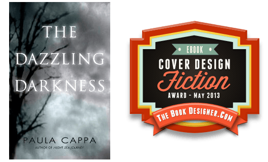
JF: This cover has some of the best title typography of all the covers this month. And somehow the designer has, with just a few elements, used the entire cover to convey both beauty and behind that a haunting and disturbing aura. Economy with impact, just beautiful.
e-Book Cover Design Award Winner for May 2013 in Nonfiction
Damon Za submitted How to Learn a New Language with a Used Brain designed by Damonza.
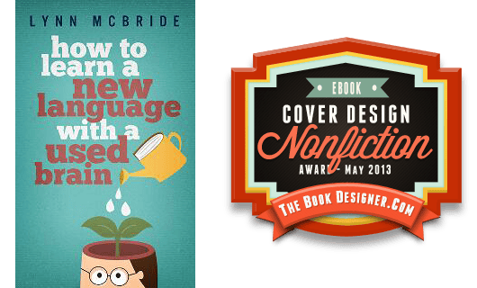
JF: Fantastic. The designer leads us right down the garden path to make his point in a compelling and amusing way.
Fiction Covers
Amanda Martin submitted Dragon Wraiths designed by Amanda Martin. “This is the second cover I have produced for Dragon Wraiths. I loved the original, a picture of a dragon pendant on a book, which fitted the story. However I received feedback that it didn’t necessary sell the genre of YA. Researching Young Adult books it seemed a photograph of a girl was more in line with the genre. After much searching I purchased this shot from istockphoto because, even though it was a significant investment, the image matches my internal picture of the lead character Leah. There is a scene in the novel where she is trapped in a runaway car in the rain and has to escape out the window and this fits perfectly. I montaged the image in Adobe Photoshop with a background of raindrops and then overlaid the lettering.”

JF: You’ve ended up with a striking cover that should appeal to your readers, and I’d love to hear how the change has affected your sales.
Amy Strickland submitted Rescue OR, Royer Goldhawk’s Remarkable Journal designed by Carly Strickland. “Carly Strickland’s design is based off of old Dime Novel covers from the late 1800s. Featuring a bled of line art and photography, this stunning cover was the perfect fit for this Steampunk adventure.”

JF: Fun, but I wonder if the type will still be readable when reduced to half this size.
Andrew Butcher submitted A Death Displaced designed by Andrew Butcher. “Designed by the author.”

JF: Good idea to keep it simple and, in this case, it works.
Andrew Claymore submitted Kill or Cure designed by Andrew Claymore. “Modeled and rendered using the cycles engine in Blender 2.66. This is the second in the ‘Orbital Decay’ series. In the second episode, a zombie infection threatens to knock the species back into the stone age. There’s a cure, but it doesn’t always work as intended, which is why the bullets are sitting there.”

JF: Love the art and composition, but I wish the title was easier to read against the similarly-colored, active background.
Anne Marie Stoddard submitted Murder At Castle Rock designed by Tiffani Hollis. “My debut novel, a music industry mystery entitled, “Murder At Castle Rock,” is set at a fictional concert venue in Atlanta, GA. For this cover, I wanted to capture something grittier than your average “cozy” mystery. “Murder At Castle Rock” isn’t quite a cozy, but it’s not quite hard-boiled either. It’s a rock n’ roll mystery with a woman amateur sleuth–something that I think stands out a bit from your every day mysteries. I wanted the cover to stand out, too. The fictional Castle Rock concert venue is aptly named for its castle-like appearance: tall and gothic with grey ashlar walls. There is a glowing electric sign on the wall that reads “Castle Rock,” so I wanted the “glow” of the sign captured in the hair of the girl on the cover. To represent this, Tiffani gave the woman’s hair pink highlights, and you can see the grey castle walls in her image. The skull and cross guitars gives it the perfect bit of edge and lets you know that the “rock” in the title stands for “rock n’ roll.” I plan to use that symbol in the branding for the other books I will write in this series. The Bleeding Cowboy font enhances that edgy rock feel in the title, and the san-serif font for the “An Amelia Grace Mystery” and author name text does not take away from that, in my opinion. I think Tiffani did an excellent job of designing the perfect eye-catching cover for my novel, but I would love to hear your thoughts!”

JF: My thought is that although a lot of effort went into this cover, it doesn’t work for me. I’m put off by the varying textures or images behind the black silhouette, the woman looks like she’s pouting, and the whole thing has a bit of a gloomy air. Sorry.
August Wainwright submitted A Study in Sin designed by Trevor Houlton. “My designer and I worked together to create this cover for the release of ‘A Study In Sin’. It’s the first in a series of Sherlock-esque mysteries set in modern Washington DC. Each cover will feature a semi-famous person with obscured features. This is Whitey Bulger, the infamous Irish mobster. Would love some feedback.”

JF: Nice use of negative space and careful control of the composition work well here, very neat.
B.R. Stranges submitted Zombie Gang: Regenerated Earth designed by Deviant Designs. “Everyone died in the aftermath of the devastating Devil Virus that ravaged the entire population of Earth. There were no survivors. Five days later, however, the freshly dead returned to life.”

JF: Appropriately yucky tone but I wish the lettering was easier to make out.
Barbara Appleby submitted The Sock Monster designed by Barbara Appleby. “This is a picture book about a boy who can only find one sock of each color in his sock draw. It’s also about being different and being accepted for who you are.”

JF: Cute but a little confusing.
Becky Young submitted Watching The Wilsons designed by Zoe York. “This was Zoe’s second draft of a cover for me, and I’m really pleased with it.”

JF: Hard to see any connection between the upper and lower parts of this cover although it makes a nice background for the script type.
Ben Woodard submitted A Stairway To Danger designed by Trifecta Lexington, KY. “Just recently found out about this competition. Thanks for doing it.”

JF: Simple but effective. Notice that in a glance we get an idea of the kind of story this is, the period, and something about the location, too.
Brooke Johnson submitted Le Theatre Mecanique designed by Brooke Johnson. “As a companion novella to my first novel The Clockwork Giant, I wanted to create the sense that the books were similar in that they took place in the same location, but that the novella was different from the other books in the series… so I chose a different font for the title. I like how it turned out. In paperback form, the books look great next to each other.”

JF: Almost against my will I really like this cover, and the way you’ve combined the historically allusive typography with a period illustration. Very nice.
Charles Ray submitted Buffalo Soldier: Renegade designed by Charles Ray. “The crude painting of a warrior against a yellowish background to suggest the New Mexico Territory, which is the setting for the story, although partially obscured behind the ghost title box, is meant to also portray the uncertainty of the main character’s mission.”

JF: A good lesson for anyone trying to do their own designs: don’t cover up what should be your main focus or image or point of interest, as was done here with the title-in-a-box. It doesn’t work.
Christina Berry Tarabochia submitted On the Threshold designed by Miller Media Solutions. “We needed a design that would work for both e-book and print, that captured the genre of women’s fiction, Christian market. The book is about a mother and daughter who lose everything, and the cop who figures out why. The blue captured the depression and loss, but also offered that on the other side of moving on with life there is hope.”

JF: This one’s better for print, since most of the type will disappear when reduced. Love that door, though.
Christopher Geoffrey McPherson submitted Murder at Eastern Columbia designed by Matt Hinrichs. “”Murder at Eastern Columbia” is something of a detective novel set in 1930s downtown Los Angeles. I asked the artist, Matt Hinrichs, to create a design that evokes the covers of pulp magazines of the period (like “Black Mask”) but with a modern twist. I think he did a bang-up job with the font choice, the color palette, even the overlay showing slight distressing.”

Christy Bower submitted The Legend of Dragon Hollow designed by Christy Bower. “Book published May 25, 2013 on CreateSpace. Background image copyright by iStockphoto.com / -ASI-.”

JF: Simple but effective. Notice how here the chief visual interest is highlighted by the moon behind the dragon’s head.
Connor Black submitted Exposure – A Jackson Chase Novella designed by Chris Peterson Design. “Jackson Chase served with the New Zealand SAS for many years, but a mission in Afghanistan leads him into a world of intrigue and betrayal that will put all of his skills to the test. Bold typography, bright colors, and a clear silhouette were used to make the cover stand out on the Amazon “shelves”.”

JF: Outstanding. All the elements of a great ebook cover are here including simplified visuals, a sense of menace from the unusual angle looking up at the helicopter, strong typography, and a carefully controlled palette. ★
Dallas Dorsett submitted Henry & Dad designed by Dallas Dorsett. “Henry & Dad, a gritty, father-son action/thriller pits Henry Purvis, a young highway construction worker, and Dad, his estranged, alcoholic father, against the Vegas mob – and each other – as they try to make things right. “It is a great quick read with heart and heavy equipment…””

JF: Another lesson for new designers: the title type on this cover is not helped by the “emboss” effect, it’s just a distraction, and if you compare it to the cover just above, you’ll see similar type in a strong design that doesn’t need any special effects to make its point.
Damon Za submitted A Simple Soul designed by Damonza.

JF: Another winner from a designer who knows exactly what he wants to achieve. Great atmosphere, and an image that draws you in. ★
Damon Za submitted My Honor Flight designed by Damonza.

JF: The designer’s familiarity with fiction covers shows in this evocative design for a collection of stories. ★
Damon Za submitted Immune designed by Damonza.

JF: Consistent branding and effective design make these covers (here and below) stand out.
Damon Za submitted Priceless designed by Damonza.

Damon Za submitted Jaz & Miguel designed by Damonza.

JF: It’s not often you see images combined as effectively as they are here. In addition to the sumptuous color and incredible texture of the background, there’s a whole story being subtly told through the images.
Damon Za submitted Left Drowning designed by Damonza. “This is the UK cover for this book – for sale at Amazon.co.uk”

Damon Za submitted Sharpened Edges: The Gathering designed by Damonza.

JF: Amazingly spooky, with typography that’s perfect for this cover.
Damon Za submitted Target Audience designed by Damonza.com.

JF: Clever and effective. You can’t look away, can you?
Damon Za submitted The Shadow Thief designed by Damonza.

JF: Fantastic drama in what is essentially a two-color cover.
David Bergsland submitted Daniel’s Mighty Men designed by David Bergsland. “This is a radical redo of the description and keywords, plus a redesigned cover. The earlier attempt was not appealing to anyone, then I realized that for my genre, political/military thriller, a shot of the capital building and/or a presidential seal was essential. Plus I really wanted some impact for the small thumbnails seen online.The reaction has been much more positive.”

Denise McGee submitted One Small Touch designed by Keri Knutson.

JF: This cover is well done, but I just don’t see what all that tortured type adds to the party. It would be more lovely without it?
DJ Edwardson submitted Into the Vast designed by DJ Edwardson. “Done with Blender & Photoshop. I used the desert scene as the backdrop for the book trailer as well.”

Dorey Whittaker submitted Wall of Silence designed by Dorey Whittaker with assistance by WestBow Press. “I self-published this novel this year. I found the artwork and wrote the marketing blurb. WestBow Press did the coloring. I am getting great responses to this cover.”

JF: Doesn’t work for me, from the anemic palette to the awkward typography and all the blurbs you can’t read.
Ed Gibney submitted Draining the Swamp designed by Ed Gibney (self-designed). “I’m tinkering with my first novel, trying to get the cover better before I start marketing it more. The original cover is at amazon here: https://is.gd/DkfkBo. That’s definitely not good. Thanks for the great website and all your help! I don’t know how indie book writers would live without you!”

JF: Well, Ed, somehow they would get along, although with a bit less snark once a month. I applaud the DIY spirit, which obviously meshes quite well with self-publishing. On the other hand, when I see a cover like this, I just wonder what one of the wonderful cover designers whose work you see here every month, would be able to do with it.
Eliza Wyatt submitted Painted designed by Eliza Wyatt. “This is the cover I painted for my debut book, the first of a series of fantasy novellas (with a target audience of 18-35, leaning female).”

JF: The painting is fantastic, the rest of it quite a bit less so.
Erica Olson submitted The Kings of Cantium designed by Erica Olson. “I tried hiring a cheap designer for this book (a fantasy set in the Iron Age), but I was unhappy with the result. So I spent many hours looking at e-book covers and learning how to use Photoshop, then designed it myself.”

JF: Great job, Erica. Two ways you could make this a lot better very easily are first, to “zoom in” on the face of the woman so she fills much more of the frame, after all that’s your chief visual connection with the readers, not all the lovely texture. And second, make the title stand out more by enlarging the type or making it much lighter to contrast with the dark background. Good luck.
Gina Hooten Popp submitted The Storm After designed by Henry Popp & Gina Hooten Popp. “THE STORM AFTER is a historical fiction tale set in the aftermath of the Great Galveston Hurricane of 1900.”

JF: Love that photo, nice.
Grace Bridges submitted Prophetess designed by DeAnna Newsome. “Supernatural thriller from Splashdown Darkwater.”

Grace Bridges submitted Winter designed by Holly Heisey. “Supernatural thriller from Splashdown Darkwater.”

JF: Of the two, I much prefer this one. Nice atmosphere and a custom “look” to the title type.
Hans Hergot submitted Firstborn designed by Hans Hergot. “For a collection of science fiction and fantasy stories. The title story “Firstborn” is the most prominent in the collection. Thanks for any feedback (no feedback being a sort of feedback too =)”

JF: Works for sci fi. It’s out of balance, but I’m at a loss as to how to improve it.
Indigo River Publishing submitted Freefall designed by Randy Hamilton (. “We try and use a rule of three with our covers. It began with our printed books/covers but holds true in the digital environment as well. 1. Across the room – Something distinct needs to hold attention from across the room or in a small thumbnail (profile, image, or title), 2. Arms length – More information should be gleaned at arms length or in a larger cover image to keep the interest and pique the curiosity of the reader, and 3. Close inspection – very few readers will inspect our covers closely, but for those that do look carefully at the print or digital versions, there will always be some subtle detail or easter egg that relates to the book, but isn’t necessarily essential to the average observer. In Freefall the hidden meaning is for those who are reading the book a second time – the pearl necklace.”

JF: I assume it’s a thriller of some kind, but the woman (with the pearls) could also be from a historical novel. In general I’m not a big fan of titles that read sideways unless there’s an intrinsic design need of some kind.
J Bean Palmer submitted ElsBeth and the Halloween Haunt designed by Melanie Therrien.

Jennifer Howell submitted Possess designed by J.A. Howell. “First book in my paranormal thriller romance series.”

Jennifer Howell submitted The Untimely Death of Brody Walsh designed by J.A. Howell. “The second book in my paranormal thriller romance series.”

JF: Nice job on these series covers for a genre where they will fit right in.
Jo Sparkes submitted The Birr Elixir designed by Ronnell D. Porter. “Ronnell did this design — and I wanted him to know how very blown away I am by his work. His site is: https://ronnelldporter.wix.com/design. Thanks! – Jo”

JF: A gorgeous painting and some lovely background texture make this cover really stand out.
Joe Anderson submitted Face the Music designed by Julie Arden Rosen. “Julie Arden Rosen came up with this wonderful design that expressed both the “crash & burn” nature of the first part of the protagonist’s journey with the blistering ability that leads to his ultimate redemption in Joe Anderson’s debut novel, FACE THE MUSIC.”

JF: An arresting image, but the title needs a lot more oomph.
John Bobo submitted Three Degrees From Justice designed by Hubert Longfield. “The front pages of the book give credit to Hubert Longfield. Yes, the fake name me and my friends used in high school and college. They had all helped me so much with advice and comments about this book cover. That listing Hubert Longfield as the desginer was my tip-of-the hat to all of them and my inability to perosnally take credit for it.”

JF: Well John, or Hubert, or whatever name you’re using today, keep all those friends on speed dial, because you’ve produced a winner. Although I’d like to see the title larger, and I don’t think that would be difficult to do considering how much background you have, this really works well.
John D. Sebastian submitted Goodbye, Gwen designed by me.

JF: No hook. I’m betting the book is a lot more interesting than this cover leads us to believe. Doesn’t anything dramatic happen?
Julia Underwood submitted War’s Last Dance designed by Unknown. “My novel was published by Endeavour Press for Kindle. They selected the design for the cover. I believe it is an excellent representation of the tone and content of the book.”

JF: Very difficult to combine images (see my comments above) and here it doesn’t work very well, with palettes in collision and type that’s at war with the background.
Junior Lopez submitted Floor Four designed by A. Lopez, Jr.. “Book Cover for Horror Novella, “Floor Four””

K.D. Lovgren submitted Photographic: A Novel designed by Jeroen ten Berge. “Paparazzi. Sex scandal. Betrayal. When Jane married actor Ian Reilly, he wasn’t a movie star, just a method actor with a dream. Now Jane and Ian are living parallel lives; she on their farm in Iowa, he on the island of Crete, filming a blockbuster version of The Odyssey. While life on the farm is peaceful, it’s also isolated. On a brisk April morning, as Jane walks back down the long drive from seeing their daughter off to school, she’s about to discover peace can be broken and isolation has a price.”

JF: Another outstanding ebook cover from a previous award winner here. I love the colors and the irresistible pull of the shattered lens. ★
Karen Bryson submitted Malled: A Tale of Revenge designed by Tony Bryson. “This is a Neo-Gothic horror novel for mature young adults.”

Karen Duvall submitted Saving Chase designed by Karen Duvall. “This cover is for a contemporary romance and I designed it for the author, M. Lee Lederhos.”

Karen Prince submitted Switch! designed by Karen Prince. “I have deliberately spelled out ‘Young Adult Fantasy Adventure’ on the cover to differentiate between this book and all the paranormal romances that populate the Young Adult and Fantasy categories on Amazon and Goodreads. Is this a mistake?”

JF: No, I don’t think it’s a mistake, and your cover has quite a bit of charm.
Kathryn Orzech submitted Premonition of Terror designed by Kathryn Orzech. “Premonition of Terror is a paranormal thriller, partly set in Prague, Czech Republic. The Charles Bridge is a recognizable landmark and an important psychic symbol in the story. I found the perfect shot by Frank Chmura that matched what I had envisioned. A radial Photoshop filter makes it more dreamy and coordinates with the look of the book’s trailer. Though a graphic designer, I knew nothing about book cover design, so I searched online and found what I needed. Thanks Joel, most useful advice came from you–about simplicity, color, fonts, resources, etc. I used 123RF.com for the Prague photo. The title font is Franchise from FontSquirrel.com.”

JF: Beautiful job, Kathryn. Franchise works perfectly here, with a bit of the constructivist era about it, and the carefully controlled colors do a lot to create a strong atmosphere. Readers should note that Kathryn, as a graphic artist, submitted this cover with a small drop shadow built into the image, and you can see that it makes her cover stand out. ★
Katie Stewart submitted Song of the Jikhoshi designed by Katie Stewart. “This is the second book in my fantasy series, so I designed it to be in keeping with the first (which I submitted here in Feb. 2012).”

JF: I remember the first, and this one is really, really good, Katie. Nice job.
Keith Baker submitted Heartless (A Richard Rogan Novel) designed by Janiel Escueta. “I gave Janiel a vague idea of what I wanted and I got back more than I could have imagined. This cover captures my novel in a succinct and fantastic way. Janiel is amazing.”
")
JF: Very effective.
Kent Sievers submitted LITTLE MAN designed by Kent Sievers.

Kit Foster submitted Eldorado designed by Kit Foster.

Kit Foster submitted The Scarlet Crane designed by Kit Foster.

JF: Looks like the leaking eye is the meme of the month. If you’re going for creepy, you’ve arrived.
L.C. Chase submitted A Wild Ride designed by L.C. Chase. “For this one the author wanted a sense of movement on the cover, which I hoped to have achieved through the action photo and font.”

JF: It works, and the action photo is a nice touch.
L.C. Chase submitted Giving An Inch designed by L.C. Chase. “This story is light and humorous, so I tried to get a rom-com feel to it.”

JF: It works, and the offer the book makes is crystal clear.
L.C. Chase submitted Networked designed by L.C. Chase. “I had submitted the first book in this series back in November, so thought I’d share the second book, as well.”

L.G. Castillo submitted Lash (Broken Angel #1) designed by Regina Wamba.
")
JF: I particularly liked the elegant typography and the way it emphasizes the relationship between the two figures.
Leonard Johnson submitted BloodLoss designed by Self. “I have blogged several times about the importance of a great eBook cover. We are visual people and when scanning Amazon or B&N on line – the first thing that grabs our attention is the finely tuned graphic of an eBook cover. In my opinion, the number one mistake made by authors – is using graphics that are unreadable as a thumbnail. Amazon will always try to up sale any item – by showing related items (thumbnail) at the bottom of the screen. I’m like a majority of the consumers – if I can’t make out the thumbnail – I pass it by. This is a missed potential sale. I created my eBook cover so that the title, author, and graphics would be recognized at a reduced size.”

Lex Adair submitted Please Don’t Kill Me designed by Lex Adair.

JF: I like the strong type, but this cover needs a border around it.
Liliana Shelbrook submitted Lantern in the Mist designed by Streetlight Graphics. “I’d like to submit this book cover for the ebook cover design awards. Thank you!”

M L Rothschild submitted Clementine’s Shadow designed by P. Rothschild.

JF: Gives no idea of the subject matter, genre, or tone of the book inside.
Mario Arend submitted Alles wird gut… designed by Mario Arend.

JF: I believe the title means “all will be well.”
Mark Chisnell submitted Powder Burn designed by Stewart Williams. “After using 99 Designs for my first three books, I chose to work just with Stewart on this one. I’m really pleased with the result, I think it stands out just enough in the thriller category to let you know that this book is a bit different, without drifting out of the genre altogether.”

JF: A really strong ebook cover with attitude and style. The powerful silhouette has allowed the designer to use a deep shadow on the title, where it might have been distracting. Memorable.
Mary Sutton submitted Storm Clouds: Hero’s Sword Vol. 2 designed by Jenn Domani.

Megan McCooey submitted Harvest Moon designed by Megan McCooey. “I felt like this stock photo was perfect for setting the tone of the book. Lexie spends a lot of time at the river where her sister was murdered. This spot is not only one of mourning, but also where she feels closest to her sister, because they spent so much time there growing up. The reflection of the moon was significant because Lexie’s sister loved astronomy (especially the moon) and because the title is Harvest Moon. The girls age in the photo helps set the tone that this is a YA novel with solemn, dark issues.”

JF: It’s a beautiful image, but the typography isn’t strong enough to carry this cover.
Melissa Bowersock submitted Superstition Gold designed by Brenda Remlinger. “Brenda did a great job on this cover, reflecting the heat of the Arizona sun and the heat of the relationship!”

Monica Enderle Pierce submitted Girl Under Glass designed by Scott Pierce; original photography: ByteStudio Photography. “Girl Under Glass is science fiction with a post-apocalyptic setting and both dystopian and romantic elements. I wanted a design that was clean, elegant, and had a speculative fiction feel without being dark.”

JF: Nice job. It’s clean, elegant, and attractive, although I don’t get much of a sci fi vibe from the design. Others might feel differently, of course.
Morgan Wylie submitted Silent Orchids designed by PhatpuppyArt and The Bookish Brunette. “This is the first in my YA urban fantasy/fantasy series called The Age of Alandria. The cover was a collaboration of PhatpuppyArt creating the art and The Bookish Brunette doing cover layout design and typography.”

JF: Interesting to compare this cover to the one immediately above, since they contain almost exactly the same visual and typographic elements. It’s like one is the bright and the other the dark side of the same concept. This one combines the images in an intriguing way, and the title is beautiful. Well done.
Nathaniel Winter-Hebert submitted Neon Lights designed by Nathaniel Winter-Hebert. “Zig Zag Claybourne’s, “Neon Lights” recounts the woes of a heady writer who gets coerced by his publisher into tackling the street lit genre with the lure of becoming a “name” author. The book-within-a-book follows the urban-excess exploits of the very capable and curvy Neon Temples, and the overall result is an original slice of side-splitting urban satire.”

JF: Okay, wait a minute. This is an ebook-only publication, right? What the heck is that image of a jacketed hardcover doing here?
Patrick Ord submitted The Curtain – A Novel designed by Ranilo Cabo. “The Curtain – A Novel deals with how corporations gather untold amounts of personal information about consumers. The book then explores how these companies can use this personal data to manipulate consumers rather than to benefit them (see henrymaddox.com). Ranilo Cabo’s book cover design (found via a 99designs contest) was able to capture the ominous and helpless feeling that most consumers feel at the approaching storm that is Big Data. In addition to an approaching storm, the clouds in the image also symbolize the internet, which is often referred to as “the cloud.” Henry Maddox’s (the main character) words come through the clouds in the seemingly innocent yet haunting phrase “All I want is your data” (with the data residing in the dark clouds). The partially obscurred Golden Gate Bridge (by the clouds)–a once glowing spectacle–shows how commerce in the tech capital of the world (the Bay area) is being reduced to selling other people’s personal information for big profit rather than innovating useful products or services. Henry Maddox stands atop the Golden Gate Bridge as the singular person with the vantage point to see through the clouds and understand the effects that the abuse of Big Data might have on individuals, families, and culture.”

JF: Despite the amount of symbolism weighing down this cover—usually a bad idea in my experience—this one succeeds brilliantly. Both atmospheric and menacing even though it’s based around a beautiful piece of art, I find this cover very compelling.
Rae Sanders submitted Final Sale, A Bittersweet Hollow Mystery designed by Candace Wilde. “This is a wonderful contest and a great idea. Thank you so much for the opportunity to have you critique the book cover. Sometimes it seems as though I’m drowning in websites as I research self-publishing and it’s always a good feeling to find something this helpful.”

JF: Thanks, Rae. Your cover communicates well, but I’d like to see the title differentiated a bit from the other type.
Renita Bryant submitted Yesterday Mourning designed by Marie Morrison.

JF: Gee, that looks awfully uncomfortable, doesn’t it? Beautiful art, though.
Richard Devin submitted Ripper – A Love Story designed by Kelsey Richardson DRE&MS.

Robert Clack submitted Trebor’s Time Machine designed by Robert Clack. “I designed the stainless steel elevator cover to match the book’s time machine. I used Illustrator for most of the design and then exported it to JPG through Photoshop.”

JF: Graphically interesting, but a little dull.
Robert Nagle submitted Interview with the Sphinx designed by Barbiel Matthews-Saunders. “This cover is for an abstract/comic/philanthropic play about the mythical Sphinx being interviewed in modern times. In the play she’s a pretty (albeit blind) woman in dark glasses being interviewed by a curious male journalist. This cover is intriguing and the gray pencil colors provide a vivid contrast with the red and blue typefont.”

Ronald Joseph Kule submitted Anyman Dreams of Love Everlasting designed by Words and Pictures Press. “This is a cover of my lastest eBook put up on Smashwords. Maggy Graham of Words and Pictures Press.com aided me.”

JF: An interesting concept that—to me—doesn’t quite come off. Perhaps if the human forms were simplified or easier to comprehend this would work better.
Rosalie Marsh submitted ORANGES: A Journey designed by Christal Publishing / Rosalie Marsh. “The cover is a photograph taken in Andalucía Spain. The design was prepared in Adobe InDesign. I obtained feedback from a creative professional.”

JF: Nothing to hook the reader, no information about the book, not very interesting.
Rudy Mazzocchi submitted EQUITY of EVIL designed by Alexander Von Ness. “Entering both Books in this Series, EQUITY of EVIL and EQUITY of FEAR”

Rudy Mazzocchi submitted EQUITY of FEAR designed by Alexander Von Ness. “Entering both Books in this Series, EQUITY of EVIL and EQUITY of FEAR”

JF: I think this one works better because it’s much easier to make out the figure against a white background, and the color of the title works much better than the dark red on black of the first volume.
Sabine Sigl submitted Diva Liebe. Unerwartet eins. designed by Michael Paukner substudio*design.media. “Hallo! I hope you are also interested in German books!!! “Diva Liebe. Unerwartet eins.” (in English: Diva Love. Unexpected One.) is a romatic novel. I would be very happy, if you would consider our cover for your contest! Thank you very much and best regards from Vienna By the way: I am the author. (Sabine Sigl)”

JF: From what I can work out, this is the story of a romance and involves some magical realism. In any event, it is certainly a beautiful ebook cover with unusually strong and confident graphics. ★
Sarah Billington submitted The Kiss Off designed by Billington Media.

JF: A beautiful cover for this YA romance from the multi-talented author. I love the energy and animation in this design, perfect for its age group. And those colors! ★
Shlomo Yermoyahu submitted They’re Playing God With Our Watermelons designed by T. McCracken, mchumor.com. “A book cover from a cartoonist, T. McCracken. A young adult novel. A Mad Scientist who claims she can electronically talk to plants brings conflict to a by-the-book high school science teacher and his more creative teenage son.”

Steve Hutchins submitted Wrestling with Pigs designed by Steve Hutchins. “For this true-life cop story, I had tried some other scenic images of Louisiana bayous or the its signature capital building, but this in-your-face police badge with pics of seized drugs/cash seemed like a much stronger message (and much more identifiable when a tiny thumbnail).”

JF: You can see why this approach really doesn’t work. The elements are disjointed, with no relation to each other, and the photos are so small that we can’t make them out. Combined with the dimly-colored title and I’m afraid it’s back to the drawing board for this one.
Susan Vaughan submitted Never Surrender designed by Judi Fennell at Formatting4U.com. “This is the first book in a romantic suspense trilogy. Judi also designed the Task Force Eagle logo in the lower right corner of each book.”

JF: The type effects aren’t helping these covers, they look overworked.
Susan Vaughan submitted Once Burned designed by Judi Fennell at Formatting4U.com. “Once Burned is the second book in my Task Force Eagle trilogy, after Never Surrender, which I’ve already submitted. Hope you like it.”

Syd Gill submitted The Vacant Chair designed by Syd Gill Designs.

JF: I like everything about this cover except the odd color of the title. But the image composite is excellent, and provides a whole dimension of story while graphically “supporting” the figures.
Tia Bach submitted Chasing Memories designed by Jo Michaels. “In my YA novel, the main character keeps dreaming of a horrific incident and sees these eyes. When I explained what I wanted to the cover designer (who was also my editor — nice combination, because she knew the book), she knew the importance of those eyes.”

JF: If you’re trying to scare us, you’ve succeeded. Deliciously creepy.
Tracy Sweeney submitted Living Backwards designed by Elizabeth Jaeger.

JF: I love the clean look but it really needs a border of some kind to keep it from “bleeding” right onto the page background.
Tyffani Clark Kemp submitted Scorned designed by Stephanie White (Steph White Cover Design. “Scorned is book one of my urban fantasy series.”

JF: Vampire romance with a punch. Makes the offer to the reader in the most direct way possible, and does it well, although for an ebook the title could be quite a bit more prominent.
Virginia Kelly submitted Dancing in the Dark designed by The Killion Group, Inc..

JF: Type is way overdone. Looks like an Entrekin.
Yona Levy Grosman submitted My name is Miriam designed by Yona L-G. “Thank You”

Z.C. Bolger submitted Danny Calloway and the Puzzle House designed by Z.C. Bolger & Alyssa Tallent. “This cover was a lot of fun to put together. I, the author, put the general idea together using stock photography and then worked back and forth with my illustrator (Alyssa Tallent) to get the correct look. The layouts for the paperback and hardcovers are different, the old groundskeeper being on the back cover, but I felt this layout was perfect for the eBook version.”

JF: It works… two thirds of the time. Unfortunately, the moon image seems pretty out of place. The cartoon characters work well with the building, and give the book a unique look. Could use stronger title lettering that integrated better with the pictorial elements.
Nonfiction Covers
Damon Za submitted Rogue Elephants designed by Damonza.

JF: Damonza pulls out a beautifully composed, informative, and memorable cover as easily as an elephant walking a tightrope… ★
David Bergsland submitted Practical Professional Self-Publishing Handbook designed by David Bergsland. “My goal was a sophisticated cover done entirely within InDesign CC using a font from the book which is also of my design, Buddy Regular.”

David Sulc submitted Backbone.Marionette.js: A Gentle Introduction designed by David Sulc.

JF: The illustration is far too detailed for an ebook cover, and the type needs more contrast.
Debes Chino submitted The Conscientious Emblem designed by Fred Martin. “ABOUT THE COVER: Much time investment cover that portrays the subconscious states of man, revealing his identity. Tricky, original ans uniqueness in the fight against PIRACY in the publishing world. The shading on the faces, is filled with the title of the book, which is only visible under magnifier. When a man thinks, he tends to travel through a wide spectrum of great distance, and brings him/her to the understanding of discovering purpose in life. To one of such, reveals THE CONSCIENTIOUS EMBLEM.”

Donna Wolfe Gatti submitted Swedenborg’s Daughter, Memoirs of a Mystic designed by Candi Byrne. “The designer and I looked at hundreds of images before finding the captivating image that grounds the cover. There is a wealth of symbolism in the image that aligns with the content of the book. The designer selected the font for it’s strong yet feminine feel, legibility, and soaring ascenders.”

JF: The image is overpowering the title typography, which may look good at full size but doesn’t reduce all that well.
Indigo River Publishing submitted Powered On: The SOUNDS I choose to hear and the NOISE I don’t designed by Jason Kauffman.

JF: Nice layout, but I’m not sure the relevance of the woman’s photo is very apparent.
JIM GRUNDY submitted FROM HELL TO HEAVEN TO HELL designed by jim grundy designed it!.

K.B. Helm submitted 100 Simple Money Saving Tips For Your Small Business designed by K.B. Helm. “Original photo and cover design by the author.”

JF: Outstanding job for an author-designed cover where the visuals, copy, and layout all serve the theme of the book. ★
Kit Foster submitted Living Leadership designed by Kit Foster.

JF: A beautiful concept that would have profited from adjusting the type for the smaller size of the ebook cover.
Linda Bonney Olin submitted The Sacrifice Support Group: Lenten Drama and Discussion designed by Linda Bonney Olin. “As the subtitle indicates, this book contains a drama script and a discussion guide. The background is a red church door with cross-shaped molding, suggesting the Christian theme of Lent sacrifice and the play’s church setting. The clasped hands extending beyond the background frame refer to the impromptu support group in the play. And I chose the quirky Kristen ITC font to convey the contemporary, humorous tone of the play. A few of the upper case letters in the title collided, so I added a tiny extra space between the problem letters to improve readability.”

JF: Adjusting the space between letters for a better fit is called “kerning” and it has helped you produce a delightful and fitting cover for this title.
Liz Cademy submitted Kitchener Stitch designed by Liz Cademy. “Kitchener Stitch is a short pictorial how-to ebook on one single knitting technique. I wanted the cover to clearly indicate the subject. The photo is of a sock toe, the most common place where kitchener stitch is used. The uncluttered cover not only looks good at thumbnail size, but its simplicity conveys the impression that the technique is simple, too.”

JF: Nicely done, clear and simple communication designed for your target audience.
Michael Haridy submitted Theatre TODAY designed by Gaze On Publishing. “It was hard to select a cover suitable for a paperback book and ebook in the same time. Out of three covers designed for ‘Theatre TODAY’, we ended by this one.”

Michele Orwin submitted In Search of the Fun-Forever Job: Career Strategies that Work designed by Allie Tucker, 143 Creative.

JF: Love this design, but for a “fun” book I’d like to see a color other than the deep red the designer has chosen here.
Miles Markovic submitted The Soul In The Mirror designed by Miles Markovic and Greg Loveder.

Richard Wendt submitted The Thirteen designed by Richard Wendt. “Written by Steve Driver, this is his first Ebook novel. Although I have many years experience as a designer/illustrator, this is my first ebook cover (so go easy on me!)”

JF: I love the drama and exaggerated viewpoint, but a book cover has to do a better job of showing the title.
S. Yates submitted Pilgrim Tips & Packing List Camino de Santiago designed by S.Yates. “Photo and layout by me ;-) Feel free to come back to with any questions you might have and thanks a lot for running this contest! SY”

Sam Neumann submitted Quitting Cold Stone (And Other Struggles) designed by Sam Neumann.
")
Shimrit Nothman submitted Justine, we’re late! designed by Bushra Owais. “My first book and the first book of its kind- teaching young children conflict resolution techniques.”

JF: Charming.
Victoria Noe submitted Friend Grief and AIDS: Thirty Years of Burying Our Friends designed by Rebecca Swift. “This is the second book in my series on grieving the death of a friend. The first one got a gold star here in March. You can see the way the template works: different photo and color for each book in the series. I was initially concerned that it was stereotypical: the color’s red (my idea), the person in the photo is a man. But I think it’s true to the subject matter, and that’s what’s important.”

JF: And this cover is just as strong, great job on this series of guides, I think you’re hitting just the right note. ★
Well, that’s it for this month. I hope you found it interesting, and that you’ll share with other people interested in self-publishing.
Use the share buttons below to Tweet it, Share it on Facebook, Plus-1 it on Google+, Link to it!
Our next awards post will be on July 15, 2013. Deadline for submissions will be June 30, 2013. Don’t miss it! Here are all the links you’ll need:
The original announcement post
E-book Cover Design Awards web page
Click here to submit your e-book cover
Follow @JFBookman on Twitter for news about the E-book Cover Design Awards
Subscribe to The Book Designer Blog
Badge design by Derek Murphy
