

Welcome to this edition of the e-Book Cover Design Awards. This edition is for submissions during November, 2012.
Here’s what we received:
95 covers in the Fiction category
16 covers in the Nonfiction category
Award Winners and Listing
I’ve added comments (JF: ) to many of the entries, but not all. Thanks to everyone who participated. I hope you enjoy these as much as I did. Please leave a comment to let me know what you think, too.
Now, without any further ado, here are the winners of this month’s e-Book Cover Design Award.
e-Book Cover Design Award Winner for November 2012 in Fiction
Laura Rahme submitted The Ming Storytellers designed by Caryn Gillespie. “It is with pleasure that I submit the cover of The Ming Storytellers for your consideration in this competition. The Ming Storytellers was released on Amazon Kindle in July 2012. Its cover is the work of designer, Caryn Gillespie. The artwork is intended to evoke the dark, mysterious and oriental themes of the novel. The female representation is sensual and introspective in a manner that recalls the beautiful and strong female protagonist. There is an emphasis on the ocean which evokes far away journeys -the main male character being the famous Chinese admiral, Zheng He- along with the idea of a spiritual journey. The dark blue color scheme and the burning buildings in the background aim to convey the depth and intense journey that is The Ming Storytellers.”
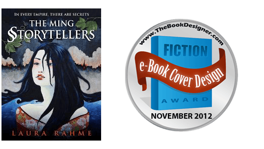 JF: Just love this cover and the evocative illustration. Even though the illustration is complex it maintains our focus, drawing us into the story. And although I would like to “bump up” the author’s name a bit, the dimensionality added by having the woman’s figure arising from a dark sea adds even more drama. Fantastic job.
e-Book Cover Design Award Winner for November 2012 in Nonfiction
Sandra Novacek submitted Border Crossings: Coming of Age in the Czech Resistance designed by Kimberly Glyder.
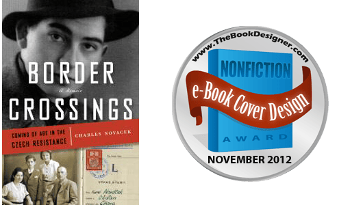 JF: This cover is a terrific example of how to put together historical images to make a cohesive whole. In the hands of a talented designer, all the elements have been carefully employed to tell a story but without taking away from the impact of the design. A real winner.
Fiction Covers
Camille LaGuire submitted 5 Twists designed by Camille LaGuire. “This is a new cover for an old book. I had noticed that my short story covers were looking scattered and incoherent – that that made my overall body of work look scattered and incoherent. I decided to do a template for the shorts. Something which would look rough and frivolous to differentiate the minor works from the novels – but which would be easy to replicate and also still be attractive.”

JF: Another great design from a previous winner here. Strong type choices, simple colors and a bit of whimsy combine into a real winner, and one that’s easy to distinguish from run of the mill covers.
Joe Prentis submitted Abraham’s Bones designed by Joe Prentis.

Tracy R. Atkins submitted Aeternum Ray designed by Tracy R. Atkins. “I wanted a cerebral cover with strong branding for my novel with themes of connected high-technology, space travel, and family bonds. I felt that the digital family-tree graphic was a simple and fitting.”

JF: Lovely graphic that needs stronger typography to really shine.
Malcolm Garcia submitted Al Kibar designed by Malcolm Garcia. “I wanted readers to know where my book was set, so I used the Syrian flag. But I also wanted to pique people’s interest, so I changed the stars on the flag to radioactive symbols.”

JF: Clever idea, but the cover is disjointed, and the teeny margins on the sides of the flag should be avoided.
Sheena Lambert submitted Alberta Clipper designed by www.designforwriters.com.

JF: Lovely and appropriate.
Graham Wilson submitted An Island Between Two Shores designed by Graham Wilson. “I hope you like my cover – I tried to make a design that was readable as a thumbnail sized graphic. Many thanks, Graham”

JF: Brilliant and effective, a great balance between the strong type, the illustration, and the negative space of the cover. Needs a rule around it to prevent bleeding onto the page.
Rene Folsom submitted Apocalypse: An Anthology by Authors and Readers designed by Rene Folsom. “This anthology originally began during a writing contest. The short stories were so good that the editor, Cynthia Shepp, who gave the contest decided to publish the works and promote the new, as well as veteran, authors involved.”

JF: Hey, that’s great. And this cover is well up there on the creepy scale, nicely done.
Laurie London submitted ASSASSIN’S TOUCH designed by Patricia Schmitt (Pickyme). “I asked Trish for a cover that would appeal to readers of paranormal romance. Since it’s the first in a series, I also wanted a branded look that I can use in the other covers.”

JF: She really came through for you, it looks great.
Spike Pedersen submitted At First Light designed by Damonza. “I am a big fan of Dasmonza’s work, and I felt he did a great job on my book cover.”

JF: You and me both. Interesting to see the designer getting creative with the title type, but also notice how Damonza always manages to focus our gaze exactly where he wants it. Well done.
Will Overby submitted August designed by Will Overby.

JF: Very strong. Good font and color choices come together to make an atmospheric and attractive cover.
Stuart Taylor submitted Austin designed by Stuart Taylor.

JF: The drawing has promise but it would take a designer to do it justice.
Bonnie Loshbaugh submitted Beauty and the Beast designed by Bonnie Loshbaugh. “Background photo from flickr user Celia Chamizo, under a creative commons license.”

Esther Byrt submitted Beyond Betrayal designed by Esther’s Designs. “This is one of my favourite covers.”

JF: It’s not easy to get all these images to work together without squabbling, and here it works quite well.
Alex Lukeman submitted Black Harvest designed by Neil Jackson. “Cover by Neil Jackson”

Alex Lukeman submitted The Lance designed by Neil Jackson. “Cover by Neil Jackson”

Alex Lukeman submitted The Seventh Pillar designed by Neil Jackson. “Cover by Neil Jackson”

JF: These three covers (above) show how to create a strong series identity. But when I got to the third I really had to wonder why the color of the fonts had reversed, a bit of incongruence.
L.C. Chase submitted Catalyst designed by L.C. Chase.

JF: I like both this cover and Chasing Demons, below. Note how they share exactly the same elements, and deal with them in similar ways. Both end up with very effective and distinctive ebook covers.
Melissa Garcia submitted Chasing Demons designed by Neri Garcia.

Justin Swapp submitted Cigars for Sawyer designed by Justin Swapp.

Jaimie Admans submitted Creepy Christmas designed by Jaimie Admans. “I have tried to go for an eye-catching, festive cover, featuring the good santa (a character in the book) and a creepy looking font… Would love to know what you think!”

JF: Love the layout, but there isn’t anything very creepy to me. I think you need much stronger type, something gothic to contrast with that jolly Santa.
Gabacho Trece (Matt Crane) submitted Dark Rider Of The Apocalyptic Darkness designed by Gabacho Trece. “I am an indie author who makes a living as a graphic designer. I designed this cover to represent the two main characters in my novel. The cover design is intended to create some curiosity and intrigue with the imagery of a cowboy riding an elk while wielding a sand wedge tomahawk.”

JF: Beautiful and distinctive, I like the unity between title type and illustration, although some of the finer points in the drawing may get a bit lost at smaller sizes. And the author’s name is pretty small, don’t you think?
Charles Ray submitted Dead Man’s Cove designed by Charles Ray, photographer, using the CreateSpace Cover Creator.

Tom Lichtenberg submitted Death Ray Butterfly designed by Tom Lichtenberg.

JF: Quite an upgrade from the paperback cover, I love the psychedelic treatment of the lighter that really snares our attention.
Sally Harris submitted Diary of a Penguin-napper designed by Andrew Brown, Design for Writers.

JF: Love it, cute and it really stands out.
Lori Hart Beninger submitted Embracing the Elephant designed by Longfeather Book Designs. “Cover “illustration” is a photo (Tiffany O’Brian) rendered by PhotoShop (by Anda Beninger) to add the sunset and look like a painting for a more 1800’s feel. Colors were adjusted by Longfeather Book Designs.”

JF: Very beautiful and evocative but it might be too self-effacing to do its job?
Angela Yuriko Smith submitted End of Mae designed by Angela Yuriko Smith. “Is that the correct way to submit the cover url? I couldn’t find a
stand alone link for it. Thanks!”

Paul Etherington submitted Forgotten Lancashire and Parts of Cheshire and the Wirral designed by Paul Etherington. “This is a parody local history book, so the cover needed to look sufficiently like a local history book but with enough to merit it needing a second glance.”

JF: It works, and the “99% Fact Free” sticker cues us in smartly.
Daniel Grubb submitted Fusion designed by Bart Dziok. “Bart has been designing covers for us for a number of months now and along with this anthology cover, has designed all Penny Grubb’s crime covers. Bart works in mixed media and usually uses an air brush and pencils for his covers. Bart hails from south east Poland and, as well as these covers, has designed clothing, cafe interiors, painted cars, personalised BMX and skate equipment and is currently working with an international award winning crime writer on a graphic novel project.”

JF: Interesting illustration, needs a major typography upgrade.
Geoff Gore submitted Gabriel’s Trumpet designed by Jill Creighton.

L.C. Chase submitted Gold Digger designed by L.C. Chase.

JF: I like the clean look of this cover and the story it promises.
Lynnette Bonner submitted High Desert Haven designed by Lynnette Bonner.

Natalie Ward submitted I Love You to Death designed by Sarah Hansen at Okay Creations.

JF: A strong design that comes across as a bit cold, and the type could be larger (and watch out for that dark-red-on-black, the type tends to disappear).
Lexi Revellian submitted Ice Diaries designed by Lexi Revellian.

JF: Yes, this cover has a beautiful “finish,” like a finely rubbed piece of furniture. Good storytelling, control of the eye-path and some built in drama make it work.
L.Leander submitted INZARED, Queen of the Elephant Riders designed by Melissa Garlington/Michael Latta. “Thanks!”

JF: Love the concept, but the little images are getting lost.
Alki Nea submitted Kea, The Third Way designed by Alki Nea.

Alma Alexander submitted Letters from the Fire designed by Sarah-Jane Lehoux.

Michael Langlois submitted Liar’s Harvest designed by Vincent Chong. “We had to go back to the drawing board for a second attempt on this one, but it was worth it. Hope you agree! Mike”

JF: Strong image, but there’s an awful lot going on here.
Melda Beaty submitted Lime designed by Lynnette Gallowa.

JF: A haunting image and stylish typography that’s just too hard to read.
Naja Tau submitted Lost Atlantis: Splitting Sand designed by Naja Tau. “This is my first novel! I designed the cover as well. A lot of people aren’t into it, but I mostly like it (except how the name also looks like Raja or Aja at first glance… I couldn’t figure out anything sexier). Besides, when I switched this cover out with a more conventional, straight-forward image, it didn’t sell even a tenth as well. I considered removing my name all together and blowing up the size and design of the tile to dramatic proportions, but I decided I’m just not that edgy. The two “objects” in the design are a deep sea angler fish and a jellyfish. I wanted to give the typography a “tagger” feel since the novel took so much inspiration from psychology text books about the effects of urbanization and poor nurturing in childhood as they compound with everyday adult stressors. Thank you!”

JF: Naja, I admire your effort, but this clearly doesn’t work very well, and any time you need someone to tell you what those shapes are and how they relate to the story, it’s a problem.
Elizabeth Cage submitted Love Bites designed by Klaus Hartleben. “I wanted to keep the food imagery of my first book in the series (Second Helpings) and for the typeface to help “brand” the titles in the series. It was great to work with a professional designer.”

JF: Wow. Okay, focus: yep. Clarity, sure. Economy, mood, yes to all of those. Well suited to the ebook environment, it’s a winner.
Terri J. Haynes submitted Love Simplified designed by Terri J. Haynes.

JF: Compare to the title immediately above. Both books have a 2-word title, and the first word is “Love.” Everything Love Bites has, this cover lacks. There’s no clear focus, message or unifying element, and the eye just wanders around. Even the type is confused. An educational comparison.
Grant Overstake submitted Maggie Vaults Over the Moon designed by CreateSpace. “CreateSpace collaborated with me on this cover, which captures the meme and theme of “Maggie Vaults Over the Moon” in a dramatic and artistically pleasing way. I think the design team deserves credit for going the extra mile in making this cover authentic and true to the story. Thanks for considering it.”

JF: Interesting concept, but using three illustrations that each have a different drawing style is a no-no for me.
Bill H Moore submitted Man With No Name designed by Bill H & Ephraim Moore.

JF: Just. Don’t. Do. It.
Rachel Cole submitted Max Under The Stars designed by Littera Book Designs. “My inspiration for this cover was the old Barnum & Bailey circus posters.”

JF: My mother always told me not to wear stripes with stripes, and this cover shows you why. A strong concept undone by too many graphic elements and colors, it could be simplified and focused, which would transform it into something special.
Jordan Stratford submitted Mechanicals designed by Jordan Stratford. “Illustration by Ally Fell”

JF: Nicely atmospheric, good job.
Loretta Boyer McClellan submitted Misthaven of Maine designed by Loretta McClellan/McClellan Creative. “Cover design includes original watercolor painting, titled, “Misthaven;” series title logo design; as well as customized author name font.”

JF: Gorgeous, Loretta, with attractive branding and great illustrations.
Loretta Boyer McClellan submitted Misthaven of Maine: Journey to Beyond designed by Loretta McClellan/McClellan Creative. “Cover design includes watercolor painting, titled, “Boathouse;” book series title logo design; and customized author font. lorettaboyermcclellan.com mcclellancreative.com”

ER Pierce submitted Mistress of Pain and Illusions designed by ER Pierce. “I love your thoughts.”

George Winston Martin submitted My Brother, My Friend, My Enemy designed by George W. Martin. “This is my first novel, and also first attempt at designing a book cover. I presented several variations to friends with graphic experience before choosing this one. I have always liked the starkness of the photograph.”

JF: One of the big problems with this cover is that it just doesn’t look like a novel. I would mistake it for a history.
Renata F. Barcelos submitted My Sore Hush-a-Bye designed by Ágata Maria C. Barcelos.

Teddi Black submitted Mythos: An Arthurian Miscellany designed by Teddi Black. “The author asked me to design a e-Book cover around a photograph of a sword which was actually a letter opener.”

JF: The competition between the two sword images makes this cover more confusing than it needs to be. It would be more effective if you removed the sword in the cloud-knight’s hand.
Paula Cappa submitted Night Sea Journey, A Tale of the Supernatural designed by Gina Casey and Todd Casey.

K. Baskett submitted No Greater Illusion designed by K. Baskett. “I took the photo and designed the cover myself – this was my first shot at doing anything like this.”

Kit Foster submitted Nowhere Safe designed by Kit Foster.

JF: Love the energy in this attractive cover from Kit Foster.
C. Humphrey submitted Once More With Feeling designed by C. Humphrey.

JF: There seem to be over 20 books with this same title currently for sale. This one is a romance set in San Francisco.
Tom Evans submitted One Hundred Years of Ermintrude designed by Me. “Note that this was specifically designed to work well on greyscale ereaders, it replaces an earlier colour cover from the original imprint which was in print and was landscape oriented.”

JF: Nice illustration, and it will render well on grayscale readers.
A.G. Claymore submitted Orbital Decay designed by Andrew Claymore. “Number four in a series that is being updated using the advice of CL Smith from the Humble Nations site. I re-made that first cover using Blender, and sales went up by a factor of 30! In this one, I’m trying to abstract the idea of an orbital station where bad things are happening – Life support failure (frost) and violence (hint of blood).”

JF: A.G. that’s an amazing endorsement for getting your cover right! This one is right on for its sci-fi genre, I would keep taking that advice from CL Smith.
SJ Kincade submitted Paws of Death designed by SJ Kincade. “A simple design was chosen to give maximum visual impact with only the barest of information (not even the author’s name is displayed).”

JF: One of the most interesting and gripping covers I’ve seen, marred only by the weak treatment of the title. With stronger type, this would be even more amazing than it is.
Mary Sutton submitted Power Play: Hero’s Sword Volume 1 designed by Jennifer Domani.

JJ Marsh submitted Raw Material designed by JD Smith.

Sidney Elston submitted Razing Beijing: A Thriller designed by Juli Watson.

JF: A good thriller cover, might be stronger without the eye sparkle.
Terah Edun submitted Red Madrassa designed by Amalia Chitulescu. “This is the cover for my Young Adult fantasy novel. I was looking for a unique design that conveyed the epic fantasy genre and the spunk of my main character.”

Bev Robitai submitted Rusty & Slasher’s Guide to Crime designed by Bev Robitai.

JF: Interesting choice to use cartoons for the cover of a comic novel, not sure that it works.
Monica Shaughnessy submitted Season of Lies designed by author. “Thriller about hunting season.”

Elizabeth Cage submitted Second Helpings designed by Klaus Hartleben. “I wanted a simple, clean design for this collection of erotic stories. I’ve had very positive feedback from readers about the design and of the 3 erotic collections, this one sells the best, and I’m sure the cover has helped with this.”

JF: See also Love Bites above. This one matches well and may have more tongue than I’ve ever seen on a book cover. Who knew tongue would sell so well?
Matt Harrison submitted Short Stories – 2012 Valley View Spectrum Type II Stories designed by Matt Harrison. “I taught a bunch of elementary students how to create ebooks in a 6 week course at their school. The final product is this ebook that we published on Amazon.”

JF: Wat to go! Turning out students who already know how to publish.
Marius Hancu submitted Simon and Hiroko designed by Marius Hancu. “In Kamakura, the old capital of Japan The Genpei Ponds The Azuma Kagami says that “In April 1182 Minamoto no Yoritomo told monk Senkō and Ōba Kageyoshi to have two ponds dug within the shrine.” According to another version of the story, it was Yoritomo’s wife Masako who, to pray for the prosperity of the Minamoto family, had these ponds dug, and had white lotuses planted in the east one and red ones in the west one, colors which are those of the Taira and Minamoto clans. From this derives their name.”

JF: Love the history, but where are the ponds? This cover suffers the fate of many like it: no reason to pick it up and no “hook.”
Bettye Griffin submitted Something Real designed by Young Creations.

C L Raven submitted Soul Asylum designed by Ryan Ashcroft of Fireclaw Films.

JF: The hand lettering and image suit the book’s horror genre quite well. The idea is to signal readers of this type of book that they should have a look, and you’ve succeeded nicely.
J.M. Ney-Grimm submitted Star-drake designed by J.M. Ney-Grimm. “I wanted to bring the title alive: stars and a dragon along a sense of magic and mystery.”

Kirk D. Relford submitted The Boulder Boys, the Beginning designed by Self. “Prepared items for technician who put into format for publication name was Dave Santillanes.”

JF: An interesting use of Copperplate can’t overcome the visual confusion caused by too many images that cause the cover to be less than the sum of its parts.
Justin Swapp submitted The Codex designed by Justin Swapp.

JF: Graphically strong, I was surprised to find out this book is stories of demon hunters, not the futuristic or sci-fi theme I thought it would be from the cover.
Damian Fanella submitted The D-Word: Divorce Through a Child’s Eyes designed by Damian Fanella. “I’ve provided a different link to the cover, as Amazon has the incorrect image displayed for the book. The version they have has incorrect colors. If you need to verify that it’s actually published here is the Amazon link: https://www.amazon.com/The-D-Word-Divorce-through-ebook/dp/B0094H8IRC”

Mike Smith submitted The Last Praetorian designed by AiTuDou.

JF: Very attractive and lots of atmosphere.
Sandra Gulland submitted The Many Lives & Secret Sorrows of Joséphine B. designed by Kris Waldherr. “Kris’s challenge was to design a template that would work for the four initial novels published, and one that could be used for future publications. In essence: a brand.”

JF: While this cover has a lot of good things going for it, if the subtitle was moved down it would not appear that the woman was staring at it, which I find a bit disconcerting. This is where you want to positively employ negative space.
Bernard M. Cox submitted The Memory of a Salt Shaker: A Short Story designed by Sabine Krauss. “Cover designed by Sabine Krauss by a photo by artist Robyn Oliver. Sabine Krauss’ designed work can be found at https://home.comcast.net/~binchen6/ Robyn Oliver’s artwork can be found at https://www.robynoliver.com/”

JF: Nicely done.
Somerset McCoy submitted The Mirrored Gate designed by Erin Dameron-Hill.

Teddi Black submitted The Mountains of Channadran designed by Teddi Black. “I designed this book cover for author and artist, Susan Dexter, for the re-launch of her backlist trilogy, Wizard’s Destiny, originally published by Ballantine Del Rey. The Mountains of Channadran is the 3rd book in the series. The cover is an original pastel by Susan Dexter. I added the background and fonts. My goal was to achieve an icy and frozen water effect.”

Michael Siemsen submitted The Opal designed by Michael Siemsen. “Designed to follow the hand print theme from previous book in series, while evoking a darker tale in two distinct environments.”

JF: The strong typography really makes this work.
Dave Cornford submitted The Queensberry Rule designed by Dave Cornford and Sonia Powell. “When I found the photo, I thought straight away that is was perfect. My first drafts were OK, but I couldn’t put my finger on what was wrong. I asked a skilled friend for help, and she made 5 small suggestions – these transformed the cover, so she gets plenty of credit for the end result.”

JF: Nicely done. The strong verticality of the design is complemented by the tall thin type, too. Not sure you need the somewhat distracting little red dot at the bottom, but well done overall.
Jim Cliff submitted The Shoulders of Giants designed by Jim Cliff.

JF: Great example of how a designer can take a fairly mundane image and transform it into a compelling cover. Probably a bit overboard on the type effects, but I’m quibbling, because this is really good.
Jessica Fortunato submitted The Sin Collector designed by Jessica Fortunato.

Paul Cain submitted The Studio Game designed by Graeme Clarke.

JF: This clever design works much better on the paperback version.
J.M. Porup submitted The United States of Air designed by Derek Murphy. “Have received many positive comments on this cover…”

JF: And I can see why. Particularly like the touch of the gloved hand. Nice!
Charles Ray submitted Till Death Do Us Part designed by Cover photo collage by Charles Ray, using CreateSpace’s Cover Creator..

Ellis Vidler submitted Time of Death designed by Ellis Vidler. “The suspense novel, set on the Carolina coast, is about a psychic artist who draws scenes violence. I am the designer.”

Karen Myers submitted To Carry the Horn designed by Self. “This is a fantasy novel, set in a fae otherworld. The cover painting is by Ann Mei, but the rest of the design is mine. There are small ink-scroll spacers for Chapter and Scene dividers, as well as other ink-drawings for the title page. I’ll be using Ann Mei’s paintings for every book in the series (this is the first).”

JF: Terrific cover and concept for a series. These surrealistic images from a very talented artist combine well with the distinctive typography. Can’t wait to see more!
Sarah Holroyd submitted Trip of a Lifetime: An Anthology designed by Sarah E. Holroyd. “I designed the cover of this travel-themed anthology around the art deco travel posters of the early 20th century, using one of those posters reflected in the mirror, and a deco-style typeface.”

JF: Quite a nice effect, even the bowler hat adds to the period atmosphere.
Richard Sutton submitted TROLL designed by Richard Sutton. “I was lucky enough to find the perfect stock illustration and photo image I could set up for a rough contrast that implied conflict, but also a pensive mood. I hope it works. The fill in the Impact font used for the title was a photo of lichen on bark, for a rugged style that also had a strong organic nature.”

Sarah Bartsch submitted Unforeseen: Journey Through Rust and Steam designed by Sarah Bartsch.

Monica Shaughnessy submitted Universal Forces designed by author. “YA Romantic Thriller. An astronomer’s daughter and a preacher’s son fall in love with tragic results.”

Nora Gaskin submitted Until Proven: A Mystery in Two Parts designed by Kelly Prelipp Lojk.

SR johannes submitted Untraceable designed by VLC Photo.

JF: The image grabs us, and the distinctive type completes a well-focused and magnetic ebook cover.
Alex Lukeman submitted White Jade designed by Neil Jackson. “Cover by Neil Jackson”

Nonfiction Covers
Angie Haider submitted A Life Out of Context designed by Angie Haider. “I am a first time author who has just released my first book. I used my background in graphic design to design the cover as well as feedback from my facebook friends. Thank you for taking the time to review my entry.”

JF: Angie, this cover would be much better with much stronger title typography.
Everett D. Wilson submitted Bury Me In My Waders designed by Everett D. Wilson. “see my website for more info: https://www.camaradodesigns.com and https://www.donewebster.com”

JF: A good idea and strong image that are being wrestled into submission by an overwrought background texture.
Ben A. Carlsen submitted Confessions of an Overspender designed by gregory j. borowski.

Benjamin Tomes submitted Confessions of the Unmedicated Mind; Growing up with ADHD, before ADHD. designed by Benjamin Tomes and Nick Hetzel.

JF: Accurately displays the chaos the author is trying to communicate.
Matt Harrison submitted Ebook Formatting: KF8, Mobi & Epub designed by Matt Harrison. “For NaNoWriMo I decided to finish a book to help ebooks suck less. I’ve seen my fair share of horribly formatted ebooks. Hopefully this will help deal with that. As such the cover has been optimized to display on ereaders, ie large font, simple design. Cheers!”

JF: And the clean design and execution are entirely at home for this kind of how-to book.
Emmanuel A. Simon submitted G is for Gadget: An interactive alphabet catalog for young techies designed by Emmanuel A. Simon. “We used a fun, light, colorful design for this juvenile alphabet book. The floating letters are also a bit nostalgic of old letter posters I recall seeing as a child. The title font (also used throughout the book) is OpenDyslexic font. An awesome project making reading easier for people with dyslexia. https://dyslexicfonts.com/”

JF: Great use of this font, which I’ve featured here on the blog. Very nice and appropriate cover that needs a rule around it to set it off from the white background.
Lawrence Winkler submitted Hind Cartwheel designed by Lawrence WInkler.

Bruce Gaston submitted Irish History Compressed designed by https://irishhistorycompressed.wordpress.com/. “I had a photo I wanted to use and a logo already. After trying various designs I realised that the orange tint of the photochrom print placed above the white background of the title gave me two colours of the Irish flag, which strongly indicated green as the right choice for the bottom section.”

Leonard Kinsey submitted It’s Kind of a Cute Story designed by Pentakis Dodecahedron. “This is the autobiography of Imagineer and Disney Legend Rolly Crump. It’s a full-color 8.5×11 coffee-table style book.”

JF: And the colors, layout and type are all reminiscent of the 1950s. The cover has survived a large reduction in size quite well.
Sundi Jo Graham submitted Liar Liar: Is Your Life Based on the Lies You Believe? designed by Donya Dunlap.

JF: Graphically a very clever cover that reminds me more of fiction than nonfiction.
Sandy L. Davis submitted Missives from Maravida: A Family’s Caribbean Sailboat Adventure designed by Self.

Brooks Jones submitted Planet Pouch: Simple Juice Pouch Bags Anyone Can Make designed by Brooks Jones. “So appreciate your comments each month. With this cover, I really wanted to convey the “look at all you’ll be able to make!” message. Looking forward to your suggestions, and thank you.”

JF: Yes, that’s a good idea but these complex and content-rich photos demand a strong, bold title that will tie them all together, and this one doesn’t do that.
Kit Foster submitted Poisonous and Venomous Animals of America designed by Kit Foster.

JF: Another terrific Kit Foster cover, here in the “Dorling-Kindersley” mode of design, which Kit has made work equally well in the ebook world.
Mark McGuinness submitted Resilience: Facing Down Rejection and Criticism on the Road to Success designed by Irene Hoffman. “I wanted a cover that would instantly convey the essence of the book, even as a thumbnail image on Amazon. I chose Irene because she has a knack for creating visual icons that communicate concepts in a fun and memorable way. I’m thrilled with the result and am getting a lot of positive feedback from readers.”

JF: Yes, this will be recognizable even at a very small size.
Gordon A. Long submitted Why Are People So Stupid? designed by Self, with help. “The art is “The Wild Hunt” by Norwegian Peter Nicolai Arbo, 1872. With such a powerful image, I thought I’d design this one myself. I had help with the fonts from my editor, Elizabeth Wilson, and my designer, Dusty Hagerud, did some final tweaking to achieve his exacting standards.”

JF: The hands-down winner for “title of the month,” the cover would have been more effective if we could see what the figures are doing, but as it is they are too small even at this size. However, I admit to being intrigued by the “self-licking ice cream cones” and would read more to find out.
Well, that’s it for this month. I hope you found it interesting, and let other people interested in self-publishing know about the Awards. —Use the share buttons below to Tweet it, Share it on Facebook, Plus-1 it on Google+, Link to it! The next issue is January 14, 2013 and the deadline for submissions will be December 31, 2012. Don’t miss it! Here are all the links you’ll need:
The original announcement post
E-book Cover Design Awards web page
Submit your e-book cover here
Follow @JFBookman on Twitter for news about the E-book Cover Design Awards
Subscribe to The Book Designer Blog
