Welcome to this edition of the e-Book Cover Design Awards. This edition is for submissions during June, 2012.
Here’s what we received:
64 covers in the Fiction category
12 covers in the Nonfiction category
Award Winners and Listing
I’ve added comments (JF: ) to many of the entries, but not all. Thanks to everyone who participated. I hope you enjoy these as much as I did. Please leave a comment to let me know what you think, too.
Now, without any further ado, here are the winners of this month’s e-Book Cover Design Award.
e-Book Cover Design Award Winner for June 2012 in Fiction
JC Leland submitted An End to the Means designed by Damon Freeman. “I ran a design contest at 99designs.com to develop the cover art for my book. Highly recommend this process for authors!”

JF: Outstanding. Strong, effective and atmospheric. Perfectly suited to the subject matter, a real winner.
e-Book Cover Design Award Winner for June 2012 in Nonfiction
Patty Wallace submitted Giving The Bird: The Indie Author’s Guide to Twitter designed by Patty Wallace, MonkeyPAWCreative. “This cover design uses clean bright bold typography to grab the reader’s attention. The book is funny too, so the confused looking bird was used to capture that feeling. Also, since twitter can be frustrating, I wanted the bird to show that. I love doing clean type design. Hope it shows here. I really like to use simple typography in my cover designs. This cover was a lot of fun. The subject matter of twitter can be very confusing, so I wanted to communicate that with the bird. Also, the author Benjamin Wallace writes funny books, so it needed to look funny as well, hence the splatter on the “i”. Hope you like it.”

JF: A real home run, and a cover so specific to the ebook format that it’s hard to imagine it on a paperback. The design just leaps off the page, even in the small search-results size, and keeps its humor, too.
Fiction Covers
Jason A. McMurray submitted A Deadly Connection designed by Jason A. McMurray. “This was my first book and my first original cover design”

JF: Very cool, Jason, just right for this book.
William C. Busch submitted Across The Battlefield designed by William C. Busch.

Katharina Gerlach submitted Amadi, the Phoenix, the Sphinx, and the Djinn designed by Katharina Gerlach and Helene Vendires. “This is a YA entry, and it’s a collection of the full Amadi trilogy”

JF: A nice illustration, and I like the colors you’ve used and the wide border, but it really bothers me that you can’t read the author’s name.
Rob Mahan submitted An Irish Miracle designed by Michael Mahan at Shelflife Creative. “Mike Mahan is the owner of Shelflife Creative, a professor in the School of Visual Communication Design at Kent State University, and my nephew. He also designed the interior layout and typography for the paperback version of An Irish Miracle. The cover photo, graciously shared on Flickr with Creative Commons Attribution rights by Eoin Gardiner, was taken near Maree in beautiful western Ireland, less than 15km from Ballybrit, near Galway, where much my store unfolds.”

JF: Nice typography combines well with the photo to produce a very pleasant cover.
Debra L Martin submitted Assassin’s Curse designed by John Dotegowski, TM Roy. “I used 2 graphic designers for this cover.”

JF: For a cover with a lot going on, this hangs together pretty well, and the distinctive lettering gives it a unique look.
Kit Foster submitted Bigger Than Jesus designed by Kit Foster.

JF: Another terrific cover from Kit Foster, who tells an enticing story with just a few details and a good command of typography. Nice.
Stefano Boscutti submitted Boscutti’s Elvis Presley designed by Stefano Boscutti. “Hi Joel, I was looking for a sense of visual consistency between the covers of my stories, screenplays and novels. Hence the same typography to frame eyecatching photographic portraits. My fiction tends to be about real people. Hence the covers look more like editorial (hopefully) than design for mass market paperbacks. “Boscutti’s Elvis Presley” is a screenplay based on Elvis’ wild, manic quest in 1970 to meet President Nixon to score a Federal Drug Agent’s badge. It’s based on an amazing true story. The cover photo is by While White House photographer Ollie Atkins from the National Archives. It’s the most requested image from the archives (even more than the Constitution or the Bill of Rights). I cropped in tight because the screenplays gets in closer to Elvis. It shows a side of Elvis only a handful of people ever glimpsed. Love your cover design awards. Great to see so many authors taking on the world. Big thanks, Stef”

JF: Stefano, I think you’re doing a great job with these covers and the others in the same vein you’ve submitted. They definitely have a journalistic feel and very strong branding from your unique style that really stands out.
Stefano Boscutti submitted Kafka’s Hairbrush designed by Stefano Boscutti. “Hi Joel, I was looking for a sense of visual consistency between the covers of my stories, screenplays and novels. Hence the same typography to frame eyecatching photographic portraits. My fiction tends to be about real people. Hence the covers look more like editorial (hopefully) than design for mass market paperbacks. “Kafka’s Hairbrush” is a story about Franz Kafka having a bad hair day in Prague. I thought his passport photo captured the mood I was going for. A little too serious, a little too worried. Love your cover design awards. Fantastic to see so much talent out there. Much thanks, Stef”

Christopher Ruz submitted Century of Sand designed by Chris Newman. “Artwork by Chris Newman, typography by me. Chris was fantastic to work with. The only thing I begged of him was to keep the colours eclectic – a desert doesn’t have to be brown! He delivered in style.”

Patty Jansen submitted Charlotte’s Army designed by Olivia Kernot.

JF: Quite a bit of visual confusion that’s not helped by the over-treated typography.
Alan Carr submitted Dragon Master designed by Alan Carr. “I spent two years designing website graphics at Blizzard Entertainment so designing the book cover was more natural to me than actually writing the book! That is, once I got over the fact that all my book cover design sensibilities were stuck in the 1990s.”

JF: Nice job, Alan, your background has helped you create an arresting cover. Interesting decision you made to obscure the face of figure here.
John Cranor submitted Early’s Gold designed by Kit Foster. “Kit kept it simple and captured the mood.”

Steven Greenberg submitted Enfold Me – A Novel of Post-Israel designed by Sapir Haad. “Original photograph courtesy of Around the Island Photography.”

JF: I went over and looked at this full size, and still have no idea what the illustration is. That’s not good.
Ben Julien submitted Exiles of the Bhel Sea designed by Ben Julien. “Painting by Kentaro Kanamoto Font: Grange”

D.M. Atkins submitted Fancy Man and the Black Lion’s Mark designed by D.M. Atkins. “The challenge was to show a black BDSM dom dealing with a racist trope in a sane way. Here the model for the Fancy Man series contemplates the Golden Age comic with it’s racism. We actually created this ficticious comic from elements of public domain comics of that era.”

Jerry Autieri submitted Fate’s Needle designed by Peter Ratcliffe. “My first and only book. Thanks! ”

JF: Very clean and effective.
Tyr Kieran submitted Getting Better designed by Tyr Kieran. “There are many elements, some more subtle than others, in the cover art that indicate aspects of the story.”

JF: Maybe too many. The density of detail might be distracting from the overall effect, but you’re not far off.
Andy Conway submitted Ghosts on the Moor designed by Andy Conway. “Another short story cover I’ve designed myself. The ghost story came to me while on holiday in Dartmoor at Christmas and I used photos I took on the trip using the retro iphone camera effect, Hipstamatic. The two pictures merged together very well in Photoshop and I added the subtle woodcut image of a witch burning in the shadow cast by the three women. After that I kept the typography very simple and bold.”

JF: Nicely done, combining images like this can be difficult but here the author pulls it off.
Terry Persun submitted Giver of Gifts designed by Simanson Design.

JF: A sophisticated cover that, in the paperback original, shows a lot of textural detail that’s lost at this size.
Our Man in Abiko submitted Hana Walker’s Half-Life 2:46 designed by Ourmani Nabiko. “This cover goes against prevailing orthodoxy to hire a designer and make your book look professional; Our Man wanted to look self-published. He has nothing to be ashamed of, is proud of self-pubbing a quirky novel. He did this with his daughter’s felt-tips and turned the scanner’s contrasts up to 11.”

JF: Terrific. Also helps to show that tools and programs cannot substitute for a sense of design, which is the strongest part of this admirable cover.
Ioana Visan submitted Human Instincts designed by Ioana Visan. “I chose this particular photo for the cover because it fits the gritty feel of the apocalyptic story and its plot and theme. The photo was taken by Derrick Coetzee.”

Dr LL submitted I Married a Parasite designed by Liam. “It was a wonderful, collaborative process and so exciting to see this talented designer bring my vision to life and add his amazing spin. WOW!”

JF: Nicely done, and I like the unique border.
Sean O’Mordha submitted Incident at Beaver Creek designed by Bill H & Ephraim Moore. “Same cover used for print edition at Amazon: https://www.amazon.com/Incident-Beaver-Creek-Patrick-OMordha/dp/0982984235”

Kelly Marino submitted Into The Hourglass designed by Kelly Marino.

C. Leigh Purtill submitted Jennifer Aniston is My Best Friend designed by Maurice Jordan. “Still trying to brand build Purtill’s latest cover.”

JF: It’s working, this one was instantly recognizable as part of the series.
Sheri L. Swift submitted Legend of the Mer designed by Creativindy Book Covers ~ Derek Murphy. “Am currently writing the sequel ;)”

JF: Running type over a beautiful woman’s face is not something I would usually advise, but it works well here and the effect is intriguing.
Rachel Francis submitted LIFE ON FIRE designed by Brice & Rachel Francis. “I’m entering this for fun. My cover is much more surreal than others in its category, and I love it.”

Morning West Publishing submitted Lutheran Ladies’ Circle: Plucking One String designed by Joleene Naylor.

JF: Many of these elements are at war with each other, and none of them dominate, leading to a confusing cover with no clear eye-path.
Kenneth Guthrie submitted Mage 1.2# Dragon Fighter (A Novella) designed by Kenneth Guthrie. “The 1.2 aftermath book in a rather long series I’ve been working on. All of the novellas in this series have a dark looking brooding young man on the covers.”

Kenneth Guthrie submitted Mage 6: Taming The Phoenix (A Novella) designed by Kenneth Guthrie. “Just for perspective on Mage 1.2# Dragon Fighter (A Novella). Here is the last cover that I produced for the series in Oct/2011. This cover was one of my first with Photoshop. Prior to that I used MS Publisher, of all things. I remember this one take around 2 hours or so.”

JF: To really establish the “brand” of this series you might think about standardizing the typefaces you’re using.
RJ Evanovich submitted Man’s Best Friend Book One – Binaltro designed by Camille Buckles. “This is Camille’s first attempt at a book cover having garduated from the Portland Art Institute last year.”

Kit Foster submitted Maple Express designed by Kit Foster.

E.S. Ivy submitted Miri Attwater and the Ocean’s Secret designed by Tim Edwards. “This book is a middle grade novel so I wanted the cover to reflect that. I designed the cover and took inspiration from Rick Riordan’s Kane Chronicles covers. Then Tim Edwards made it a reality in Photoshop. (I drew a little bit of the coral and I’m quite proud of that! But Tim did all the heavy lifting.)”

JF: Fits the genre nicely.
Monique McDonell submitted Mr Right and Other Mongrels designed by Lisa Kelly. “This is book is contemporary women’s fiction and we wanted the cover to have a fresh vibrant feel.”

JF: You can’t get a “fresh and vibrant feel” using mismatched and tired clip art, and it needs a border of some kind to keep from “bleeding” onto the white page.
Ken Lewis, Managing Editor submitted No Time To Mourn designed by Kent Lucas. “We feel that our cover designer Kent Lucas has captured the working environment perfectly of the lead character in our new detective noir series, Oakland private investigator Jim Wolf, in NO TIME TO MOURN, book #1. The cover depicts a new day dawning over the Oakland Bridge, and the distinctive “wolf eyes” banner below which will also appear on each of the next two books in the three book series.”

Bryan Young submitted Operation: Montauk designed by Blain Hefner and Lucas Ackley. “This book is an old fashioned pulp sci-fi novel and we went through all the old paintings we could looking for inspiration. I sent the book off to Blain Hefner who went and did a whole bunch of mockups, we talked and picked the elements we liked the most, and he painted it up. Lucas Ackley handled the design elements from there.”

JF: Not sure it works as well for ebooks as it did for those pulp paperbacks. Just too much going on, but solid typography holds it together.
Gemma Tarlach submitted Plaguewalker designed by Gemma Tarlach. “Re: the design, I knew I wanted something simple that would look good large or small (thanks to your advice) but the two biggest elements crucial to the design, as I saw it, anyway, were: capturing the cold, lifeless setting of the story itself (a medieval Bavarian winter) and pulling the reader into the tale, in the same way the protagonist is pulled forward to follow the plaguewalker in his dreams.”

JF: You’re almost there, but the little, ornate type isn’t doing a good job. You might try this with the title about twice the size and experiment with the font, too. Lovely illustration.
Maggie Dana submitted Riding for the Stars designed by Maggie Dana. “This is book #3 in my Timber Ridge Riders series for young horse lovers (target age: 9-12).”

JF: Professional designers know that restraint is a great tool to create the impact they want. Here the author, who is also a designer, combines all the same elements we often see on these covers, but with such finesse that the result is both dynamic and atmospheric. Beautiful.
Lev Raphael submitted Rosedale the Vampyre designed by Sue Trowbridge. “We wanted something eerie and attractive that wasn’t too obvious. You know: dripping fangs, etc.”

Lisa Nowak submitted Running Wide Open designed by Robin Ludwig.

Donna Hosie submitted Searching for Arthur designed by Design for Writers.

JF: Adept use of the Charlemagne typeface and careful construction of this cover set it apart.
Elizabeth Krall submitted Ship to Shore designed by Karen Leverington. “I wanted a cover that would evoke an emotional response from the image, and hoped the bit of text would make the reader wonder ‘well, yeah, what WILL happen on land?'”

Diana Murdock submitted Souled designed by Crystalyn Abercrombie. “I hope I did the image URL correctly. Let me know if not and I do it again.”
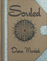
JF: You did fine. Despite an interesting design, this cover is held back by a somewhat dull palette.
Matt Hinrichs submitted Still Life In Red designed by Matt Hinrichs. “This is a mystery in which two women in modern-day Sedona, Arizona find a time travel portal which takes them to Impressionist-era France and Vincent Van Gogh. This was a fun project and the authors loved this layout, which was the first and only one I did (yes!).”

JF: Looks like your inner Van Gogh nailed it, Matt.
Ellis Vidler submitted Tea in the Afternoon designed by Ellis Vidler. “Mainstream Southern fiction”

JF: This interesting graphic would be better served by stronger typography.
Moses Siregar III submitted The Black God’s War (Splendor and Ruin, Book I) designed by Moses Siregar III. “I made this one myself, but input from Facebook friends and some technical help from William Campbell made the cover much better.”

JF: Excellent job, this cover has a lot going for it including the careful typography and arresting image.
Laxmi Hariharan submitted The Destiny of Shaitan designed by Peter Ratcliffe. 
Brent Wolfingbarger submitted The Dirty Secret designed by Ranilo Cabo. “I sponsored a book cover design contest on 99design.com and asked my friends to share their feedback via the polling feature that is available on 99designs. I narrowed the field to 5 entries (including some very competitive designs by Kura Carpenter, Julius Apelanio and Eli Cruzader), and then carefully considered some very passionate opinions expressed by my friends. In the end, I selected Ranilo’s design and I am quite pleased by the positive feedback I have received from readers thus far. The entire cover (front, back and spine) for the print edition of The Dirty Secret can be viewed at: https://www.wolfingbarger.com/ranilo_cabo/ If you’re interested, you (and your readers) can also check out some of the other designs I considered, which are posted on my website at https://www.wolfingbarger.com/talented_designers/ Even though I did not go with those other designs, I was very impressed by the quality of that work and wanted to help spread the word about those designers’ talents on my website. Thanks for your consideration! Brent Wolfingbarger”

JF: A fantastic cover for an indie book, really first-rate. Glad to see more work from the crowd at 99designs.com in the competition.
Melinda Young submitted The Final Testament of William Crook, Once a Bodyguard to the President designed by Melinda Young. “The image is a photo taken by a friend of the “Standing Lincoln” statue in Chicago’s Lincoln Park. I was happy to have an image that wasn’t familiar and one that I could manipulate (most are copyrighted). Through much experimenting with Photoshop Elements, I came up with an image I feel reflects the main character’s assertion that this man he knew well is no longer thought of as a person but is now merely an icon frozen in history.”

Amy submitted The Lizard Thieves designed by Amy Beth Katz and Brad Katz. “I once stole a stuffed animal lizard from a man — my teacher – whom I was madly in love with, and tried to give it back to him via a funny ransom note I signed as “The Lizard Thief” (which he did not think was funny at all.) I knew I wanted my book of poetry to have something to do with a lizard. So when I found the photo of an iguana being consumed by an owl, by National Geographic photographer Michael Turco, I knew this would be the centerpiece of my book of love poems. Love indeed! My brother, who is a Hollywood film and TV editor (and making a documentary about indie rock) helped me design the cover.”

JF: Okay, it definitely stops you, no doubt about that. Then there’s the whole dissonance thing we you see it’s “love poems.” This anti-genre move might work, or it might be the symbolism thing.
Veronika Licakova submitted The not so secret emails of Coco Pinchard designed by Veronika Licakova.

JF: Love it, particularly the duct tape. Clever and appealing.
Patrick O’Duffy submitted The Obituarist designed by Carla McKee. “This is a crime novel about a ‘social media undertaker’, so I wanted a cover that evoked computers and web browsing. Rather than the images that my other covers have used, designer Carla McKee decided to use typography as the focus, with a subtle trim and use of colour around the title. (The first draft had more colour, but it didn’t render well in Kindle greyscale.)”

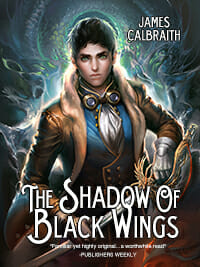
James Calbraith submitted The Shadow of Black Wings designed by Flying Squid. “Cover artwork done by Yue Wang.”
Wendy Scott submitted The Sleeping Gods designed by Wendy Scott. “A short story published as an ebook exercise to learn how to prepare digital files and design an ebook cover. The cover image is from MorgueFile.com, by ‘kevinrosseel’ (https://morguefile.com/archive/display/181617)”

JF: Like The Final Testament, just above, this cover gives up too much to the image, and loses balance. Ideally you’re looking for an integrated message, and in these cases the image takes over.
Thomas A. Knight submitted The Time Weaver designed by Claire Stratford.

JF: Beautiful simplicity and balance. A unique look.
Claudia Carozza submitted The Twenty designed by Robyn Platoni.

JF: Okay, so admit it: you also noticed there were 27 figures on this cover?
Marvin Rondares submitted The Warriors: Ep. #01.01 “The First and Last Time” designed by Marvin Rondares.

Kit Foster submitted The Will of the Gods designed by Kit Foster.

JF: Compare this cover to the one immediately above it, The Warriors. Both have a title, sub- or series title, author’s name and an image. One is confused, illegible and indistinct. Here, Kit Foster shows how strong typography, a carefully controlled palette, appropriate illustration and the knowledge of how to control the reader’s attention combine to make a standout cover.
Jennifer Quintenz submitted Thrall designed by Jennifer Quintenz. “This is the first book in a YA paranormal series.”

JF: Great job, I especially liked the overlaid filigree, a lovely touch.
James Lewis submitted Tiger’s Blood designed by James Lewis. “Just getting into the cover design game and eager to improve. Thanks for your professional review.”

JF: Looks like you’ve got a great future ahead of you. Hard to find anything to criticize here, but I’d love to see it with the title in white or at least a whole lot lighter to create a “high key” for the cover in exactly the place you want to lead the reader.
D.M. Atkins submitted Touched by Death designed by D.M. Atkins. “The challenge was finding a simple design that could represent an erotic horror collection that covers multiple themes and genders. We went with the mildly decayed hand reaching from the grave.”

Jordan Castillo Price submitted Turbulence 1: Into the Bermuda Triangle designed by Jordan Castillo Price.

JF: Very cool and effective.
LYNN RODOLICO submitted TWO SEAS designed by ANTONINO RODOLICO. “I chose a straight-forward autumnal photo as a metaphor to reflect the contrast between the power of an apparently immobile mountain against the human-like two palms engaged by winds.”

Nonfiction Covers
Benedict Beaumont submitted A Last Chance Powerdrive designed by Peter Woolf.

Laura Dennis submitted Adopted Reality designed by Jaime Zollars. “The designer is an amazing artist, and she adapted her work for my book cover. (So I do have the rights to the cover — for the purposes of book promotion and the book itself!)”

JF: The illustrator is an accomplished artist and children’s book illustrator. And this image makes a terrific cover. The larger example on Amazon is brighter than the version you see here.
Dating Goddess submitted Date or Wait: Are You Ready for Mr. Great? designed by Dave Innis. “I write under the nom de plum, Dating Goddess.”

JF: A strong nonfiction cover achieved through confident typography and the discipline of a 2-color design.
Ulrich submitted Gehirn-Glühen designed by Herman Zeichen.

Terry Persun submitted Guidebook for Working with Small Independent Publishers designed by Renda Dodge.

Leon M. Hielkema submitted HR Strategic Project Management SPOMP designed by Joii, A. Breeuwsma.

Jennifer Brozek submitted Industry Talk: An Insider’s Look at Writing RPGs and Editing Anthologies designed by Ivan Ewert.

JF: A clean and attractive design for an industry-specific book.
Mindy Levy submitted Mindy’s Musings designed by Mindy Levy.

JF: Mindy, there’s something very charming about this book cover, but it needs better and stronger type to really make it sing.
Kit Foster submitted More Podcast Money designed by Kit Foster.

Nancy Hendrickson submitted Pinterest: Build Your Brand, Your Tribe, Your Sales designed by Nancy Hendrickson.

Chris Starfire submitted Visits From Beyond designed by Chris Starfire. “The cover photo was an accidental photo taken when I was taking garden photos one day. When I uploaded the photos to my computer and saw it, I felt like it belonged to the book and designed the cover around it.”

Well, that’s it for this month. I hope you found it interesting, and let other people interested in self-publishing know about the Awards. —Use the share buttons below to Tweet it, Share it on Facebook, Plus-1 it on Google+, Link to it! The next issue is August 12, 2012 and the deadline for submissions will be July 31, 2012. Don’t miss it! Here are all the links you’ll need:
The original announcement post
E-book Cover Design Awards web page
Submit your e-book cover here
Follow @JFBookman on Twitter for news about the E-book Cover Design Awards
Subscribe to The Book Designer Blog

