Welcome to this edition of the e-Book Cover Design Awards. This edition is for submissions during February 2012.
Here’s what we received:
67 covers in the Fiction category
20 covers in the Nonfiction category
Award Winners and Listing
I’ve added comments (JF: ) to many of the entries, but not all. Thanks to everyone who participated. I hope you enjoy these as much as I did. Please leave a comment to let me know what you think, too.
Now, without any further ado, here are the winners of this month’s e-Book Cover Design Award.
e-Book Cover Design Award Winner for February 2012 in Nonfiction

Kristian Truelsen submitted 30 Failures by Age 30 designed by Katharine Miller. “In this image author Katharine Miller pays homage to the works of painter Art Frahm.”
JF: Clearly the best nonfiction cover this month. This cover design brings together a delightful tongue-in-cheek air with strong typography and the discipline of a limited palette. It stands out from the crowd and reflects the quirky humor and artistic sensibilities of the author. Well done.
e-Book Cover Design Award Winner for February 2012 in Fiction
Tamara Henson Coffey submitted The Pathos of Rowan Jun designed by Tamara Henson Coffey. “I wanted to express a graphic novel feel for a very action/adventure type of story, so I made a close-up of a fully inked comics-style character and hand lettered the title and author name.”
JF: An astonishingly strong and harmonious blend of art and lettering. The energy in this cover is palpable, it almost leaps off the screen. Getting this kind of internal consistency and focus, here for a “warrior sci-fi” story, is unusual. Great stuff.
Fiction Covers
Rebecca P Dahlke submitted A DEAD RED CADILLA designed by Allen Chieu. “Allen Chieu does covers for quite a few published authors…he’s sixteen and in high school.”

JF: Love this one, it definitely makes a statement.
Adelaide Cooper submitted Angel Cake designed by Adelaide Cooper. “This is the cover of my 4th self-published erotica title, and hopefully the first in a series since it became my runaway bestseller in the BBW erotica genre.”

JF: Very nice, and it looks like you know exactly what your audience wants.
Michael Canfield submitted Apocalypse x 7: Offbeat Doomsday Stories designed by Michael Canfield.
Adelaide Cooper submitted Bad Cupid designed by Adelaide Cooper. “Cover for my most recent self-published gay erotica book for Valentine’s Day.”

JF: Another strong cover, marred only by trying to run the very light title type over the pale beefcake in the background.
Kristian Truelsen submitted Boris and the Open House designed by Katharine Miller. “Mixes hand-drawn characters with vector-created backgrounds, reflecting the retro-future design of the series.”
Kristian Truelsen submitted Boris Gets a Visitor designed by Katharine Miller. “The whimsy of this series is well-reflected in the image of robot meets robot plus drinks, ball chairs and a sock puppet.”
Kristian Truelsen submitted Boris Makes a Friend designed by Katharine Miller. “The illustration suggests the robot-protagonist’s loneliness and makes us wonder whether he himself will be his only friend.”
Kristian Truelsen submitted Boris Takes a Nap designed by Katharine Miller. “A dreaming robot is fanciful on its own, but the image of a 1960s mod girl (with the umbrella) hints at the quirky diversions his dreams may provide.”

JF: These are reductions of the paperback originals, but the landscape orientation of these covers signals that they are children’s books right away. Would love to see how the layouts translated to the Kindle…
catherine daly submitted Charlotte’s Way designed by catherine daly.
Chris Almeida submitted Countermeasure designed by Chris Almeida. “The binary code and font for the title are the anchoring points of the series. All book covers int he series will contain the same central horizontal bar as a consistent feature to bind them together. Colors are picked based on the setting of each book. First was blue for the Mediterranean sea, second will be white for the Russian winter. Covers of associated shorts will also retain the branding elements.”

JF: Good branding strategy and very nice design, Chris, but I wonder how it would look if you broke the title in two and enlarged it to two or three times its current size?
Andrea Parnell submitted Delilah’s Flame designed by Franke Spanuth, Croco Designs. “Historical Western Romance”

JF: Really good cover, but would rather see it without the unreadable type.
Tawny Stokes submitted Demon Whisperer designed by April Martinez.

JF: One of the top covers submitted this month. Atmosphere, a limited palette, carefully-selected elements and distinctive lettering all used to great effect.
I.G. Frederick submitted Dommemoir designed by Nyla Alisia. “I was so thrilled by this cover. It does everything a book cover is supposed to do: give otential readers an idea of the book’s tone and tantalize them with enough about the story to tempt them to peek inside. She created the cover without any input from me. I sent her the manuscript and gave her free rein. She says she selected the elements that touched her, that made the story so powerful for the design. If she had tried to explain this cover to me before I saw it, I would have fought her every step of the way. But what she created is perfect. In one image she captured every critical element of the book, without giving away too much.”

JF: I’m a little less thrilled, and think that there are too many elements and fussy typography for this cover to really shine.
Rejean Giguere submitted DreamWeaver designed by Peggy Ireland. “I actually found this image while I was still creating the outline for DreamWeaver. It hung over my desk the entire time I was writing.”
Patrick O’Duffy submitted Godheads and Other Stories designed by Amanda Watts. “We wanted to continue the motif of buildings and signs after using it so well in ‘Hotel Flamingo’. I suggested a run-down church to align with the title of this collection; Amanda found the perfect image and a great way to incorporate the title into the signage.”

JF: Clever and compelling. What you give up by moving the title to the bottom of the book—something I try to avoid—you gain back with this evocative cover.
Esmeralda Greene submitted Goody Two-Shoes designed by Esmeralda Greene.
Andrea Zanetti submitted Grounds for Death: A Garden Plot Mystery. “Cover illustration by Kathleen Collins Howell. Cover design by Rebecca Swift.”
Randy Nargi submitted G-SALE designed by Randy Nargi. “For the cover of this novelization of the hit indie comedy G-SALE we used an image from the film treated with a “cut paper” effect to echo the sales tag for the title image. We also added some illustration elements mixed with the photograph. The type reflects some of the ‘retro-modern’ style of the objects featured in the story.”

JF: It may be a matter of taste. Although lots of good things here, the cut paper outline and mix of styles make it a bit visually noisy for me.
Edwina Ray submitted Guilty Until Proven Innocent designed by Sarah Billington.
Lynn Dove submitted Heal the Wounded designed by Caleb Booth (artist). “The second cover design by Caleb Booth for my Y.A. “Wounded Trilogy” is for Heal the Wounded. Again, he has captured the emotions of the characters so well on this cover! (He has just finished the final cover to my last book, Love the Wounded, that I hope to publish in 2012.)”
Kit Foster submitted Hive designed by Kit Foster.

JF: Another strong cover from the talented Kit Foster.
Patrick O’Duffy submitted Hotel Flamingo designed by Amanda Watts. “My novella revolves around a strange hotel rather than one particular character, so it made sense to make the hotel the star of the cover. Amanda came up with the idea of making the title into a neon sign, which looks amazing.”
aSaint submitted Indaesous and the Mist of Sand designed by BookBaby.com. “Within three business days, the BookBaby.com Design Team had my first cover book draft available! I was thrilled at the results. I had only given them specific descriptions within the book and my preferred colors. I specifically gave them complete design creativity. I’m hoping this will be a part of your Feb / Mar awards!”

JF: I have to say, the designers at Bookbaby.com did a great job on this atmospheric sci-fi cover.
David Tomen submitted Isla Lacra (Scar Island) designed by Johnny Breeze – John Boyd Books Team.
Bryan Young submitted Lost at the Con designed by Lucas Ackley (art by Erin Kubinek). “This was a book set at a comic book convention, so it needed to have the feel of a comic book. It’s also a fish out of water story, hence the character on the front. I think the artist/designer pair worked fabulously.”
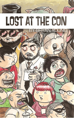
JF: Stands out by virtue of the clever illustration.
Bryan Young submitted Man Against the Future designed by Lucas Ackley. “For this collection of science fiction shorts, the designer and I pored over hundreds of vintage sci-fi collection covers and came up with something that felt new and old at the same time.”

JF: One of the reasons this works so well is the adept use of type that alludes to the classic era of paperback covers. Nice job.
Steve Bauman submitted Matadors designed by Steve Bauman. “Thanks for the consideration!”

JF: One of the best covers I saw this month. A visually arresting photo and attention to the typography make me want to pick this book up—virtually.
SJ Clarke submitted Mind Over Matter designed by Delilah K. Stephens. “Mind Over Matter released Nov. 2011 in print, and as an ebook.”
David Lee Jones submitted MoriaVaratu designed by David Lee Jones. “The author designs all his own covers.”

JF: This designer suggests you try a pro next time.
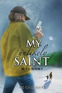
CC Carlquist submitted My Unlikely Saint designed by Stephanie Dalton Cowan.
Christopher Geoffrey McPherson submitted News on the Home Front designed by Matt Hinrichs. “”News on the Home Front” is about life in the states while loved ones were fighting overseas. The cover designer used one of the war’s most potent symbols (the service flag) as the main point of interest, while using a wallpaper design in the background to denote the fact that this flag hung in someone’s home. The simple design evokes the WPA posters that were prominent at the time.”

JF: Nice. Notice the color contrast that propels the flag into the foreground.
Craig O. Thompson submitted OMAR: A Novel designed by Harriet McInnis. “A clearer view of the OMAR cover (without the Intn’l Benjamin Franklin Awards sticker) can be seen inside the “Look Inside the Cover” preview download. The cover utilized a rare photograph, the author was able to take, of the only existing bejeweled copy of the priceless “illuminated” book, “The Titanic Omar” — that went down with the ship. The author’s intent, to create a layered, deep-sea effect, was carried out by the designer, Harriet McInnis.”
Russell Brooks submitted PANDORA’S SUCCESSION designed by Carol Webb.

JF: Really good genre cover that would be stronger without the itsy bitsy type reduced from the paperback.
Val Stevenson submitted People Tell Me Things designed by Colin Taylor. “The brief for the designer was: it will be seen at thumbnail size, so I want something that can be seen from space!”
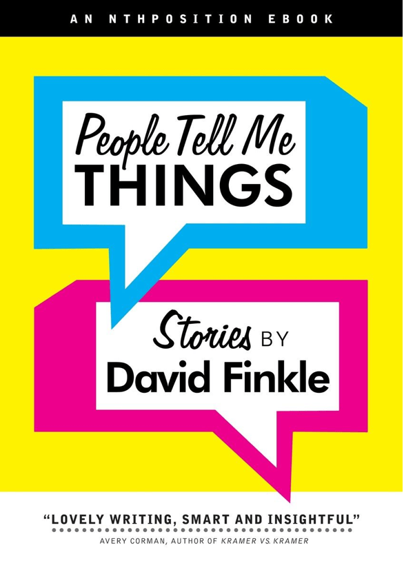
JF: It worked, the cover really stands out.
Ann Duran submitted Phoenix Rising designed by https://graphiczxdesigns.zenfolio.com/. “I asked my designer, GX, to take this imagery from a scene in the book and bring it to life. I love the vivid colors. I believe it artfully demonstrates the paranormal genre of the story and connects the title to the cover.”
Delaney Diamond submitted Private Acts designed by Mina Carter.
s.a. devlin submitted Running After Tall Sexy Men designed by s.a. devlin. “Images used are stock photos, all rights were purchased for wide distribution.”

JF: Now I know you can find a stock shot of just about anything! Confused and illegible typography don’t help this cover.
Lynn Dove submitted Shoot the Wounded designed by Caleb Booth (artist). “I asked my friend, Caleb Booth, a brilliant young artist to design the covers of all three of my books in the “Wounded Trilogy”. My first book for Young Adults, Shoot the Wounded is about gossip and innuendo and if you look carefully at the girl in the left hand corner, you will notice a “smoking gun”. I love pointing that out to students when I speak to them about the books.”
M.L. Ryan submitted Special Offers designed by M.L. Ryan. “My first novel and I decided to create my own cover art. Many paranormal romance/urban fantasy books have more “romancey” covers (scantily clad woman/men) but the plot contains a lot of humor and I wanted the cover to convey that. I used bits of stock photos that I altered in various ways for the woman and the eBook reader-entrapped male. The cat and the ebook reader itself are my original vector art.”
Laura Reese submitted Stay Tuned designed by Lee Libro.
Viper submitted Stranger on the Bus to Vasto (an erotic seduction) designed by Viper. “This cover is part of a continuing erotica series by the author ‘Viper’. The aim of the cover was to hint at the sexual theme and the amorous encounter with a stranger on a bus in an exotic location (Italy in this case), focussing on the detail of the stranger’s hand on her thigh rather than opting for something more graphic. The author took the photo herself and designed the rest. I guess the main thing was trying to keep the typography clean and simple, so it complemented the image and didn’t overwhelm it. Thank you for the opportunity to enter this competition.”

JF: This covers shows promise, ‘Viper’ but the illustration has overwhelmed the type and is consequently out of balance.
Jan Jacob Mekes submitted Struglend Tales designed by Ado Ceric / Jan Jacob Mekes. “The cover illustration was done by the amazingly talented Ado Ceric, while I myself did the textual design.”
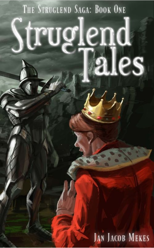
JF: Distinctive typography combined with an effective and atmospheric illustration make this a winner.
Marianne Wheelaghan submitted The Blue Suitcase designed by Marc Pimbert.
Andy Conway submitted The Budapest Breakfast Club designed by Andy Conway. “This is a book that’s been out a while but I wanted to revamp the cover. The original design never really felt like the indie-rom that the story is, so I pushed my Photoshop skills to the limit to achieve more what I had in mind. I used a very cheap app called ToonPaint to ‘cartoonise’ both the main character model and the Budapest background – all done in my iPhone. Then I found some free vector silhouettes to suggest the other characters.”
Eric Munter submitted The Bylaws of Friendship designed by Eric Munter / AiRiXdesigns.

JF: This cover is outstanding on the paperback version and although it keeps its character, size reduction has robbed it of some of the texture that makes it work when larger.
Ian Truman submitted The Factory Line, A Pulp Novel designed by Olivier Carpentier.

JF: Love the economy of this cover, but it really needs a rule around it to keep the white background from bleeding onto the page.
Maria Miller submitted The Gambling Master of Shanghai designed by Maria MIller. “This is a wonderful book of short mystery stories which I had the privilege of designing for Joan Richter.”

JF: A beautiful cover that’s just a bit too hard to read at this size. Reduced from the paperback edition.
Martyn Ellington submitted The Harvesting designed by Plan4 Media.
C. Glen Williams submitted The Interview: A Short Story designed by C. Glen Williams. “I redesigned this cover recently. The original had an eye-blistering purple/green/orange color scheme (hey, the color scheme picker said they would look good together!), in addition to a font that became unreadable when scaled down for search results.”

JF: This type of simplicity works well for ebook covers, and this one has great impact.
Steve Merrick submitted The Magic Laptop Ride designed by Steve Merrick. “Hi This is the itunes bookstore link to The Magic Laptop Ride. ;-) Steve”
Steve Merrick submitted The Navigator designed by Steve Merrick.
Wilette Youkey submitted The Origin designed by Wilette Youkey.
Karen Inglis submitted The Secret Lake designed by Damir Kundalic. “The cover was inspired by ‘Still Pond’ in Isabella Plantation in Richmond Park, London. In May each year it is surrounded by crimson pink and purple Azaleas which all reflect in the water – it is truly stunning. The pond was the inspiration for the ‘lake’ in The Secret Lake. I emailed a picture of the pond to my illustrator (who lives in Bosnia!) along with a sketch of where I wanted the children standing and an idea of what they’d be wearing and so on. I was astounded when he came back with this. It perfectly captured what I was looking for! Do take the time go Google Isabella Plantation – it’s a very magical place! Karen”
Chuck Barrett submitted The Toymaker designed by Mary Fisher Design.

JF: Another clever piece of art that makes a winning cover that really stands out.
Thomas Burchfield submitted The Uglies designed by M.S. Corley.

JF: I really like this simple and effective cover, and part of the effect is achieved by pushing the illustration to the background.
Linton Robinson submitted The Way of THE WEEKEND WARRIOR designed by Linton Robinson. “This cover is only for the eBook version. Paperback has different one that doesn’t scale down well. Funny thing is, now I’m thinking of using it for the paperback cover, too.”

JF: Seminal hand grenade-beer artwork.
Stephanie Zia submitted The Wild Flower Man designed by Stephanie Zia.
Colleen Collins submitted The Zen Man designed by Peter Ratcliffe. “Here’s a link to Peter Ratcliffee’s website: https://www.peterratcliffe.com. Thank you, Colleen Collins https://www.colleencollins.net/”
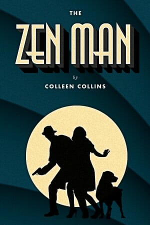
JF: A great piece of work by designer Peter Ratcliffe who here uses the allusion to The Thin Man and its classic 1930s style for inspiration.
James Lewis submitted Tiger’s Blood designed by James Lewis.
Katie W. Stewart submitted Treespeaker designed by Katie W. Stewart. “This is the second cover I’ve designed for this book. The book is fantasy and the tree is central to the story.”

JF: And a nice job, too. Clear and direct.
Rebecca Bloomer submitted UnEarthed designed by Kerem Gogus. “Hope this is right!”
Katharina Gerlach submitted Urchin King designed by Katharina Gerlach. “I redid this after several readers suggested the old cover was too young for the content. The background image is from Valery Sibrikov, Shutterstock.”

JF: Part of the problem with this cover is that almost half the area is occupied by the background in the photo, and it’s a dull color that doesn’t help the overall effect at all.
Daniel R. Marvello submitted Vaetra Unveiled designed by Susan C. Daffron.

JF: The multi-talented Susan Daffron shows she can turn out a genre cover that piques our interest, and here’s one place where some distressed effects on the title type work well.
Colin F. Barnes submitted Vex: A Modern Viking Saga Short Story designed by Colin F. Barnes. “This cover was designed to focus on the single female protagonist of the story.”

JF: It really worked. Gee, she looks familiar, doesn’t she? Although I’m not a big fan of type that breaks up, it looks like the effect was intentional here.
Thomas Burchfield submitted Whackers designed by Author. “Looking at it now, it’s too crowded and some of the elements–the cat o’ nine tails, the microphone–are too obscure to register with viewers. But considering I did it myself, with no experience, not too bad, I’d say.”
Lyndon Perry submitted Zero Hour designed by Michael Jerrell. “I (ResAliens Press) commissioned illustrator Michael Jarrell to do this cover of Stoney M. Setzer’s collection of supernatural suspense.”
Nonfiction Covers
Robert Lanphear submitted 10 Secrets of a Working Dog designed by Robert Lanphear.

JF: A charming cover, reduced from the paperback original.
Lois Nicholls submitted Aussie, Actually designed by Darian Causby. “Hi Joel, Darian Causby recently updated the cover of my memoir, ‘Aussie, Actually’. I’ve uploaded the new cover to my Bookshelf on KDP, however, it’s not currently reflected in the Amazon store. The eBook has only been available on the Kindle Store since 1 Feb 2012. The new cover includes a byline up top – ‘A South African woman’s memoir of migrating to Australia’ – it better describes the book, compared to the old tag line, ‘Landing on Foreign Soil’. Kind regards, Lois Nicholls Brisbane, Australia”
Lawrence D. Elliott submitted Bitte was? An American author’s misadventures in the German language designed by Lawrence D. Elliott. “Thank you.”
Grant McDuling submitted Classic Motorcycles, An Enthusiast’s Guide designed by Patrick van der Helm.
Marian Levett submitted Clean Your Bathroom: A Quick and Dirty Guide designed by Marian Levett. “I am a self-taught freelance artist and writer working with a newly-formed author collective.”

JF: I think those authors are lucky to have such a talented designer available. This cover is spunky and effective.
Alfonso López Alonso submitted Comer bien a diario designed by Jimena Catalina Gayo. “All illustrations were made on purpose for the book”
Treb Gatte submitted Designing and Publishing eBooks, An Introduction to Kindle Book Creation designed by Treb Gatte. “Hi Joel, we met at the Amazon Createspace 2.0 event in Seattle. I asked the question about using a pseudonym versus an existing author platform. Here’s my entry using the wonderful advise you and Piotr have provided on cover design. The idea for the fingerprint came from looking at my Kindle Fire one day. Anyone with a reader can identify with the fingerprints. Hopefully, I got the cover design right! Thank you for the wonderful content.”

JF: Love the visual, would be even stronger with better typography. Wasn’t that a great event? I really enjoyed coming up there and meeting so many book people.
Felipe Adan Lerma submitted Everyday Gratitude Vol 1 designed by Felipe Adan Lerma. “Original art work and design by myself, the author, also.”
Bryan Young submitted God Bless You, Mr. Vonnegut designed by Lucas Ackley (art by Erin Kubinek). “This is a collection of non-fiction (and a little bit of fiction) that was all about or inspired by Kurt Vonnegut. We wanted something simple, similar in tone and color to what Vonnegut’s books are looking like these days, with a warm portrait of the man.”
Jose maria cal under a Milos Galloway pen name submitted Guys, how to discover if a woman likes you designed by jose maria cal. “We would discover all their wishes – sweet, innocent, erotic and even naughty wishes- if we learn to read their signals and if we are able to observe, with sensitivity and respect, their expressive world. This is an extraordinary book that will approach men to women. Women, our companion throughout our life, who keep deep inside the passionate wish to find the love.”
Colleen Collins submitted How to Write a Dick: A Guide for Writing Fictional Sleuths from a Couple of Real-Life Sleuths designed by Peter Ratcliffe. “Peter Ratcliffe’s website: https://www.peterratcliffe.com/”
Kim Abernethy submitted In This Place designed by Nancy Freund.
Vicki Hudson submitted No Red Pen – Writers, Writing Groups & Critique designed by Vicki Hudson, Joleen Naylor. “Photo credit and concept to Vicki Hudson. Credit to Joleen Naylor for taking concept to creation and layout.”

JF: This was a good concept mostly well done, but the cover is suffering from a lack of contrast that makes a critical part of the title really hard to read.
Janet Roberts submitted Oil under Sherwood Forest designed by Janet Roberts.
Jen Smith submitted SICK designed by Authority Publishing.
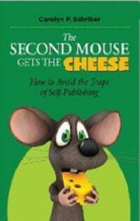
Carolyn Schriber submitted The Second Mouse Gets the Cheese designed by CreateSpace. “The book suggests that prospective self-publishers can benefit by paying attention to the experiences of others — by being the second mouse, rather than the one who springs the trap.”
Emily Cook submitted Weak and Loved: A Mother-Daughter Love Story designed by Michelle Rockhill.
Veronica Torres submitted What Will Happen in 2012 and Beyond? designed by Hollyscreative.com. “I feel that this stock art nicely conveys the POSITIVE outlook my book presents about the year 2012. Plus, the meditating, middle age woman fits my target market perfectly.”
Raymond Larrett submitted Yarns & Stories Of Abraham Lincoln designed by Raymond Larrett.

JF: This illustration made me laugh out loud. Nice.
Well, that’s it for this month. I hope you found it interesting, and let other people interested in self-publishing know about the Awards. —Use the share buttons below to Tweet it, Share it on Facebook, Plus-1 it on Google+, Link to it! The next issue is April 15, 2012 and the deadline for submissions will be March 31, 2012. Don’t miss it! Here are all the links you’ll need:
The original announcement post
E-book Cover Design Awards web page
Submit your e-book cover here
Follow @JFBookman on Twitter for news about the E-book Cover Design Awards
Subscribe to The Book Designer Blog


