

Case Study: The Boy Behind the Gate by Larry Jacobson
Design Brief: The author and his partner were the first gay couple to sail around the world. Larry, a former marketing executive, made a complete break with his former life and spent seven years traveling around the world in his sailboat, Julia. He wanted a top-quality book that could also function as an introduction for his career as a motivational speaker. Larry was concerned that the book not be boring to look at, and gave me complete freedom to come up with a design that really kept people interested.
Constraints: Rather than a straight narrative, the book had a lot of different types of information in it that had to be presented in an orderly way. The author also felt very strongly about including photos from his journey. These would have to print in color.
Raw Material: The author is an excellent writer, and had worked with several editors getting his manuscript ready for print. The text, however, consisted of several, parallel streams. Besides the author’s straightforward story, there were entries from his personal journal on the trip, emails during the journey back to a group following the trip, and reflections on the whole affair written later. The author also supplied about 100 color photos.
Production Goal: We decided on a 6″ x 9″ trim size jacketed hardcover. We struggled to bring the book in under 400 pages to keep it from seeming unwieldy, and the final page count was 372. We had to find some way to include the photos and any other ways to make the book graphically interesting.
Challenge: Create a design that would keep the reader interested, make sense of all the text streams, allow for color photos without compromising the reading experience, and look great doing it.
A Host of Solutions
When dealing with books that have parallel text streams, I try to avoid using very different typefaces, which is often the first option. There are many other ways to solve this problem, and all the others seem to me to lead to less disturbance in the reading experience.
However, in the case of The Boy Behind the Gate, more drastic measures were called for. By using a set of icons, we were able to brand each section that had a different origin from the main text. This kept the type change to only one: I used the sans serif typeface Myriad for the retrospective comments that were used to fill in bits that were missing or needed to be amplified.
Here’s what the text spreads look like:

Click to enlarge
Ordinarily, I would try to avoid icons this size, but the author just loved the layout and thought we had solved the problem of boring books.
Mapping for Many Uses
This type of book usually has a map to show the route taken. These are often printed on the endleaves of the book. These sheets are used in casebound books to connect the text block to the case. They are the sheets glued to the inside of the front and back covers of hardcover books.
Larry had a great map drawn, and that’s exactly what we did with it, adding another graphic touch to the book:

Click to enlarge
Once we had the map, of course, I couldn’t let it go to waste. It became an integral part of the chapter openings, which trace the journey on the map in close focus:

Click to enlarge
Integrating Color Into the Book
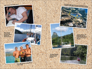
This book was always going to be a book printed by offset rather than digital printing. I explained to Larry the best way to get his photos into the book was with inserts.
The photos would be printed separately as two 16-page sections. Each of these could then be inserted into the final book between sections of the text, and then the whole thing attached to the cases.
This scheme allows both the text and the photos to appear at their best. Here’s what the photo spreads look like:
Jacket Design
After looking at several jacket designs, most using the photos from the book, Larry settled on one that has a pretty literal interpretation of the title. Dominated by a beautiful sunset photo, it inspires the kind of wanderlust that Larry writes about so eloquently in the book:

Click to enlarge
Printing and binding a hardcover gives you even more options for customization and branding. In this case, as a coup de grace, we added a beautiful copper-foil stamp to the front of the cloth cases, using a design of the Julia’s medallion.
This book was a treat to work on, while also being one of the most complex books to put together that I’ve done in a while. I was lucky to have a world-class client to make this book happen. It’s enjoying quite a bit of success, and the book itself is on its own journey now.
Data
Buy The Boy Behind the Gate on Amazon
Larry Jacobson’s Buoy Press website
ISBN: 978-0-9828-787-9-8
Size: 6″ x 9″, 372 pages
Price: $27.95
Typography, book layout and graphics in Adobe InDesign and Photoshop
Typeset in Century Oldstyle, Electra and Myriad Pro
Offset printing and binding by Bookmasters
All Amazon links are affiliate links.
