

(Ed: This post is part of a longer article that originally appeared last year on Self-Publishing Review)
Book designers are typographers by necessity, if not by nature. Content may be king, but content is almost always text. Text must be displayed for a reader, either on the pages of a book, or on a screen.
To display text, you need to use a type font. The font could be chosen by a designer, or it might be a default set up by the engineers who create digital reading devices.
When it comes to fonts, designers have strong feelings. While you’re sitting at a restaurant trying to decide what to order, the book designer at the next table is examining the type fonts used on the menu and how the kerning looks.
I like Volvos, maybe you like Chevys. Same with type fonts. Some designers like Palatino, it does nothing for me. But when you find a font you love, it’s a relationship that can last a lifetime.
For many years my favorite typeface for book design was Bembo. One of the reasons I prize Bembo for book typography is the way it smoothly flows on the page. It’s easy on the eyes even for extended reading, and it seems plain and without any eccentricities.
It’s The Good Old Style
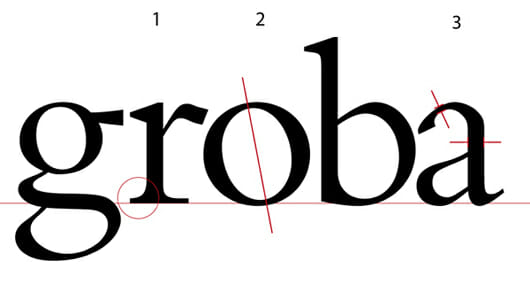
Bembo is an oldstyle typeface. That means that: (see the illustration above)
- The serifs are bracketed: there’s a curved connection between the serif and the stem of the letter.
- An axis drawn through the thinnest part of the round letters will lean to the left.
- The difference between the thin strokes and the thick strokes is not that great.
These oldstyle typefaces were modeled on humanistic calligraphy. The earliest type creators and printers of the fifteenth century used as models the books that were handwritten by scribes practicing a craft that was—even then—hundreds of years old.
Blow it Up
It may seem odd that our modern digital type fonts derive from models that are ancient. Or that the pages of today’s bestseller might contain traces of the scholars of the Renaissance, the same scholars who rediscovered and reissued the books of antiquity 500 years ago. But it’s true.
Despite the smoothness that Bembo shows on the page, a look at the enlarged version above tells us a great deal about its origins.The three characteristics of the humanist typefaces I listed are all due to one influence: the way the calligrapher’s flat-edged pen forms letters:
- As the pen held by a right-handed writer passes through the circle of the round letters, it naturally forms the tilted axis.
- As the scribe finishes each stroke, his pen naturally creates the little serifs, or ending strokes on the letters as he moves to the next letter. This helps tie the letters together into words, and is the chief reason we prefer serif typefaces for text.
- And the pen, although naturally creating thin and thick strokes as it moves through the letterforms, will never make a really thin line.
Not only that, but when the letters are enlarged as much as they are here, we start to see all kinds of oddities and eccentricities that are invisible at normal sizes. The branch of the “r” quivers a bit, the top of the “a” has flat spots, and “g” gyrates in several directions at once. What happened to the smooth flow we’ve come to expect from Bembo?
Truth is, a perfectly uniform typeface would be difficult to read for long. It would look pretty sterile, even boring, set in the massive blocks of text that make up books.
It’s because of its eccentricities that Bembo looks so beautiful on the page. All the variation in the individual letters creates color, rhythm, and the flow this typeface is known for.
Branching Out
Now I use a wider palette of typefaces for book design. Many of them are oldstyle typefaces like Bembo. Adobe Jenson, for instance, is modeled on a typeface originally created around the same time and in the same place—the late fifteenth century in Venice—that gave rise to Bembo.
And there are many other typefaces prized by book designers for their balance of evenness and eccentricity, and their ability to form inviting blocks of text that stand up to continuous and focused reading. Oldstyle typefaces form the backbone of the book designer’s library of tools. If you pick one for your book, you can’t go far wrong.
Takeaway: Bembo, like many oldstyle typefaces, makes an excellent choice for printed book production.
