


The typefaces we use for books are a real contradiction. They can be so quiet you just don’t notice them. But if you enlarge the letters, you can see right away that they are full of idiosyncrasies and flourishes.
Display typefaces, on the other hand, announce themselves to the reader in no uncertain terms.
In most nonfiction books, we use a combination of display and text typefaces, and the interaction between the two designs, when they are complimentary, is like a harmony of voices.
3 Great Combinations
Book designers, in my experience, tend to have a very limited palette of favorite typefaces they go back to again and again. They are predictable and reliable. The english language has quirks to it, like any language, and sometimes those quirks create typographic patterns. For instance, a page with a more than average number of “…ing” verbs will have a different “color” than other pages because of the number of lower-case gs.

Sometimes latin is used to “greek” text (That’s odd, isn’t it? We use latin to greek text.), but the look you get is deceptive. Latin has many fewer letters with ascenders and descenders—the parts of the letters that rise above, or fall below, the main line of text. This gives a page in latin a much more orderly and linear look than the same typography in english.
Here are three combinations of typefaces I particularly like. If you don’t know what typefaces to use in your book, try these, I think you’ll like them.
Adobe Caslon and Myriad Pro
Two great typefaces (and with a tip of the hat to Carla King!) that just produce beautiful music together. Caslon is a smooth, easy reading text face rooted in the typefaces of William Caslon, an eighteenth-century printer in Britain. Myriad Pro is a complete type family with a lovely modern verve, and the two together just seem to fit.
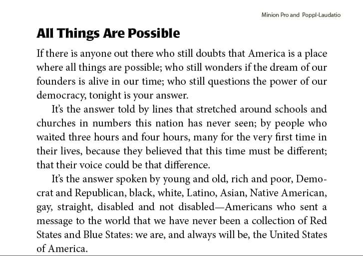
Minion and Poppl-Laudatio
Minion is an oldstyle typeface with a distinctive “color” on the page. I find the little flared hints at serifs on Poppl-Laudatio really bring out the fun and lively side of Minion, and they make me smile when I see them together.
Adobe Jenson and Lithos
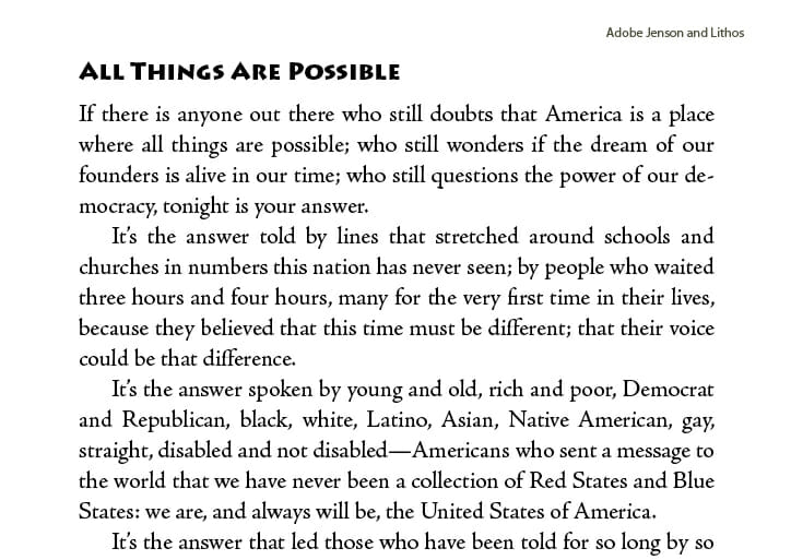
Some people don’t like Lithos, but used with care it has great character and dense color. Jenson, modeled after the earliest humanistic typefaces of the fifteenth century, is a standard in book typography. It’s many eccentricities somehow fall into a beautiful harmony on the page. I feel a lot of dynamism in this pair of typefaces.
These three combinations are all sans serif bold display faces with text typefaces. There are many other combinations possible, and it’s likely you might use one ornamental typeface in the chapter openings somewhere. But experiment with these combinations. Fine tune them until they sing.
And tell me: What are your favorite typefaces to use together?
<
p class=”note”>Takeaway: Using complementary combinations of typefaces can give your book pages a dimension, color and harmony they might not have otherwise. Use these combinations as a starting point for your own experiments.
