Case Study: Unmaking War, Remaking Men: How Empathy Can Reshape Our Politics, Our Soldiers and Ourselves by Kathleen Barry
Design brief: Create a complete book design for the important launch of a new imprint.
Constraints: None. The author was committed to turning out a quality product. Her first 5 books were traditionally published, and she wanted a production at least as good as those.
Raw material: Author Kathleen Barry, a distinguished academic, author and speaker, turned in a manuscript that had obvious social importance. I referred her to an editor who would be able to deal with her topic and the heavy annotation, citations and bibliography. The result was a polished manuscript ready to go to layout.
Production goal: Digital printing for print-on-demand distribution through Lightning Source.
Challenge: Create a book that, if possible, surpassed general trade book standards, while at the same time communicating Professor Barry’s forceful argument for a “politics of empathy.”
Here’s what we’ll cover in this self publishing case study:
Self Publishing Case Study: Solutions and Consequences
I was excited to work on this project because it had an important theme, it was going to be a high-quality text with a lot of circulation, and Kathleen Barry, a fellow member of the Bay Area Independent Publishers Association (BAIPA), was keen to start her own publishing enterprise.
Throughout the process we consulted regularly. I put a lot of thought into the designs I prepared for the interior, and included in the choices I showed Kathleen one that was a bit daring. I was delighted when she chose this design, and excited about carrying it out.
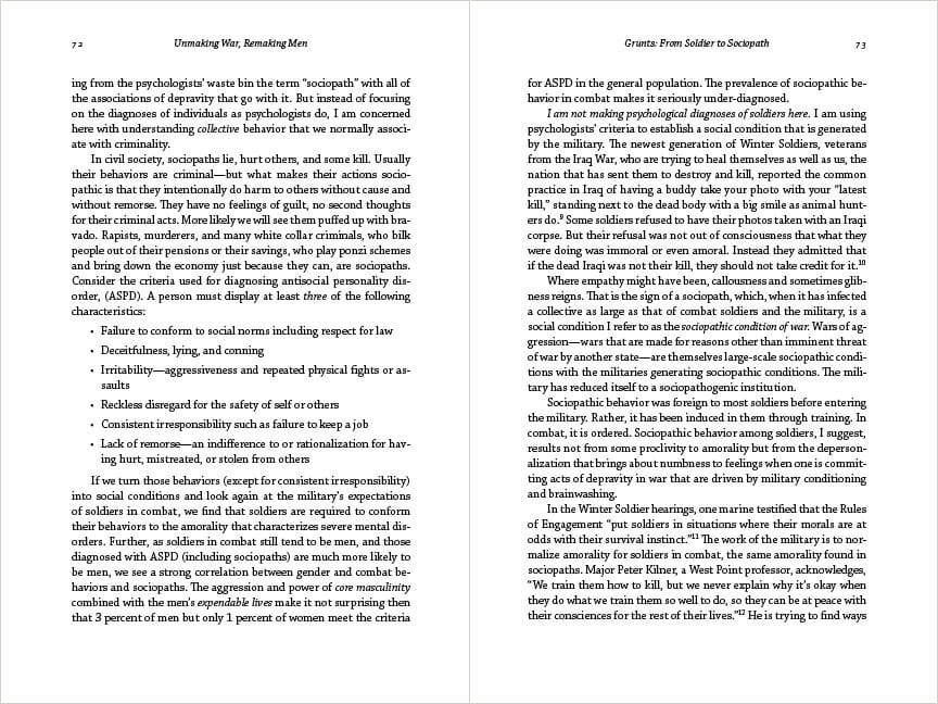
What makes this interior unique is this: it uses only one typeface for the entire book. Since rediscovering Chaparral several months ago while researching an article on type designer Carol Twombly, I decided to try to find the ideal use for this interesting typeface. This book turned out to be the it.
Type Color and Contrast

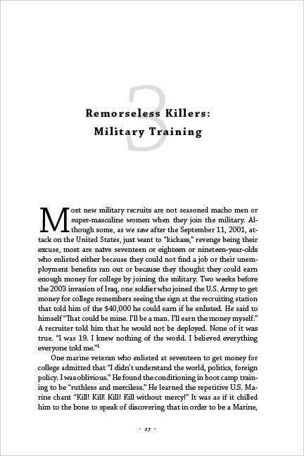
Here’s a chapter opener from Unmaking War, Remaking Men. It aims to be dramatic, with the very large chapter numbers, the overprinting of the chapter title, and the contrast between black type and gray type on the white background. It’s a way to introduce “color” in a variety of ways on one page.
The large drop cap also helped. The large chapter numbers are Chaparral Light, the chapter title is Chaparral Bold, and everything else is Chaparral Regular. This adds another layer of contrast and visual interest to the design. Although the typeforms of Chaparral are pleasingly eccentric, it is a slab serif typeface, with no variations in the weight of the strokes at all. The whole design becomes a matter of balance.
The result was a page design that communicates clearly and in a strong, clear voice. There’s a focus you get when confining yourself to one typeface, and I’m grateful that Kathleen chose this design. I asked her to characterize the general tone of the book:
My book is very thoroughly researched but it is not written in an academic style . . . You could say its written by an academic for a general audience
The design tried to reflect this sentiment.

While the book was in production, Kathleen made contact with some of her network of global feminist activists. Her first book, Female Sexual Slavery, launched an international movement against trafficking in human beings. These contacts resulted in a simultaneous co-publication with the independent Australian publisher Spinifex, where there is now a listing for the Australian publication of her book.
The author’s network of other authors in her field of study also resulted in numerous prepublication testimonials.
Cover Design

The dualistic nature of the title suggested the main characteristic of the cover design, a split panel with the title holding the two parts together.
The top image, blurred almost beyond recognition, suggests a battlefield from the soldier’s point of view. At the bottom are soldiers with their weapons, supressed behind a blue tint. Reaction to the cover has been quite good, and the author tells me that at the recent Sonoma Book Fair she took numerous orders for the book even though she had no books to sell. All she took was a poster of the cover. Combined with the powerful subtitle and the author’s authority in her field, she was able to sell the book sight unseen.
Conclusion
As a book designer and mentor to self-publishers, it was really satisfying to take Kathleen Barry’s project from the earliest stage right through to launching the book and her press today. The book fulfills its mission and time will tell what reaction it will find in the marketplace of ideas.
The entire project took six months, and I suspect it will not be the last book we see from Kathleen’s Phoenix Rising Press.
Self Publishing Case Study: Data
Buy Unmaking War, Remaking Men on Amazon (affiliate link)
Kathleen Barry’s author website
ISBN: 978-0982796702
6″ x 9″, 246 pages
$17.95, Phoenix Rising Press
Typography and design in Adobe Photoshop and InDesign


