When you start to design your book, one of the first things you might realize is that the chapter opening pages have the greatest potential for design elements. The rest of the book has to do the duty of conveying the meaning in the manuscript, and we judge book designs by how well they get out of the way of the communication between the author and the reader, while making the book as readable as possible while using distinctive fonts that lend their own imprint to the look of the page.
And since the advent of desktop publishing and page layout software, the favorite decorative element at the beginning of chapters has got to be the drop cap. Many word processors now offer the drop cap as an option, automatically formatting the beginning of the paragraph to accommodate them.
In powerful page layout programs like Adobe InDesign, the control we have over elements like drop caps is truly remarkable, and largely automatic one you’ve formatted your paragraph and character styles to get the effect you want.
Let’s take a look at some solutions for using this design element.
Drop Cap Styles
There are lots of ways to use the drop cap. This page, a sample from my archive of InDesign Book Templates, has a chapter opening in Centaur, text in Adobe Caslon Pro, and a small ornament from the Warnock font. I call this one the “flaming meteor,” but you can give it your own name.
Here we see a 2-line drop cap exactly as it would be if you just pushed the “drop cap” button. It uses the capital of the text font and simply enlarges it to fill the space of 2 lines, here 30 points.
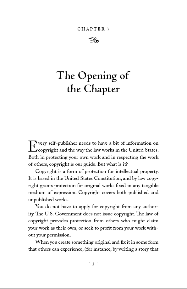
I guess it’s okay, but it looks pretty boring to me. It doesn’t add much to the page. To give it some life, I’ve changed the font to Centaur, to mirror the font in the chapter title, and increased the drop to 3 lines. Have a look:
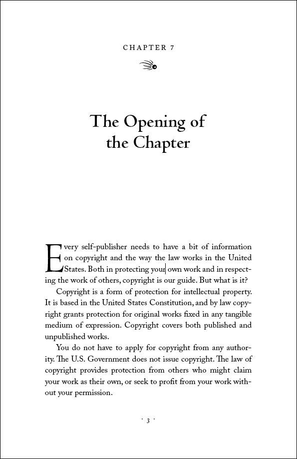
But we’re still firmly in the “classical roman font” arena. What else could we add to the page? How about something entirely different? Here I’ve changed the font to Madrone and, due to the heavy nature of the type, screened it back to 25% black:
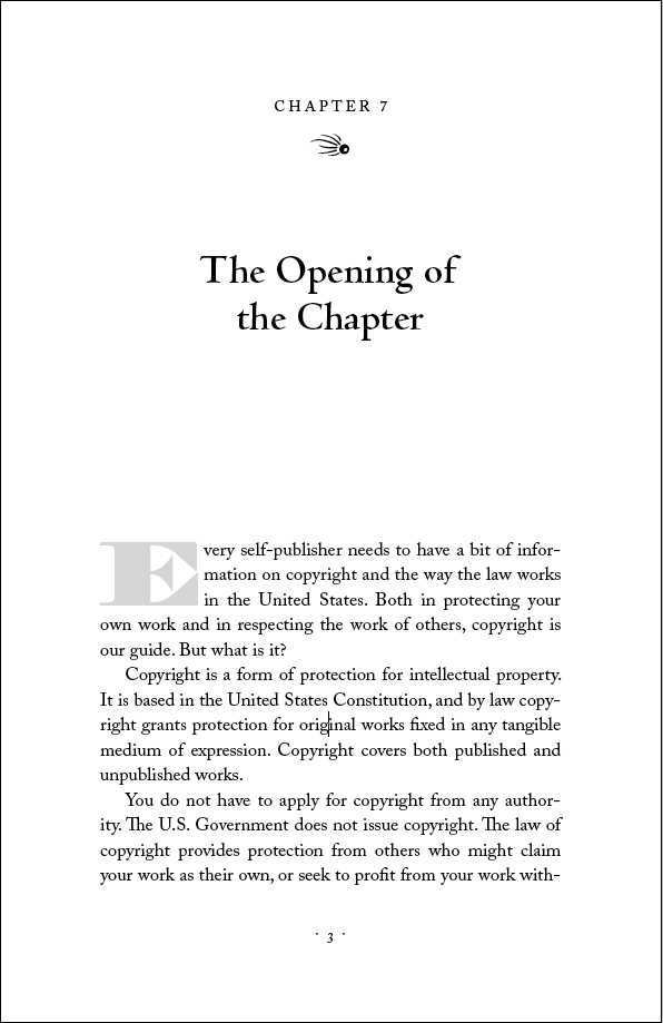
Dropping isn’t the only thing drop caps can do. They can just as easily stand up away from the line, in which case they’re called “stand-up caps.” Here’s an example in Party LET where there’s no drop at all:
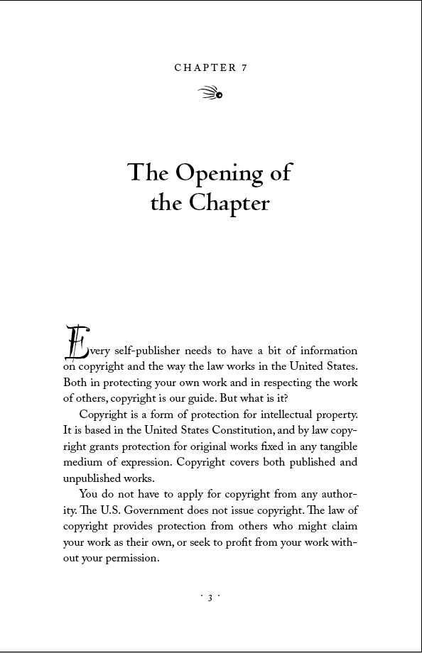
But wait, there’s more! If we take this same design and manipulate both the drop and the stand-up, we can get a drop/stand hybrid that has an appeal all its own:
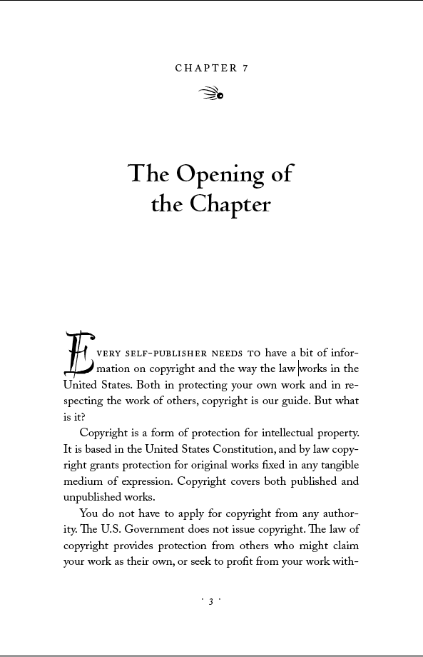
I’ve also introduced another element to go with the drop cap: a series of words in letterspaced small caps. This is a run-in effect that can be programmed into InDesign’s functions, and lends an elegant air to the beginning of the chapter.
Now I’m cooking, but we’re not finished. Here’s another example of some of the power you can manipulate in InDesign to get effects you might not think possible:
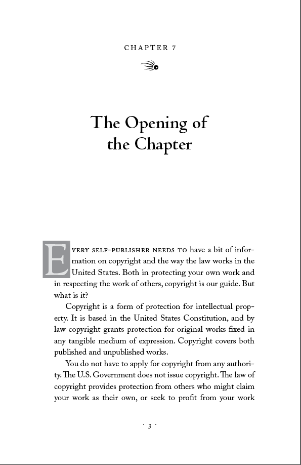
This two-toned, hanging indent 3-line drop cap is in Goudy Old Style. All the toning, of the background box (40%) and the drop cap (10%) is carried out automatically through InDesign’s normal functions.
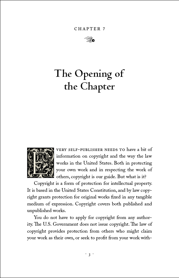
Of course, you don’t have to use type at all. Like the illuminated manuscripts of old, you can use wildly decorative elements for drop caps. Here’s a Victorian decorated letter embedded inline as a graphic:
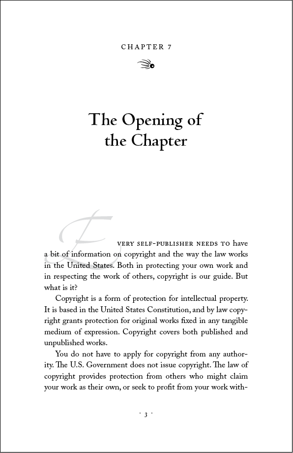
Okay, one more to end this little journey. When you’re designing, it’s good to just let go sometimes and do things that may not work in the end, but take you in a new direction. Here I’ve used an alternative form of a Zapfino capital and tinted it way back to 12%, allowing me to overlay it right on top of the rest of the type for a really unusual drop cap look. This is also completely automated through InDesign’s controls:
Well, there you have 8 examples of what you can do with drop caps, and I’m sure there are hundreds more if you just experiment. In the end you’ll have to decide if the treatment is suitable for the book, but don’t be afraid to try something new. It’s your book!
>>I think you can tell how much I enjoy this work.<<
I sometimes wonder if I'm the only one in the world who enjoys formatting pages.
Words are almost toys for me, like a child’s building blocks, Lincoln Logs, Legos or an Erector Set. Rewriting and editing—especially with a computer—is fun, not work. I love to play with words, to rearrange them and try alternatives.
When I move from simple writing to page formatting, the playtime becomes a bit like Scrabble or a crosswords puzzle–selecting words that fit right.
A particular joy of self-publishing is that _I_, and not some far-off stranger, get to make the changes that can eliminate excess pages, widows and orphans, or better wrap text around a photo. _I_ am the one who can decide if "organization" shouild be replaced by "club" or "group" to eliminate some characters.
Formatting is so much fun that I'm almost sad when I finally approve a proof for printing.
Yesterday I approved a book–and today I made about a dozen changes for thre next version. Am I an addict, Dr. Friedlander?
Michael N. Marcus
– http://www.BookMakingBlog.blogspot.com
– “Get the Most out of a Self-Publishing Company: Make a better deal. Make a better book,” http://www.amazon.com/dp/0981661777
– “Become a Real Self-Publisher: Don’t be a Victim of a Vanity Press,” http://www.amazon.com/dp/0981661742
Well, you seen to have cured the sadness that comes from approving a proof and, consequently, sending your “child” out into the world. However, as you suspect, you have done this at a cost to you, since you are exhibiting all the signs of a classic case of Chronic Rampant Tweakitis. No known cure, unfortunately, so you might as well enjoy your tweaking!
So good to see a master at work and the work of a master … thanks for all the sharing Joel
Thanks, Tom, I think you can tell how much I enjoy this work. I’ll take it as from one “master” to another.
Oh, I loved this post. I’m evolving into a typography snob and I love those page designs. I’ll admit my girly preference and say that I like the illuminated drop-cap the best. It’s so beautiful and ornate. I know it’s feminine, but I just love it.
Christy, I’m not sure how those would fit in with your test prep books, but why not? A little feminine touch in all those tall gray columns of type might be very welcome.
Joel:
Let me say again how much I appreciate your input into the world of book design. You are a welcome (nay, much needed) voice in a wilderness not always acknowledged by those in the world of books.
That said, I must say I much I prefer your first drop-cap example. Plain and simple, and yet decorative enough to add just enough personality to the text without being the least distracting to the reader, which is a book designer’s first priority.
Here’s a link to an article I wrote last year about book design and readability that I know you’ve referenced in the past. I hope you don’t mind me bringing it up again.
http://howpublishingreallyworks.com/?p=2746
Maggie
Hey Maggie, thanks for that. I’m more like you, a bit old school, and would probably have used option #2 if this was a live job. But it’s invigorating to know what your options are, that you can push it pretty far in the right circumstances.
Everyone who has never read Maggie’s wonderful piece on book design should take a few minutes and read it right now.
Joel,
Very nice sequence showing some of what’s possible.
A lot of the same-old/same-old designs in self-published works seem to stem from people who either design using MS Word or treat a powerful tool like InDesign as though it were just another word processor.
Thanks for taking the time to demonstrate how much more it really is.
Thanks Walt. I think education is pretty powerful because if people never saw really good examples of typographic design, they wouldn’t know what they were missing. Watch for more typographically geeky articles on book design minutiae coming up!
These sorts of embellishment are exactly the things I think we’re going to leave behind in the madcap rush toward the eworld. Of course, the argument can be made (and has been made) that the development of the printing press did much the same thing, stripping all those illuminated manuscripts of all their art and heart. Books eventually recovered, but it took many years, and I’m afraid I don’t have all that many left.
You and me both Levi. Whenever I hear people talk about how “someday” ebooks will be able to display brilliant typography and the designers will come back and out of hiding, I wonder just how far off that is because we’re not getting any younger. Just saying.
Great page designs, Joel.
I often use drop caps to break up a dull gray page, especially if I have no appropriate photo or other graphic element to use, but I never thought of using a drop cap as a “thing of beauty.”
Ironically, last night I was reading “The Non-Designer’s Design & Type Books” by Robin Williams (no, not THAT Robin Williams). This Robin is female, and she has some great examples of decorative drop caps.
I’m feeling inadequate this morning. I may have to re-decorate some of my books.
Michael N. Marcus
– http://www.BookMakingBlog.blogspot.com
– “Get the Most out of a Self-Publishing Company: Make a better deal. Make a better book,” http://www.amazon.com/dp/0981661777
– “Become a Real Self-Publisher: Don’t be a Victim of a Vanity Press,” http://www.amazon.com/dp/0981661742
Michael, yes, decorate away, but don’t feel inadequate. You’re just adding to your incredible storehouse of life experience and knowledge as a newbie book designer!
Waaaah! I wish this happened 24 hours ago–BEFORE I uploaded the hopefully final PDF for a new book.
However, it was not too late to redecorate my next book.
I had used drop caps made from Constantia that I had used as text type, but in bold. I’m now experimenting, and for the moment I’m using Rockwell, non-bold, in gray to match my headers and chapter numbers. It’s far from a thing of beauty, but I like it much more.
I suppose it’s only fitting that each book is better than the one before, but I’m a bit embarrassed by my first few books. Fortunately, I was selling content, not just form.
Michael N. Marcus
– http://www.BookMakingBlog.blogspot.com
– “Get the Most out of a Self-Publishing Company: Make a better deal. Make a better book,” http://www.amazon.com/dp/0981661777
– “Become a Real Self-Publisher: Don’t be a Victim of a Vanity Press,” http://www.amazon.com/dp/0981661742
Michael, you are evolving as a designer, no shame in that. The first few books I did were nothing special, trust me. If you don’t do the beginner parts, you never get to the other parts. It’s nice you are experimenting with the way your books look, and they will only get better.