• Skip to primary navigation
  • Skip to main content
  • Skip to primary sidebar
  • Skip to footer
  • Self-Publishing
  • Author Blogging
  • Sitemap
  • Fonts/Typography

The Book Designer

Practical advice to help build better books

by selfpublishing.com

COACHING


PUBLISHING


WRITING


PRODUCTION


FREELANCE


WRITING JOBS

  • Home
  • About
  • Articles
  • Contact
  • Shop
You are here: Home / Book Design / Self-Publishing Case Study: Personal Memoir

Self-Publishing Case Study: Personal Memoir

by Joel Friedlander on September 22, 2010 19 Comments

Table of Contents

  • Case Study: The Andrew Street Mob by Brian Marais
  • Solutions and Compromises
  • Conclusions
  • Data

Case Study: The Andrew Street Mob by Brian Marais

Design brief: Create a book design and production method to enable an author to publish a personal memoir.

Constraints: The Andrew Street Mob was not designed to be a commercial project, so the economics of the production had to be strictly monitored.

Raw material: Author Brian Marais submitted an unedited manuscript of 227,000 words and the desire to have a book that looked and read well. The book tells the author’s firsthand account of growing up amid a group of 40 or more kids in Johannesburg, South Africa in the 1950s.

Production problem: Digital printing and print on demand make books like The Andrew Street Mob possible. Without this technology very few books of this nature would be published, since the cost would be prohibitive.

But the nature of the production also presents challenges. The very long manuscript could conceivably create a book of 700 pages or more depending on the size, layout and typography.

Unfortunately, digital printers charge by the page, while publishers can’t get away with pricing by the page. A 700 page softcover book at Lightning Source will cost $10.00 each to print. That doesn’t leave a lot of room for a profit, let alone a wholesale discount.

Challenge: Create a book that can be handled and read, that’s economical to produce, and that minimizes the cost to print as much as possible.

Solutions and Compromises

self-publish a personal memoir
Chapter opening - click to enlarge.
The author and I had several discussions to focus on what the aim of the publication was. We talked to editors and looked at the possibility of researching South African publishers for a tie-in with the World Cup.

In the end it became clear that the publication would be more or less as a personal memoir. This decision allowed the author to move forward with a sympathetic editor in his family who would take care of polishing the manuscript.

Likewise, once the book was in proofs he found a friend to proofread and mark up the book before it went to press.

If he had been trying to create a commercial product, both of these important parts of the publishing process would have cost quite a bit more.

self-publish a personal memoir
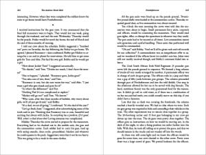
This spread has over 800 words but is still quite readable - click to enlarge
For the interior I created a long-narrative design that was both economical and readable. I used Adobe Garamond Pro, one of the most readable text faces in my collection. This typeface is also space-efficient, and I was able to fit the book into 586 pages. It would cost $8.50 to produce. Still not cheap, but with a bit more room for the publisher’s profit.

You’ll notice from the pages here that the spreads were not all vertically justified or combed through for typographic refinement. On a book this long, the amount of time needed to fine tune the whole thing would have been significant. This was another conscious choice, guided by the original discussions we had, to minimize the expense of the book production.

self-publish a memoir
Click to enlarge
Since cover design is largely positioning and packaging on commercial books, we were able to do away with most of the time and expense of design development. The finished cover was designed to be appropriate and professional.

Conclusions

I’m a big fan of these kinds of books. Whenever I come across arguments about self-publishing that fall into black-vs-white arguments, I think of the many self-publishers I’ve known over the years and the many ways they have of publishing their books. Each one has their own reasons, their own ways of doing things. You can’t assume you know someone else’s aims or motivations.

The Andrew Street Mob is no exception. It’s a unique work that is destined to become a primary source for the experience of a particular time in a particular place. I don’t think we can have enough honest, direct and heartfelt testimonies to a specific human life. Our culture gains from the publication of these books, and I’m happy to have a hand in creating them.

Data

The Andrew Street Mob by Brian Marais on Amazon (affiliate link)
Marais Media International
ISBN: 978-0982673201
$19.95, 586 pages, 6″ x 9″ trade paperback

Filed Under: Book Design, Book Production, Interior Design, Project Focus, Samples, Self-Publishing Tagged With: Brian Marais, Marais Media International, memoir, personal memoir, self publishing, The Andrew Street Mob

journal marketing

Reader Interactions

Comments

  1. Graviil Petrov says

    April 15, 2019 at 11:50 pm

    One of the best post I ever read.

    Reply
  2. Rico Marciano says

    July 15, 2013 at 12:45 pm

    Joel, I love Adobe Garamond Pro, did you state that this font helped to reduce the amount of pages in a book from 700 to 585? If so, is their a similar font which would help to increase the page count of a book?

    Reply
    • Joel Friedlander says

      July 15, 2013 at 4:05 pm

      Fonts have wider or narrower “set widths” and there are literally thousands of them. Using a service like Myfonts.com or Fontsquirrel.com will allow you to set a piece of sample text in different fonts to see the effect of each. That’s what I do.

      Reply
  3. Rico Marciano says

    July 15, 2013 at 12:33 pm

    Joel, I feel you’re a genius and you critique without being condescending. That said, I also like this type of book and the uniqueness of the theme of the story. For a book that is not designed to be a commercial project–the interior is beautiful and the exterior–although simple–is also very professional! But, a 700 page book that’s not designed to be a commercial project, by an unknown author, in a World that possesses the attention span of a gnat–seems destined to fail–unless published only for friends and family, am I right? If the book is not designed to be a commercial project, why worry about the profits?

    Reply
    • Joel Friedlander says

      July 15, 2013 at 4:04 pm

      Thanks, Rico. The book has achieved the goals the author/publisher set for it, so I see it as a success. Profit may or may not be one of the goals of a publication, but they all need to be taken into account when planning and executing a book like this one.

      Reply
  4. Nan Barnes says

    September 23, 2010 at 1:44 pm

    I always appreciate your blog, Joel, and referenced it on our blog yesterday. http://bit.ly/9pbX8d
    I have a new client who wants to use LSI for a very long work of historical fiction, about 700 pages (and still editing). Any suggestions, in addition to Garamond, to reduce the page count and to make this project commercially feasible?

    Reply
    • Joel Friedlander says

      September 23, 2010 at 1:54 pm

      Hi Nan, I really like your site and the service you offer to authors. Thanks for linking to my blog, I really appreciate it.

      Of course I don’t know the book, but as I indicated, an LSI production of a 700 page book is going to cost $10 wholesale. If you restrict sales to Amazon and other online retailers and go with a short (20%) discount, you could reasonably charge $20 for the book and walk away with a good profit on each copy.

      There are a whole host of typographer’s “tricks” to manipulating page length, so I can’t really go into them in this comment, but perhaps this would make a good blog post.

      If you have more detailed questions, Nan, please drop me an email and I’ll see if I can help. And thanks for reading!

      Reply
  5. chris says

    September 23, 2010 at 3:26 am

    Ahh, Adobe Garamond Pro. My all-time favourite font for fiction.

    It makes my drunken prose look like Hemingway! :)

    Reply
    • Joel Friedlander says

      September 23, 2010 at 10:51 am

      Chris,

      Yeah, it’s elegant. How is your book coming along?

      Reply
  6. Christy Pinheiro says

    September 22, 2010 at 4:35 pm

    The book layout looks great, and the price is still affordable. It’s a win-win for everyone. I know about the issues with a larger book– my longest textbook is almost 750 pages, but the price point is much higher (like all textbooks) so I’m not as worried about the price adjusting higher on the page count. That being said, it’s an amazing job that you’ve done here– the entire project really looks great.

    Reply
    • Joel Friedlander says

      September 22, 2010 at 4:44 pm

      Thanks Christy!

      Reply
  7. david w berner says

    September 22, 2010 at 10:38 am

    Great advise for those working to self-publish, but also for those working with publishers of ALL types. DO NOT just accept what the publisher decides to do with your cover or your book design. Ask questions, offer ideas, make sure it all makes sense for the book style, genre, etc.
    When I published my first book – Accidental Lessons the publisher’s artists’ initial idea was NOTHING what I envisioned and did not clearly represent the book. We worked together and came up with something that worked for them and me.

    David B

    Reply
    • Joel Friedlander says

      September 22, 2010 at 10:42 am

      Great point, David. Thanks for your input.

      Reply
  8. Marcus says

    September 22, 2010 at 10:33 am

    You might want to also mention that the trim size can have a huge effect on production costs, as certain sizes are much cheaper than others (try getting a price quote on a 6.5×8.5 or some other non-traditional size and you’ll see what I mean!). This depends, of course, on the printer you’re using, but the standard trim sizes are pretty universal because paper sheets come in specific sizes (parents) which are then cut down into the book’s size, and this is what a lot (most?) of the short-run self-publishing printers use. The more efficient use of your printing space, the cheaper and easier it is to print. Now, if you’re doing a very large print run on web-fed press, there’s less to worry about. It also makes it less of a headache for bookstores, who actually have to shelve the things.

    I hope my info isn’t too out of date, but I haven’t used a short-run self-pub printer in a few years, and I know the tech has greatly advanced in that time…

    Reply
    • Joel Friedlander says

      September 22, 2010 at 10:38 am

      Marcus, of course you are correct, and standard sizes offer the most cost efficient production. There is a difference, however with digital printers who offer only very specific sizes (see my recent post on How to Pick the Size of Your Book). This book was printed by Lightning Source, which categorizes and prices books as “small paperback” “large paperback” and within those ranges the prices are all the same. Still good advice, and thanks for your comment.

      Reply
      • Marcus says

        September 22, 2010 at 4:32 pm

        Ah, interesting. I thought I might be a tad out of touch with places like Lightning Source.

        Reply
  9. J. Tillman says

    September 22, 2010 at 9:14 am

    “Since cover design is largely positioning and packaging on commercial books…”

    What does that mean?

    Reply
    • Joel Friedlander says

      September 22, 2010 at 10:35 am

      J. Tillman,

      It means that book covers are principally designed as packaging for a commercial product. And when we make a book look like it belongs in a specific genre, it’s serving the function of positioning the book in the potential buyer’s mind. So thrillers look like thrillers, not like devotionals or how-tos.

      Reply

Trackbacks

  1. Tweets that mention Self-Publishing Case Study: Personal Memoir — The Book Designer -- Topsy.com says:
    September 23, 2010 at 6:21 pm

    […] This post was mentioned on Twitter by Publisher Guide, Lee Benz, Joel Friedlander, Chris O'Byrne, Wanda Shapiro and others. Wanda Shapiro said: check out this post by @JFbookman (especially @Jeff_Emmerson) http://bit.ly/9skl5p Self-Publishing Case Study: Personal Memoir […]

    Reply

Leave a Reply Cancel reply

Your email address will not be published. Required fields are marked *

This site uses Akismet to reduce spam. Learn how your comment data is processed.

Primary Sidebar

Get the Advanced Publishing Kit

Topics

  • Audiobooks
  • Author Blogging 101
  • Book Construction Blueprint
  • Book Design
  • Book Printing
  • Book Production
  • Book Reviews
  • Cameras
  • Contributing Writers
  • Cover Design
  • E-Books & Readers
  • Editorial
  • Guest Posts
  • Interior Design
  • Interviews
  • Journey of a Book
  • Legal Issues
  • Marketing
  • Podcasts
  • Project Focus
  • Reports
  • Reviews
  • Samples
  • Self Publishing Basics
  • Self-Publishing
  • Social Media
  • Training
  • Video
  • Webinars
  • Writing
Self Publishing Platform
Self Publishing School

COACHING

Self Publishing

PUBLISHING

The Write Life

WRITING

The Book Designer

PRODUCTION

Make a Living Writing

FREELANCE

Freelance Writers Den

WRITING JOBS

Footer

  • Home
  • About
  • Articles
  • Contact
  • Shop
  • Self-Publishing
  • Author Blogging
  • Sitemap
  • Fonts/Typography
Terms of Service
Privacy Policy
Comment Policy
Guest Author Guidelines
Why?
"Writers change the world one reader at a time. But you can't change the world with a book that's still on your hard drive or in a box under your bed. This blog exists to help you get that book into people's hands."
—Joel Friedlander

Copyright Self Publishing School All Rights Reserved. © 2022