Welcome to this edition of the e-Book Cover Design Awards. This edition is for submissions during January, 2012.
Here’s what we received:
82 covers in the Fiction category
10 covers in the Nonfiction category
Award Winners and Listing
I’ve added comments (JF: ) to many of the entries, but not all. Thanks to everyone who participated. I hope you enjoy these as much as I did. Please leave a comment to let me know what you think, too.
Now, without any further ado, here are the winners of this month’s e-Book Cover Design Award.
e-Book Cover Design Award Winner for January 2012 in Nonfiction

How to Order an Italian Coffee in Italy by Sara Rosso, designed by Sara Rosso.
JF: The author, who is also a photographer, has achieved a small bit of perfection with this cover. The luscious photo combines flawlessly with the clean typography to create an indelible (and delicious) image. Well done, and it makes me want to go fire up the Gaggia right now. (Russo is also the author of The Unofficial Guide to Nutella.)
e-Book Cover Design Award Winner for January 2012 in Fiction

The Man Who Did Too Much by Camille LaGuire, designed by Camille LaGuire. “I struggled to find the right tone for a cover for this book. It’s a contemporary cozy mystery, but also kind of a throwback. Modern cutesy covers didn’t quite fit. Then I got inspired by Saul Bass, and decided to go for a very simple retro cover. (It’s a theme I feel I can do all sorts of things for future books in the series as well.)”
JF: This cover relies on a great translation of the work of legendary graphic designer Saul Bass (1920-1996), particularly his film poster for Anatomy of a Murder. Graphic covers like this one are underutilized by ebook publishers, which is too bad. The strong elements and simplified color scheme help make the book stand out at any size and create a powerful brand for the author to build on.
Fiction Covers
Derek Murphy submitted 77 Days designed by Derek Murphy. “Thanks, think you’ll like this one! Here’s the amazon link: https://www.amazon.com/77-Days-in-September-ebook/dp/B0052T1O6S/”
JF: A strong entry from the talented designer Derek Murphy. I especially like the color and style of the strong type, perfect for this thriller, and it shows that in the right hands, simplicity can have a powerful effect well suited to the context in which people look at ebook covers.
Judith Deborah submitted A Falling Knife: An Evan Adair Mystery designed by Andrew Brown of Design for Writers. “I asked Andrew to create a cover that was striking and original, and that would work in both thumbnail and full-size versions. The cover imagery communicates the genre very clearly, and the font choice and text arrangement pop out very well. I’m really pleased with the result.”
JF: Another strong cover, this one with some typographic tricks, too. And thee abbreviated palette of colors and simplified illustrations help to make a dramatic effect. Shows the usual downside of having been reduced from the paperback version.
Felipe Adan Lerma submitted A Month of Mornings Vol 1 designed by Felipe Adan Lerma. “All design and photography work by author.”
C. Jayee Cohen submitted A Night Below New York designed by C. Jayee Cohen. “The book takes place in a dark Arabesque brass city underneath the earth, and for it, I was trying to create an atmosphere similar to Richard Williams’ animated film, The Thief and the Cobbler. “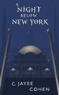
Carole Howard submitted About Face designed by Gini Hamilton.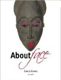
Saewod Tice submitted Amongst the Ruins designed by CH Harris.
JF: A cover suffering from too much visual and typographic confusion to make much of an impact. And for such a small image, it might be better not to duplicate the series branding.
Gayla Drummond submitted Arcane Solutions (Discord Jones #1) designed by Self.
Rowan Fae submitted Autumn Eddy designed by Rowan.
Damon J Courtney submitted Baptism of Blood and Fire designed by Jeff Jenkins. “I have no illusions of winning, it being my first book, and Jeff having never designed a cover before, but I would just love to hear your feelings on it. Perhaps we can learn from it and work on it a bit. :) Thank you.”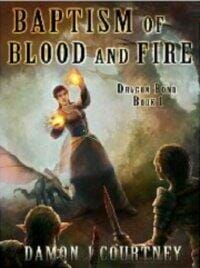
JF: You’ve made a great start with an atmospheric illustration and some distinctive typography. Try to avoid putting type on the cover that’s simply unreadable, it doesn’t help.
Alfie Thompson submitted Between Dusk and Dawn designed by Kathy Carmichael. “This is the cover I wanted when a major publisher originally published this book. (The cover they gave me was awful.) From reading your comments on other submissions various months, I suspect you aren’t going to like some of the type on this one, but I love the cover and Kathy captured the feel of the book perfectly.”
JF: You are correct.
Matt Horner submitted Billy’s Log designed by Matt Horner. “This is a funny book, and we wanted to convey a lads lit feel to the cover, without a sports reference. We also avoided macho images, as the book reveals a more vulnerable side to our ‘hero’ Billy.”
JF: Graphically strong and it does what a cover should do—stop the browser. Could have done without the little unreadable type, and at this size (reduced from paperback) it took several looks before I deciphered the beer can, but overall quite well done.
Heather Wardell submitted Blank Slate Kate designed by Heather Wardell.
JF: Excellent job, Heather, simple, to the point and compelling.
Vincent Eaton submitted Brussegem, a snug hell designed by Fontana Design & Identity. “About the book: Brussegem is both a place and a person. But mainly it is a painter. A fully dedicated and fairly isolated American painter living in Europe whose creed is art, and only art. Until Veronica, a married woman, seeks his attention, companionship, something artistic, and, if possible, something wild. But then there’s her baby. And that cat. This is a novel of art and domesticity, centering on a determined artist who does not want to fall in love, and an equally determined woman who does.”
JF: Very good job of tying the theme of the cover to the theme of the book, marred only slightly by the painted words that can be a little hard to read.
T.K. Marnell submitted Bubbles Pop designed by T.K. Marnell.
JF: This cover, intended for the teen market, does a good job of catching our attention and, like Blank Slate Kate above, makes us wonder about what it obscures. I’ve never used type like this, but it does seem to suit.
Amber Lynn Natusch submitted CAGED, book 1 of The Caged Series designed by Jamie Rosen.
Christopher Wills submitted Call me Aphrodite designed by Myself. “I hoped to suggest loneliness, the dark side of London and vulnerability.”
JF: Combining photos can be challenging, and here you can see why. There’s a lot of visual confusion where the face meets the dark buildings, and I would suggest getting some display typefaces rather than using a text face like this one.
Dan Collins submitted Cartoons That Will Send Me Straight To Hell designed by Dan Collins. “My first ebook, written, designed and constructed in epub format by myself.”
JF: The author is a long time cartoonist, and it shows in this idiosyncratic cover that perfectly captures the work inside.
Chris Daley submitted Child of Destiny designed by Chris Daley. “Created using a public domain image from NASA as the starting point. First book in a 3 book series.”
Lee Harlem Robinson submitted Come and Go designed by Caroline Manchoulas.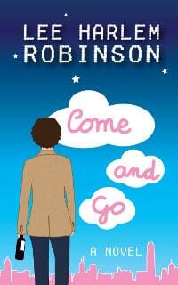
Sandra Miller submitted Concerto designed by Sandra Miller.
JF: Another case of using weak fonts where emphasis is needed. Display fonts would help here.
Istvan Szabo, Ifj. submitted Crystal Shade: Angeni, Volume 1 designed by Istvan Szabo, Ifj..
JF: Although it’s atmospheric, the type on this cover is hard to read on the paperback edition, simply lost here.
Lois D. Brown submitted CYCLES designed by by author. “This is the second cover to my young adult urban fantasy. I changed my original after the book had been on sale for less than a week. The feedback I got on the first cover is that it did not look “YA.” After carefully studying the covers on Amazon in the teen section, I decided a young adult book was not complete without an intriuging girl on the cover. (You may think I jest, but take a look for yourself.) In any case, this is what my research resulted in.”
JF: Lois, I don’t think you jest at all, and I’ve often written about studying the books in your genre to find out the expectations of your readers. (On CreateSpace: Cover Design: Why Genre Readers Rule.)
Kristine Cayne submitted Deadly Obsession designed by Scarlett Rugers. “Scarlett’s website: https://www.scarlettrugers.com”
JF: This cover was probably easier to decipher in the paperback version. (Note: There are 7 books in the Amazon store with this title.)
Susan Russo Anderson submitted Death of a Serpent designed by Jeroen ten Berge. “Joel, Thanks for hosting these monthly design awards. I found the designer, Jeroen ten Berge, by looking at covers here—can’t remember which month but it was probably fall 2011. You’re site is tops.”
JF: A beautiful image and careful typography don’t always add up to what we’d want them to be. On this Kindle-only cover, it’s quite challenging to figure out exactly what we’re looking at. The designer is very talented and most of Jeroen’s covers are striking and graphic.
TL Erickson submitted despair designed by Self. “Thanks for running this competition! Great idea!”
JF: I like the simplicity of the cover, but you need to find a different solution for making the title stand out so the cover doesn’t look quite so “hand made.”
Kit Foster submitted Don Coyote de la Merika designed by Kit Foster.
JF: The very talented Kit Foster is an expert at combining illustration and typography, as in this cover in the same style as a companion book by the same author.
Brian Platt submitted George Barrington Hunter designed by Brian Platt aka JB. Woods.
Jake Needham submitted LAUNDRY MAN designed by OpalWorks Co Ltd.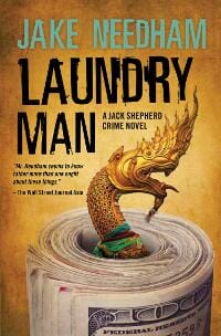
JF: The designer is a highly experience cover artist, which shows in the careful arrangement of elements here that heighten our interest in the story. Reduced from the paperback cover.
Belinda Kroll submitted Mad Maxine designed by Belinda Kroll.
Chloe Alison submitted Mission of Seduction designed by Chloe Alison.
Victoria Griesdoorn submitted of Altered States, volume one designed by Gary Bonn. “I’m the editor of the of Altered States project, which brings together more than 20 international writers, illustrators and photographers. Our anthologies are entirely self-produced, including the cover design, which is designed by Gary Bonn who is also a fiction contributor.”
JF: This cover for a new series has a lot going for it, from the “transcendent” artwork to the way the type frames the cover. On the other hand, it’s a great demonstration of why you need to put a frame around a white cover if you don’t want it simply bleeding into the rest of the page. Or maybe that’s the effect the designer was going for?
LK Hunsaker submitted Off The Moon designed by LK Hunsaker.
Karen Mueller Bryson submitted One Last Class designed by Tony Bryson.
JF: Charming and effective.
Matt Horner submitted One Monster of a Night designed by Matt Horner. “This was fun to do, quite of lot of info to get on there for the authors, but hopefully the image is eye catching enough to provoke interest.”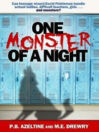
JF: Well, the image, composition and lettering all work together great, very effective cover. But since this is a Kindle-only publication, why put the type on at the top of the cover that’s unreadable at any size you’re likely to see the cover?
Patty Jansen submitted Out of Here designed by Andrew McKiernan.
Istvan Szabo, Ifj. submitted Pale Moonlight (7 Post Meridiem #1) designed by Istvan Szabo, Ifj..
Joanne Sydney Lessner submitted Pandora’s Bottle designed by Linda Pierro.
JF: A beautiful cover reduced from the paperback edition.
Augusto Pinaud submitted Putsch designed by Kenn Rudolph.
JF: Another good example of a simple design that works perfectly for an ebook.
S.W. Lothian submitted Quest One. The Golden Scarab designed by S.W. Lothian.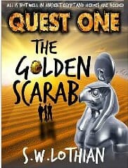
Dana Delamar submitted Revenge designed by Scarlett Rugers.
JF: Another example of this talented designer’s work that does not translate well to the ebook cover format. The graphics have become murky and the type indistinguishable.
Christina York submitted Rodeo Royalty designed by J. Steven York.
Shaila Abdullah submitted Saffron Dreams designed by Shaila Abdullah. “From the darkest hour of American history emerges a mesmerizing tale of tender love, a life interrupted, and faith recovered. Arissa Illahi, a Muslim artist and writer, discovers in a single moment that no matter how carefully you map your life, it is life itself that chooses your destiny. After her husband’s death in the collapse of the World Trade Center, the discovery of his manuscript marks Arissa’s reconnection to life. Her unborn son and the unfinished novel fuse in her mind into one life-defining project that becomes, at once, the struggle for her emotional survival and the redemption of her race. Saffron Dreams is a novel about our ever evolving identities and the events and places that shape them. It reminds us that in the midst of tragedy, our dreams can become a lasting legacy.”
JF: Nice use of Zapfino, although I find the cover a bit confusing visually.
Mercy Loomis submitted Scent and Shadow designed by Mercy Loomis.
JF: Would be much improved with stronger typography.
Anthony Healy submitted Scut designed by Phil Mortimer. “Crime Thriller, so design had to reflect the quirky, unsettling nature of the book.”
JF: Okay.
Janet Roberts submitted Secrets designed by Janet Roberts. “As this children’s book is set in the Second World War I wanted to include the outline of a bomber. As the story is about an injured gunner who parachutes into occupied France, this seemed an appropriate image”
Sean Day submitted Share the Road designed by Sean Day. “Both the upside-down bike and children’s trailer with a guitar are elements in the story. Shot in La Jolla, CA with a self-timer.”
Christina York submitted Sharper Than a Serpent’s Tooth designed by J. Steven York.
JF: White covers need borders around them, as you can see here. You need to be a pretty adept typographer to create a book cover with script like this, and here it’s simply not up to the job.
Cody Rutty submitted Stalked designed by Cody Rutty. “Oil on Canvas by Cody Rutty, additional design work by Cody Rutty. Thank you!”
JF: Nice piece of artwork, weak type choice. The black outline takes away from the effect. It would be interesting to see this cover as a full bleed and with much stronger and more allusive typography.
Tori Scott submitted Superstition designed by Ade Ratna.
JF: A complex and sophisticated design that’s baffling when you consider it was done for a Kindle original. Doesn’t it look just like a print book that’s been reduced?
Rebecca Burke submitted The Ahimsa Club designed by JT Lindroos. “This is a YA book about a teen activist and reluctant musician!”
Dixon Bennett Rice submitted The Assassins Club designed by Suzanne Fyhrie Parrott. “This is a serial killer vs serial killer novel set in the 1970s, with the antihero a young man who’s a student by day and bartender by night. A rundown Montana roadhouse is the setting for many scenes, and I had an idea of a glass or bottle on a bar for the cover. Suzanne took that vague concept and turned it into vivid reality.”
Gloria Breward submitted The Audacity of Dope designed by Joe Font. “Published Nov 2011”
JF: Easy winner for title of the month.
Autumn Angel Moon submitted The Beauty at the Bus Stop: A novel designed by Autumn Angel Moon. “Cover for indie author of contemporary romance”
LJ Cohen submitted The Between designed by Jade E. Zivanovic.
JF: Wow. That’s pretty . . . freaky. But in a good way.
J Smith submitted The Black Jewel designed by J Smith. “This is book 2 in the series; so Title placement, Font, and Color were maintained. This image scored the highest among a dozen different selections provided to my test panel, beating out a colorized version of the same image. One comment I received on this cover was “It looks like I could just reach out and pick up the sword for battle.”
JF: I think the extreme perspective draws the viewer in.
F.X. Biasi Jr. submitted The Brother-in-law designed by Sandra Williams. “The Brother-in-law is a Mafia based tragic love story steeped in suspense.”
JF: Sounds fishy to me. Why are the people gazing at the fish? I’m puzzled.
Richard Alan submitted The Couples designed by Carolynn Marcus Schwartz.
Andy Gavin submitted The Darkening Dream designed by Cliff Nielsen/Pete Garceau. “I wanted an illustrated cover to convey the mood of the book. Artist Cliff Nielsen shot the model and used other photographic elements in the photo-illustration. Designer Pete Garceau did the titles and mechanical.”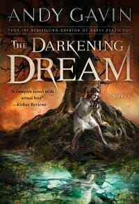
JF: A beautiful print book cover.
J Smith submitted The Diamond Coronal designed by J Smith. “I reissued The Diamond Coronal, the 1st book in the series, when the 2nd book was published, The Black Jewel. The Diamond Coronal original cover was included in the November competition (shown in the small lower left inset). The lower right inset is a prototype of the 3rd in the series. I included it here to show how the title font is getting larger from book to book ;)”
Emily Casey submitted The Fairy Tale Trap designed by Ryan Rhoads.
Diana Layne submitted The Good Daughter designed by Shanel Anderson. “Thanks!”
JF: Sophisticated design and adept typography set this cover apart. But again, do the designers ever look at these covers at this size? There are a number of examples of Kindle originals this month that are very similar. Still, this is one of the best ebook covers I’ve seen that translates the idea of a paperback cover successfully to digital.
Jon Mac submitted The Human Ate My Pumpkin! designed by Jon Mac.
JF: Love how emphatic and idiosyncratic this cover is. Instantly creates exactly the right tone, and notice how the red border makes this image stand out.
DJ Hazard submitted The Ladies’ Subway Companion designed by DJ Hazard. “This is my first book of erotica, although I had written and performed at many erotic storytelling shows here in NYC. I love writing eBooks and I like designing the covers. Technically, I’m just this side of a Luddite. I do all my work on MS Paint and Picnik.””
JF: Very nice, DJ, although I would have preferred a little more emphasis on the title, but I love the atmosphere the cover creates.
Roh Morgon submitted The Last Trace designed by Roh Morgon. “The background image for this was converted from color to black-and-white, then inverted (as in a negative). At first the eye doesn’t notice the white figure of the woman standing on the path. She materializes (just like she does in the story) only when the viewer attempts to make sense of the image.”
Bridget McKenna submitted The Little Things designed by Bridget McKenna.
Janet Angelo submitted The Oddstock Folk designed by . “My first-time author KJ Melville is writing a wonderful series of novels set in Scotland. We wanted to go with a cohesive look that was fairly simple but clearly portrayed the main character(s) and also the fact that each book is the first or second in the series.”
Janet Angelo submitted The Oddstock Girls. “This is Book Two in the Oddstock Series. You can see how the author and I have kept the same fairly simply, streamlined theme to clearly denote that it’s a series, but this book has a different color scheme from Book One and a photo depicting the main character, Annie. This photo is authentic in that it was taken in Scotland (where the books are set). ~Janet, the publisher”
Hugo Byrd submitted The Rise and Fall of The Rocketmen designed by Hugo Byrd. “Book cover design is way harder than I expected. This is the result of three failed attempts and around 10 hours work.”
JF: Nice job, Hugo. Your cover shows the work you put into it.
Joanne Tombrakos submitted The Secrets They Kept designed by Wendy Bass. “I’m still a little unclear on the url for the cover but am happy to send a jpg should you need one. In lieu of that I’ll link to my blog which has several choices of image and of course you can grab the photo on Amazon. Thanks for your consideration.”
JF: The careful typography and sure-handed execution from this top cover designer are lost a bit in the reduction from the paperback original.
Grant McDuling submitted The Vortex and the Leach designed by Patrick van der Helm.
Stefano Boscutti submitted The Wedding Video designed by Stefano Boscutti. “It’s a modern take on the farce “The Marriage of Figaro”. It’s a comedy of sexual manners and misunderstandings. Double and triple entendres. Fallbacks and fall guys. I wanted to keep it light and frothy and slightly wry. Hopefully to better picture the words and story inside. Also wanted to maintain the type style with my other titles for consistency. Questions? Fire way. Thanks”
JF: A clever and amusing cover somewhat marred by the white type, especially the smaller lines, which are very difficult to make out against the background.
Edwina Ray submitted The Witch’s Curse designed by Sarah Billington. “Thanks for the opportunity. :)”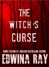
JF: I love the whole look of this excellent ebook cover. Limited colors, a clearly understood image and strong typography that suits the genre all combine to great effect.
Robby Charters submitted The Zondon designed by Robby Charters.
George Cotronis submitted Twenty Palaces designed by George Cotronis.
Toni Dwiggins submitted Volcano Watch designed by J. Simmons.
JF: This might be a case of the type actually being too big, so large that you can’t make out the image behind it.
Dave Malone submitted Winter in Love designed by Jenni Wichern. “This is a poetry book.”
Matt Horner submitted Winter Woman designed by Matt Horner. “The challenge with all of F. M. Parker’s ebooks, is to maintain the heritage of his backlist, to portray the Western theme, and also freshen up the look of the covers to attract a new audience.”
JF: An excellent job of improving on the old paperback cover, this ebook cover combines a limited set of colors with a clear visual and typography that signals its genre. It all works perfectly, and the designer shows he knows exactly what’s needed and what isn’t to take advantage of this format.
Derek Murphy submitted Yseult designed by Derek Murphy (Creativindie).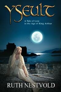
JF: Another strong and evocative cover from Derek Murphy.
Jason Z. Christie submitted Zombie Killa designed by Jason Z. Christie. “I did the layout only, not the zombie Hillary.”
JF: Okay, wow, right. Zombies! It works.
Nonfiction Covers
L. Spikes submitted Classics for Twitter: Laozi designed by L. Spikes.
Tom Evans submitted Flavours of Thought designed by Tom Evans. “I spent two days trying to design this cover and failed. Then I found the most perfect stock artwork for $5 that described the book’s content and “designed” it in about 10 minutes. Simplicity and not pushing water uphill is the key. And making sure it works in print, ebook, colour and greyscale”
JF: Overall this is a strong cover, helped by the stock artwork to give a good idea of the content. For the Kindle version, you might consider changing or eliminating the tiny type that can’t be read.
Lucy Tobias submitted Florida Gardens Gone Wild designed by Lucy Tobias. “wanted it to “snap” at postage stamp size”
Matt Harrison submitted Guide to Python Decorators designed by Matt Harrison. “My take on a simple cover for a technical ebook. It has had sales since its public announcement, so that cover isn’t that bad. Or programmers just have a poor sense of cover judgement.”
Anthony Healy submitted In Memoriam designed by Phil Mortimer. “Book of poetry about the death and life of Poet Mick Imlah. Design to reflect the afterlife and still be gritty yet clean.”
JF: Unfortunately, the weak colors and small type have rendered this cover much less effective than it could have been.
James Gibson submitted Making A’s in College designed by Brook Armsby. “We wanted a graphic cover that would illustrate the demands of college, and a stack of books seemed obvious, simple, graphic.”
JF: Well done, too, although some of the black type is a bit hard to make out agains the black and white image. But conceptually right on the money.
Edwin Tipple submitted My Thai Eye designed by Edwin Tipple. “I have dipped my toe in the indie e-book world with this short fund-raiser (Thai flood victims) released in January.”
Karen Skidmore submitted Shiny Shiny: How to stop being a social media magpie designed by Tom Evans. “I wanted simplicity. Something that would stand out well in black and white, particularly whilst looking in the Kindle store from a Kindle. It’s a brand new book out just this week. Thanks, Karen”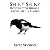
JF: A creative and amusing concept for a cover that could use a border around it.
David B. Smith submitted Small Does Not Mean Struggling designed by WinePress Publishing.
Veronica Torres submitted The Journey of Consciousness, A Warrior’s Tale designed by Hollyscreative.com. “I commissioned the art for this book from Randy Sue Collins (thanknature.com). She painted it using acrylics on board. I then scanned the art and Holly Eve did the graphics. Using an original painting gave a lot of texture to the cover which matches the mood of the book. The forest scene wraps around the spine and back cover for the paperback version.”
JF: Very well done, too, but the type needs to be sized a bit differently since what I think is the title is being overwhelmed by what must be the subtitle. Needs to show a clear hierarchy, and you can’t do that if everything is the same size.
Debra Winegarten submitted There’s Jews in Texas? designed by Michal Mahgerefteh. “My book is not available on Amazon, it is only available through my website. I am not sure how to upload only the cover URL — I have the cover as a .pdf and would be more than happy to submit it to you. Thank you!”
JF: Runner-up for title of the month, this is an award-winning poetry collection.
How to Take Part in the E-book Cover Design Awards
Well, that’s it for this month. I hope you found it interesting, and let other people interested in self-publishing know about the Awards. —Use the share buttons below to Tweet it, Share it on Facebook, Plus-1 it on Google+, Link to it! The next issue is March 11, 2012 and the deadline for submissions will be February 29, 2012. Don’t miss it! Here are all the links you’ll need:
The original announcement post
E-book Cover Design Awards web page
Submit your e-book cover here
Follow @JFBookman on Twitter for news about the E-book Cover Design Awards
Subscribe to The Book Designer Blog


