Welcome to the e-Book Cover Design Awards. This edition is for submissions during September, 2017.
This month we received:
90 covers in the Fiction category
27 covers in the Nonfiction category
Guest Judges
I’m very pleased to welcome Tamara Dever and Erin Stark of TLC Graphics to The Book Designer as a guest judges this month. TLC Graphics has been creating award-winning books for over 20 years.

Founder Tamara Dever and Designer Erin Stark are dedicated to bringing to fruition the passion of writers dedicated to quality publishing. They are the authors of the acclaimed publishing guide/journal guide, My Publishing Journey. You can learn more at TLCGraphics.com.
Comments, Award Winners, and Gold Stars
I’ve added comments (TLC: ) to many of the entries, but not all. Remember that the aim of these posts is educational, and by submitting you are inviting comments, commendations, and constructive criticism.
Thanks to everyone who participated. I hope you enjoy these as much as I did. Please leave a comment to let me know which are your favorites or, if you disagree, let me know why.
Although there is only winner in each category, other covers that were considered for the award or which stood out in some exemplary way, are indicated with a gold star: ★
Award winners and Gold-Starred covers also win the right to display our badges on their websites, so don’t forget to get your badge to get a little more attention for the work you’ve put into your book.
Also please note that we are now linking winning covers to their sales page on Amazon or Smashwords.
Now, without any further ado, here are the winners of this month’s e-Book Cover Design Awards.
e-Book Cover Design Award Winner for September 2017 in Fiction
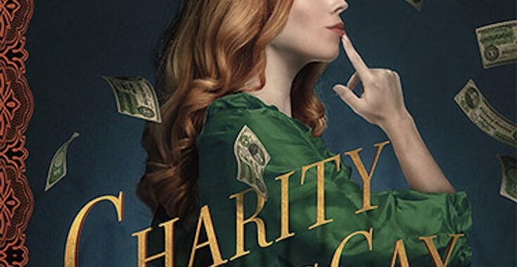
James Egan submitted Charity MacCay and the Almighty Dollar designed by James T. Egan of Bookfly Design.


TLC: GOLD WINNER! We would change nothing about this gorgeous cover. The illustration is beautiful and the typography is perfectly integrated into the image. Gorgeous edge treatment, too. Wish we’d designed this one ourselves!
e-Book Cover Design Award Winner for September 2017 in Nonfiction
Steven Craig submitted Italy Travel and Adventures: Rome, Venice, The Cinque Terre and Nearby Villages designed by J.D. Smith. “Thanks!”


TLC: GOLD WINNER! Beautiful imagery, strong type, nice, warm Italian color scheme. The type is clean and easy to read. The subtitle could move up from the bottom just a bit more. Makes us want to go to Italy!
Fiction Covers
A.H. Shelton submitted Surrogate designed by A.H. Shelton. “My novel, Surrogate, falls within the genre of Paranormal Romance. I believe the cover conveys this fact very well. Both the baby and the staircase play significant roles in the storyline of the novel – A.H.”

TLC: There are too many fonts on this cover and they don’t work well together. The imagery is confusing instead of being intriguing. The layout is unbalanced, leaving your eye to focus on the more empty lower half.
Alexander Grant submitted The Lion’s Peril designed by Deranged Doctor Design. “Thank you for considering it Best regards”

TLC: Nice cover at first glance, but could use a few adjustments. The series name and book number are too large and crowd the bottom border. The rivets get cut off in places, but aren’t in others. “Peril” in the title is too close to the sides of the border and has too much space between the letters.
Alexandra Brandt submitted Adrift designed by Alexandra Brandt. “Part of continued redesign/author branding for a writer friend’s dystopian Sci-Fi short stories.”

TLC: Beautiful, clean, intriguing! ★
Alisa Kester submitted A Manifestation of Monstrosities designed by Alisa Kester. “I wanted a particular look for the model, but was unable to find a stock image that suited. So I designed and sewed the dress, then did my own photoshoot.”

TLC: Kudos on creating exactly what you had in mind! Bold colors, nice image, but type is hard to read.
Amanda Linehan submitted Lakeside designed by Amanda Linehan. “This cover is for a contemporary YA novel.”

TLC: This cover is unreadable and the imagery gives the reader no idea what the book is truly about. It needs a series logo or other graphic indicator. It will likely have trouble attracting YA readers.
Anah Tillar submitted Without Benefits designed by Yonderworldly Premade Covers.

Andrea Barbosa submitted Olympian Heartbreak designed by selfpubbookcovers.com/Daniela. “Sabrina found out that Nikos returned to Greece and is heartbroken until a surprising invitation to go to Athens gives her hope. On the cover, Sabrina and Nikos and the temple of Poseidon in Cape Sounion where he takes her and they have a passionate evening.”

BJ Sikes submitted The Archimedean Heart designed by Eloise Knapp. “Eloise captured the mood of a Versailles populated by clockwork nobility. Layers of symbolic imagery float around the central face with its half-hidden machinery.”

Brian O’Sullivan submitted THE PUPPETEER designed by Elisabeth Brizzi. “Hope the cover speaks for itself :)”

Carol L. Wright submitted Death in Glenville Falls designed by CAROL L WRIGHT. “This is a cozy mystery, complete with a bookstore and a cat, set in September and October in a small, New England town.”

Chad Steward submitted Thomas Templeton and the Whispers of Branson Manor designed by Chad Steward. “This is my second fully illustrated cover design. This cover is for a middle grade mystery/horror book, so I tried to choose fonts, colors, and an artistic style that would be appropriate for this genre.”

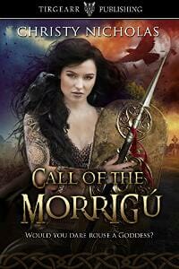
Christy Nicholas submitted Call of the Morrigú designed by Christy Nicholas.
Christy Nicholas submitted The Enchanted Swans designed by Cora Bignardi.

TLC: This is a stunning cover, from series treatment to title typography, to illustration, everything is professional and pleasing to the eye. The series is well done. ★
Clover Blaire submitted Giant Men and Violent Women designed by Clover Blaire. “The trail is paved but the woods are empty. However, the title informs the reader that the woods simply look empty. A reader is to imagine Giant Men and Violent Women deep within this supposedly barren woods, with just a single ray of light to guide their path.”

Corey Mattingly submitted Jetsam designed by Corey Mattingly. “Oil on canvas, digital after touches.”

TLC: We applaud creative type treatments, but this one detracts from the title’s readability. If you include “a novel by,” it’s best kept small and should be place near the author’s name.
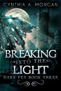
Dan Van Oss submitted Breaking Into The Light designed by Dan Van Oss.
Dan Van Oss submitted Unofficial Detective designed by Dan Van Oss.

TLC: Strong image and colors. Nice, clean type.
Dan Van Oss submitted Utopia: Secrets of Aurora designed by Dan Van Oss.

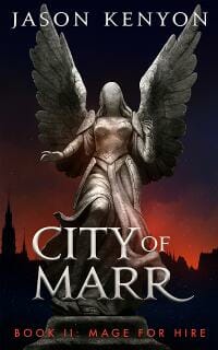
Dane Low submitted City of Marr designed by EbookLaunch.com.
Dane Low submitted So Near The Horizon designed by EbookLaunch.com.

TLC: Well-done typography, evokes a vintage feel.
Darja DDD submitted Inharmonic designed by Milo from Deranged Doctor Design. “Fantasy & Magic cover design by Milo from Deranged Doctor Design. The Music Maker Series Book 1.”

Darja DDD submitted Perception designed by Milo from Deranged Doctor Design. “Fantasy & Magic cover design by Milo from Deranged Doctor Design. The Music Maker Series Book 2.”

TLC: Both covers in this Music Maker series have great color, professional imagery, nice typography, and fit well within the fantasy genre.
Darja DDD submitted The Rest Will Come designed by Kitten from Deranged Doctor Design. “Humor & Satire book cover design by Kitten from Deranged Doctor Design.”

TLC: Strong typography, intriguing image, layout flows very well.
Darja DDD submitted The Dating Bender designed by Kitten from Deranged Doctor Design. “Romantic Comedy book cover design by from Kitten Deranged Doctor Design.”

TLC: Appropriate colors, nice touch by placing the shoe into the “g.” Cover is a little top-heavy. Would like to see the author’s name a bit smaller and everything else moved down. Bringing some pink into the bottom somewhere could help with balance.
Darja DDD submitted Celestial Ascension designed by Milo from Deranged Doctor Design. “Science Fiction, Action cover design by Milo from Deranged Doctor Design. Splintered Galaxy Series Book 1.”

Darja DDD submitted Uprising of the Exiled designed by Milo from Deranged Doctor Design. “Space, Science Fiction cover design by Milo from Deranged Doctor Design. Splintered Galaxy Series Book 2.”

Darja DDD submitted Equilibrium of Terror designed by Milo from Deranged Doctor Design. “Science Fiction cover design by Milo from Deranged Doctor Design. Part 1 from Splintered Galaxy Series Book 3.”

Darja DDD submitted Equilibrium of Terror designed by Milo from Deranged Doctor Design. “Science Fiction cover design by Milo from Deranged Doctor Design. Part 2 from Splintered Galaxy Series Book 4.”

TLC: Overall, a nice series. There’s too much space between words in the title. Adjusting the spacing and centering the second line might be a better solution. It works well on Celestial Ascension.
Darja DDD submitted A Broken Peace designed by Milo from Deranged Doctor Design. “Epic Fantasy cover design by Milo from Deranged Doctor Design. Chronicles of Nysa.”

TLC: Unique imagery that’s put together so beautifully! This is a great example of many elements working together to convey a feeling without getting in the way of readability. While it works to capture the eye immediately, it also makes us want to stop and explore its details in more depth. Great job! ★
Darja DDD submitted The First Line designed by Marushka from Deranged Doctor Design. “Teen & Young Adult, Sports cover design by Marushka from Deranged Doctor Design. The Dallas Comets Books 1-3, Dallas Comets Boxed Set, Kindle Edition.”

TLC: We like the series logo and the cover is well-balanced. The script, however, is quite difficult to read. Fits well in its genre.
Darja DDD submitted The Non-Disclosure Agreement designed by Marushka from Deranged Doctor Design. “Contemporary Romance book cover design by Marushka from Deranged Doctor Design.”

Darja DDD submitted Devour designed by Milo from Deranged Doctor Design. “Horror book cover design by Milo from Deranged Doctor Design. Book one of the Death & Decay series.”

Darja DDD submitted Divided designed by Milo from Deranged Doctor Design. “Horror book cover design by Milo from Deranged Doctor Design. Book two of the Death & Decay series.”

David Todd submitted Preserve The Revelation designed by Veronica Jones-Brown. “The cover photo is by Rick Lundh, and is used by permission. I think Veronica did a good job of showing the beasts of Revelation along with the lonely journey the protagonist goes through.”

Delaney Diamond submitted That Time in Venice designed by Clarissa Yeo.

Dillon Foley submitted Herstory designed by Dillon J Foley.

TLC: This cover is balanced well, but is very difficult to read. The clip art figure doesn’t work well with the special effects.
Dionne Abouelela submitted Something Beautiful designed by Dionne Abouelela.

TLC: Oh, how we wanted to give this a star! It’s almost perfect. Taking “a novel” out of the lights and making it much more like the author’s name would allow the title to pop even more and add to the intrigue. Overall, well done.
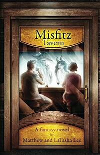
Edward Gehlert submitted Misfitz Tavern designed by Kendall Hart.
Elaine Ambrose submitted Gators & Taters designed by Patrick Bochnak. “This children’s books highlights “taters” for potatoes because the writer is from Idaho and grew up on a potato farm. The writer used “gators” to add rhythm and rhyme to the title. The illustrator created a cover that appeals to children and uses the two words.”

Eli Ingle submitted Rigel designed by Eli Ingle. “I drew the original design for the cover by hand, before quickly realising it needed more detail and individually photographed my eyes, a snooker ball and my little brother’s wooden blocks and photo-shopped these together to make the cover of ‘Rigel’.”

TLC: This cover is confusing. Is this book a sci-fi? Does it have a Western theme? All of the fonts are Wild West-themed, yet the imagery and colors seem to fit a sci-fi or fantasy book.
Elizabeth Grey submitted Just Friends designed by Elizabeth Grey. “I have self-designed all of my ebook covers, with a series lined up, and this is the first book. The books are contemporary romantic comedy / chick lit with a touch of steam!”

Erin Thornton submitted Dangerous After Dark designed by Hammad. “Since my book is about an attacker that spends time inside my heroine’s house. The hero and heroine have actually installed extra security and he still somehow is able to make it in and stalk her from inside her own house. They are always looking over their shoulders and the hero is protecting her.”

Eszter Molnar submitted The Clown’s Clothes designed by Anita Bagdi.
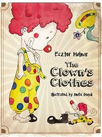
TLC: Cute illustration, but the type combination doesn’t work well. We’d like to see a stronger title, perhaps with color.
Felicia Leibenguth submitted Juniper designed by Felicia F. Leibenguth. “A dead Earth, a new planet and a thousand years into the future, the human race need rescuing again… Juniper is a skilled fighter with a sword and is covered in scars from constant battles. Her loyal dog Shelbie is always at her side, doing what he can to help, and is the source of her sanity.”

Gregory Josephs submitted The Education of Ryan Gregori designed by Damonza. “My novel is a coming of age story that focuses on a young man’s quest for a ‘metamorphosis of self.’ The talented designers (they don’t give out specific designer names) at Damonza ran with the theme of a chrysalis and created a cover that perfectly captures the essence of my book.”

TLC: We’d give this the runner-up if there was one. ;) Super-cool image, very eye-catching, great title treatment. The only thing we’d change is to move the image up and the author’s name to the bottom so it didn’t detract from the title. ★
Helen Scheuerer submitted Heart of Mist designed by Alissa Dinallo.
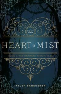
TLC: Lovely use of images, great typography, all well-integrated. Nice series treatment as well. We do wish the colors popped more. ★
James Egan submitted Call Back designed by James T. Egan of Bookfly Design.
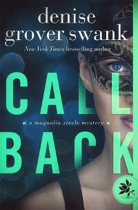
TLC: Great typography! Nice, bold and unique color. Overall layout is well done. The image of a masked woman is just too common.
James Egan submitted Mountain Man: Prequel designed by James T. Egan of Bookfly Design.
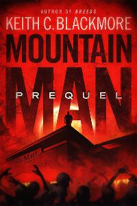
TLC: Strong cover, evokes immediate emotion, great layering of images, readable and bold title, simple but well-done typography. ★
Jennifer Alsever submitted Ember Burning: Trinity Forest Book 1 designed by Caroline Teagle Johnson.

TLC: Nice cover, clean type, simple image that makes the reader want to know more.
Jessica Werer submitted Ashwoold Falls – Sra’kalor designed by Jessica Werner.

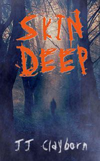
Johnathan Clayborn submitted Skin Deep designed by Johnathan Clayborn. “This book is a mystery-horror book reminiscent in the beginning of M. Knight Shyamalan. I wanted to create an image that conveyed “creepiness”, but also enough mystery in the little details that people would want to know more.”
Karl Drinkwater submitted Cold Fusion 2000 designed by Karl Drinkwater. “A redesigned cover to imply the literary/contemporary novel’s quirkiness, focus on relationships, and underlying humour. The novel is set during a hot summer, hence the summer-sky palette (which is also a cold and icy blue, tying in to the title).”

Kasia Bacon submitted The Highlander designed by Marek Frankowski. “Old-school fantasy cover.”

Kat Theo submitted Layla Escapes the Zoo designed by Patrycja. “The story is about a curious slow loris that lives in the best zoo in the world. But she is super curious about the outside world because she has been her entire life in a zoo. So you can see Layla, the main character, inside the jungle and what surrounds her, is her old home, the zoo.”

Kira Carter submitted Unblinking designed by James T. Egan, Bookfly Design.

Krista Gossett submitted The Truth about Heroes: Two Sides to Everything designed by Krista Gossett. “One of the main characters (the one in the cover art) is the daughter of the Royal Army Commander and a warrior in her own right. I feel this cover captures her determination and confidence to a T.”

Kristen Stieffel submitted Alara’s Call designed by Sara Helwe. “This is a secondary-world fantasy about a prophet. Since the storyworld doesn’t have any visual epic fantasy elements like dragons or elves, conveying the fantastical aspect of the story without being cheesy was a challenge.”

Leslie Tall Manning submitted Maggie’s Dream designed by Leslie Tall Manning. “The original artwork is by Johnny Linder, an artist in Germany, who allowed me permission to use his artwork via pixabay. My husband then added colors and layers, and created the topography. A joint effort!”

TLC: This is almost a great cover. The imagery and title treatment are nice, but the font used for the author’s name doesn’t work well with the title and takes attention away from it. A slightly smaller, sans-serif in all caps might work much better.
Lisa Aldridge submitted Dangerous Impressions designed by Shelly Schmidt. “The cover needed to reflect the role of art, specifically Impressionism, so we selected Monet-style waterlilies. The empty boat and moon hint at suspense and romance.”

Luke Bauserman submitted Some Dark Holler designed by Cody Tilson. “This design was developed to portray the book’s southern gothic and YA fantasy elements. It was inspired, in part, by promotional artwork for the 1955 film Night of the Hunter.”

TLC: This cover has a very nice title treatment and color scheme. The bottom half would be a strong cover, but the man’s portrait actually detracts from the intrigue. A dark background behind him would tie everything together and allow the necessary elements to pop.
M.D. Thalmann submitted The 13 Lives of a Television Repair man designed by M.D. Thalmann.

Mariah Sinclair submitted Killer Heels designed by Mariah Sinclair. “This is a cover make-over. Previously, the cover was more chick-lit with an illustration and lots of bright pink. It was cute, but when the rights reverted to the author she wanted to try a different approach. Still directed toward women, but less cozy/chick-lit and more mystery-oriented.”

McKenna Grey submitted Blade of Death designed by MK McClintock & D.D. Miers.

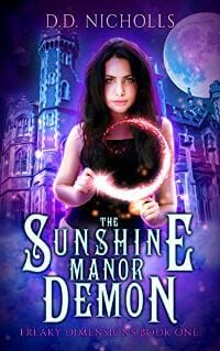
Meg Cowley submitted The Sunshine Manor Demon designed by Meg Cowley, Jolly Creative Cover Designs.
Meg Cowley submitted Ancient Magic designed by Jolly Creative Cover Design.

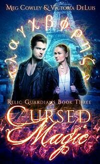
Meg Cowley submitted Cursed Magic designed by Jolly Creative Cover Design.
Meg Cowley submitted Hidden Magic designed by Jolly Creative Cover Design.

Mihail Uvarov submitted A Feast Most Foul designed by Mihail Uvarov. “A Feast Most Foul is the second in a short series of mysteries novels, focusing on a newly crowned duchess who investigates the murder of a knight that her betrothed is accused of.”

TLC: This cover’s title might pop better if the woman were faded into the background a bit. Right now, everything on the cover is foreground and competing for attention. The colors and type are quite nice.
Nicole Campbell submitted The Tower designed by Micah Sedmak. “The title of The Tower is in reference to the tower tarot card, which represents crumbling foundations in life and the need to rebuild (darkness to light). We tried to go a more abstract route rather than designing an actual tarot card.”
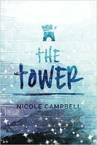
TLC: Love the simple, clean design, nice type, feels mysterious. Should stand out against its competition. ★
Oselumhense Anetor submitted Triumph of Innocence designed by Oselumhense Anetor. “The design seeks to emphasise innocence (the small boy) over darkness, as suggested by the title.”

P.K. Gardner submitted Enemies Like These designed by P.K. Gardner. “In a black comedy about a superhero dealing with depression, the cover is meant to evoke both flying… and falling.”

Patrick Samphire submitted Snowspelled designed by Patrick Samphire. “Original art by Leesha Hannigan. This is an historical fantasy set in an alternative version of 19th Century England.”

TLC: Lovely custom illustration, simply type, easy-to-read title, and pretty corner treatments allow this cover to work well within its genre.
R.L. Ostrander submitted Never/More designed by richard Ostrander. “I am both the writer of the novel and the cover designer. My design is meant to invoke the image of Edgar Allan Poe as well as capitalize on his association with the raven, both of which play a role in the book. It also continues a trend in my work of using only pure black, red and white.”

R.L. Syme submitted Vangie Vale and the Corpseless Custard designed by Lyndsey Lewellen of Lewellen Designs. “You may think all custards should be corpse-less, but the naming convention in this series is that the “match”baker, Vangie Vale, matches a person to a baked good they should eat, and that item becomes the title. So the “corpse-less” custard is basically a missing (can’t find the corpse) person.”

Rachel Pudsey submitted The Faelti designed by Rachel Pudsey. “The title specifically relates to a type of creature called the faelti – fearful, fae-like creatures rejected by the fae for their ability to manipulate fire.”

Rena Hoberman submitted Molten Heart designed by Rena Hoberman of Cover Quill.

TLC: Bold imagery and type with the overall orange tones make this cover stand out well.
Rick Stowell submitted Jay and the Americans designed by Rick Stowell/Create Space. “Jay and the Americans is a pastiche of 1960s California. Growing up in LA meant fast food. From Bob’s Big Boy to the iconic Jack-in-the-Box restaurants, nothing said car-culture like “Jack.” For the novel’s cover I modified a vintage photo with water color effect software, enhancing the coloration.”

TLC: This almost looks like an art magazine cover. Nice image for the book’s setting.
S.J. Lem submitted The Waterfall Traveler designed by Lindsay Nery & Vic Sanchez.
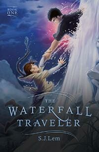
TLC: Beautiful title treatment and nice illustration! It could use an interesting border or corner treatment to rein it all in. This would be another tool to indicate that the book is part of a series.
Sandra Tooley submitted Buried Secrets designed by Bill Tooley.

Sebastian Carter submitted The Stone designed by Sebastian Carter. “I designed my own cover, but I haven’t hung out a shingle yet to take on design clients.”

Sheryl Beaumont submitted The Carlswick Deception designed by Jessica Bell.

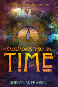
Sheryl Frazer submitted Crossroads Through Time: A Different Choice, An Altered Life designed by Sheryl Frazer & Creatspace team at Amazon. “I created the design for the cover and the Createspace cover designers implemented it then added the font for the title.”
Sonora Taylor submitted The Crow’s Gift and Other Tales designed by Doug Puller. “This is the cover for my first short story collection, “The Crow’s Gift and Other Tales.” Illustrator Doug Puller drew a beautiful and haunting sunset scene, which features the titular crow, one of his gifts, and subtle markings of the peril he witnessed.”
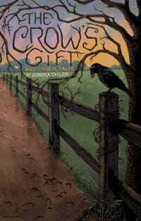
TLC: We love this title treatment! The overall cover, however, is unbalanced. Moving the author’s name to the bottom and making it a little more prominent could help.
Stephanie Anthony submitted Tigerlily designed by Vanessa Kling. “I briefed Vanessa on what I pictured for the cover and was blown away with what she came up with, I’ve already had such great feedback from reviews who picked my book because of the cover and that’s exactly what I wanted to achieve.”

Teddi Black submitted Dark Treasures designed by Teddi Black.

TLC: Nice cover overall, fun touch with the spider. The title draws you in and uses an appropriate font without getting cheesy (with dripping blood or the like). The graphics lead the eye around well. We’d like to see the author’s name moved down a bit.
Vashti Quiroz-Vega submitted The Fall of Lilith designed by Damonza. “The Fall of Lilith is an epic/dark fantasy about angels. The illustration of the fallen angel on the cover is by Michael C. Hayes.”

TLC: Lovely detail, typography, and color scheme. Beautiful cover with lots of depth. ★
W.M. Bunche submitted Mercy’s First Semester designed by Jeanine Henning.

Wayne Snowden submitted Padma and the Elephant Sutra designed by Francesca Lindsay-White. “Padma, an albino elephant, stands in front of plumeria bushes decorated with frangipani flowers. It’s late spring in an elephant paradise. Behind her is a Buddhist stupa, and rising out of dense jungle is the sacred mountain, Sri Pad. There are hints of elephant ancestors among the clouds.”

Nonfiction Covers
Alex Bernstein submitted Plrknib designed by Alex Bernstein. “A completely self-produced work, mostly done via days of manipulation in Photoshop (and a few other tools). Primarily features a 35+ year-old snapshot of the author (me).”

Alexandra Brandt submitted Make It So designed by Alexandra Brandt. “My first non-fiction cover design; the author wanted visual links to a certain well-known sci-fi property (any guesses?). I am interested in seeing whether I managed to balance the sci-fi references with actually making it look like non-fiction…”

TLC: Nice, clean type and imagery. Well done. A Trekkie will recognize the reference right away, but “SO” in this font may cause someone less familiar with the series to think it’s a “50.” This may not matter, as you’re trying to reach sci-fi fans in the first place.
Alicia Bayer submitted A Magical Homeschool: Nature Studies: 52 Wonderful Ways to Use Nature Studies in Every Season to Teach Science, Math, Art and More designed by Alicia Bayer. “The book is composed of seasonal nature study projects to work all different subjects into the fun. I included the collage of photos of our kids doing some of the activities to show that they were field-tested with real homeschoolers.”

TLC: This cover is too busy. It could be improved by choosing one strong image, cleaner and stronger typography, and a more fresh color scheme.
Amy Lyle submitted The Amy Binegar-Kimmes-Lyle Book of Failures designed by Andrea Ferenchik.

TLC: This is a nice, bold cover, but could use the space better. By making the image smaller, the title could move away from the top edge, and her feet wouldn’t be cropped. The subtitle and author’s name would be more readable if each was enlarged a bit.
Andre Davis submitted Our Two Societies designed by Andre Davis. “If you go to the books Amazon page please click on the cover of the book to see it in a much better resolution. Thank you.”

Andrew Emery submitted Wiggaz With Attitude: My Life as a Failed White Rapper designed by Richard Firth. “The ebook cover contains items that are drawn directly from the memoir – 80’s and 90’s items including the first rap record I bought, concerts I went to, my lyric sheets, photoshoots for my group, demo tapes and rejection letters. These are framed with those other essentials in my life.”

TLC: This cover is creative and caught our attention, but just misses being effective. It’s so busy, that we don’t know where to look, so the eye follows the cable down to the open area and author’s name, which then leads us off the edge of the book. That would be good if we were first attracted to the title, but the title gets lost in the clutter, so we fail to read that first.
Anil Jain submitted Mind the Movement designed by Anil Jain.

Anne McCormack submitted Peacock Dreaming: The Wisdom Of Flowers designed by Anne McCormack. “The photograph on the front cover was taken by the Author, Anne McCormack.”

Cate Emond submitted Through the Breaking designed by Corina Nika. “The cover is inspired by my love of collage artwork, and the themes/imagery of the poetry itself, mainly loss of self (the covering of the girl’s face) and the ocean (her hair is created from an image of ocean water). The design process was fairly seamless – Corina just “got” me and the poems!!”

TLC: This is an interesting cover for us to critique, as we both had different reactions. Both of us think the image is intriguing and we think the fonts are well chosen. 1) It feels like the elements are floating as opposed to working together and it looks like a novel. 2) I don’t feel like the elements are floating and that they do work together. Poetry can be more disjointed than prose, thus this cover can reflect what’s inside.
Cherie Kephart submitted A Few Minor Adjustments designed by Asa Wild. “Fewdays the Elephant symbolizes strength and remembering. A symbol from Africa, it also exemplifies transformation. The dark parts of life are seen in the two gray legs of the elephant, the vibrant and colorful array of shapes and patterns represent how we shine when our true self is revealed.”

TLC: The elephant is gorgeous, but the green title box needs to either bleed off of both sides, not bleed at all, or leave more space on the right so the fact that it doesn’t bleed looks like it’s on purpose. The title needs to be vertically centered in the box and the author’s name should be centered to match the alignment of the title.
Corinne Asch submitted The Microblading Bible designed by Corinne Asch. “I designed my own cover but I did have it made into an ebook cover on fiverr. My book is on Microblading for the professional. Microblading is a form of tattooing for eyebrows and is all about the eyebrow measurements, hence the picture on the cover. The image is instantly recognizable to the prof.”
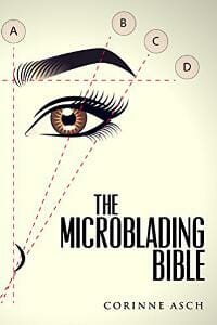
TLC: This is eye-catching, but it looks like a novel. A subtitle would help.
Dalton Giesick submitted Brotherly Love designed by Trafford Publishing.

Dane Low submitted The Layman’s Guide to Bitcoin designed by EbookLaunch.com.

TLC: Nice, strong layout and type, intriguing graphic, good color scheme. Should stand out against the competition well. The “A” and “Y” in the title need to be manually kerned closer together. ★
Elaine Ambrose submitted Angel Bumps designed by Jeanne Core. “Angel Bumps – Hello from Heaven is an anthology featuring 60 stories from 50 writers from across the country. They relate sentimental and inspirational accounts of visions, moments, and tender messages from loved ones who have passed away.”

Elaine Ambrose submitted Midlife Happy Hour designed by Jeanne Core. “The cover of Midlife Happy Hour was designed to incorporate two essential themes: aging and wine. The image is an hourglass that appears to be a wine glass. The audience is middle-aged women.”

Gisela Hausmann submitted NAKED GOODREADS How To Find Readers designed by GISELA HAUSMANN.

Kelly Whitaker submitted Jealous, Exposing the Queen of Heaven designed by KL Cooper with Undercover Press. “This cover denotes light shining in the darkness. The throne speaks of a king. Jealous is God’s name that was given to Moses on Mt Sinai after the children of Israel defiled their worship with the queen of heaven. When Jealous is seated on the throne, His Light will expose what’s hidden in the dark.”

TLC: This isn’t bad, but it looks like a novel.
Maria van Hekken submitted Leading With Y.E.S. designed by Paul Barrett. “Simplicity is key to the cover design where the title becomes the hero. Utilizing primary colors, the cover strives to be bold with an accessible and informal style. It’s complimented with a larger than life pencil that wraps around the cover to support the major focus of the book: storytelling.”

TLC: Strong type and layout. Should fit within its genre well.
Mariah Sinclair submitted The Multi-Passionate Entrepreneur’s Playbook designed by Mariah Sinclair. “I wanted to create something with high-energy, captured the “multi-passionate” person and stood out against the stoic business book competition.”

Martha Miller submitted Times New Roman: How We Quit Our Jobs, Gave Away Our Stuff & Moved to Italy designed by Bradford Gantt. “Title is purposely set to bleed off edges as this is a story of not being perfect and not doing what is expected. (I had to fight with production who kept “fixing” it.) Title is large so thumbnail would be legible and is in TNR font. Actual building author lived. Cobbles and scooter are Roman icons”

TLC: Great, bold type. Love that it bleeds! Nice image, but we wish it had more contrast or better lighting. Seems a bit dull. ★
Mercedes Labenz submitted Father, Son & Violin designed by Mercedes Labenz. “The goal was to create a specific feel emotionally for this very poignant memoir. The violin is the authors creation and winner of the Mittenwald Competition. Mao’s picture, featured in the background of a family photo, is symbolic of his “watching” everyone, even in private family moments.”

Nan Foster submitted Gutsy designed by Nan Foster. “Science has proven that food and its impact on mood are the keys to finding health and wellbeing.”

TLC: Type and imagery stand out well, appropriate color scheme for the topic, interesting image. ★
Oliver Perkins submitted The Message of the Clouds designed by Oliver Perkins. “I tried to make a simple but effective design, obviously showing the weather forecasting using the clouds theme of my book, without too much distraction. I am concerned that it might not fit in with other books in its category and, along with the title convey a completely different book idea.”

Rebekah Loper submitted The A-Zs of Worldbuilding: Building a Fictional World From Scratch designed by Rebekah Loper. “I won’t lie – it is a stock photo, but I searched for a while to find the right one. My budget necessitated DIY, so I kept it simple instead of trying to be fancy and messing it up, and mostly aimed for a cover that would pique my own interest if I was shopping!”

TLC: The layout would have been more effective if the title and subtitle weren’t shoved to the top, but used the open space allowed by the image. The author’s name competes with the title and should be smaller. The chosen fonts are very traditional and don’t reflect the book’s topic as well as they should.
Ruth Schwart submitted Love Began in Laos designed by Ruth Schwartz. “The author provided the image and then I pulled the color palette out of that. I then feathered the edge of the photo and pulled in an interesting background graphic behind the title to pull everything together.”

Samantha Keel submitted Maim Your Characters: How Injuries Work in Fiction designed by Lindsay Mixer. “Lindsay designed this cover for me (with some minor tweaks on my end), and I think it conveys the idea of the book beautifully and dynamically. As it’s a first-in-series design, expect to see more entries in the months to come!”

Samuel Thomsen submitted Progress Debunked designed by Samuel W Thomsen. “You might expect the word “DEBUNKED” to be stamped across in a big red stencil font, but the sharp contrast between the aggressively worded title and the quietness of the font and image is intended. Though my book does seek to thoroughly debunk progress, its tone is patient and philosophical.”

TLC: The title (and other text) of this book are not bold enough to work well on an e-book.
Well, that’s it for this month. I hope you found it interesting, and that you’ll share with other people interested in self-publishing.
Use the share buttons below to Tweet it, Share it on Facebook, Plus-1 it on Google+, Link to it!
Our next awards post will be on November 27, 2017. Deadline for submissions will be October 31, 2017. Don’t miss it! Here are all the links you’ll need:
- The original announcement post
- E-book Cover Design Awards web page
- Click here to submit your e-book cover
- Follow @JFBookman on Twitter for news about the E-book Cover Design Awards
- Check out past e-Book Cover Design award winners on Pinterest
- Subscribe to The Book Designer Blog
- Badge design by Derek Murphy

