By Joel Friedlander
Welcome to the e-Book Cover Design Awards. This edition is for submissions during October, 2019.
This month we received:
42 covers in the Fiction category
10 covers in the Nonfiction category
Guest Judge
 We are pleased to welcome James Willis to The Book Designer as a guest judge this month. While his background is in corporate branding, design and marketing, James’ passion is and will always be, books. He’s worked with Madame Tussauds, The London Aquarium, Beauty Magazine, GSK, The Sun and many other know entities, but his work as co-creator of SpiffingCovers has felt like a real homecoming since it is a confluence of his passion for literature and his skills in branding and theory. Underpinning all of his work is the intent to ensure a truly ethical service for authors and to work in a genuinely progressive way; engaging with clients in meaningful dialogue and consultation and providing a service with real-world value.
Comments, Award Winners, and Gold Stars
I’ve added comments (JW: ) to many of the entries, but not all. Remember that the aim of these posts is educational, and by submitting you are inviting comments, commendations, and constructive criticism.
Thanks to everyone who participated. I hope you enjoy these as much as I did. Please leave a comment to let me know which are your favorites or, if you disagree, let me know why.
Although there is only winner in each category, other covers that were considered for the award or which stood out in some exemplary way, are indicated with a gold star: ★
Award winners and Gold-Starred covers also win the right to display our badges on their websites, so don’t forget to get your badge to get a little more attention for the work you’ve put into your book.
Also please note that we are now linking winning covers to their sales page on Amazon or Smashwords.
Now, without any further ado, here are the winners of this month’s e-Book Cover Design Awards.
e-Book Cover Design Award Winner for October 2019 in Fiction
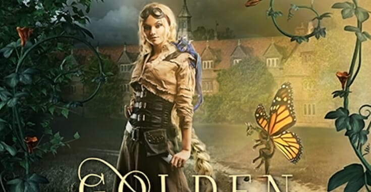
Karri Klawiter submitted Golden Braids and Dragon Blades designed by Karri Klawiter. “This cover was so much fun to create. A steampunk twist on Rapunzel, including little dragons!”


JW: Highly ambitious and has clearly had a lot of thought put in. The colour choices work really well and everything has a lovely immediacy to it. The title is a tiny bit lost in the composition but other than that, I’d enjoy looking closely at this atmospheric cover.
e-Book Cover Design Award Winner for October 2019 in Nonfiction
Julia Goldstein submitted Material Value designed by Alan Barnett. “Of the design options that Alan sent me, I chose this one because it matches the book’s tone of cautious optimism, showing readers what is possible. The colors of blue and green are both appealing and appropriate for the topic.”

JW: A decent composition with some nicely chosen icons gives the right look and feel for the subject matter. Colours are well chosen and the designer has done a good job of taking the large volume of text and making it feel minimal.
Fiction Covers
Alex Palange submitted Exotic Destination: Alexandra -Part 1 designed by Alex Palange. “Photographer Chris Thomson.”

JW: The composition is solid enough but the colour palatte is a little harsh and overall the elements are lacking a coherent stylistic vein, which results in slightly confusing and dated-looking image. Nice movement on the figure helps a lot.
Amanda Pillar submitted Kiss my Assassin designed by Amanda Pillar, Smoking Hot Covers.

JW: A great title is complimented by decently humourous and retro styling. Titling is appropriately ‘in your face’ and the noir-esque lighting is fun. The background is a touch muddled but it all hangs together.
Amanda Pillar submitted Heir of Shadows designed by Amanda Pillar. “The first three books in the Daizlei Academy series that I designed for Kel Carpenter’s rebrand”

JW: Great, classic, genre-styling. A straight-forward cover with great lighting and a decent central illustration.
Amber Nguyen submitted Trivium designed by EBookLaunch. “The image was chosen to represent the protagonist, Cassia, entering the Trivium sensory deprivation tank to choose her future, but also to imply that she’s drowning/sinking when it comes to knowing what she wants from life. The triquetra is the symbol for the Trivium. Font is CactusMed for scifi.”

JW: The elements are all nicely aquatic and quite tasteful but the overall ‘blueness’ feels a bit under-explored. The layout plays very safe with everything centralised and evenly spaced, meaning it works fairly well but there’s no real focal point.
Bradley Wind submitted BULB designed by Bradley Wind. “Land and sky/orange and blue. A world where Light records everything we do and is accessible to all = BULB”

JW: A highly engaging main image and concept is a little undermined by other elements being rather tacked-on. Still manages to convey a nicely surreal and disturbing b-movie appeal.
Brandi McCann submitted Shutter Speed designed by Brandi McCann.
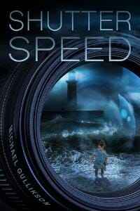
JW: A good amount of mystery and threat here. The highlights in the reflected image ought to be carried through to the lens housing to unify the elements into one, coherent moment.
Carolyn Haley submitted Wild Heart designed by Leslie Noyes. “The cover image came from accidental discovery of an independent equine photographer’s portfolio, which contained this shot that matched exactly the key horse-character’s appearance and behavior. That slanted the whole project!”

JW: For the right audience this will be ticking all the right boxes. The subheading tells you what you’re getting and the image nicely reinforces that with warm colours and some control of elements. Not ambitious perhaps but certainly appropriate.
Cat Connor submitted Metabyte designed by Jojo Neonstar. “Metabyte is bk9 of The Byte Series (crime thriller): the dragonfly is a symbol for change, transformation and adaptability. Green & glitter because spring follows winter, always. Font: is similiar to the original. New cover and formatting was required after my publisher closed.”

JW: Pretty good composition and intriguing use of the dragonfly wing. This grabs attention. I feel the elements would benefit from being unified more. The green is a little over-powering and the series info is a bit lost at the top. Overall, it has some merit.
Darja DDD submitted Sheepdog designed by Marushka from Deranged Doctor Design. “Thriller, Mystery, Action & Adventure book cover design, Gideon Shepherd Thrillers Book 1”

JW: Dynamic, legible and controlled. Colours are well-tuned and everything hangs well together. Good stuff.
Darja DDD submitted Clockwork Alchemist designed by Milo from Deranged Doctor Design. “Historical Fantasy book cover design, The Thief’s Apprentice Book 1”

JW: Sculpturally interesting and very well controlled. The green is just enough. Despite the complex ornamentation the cover is nicely inclusive; not overly masculine or feminine. Very nice work. ★
Darja DDD submitted Clocks and Daggers designed by Milo from Deranged Doctor Design. “Historical Fantasy book cover design, The Thief’s Apprentice Book 2”

JW: As above but now with a play-on-words in the title, which adds a welcome layer of humour to the fairly serious stylings.
Darja DDD submitted Under Clock and Key designed by Milo from Deranged Doctor Design. “Historical Fantasy book cover design, The Thief’s Apprentice Book 3”

JW: Again, great!
Darja DDD submitted Turbulent designed by Milo from Deranged Doctor Design. “Post-Apocalyptic book cover design, Days of Want Series Book 1”

JW:A very nice looking series which might benefit from a little more variation per cover to increase interest. To really put the icing on the cake I’d like to see the photoshop shadow effects left off the title and author name and also the inclusion of a three-line tagline per cover, to give readers a taste of what’s in the excellent-looking books. Solid.
Darja DDD submitted Turmoil designed by Milo from Deranged Doctor Design. “Post-Apocalyptic book cover design, Days of Want Series Book 3”

Darja DDD submitted Uprising designed by Milo from Deranged Doctor Design. “Post-Apocalyptic book cover design, Days of Want Series Book 4”

David Graf submitted Blue Note designed by Holly Graf & Krissy May. “Use of excessive white space to offset colorful dragon scales is intentional to create a standard theme across the approximately 70 planned books in the multiverse.”
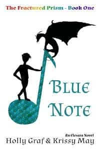
JW: The quirky main illustration has a certain charm but the text effects and layout are not pulling together to create the atmosphere required. There is a nice folky charm to this which could be built on with a little texture and text control.
David Heidenstam submitted In the Beginning… designed by Emir Orucevic. “A striking cover by Emir Orucevic, for a stage play set in the Garden of Eden. Hopefully: the Gilligans Island font helps suggest the comedy aspects; the downward slope hints at how things go downhill; and while apple green would have been an easy choice, the red hints at how it all ends in tears.”
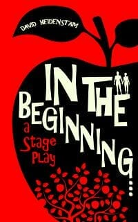
JW:A confident and graphic style at work here. The off-white title works very well with the red. A nicely executed composition which is very well-balanced. It hits the comedy mark with the right amount of playful design.
Dian Huynh submitted Empty Vessels designed by Dian Huynh. “The aim was to create a cover for a paranormal romance, with emphasis on the paranormal aspect. I provided the art, and the text was provided by the client.”

JW: Good illustration and solid composition. Interesting hair, which is always a bonus! Atmospheric and slick.
Emma Zeth submitted The Lucky Prepper designed by Emma Zeth. “I wanted a cover that looked good as a thumbnail and was genre appropriate. I tried photos of gardens and vegetables, but they just didn’t fit. This is just a photo from my local woods. I chose red and teal to stand out.”

JW: Nice juxtaposition of red and green which would be better served if the main title was more sensitively handled. The white mist behind the text is a bit distracting. Could be improved by choosing one font for all the cover text and placing text ‘within’ as opposed to ‘over’ the image elements.
Faith Quintero submitted Loaded Blessings designed by The Book Designers. “Two silhouettes face one another – bordered by night sky blending with a dark ocean. Story alternates between the Age of Discovery (Inquisition era Spain and modern day Israel). Jews sent into exile could take bronze but not gold. Title was “cut” from an ancient map. A Spanish ship travels below.”

JW: The visual pun works a treat and the lighting is cosily handled. The boat is a little too small to work at small sizes but the overall composition is good. One improvement could be to make the title and candle both a touch smaller so that they occupy their own spaces a little more effectively.
Ihor Tureha submitted Rampage designed by MiblArt. “This is an illustrated book cover design that depicts the scene in a large cavern made of blue stone. All the characters are drawn completely from scratch.”

JW: Lovely handling of light on form, and the giant cat is suitably menacing. Love the titling. Atmospheric and memorable.
Ihor Tureha submitted A Portion of Dragon and Chips designed by MiblArt. “The genre of the book is a fantasy comedy where the main character is a polite human-like robot who has been transported to a medieval kingdom. The design features different elements that indicate robots and mechanical beings in the fantasy setting.”

JW: This certainly hits the genre notes. Fun and ambitious with lots to see. A little lighting variation could lift this further; giving the pages more depth and curl. The red of the background does pull focus a bit too much; the book would look great on some grey stone. Funky!
Jack Hammer submitted GR2113 designed by Sugary Violet.

JW:Great use of light and colour and fun illustration. I feel like the background could be used to ‘place’ the characters a bit more. Plus, the title and author name might be better away from the edge. Overall, it’s looking good for the demographic.
Jeff Payne submitted The Volunteers designed by J. Aaron Payne. “My career is in motion graphics, so I made the cover myself. I chose the color palette because I wanted it to feel desolate and filthy. I strive for simplicity because I don’t want a reader to be influenced by specific imagery. I strive for the same level of simplicity in my writing style.”

JW: The huge space over the forest is interesting and really ecxudes desolation. I’m instantly thinking that something very bad has happened to ‘The Volunteers’ and I want to find out what. Only improvement would be to relocate the author name to the top in a smaller, lighter version of the same font to allow those dark trees to do their foreboding work. There seems to be shape in the background like a mushroom cloud but it’s too faint to really see. ★
Julie Alexsoo submitted Blood Branded designed by Hugh Pindur.

JW: Nice rough edges and colour control. A hard-hitting design.
Karl Drinkwater submitted Helene designed by Matt Kadish. “Sci-fi. First of a spin-off series of shorter tales set in the Lost Solace universe.”

JW: Nice colours and the composition is not bad. The photograph choice feels a little ‘straight-on’ and the cut out around the hair needs a little work. The space at the top is crying out for the tagline to be moved there.
KJ Waters submitted Shattering Time designed by Blondie’s Custom Book Covers. “We took the image of the watch in a clock shop then merged it into the cover tempalte from my first book, Stealing Time. I wanted to represent the Native American aspect of the story line and hit the clock face with the arrows while representing the hurricane in the storyline.”

JW: I can see that thought has been put into representing themes of the book here, creating a hard-hitting image. I think the design could be improved by making the background go behind the clock as opposed to over it, and the lighting being blended more into the image. The flash of the lightning might light the edges of objects more starkly to bring it all together as a single scene.
Kristen S. Walker submitted Riwenne & the Mechanical Beasts (Divine Warriors #1) designed by MiblArt. “The design was intended to look steampunk but with a brighter color palette than the typical brown and copper, inspired by the magical girl genre. The design team helped make each cover look like part of a series while still having a unique look.”

Kristen S. Walker submitted Riwenne & the Bionic Witches (Divine Warriors #2) designed by MiblArt.
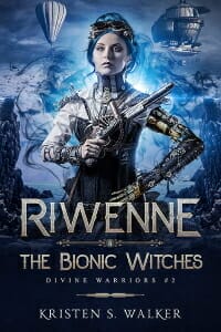
JW: A very strong set of covers, here. Colour is controlled and balance is good. I’m getting a strong Steampunk flavour but without getting bogged down in the typical Steampunk ‘dirt’. Backgrounds are interesting but not overloaded. Nice and fresh as well as skilfully executed. ★
Kristen S. Walker submitted Riwenne & the Airship Gambit (Divine Warriors #3) designed by MiblArt.

Lance Charnes submitted Chasing Clay designed by Damonza. “This is the third book in this series. I wanted the cover to bear a family resemblance to the others but also to break new ground. The pot’s the same color scheme as the ceramics that are the plot’s Macguffin and signals that this story isn’t about paintings, as were the previous two.”

JW: Funky and fun with a retro tone.
Linda Lee submitted Lullaby designed by Charlie Bowater. “Original cover by multiple time award-winning artist Charlie Bowater of Sarah J. Maas fame. The elements of the lights in the background are part of the magic that is part of this series, inspired by the Northern lights. The sand swirling in hand is her power over elements. Desire font.”
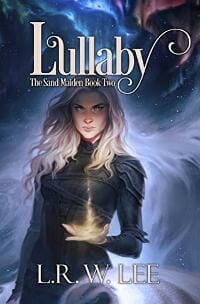
JW: A superbly brooding overall composition. Very nice. ★
Mark Turnbull submitted Allegiance of Blood designed by Chandler Book Design. “I took images. Child watches as father rescues him. Representative of blood allegiance. Sinister smoke like fog of war. Black and white = clear cut allegiances. Red ‘Blood’ for war’s bloodiness. Poleaxe for ‘T’ fits period. Font in keeping with 1642.”

JW: I’d like to see a little of the red from the title merging into the background to bring this piece together, along with some dynamic lighting from a single direction. I’m not sure that the ‘T’ of the author’s surname being the poleaxe works, since it feels a little humorous. The font choice is great and the imagery itself is very compelling, but with a little more directional light and dark we’d see this one really sing.
Michael Huard submitted Count Rothchild designed by Denise Worisch. “The count on the cover was inspired by Bram Stoker’s Dracula book and film. The reds and blacks and crosses and all are representing a gothic feel to the tale, thank you so much, – Michael”

JW: Nice, simple and controlled. Well chosen images and fonts make this one memorable and appropriate.
Micki Voisard submitted THE INITIATED designed by Myself. “The significance of the soldiers face is that of a LRRP. The LRRP’s chose to no longer wash their faces of their war-paint but, instead, chose to wear it “proudly,” even when arriving in the United States. The smallness of the flight attendant signifies an “innocence” of all who entered that war.”

JW: Intriguing imagery which certainly makes one think. The layout is somewhat unambitious and the title does require some work.
Morran Kaz submitted 550AU Buried in Stone designed by Kaz Morran. “I made this cover at no cost using Canva, with photos courtesy of NASA and an American cave explorer, Dave Briggs. The two photos represent the two foundations of the story; our aerospace engineer protagonist’s space telescope “eye” and the collapsed cave the characters are buried in.”

JW: The off-centre titling (550 AU) works well from a composition perspective, and the eye is nicely piercing. I would like to see more control over the rest of the title and the author name.
Richard Easter submitted The General Theory Of Haunting designed by Richard Easter / Simon Cherry. “This cover only reveals its connections to the book once the story has been read. Only then do you see that much of the plot is contained in this image. But of course – hopefully – the image is intriguing enough to make you want to pick the thing up!!”

JW: It’s a risk to design a cover that requires the book to be read for the reader to understand it, but I do feel that this is an interesting cover that wants to be deciphered. Would look nice printed on a rough parchment style stock.
Sharon Cathcart submitted Flowers of Europe designed by Sharon E. Cathcart. “The mysterious woman at the center of this image, along with the palette of golds, gave just the right impression for my tale as soon as I saw it.”

JW: An intriguing main image really pulls the eye. Nicely controlled background which isn’t too busy but frames the portrait really well. The title font does feel a little secondary, however; especially since we have two serif fonts in the same design. Apart from that, cool.
Stephen Jordan submitted Tatiana and the Russian Wolves designed by Suzanne Lawing. “The cover was designed to convey howling wolves calling the pack together for their endless hunt. Tatiana was plagued by depression—“the Russian wolves.” The dark red serif font was chosen with an embossed effect—against the sinister clouds and the rugged mountainscape.”

JW: A strong main image slightly overpowered by the title treatment.
Sussi Voak submitted The Travelers Detective Club Portugal designed by S.M. Savoy. “The book is about two 11 year olds who have to solve a mystery while traveling. They are given magic buddies to help them. These are small stuffed creatures that come alive. The cover shows the buddy of the main character coming out of his kid’s backpack which is at the main character’s feet.”

JW: A fun image but one that confuses the eye somewhat. The character is cute and nicely drawn but I can’t really tell what’s going on.
Thomas Galindo submitted The City Below the Cloud designed by T S Galindo. “In the story, the city is lit only with neon signs and bioluminescent mushrooms, so I wanted the cover to reflect that.”

JW: An intriguing and quite striking cover. Quiet, confident and odd!
Nonfiction Covers
Craig Macnaughton submitted A B Sea Creatures: An Astonishing Aquatic Alphabet! designed by Craig Macnaughton. “The font is Washout, which popped into my mind immediately. I wanted something extra bold, but still organic and blobby. I also wanted to give a preview of the creatures featured inside, so I thought them poking out from the edges of the book would be fun”
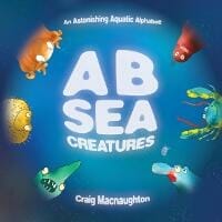
JW: Effective composition with a font which is fun yet nicely legible. It has a lovely watery vibe. I feel like I’d like to see what’s beyond the vignette.
Jacquelyn Lynn submitted The Simple Facts About Self-Publishing designed by Jerry D Clement.

JW: A straight-laced cover, and while I appreciate the no-frills approach, this perhaps needs a little something to make it more memorable. The centred text fights with the off-centre laptop a touch.
Janine Kuestner submitted Shadows on the Porch: A Cleveland memoir of survival and three generations of mental illness designed by Janine Kuestner. “The photo on the cover is the author when she was about three years old. The book is her memoir, and opens when she is a young girl, not much older than she was in that picture.”

JW:As a memoir featuring an authentic photograph, it is very poignant. I would prefer to have the title in a less prominent position and the lighting slightly increased in constrast to really bring out the sculpturally interesting and affecting image.
Karri Klawiter submitted Transcending Anxiety designed by Karri Klawiter. “The cover was designed with the idea of using yoga, meditation, etc in day to day life to over come anxiety.”

JW: The slightly ‘chick-lit’ styling might feel a little overtly feminine for an issue which is non-gender specific, but the design works nicely with a soothing pastel pallette and reassuring sense of tranquillity. ★
Maraya Loza Koxahn submitted Love, Death & Tango designed by Maraya Loza Koxahn.

JW: A striking and sensual image. It’s certainly memorable. The red really pops. I’d love to see some more convincing shadows cast onto the stones and the title would benefit from being locked together in terms of line spacing and tracking, and without the bevel.
Michael Dane submitted HomoAmerican – The Secret Society designed by Michael K Dane. “The book is not only Smyth sewn and stamped in Gold foil of the silk covered hardcover but the lustrous heavy dust jacket is stamped in Gold foil as well. The photo has a particular shelf presence and the book is a marvel to behold in person.”

JW: Fun and clearly not entirely serious! The minimal palette is good, but the text treatment is not playing with the figure. A little interplay here and some shared light and colour – eg. make the man’s tie yellow – would help unify these elements.
Michael N. Marcus submitted God & Baseball designed by Michael N. Marcus. “I found perfect photo that POPs on a white web page. Typeface for “God” is Old English Text, mimicking old bibles. Type for “Baseball” mimics a team logo. Ampersand nicely nestles between words. Other text is simple Calibri chosen for readability when small. Banner text may be changed in future. The cover artist is Adam Kazmierski.”

JW: A euphoric main image feels a little undermined by the title treatment. Nice colour choices and theme but the text treatment overall is a touch hectic and gets in the way of the message somewhat.
Sharon Cathcart submitted Some Brief Advice for Indie Authors designed by Sharon E. Cathcart. “I recently re-designed the cover for this work. I wanted something that gave both a fun/funky feel and a connection to writing. A mint green typewriter seemed made to order.”

JW: Lovely colours and a straight-forward concept. The typed area isn’t completely convincing but we get the idea. Be aware of margins for titles and author names.
Wageedah Salie submitted Braving Change designed by Wageedah Salie – One Story Creative.

JW: Solid composition and colour control although perhaps a little too much going on within the cover. Could benefit from more space. It works though!
Well, that’s it for this month. I hope you found it interesting, and that you’ll share with other people interested in self-publishing.
Use the share buttons below to Tweet it, Share it on Facebook, Link to it!
Our next awards post will be on December 23, 2019. Deadline for submissions will be November 30, 2019. Don’t miss it! Here are all the links you’ll need:
- The original announcement post
- E-book Cover Design Awards web page
- Click here to submit your e-book cover (See New Submission limits)
- Follow @JFBookman on Twitter for news about the E-book Cover Design Awards
- Check out past e-Book Cover Design award winners on Pinterest
- Subscribe to The Book Designer Blog
- Badge design by Derek Murphy

