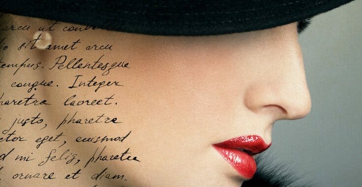
Welcome to the e-Book Cover Design Awards. This edition is for submissions during October, 2016.
This month we received:
73 covers in the Fiction category
24 covers in the Nonfiction category
Guest Judge
 I’m very pleased to welcome Michele DeFilippo to The Book Designer as a guest judge this month. Michele has worked in book publishing since 1972, first at Crown Publishers in New York City, then as the owner of a traditional typesetting business from 1980-1993. She now owns 1106 Design which helps authors produce beautiful books while providing solid indie-publishing advice and hand-holding every step of the way. Her mission is to cut through the noise, stay focused on quality, and simplify the publishing path for her clients.
You can contact Michele and download a free copy of her book, Publish Like the Pros: A Brief Guide to Quality Self-Publishing at https://1106design.com.
Comments, Award Winners, and Gold Stars
I’ve added comments (MD: ) to many of the entries, but not all. Remember that the aim of these posts is educational, and by submitting you are inviting comments, commendations, and constructive criticism.
Thanks to everyone who participated. I hope you enjoy these as much as I did. Please leave a comment to let me know which are your favorites or, if you disagree, let me know why.
Although there is only winner in each category, other covers that were considered for the award or which stood out in some exemplary way, are indicated with a gold star: ★
Award winners and Gold-Starred covers also win the right to display our badges on their websites, so don’t forget to get your badge to get a little more attention for the work you’ve put into your book.
Also please note that we are now linking winning covers to their sales page on Amazon or Smashwords.
Now, without any further ado, here are the winners of this month’s e-Book Cover Design Awards.
e-Book Cover Design Award Winner for October 2016 in Fiction
Dane Low submitted The Pearl and the Carnelian designed by Book Cover Design by EbookLaunch.com.


MD: Gorgeous, outstanding photo and design. This cover looks like a best-seller.
e-Book Cover Design Award Winner for October 2016 in Nonfiction
Damon Suede submitted Your A Game: winning promo for genre fiction designed by Phil Pascuzzo (Pepco). “For a dynamic guide to genre fiction promo which is structured as a chooseable adventure, we needed a cover design that emphasized fun and personal choice in book promotion. Pepco ran with the idea of an engaging, interactive adventure and gave us a cover that evoked a bright expansive game board.”
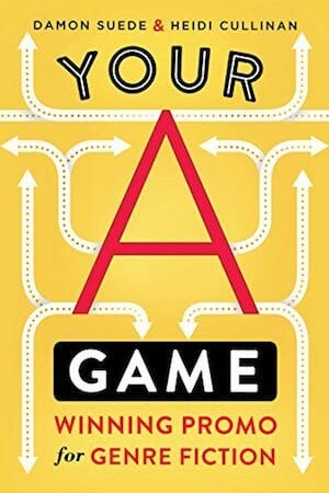
MD: Terrific, sophisticated, eye-catching cover perfectly conveys the message that there are many ways to promote a book. Kudos.
Fiction Covers
Alicia Rades submitted Distant Dreams designed by Shardel. “The artwork was done by Shardel. I added the text.”

MD: Nice artwork, especially the hearts in the sky. There’s a little too much space between the D and R in Dreams and also between the R and the E. I’d tuck these in closer.
Amanda DeWees submitted The Last Serenade designed by James T. Egan of Bookfly Design. “Book two in my mystery series about a Victorian actress and medium takes place in Paris. James chose to show a view of Les Invalides, which evokes a sense of time and place while avoiding the usual Parisian clichés.”

MD: Very nice, sophisticated, and Victorian.
Amy Maroney submitted The Girl from Oto designed by Andrew Brown, Design for Writers. “My novel is a historical art mystery with a contemporary twist. I worked with Andrew Brown to develop a beautiful and intriguing cover for it. The mountains and the shell motif are integral to the storyline—much of the action happens along the “Way,” the pilgrim’s route through the Pyrenees.”

MD: Very nice. Skillfully crafted typography and a compelling image.
Andrew Malcolm submitted Coast designed by A. Richard Malcolm. “The book cover is a combination of a photograph of Toronto’s Inner Harbour’s shoreline east of the downtown, and a graphic image of a girl. I came up with the colour scheme (using a Photoshop gradient map) and then used the same colours to create a motion graphic trailer for the book.”

MD: The title is very hard to read and the composition isn’t good. There’s a lot of wasted space. This looks more like a brochure or a report than a book cover.
Ariana Parker submitted Borealis designed by Ariana Parker. “The novel takes place mostly in Alaska and the dark trees are a reminder of the dark wilderness environment the protagonist finds herself in. Although it is a vampire romance, the bright colors of the Auroras reflect Ethel’s bright spirit as she overcomes the obstacles and adversities throughout.”

MD: The image is compelling. The classic, “handtooled” type fonts don’t seem to be a good fit for a vampire novel or a romance.
Autumn M. Birt submitted Spark of Defiance designed by Autumn M. Birt. “Made of several images purchased through stock photo sites with hand drawn elements. Based on a scene from the book as well.”

MD: The image is dramatic and interesting. The bright dragon’s mouth pulls the eye first to the author’s name and away from the title.
Ava Hayworth submitted Captivate her designed by Amy Hayworth.

MD: Good typography. The word Captivate could perhaps be a bit bolder for better contrast against the woman’s hair and the splashes of color.
Ava Hayworth submitted Cherish her designed by Domi, Inspired Cover Designs.

MD: This cover is better than Book One or Book 3 (below). The beautiful photo and the absence of other distractions makes the title pop.
Ava Hayworth submitted Dazzle her designed by Domi, Inspired Cover Designs.

MD: The busy photo and color splashes distract from the cover text.
Ben Haskett submitted The Waypoint designed by Ben Haskett. “Some of my favorite book covers don’t show their real significance until deep inside the book. The three doors on the cover of Stephen King’s Drawing of the Three, for example. My goal was to make something that was attractive and eye-catching, but also vague enough to not reveal anything.”

MD: This cover concept is good but the execution is a bit amateurish. All the elements are equally prominent, fighting for the viewer’s attention. I’d give this concept to a designer as a starting point.
Ben Trebilcook submitted Old Habits designed by Ant Gardner. “Designer, Ant Gardner, suggested I keep a uniform design to the previous book. One colour, with black silhouette and same font. The colour blue relates to the subject matter and lead character, a NY cop (Boys in Blue). The bold silhouette of a hand-grenade refers to a significant scene in the book”

MD: Good contrast between the title and the background. It does go well with the previous cover, but the typography on both could be enhanced.
Brandi Gabriel submitted The Orphan Bride designed by iCreate Designs. “Seeing as this is a Christian western romance centered around an orphan train rider, I wanted to be sure I had the train tracks, model, and suitcase. I think the image and typography portrayed exactly what I was looking for.”

MD: Nice typography and design. The blurred figure in the background increases curiosity.
Caylen D. Smith submitted Uneven Odds designed by Daniela Owergoor. “I wanted the cover to represent time, but not simply a clock, so the idea of the hourglass came into play. The cracked glass feature and sand spilling out at the bottom revealed a sense that time is literally running out.”

MD: Nice design that matches the author’s other books on Amazon. The titled hourglass draws the eye.
Charles Conway submitted Steve’s Web – Operation: Stay Safe Online designed by Charles Conway. “Designed to appeal to 9-14 year olds (and/or their parents)”

MD: The cover has too many elements in different styles and the arrangement is a little confusing. The bright blue color clashes with the camouflage background.
Chris Hewitt submitted Saving Christmas designed by Chris Hewitt. “Decided to design the cover myself. It’s an attempt at a Saul Bass inspired cover that i hope sums up the book.”

MD: Very cute and eye-catching. Nicely done.
Chris Mason submitted P is For Phoenix: An ABC Book of Legendary and Mythological Creatures designed by Vladimir Cebu.

MD: The image isn’t bad. The title treatment is overworked. Photoshop effects are nice when subtly applied. These overpower the words.
Dane Low submitted Winter Rage designed by Book Cover Design by EbookLaunch.com.

MD: An excellent cover. Beautiful typography and a mysterious image bleeding into the cover text.
Dane Low submitted Days of Future Past designed by Book Cover Design by EbookLaunch.com.

MD: An excellent cover with a compelling illustration.
Dane Low submitted Lost and Found designed by Book Cover Design by EbookLaunch.com.
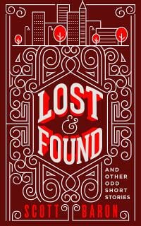
MD: Nice. Sophisticated and quirky. Perfect art and typography for a book of “odd short stories.”
Daniela Morescalchi submitted Bits and Pieces designed by agileArt. “Unique feline and his vet help solve a series of brutal murders. Because that is something all cats normally do.”

MD: A gripping image and a title treatment that draws the eye. Very good.
Darja DDD submitted 13: An Anthology Of Horror and Dark Fiction designed by Milo from Deranged Doctor Design. “Anthologies, Horror book cover design”

MD: An excellent cover. Eye catching with perfect coloring for horror and dark fiction.
Darja DDD submitted Wolf Moon designed by Kitten from Deranged Doctor Design. “Science Fiction, Fantasy, Paranormal & Urban book cover design, Furred, Feathered, and Fanged Book 1”

MD: Excellent design and typography. Top notch.
Darja DDD submitted Ashes to Ashes designed by Kitten from Deranged Doctor Design. “Science Fiction, Fantasy, Paranormal & Urban book cover design, Furred, Feathered, and Fanged Book 2”

MD: Also excellent. Perfectly aligned with the first book in the series.
Darja DDD submitted Outfoxed designed by Kitten from Deranged Doctor Design. “Science Fiction, Fantasy, Paranormal & Urban book cover design, Furred, Feathered, and Fanged Book 3”

MD: Excellent again. Wonderful series design here.
Darja DDD submitted Grey Stone designed by Milo from Deranged Doctor Design. “Fantasy, Sword & Sorcery book cover design”

MD: Excellent cover design. Compelling image and creative title treatment.
Darja DDD submitted Everything to Lose designed by Kitten from Deranged Doctor Design. “Cover design for Mystery, Thriller & Suspense book, A Lucas Holt Novel Book 1”

MD: Perfect design, typography, composition, and color for a thriller. Kudos. ★
Darja DDD submitted Trust No One designed by Kitten from Deranged Doctor Design. “Cover design for Mystery, Thriller & Suspense book, A Lucas Holt Novel Book 2”

MD: Excellent design that goes with the first book in the series.
Darja DDD submitted Paladin designed by Milo from Deranged Doctor Design. “Science Fiction & Fantasy, Military book cover design”
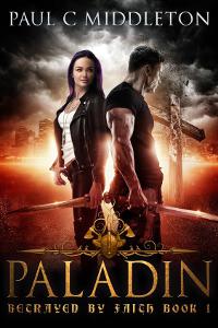
MD: Dramatic illustration, nice title treatment. An eye-catching cover.
Debbra Lynn submitted Beyond the Red Carpet designed by Matt Harris – Sky Events Agency. “This is my first book in my series. And since it is a trilogy my designer to keep the same theme for all three books. I have released this one and the second one so far.”

MD: The photo of the hand and gun is a little overwhelming in this cover. The title is hard to read. The colors are right for a mystery or adventure.
Deborah Coonts submitted So Damn Lucky designed by Andy Brown.

MD: The colors are a little cheerful for a mystery. The covers on Amazon are different, and better, IMO.
Ella Beaumont submitted Shadow’s Fall: New White Sands City Cyberpunk Book 1 designed by Ella Beaumont. “Aiming for a style that could work across an epic science fiction cyberpunk series that spans fifteen books. The element that ties the series together, besides the plot, is the City itself. The idea was to filter it through each character’s perspective(represented by color and silhouette).”

MD: The concept isn’t bad, but the typography misses the mark.
Emmanuel Obi submitted Bruce Howard – Gentleman with a Loaded Gun designed by Emmanuel Obi Jr..

MD: From the Amazon description, this sounds like a good book, but the cover doesn’t reflect that. No color, no emotion and a “Broadway” font. It looks self-published.
Heather Day Gilbert submitted Forest Child designed by Jenny at Seedlings Design Studio. “I wanted both covers in the Vikings of the New World Saga to have a similar look, with a close-up of a strong Viking woman with a weapon. Starting with a stock model, Jenny at Seedlings altered elements and added background, arrows, and clothing, to make the cover match my warrior heroine perfectly.”

MD: A compelling image draws the eye to this cover. The title treatment needs a tune-up to capture the mood of the image.
Hydra Burton submitted Marks Choice designed by Hydra Burton.

MD: The cover image isn’t bad but it’s overpowered by the unnecessary black box around the title and the band behind the author’s name. The fonts are bland. The title should have an apostrophe, Mark’s Choice.
Iain Pattison submitted The Hex Factor and Other Quintessentially Quirky Tales designed by Jean Hill. “Jean has done a clever job creating a fun, tongue-in-cheek cartoon cover for this 4th Quintessentially Quirky Tales volume that is not only eye-catching, colourful and guaranteed to raise a smile, but looks individual while dovetailing seamlessly into the series cover style.”

MD: Nice illustration aligns with the other books in the series. All have a quirky look and feel in keeping with the theme.
Ivan Zanchetta submitted The Gorgon’s Blood Solution designed by Ivan Zanchetta. “I was asked to create a cover for the first book of a series about an alchemist’s apprentice ans his journey into this dangerous art. I designed a scene with a young man venturing into the night, a metaphor for the unknown territories he is about to explore.”

MD: Nice image. The title is a little hard to read.
Ivan Zanchetta submitted Legacy designed by Ivan Zanchetta.

MD: Nice, eye-catching cover. Nice title treatment.
Ivan Zanchetta submitted Lost and Forgotten – Book One designed by Ivan Zanchetta.

MD: A very good cover, as is the second book in the series on Amazon.
J.A. Alexsoo submitted The Knight’s Order designed by Hugh Pindur. “I wanted a cover that had a title that stood out, even if the image is small. I always loved the fantasy novels that displayed a scene of the book that is eye-catching. I think Hugh did a great job to create a cover that grabs your attention, and that promises a fantasy full of action and adventure.”

MD: Beautiful illustration and well-crafted title typography make this cover stand out as the author intended. The treatment of the author’s name adds a bit of confusion. Linking the two “Os” in different sizes looks more like a symbol that is separate from and unrelated to the name.
Jade Zivanovic submitted 44 Rillington Crescent designed by Steam Power Studios.

MD: The graphic on this cover successfully draws the eye, but the title treatment is bland.
James Egan submitted Mr. President designed by James T. Egan of Bookfly Design.

MD: An eye-catching monochrome design and a compelling photo. Sophisticated use of light and shadow on the vertical title perfectly complements the image. Nice.
James Egan submitted Outside the Limelight designed by James T. Egan of Bookfly Design.
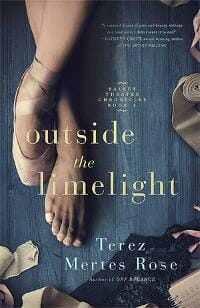
MD: Beautiful photography, well-crafted typography, sensitive composition of multiple elements combine to give this cover the look of a bestseller. ★
James Egan submitted Golden Dragon designed by James T. Egan of Bookfly Design.
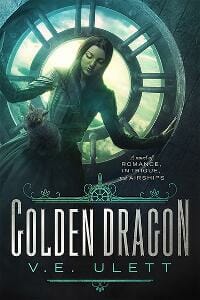
MD: Beautiful illustration and beautifully crafted typography and use of light and shadow. A winner. ★
Janis Kirstein submitted Fantasy Animals designed by Janis A. Kirstein. “I created this cover for my own book . I am a writer and an artist. This is my first children’s book.”

MD: Script font doesn’t quite work for a children’s book. The illustration is off-center and the colors in the illustration clash with the background pattern.
Jeanie Mellersh submitted Schoolboy into War 1914 designed by Jeanie Mellersh. “This is one of a series of three books about the first World War written by my father in law, who fought in the war as a young man. I have tried to keep a house style across the three books, make thecovers workable in colour or black and white, and allow them to to be noticeable at very small size.”

MD: The oval and the silhouette of the soldier draw the eye, but the typography on the cover doesn’t quite work. A good cover concept is here in raw form, but the execution is lacking.
Jim Cronin submitted Hegira designed by Solstice Publishing. “This cover image captures the theme of the novel as a species escaping their dying planet to find a new world.”

MD: The illustration on this cover is good, but the title font is without emotion and poorly spaced, with too large a gap between the first two letters. The award medal should be smaller and relocated. In its current size and position, it overpowers the spacecraft.
Jim Cronin submitted Recusant designed by Solstice Publishing.

MD: As with Hegira, the illustration is good but the typography is lacking. The author’s name is almost as large as the title.
Katrina Avant submitted A Queen’s Choice designed by Katrina’sWorks Publishing LLC. “The Queen of Hearts compliments and represents the main character Queen Ella Willis.”

MD: The bright playing card immediately draws the eye. The reflection of the card is a bit too bright. The three font styles don’t really go together and the title treatment could be improved.
Katrina Avant submitted What Mama Should Have Said designed by Katrina’sWorks Publishing LLC. “In regards to what her mama should have told her about life, Brianna Day wants to make her point loud and clear.”

MD: The photo is eye-catching but the composition is off balance. A larger title, smaller author name, and relocation of the series title would help.
Kim O’Toole submitted The Spider’s Nest designed by Kim O’Toole. “The cover is meant to signify the dangerous elements in this technothriller (the spider, a much-feared animal also relevant to the story, and the splash of red in the corners, for danger)”

MD: The colors are correct for a techno thriller. The spider works, but the typography is otherwise bland. The type, as well as the image, should convey the emotion of the story to the prospective buyer.
Kim Streible submitted The Butterfly and the Moonbeam designed by Clarissa Yeo.

MD: Beautiful type and a beautiful illustration make a compelling cover. I wish the butterflies did not obscure the girl’s face.
Kris Kramer submitted The Chosen designed by Marek Purzycki. “I’m a big believer in cover art that really stands out from the crowd, and that isn’t like the standard, generic book covers that populate bookstores these days. So I searched for an artist that really grabbed my attention, and once I found him, I’ve used him for every book in this series.”

MD: A beautiful illustration, high in emotion, but a bland title treatment.
Lee Hall submitted Open Evening designed by Design for Writers.

MD: The diagonal slashes draw the eye, but the cover art doesn’t provide any clue that the story takes place in a high school. The composition is bottom heavy, with all the text crowded together. Perhaps the title could be larger, at the top for more impact.
M Ruth Myers submitted Maximum Moxie designed by W. Alan Raney. “Alan used typography and design evocative of pulp novels and movie posters of the story’s setting (1940s). He also tried to convey the type of book it is, and the fact there’s a female protagonist.”

MD: An effective title treatment and illustration as described. The author’s name is a bit too large and bold. It fights with the title.
MAGDALENA ADIC submitted I WANT TO BE BEAUTIFUL designed by KORALJKA KLEMEN KOVACIC, MAGDALENA ADIC. “As a co-authors we illsutrated, designed and wrote this childrens story / book about the owl Churky. Teaching children the acceptance of variety, diversity and learning about themselves trough animal characters positively affects their development.”

MD: The illustration draws the eye but the composition is lacking. There’s plenty of room below the illustration for the series title and the authors’ names. Why obscure the art?
Mariah Sinclair submitted Leaving Spirit designed by Mariah Sinclair. “Author wrote a hardboiled mystery but wanted a strong gritty punk aesthetic for the cover because the book is about punks, junkies and a dive bar in San Francisco. First book in the series. Additional books will replace yellow with another bold color.”

MD: Excellent cover perfectly captures the emotion the author described. Good title treatment. Very eye-catching. ★
Matt Hinrichs submitted The Christmas Club designed by Matt Hinrichs. “Short novel about a handful of lost holiday $5 bills changing the fates of several 1950s Cleveland residents. This whimsical design combined a festive framework with modified clip art and original illustration (the falling bills). The author loved the results.”

MD: Very nice design and skillful combination of images. The title is a little hard to read against the background texture. This would be solved if the title were bolder or the texture were muted.
Nicholas Adams submitted Imprint designed by Nicholas Adams. “I’m an independent author with zero budget for design services. I’ve used my experience as an architectural designer to layout and compose the cover. I look forward to your professional feedback.”

MD: The author’s design skill is evident in this eye-catching, high-contrast cover. The title could be larger and the author’s name brighter.
Oli Jacobs submitted Wrapped Up In Nothing designed by Elaine M Will.

MD: A compelling red-hot image and distressed font set the stage for this violent story. The title is crowded at the top and the author’s name is larger than the title. I’d move the image down and extend the sky to make room for a larger, three-line title and decrease the size of the author’s name for more impact.
Randy Ellefson submitted The Ever Fiend designed by Randy Ellefson. “My first cover. I went for a clean approach, classic font, and strong image. I made the title glow like the face and tried not to overdo it. This is an ordered series, so no volume number on cover. I’ve tried to follow your advice. How did I do?”

MD: A good start. The illustration is compelling. The typography needs a little help. I’d make the title larger and brighter, more like the bright spot in the image and give it a more creative treatment. I’d either remove Talon Stormbringer from the cover entirely, or place it above the title. In its current location, it could be misconstrued as the author’s name.
Raven Anxo submitted A Thirst For Vengeance designed by Raven Anxo. “This cover represents one of the main characters in the book, and shows her holding one of her favorite weapons of choice.”

MD: The image is OK, but perhaps too bright. Too many font styles that don’t go together at all.
Rena Hoberman submitted Chosen: Humanity designed by Rena Hoberman of Cover Quill.

MD: Beautiful illustration. The woman’s diagonal posture sweeps the eye from the title to the author’s name. The title could be bolder for better visibility in small sizes.
Rick Holland submitted Gather The Seekers (Challenged World Volume 3) designed by Rick Holland. “I chose a somber, yet hopeful cover for this story which involves an attack on the American home front.”

MD: A beautiful cover. Effective use of color, light and shadow in the title. Perfectly executed typography. ★
Rochelle Karina submitted A World Rebuilt designed by B Wade. “The image used for this cover was a photo taken by the designer nearly 30 years ago. After hours of searching through stock photos, he pulled this out of his archives and mocked it up for the cover – perfect!”

MD: The photo is compelling, but after reading the description on Amazon, the fonts and colors on this cover are all wrong. I’d colorize the photo and choose different fonts more in keeping with the story. This looks like a pleasant, and possibly humorous, memoir.
Rosemary A Johns submitted Blood Dragons designed by JD Smith. “We wanted to create a cover, which would start an iconic reinvention of urban fantasy. Also set up a new series, which is set in a divided, paranormal London. It’s a dark romance, with a thriller edge – where the heart is central and can be stopped (like clocks) by the vampires’ venom.”

MD: Beautiful, effective cover. Engaging, emotional illustration and well-crafted typography. Nice.
Sana Pirzada submitted The Rose Within – A Gothic Romance designed by Ioanna Papangeli. “The Rose Within is a Gothic romance of the likes of traditional Victorian Gothic masterpieces. I took this cover photo myself in Highgate Cemetery, London. It shows a statue overlooking a grave and very aptly illustrates the dark, Gothic, romantic themes in the novel.”

MD: The cover photo is good. The red title on the black background is hard to read. I’d choose another color, or perhaps colorize the photo red and make the title white so it pops.
Sherry Maysonave submitted The Girl Who Could Read Hearts designed by Denise Caliva (Calica Designs, Houston Texas area) & Balboa Press. “Inspired by a vivid dream the author, Sherry Maysonave, had starring one of her deceased sisters”

MD: The typography works, but the illustration seems less appropriate after reading the description on Amazon.
Sherry Soule submitted Immortal Eclipse designed by SwoonWorthy Book Covers.

MD: A good cover design, typical of the genre. The background and foreground images look pasted together. The figure is brightly lit but the background is monochromatic and in shadow. Some blending would look more realistic.
Ted Berner submitted Proof the Novel designed by Ebook Launch. “While ebook Launch put the cover together, the image on the cover was done by two people. The open Bible was done by an artist with color pencil, and the creature tearing its way out of it was done by a digital artist.”

MD: The image is too contrived and the title font is overworked. If the creature were rendered in warm colors instead of cool blue the image would be more believable.
tony dargis submitted Reach For The Sky designed by tony dargis. “Another composition, less of an assembley. My illustrator is very shy – and this is book 2 ( of 12) in the Super Speed Sam series. The cover is another piece of the total package, hence the rigid format.”

MD: A lighthearted cover that goes with the others in the series on Amazon. Good illustration.
tony dargis submitted Kitchen Decorations designed by tony dargis. “It’s difficult when you have 12 books to cover – and limited finances :-). This is book 3 ( of 12) in the Super Speed Sam series. ”

MD: A lighthearted cover that goes with the others in the series on Amazon. Good illustration.
V. L. Cooke submitted Golden Opportunity designed by Marushka. “I loved this cover from the moment I first saw it. Marushka from Deranged Doctor Design was amazing and I think it’s obvious why I chose her to design the rest of the series as I write them.”

MD: Excellent photo illustration and good title treatment.
Nonfiction Covers
Amanda Downey submitted Meant to Be Heard: Tuning In to the Grace of Your Voice designed by Amanda Downey. “The goal with this cover was express the light that comes from one’s being as they find their voice. Incorporating sheet music that the author played in her childhood hints at the musical nature of the book as well as refers to the childhood stories she tells throughout her book.”

MD: The dark blue background and heavy, black title seem at odds with the book description above.
Chris Mandson submitted Black Ops, Aliens, Spirits, Bigfoot and our untold History designed by Ian Paterson. “I thought this was clever, the use of keywords in the title and the images grabbed my attention.”

MD: Keywords in titles and subtitles are good, but this cover is much too busy. Too many images, too many focal points, poor design. Sorry.
Dana Miller submitted Ten: Five Five designed by Dana Miller. “The silhouette on the cover was derived from a 1969-70 photo of the author and his training dog, taken at Lackland AFB shortly before he left for Vietnam.”

MD: This cover is much too busy. The silhouette is overpowered by the flash in the background and the type is unreadable. This is a decent concept, just poorly executed.
Dane Low submitted The Art of Monitoring designed by Book Cover Design by EbookLaunch.com.

MD: Nice design, nice art, clever title treatment. A subtitle wouldn’t hurt to tell the buyer what the book is about.
David Butcher submitted Handling Strife: Ideas for Happier Living designed by David M Butcher. “Cover picture shows a person that seems to have problems, or in the midst of Strife.”

MD: The photo and title treatment are too contrived for a self-help book. A book cover should show the solution, not the problem. Buyers are diverse in every way, and they like to see themselves in the cover. Showing one gender or race on the cover automatically excludes everyone else.
David Ramos submitted The Bible Habit designed by David Ramos. “Thanks for this opportunity!”

MD: Nice. The colors are cheerful and eye-catching and the type is well-crafted. A nice change from the typical Bible study guide.
Dawn Taarud-Martinez submitted Murdered In The Cemetery designed by Dawn Taarud and Lisa Stone.

MD: The image isn’t bad but the title treatment could be improved. Perhaps a bold condensed with “Murdered” being very large and “in the Cemetery” in a single line beneath it. The yellow subtitle, stacked in three lines with the empty space to the left seems odd.
Debby Gies submitted P.S. I Forgive You designed by Art4Artists. “This book is a sequel to Conflicted Hearts, and a memoir about finding forgiveness before her death, for the narcissistic mother I abandoned.”

MD: The cover is a little busy. The ultra-bold author name seems out of place with the other font choices.
Holly Worton submitted Walking the Downs Link: Planning Guide & Reflections on Walking from St. Martha’s Hill to Shoreham-by-Sea designed by Kim Killion.

MD: The image is good. The title and subtitle typography could be more creative.
Karl Levy submitted Sinarth designed by Damonza. “The cover design was created by Grady at Damonza. Instructions given were to use the 35 year old Black and White photo of the boy soldier I provided and to combine it with Cambodian themes such as sunsets, sunrises, sugar palm trees, the ancient temples angkor Wat. They nailed it second go..”

MD: Dramatic, effective imagery and expert use of color. Nice. ★
Mara Johnson submitted Her name was Bitter: A Memoir designed by Deranged Doctor Designs. “I worked hand and hand with the cover designer Kitty. I escaped the darkness in my life and I wanted my cover to reflect that. Thank you and be blessed.”

MD: Dark, emotional, eye-catching cover. Perfect!
Meg Beeler submitted Living in the Heart of the Universe: Expanding Your Relationship with Earth and the Cosmos designed by Pete Garceau. “Allow the universe to unlock your inner wisdom and guide your life path.”

MD: Beautiful image, sophisticated typography. A great cover. ★
Meikele Needles submitted My Belly has Two Buttons designed by Meikele Needles and Rebecca Robertson and Jessica Buttler. “Child and adult hands in a heart around a button representing a belly button and a “Mic-key” button which is a type of feeding tube.”

MD: Nice image and title treatment, though it might pop more in white than black. I wonder about the dark red background which can communicate danger, blood, negativity for this otherwise helpful book.
Michael Eli Vineberg submitted Left Alone to Learn (The Break-up Book) designed by Miguel Angel De La Rosa Aguiar. “I love the cover of my book. The designer achieved exactly what I wanted with the placement of the words, the color contrast, the font, how the lines guide the viewer toward the title, and the overall sensation that occurs when a person comes across the image.”

MD: The lines of the cover definitely draw the eye, but the overall effect seems more depressing than inspirational. The title fonts are bland.
Michael W. Perry submitted Embarrass Less: A Practical Guide for Doctors, Nurses, Students and Hospitals designed by Michael W. Perry. “My first attempts were stock photos of hospital staff. That wasn’t just dull, it said nothing about the theme. Then I realized that a picture of two kids playing doctor would express that theme perfectly. Less embarrassing stays make both patients and staff happier.”

MD: The photo is charming. I’d find a way to make it fill the entire cover so that the title, subtitle and image are seen as a unit instead of being broken up. I’d rewrite the subtitle to better explain the title.
Mike Ducheine submitted The OBAMA Legacy designed by Mike Ducheine. “Obama is referred to by the Republican Party as “King Obama”; I find it appropriate to design a cover which paints the president as a king in order to talk about his legacy”

MD: Looks homemade and self-published. No design, no typographic skill. The author’s name should not be at the top.
Mike Kowis submitted Engaging College Students: A Fun and Edgy Guide for Professors designed by Derek Murphy. “The cover design is intended to capture the image of fully engaged college students during a lecture or discussion. The front cover depicts the students laughing hysterically and are fully enjoying whatever the professor just said. This kind of student engagement is the goal for all professors!”

MD: The design looks old fashioned. I’d find a more diverse photo and lose the black bands.
Pradeep Bahirwani submitted Crouching Tiger Hidden Hogan: The Sixth Lesson designed by Pradeep Bahirwani. “The emphasis is on Duality: Hidden Hogan and Crouching Tiger as Master and Pupil, as Theory and Practice, as White and Black.The use of the colon is necessary since it is part of the main title.”

MD: The design is too busy and the fonts are not well-crafted. The title and subtitles should be rewritten to make an immediate and clear promise to the buyer.
Rick Holland submitted KISSTRATEGY designed by Rick – Vision Press. “A clean, bright design for a new business book.”

MD: A compelling title and cover design. I’d put more thought into the image of the lips. Why are the three steps out of order? Perhaps the numbers should be removed.
Tamian Wood submitted Latina Authors & Their Muses designed by Tamian Wood. “Latina Authors & Their Muses is a collection of interviews with 40 Latina authors, both established and emerging, living in the U.S. and writing primarily in English.”

MD: The image of the woman is beautiful, but the fiery red background fights it. The title treatment is bland.
Teddi Back submitted The Power of Creativity designed by Teddi Black.

MD: Great cover. Creative image, well-crafted type. ★
Teddi Black submitted Selah in the Storm designed by Teddi Black.

MD: An evocative image and well-crafted type. A successful cover.
Wendy Dewar Hughes submitted Von Königsberg Nach Kanada designed by Wendy Dewar Hughes. “This book is a series of letter from a Jewish father to his son about escaping Nazi Germany. I wanted to capture the juxtaposition of grim reality with hope.”

MD: The single flower on an indistinct but clearly not pleasant background is very effective. The title font works, but the font for the authors’ names doesn’t quite go with it.
Well, that’s it for this month. I hope you found it interesting, and that you’ll share with other people interested in self-publishing.
Use the share buttons below to Tweet it, Share it on Facebook, Plus-1 it on Google+, Link to it!
Our next awards post will be on December 19, 2016. Deadline for submissions will be November 30, 2016. Don’t miss it! Here are all the links you’ll need:
- The original announcement post
- E-book Cover Design Awards web page
- Click here to submit your e-book cover
- Follow @JFBookman on Twitter for news about the E-book Cover Design Awards
- Check out past e-Book Cover Design award winners on Pinterest
- Subscribe to The Book Designer Blog
- Badge design by Derek Murphy


