


By Joel Friedlander
Welcome to the e-Book Cover Design Awards. This edition is for submissions during November, 2018.
This month we received:
62 covers in the Fiction category
17 covers in the Nonfiction category
Comments, Award Winners, and Gold Stars
I’ve added comments (JF: ) to many of the entries, but not all. Remember that the aim of these posts is educational, and by submitting you are inviting comments, commendations, and constructive criticism.
Thanks to everyone who participated. I hope you enjoy these as much as I did. Please leave a comment to let me know which are your favorites or, if you disagree, let me know why.
Although there is only winner in each category, other covers that were considered for the award or which stood out in some exemplary way, are indicated with a gold star: ★
Award winners and Gold-Starred covers also win the right to display our badges on their websites, so don’t forget to get your badge to get a little more attention for the work you’ve put into your book.
Also please note that we are now linking winning covers to their sales page on Amazon or Smashwords.
Now, without any further ado, here are the winners of this month’s e-Book Cover Design Awards.

e-Book Cover Design Award Winner for November 2018 in Fiction
James Vella-Bardon submitted The Sheriff’s Catch designed by Mark Ecob. “The idea was to convey historical fiction in a fresh, dynamic, unprecedented way. The novel is in essence a thriller except that it’s set 500 years ago. It’s also cross-genre so we didn’t want to go with the usual ‘Cornwell / Iggulden’ cover which generally only appeals to men above a certain age.”
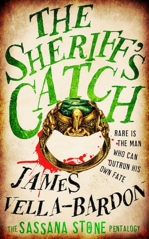
JF: Outstanding example of using hand lettering to create a unique and historical look for this cover. It also implies an adventurous and gripping tale.
e-Book Cover Design Award Winner for November 2018 in Nonfiction
Dietmar Vogelmann submitted My Different Orient; a Memoir designed by Dietmar Vogelmann. “Since the Memoirs is about the challenges of a life abroad in Vietnam. The Coffer should reflect the Communist Part (yellow/ red) as well as the journey behind the book, hence the man wondering aimlessly across one of Vietnam’s most famous markets which is the background.”

JF: Well done, graphically interesting and to the point. One of the best author-designed covers in this collection, it puts us right into the journey along with the author.
Fiction Covers
Aila Stephens submitted Alabama Rain designed by Aila Stephens. “The blue-gray tone on the cover represents the time period most of the book is set in: The Great Depression. No detail on the cover is included by accident.”

JF: Artful with a good type treatment, but simplifying the visual would likely make it a stronger cover.
Amala Benny submitted Air of Darkness designed by Amala Benny. “Urban Fantasy featuring a kick-ass protagonist who uses her elemental magic to keep her city safe.”

JF: Expertly designed, and the glow on the central figure’s hand is a great focusing device.
Amala Benny submitted The Girl in the Osage Hills designed by Amala Benny.

JF: Not sure the typography is standing up well to the riotous color scheme of the background.
Amanda Lyons submitted The Apocalypse of Peter designed by Amanda Lynn Lyons. “This is a critical satire regarding immigration and exclusion. The open gate signifies a new beginning from an oppressive state. The tiger eyes and shark are a reference to certain tests the protagonist went through to get to this state of hope. The font is called, “Seraphim.””

JF: It can be tricky using symbolism on a cover because viewers of course do not know what’s inside the book. Here, the visuals are very confusing and the type ineffective, it almost looks like it’s breaking up.
Artemis Crow submitted Leona’s Cage designed by Artemis Crow. “I found this image on Shutterstock and knew it was perfect for this novella. I changed it to black and white, colored the eyes and blood then tucked the title and author name in the lower half so nothing would distract from the striking image.”

JF: Well, it is striking, I’ll give you that.
Audrey Driscoll submitted She Who Comes Forth designed by Audrey Driscoll.

JF: A virtual exhibition in what not to do with the typesetting of your title. Perhaps hire one of the awesome designers whose work you see here to help out next time.
Bryan Danielson submitted The Dust Solution designed by Bryan Charles Arthur Danielson. “I learned e-book cover design mostly from studying the concepts discussed on this site. Thank you all for the insight. I hope I put it to good use. The cover is intended to appeal to any general science fiction, cyberpunk, and/or technothriller fans.”

JF: Thanks for being a reader, Bryan. There are things to like on this cover, but the frame is not one of them. Especially in a “space” illustration like this, I don’t think you gain anything by using what is a pretty complex framing element that adds nothing.
charlotte stanley charlotte stanley submitted Beats of the Heart designed by Susan Garwood. “The female main character is an artist who uses her hair as an extension of her creative expression. My designer captured the artistic nature of Izzy as well as the rock star vibe for Dawson”

JF: Interesting manipulation of a stock image that’s visible on several other titles in this genre, along with a strong title.
Christopher Pickert submitted Year of the Amphibian designed by Eroyn Franklin. “The artist read the book as part of the project, so the cover really reflects the story: the lake is a central theme, especially the lake at night. The cover is all hand-drawn, including the lettering. Even in B&W on a Kindle the dark water lines and light lettering make a nice contrast.”

JF: A clever and artful design, although I wish the title stood out a bit more.
Dan Van Oss submitted The Smell designed by Dan Van Oss.

JF: Between “Rot” and “Smell” and the violence implied by the central figure, the designer has let us know exactly what to expect in this post-apocalyptic thriller.
Dan Van Oss submitted Heir of Ashes designed by Dan Van Oss.

JF: Engaging and well focused, with a good title treatment.
Dan Van Oss submitted The Focus Stone designed by Dan Van Oss.

JF: You can see how all three of this designer’s covers are extremely well focused and use singular visuals to imply something about the plot of each of the books.
Daniel Ross submitted FORCE NO ONE designed by Daniel Charles Ross/Force Poseidon. “The C-130 is a character in the story; kinetic colors complement the setting sun; large-type title (here 127-pt Akzidenz Grotesk Black); simple graphics; and bullet holes (Exits, shot from the inside out.) underscore the alarm.”

JF: It’s dramatic and impactful, and I wouldn’t disagree with your own appraisal, but the element at the top, with the unreadable blurb and confusing and unnecessary “line” underneath it detract a wee bit.
Daniel White submitted Tarkentower designed by Daniel White.

JF: No idea what this cover is designed to communicate, except “Watch out for scissors.”
Daniel White submitted The Tinweed Man designed by Daniel Scott White. “A shoe and a butterfly, right out of the story. This is a fantasy book. Has the typical box around the cover and the large title found on all Longshot Press books. Do titles really have to be so big these days?”

JF: Nice illustration of a worn boot. Titles on these books are very generic, not sure that adds anything to the covers.
Darja DDD submitted Delusions designed by Kitten from Deranged Doctor Design. “Mystery, Thriller & Suspense cover design”

JF: Perfect for the mystery/thriller genre.
Darja DDD submitted Primal Nature designed by Milo from Deranged Doctor Design. “Paranormal & Urban Fantasy cover design , The Primal Series, Book I”

JF: Another solid series design. This designer continually uses distinctive type, emblematic figures, a bright light to contrast the central figure, who is often facing away from us. And from these elements they continue to create strong series designs.
Darja DDD submitted Nature of the Beast designed by Milo from Deranged Doctor Design. “Paranormal & Urban Fantasy cover design , The Primal Series, Book II”

Darja DDD submitted The Beast Inside designed by Milo from Deranged Doctor Design. “Paranormal & Urban Fantasy cover design , The Primal Series, Book III”

Darja DDD submitted Fall Back designed by Milo from Deranged Doctor Design. “Post-Apocalyptic book cover design , Collapse: New Republic Book 1”

JF: Here’s another strong series design, this time using emphatic bold type that matches the military milieu quite well. Once again the main figures are in the center and highlighted by a light source and set in an environment that takes us right into the story.
Darja DDD submitted Man Down designed by Milo from Deranged Doctor Design. “Post-Apocalyptic book cover design , Collapse: New Republic Book 2”

Darja DDD submitted Overwatch designed by Milo from Deranged Doctor Design. “Post-Apocalyptic book cover design , Collapse: New Republic Book 3”

David Godwin submitted Eyes of the Blind designed by D.A. Godwin. “The design takes environmental clues from the fantasy setting, and from elements within the book. It is composed almost entirely of custom photography, and was intentionally NOT the standard hero pose and swooshy font that is so common with current fantasy titles.”

JF: The illustration looks interesting, but there’s no energy to the composition because everything is given about the same emphasis, and the title type could be a lot stronger.
David Grigg submitted The Fallen Sun designed by David R. Grigg. “This is a Young Adult novel set in a world where all illumination and warmth comes from a ‘fallen sun’. The cover design is intended to focus on this image of an artificial sun surrounded by structured darkness.”

JF: The simplicity and strong contrast in the design plus the emphatic type were great choices for this cover. ★
Deborah Coonts submitted The Lucky O’Toole Vegas Adventure Boxset 2 designed by Glendon of Streetlight Graphics.

JF: Fits perfectly with the rest of the books in this series.
Ebook Launch submitted The Best of Intentions designed by Ebook Launch.

JF: A poetic cover whose low-impact look may be just right for literary fiction.
Ebook Launch submitted A Part of You designed by Ebook Launch.

JF: At first glance this cover looked dreary, although quite professional. But for a novel that revolves around infertility and surrogacy, the suffering implied by this illustration might appeal to readers.
Ebook Launch submitted Daisy’s Run designed by Ebook Launch.

JF: Talk about focus! This series (see the 2 following) uses the round window to focus us on the central highlighted figure. It also features a cool, modern look, and effective series branding. (“Pushing Daisy” has strange reverberations with the common expression “pushing daisies” that implies being dead and buried. Or maybe that’s just me?)
Ebook Launch submitted Pushing Daisy designed by Ebook Launch.

Ebook Launch submitted Daisy’s Gambit designed by Ebook Launch.

Eleanor Oberio submitted Rocky the Rocketsaur designed by German Creative.

JF: Love the bright yellow color and fun spaceship, but there must have been a better font for the title.
Eleanor Oberio submitted The Adventures of Emanuel: The Flying Shark of Bouncy Land designed by German Creative.

JF: Awkward illustration and overworked type.
Eugene Fournier submitted Still Breathing designed by Damonza. “The image on the cover relates to the main character’s vision of being in Uganda which becomes a reality later in the novel.”

JF: A beautiful yet quiet cover that pulls us effortlessly into the story. ★
Gabrielle Prendergast submitted Fighting Furry designed by Gabrielle Sara Prendergast. “The author wanted something to reflect the humor of this this werewolf romance series. I went with a kind of B-movie look and we both loved it. With the second book in the series I think it creates a strong but lighthearted brand.”

JF: These are fun, exciting covers that really do evoke that “B-movie” look, and the expressions on the women’s faces tell us a lot about the “tone” of the books. ★
Gabrielle Prendergast submitted Stripped designed by Gabrielle Sara Prendergast.

Ian Amos submitted When Standing Stones Move designed by Ian Amos. “It’s really hard to make standing stones glamorous or appealing to the target young age range!! I’ve tried to capture the mystery around them as well as allude to the quest our main character takes, hinting at some of the plotline and artifacts the main character has to collect.”

Jacob Spencer submitted Dark Was the Mountain designed by Lulu publishing. “The dark mountain on the cover is, as made obvious by the title, is a staple stage area in the book series”

JF: Nice atmosphere and central image.
James Egan submitted The Confectioner’s Guild designed by James T. Egan of Bookfly Design.

JF: Beautifully detailed work makes this strong composition delectable.
James Egan submitted Crimson 37 designed by James T. Egan of Bookfly Design.

JF: Love the way the designer has integrated the title, strong typography, and the excitement of the action in this spy thriller. Superb. ★
James Egan submitted A Holiday by Gaslight designed by James T. Egan of Bookfly Design.

JF: Another gorgeous and detailed cover that just screams “holidays.”
Jasmine Antwoine submitted The Order of the Sacred Vow designed by Jasmine P. Antwoine. “This is an urban fantasy short story belonging to a series. The most important is the urban landscape where the story takes place and which somehow dictates the action – hence the silhouette of the city in the background.”

JF: The author’s name is missing.
Jill Marsh submitted Snow Angel designed by JD Smith Design. “This is the seventh book in a crime series, so we aimed to keep the brand but convey its particular setting: an English village at Christmastime.”

JF: It works, and the strong contrast pushes the “mirror” strongly into the foreground.
Jo Macgregor submitted The First Time I Died designed by Jenny Zemanek. “The book is a paranormal suspense, where the iced lake plays a major role. It takes place in Vermont in Winter, hence the palette. It needed to look primarily like a psychological suspense/thriller, but with a restrained, subtle other-worldly element. :)”

JF: A strong professional cover that sets an alluring tone and is perfectly put together. Notice how the eye is led to the lone “I” and the red word “Died” to heighten the impact.
Jodi Cleghorn submitted The Starling Requiem designed by Jodi Cleghorn.

JF: The simplicity of the cover has worked to your advantage.
John Mabry submitted The Glory: Berkeley Blackfriars Book 3 designed by Milo at Deranged Doctor Designs. “I love this cover–it’s the best cover in our series, and may be the best cover on any book I’ve ever seen! So I’m really proud that it’s on one of mine. Wonder, magic, drama, danger…it’s all here, along with a melancholy, muted color palette that just sucks you in. Even the flames look hot.”

JF: Well said, it’s terrific. ★
JP (Jo-Anne) McLean submitted Secret Sky designed by JD&J Designs. “Secret Sky is the first book in The Gift Legacy contemporary fantasy series. Title font is Bebas to which JD&J have added a grunge effect. In this cover, I wanted to capture the character’s vulnerability and a mysterious, moody element to create tension.”

JF: Moody and effective.
Karl Fleet submitted 01: Corporate Truth designed by Kate Slavin. “The series is called the Truth Files and deals with themes related to the corporate world. Corporate Truth is the first book in the series and was given a beige look to feel like a manila folder.”

JF: I do see what you’re trying to accomplish here, but I’m not sure it will be effective when competing with the colorful and exciting covers it will be next to. In other words, it’s good to be “different” to set yourself apart, but not to the point of eliminating the drama and appeal of your story.
Karl Fleet submitted 02: Criminal Truth designed by Kate Slavin. “For the second book Criminal Truth, in the truth files. We wanted to use blue from criminal files.”

karl Fleet submitted 03: Fractured Truth designed by Kate Slavin. “For the third book in the Truth Files. We wanted Fractured Truth has a feeling of a green medical file.”

Kate Spofford submitted The Art Kids designed by Kate Spofford. “This is a new cover design for an updated edition of my book. The main title is in the font Playlist which had a brushstroke quality that speaks to the subject matter of the novel. The image is a stock photo that had a nice soft palette which mirrors the quiet nature of the story.”

JF: It works and the background color is quite pleasing.
Kathleen Murphey submitted Other Tales designed by Tony Skorupski. “The image is “Thou little child” (1915) by WH Robinson. The child is androgynous or gender ambiguous which important to the stories in Other Tales. The font of the title is to highlight the old origin of stories. The blue transitions into green as our ideas of gender transition and expand.”

JF: Not very good, I’m afraid. I’m betting the amateurish look will not help you sell this book.
Kimberly Ruff submitted Saving Tir na nOg designed by Evonne and Ray T. Christian II and Kari Kunkel Anderson. “Comic book artists Evie and Ray were given carte blanche to choose the image they would draw and paint after they read an early draft of the book. The image they chose captures the young protagonist’s emotions as she prepares to face her foes in battle. Kari added the graphic design.”

JF: The image is certainly effective; the type much less so.
Lee Hyat submitted Wedding at Mistletoe Chalet designed by Lee Hyat.

JF: A solid genre cover, especially for the holidays. The red glove holding the woman really tells us about the intimate relationship between the two characters.
Lucia Mann submitted Addicted to Hate designed by CenterPointMedia. “Addicted to Hate is inspired by true events”

JF: Drab. And what’s all that stuff at the top of the cover for?
Michael Sahd submitted Assassin Marked designed by Michael C. Sahd. “I designed this book cover in an art noir style to reflect the mood of the story (which concerns a crime syndicate member who has gone rogue and assassinated one of his bosses).”

JF: Nice attempt, but the illustration and the hard to read type at the top hold this cover back.
Nala Henkel-Aislinn submitted Blueprint for Love designed by Nala Henkel-Aislinn. “This design is for book one of a three-book contemporary romance series. Originally the cover had a woman only, but based on feedback added the male later. Script font is Monday, and along with the word “Love” should convey the genre.”

JF: There are a lot of things to like on this series design, but not the “pasted together” look of the characters’ images, which look like they are from very different sources with tonal values and lighting.
Nala Henkel-Aislinn submitted Deadline on Love designed by Nala Henkel-Aislinn. “This is book two of a three-book contemporary romance series. The three books are a small-town sub-genre. The location is in the Pacific Northwest of the U.S., in a fictional town called Cranberry Hill…hence the more cranberry hue of the title font.”

Nala Henkel-Aislinn submitted Recipe for Love designed by Nala Henkel-Aislinn. “Third of a three-book contemporary romance series—privileged socialite meets a hipster chef and sparks fly, as will happen in a romance.”

Rachel Beck submitted Defrag designed by Art by blacquiao (Andrew Miranda); Layout by Rachel Beck. “Original art was done in watercolors, then scanned. The binary was added digitally, along with some slight texturing to help blend the traditional and digital mediums. This process of combining digital and physical mediums is reflective of major themes of this cyberpunk novella.”

JF: I don’t really think the “1s” and “0s” in the background are adding anything other than visual noise.
Robin Helm submitted Accidentally Yours designed by Damonza. “This book is the first in a 3 book Time Swap series. Since I wanted the Regency cover model to match the modern cover model, I had a photo shoot done of my daughter in Regency costume. I also used her photo shoot from her senior year in college. The same girls look at each other through time.”

JF: You went to a lot of trouble, but I think it paid off in an attractive and on-point cover. However, I’ll have to say that if you hadn’t made the point that the two girls are the same, I would not have gotten that at all since their hairstyles and clothes are different, and the one in the foreground is pretty much turned away from us.
Warren Martin submitted Till the Cows Come Home designed by Warren Martin.

JF: Demonstrates why you need a cover designer, because otherwise you end up with this.
Nonfiction Covers
Alexander Gerasimchuk submitted The Secret Book of Dzyan designed by Firliefadilah.

JF: Nicely done. The classic typeface and center alignment work well for this mystic title.
Bennie Pollard submitted Small Business for the Rest of Us – One Dude’s Journey designed by The Frontispiece. “The book design agency was sharing studio space with a local letterpress shop. The book designer started pulling out wood and metal letterforms & arranged them into this cover design.”

Carol Bond Wagner submitted God Is Out to Get Us: At All Costs – The Life of Abraham designed by Elisabeth Bennett.
JF: How can a typography not like it? The title could use more contrast with the background (you could ink the letters). Astute observers (and anyone who has set type) will note, this photo is actually backwards, since type has to be in reverse to print properly when transferred to paper.

JF: An interesting cover for a number of reasons, including the title statement. It is odd, however, to so aggressively split the title in half, the way this one does. Also not certain the “paper edge” was intentional or accidental.
Dave Lewis submitted Never Seventeen designed by Dave Lewis. “My latest book, a modern haiku collection.”

JF: For poetry, I think a plain cover with some elegant type would be far superior.
Donna Provance submitted Odie Explores designed by D.S. Provance. “To convey the concept of exploring and the fact this children’s book involves a dog, Odie is wearing his backpack with the backdrop of nature. I wanted the focus on Odie, so I used the sky as the primary background. (I also tried to apply last year’s advice offered with Meet Odie, e.g., no By:)”

JF: Confession: I love dogs, and I love dogs on book covers. But you should know that this book exemplifies the “self-published” look, and that’s too bad.
Ebook Launch submitted Molded designed by Ebook Launch.

JF: Clever play on the various meanings of “molded” and intriguing because the reader naturally wonders what the mold is all about. Striking. ★
Elly Flippen submitted Psychic Literacy designed by Ender H. Isin. “All of Ingo Swann’s book utilize his paintings on the covers. This book uses an aspect from Ingo’s painting Floating Canyons which is held by The American Visionary Art Museum.”

JF: It certainly is an intriguing image, so I wonder why the designer left the type so very weak that it can barely be read.
Grieg Pedersen submitted The Empire Has No Clothes: Observations on Life, humanity, and America by someone who missed the announcement designed by Grieg Pedersen. “The Native American concept of the heyoka, one who lives and/or perceives things backwards from others, is important to the perspective presented in the book.”

JF: This cover appeals precisely because of its “backward” elements, both the illustration and the title, which reflect the content. But I can’t help wondering what a talented designer would have done with the same elements.
Ihor Tureha submitted Freedom over Anxiety designed by MiblArt. “Author and designer want to show through this simple cover design how everyone can come to a life where you could have control over it. No longer having panic attacks. Feeling calm, in control and happy. Loving the person you are!”

JF: A well balanced design that does the job. My caveats include whether the spectral highlight is really needed, because it doesn’t direct us anywhere specific, it seems to exist for its own reasons, and the title, which seems irregular. Wouldn’t we usually say “Freedom from Anxiety”?
Jasmine Antwoine submitted Poems from a Monster designed by Jasmine P. Antwoine. “Sometimes, monsters write… This is a compilation of poems and prose I have written over the course of eighteen years. I have also designed the cover. It points to how a monster could possibly see the world. I know it has flaws, this is why a comment or advice would help me a lot for the future.”

JF: It’s impossible to know what this cover “means” or what feeling it is supposed to communicate. With poetry, which excels at creating imagery in the reader’s mind, simpler covers seem to work better. Also the title treatment is pretty heave-handed, even for “monster” poetry.
Laykin Waters submitted Vanishing Depth designed by Laykin Waters. “Vanishing Depth is poetry picture book for teens and young adults that relays a story of fighting against depression, grief, and bullying as one of rising up from deep water. This message is conveyed not only through the title and image on the front but also from the color choices of black and blue.”

Lola Akinmade Akerstrom submitted DUE NORTH designed by Lilit Kalachyan-Nurse. “While visiting Ccaccaccollo, Peru, a young Quechua boy came skipping along a red mud wall and, for a split second, hung frozen in time — a symbol of absolute joy. That moment of pure innocence instantly transported me back to my childhood when I found total excitement in the most basic things.”

JF: Lovely image; can’t read the type; square format makes it look more like an album cover or corporate report because the design somehow doesn’t say “book.”
Mike Kowis submitted Smart Marketing for Indie Authors: How I Sold my First 1,563 Books and Counting! designed by Rob Williams. “My designer and I chose the image of typewriter placed next to a cup of coffee as iconic symbols of a writer. We also chose warm colors and increased the font size of “Indie Authors” in the main title b/c that is this book’s target audience.”

JF: Well targeted for its intended audience, with strong typography. Interesting we are still using typewriters to signal “writer” when I bet very few people reading this article (indie authors mostly) owns or maybe ever owned one. ★
Monique Lynch submitted Building Your Confidence Workbook: A Guide for BBW (Big, Beautiful Women) designed by Delroy McPherson. “I struggled with self-confidence so badly that I refused to take pictures or look in the mirror for years. During my journey to self-healing and confidence, I had to learn to accept me for where I am at and use it as a stepping stone for where I want to be. That’s why I chose to use my picture.”
")
JF: It gets the message across.
Rachel Larkin submitted Delighting in the Names of God: 8 Weeks to a Deeper Prayer Life designed by germancreative. “I wanted a feminine look to the cover design to match the word “Delighting” but not too girly. It was important to me that the flowers were modern looking and not stuck in the 80s – a softer look rather than a floral look. Green is always a calm peaceful colour for my genre.”

JF: It all works together well for this religious title. You might ask your designer to add some leading (space between the lines) of your subtitle.
Thomas Washing submitted An Unlikely intervention – A Startup Company’s Quest to Conqer the World’s Second Leading Killer of Children designed by Paul Dotey. “The most audacious undertaking by a startup company I had ever encountered—an underfunded handful of entrepreneurs setting out to conquer pediatric diarrhea, a disease that kills young children in underdeveloped countries, like these girls in Indonesia, and has plagued humankind for millennia.”

JF: Very appealing and well put together, I hope it helps them with their humanitarian efforts. ★
Well, that’s it for this month. I hope you found it interesting, and that you’ll share with other people interested in self-publishing.
Use the share buttons below to Tweet it, Share it on Facebook, Link to it!
Our next awards post will be on January 28, 2019. Deadline for submissions will be December 31, 2018. Don’t miss it! Here are all the links you’ll need:
- The original announcement post
- E-book Cover Design Awards web page
- Click here to submit your e-book cover (See New Submission limits)
- Follow @JFBookman on Twitter for news about the E-book Cover Design Awards
- Check out past e-Book Cover Design award winners on Pinterest
- Subscribe to The Book Designer Blog
- Badge design by Derek Murphy
