Welcome to the e-Book Cover Design Awards. This edition is for submissions during November, 2016.
This month we received:
100 covers in the Fiction category
17 covers in the Nonfiction category
Comments, Award Winners, and Gold Stars
I’ve added comments (JF: ) to many of the entries, but not all. Remember that the aim of these posts is educational, and by submitting you are inviting comments, commendations, and constructive criticism.
Thanks to everyone who participated. I hope you enjoy these as much as I did. Please leave a comment to let me know which are your favorites or, if you disagree, let me know why.
Although there is only winner in each category, other covers that were considered for the award or which stood out in some exemplary way, are indicated with a gold star: ★
Award winners and Gold-Starred covers also win the right to display our badges on their websites, so don’t forget to get your badge to get a little more attention for the work you’ve put into your book.
Also please note that we are now linking winning covers to their sales page on Amazon or Smashwords.
Now, without any further ado, here are the winners of this month’s e-Book Cover Design Awards.
e-Book Cover Design Award Winner for November 2016 in Fiction
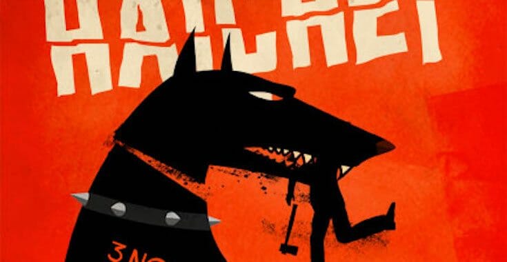
Cheryl Mullenax submitted Die Dog or Eat the Hatchet designed by Sig Evensen (Inkubus Design). “Sig did a wonderful job with this Saul Bass inspired book cover, which captures the hardboiled, pitch-black gallows humor theme of the book perfectly.”


JF: A cover whose strong graphics and violent colors grab you by the throat. Bracingly good and destined to stand out amongst all the photo-oriented covers around it.
e-Book Cover Design Award Winner for November 2016 in Nonfiction
Rebecca Reynolds submitted Curiosities from the Cabinet: Objects and Voices from Britain’s Museums designed by Dan Mogford. “I wanted to introduce some movement to the cover – difficult with a book about objects. But I think the marionette manages to do just that. I also like the way the strings lead your eye from the title, down to the skeleton, then out to the subtitle.”

JF: A beautifully balanced design that integrates all the elements into one cohesive whole. The dancing skeleton adds a liveliness that animates the whole design.
Fiction Covers
Adam Wayne submitted 139 Years to the End of the World designed by Adam Wayne.

JF: Nice job, well focused and interesting.
Alexander von Ness submitted Wake Me In The Future designed by Alexander von Ness.

JF: A pretty effective genre cover.
Alexander von Ness submitted Offensive Behavior designed by Alexander von Ness.

JF: The layout needs work, too many objects pointing in too many directions, and the title effects seem overwrought.
Alexander von Ness submitted King of Trees designed by Alexander von Ness.

JF: Is that a tree peeking out from the background? The effects on this title make it look blurred, just don’t think you need all that going on inside the letterforms, that’s not where the story is being told.
Alexander von Ness submitted Death of a Prince designed by Alexander von Ness.

JF: Nicely balanced composition with interesting art and careful type.
Alexander von Ness submitted Ledbetter Street designed by Alexander von Ness.
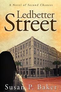
JF: The same typeface is used to create continuity with the author’s other book (above) but there doesn’t seem to be a reason for the switch in type styles for the author name and tagline at the top.
Alexander von Ness submitted Windborne designed by Alexander von Ness.

Alexandra Brandt submitted Banoffee Pie and Black Pudding designed by Alexandra Brandt. “This is a light contemporary fantasy with Irish food and folklore in it; I don’t usually mix display fonts but I wanted to contrast the contemporary with the ancient/fantastical. Would love any thoughts on it!”

JF: I think it works, and your handling of the background and the deft blending of colors really helps. Your title could use a bit more contrast, but overall very pleasing.
Alexandra Brandt submitted Children Without Faces designed by Alexandra Brandt. “Dark fantasy suspense. I designed this cover for my husband, and found I really enjoyed cover design. I need to know if I “get it” yet — right now I am just focusing on nailing the genre.”

JF: Visually interesting but murky; the small type will disappear when the cover is reduced, and the title is fighting with the background.
Anna Naax submitted It Feels Like Falling designed by Anna Naax.

JF: A clever and effective design that would benefit from a less stolid typeface.
Brian Ference submitted The Wolf of Dorian Gray – A Werewolf Spawned by the Evil of Man designed by Brian S. Ference. “Designed in Adobe Photoshop for Print and eBook use by myself. Thank you.”

JF: Might be a bit too washed out, it makes little impact.
Brian Shea submitted The Sky People designed by Adrijus Guscia. “The Sky People is a darker, more literary science fiction novel and that is well captured by the cover design. In fact, the design inspired the story I wrote, rather than the story inspiring the design.”

JF: The arresting image carries virtually all the weight.
Caleb Prochnow submitted Blood Fuel designed by Caleb Prochnow. “I wanted to design a book cover that alluded to the mood and atmosphere in Blood Fuel while still leaving room for the reader to draw their own conclusions from the artwork.”

JF: I really like the boldness of the design and the vibrant colors, it really stands out.
CB Archer submitted Assailant’s Greed: The Triad’s Tale designed by CB Archer. “I know that the text in my Tales Series could be improved, but I really wanted them to fit the old Atari cover feel, and those were not the most legible in the first place. I’m kind of stuck with them now. No matter, I still am going to share them because I like this website! :)”

JF: Thanks for sharing, CB, and keep on truckin.
CB Archer submitted Navals of War: ~xX.Deadeye.Xx~’s Tale designed by CB Archer. “This cover is based off of box art that famously based its own art after a scene in a movie. An inspired cover based off an inspired cover. This cover is Coverception!”

JF: Maybe the top third of this is “Coverconfusion.”
Chad Steward submitted Penelope Gilbert and the Children of Azure designed by Chad Steward. “This cover art was designed after the animal companion named “Chip”. This digitally drawn and painted owl was made to merge machine and animal, representing the types of creatures found in the land of Azure.”

JF: An interesting idea, but the muted colors drain it of impact, and the typography is very weak.
Columbia Hillen submitted Pretty Ugly designed by Columbia Hillen. “I wanted the cover to express the mood created by pure beauty. But with something else that creeps subconsciously in the mind of the viewer. Something eating away at this beauty. As the subject of the novel is grounded in cutting-edge medical science, the particles flying around bring reflect that.”
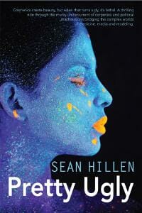
JF: The small type is useless on an ebook cover. The strong image saves this cover, which is otherwise pretty vanilla.
Cora Graphics submitted The Dragon Slayer: Dragon Empire designed by Cora Graphics.
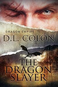
JF: Not sure this works well despite the strong images. The gap where the bird is flying is close to where the man’s mouth would be, and the whole thing is disconcerting. The type is too slight to stand up to everything else going on and is starting to disappear.
Cora Graphics submitted Bleeding Hearts designed by Cora Graphics.

JF: A beautiful and evocative cover with a quirky font choice for the title.
Cora Graphics submitted Flight of the Dragon King designed by Cora Graphics.
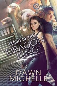
JF: All the mysterious and indecipherable shapes in the background distract from an otherwise promising cover.
Cora Graphics submitted Evanescent Appearances designed by Cora Graphics.
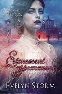
JF: Has a rough look, and I just don’t think that title is working at all. It’s both overworked and hard to read.
Cora Graphics submitted Hellfire designed by Cora Graphics.

JF: An interesting cover that, in my opinion, could be instantly improved by moving the author’s name to the bottom. Why obscure the art with it?
Cora Graphics submitted Fearless designed by Cora Graphics.

JF: Beautiful, and the purplish palette is perfect for this genre novel. The title treatment complements the art perfectly.
Cora Graphics submitted The Rebel Warrior designed by Cora Graphics.

Cornelia Fick submitted Eye of a Needle designed by Caligraphics. “A fitting cover for a literary novel. It fits the theme.”
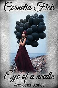
JF: The composition is very static, and I have no idea what that border is about.
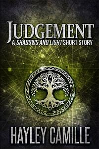
Dan Van Oss submitted Judgement: A Shadows and Light Short Story designed by Dan Van Oss. “Hayley chose a premade cover that well matched her story of magic and murder set near a forest.”
Danielle Williams submitted The Purrfect Christmas designed by Danielle Williams. “Although I’m currently searching for professional cover designer for my novel, after some study I decided I could illustrate and design my own cover for this feel-good holiday short story. The characters were colored in Krita, a free digital art program I don’t think many authors know about.”

JF: But it does look like a “hobby” publication, not that there’s anything wrong with that.
Darja DDD submitted Defending Jagger designed by Marushka from Deranged Doctor Design. “Romantic Suspense, Contemporary book cover design, Search & Seek Book 1”

JF: These series covers (see below) have very active backgrounds, so the decision to use color to focus on the titles works well.
Darja DDD submitted Stealing Dallas designed by Marushka from Deranged Doctor Design. “Romantic Suspense, Contemporary book cover design, Search & Seek Book 2”

Darja DDD submitted Amber Sky designed by Milo from Deranged Doctor Design. “Steampunk, Science Fiction&Fantasy book cover design, A Dark Sky Prequel Novella”

JF: A solid steampunk cover with appropriate typography and colors, it clearly signals its genre and that’s a good thing.
Darja DDD submitted The Wave Speaker designed by Milo from Deranged Doctor Design. “Epic Fantasy, Asian book cover design, Prelude to the Powers of Amur”

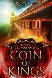
JF: These series covers (see below) use strong environmental cues to draw us into the story, along with the large title treatment that becomes a powerful branding element.
Darja DDD submitted Coin of Kings designed by Milo from Deranged Doctor Design. “Epic Fantasy, Asian book cover design, The Powers of Amur Book 2”
Darja DDD submitted Autumn Winters designed by Milo from Deranged Doctor Design. “Paranormal, Fiction, Fantasy book cover design, Realm Watchers Book 1”
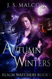
JF: Another strong series design (see below) that relies largely on the attractive heroine, the scenery behind her, and the color shifts that seem to have some implication. She looks a bit diffident for an action hero, though.
Darja DDD submitted In the Blood designed by Milo from Deranged Doctor Design. “Paranormal, Fiction, Fantasy book cover design, Realm Watchers Book 2”

Darja DDD submitted Fever designed by Kitten from Deranged Doctor Design. “Fantasy, Romance book cover design, Blood Moon Rising Werewolf Romance, Book 1”
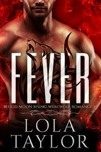
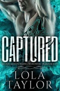
JF: Yet another strong series design (see the two following) that relies on emphatic typography and objectified beefcake for its major appeal. The titles have been integrated into the scene, and I think this one, due to the hot color, is probably the strongest.
Darja DDD submitted Captured designed by Kitten from Deranged Doctor Design. “Fantasy, Romance book cover design, Blood Moon Rising Werewolf Romance, Book 4”
Darja DDD submitted Sacrifice designed by Kitten from Deranged Doctor Design. “Fantasy, Romance book cover design, Blood Moon Rising Werewolf Romance, Book 5”

Darja DDD submitted American Exit Strategy designed by Milo from Deranged Doctor Design. “Science Fiction & Fantasy, Futuristic book cover design, The Economic Collapse Chronicles Book 1”

Darja DDD submitted American Meltdown designed by Milo from Deranged Doctor Design. “Science Fiction & Fantasy, Futuristic book cover design, The Economic Collapse Chronicles Book 2”

JF: Yet more series goodness (see American Exit Strategy, above) with strong typography that helps set the tone, and illustrations that mirror each other. In both cases the flag, clouds, and figures walking into a receding perspective all help to really pull us into the story within.
Darja DDD submitted A Mongrel’s Curse designed by Milo from Deranged Doctor Design. “Fantasy, Dark Humor, Magical Realism book cover design, Breed Matters Book 1”

David Lewis submitted Amber Stars designed by David Ralph Lewis.

JF: Awkward typography and ineffective graphics.
David M. Kelly submitted Three Lives Of Mary designed by David M. Kelly. “Earlier this year I decided to use only open-source software for my graphics projects. I created this cover with Blender and Gimp–a big learning curve (especially Blender). I wanted the design to be clearly SF, but also to reflect the humanity that still exists within the character of Mary.”

JF: A good idea that might have been stronger without whatever that brown stuff is at the top.
Debbie Richardson submitted Welcome to the Apocalypse designed by D L Richardson. “I had to find images that would speak because there are so many words on this book cover, it’s a long title and it’s also Book 1. I could find end of the world images, or cyber images, but not something that incorporated both. This took a month of tweaking to get it exactly how I wanted.”

JF: A good layout and the artwork works well, so kudos on that, but the typography is weak, and compressing fonts—as on the title—is not the solution.
Deborah Coonts submitted Lucky Bastard designed by Andy Brown.

JF: The color combination is pretty garish, and not in an appealing way, and the objects on the cover seem to have been placed rather haphazardly.
Debu Majumdar submitted Sacred River: A Himalayan Journey designed by Sandy Rafferty Vivian. “This novel is about a journey by the protagonist along the Ganges River. The cover picture depicts the turbulence of water, physically and metaphorically, as the protagonist travels up-river in search of peace and tranquility.”

JF: This cover is very weak (looks more like an author-designed cover) and has no “hook” whatsoever. Why should we be interested? And why run small white type right over the lightest part of the image?
Derek Murphy submitted The Scarlet Thread designed by Derek Murphy. “This is a remake for one of my dark fantasy books. It was already selling well but the new cover is already boosting sales.”

JF: A beautiful cover that fully leverages the “back to you” meme to great effect. Combined with the graceful and expert typography, this is clearly a winner. ★
Donna Harriman Murillo submitted The Insect Hotel designed by Donna Harriman Murillo.

JF: A delightful cover with great illustration and type that matches. But I’m mystified why the young boy seems to be so obviously hiding that we’re unable to make any contact with him.
Elizabeth Langston submitted Wish You Were Here designed by Lisa Amowitz. “This cover is for the 3rd in a series. The designer had used the same elements of an eye peering through smoke and the whimsical font on the previous books in the series. New for this one, though, was my request for the cover to be more vibrantly colored, to give an outdoor, summery feel.”

JF: Very artful, although I wish the title was stronger, to stand off the background better, and also so you can read it when the cover is reduced in size.
Eric Slade submitted Havenwood designed by Andrei Bat. “I was looking for an historical fantasy cover that communicates more subtle elements of a “steam punk” or “gas lamp” vibe (air ships are featured, but I do not want to over-promise that sub-genre) while also invoking a setting in the post-Civil War/early 20th century American South.”
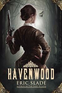
JF: More “back turned to us” design, deployed effectively on this atmospheric cover. The font choice and ornamentation on the title are the “steampunk” signal.
G.L. Tomas submitted The Mark of Noba designed by Najla Qamber.
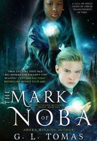
JF: There are things to like here, but so many elements on one small cover render it all a bit confusing. There are 4 separate type elements, 2 figures, 2 focal points of light, it’s all just too much to communicate a strong, clear appeal.
James Egan submitted Honey designed by James T. Egan of Bookfly Design.

JF: Here the designer is fully in control, directing us to the girl’s fist while providing lots of energy and attitude, a very strong sci-fi fantasy cover. Almost frighteningly good. ★
James Egan submitted Undertow designed by James T. Egan of Bookfly Design.
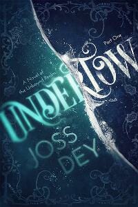
JF: Great stylized typography and textural ornamentation, delightfully combined with a visual representation of a wave’s undertow. ★
James Egan submitted The Troll Hunter designed by James T. Egan of Bookfly Design.
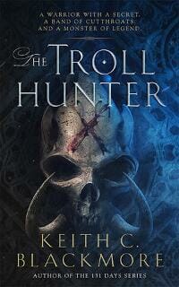
JF: Expert, careful typography along with visuals that telegraph menace and mystery.
Janelle Diller submitted Never Enough Flamingos designed by Adam Turner. “Adam Turner is versatile and gifted. He took the concept from watercolorist Susan Bartel, built on the art deco theme, and created this unique cover for a historical fiction novel.”

Jeanette O’Hagan submitted Glimpses of Light: stories and poems of imagination and hope designed by Jeanette O’Hagan. “The stories (a range of genres) and poems in Glimpses of Light reference finding light in dark places. The photo (taken by Helene Young) of the sun on the horizon has movement and direction.”

JF: The photo is uninteresting and there’s little else to rescue this weak cover.
Jeanette O’Hagan submitted Heart of the Mountain: a short novella designed by Jeanette O’Hagan. “Heart of the Mountain is YA fantasy. I sought to combine elements of the story (glowworms, crystals vs feathers) to create a sense of intrigue.”

JF: A much better solution with a simple, clean design that makes its point well.
Jeanette O’Hagan submitted The Herbalist’s Daughter: a short story designed by Jeanette O’Hagan. “A YA fantasy sweet romance. The pink & green ribbons feature in the story. The tree pays tribute to the anthology the story was first published in – Tied in Pink: romance anthology (for Breast Cancer Research). The lack of capitals in the title allude to the protagonist’s position and modesty.”

JF: Again, although I like the simplicity I miss the main character. If the plan is to appeal to previous readers, the “cues” will work well. They won’t attract new readers who don’t know what they mean on this cover with no drama to capture our attention.
Joel Horn submitted Lost Coast Rocket designed by Joel Horn. “I combined a photo I took while camping on the Lost Coast with a few other elements to create this cover for Lost Coast Rocket.”

JF: Obviously self-published, and I don’t mean that in a good way.
John Richards submitted Return to Autumn designed by CL Smith. “This book cover ties directly into the the main characters last name Autumn.”

JF: Great creative vision, a compelling image. ★
Joshua Medling submitted YOKE designed by Joshua Medling. “Completely custom and graphically aligned to the story.”

JF: There are 4 or 5 distinctly different horizontal “bands” of image/meaning, and I don’t think they ever come together.
Josi Russell submitted Shadows of Empyriad designed by Richard Lance Russell. “It’s always tricky to come up with an image that instantly conveys to the viewer what the book is about. My book cover artist did a great job of combining iconic Yellowstone images of the grand prismatic springs and the wild buffalo with the futuristic spaceship delivering alien refugees.”
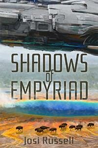
JF: I think adding the water distracted from the main and somewhat visually complex image of the hovering spacecraft. Otherwise well done.
Karen Simpson Nikakis submitted Angel Cast #1 Angel Blood designed by AS Nikakis. “Angel Blood is the first in a series about a young Australian daimon (half angel) whose quest is to find her mother. As a daimon, she resembles female aspected angels who have red hair and violet eyes. I wanted an other worldly cover, but one which was a variant on a human face.”

JF: I think a daimon isn’t a specific type of creature, but an “occult power that drives humans forward or acts against them.” The cover relies completely on the strong image of the girl’s face, but it’s pretty generic, and the title treatment reminds me of spaghetti.
Karen Simpson Nikakis submitted Heart Hunter designed by AS Nikakis. “The hero is a young female hunter at one with the landscape. She is coloured fairly monochromatically to show this and merges with the landscape. The typography is designed to show a romance element.”

JF: The images are combined effectively, but the overall effect is very muted, so maybe the title should have some color to it?
Karen Simpson Nikakis submitted The Emerald Serpent designed by AS Nikakis. “The Eadar are emerald-eyed so I wanted them linked to the goddess Serpent. The setting is northern Scotland, so the colour and landscape are designed to indicate this. The typography is intended to indicate the Celtic flavour while remaining legible.”

JF: The best and most integrated of these three, and using the green of the forest in the woman’s eyes is a nice touch.
Kent Babin submitted Revenge is a Dish Best Served on the Mongolian Steppe designed by Sagar Ghoting.

JF: An interesting design that combines some odd elements. I like the typography, but the color changes in the background are just distracting.
Kev Heritage submitted Vatic designed by Kev Heritage. “Vatic is one of the ‘skilled’ – an empath, known for their intense staring eyes. In a flashback scene, Vatic sees his own, accusing eyes staring back up at him from the shards of a smashed mirror.”

Kimberly Jayne submitted Take My Husband, Please designed by Dane at Ebook Launch. “I needed an update to my book’s visual appeal, and it’s hard to find good rom-com covers that don’t look like chick-lit (which this story is not). I found a great designer in Dane at EbookLaunch, who made this genre-busting rom-com come alive visually, almost like a movie poster.”

JF: It does have a cinematic look to it, and clearly promises an entertaining read. Nice.
Lexi Revellian submitted Dreams of the Machines (Time Rats Book 2) designed by Lexi Revellian.

JF: Very cool, and I like the way the trees focus us on your heroine.
Lucy Mihajlich submitted Interface designed by Jon Holcroft (artist) and Lucy Mihajlich (designer).

JF: Graphically clever and perfectly apropos of the theme of the book, but I wish the title stood out a bit more.
Margaret Cooper Evans submitted Evil in Overdown designed by Andrew Evans. “Completely computer generated face after failing to find an innocent looking 25year old who had a sinister twist. This sums up the character completely, I asked for the red to be added to make the face “pop” and stand out on the Kindle site. Between us I got the exact look I wanted.”

Marianne Sciucco submitted Swim Season designed by Heather McCorkle. “The heroine is a complex character dealing with multiple issues. A champion swimmer, she has decided to stop winning. Swimming is now her therapy. But it’s not as simple as she thought. The expression on the young woman’s face, her hidden eyes, hint at her inner conflict. What’s going on with her?”

JF: Pretty basic.
Matt Posner submitted Squared Circle Blues designed by Geetali Baruah. “For Squared Circle Blues, a novel about professional wrestling in the 1980s, I needed a visual artist to create an original image. Geetali Baruah, who has designed covers and interiors for four other books of mine, found an artist who could create the central image of the grappling men.”

JF: Even at this size it’s hard to interact with the 2 men grappling, so to me the whole design is a bit distant and the title treatment, with the “splash” behind it is hard to integrate with the rest of the cover.
Matt Sinclair submitted Billy Bobble and the Witch Hunt designed by Charlee Hoffman. “For the second Billy Bobble novel, we used the same illustrator we’d hired for the first, Kirbi Fagan, but we wanted a different type treatment. Charlee and I discussed a variety of possibilities and decided to go with something along the lines of a chalkboard font without looking too “chalky.””

JF: A chalked-look font would work, but it would have to be a lot stronger than this one to hold its own considering all the other parts of the cover looking for attention. The coloring may be part of the problem, because it keeps pulling us into the helix drawing, a less important part of the design.
Matthew Gillies submitted H+ designed by Matthew Gillies. “Because the title of the novel consists of 1 letter and 1 symbol, the primary focus was ensuring the title didn’t get lost in the overall design of the cover. What I aimed to achieve was creating a kind of complimentary layer where both the title and the character become the focal point.”

JF: An interesting solution with a tenuous balance and a lot of nice texture.
Maxine Sylvester submitted Ronaldo: The Reindeer Flying Academy designed by Maxine Sylvester. “I illustrated the book and decided to design the book cover in the same style. I wanted something that included some of the characters, was fun, colourful and would appeal to both children (7-10) and parents alike.”

JF: Success! Delightful and promises an exciting and fun story inside. ★
Megan Easley-Walsh submitted Flight Before Dawn designed by Megan Easley-Walsh.

JF: Combining the image of the woman and the map would probably make for an interesting book cover, but it would have to be done with a lot more nuance, and be accompanied by a professional type treatment.
Michael Wisehart submitted The White Tower (The Aldoran Chronicles: Book 1) designed by Michael Wisehart. “Tower illustration by Jack Adams”

JF: Pretty effective, despite the tower art looking like it was appliquéd onto the background.
Mike Ryan submitted Daddy’s Heart, My Heart, The Purple Heart designed by Michael Ryan. “The background is an actual “memory box” from a United States Veteran.”

JF: Needs to be rescued by a pro who could clean up the photo and make a cover out of it.
Nancy O’Neill submitted Her Way Out designed by Nancy O’Neill. “I wanted something bold but still had a simple design. Using the microchip graphic as an overlay represents the technology element in the story. I chose a light green for the overlay because it complements her peach skin tone and green is often associated with technology.”

JF: You’re getting there. Tip: using dark-colored type with a shadow just makes the letters look blurry from a distance.
Natasha Snow submitted Hallelujah is Dying designed by Natasha Snow. “As always, thanks! :)”

JF: Many covers that rely on landscapes are boring, to be frank. Here, the strong type and shocking color contrast bring a lot of drama to the design.
Nichole Thalmayer submitted The Time Eater designed by N.J. Thalmayer. “It’s a teen fantasy with swords and magic that reads something like an urban fantasy. I was trying to capture that feeling in the cover.”

JF: It didn’t work—we can barely make out the imagery and the type treatments are very amateurish.
Rachael Tamayo submitted Chase Me (Friend-Zone Book 1) designed by Solstice Publishing.

JF: Very weak, bordering on non-commercial. The woman’s face is attractive, but sadly that’s not enough to make up for the “noise” in the background and the barely competent typography.
Richard Chalkley submitted The Hurdy Gurdy Man designed by SpiffingCovers.

JF: Great visual interest along with carefully placed type make this cover stand out.
Ronder Scott submitted Blake’s Rope designed by Ronder Scott. “The main character in the book Robin stands on top of a grave in her backyard. The green sweater peering out from the soil is the elephant in the room that no one wants to talk about. The tree has a rope hanging from it symbolizing a lynching that takes place physically and mentally.”

Sanja Gombar submitted A breeze of fate/Ein Hauch von Schicksal designed by Sanja Gombar. “The idea was to represent a young woman who travels through time to find herself where she is forced to marry a man she doesn’t know. The setting is Barbados, Pirates are involved.”

JF: Beautifully designed and well executed. My only hesitation is the strange feeling I get when I see the mast of the boat “penetrating” the figure of the woman.
Scott Burn submitted The Enemy Within designed by Maxim Mitenkov. “A sci-fi thriller about a 17-year old who suffers agonizing apocalyptic visions.”
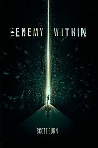
JF: Starkly dramatic, although I think there was a better solution for the author’s name, which might be better moved away from the figure that is the focus of the cover.
Skye Genaro submitted Echo Into Light designed by Ravven. “I rebranded this series right before this third book came out, and I’m thrilled with the results. The previous covers were eye-catching, but weren’t effectively reaching the YA paranormal audience. They were harder looking and had more of a sci-fi edge. The new covers have boosted sales.”

JF: That’s great news, and I can see why. This is a colorful, energetic design that’s very appealing.
Stephanie A. Cain submitted Shades of Circle City designed by Stephanie A. Cain. “After studying trends in urban fantasy, I had a basic concept, which I created using stock photography. One challenge I had was finding a way to convey that this was urban fantasy, rather than straight mystery, which is why I used the light effects.”

JF: Unfortunately many of the elements added to the cover seem gratuitous and confuse and already complicated design.
Stewart Hoffman submitted The Bug Boys designed by Stewart Hoffman. “The Bug Boys is a humorous superhero science fiction story geared towards readers 10-years-old and above. The cover represents elements in the story. Alien robots, bugs and the portals that connects two young South Yorkshire lads to an ancient alien research project.”

JF: Although you might expect an action scene here, I quite like this quirky cover with its colorful bugs and strong title.
surakshith markanti submitted you are never a stranger designed by surakshith markanti.

JF: A strong composition that once again fully leverages the “back turned to you” idea.
Susan Illene submitted Forged by Flames designed by Jeff Brown. “The model shots for this cover were taken by Josh McCullock.”

JF: Very atmospheric, it looks exciting, with the woman poised for action.
Suzan Lauder submitted Letter from Ramsgate designed by Zorylee Diaz-Lupitou. “Multiple story themes are in the cover: parasols, friendship of the two women with one being the mentor, period clothes show the social class of each woman, letter, veil of mystery, beach, wax seal, mystery man watching the ladies, another worried mystery man rushing out of the pastoral scene.”

JF: Obviously, that’s way too much for any browser to process in a few seconds, but the cover is attractive and I liked the relaxed illustration style and “pulled cloth” effect that reveals the letter.
Tammy Seidick submitted What Claims By Fire designed by Tammy Seidick. “Thanks for your comments!”

JF: Masterful typography and the baleful look of that big cat really make this cover stand out from the crowd. ★
Thomas Burchfield submitted Dracula: Endless Night designed by Cathi Stevenson. “Cathi Stevenson did this excellent variation on “Dragon’s Ark,” a Dracula novel I published in 2011, for this “prequel.” It captures his demonic, menacing power: He truly is a “Superman of Evil.””

JF: Menacing and atmospheric, and that eye is perfectly placed.
Tiffany M. Catron submitted Shadowmark designed by T.M. Catron.

JF: Good idea, but I’d like to see those symbols look like they really belong in this scene.
Tom Saine submitted Pepper Creek Murder designed by Tom Saine. “I have submitted covers in the past and was criticized for my choice of fonts—with this cover I tried a more conservative typeface.”

JF: Yes, sure, but then you unleashed a whole can of whoop-a** on the title. Trust me, all those embosses and effects don’t make the title better, they are just a distraction from staring at what’s the obvious appeal of this cover, whether it’s related to the story or not.
tony dargis submitted Come Fly With Me designed by Tony Dargis. “This is book 4 ( of 12) in the Super Speed Sam series. ”

JF: I hope kids like them, because to me they not only don’t match very well, they have a very “home-made” look to them.
tony dargis submitted Santa’s Rescue Dog designed by Tony Dargis. “It’s difficult to match the quality of designs that are presented on this page, but when you have 12 books to cover – in three languages – and limited time,finance and space… This is book 5 ( of 12) in the Super Speed Sam series. Happy Christmas to you all”

Zac Scott submitted Cutting in designed by Zac Scott. “Painting and decorating, hilarious and rude stories.”
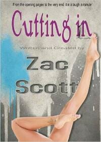
JF: Um, well, maybe that’s why it looks like it was assembled rather than being designed. Pretty incomprehensible, even for humor.
Nonfiction Covers
Carrie Ellen Mohn submitted Song for the Maker: an Alphabet designed by Carrie Ellen Mohn. “The background image was painted from a photograph from the Hubble Space Telescope of the nebula Orion. The A, B, and C are from the artwork of the interior pages. Thank you Joel for your time.”
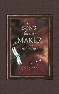
JF: Putting the whole thing inside a panel has rendered the cover rather too modest and unassuming. It’s meant to be a sales tool, but I do see that it was very carefully made.
Dayo Sowunmi II submitted Leadership is Mental: How To Excel As A Project Leader designed by Sara Garcia. “Penguin leader – padded room in mental asylum. Play on words on book title. Leaders who excel understand “the mental side” of human behavior, while maintaining a healthy sense of humor.”

JF: A good, strong design, despite the fact I can’t think of any connection between “leadership” and penguins. But what do I know?
Deborah Bradseth submitted Mommy Can We Have a Jellyfish? designed by Tugboat Design. “Humorous stories about a full time working mom.”

JF: Okay, it’s cute.
Dennis Hunter submitted You Are Buddha: A Guide to Becoming What You Are designed by Dennis Hunter. “I designed my own book cover to be literally “eye-catching.” I also wanted a fresh look that would stand out in a sea of spiritual books with overused images of lotus flowers, meditation mudras, etc. I created a design that relates to the book’s title and help readers self-identify with the subject.”

JF: I like the idea of this cover and it was well executed, but the similarity in tone between the “eye” photo and the top and bottom backgrounds seems wrong to me. Either they should coordinate better, or establish a contrast.
Gareth Little submitted They’re Coming for You: Threats and changes from innovative ideas designed by Gareth Little. “I wanted to very quickly create a simple, effective cover using only online tools. There are lots of very easy to use free design sites now that produce good results if handed with care.”

JF: Clever graphics that pack a punch. Sure to attract attention, and that’s at least half the battle. ★
K.M. Weiland submitted Creating Character Arcs designed by Damonza.

JF: Suits the subject well and illustrates the topic of the book.
Lorna Sixsmith submitted An Ideal Farm Husband designed by Derry Dillon. “The last in a trilogy, my book cover aims to emphasise the amount of work a farmer does and the support he gets. Note he’s standing between his wife and his parents! The dog is his best friend and the chicken emphasises the role of poultry in the farm wife’s income. Traditional and technology meet.”

JF: Looks home-spun, and maybe that’s what’s wanted in this category.
Michele Stevens submitted Chasing Stones designed by Michele Stevens. “The book is about a widow, alone and feeling rather small amidst all the chaos that ensued after her husband’s death. The colors, simplicity, and fonts on the book cover were chosen to reflect some of that feeling. Stones have a double meaning in the story as well.”

JF: A quiet and tasteful design that matches the seriousness of the subject matter.
Miles Anthony Smith submitted Why Leadership Sucks™ Volume 2: The Pain, Pitfalls and Challenges of Servant Leadership Fundamentals designed by BooksGoSocial.

JF: I guess my question with this cover is what response were you trying to evoke? Considering the colors, not sure that highlighting one word in the title is helping.
Mimi Emmanuel submitted the Holy Grail of Book launching designed by Mimi Emmanuel. “I like to share the process of how one indie author created the cover for her book with the help of her daughter. People often think that covers get created in a couple of hours and even though this may well be the case occasionally. More often ‘the birth of a cover’ is a ‘brewing process.'”

JF: The fonts and pictorial elements allude to the design of Westerns, but in spite of the careful way this cover was constructed, I don’t see the connection.
Nayden Kostov submitted 1123 Hard to Believe Facts designed by Yuiiya Krumova.

JF: Looks like a draft for a cover, rather than the finished article. And considering the subject matter, don’t you think it should be a little more exciting?
Soma Norodom submitted Royal Rebel designed by Soma Norodom. “Dressed in princess attire and inside the Royal Palace in Phnom Penh, Cambodia”

JF: This type of design is more common in other countries. Focusing on the woman, and not so much on the room she’s in, would make it more interesting, and a stronger title treatment would help, too.
Stan Holden submitted Giving Candy To Strangers designed by Stan Holden. “An easy, informational, humorous and fun read for anyone who deals with people!”

JF: A solid nonfiction cover.
Tony Gebely submitted Tea: A User’s Guide designed by Sandra Friesen. “There is hidden meaning, the blue represents water, the yellow represents the color of tea liquor, and the green represents a tea leaf.”

JF: A very “Zen” cover, admirable in its simplicity and balance. ★
Vanessa Morgan submitted When Animals Attack designed by Gilles Vranckx.

JF: Shows unmistakable signs of being assembled from various pieces, and that’s not good.
wesley phillip submitted Brasil Pelada II: A Visual Guide to the Rio Olympics & Paralympics 2016 designed by wesley phillip. “Northampton”

JF: A rather brutal illustration style, no discernible composition, and why does it say “ePub” on the cover?
Well, that’s it for this month. I hope you found it interesting, and that you’ll share with other people interested in self-publishing.
Use the share buttons below to Tweet it, Share it on Facebook, Plus-1 it on Google+, Link to it!
Our next awards post will be on January 23, 2017. Deadline for submissions will be December 31, 2016. Don’t miss it! Here are all the links you’ll need:
- The original announcement post
- E-book Cover Design Awards web page
- Click here to submit your e-book cover
- Follow @JFBookman on Twitter for news about the E-book Cover Design Awards
- Check out past e-Book Cover Design award winners on Pinterest
- Subscribe to The Book Designer Blog
- Badge design by Derek Murphy

