Welcome to the e-Book Cover Design Awards. This edition is for submissions during May, 2015.
This month we received:
108 covers in the Fiction category
22 covers in the Nonfiction category
Comments, Award Winners, and Gold Stars
I’ve added comments (JF: ) to many of the entries, but not all. Remember that the aim of these posts is educational, and by submitting you are inviting comments, commendations, and constructive criticism.
Thanks to everyone who participated. I hope you enjoy these as much as I did. Please leave a comment to let me know which are your favorites or, if you disagree, let me know why.
Although there is only winner in each category, other covers that were considered for the award or which stood out in some exemplary way, are indicated with a gold star: ★
Award winners and Gold-Starred covers also win the right to display our badges on their websites, so don’t forget to get your badge to get a little more attention for the work you’ve put into your book.
Also please note that we are now linking winning covers to their sales page on Amazon or Smashwords.
Now, without any further ado, here are the winners of this month’s e-Book Cover Design Awards.
e-Book Cover Design Award Winner for May 2015 in Fiction
Meredith Rich submitted City of Fae designed by Jenny Zemanek.


JF: Distinctive typography and an illustration that’s both magnetic and textural at the same time produces everything you want in a cover like this: a mysterious woman, an urban setting, and intimations of mysteries yet to unfold. Lovely.
e-Book Cover Design Award Winner for May 2015 in Nonfiction
David Haber submitted Letters to Eden designed by Liz Merchant. “Liz quickly saw that the cover for my memoir should be a hand-drawn illustration. We felt the freehand font and slanted typography would emphasize the struggling of cycling alone while hinting at the romance and humor of such an adventure as told through the letters written home.”
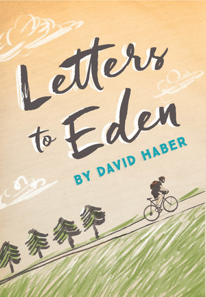
JF: Simple, legible, charming, and with a clear path into your story. The title font’s style matches perfectly with the illustration, and the whole cover focuses us on the uphill climb of the rider. Nicely done.
Fiction Covers
Alan Drabke submitted SOME DAY RISE Spies & Politics Thriller (2/3) designed by Alan Drabke. “I used the font- Mistral for the title. My thinking is Mistral looks a bit like spray painted graffiti so it conveys a sense of rebellion against the establishment. The font for the author’s name is- Bodoni. I thought this might catch the attention of Tom Clancy fans.”

JF: A complete miss. Regardless of the benefits of Mistral, the typography is chaotic and unreadable, overpowering the image.
Allen Tiffany submitted Youth In Asia designed by Allen Tiffany. “I was very deterministic in designing a cover that would appeal to my target audience: Vietnam Veterans. Thus an iconic “Huey” helicopter with soldiers disembarking in a jungle setting. I wanted a clear visual of what the story is about, and the abundant use of black symbolized a dark ending.”

JF: Your image is right on, but the rest of the cover is amateurish.
Amy DuBoff submitted Architects of Destiny (Cadicle: Volume 1) designed by Tom Edwards. “Cover design and illustration copyright © 2015 Tom Edwards”

JF: A workmanlike sci-fi cover
An Indian submitted India Was One designed by Darshini.

JF: I’m not familiar with graphic design conventions in India, but from here this looks like an interesting idea poorly executed, and the title has been completely marginalized.
Andrea Wells submitted The Violet Hour designed by Pixel Mischief Design. “Young Adult Paranormal Romance”

JF: Beautiful and mysteriously inviting, with deft typography.
Andrew Lowe submitted The Ghost designed by Naomi Green. “The image relates to one of the book’s main themes – the long shadow of the past, but also illustrates the underlying story. I worked closely with the designer – and after we couldn’t get approval for a stock shot, I just went out and took this myself. Cover pic and author photo in one!”

JF: A nice job, love the photo and background texture, but not so sure about the fancy type treatment for the word “the.” Why bring so much attention to the least important element on the cover?
Angelica R. Jackson submitted Crow’s Rest designed by Kelley York of X-Potion Designs. “I was able to work very closely with the designer, who took my concept/mockup and made it look professional and atmospheric. I’m very pleased with the results for this”

JF: And you should be pleased. The illustration looks almost like a tapestry, which makes the subtle emboss effect on the title even more apt. Lovely. ★
Anita Dugan-Moore submitted Gabriel’s Wing designed by Anita Dugan-Moore. “I enjoyed creating the cover for this particular book. It’s an amazing story that required a dark and sinister feel to represent it. I did my best to make a cover that was both visually attractive that would grab the attention of potential readers as well as fit with the dark story within.”

Anma Natsu submitted Aisuru designed by Anma Natsu.

JF: Pretty, but what’s so supposed to hook our interest?
Anthony Joseph Morrone submitted Kill The Balloons designed by Laura Potucek. “This cover was originally a photo of Brooklyn with Manhattan in the distance taken by the author. The designer augmented some of the colors in the photo as well as altered the height of the sky. The designer and author collaborated on the creation of a new and proprietary font, used for the title.”
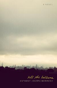
JF: I can see a lot of talent went into this, but to be honest it’s quite underwhelming, it has very little impact.
Anthony Maldonado submitted The Death Detail designed by Mariann Yattaw. “The cover shows the altered biohazard symbol that is stamped on the entrance to Securus originally intended to warn people of the threat of a deadly biological weapon known as The Agent. The glow symbolizes light of humanity overcoming The Agent and the conflict burning within the facility itself.”

JF: The abbreviated color palette robs this cover of contrast and therefore, of impact.
Barry Colonna submitted The Eye of Trileon designed by Barry Colonna. “The image on the book cover is an ancient device, called The Eye of Trileon, which allows users to travel back in time to Atlantis. When it is activated, the gem in the center glows brightly until nothing else can be seen.”

JF: The image has promise, but the entire cover looks more assembled than designed.
Ben Faroe submitted Hubris Towers Season 1, Episode 1: An Uneasy Interview designed by Ben Y. Faroe. “I wanted a timeless, fairly iconic, stylized look with an unreal/comic element that hints at the subject matter and sense of humor. The bright thick border is designed to be eye-catching in thumbnail formats. The progress bar gives a quick indication of how far through the season each episode is.”

JF: I like the idea of that progress bar, that’s clever. However the elements of this cover never come together into one unified hold, they just float around in space uncontrolled.
Bob Moats submitted Gus Mackie and the Rock Star designed by Bob Moats. “I design all my own covers since I have a background in graphic design. This book is the last of a series about a private eye protecting a rock singer from a killer.”

JF: Interesting approach. I like the strength of this, but there’s also some “cheese.” Your name looked better in white, as on other covers in this series.
Bob Moats submitted Wiseguy Murders designed by Bob Moats. “I design all my own book covers having a background in graphics for the printing trades and personal businesses. I have no website for my designs, just my main website for my books. Wiseguy Murders is about a mob hit that brings in the main character of the book to solve the murder and find out why.”

JF: Another interesting concept, why did you need that truncated fellow in the background? Distracting, with tortured type.
Bree Hood submitted Thunderbird & the Search for Sovereignty designed by Bree A. Hood. “The base photography for my cover was done by myself, using a Cannon. The design, layout, and special effect editing was done by myself in Photoshop or Indesign. The cover is designed to capture the universal idea of walking a path of self discovery…in search of liberty and freedom.”

JF: The very charming illustrations can’t save this cover from the confusion and illegibility of the title panel.
Carolyn Haley submitted Into the Sunrise designed by Debbie Taylor. “We wanted something simple and vivid that clearly stated “horsey romance.

JF: Yep. Got it.
Cary Knor submitted Mariasha and the Great Book designed by Luvbeautiful. “The main character, Mariasha, must leave her kingdom and find the path of flowers to continue on her quest.”

JF: I had to lean over and get closer to the screen to “read” this cover, and that’s not a good sign for an ebook and its sales environment, no matter how charming the book.
Christopher Geoffrey McPherson submitted Murder at Eastern Columbia designed by Matt Hinrichs. “We recently did a re-design of the cover for the first book in my mystery series so that it better aligned with the later covers. This design is lighter, brighter and more dramatic than the original incarnation.”

JF: Very cool, and you can see that the designer knows how to create tension and interest with a few elements.
Dane Low submitted One Foggy Night designed by www.ebooklaunch.com. “A boy is running away and the man is trying to catching him (A metaphor for the man grasping for his youth). Since the image is dark and mysterious, the font selection was important to keep it light and communicate fantasy.”
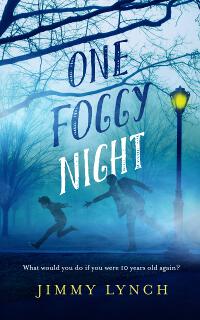
JF: There’s so much atmosphere and story in this cover that it’s irresistible, and the hand-lettered look of the title works perfectly.
Dane Low submitted Selling Laura Poole designed by www.ebooklaunch.com. “This cover is all about creating a suspenseful atmosphere with lighting, filters and type treatment.”
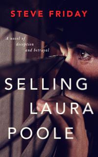
JF: I think it works.
Dane Low submitted The Coffee Girl designed by www.ebooklaunch.com.

JF: Lighthearted and perfectly apropos with good typography.
Danielle Summers submitted The Prince’s Assassin designed by Eden Connors. “This is a gay erotic romance fantasy action/adventure novella, and I wanted a cover that was very sexy.”

JF: Here you’ve got a combination of the “paste it on” look with complete illogic. One I can understand, what’s the second one supposed to be? Why stop at two?
Darren Gallagher submitted Strings designed by Darren Gallagher.

JF: Not pleasant, although the color combination works.
Dean Hamilton submitted The Jesuit Letter designed by Marie Vecera. “The book is historical fiction set in the Elizabethan era. The use of written parchment in the background, along with the wax token (an “angus dei” token symbolizing papal allegiance) are both integral elements of the plot.
The title font used is a tweaked variant of Celtic Garamond the 2nd.”

JF: Can’t argue with that.
Diane Rose Duffy submitted TAKE A PIECE OF MY HEART designed by Sprinkles on Top Studios.

JF: Very low-impact.
Diego Matarrita submitted Salvar una mosca designed by Luis Diego Matarrita. “Hi, I hope is not an issue if my submission is on a book written in Spanish. The title translates to “To save a Fly”, and is a collection of short stories linked together by human tragedy turned into an expected spectacle of crushing solitude.”

JF: Completely illegible, one of the cardinal sins (to me).
Donovan Pruitt submitted City of Roses designed by Damonza. “For this Fantasy/Paranormal Romance that touches on elements of Ukrainian folklore and the Chernobyl disaster, Damonza focused on capturing the setting (Pripyat, Ukraine, outside Chernobyl) and two primary plot elements: the roses and the dreamlike spirits mixed with white and gold.”

JF: And he delivers a strong cover with enough oddities to be fascinating.
Doug Howery submitted The Grass Sweeper God designed by Mario Nevado. “The book cover depicts a scence from the book (end of chapter two). Thank you, Doug Howery”

JF: The illustration looks interesting but the type is simply getting lost.
Eden Connors submitted Hurt designed by Eden Connors. “This is a cover for a lesbian romance. The author wanted to depict the anguish of a broken relationship.”

JF: A simple but effective ebook cover.
Eden Connors submitted the captive designed by Eden Connors.

JF: Makes a case for itself with genre readers, the title should be more prominent for better balance.
Eden Connors submitted XTC: A Lola Avocado novel designed by Eden Connors.

JF: Cute.
Elizabeth Andre submitted The Time Slip Girl designed by Eden Connors. “The Time Slip Girl is an interracial lesbian time travel erotic romance. I wanted something that was sultry and suggested romance across time and place.”

JF: Yeah, I get that, but no, this isn’t how you do it. It’s more like a collage than a book cover, but the incongruities are too dense, maybe hire a designer.
Emma Davies submitted Letting In Light designed by Jessica Bell. “Letting in Light is predominantly a romantic novel but with themes of friendship, and community spirit too. Set on a country estate I wanted the cover to have a strong sense of place but also to be warm and inviting, just like the book. Jessica captured this perfectly!”

JF: Delightful, with a unique style and deft color touches.
Fernando Ariel submitted Los cuatro libros de Alonso Ibarrola designed by Fernando Ariel. “We opted for an image of the author for the cover of this collection of short stories, but used large CMYK dots to obscure the image – a visual pun on Ibarrola’s long career in journalism. As a 4-colour process, CMYK was particularly appropriate as this compendium combines 4 volumes.”

JF: That’s pretty subtle, the connection between 4-color CMYK halftone dots and the union of four works, I wonder if anyone will get it? But there’s no denying the graphic appeal of the overlaid dot patterns that form those hypnotic rosettes. Nice.
Frances Judge submitted Randi’s Steps designed by Frances Judge. “I chose to design my own book cover because I graduated from FIT with a major in Illustration. My son, Stephen Judge, who is also a student there, helped with formatting the type.”

JF: I love the fashion look of your illustration, but the type seems weak to me. Book cover design is a specialty.
Frankie Mahrle submitted Yesterday, Once More designed by Frankie Mahrle. “This photo received very little photoshopping, merely putting my son’s girlfriend’s nails on my daughter’s hand. The blood drip is natural, and was done in one take. I let the blood drip further, but it began to look like she’d slit her own wrist. Nope. That’s the vic’ blood. ;-)”

JF: And when you say “natural” you mean. . . The typography on this cover is fighting itself and the font choice is odd for this genre.
Gabrielle Faust submitted Eternal Vigilance: Bound in Blood designed by Gabrielle Faust.

JF: Interesting and I like the layered visual style.
Gabrielle Faust submitted Eternal Vigilance: The Death of Illusions designed by Gabrielle Faust.

JF: Although this cover works, I prefer branding in a series that’s more visually consistent. Pick a visual approach and stick to it.
Guido Henkel submitted Rebecca Sullivan and the Book of Secrets designed by Thu-Lieu Pham. “This is a coming-of-age story for young adults, taking place in a modern world full of dark witch, evil sorcerers, good wizards, and beings from other dimensions. The cover is trying to represent the arcane, magical aspects of the story to captivate potential readers’ imagination with its vibrancy.”

JF: I like the mystery promised by the book, and the classical approach to the type.
Hanna Sandvig submitted Licensed to Shop designed by Hanna Sandvig at Book Cover Bakery.

JF: The colors are odd, and it looks more artificial than free and easy.
Harry Campion submitted A Matter of Property designed by pro e_book covers. “My first story with this designer. Won’t be my last.”

Heather Gilbert submitted Trial by Twelve designed by Jenny Zemanek at Seedlings Design Studio. “Jenny helped me revamp the first cover for my Christian mystery series set in the mountains (Miranda Warning) and this second novel followed our new template, which focuses on natural elements with a slightly creepy vibe.”
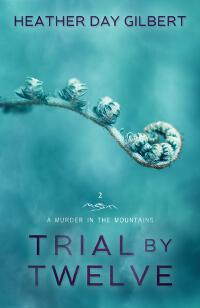
JF: And slightly malevolent. Delicious.
Helen Ryan submitted McSorely’s Evil Tea designed by Roderick Ryan. “Cover created with a tea bag, a tea cup, plasticine, bit of copper wire, an old camera and GIMP.”

JF: Is the villain a tea bag? Really? An interesting, almost “primitive” style.
Herb Borkland submitted DOG$ designed by Libby Lael. “Designer Libby Lael’s website is in progress. Aside from a cover for a novel of her own (“Deaf Beneath”), her work for DOG$ is only her second novel cover.”

JF: Confused and confusing.
J. Zachary Pike submitted Orconomics: A Satire designed by James T. Egan. “The author created the engraved orc and bill artwork, but had difficulty turning illustration into a strong cover design. Bookfly Design set the drawing on a cover that blends the fantastic and the financial, and added flames to speak to the story’s conflict.”

JF: Made me smile. Very cool with amazing background detail.
James Egan submitted No Way Back designed by James T. Egan of Bookfly Design.
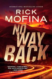
JF: Exciting, with amazing depth and drama with the type an integral part of the message. ★
James Egan submitted Off Balance designed by James T. Egan of Bookfly Design.
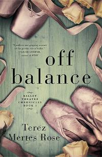
JF: Careful color control and beautiful textures highlight this effective composition.
James Egan submitted The Mage and the Magpie designed by James T. Egan of Bookfly Design.
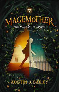
JF: I don’t know the significance of these talismanic story elements, but they are intriguing.
Jefferson Smith submitted Brotherhood of Delinquents designed by Jefferson Smith. “The challenge was to convey three layabout boys who are saddled with the responsibility of watching over their kingdom, saving it from monsters, but required to stay in the shadows the entire time. I think this solution captures all that, and hints at the secret tunnels they discover along the way.”

JF: Well focused, and the unusual font works well here.
Jenny Bravo submitted These Are the Moments designed by Natalie Olsen.
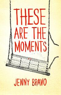
JF: And this is the cover. Beautiful in its simplicity and devastating at the same time, the broken chain will lead to…? ★
Jenny Perinovic submitted A Magic Dark & Bright designed by Jenny Adams Perinovic.

JF: A lovely idea undone by the confusion from combining the active background and the lettering.
jet michelle submitted Desire An Erotic Fairytale designed by Jet Michelle. “I wanted something sexy and pretty and classic. I wanted it to be unique so I didn’t use any stock photos. Just because it’s an erotic tale doesn’t mean it has to look trashy. Thanks for reviewing.”

JF: I agree, but this is way too heavy-handed for the subject matter.
Jim Heskett submitted Reagan’s Ashes designed by Kit Foster.

JF: Poignant and dramatic, with strong focus.
Joel Sullivan submitted Revolver (a collection of short stories) designed by Matthew Shuttlesworth.
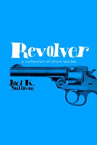
JF: Cool, and here the designer has contorted the title artistically to make an effect, made possible by the restraint of the rest of the cover.
John Boatwright submitted Alastair Berrymunch vs. The Blackthorn Beast designed by John Boatwright. “The main character is a bit of a reveal in the novel so I couldn’t illustrate him. I went with a pivotal scene to communicate that strange creatures are the backbone of the novel. I also needed to communicate the fact there is a female protagonist even though the titular character is male.”

JF: The style is engaging even though we may not be able to figure out what’s happening here. The “Blackthorn Beast” type could have stood out a bit more.
Kate Bloomfield submitted Frost Arch (Book 1: The Fire Mage Trilogy) designed by Kate Bloomfield.

JF: This cover works well, the framing elements focus us on the main figure, and the controlled palette adds to that focus. The font used for the title might not seem like it would work, but it seems very natural on this cover.
Kayti Nika Raet submitted Niko designed by Hana Kura. “Niko is a YA dystopia featuring a badass girl with a baseball bat, set in a world of acid rain and flesh eating monsters. This cover showcase the “badass girl” side of things, with a gritty background that hints at the genre.”

JF: The bat is getting a bit lost against the dark background, but there is no doubt this is one badass cover. And that look!
Kenneth Clark submitted Temptation University designed by Kenneth Clark.

JF: Photo + photo + type = ?
Kenneth Clark submitted The Heart of Graymoor designed by Kenneth Clark.

Kim DDD submitted Fractured Memories designed by Marushka from Deranged Doctor Design. “Cover design for Young Adult Post apocalyptic novel featuring strong, kickass heroine :)”

JF: Solid genre cover.
Kim DDD submitted Halt At X designed by Maruska from Deranged Doctor Design. “Cover design for Romantic Suspense novel ( targeting also horse lovers)”

JF: A challenge combining the “Mona Lisa” with some horses, but the colors you used help but don’t obscure the odd combination.
Kim DDD submitted The Borrowed World designed by Milo from Deranged Doctor Design. “Cover design for Post apocalyptic novel.”

JF: Heightened drama from the illustration, I think it works.
Kim DDD submitted Wish For Me designed by Maruska from Deranged Doctor Design. “Cover design for Steampunk Romance Wish For Me, book #1 in The Djinn Order Series”

JF: A different approach than I’ve seen on other steampunk novels, a very atmospheric look.
Kristin Van Risseghem submitted The Guardian, a Sword, & Stilettos designed by Marya Heiman.

JF: Difficult to read and the elements don’t seem to add up to a coherent message.
Laure Reminick submitted Jaguar Transit designed by Laure Reminick. “I love cover art by Dave Seeley, particularly the back cover on Captain Vorpatril’s Alliance. I used Corel Painter, per a comment by Seeley.”

JF: Just right illustration, and the woman’s gaze focuses us on the spacecraft, while the beefy type frames the cover nicely.
Lennox Brown submitted The Shabby Realm designed by Karol Kukaszczyk.

JF: Definitely comes across as an exciting adventure, and I like the “pulp”-y title treatment.
Leslie Tall Manning submitted GAGA designed by J. Kenton Manning. “J. Kenton Manning is a professional illustrator and sculptor, and lucky for me, my husband. He does all of my book covers (and only mine!) which we work on together.”
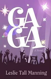
JF: Lucky you, to have your own and exclusive designer! This one is delightful, fun, and tells the reader exactly what kind of book to expect.
LeVar Ravel submitted Bird Blind designed by LeVar Ravel.

JF: Mystifying, and the black and white is pretty harsh.
Lyn Croft submitted The Battle of Phang Lore, Quest for the Eldtale designed by Lyn Croft/Beau Coup Publishing. “Artwork by Lyn Croft. Title and trademark provided by Beau Coup Publishing.”

JF: There are a couple of disturbing things here. Why vary the font within the title for no good reason, and why put the only light colored blue type right on top of the only light colored blue highlights in the whole image?
Mala Spina submitted Kafra il Magnifico designed by Mala Spina. “Second independent novel of a Sword & Sorcery serie that takes place in an ancient exotic city.”

JF: Notice how the illustration nicely frames the center of attention, and with careful title typography this works very well.
Mara Miller submitted Cheap Guitars designed by Kellie Dennis. “This is a New Adult romance.”

JF: Sexy and appealing, makes you want to read the book.
Mary Findley submitted The Pinocchio Factor designed by Mary C. Findley. “Second in my Steampunk series under my pen name designed by myself.”

JF: An appealing face, but the rest is visually chaotic.
Matt Margolis submitted False Flag designed by Matt Margolis. “This cover is a composite of several images, with various effects applied.”

JF: Simplicity has helped this design, but I’d like to see the central figure stand off the background more.
Matthew Saunders submitted Daughters of Shadow and Blood – Book I: Yasamin designed by J. Matthew Saunders. “Having a background in Web and print design, I decided to take on the challenge of the cover design and interior formatting myself. There was a definite learning curve, but I’m proud of the end product”
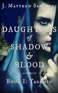
JF: A good effort, but the title is fighting with the background which weakens the overall effect.
Melanie Hatfield submitted Blades of Blood designed by Joshua Jadon.

JF: Workmanlike genre cover.
Melody Bremen submitted Car Guts designed by Melody J. Bremen.

Michael Coorlim submitted Ghosts of Shaolin designed by Kat O’Connor. “Composite cover created using purchased stock photos.”

JF: The background texture helps hold it together, there are a lot of elements to balance here.
Michael Mullin submitted Simon designed by Jim Valeri. “Wish I had the concept sketch I showed the designer. It looked like a bad greeting card! He took it from there.”
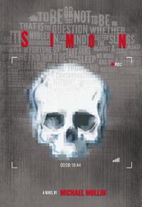
JF: A dynamite concept that needs to be visually a lot stronger to really be effective at the size most ebook covers are seen.
Michael Trupiano submitted Tales of Impending Peril – Volume One: The Fires of Hexmalivus designed by Evan Appel. “This is my first novel that I’ve written and, to my knowledge, it is the first novel cover that Evan has drawn. With the cover style I was trying to have him go with a bit of a sci fi pulp novel style of a steampunk airship battle along with a flaming skeletal dragon being ridden by and evil wizard.”

JF: Difficult to decipher what’s going on in the illustration, and the title effect adds to the confusion without contributing much to the overall look.
Michele Orwin submitted You Won’t Remember This designed by Al Pranke. “The author wanted an image from the title story. It opens with a woman sitting in a green canvas chair watching a white butterfly. She wanted the chair and the butterfly but didn’t want them in a particular setting. Al Pranke figured out a way to make that work.”
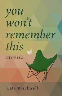
JF: That’s a tough challenge, but I don’t think the disjointed objects on this cover meet it.
Mike Burton submitted Unlimited designed by Mike Burton.

JF: But it actually says “Unlimted” right?
Mike Russell submitted Nothing Is Strange designed by Mike Russell.
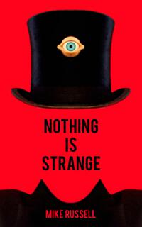
JF: This cover is kind of perfect, don’t you think? Ironic, amusing, and strongly graphical. ★
Nadine Keels submitted Love Unfeigned designed by Nadine C. Keels.

JF: If you want a professional looking book cover, you’re likely going to have to hire a professional to get it, because this isn’t it.
Natasha Brown submitted Cape Cod Kisses designed by Natasha Brown. “Thanks for your consideration :-)”

JF: An attractive and effective cover that solves the problem of having two well-known authors even though it buries the book title to some degree.
Natasha Brown submitted The Never Prayer designed by Natasha Brown. “Thank you for your consideration”
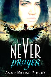
JF: Attractive and dynamic.
Pamela DuMond submitted Killer Confections: 8 Delectable Culinary Cozy Mystery Novels designed by Michael James Canales. “Our author consensus for Killer Confections was to create a cover for a book bundle that wouldn’t be to “busy”, but still attract readers looking for a deal on cozy, culinary, and/or humorous mysteries.”

JF: Good solution for a “bundle” cover with 8 authors, and I love the title (even though it could have been more prominent)!
Rick Heiman submitted Time Traveler’s Rock, Flaming Eagle designed by Rick Heiman with help from Xlibris Publishing staff.. “My cover to give hints about my book. The main character is an older man who is sent back in time 500 years where he is a 10 year old Indian boy who learns how to build canoes. It shows the boy looking into the water where he see’s his reflection as an old man. The eagle has special meaning also.”

JF: Well, it’s all very muted and subtle, including the title, and that robs it a bit of any drama, i.e. interest.
Robert Bryndza submitted Miss Wrong and Mr Right designed by Tash Webber. “Thank you!”

JF: A clever and “theatrical” treatment for a comedy novel that will stand out because it’s not the usual approach.
Rory Marron submitted Black Sun, Red Moon: A Novel of Java designed by John Amy (with RM input!). “I wanted something to intrigue and also relate to the setting of my story. I hit upon the idea of an Indonesian shadow puppet over the red circle (either a rising sun, to link to the Pacific War theme) or a ‘red moon’, linking to the story title. John Amy brought everything together superbly.”

JF: Well put together with strong typography, and the Indonesian puppet adds to the exotic nature of the imagery. ★
Roseanna White submitted Gathered Waters designed by Roseanna White. “For this historical novel, we wanted to capture the era, the baptism aspect that plays a crucial role in the story, and also the idea of a new day dawning. The white tulips are also a major plot point.”

JF: It looks de-saturated to me, and doesn’t make much impact.
Roseanna White submitted The Revised Life of Ellie Sweet designed by Roseanna White. “The first in a series, the author wanted this to have a Young Adult romance feel, but for the title to be the main focus. (second book cover to follow)”

JF: I like the idea for this series, but why is the strongest visual element on this one the basically meaningless pattern above the author’s name?
Roseanna White submitted The Unlikely Debut of Ellie Sweet designed by Roseanna White. “The second book in a series, the author wanted a similar feel as the first, but for the heroine to be alone this time. Again, for a young adult romance audience.”

JF: This one works better and is more unambiguous.
Slobodan C submitted Dome City Blues designed by KPGS.

JF: A solid and interesting genre cover sure to appeal to sci-fi fans.
Stacy Claflin submitted Dean’s List designed by Stacy Claflin, using DIY Book Covers.

JF: It’s the “put the type on the photo” option, but keeping it simple and picking the right photo help a lot.
Stephen Knight submitted These Dead Lands: Immolation designed by Marc Lee. “For this book, my co-author and I wanted something dynamic and extremely action-oriented that actually referenced one of the scenes in the book. Marc Lee gave us everything we asked for, and more. Chinooks evacuating the troops just before the undead hordes close in–what’s more thrilling than that?”

JF: Fantastic piece of art, you’re correct, and a dynamic cover, but I wish you had “zoomed in” a bit so we could interact with the action in this scene a little more directly.
Tammy Seidick submitted Sinner’s Lips designed by Tammy Seidick. “Thanks for your review!”

JF: Gets to the point, although the traffic scene at the bottom seems unnecessary because the top image is so compelling and well suited to the title.
Tanya von Ness submitted Colours designed by Tanya von Ness.

JF: Nicely done with lots of visual interest layered into the images.
Tanya von Ness submitted Dear Crossing designed by Tanya von Ness. “This was a redesign of the whole series”

JF: Terrific covers for a series of murder mysteries with lots of atmosphere and just enough “story” elements to capture our interest. The restrained typography allows the images to really communicate.
Tanya von Ness submitted Targeted designed by Tanya von Ness. “This was a redesign of the whole series”

Tanya von Ness submitted From the Storm designed by Tanya von Ness.

Teddi Black submitted Harvest designed by Teddi Black.

JF: totally delightful, with a unique style that will help this book stand out, and a perfect style for the title treatment. ★
Terry John Barto submitted Gollywood, Here I Come! designed by Mattia Cerato. “This is the cover of our children’s picture book. The lead character, Anamazie, is featured with the paparazzi surrounding her. In the background is Gollywood Studios. The “Here I Come!” banner is being dragged by a plane driven by Anamazie’s mom, Henrietta Pearl, which continues on the back cover.”

JF: The child in me is charmed.
Tracy Tomkowiak submitted Barnstormin’: A Journey of Baseball’s Worst Team Ever designed by Tracy Tomkowiak. “I enjoy the freedom of designing e-book covers—no more worries over things like bleeds, trim lines and safeties. I can push more with the visual elements in order to better capture the spirit of the story.”

JF: I get it. And this is a strong cover with all the elements you’d want to see in a baseball tale, but that still doesn’t tell me what you gained by running the title right off the edge on only one side. Not saying it’s incorrect, just that I don’t see a rationale for it.
Waheed Rabbani submitted Doctor Margaret In Delhi designed by Waheed Rabbani. “A Victorian era Doctor Margaret’s journey to Delhi, India.”

JF: Considering the amazing visuals possible for this title, this confused and barely legible cover is disappointing.
Wesley Banks submitted Hope In Every Raindrop designed by Rossitsa Atanassavoa.

JF: A cover that could have been improved with a more polished typographic approach to the title, which is plain to the point of awkwardness.
Yara Polana submitted God is a Black Woman designed by Yara Polana. “God is a Black Woman inspired by the Macuan tribe from the north of Mozambique, where you encounter their traditional masks, called Mussiro, that represents beauty in a traditional sense. This tribe is known to be a Matrilineal society but slowly falling into southern Patriarchal culture.”

JF: Love this cover, but it would be even better if “God” stood out a bit more, and “is a black woman” wasn’t reduced to such a small size. That illustration is dynamite.
Nonfiction Covers
Bruce Trimble submitted Sailing With Impunity: Adventure in the South Pacific designed by Bruce Trimble. “We dreamed for years of taking a small boat across a big ocean. When Mary decided it was time to write this book, I began thinking how to convey the adventure visually on the cover, and avoid the cliche “sailboat anchored in tropical lagoon” image. This is Mary’s fifth book, and my third cover.”

JF: Neither the black and white treatment of the photo nor the rather staid typography communicate colorful or vibrant adventure.
Carlos Rivera submitted Leadership: Past, Present & Future designed by Me. “The cover has Past and Present Leaders that I talk in the book, but not all on the cover where pick. Thank You.”

JF: Interesting concept that would have been stronger if the images had been colorized more uniformly to allow the individuals to emerge from the mass instead of the distracting colors, which add nothing.
Cathi Stevenson submitted Turn Back the Clock designed by Cathi Stevenson. “I chose to focus on this great title and didn’t want to take away from it by using images or distracting graphic details. The vibrant color stands out, and the shading and angle of the numbers on the “clock” makes a subtle statement about the book’s content, without taking attention from the title.”

JF: A very successful cover that relies almost entirely on the designer’s deft hand with typography and composition. ★
Dane Low submitted Learn Your Fretboard designed by www.ebooklaunch.com. “One of a series of how-to books for aspiring guitarists.”

JF: Attractive and expertly produced, a solid nonfiction cover. ★
Denise Gaskins submitted Addition & Subtraction: Math Games for Elementary Students designed by Denise Gaskins. “This is the second book in my math game series. I don’t know if you remember me from way back in the original Self-Publishing Roadmap group, Joel, but I’ve learned SO much from you over the years. Thank you!”

JF: I remember you well, Denise. This is a clean and attractive cover for an instructional book, well done.
Denise Gaskins submitted Counting & Number Bonds: Math Games for Early Learners designed by Denise Gaskins. “This will eventually be a five-book series of math game books. I blended the academic-looking structure of a workbook cover with a picture of playful family interaction. I hope to communicate that practicing math skills doesn’t have to be a chore: this is math that kids will enjoy.”

Elijah Bergton submitted Ion 8 designed by Elijah Bergton. “13 poems, 13 marks around the bird, 8th mark from top right is sticking out. The number 8 is in the title, and in the book it symbolizes a higher infinity. Released on 10/8, the marks also represent a clock, or time. The bird relates to many ideas. The background relates to interconnectedness.”

JF: It’s not absolutely required to put your author name on your ebook cover. I’m not sure I followed the author’s notes about the cover, but I can’t deny the hypnotic attraction this image has, although I’d still strengthen the title.
Guido Henkel submitted Inside the Workplace: What I Have Seen, Heard and Often Measured designed by Thu-Lieu Pham. “The key to this design was to capture the sensory nature of the title and the book, placing it in a neutral environment that is almost reminiscent of Cold War spycraft.”

JF: An interesting illustration, not sure why the designer went black and white with this cover.
Ian Anderson submitted Lath and Plaster Ceilings: Homeowners Guide to Repairing, Removing and Replacing designed by Ian Anderson. “First cover essentially text over an image, using paint.net. I juggled the size of the ‘lath’ to fit the text, which was outlined and feathered, but it still looks to float over the image. Choosing a font for a dry & old subject was hard and I think it ended up too ‘cheesy. Lots to learn for sure!”

JF: Still, the strength of the cover is that it communicates in every way what it’s about, and that’s often most of the battle with nonfiction covers. And the font you chose, while a bit primitive, adds a roughhewn charm.
Jen Herchenroeder submitted Kaufman’s Hill designed by Andrea Duquette. “Andrea Duquette drew inspiration from the setting of the memoir and the sans serif fonts popular in advertising and signage of the era.”

JF: Pretty but no discernible “hook” to interest us anywhere.
Kristen James submitted 101 Questions To Improve Your Novel designed by Kristen James. “I aimed for simple, bold, eye grabbing, and easy to understand at a glance. The blue water symbolizes the vast journey of writing a novel, yet it’s calming. The outdoor writer captures the fun element of writing anywhere, and hopefully the fun tone of this writing guide and revision checklist.”

JF: I think you made some good choices, and the outdoor writer was one. You probably don’t need that heavy black border, and your type need some fine-tuning, but keeping it simple pays off again.
Lori Henry submitted Dancing Through History: In Search of the Stories That Define Canada designed by Pixel Studio.

JF: A classic look that suits the subject matter.
Maria Gallo submitted Stop Lecturing Start Communicating: the public speaking survival guide for business designed by Vivalogue. “The cover reflects key components that relate to the book’s message of how to effectively deliver business presentations. 1-Clarity in communication (cover clearly identifies the subject) 2-Engaging the audience (bright colours peak interest) 3-Less is more (clean/crisp images get to the point)”

JF: Well said, and well executed, a solid cover. ★
maureen kennedy submitted The Mediterranean Diet designed by Andy Miller. “A first-time collaboration. We are hoping the simplicity will stand out in the crowd!”

JF: I don’t think it works. As a longtime buyer of cookbooks and books about food, anything on the Mediterranean diet should make use of the rich visual vocabulary of that diet. People buy cookbooks because they’re attracted to the food (not diet books) and if you don’t entice them with the food, why should they be interested?
MJ Harden submitted Voices of Wisdom Hawaiian Elders Speak designed by Tamara Lester. “The book is full of photos, all black and white, so a black and white cover fit. We wanted simple, strong and a Hawaiian elderʻs face that reflects aloha. Apparently, you donʻt like gold award stars, but the gold looks good against black & white; and, frankly, I won a very important national award.”

JF: Well, congratulations on your win. However, you make my point for me: the award is about you, not about appealing to your readers. So when these awards get in the way of the message the ebook cover is supposed to communicate, I point that out.
Philip Casey submitted Tried and Sentenced Selected Poems designed by Philip Casey. “With no budget, I’ve learned to create my own covers in GIMP. The image is adapted from Holbein’s An Allegory of Passion, courtesy of Getty’s Open Content Program.”

JF: I like the red color you’ve chosen, the rest look more like it was assembled rather than designed. You’ve given us no reason to be interested, I’m afraid.
Roseanna White submitted Broken Umbrellas designed by Roseanna White. “The author wanted a simple, uncluttered cover featuring the umbrella from the title and the snowstorm in which she saw the broken umbrella that inspired this memoir.”

Stuart Horwitz submitted Book Architecture: How to Plot and Outline Without Using a Formula designed by Molly Regan. “We modeled this on the structural paintings of Piet Mondrian. Molly used the font, “Trashhand” which fits the idea of the writer as draftsperson perfectly: you are going to have to do this work, and you can. Little known fact: the writing behind the translucency is a page from Franz Kafka’s diary!”

JF: A creative and interesting approach with visual appeal, but you could have left the handwriting off and had a stronger, more Mondrian-like cover.
Taillefer Long submitted Toward the Abyss: Israel and the Palestinians designed by Taillefer Long. “Original illustration to meet author’s idea. Designed around illustration to create an unsettling, almost sci-fi feeling to reflect complexity of the issue.”

JF: A very odd approach, much more like a sci-fi novel, and it would be strange there, too.
Vladimire Calixte submitted Naked and Transparent: Six Vital Tools for Knowing Yourself and Attracting Healthy Relationships designed by Charles Davis.

JF: I don’t think the images go together very well, and variations in the type treatments create more distraction. For a book about relationships, the visual approach seems beside the point.
Yash Sapkale submitted Access Denied designed by Yash Sapkale. “e-Book cover is Designed by passion. Took a lots of time and efforts.”

JF: Yash, it does take time and effort, and most of it is in learning. Graphic designers are skilled and trainer artisans, and book cover designers are even more specialized. Because you’re competing against people who have put years into studying and training in this specialty, it’s very difficult for an amateur to produce a cover that can match their in professionalism. Even though people might not know why one cover looks different from another, I think we’re conditioned to respond to the overall effect, and on your cover, although you had some good ideas, they don’t really come together in a cohesive way that communicates interest or excitement.
Well, that’s it for this month. I hope you found it interesting, and that you’ll share with other people interested in self-publishing.
Use the share buttons below to Tweet it, Share it on Facebook, Plus-1 it on Google+, Link to it!
Our next awards post will be on July 13, 2015. Deadline for submissions will be June 30, 2015. Don’t miss it! Here are all the links you’ll need:
The original announcement post
E-book Cover Design Awards web page
Click here to submit your e-book cover
Follow @JFBookman on Twitter for news about the E-book Cover Design Awards
Check out past e-Book Cover Design award winners on Pinterest
Subscribe to The Book Designer Blog
Badge design by Derek Murphy


