Welcome to this edition of the e-Book Cover Design Awards. This edition is for submissions during May, 2012.
Here’s what we received:
102 covers in the Fiction category
13 covers in the Nonfiction category
Award Winners and Listing
I’ve added comments (JF: ) to many of the entries, but not all. Thanks to everyone who participated. I hope you enjoy these as much as I did. Please leave a comment to let me know what you think, too.
Now, without any further ado, here are the winners of this month’s e-Book Cover Design Award.
e-Book Cover Design Award Winner for May 2012 in Fiction
Diane Capri submitted Fatal Distraction designed by Jeroen ten Berge. “Hope I’ve done this correctly!”

JF: What you did right was hire Jeroen ten Berge. This terrific cover has atmosphere, drama, and instant appeal. The designer tells a story with graphics and the many thoughtful and effective design details. Great stuff.
e-Book Cover Design Award Winner for May 2012 in Nonfiction
Damonza submitted Going the Half Hog designed by Damonza.
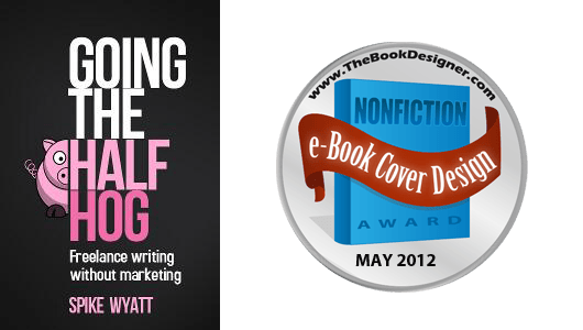
JF: Amusing and it tickles both the mind and our visual sense. Controlling both the palette of colors and the way you use typography results in winners like this one, where a clever concept for a book meets a design that matches it perfectly.
Fiction Covers
Dean Wesley Smith WMG Publishing submitted A Dangerous Road: A Smokey Dalton novel designed by Dean Wesley Smith.

JF: A better than average effot despite the typo on the cover, 6 separate text elements and some gratuitous type effects, it gets the job done.
Algor X. Dennison submitted A Darkened Landscape designed by Algor Dennison. “New cover for a trilogy of dark western stories. Self-made, going for the creepy atmospheric look.”

JF: Apparently so darkened that it’s hard to decipher.
EC Sheedy submitted A Perfect Evil designed by AngieOCreations. “Angela O is just starting out in the world of cover design. I think her covers are worthy.”

JF: Looks like she has a bright future.
Lauren Royal submitted Amethyst designed by Kim Killion (Hot Damn Designs). “My main objective was a design that would “brand” my books, so that even though each of my series would have its own distinct look, readers would recognize all of the books as mine. Kim accomplished this by custom-designing my author name font, which she’s now using on all of my covers.”

JF: And she’s done a nice job with the typography. I know these covers are common in romance, but they often look to me like two different covers on the same book.
Mary C. Moore submitted Angelus designed by Katie Miller. “Cover Artwork done by Wyly Em Cover Design by Katie Miller”

DJ Hazard submitted Arcturus Initiative designed by DJ Hazard. “I renamed one of my books. It used to be Arcturus Initiative: Book One, so I re-did the cover. Picnik went out of business in April. That was my main design tool. I found a new place that is similar, so I’m still scratchin’ away on the walls of my cave :)”

Damonza submitted ARSON designed by Damonza.

JF: Nice use of distressed type on an atmospheric cover. It works.
Beverly C Gray submitted Black Knights of the Hudson Book II: Boots and Saddles designed by Beverly C Gray. “The gray-tone architectural design is the Cadet Chapel at West Point and is used on all books in the series. The color inset changes for each book and represents title or a scene in the book. Thanks for doing this.”

JF: Well, despite the symbolism, this mashup doesn’t really work for me, and the title typography needs a complete overhaul.
Fayth Devlin submitted Blood Lust Rising designed by Baron Mrkva.

Ian Thomas Healy submitted Blood on the Ice designed by Ian Thomas Healy.

Patrick Samphire submitted Bone Roads designed by Patrick Samphire. “This is the cover I designed for my collection of fantasy short stories. In this case, I simply cropped an istockphoto image and added the text.”
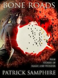
JF: But you did it carefully, and the use of type is good.
Polly Bernson submitted Caravan to Armageddon designed by Molly Williams.

Renee submitted Circuits of the Wind: A Legend of the Net Age (Vol. 1)“Thank you!”

JF: I wish Renee had credited the designer of this elegant and effective cover that blends illustration and typography. Will you leave us a comment, Renee? Thanks.
Meradeth Houston submitted Colors Like Memories designed by Charlie Volnek.
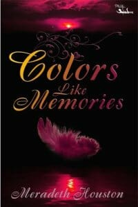
JF: Okay, we see this every month, the dark red and black problem. This looks like it might have been a good ebook cover, but it’s so murky that it’s even hard to read. Could be fixed with a bit of tweaking.
Jan Tilley submitted Coming About designed by Jan Tilley. “I self-published through CreateSpace.”

Victoria Rollison submitted Conspire designed by Victoria Rollison.

Kit Foster submitted Control designed by Kit Foster. “Gary’s direction for the cover of Control was as follows ” I was aiming to keep a kind of clean, sterile feel – as it gels with the theme of the book and also looks clear as a thumbnail icon on websites.” This is what we came up with.”

JF: Beautifully done, very clean, almost icy. And notice the custom typography that also helps to set this cover apart.
Allyson Longueira submitted Coolhunting designed by Allyson Longueira.

JF: I’d love to see these books by a very popular author with really imaginative covers rather than the kind of assemblage you see here, because this genre produces some great ones.
Niki Savage submitted Crossfire: Hearts on Fire designed by Niki Savage. “I submitted the first book in the trilogy a while ago and while you said the cover was striking, it didn’t denote romance. This is the third book and I have taken your advice to heart. The heart on the cover is a big red ruby, which plays an integral part in the story, and I feel that also covers the romance aspect of the story.”

Alicia Kat Dillman submitted Daemons in the Mist designed by Alicia Kat Dillman. “I wanted her to look like she was standing across the street from you, her hair caught up in the gust of wind from a passing car.”

JF: It certainly works, and the subdued background really helps the woman’s face stand out. Nicely done.
Joe Ducie submitted Distant Star designed by Vincent Chong. “Thank you for your consideration. Kind regards, Joe Ducie joeducie.net”

JF: When these genre novels are sold as mass market paperbacks you wouldn’t see a cover like this too often, because the title or author’s name—whichever is the bigger draw—needs to be visible in the book racks at the top of the cover. For an ebook, this cover uses its sparse, dystopian looking layout to good effect.
A. D. Cooper submitted Doctor Jekyll and Ms. Hyde designed by A. D. Cooper. “Commissioned by the author Carl East.”

Bridget McKenna submitted Evenings, Mornings, Afternoons designed by Bridget McKenna.

JF: I like how clear this cover is, it really communicates.
JR Wesley submitted Eyes of the Seer designed by Crimson Melodies. “Eyes of the Seer was illustrated by Christine Griffin, a digital artist discovered and chosen by the book’s author, Peter Dawes. The lettering was designed by the publishing team at Crimson Melodies.”

Wendy Tokunaga submitted Falling Uphill designed by Andrew Brown.

Ellen Herbert submitted FALLING WOMEN and Other Stories designed by Hollowtree Workshops.

Anthea Sharp submitted Feyland: The Bright Court designed by Kim Killion. “The second in a YA urban fantasy series — Kim Killion designed this fabulous cover!”

Damonza submitted FLAT-OUT LOVE designed by Damonza.

JF: Interesting use of visual irony and a cover that owes a lot to web graphics.
Michelle Grogan submitted Forbidden Love designed by Kip Ayers. “I went into this not knowing what I wanted until I met Kip Ayers who put my thoughts/ideas into something real! I loved this design on fist sight!”

Allyson Longueira submitted Forest for the Trees designed by Allyson Longueira.

Christopher Geoffrey McPherson submitted Forever — and other stories designed by Matt Hinrichs. “This is my third project with this designer and I have to tell you each cover is better than the previous. This time it’s a collection of short stories. I did not have any ideas of how I wanted the cover, so the designer had carte blanche to do whatever he wanted. Imagine my surprise when he came up with this retro ’60s throwback! I love the design, the elegant simplicity, the use of colors. (The cover image is from my story “Reflections in a Broken Mirror” which takes place in the last second of the life of a man who has just cut open a vein in his arm.)”
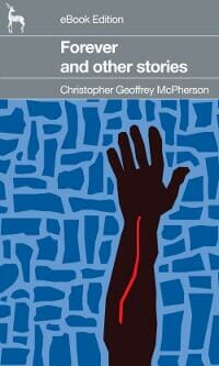
JF: Also reminiscent of Saul Bellow designs from the 1960s, Matt Hinrichs pulls off another study in interesting ways to approach the ebook cover.
Warren Martin submitted Forgotten Soldiers: What Happened to Jacob Walden designed by Donna Casey & Warren Martin. “Hi, Hope I did this right and thanks for for your work on your site-a lot work I know goes into it and a lot of great info. Warren”

David Brown submitted Geek ‘n Dork: A Novel designed by David Brown. “Any feedback will be greatly appreciated! Love what you do! Keep doing your thang! Best, David Brown Author & Novelist”

JF: David, I’m speechless.
James Conder submitted GS Lyman, Accidental Master of the Unknown: Monday designed by James Conder.

Avis Black submitted How Julian and Nigel Turned Each Other Gay (Inadvertently), or So They Both Claim designed by The Slash Press. “An example of a text-only design.”

JF: There’s a big price to pay, in my opinion, for using this highly ornamented typeface. The price is readability. It can be done, but not this way.
Maree Anderson submitted Ruby’s Dream designed by Rob Anderson. “Hi Joel. Two of Rob’s covers garnered positive comments in your October awards, so I thought I’d enter this particular cover (and the next one) as an example of how Rob and I opted to tackle covers for an ongoing series. As always, we appreciate your valuable feedback.”

Maree Anderson submitted Jade’s Choice designed by Rob Anderson. “And this is (obviously!) the 3rd book in the Crystal Warrior series. Our main difficulty was finding artwork that we felt was similar enough to brand the covers as an obvious series, while still being relevant to the genre and each individual book. I think it helped immensely that all three books were already essentially written, allowing us to purchase artwork all at once, with a view to the covers for the entire series. (Our eyesight may never recover from scouring thumbnails on stock-photo sites, though *g*)”

JF: Some of the strongest ebook covers, as a series, that I’ve seen from entrants. These are beautifully matched without being clones, and the overall effect is beautiful.
Jim Moorman submitted Jamaican Flowers designed by Alan Gallo.

Kerry Dunn submitted Joe Peace designed by Hollowtree Workshops.

Suzanne Ferrell submitted KIDNAPPED, A Romantic Suspense Novel designed by Lyndsey Lewellen.

Anderson O’Donnell submitted Kingdom

Geoffrey B. submitted Lame Excuses designed by James Junior.

JF: I like the type that alludes to a diner era and matches the photo quite well, and the restraint that makes this cover work.
Simon Townley submitted Lost In Thought designed by Simon Townley.

JF: Really nice piece of design with a cover that unifies color, images and typography. I’d like to see the title with a bit more contrast, but it’s hard to find fault with it.
Blaine Reimer submitted Love is a Wounded Soldier designed by Blaine Reimer. “I wanted the cover to have a vintage look to reflect the era the story portrays. I didn’t want it to be too busy or look over processed.”

Emma Laybourn submitted Megamouse designed by Emma Laybourn. “As I don’t own the rights to the original cover for my children’s book, I made my own. I found a copyright-free photo of a sewer tunnel, recoloured and posterized it, and then Photoshopped my own sketches of the mouse and rat on top. I was aiming for a mixture of excitement and humour to reflect the book’s contents.”

JF: Nicely done, although it comes off as a bit dark for a humorous book.
Isabella Amaris submitted Mesmer, Book #1: Sanctuary (A Three Towers Fantasy) designed by Isabella Amaris.

Barbara J Webb submitted Midnight in St. Petersburg designed by Reese Dante.

JF: A really skillfully-handled composite cover. Beautiful.
Jordan Castillo Price submitted Mnevermind 1: The Persistence of Memory designed by Jordan Castillo Price. “This cover was designed to have a dreamy feel to represent the book’s fluid reality, end yet retain some edginess.”

Rachel Howzell submitted No One Knows You’re here designed by David Hall.

Tiffany Snow submitted No Turning Back designed by Tiffany Snow.

JF: Nice job, the image is striking.
Christopher Hayes-Kossmann submitted Nothing Too Dangerous designed by Christopher Hayes-Kossmann. “Composited myself from a number of paid stock photography sources, including human and animal skulls, which gave the central image an unnatural and distorted feeling. Designed primarily in Photoshop 8.”

JF: Love it. Striking and original, it really communicates.
Johanna van Zanten submitted On Thin Ice designed by Bookbaby. “The photo is of Amsterdam last winter taken by a friend of the author.”

JF: I wish they would credit whoever did this design, don’t you? Despite the expert typography, it looks like it wants more contrast between the title and the background, but very sophisticated nevertheless.
Jean Ann Geist submitted Only in the Movies designed by Laura Tolkow, Flush Left. “Laura Tolkow transformed Sascha Instone’s watercolor into the cover of Only in the Movies.”

Leonard Kinsey submitted Our Kingdom of Dust designed by Pentakis Dodecahedron. “Photographer: Alan Partlow, Model: Draven Star. Shot in front of a green screen and then composited and color-graded in After Effects, with final touch-ups and text in Photoshop.”

JF: You see it? The dark red type on the black background?
carol phillips submitted Prince Of Bryanae designed by carol phillips.

Steve Trotter submitted RESURRECTED: An Adam Wolf Thriller designed by Jeroen ten Berge.

JF: A real winner and the branding is both monumental and used effectively as part of the design.
Rick Novy submitted Rigel Kentaurus designed by Rick Novy & Brad Torgersen. “Image licensed through Dreamstime, and heavily modified by Brad.”

Jan Tilley submitted Rogue’s Hollow designed by Jan Tilley. “I self-published through CreateSpace.”

JF: Jan, your covers benefit from your photo picking and keeping them simple. If you study typography a bit, they will get even better.
Lev Raphael submitted Rosedale in Love designed by Kathy Phillips. “The novel is set in 1905 New York and I was thrilled to find and buy original art by Clarence Underwood, a period illustrator. It was my first time working with an artist from stage 1 on a cover–as opposed to having “cover consultation”–and it was a blast to be able to choose fonts, size, colors, etc. ”

JF: Beautiful job, Lev. There’s something about the name “Rosedale” that matches this artwork perfectly.
Sylvia Morice submitted Short Journeys

D. R. Martin submitted Smoking Ruin designed by Jesse Pelkey. “The cover art was by Doug Oudekerk, and the design and typography by Jesse Pelkey.”

JF: Very effective genre cover.
Michele Drier submitted SNAP: New Talent designed by Jennie Rosenberg.

JF: Clean and strong, and a type effect that actually works.
Dave Cornford submitted Spillage designed by Dave Cornford.

JF: Great example of DIY cover design for this quirky short piece.
Matt Sinclair submitted Spring Fevers designed by Calista Taylor. “Designed by Calista Taylor, with assistance from book designer R.C. Lewis, the cover of Spring Fevers captures the atmosphere of the stories in the anthology. Spring Fevers is about relationships in their many forms, and the cover conveys a sense of both sunlight and rain, sharpness and blur, color and black and white.”

KS ‘Kaz’ Augustin submitted Steel & Skin designed by KS Augustin. “While I usually pay for pro covers for longer works, I’m more reluctant when it comes to short stories, and I was loathe to go with explicit material, even though it was for an erotic short story set in s-e Asia.”

JF: Great job Kaz, the imagery is lovely. Stronger typography would make this even better.
Holly Elizabeth submitted The Amalfi Alliance designed by Holly Elizabeth. “Thanks so much for the opportunity to enter. Best regards, Holly Elizabeth”
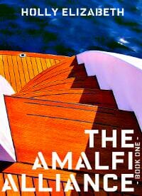
JF: Nice job, Holly, I love the way this came together and would like to see where the series goes from here.
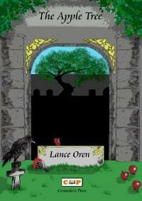
Russell D. James submitted The Apple Tree designed by Daniel Carrier. “This book is also available on Barnes & Noble at https://tinyurl.com/7nghyeo. Mr. Carrier is the cover designer for Cantadora Press and is also a published author himself.”
Lois Karlin submitted The Book of Maggie Bradstreet designed by Gini Hamilton.

Tracy Edward Wymer submitted The Color of Bones designed by Tracy Edward Wymer. “This is a middle grade novel for ages 9 and up, grades 4 and up.”

carol phillips submitted The Dead Held Hands designed by carol phillips. “i didn’t put together the ebook, only cover art and design.”

JF: Great image, wonder if the type isn’t a bit small.
Seth Rosenzweig submitted The Devil Speaks Hungarian designed by Seth Rosenzweig.

JF: Well, it does make us stop and look, doesn’t it? The ebook is quite normal inside, you don’t have to lean sideways to read it.
Edwin Hughes submitted The Endless Circle designed by Matt Wainwright. “Designed as part of a series, using different colours and occasionally background images for each book.”

JF: Love the simplicity of this design, should make for great branding.
Marsha Canham submitted The Following Sea designed by Marsha Canham.
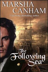
JF: Nice job, very atmospheric.
Hazel Gaynor submitted The Girl Who Came Home – A Titanic Novel designed by Andrew Brown at Design4Writers. “Andrew did a fantastic job on the design, which features original artwork by Titanic artist, Jim McDonald.”
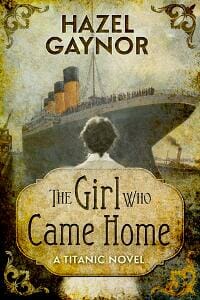
JF: Beautiful cover from Andrew Brown that merges the familiar image of the Titanic with sensitive typography and art that establishes the tone of the book.
Scott Sherman submitted The High Price of Pest Control designed by Carl Graves. “My designed had a version of this copy on sale for considerably less than he normally earns for custom cover. I contacted him, asking if I purchased it, would he be willing to tweak it at additional cost? After he agreed, I purchased the cover design. The original appeared much as the final. However, as my story was about a “killer cube” I asked if he could somehow inset a white, bloody box into his already-striking design. I’m no designer myself, but I send him a mock up to give him a sense of what I wanted. I didn’t think there was a way he could do it without it looking awkward. However, his execution exceeded my expectations. I don’t think you’d ever know the cover wasn’t designed exactly as it appears. I think he achieved a seamless customization. As a result, I’d like to nominate him for an award. Not only is it a sexy cover, but it shows extraordinary flexibility and creativity on his part. I’m so proud of it.”

David McGowan submitted The Hunter Inside designed by Marcus Graham. “Here is the cover of The Hunter Inside, my debut novel. It is a suspense filled thriller with plenty of page-turning twists and turns that keep the reader on the edge of their seat!”

JF: Yep, works for me!
Pamela DuMond submitted The Messenger’s Handbook designed by Michael James Canales. “Young Adult romantic time travel thriller.”

JF: Looks like it’s packaged just right for its intended market.
Mariah Walker submitted The Most Ferocious Dinosaur designed by Mariah Walker.

JF: You can’t lose with simplicity when it’s this charming.
Sylvia McDaniel submitted The Outlaw Takes A Bride designed by Kathleen Baldwin. “Kathleen has designed most of my covers, but I felt this one was especially fitting.”

Nancy Adams submitted The Secrets of the Sibyl: a Short Story designed by Carrie Spencer. “This is historical suspense set in the Roman world of 382 A.D.”

JF: Imagine how effective this would be with the title in a light color.
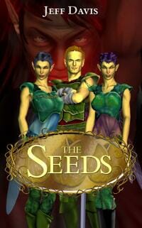
Jeff Davis submitted The Seeds designed by Jeff Davis. “I design my characters graphically first. As I write, I’ll pop up an image and ask, “If he did this, what would you say? What would you do?” It’s an effective way for me to stay true to the characters.”
A. D. Cooper submitted The Stars On My Arm designed by A. D. Cooper. “Commissioned by the author Leigh Jarrett. Sequel to a previous submission “Simply Marvellous”.”

Kelly McClymer submitted The Twelfth Night Bride designed by Kelly Pernell.

JF: Appealing, isn’t it?
Jodi McIsaac submitted Through the Door designed by Justin Sherwin of Firestain.

JF: Beautiful image, but a risky decision to make the reader rely almost completely on the image.
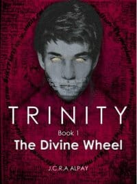
J.C.R.A Alpay submitted Trinity: The Divine Wheel designed by J.C.R.A Alpay.
J.M. Ney-Grimm submitted Troll-magic designed by J.M. Ney-Grimm. “The art featured on the cover is by Kay Nielsen, a magnificent illustrator from the art nouveau period. This particular illustration was published in 1914 and is in the public domain.”

Allyson Longueira submitted Turbulence designed by Allyson Longueira.

Leslie Hall Pinder submitted Under the House designed by Wendy Brown.

Carol Rich submitted Untethered designed by Another Jones Graphics.

BV Lawson submitted Vengeance is Blind designed by BV Lawson. “I wanted a simple design to match the theme connecting the three stories, that people who take vengeance into their own hands can be blinded by their own hubris. There’s also a music undercurrent to two of the stories, hence the background.”

JF: Correct me if I’m wrong, but that doesn’t really look like a person, does it?
Elisabeth Grace Foley submitted War Memorial designed by J. Simmons. “”War Memorial” is a short Civil War story. I chose a picture of an old oil lamp to evoke a scene from the story, and my cover designer J. Simmons was able to find a shot actuallly taken at Gettysburg (where it’s set). I’m really delighted with the design he came up with!”

JF: I think it’s really challenging to combine images, especially on the small covers of ebooks, but this one is quite attractive, partly due to the strong typography.
Kevin Hilliker submitted We Are Elephants designed by Kevin Hilliker. “This cover was a lot of fun—and the process went very quickly. I’ve had the image of the “skull-barn” in my head for some time, now. Not sure what that says about me… Hope you like it! (The back cover is also shown on my site, which is as equally eerie as the front…)”
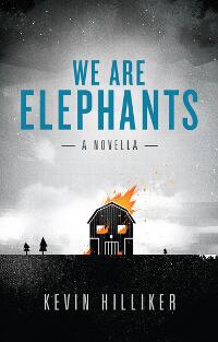
JF: Nice, got a big smile here.
Keta Diablo submitted Where The Rain Is Made designed by Fantasia Frog Designs. “Cover is on left side, first column, scroll down. Thank you, Joel”

Mary C. Moore submitted Wolfman designed by Mary C. Moore. “This is my second submission. If we are only allowed one, I prefer my first submission of Angelus to be entered in the contest. Thank you!”
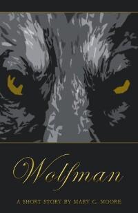
JF: Fine to have two, but I really prefer this one, which just needs some stronger title type to really stand out.
Steven Lyle Jordan submitted Worldfarm One designed by Steven Lyle Jordan. “Created in Photoshop.”

Ruth Harris submitted ZURI designed by Stewart A. Williams. “There was a double cover challenge for ZURI. The first was to convey Africa. The second was to indicate the rescued baby rhino—named Zuri, meaning “beautiful” in Swahili—who is the center of the story. Stewart used the warm yellow, the trees & the narrow bands of African design to accomplish the first. The baby rhino was created from stock art & the rhino’s horn was made smaller to denote Zuri’s youth.”

JF: The colors alone make this magnetic, and shows how a designer can imply lots of things with apparently simple decisions.
Nonfiction Covers
Ron Brown submitted Anticipate. The Architecture of Small Team Innovation and Product Success designed by Viltor Gmyria.

JF: Nice, clean design.
John Enzo submitted Awakening’s Treasure: Waking from Life’s Dream to Awakening’s Pull designed by Derek Murphy. “Because our previous cover was too subdued in its thumbnail form, we submitted it to Derek Murphy. After working it over, this is the revitalized outcome.”

JF: Great to see designer Derek Murphy bring some of his finesse to nonfiction titles.
Dina Porell submitted Egyptian Street Culture That No One Will Tell You About designed by Ian Porell.

JF: I have no idea what the book is about, but I love the title.
Amy Van Court submitted Escaping Career Prison: Three Keys to Breaking Free and Finding Work You Love designed by Adina Cucicov.

JF: A clean design that’s a bit odd since there’s an incongruence between the symbol of imprisonment—the barbed wire—with the bird as a symbol of freedom which would have … flown over the barbed wire, right?
Mark Yoshimoto Nemcoff submitted Fatal Sunset: Deadly Vacations designed by Mark Yoshimoto Nemcoff. “I shot this cover photo at Black Rock on Maui. It wasn’t until I had finished writing Fatal Sunset that I realized I had actually taken this pic a few hours after the tragic event which inspired the book–the death of a tourist that happened less than a dozen miles from where this photo was taken.”

Renee Benzaim submitted How to Make Compost designed by Renee Benzaim.

Allyson Longueira submitted How to Negotiate Anything: A Freelancer’s Survival Guide Short Book designed by Allyson Longueira.

JF: Simple and effective, and note how the designer has used the same author branding as on her fiction covers.
Abel Keogh submitted Marrying a Widower: What You Need to Know Before Tying the Knot designed by Francine Platt. “The second book in the Dating a Widower series.”

Paul Rice submitted Pimp ur Blog Episode Two: Increase Search Results with Articles and Feeds designed by Nancy Flores at https://www.nancyfloresi.com. “We hired a graphic designer, Nancy Flores, for Pimp ur Blog Episode Two. She also redid Episode One’s typography cited in the March awards as needing improvement.”

JF: It’s much more legible, and the cover still promises a fun approach to the subject.
Susie Kay submitted Professionalism: The ABC for Success designed by Matt Kay. “Very neat, says it all without fuss and adapts readily to next in the series”

Russell Phillips submitted The Bear Marches West: 12 Scenarios for 1980’s NATO vs Warsaw Pact Wargames designed by Aoife Brown. “The cover image is by Aoife Brown, I added the text myself.”

Damonza submitted The Book of F*cking Hilarious Internet Memes designed by Damonza.

JF: Another really strong cover from Damonza, who is setting a high bar in both fiction and nonfiction.
Ou Tao submitted The Leftlovers designed by Pere Ibañez.

JF: Another haunting and unique cover from a previous award winner.
Well, that’s it for this month. I hope you found it interesting, and let other people interested in self-publishing know about the Awards. —Use the share buttons below to Tweet it, Share it on Facebook, Plus-1 it on Google+, Link to it! The next issue is July 15, 2012 and the deadline for submissions will be June 30, 2012. Don’t miss it! Here are all the links you’ll need:
The original announcement post
E-book Cover Design Awards web page
Submit your e-book cover here
Follow @JFBookman on Twitter for news about the E-book Cover Design Awards
Subscribe to The Book Designer Blog

