By Joel Friedlander
Welcome to the e-Book Cover Design Awards. This edition is for submissions during March, 2018.
This month we received:
68 covers in the Fiction category
12 covers in the Nonfiction category
Comments, Award Winners, and Gold Stars
I’ve added comments (JF: ) to many of the entries, but not all. Remember that the aim of these posts is educational, and by submitting you are inviting comments, commendations, and constructive criticism.
Thanks to everyone who participated. I hope you enjoy these as much as I did. Please leave a comment to let me know which are your favorites or, if you disagree, let me know why.
Although there is only winner in each category, other covers that were considered for the award or which stood out in some exemplary way, are indicated with a gold star: ★
Award winners and Gold-Starred covers also win the right to display our badges on their websites, so don’t forget to get your badge to get a little more attention for the work you’ve put into your book.
Also please note that we are now linking winning covers to their sales page on Amazon or Smashwords.
Now, without any further ado, here are the winners of this month’s e-Book Cover Design Awards.
e-Book Cover Design Award Winner for March 2018 in Fiction
Kristin Smith submitted Catalyst designed by Marya Heidel.


JF: A beautifully composed and engaging cover. The red-haired, green-eyed heroine pulls us in, and the extravagant textures and beautiful detail in the background helps to magnify its attraction.
e-Book Cover Design Award Winner for March 2018 in Nonfiction
Yahya El-Droubie submitted The Naked Truth About Harrison Marks designed by Yahya Eldroubie. “Extensively repaired and retouched black white photo of the photographer George Harrison Marks with a fade at the bottom. The typeface I used was Hipton Sans – a single stroke gothic.”

JF: Great energy and balance, with a distinctive title treatment that’s almost a logo for the book. Nicely done.
Fiction Covers
A.C. Weston submitted She Is the End designed by A.C. Weston. “The cover artist, Kavya Tiwari, worked with me to create art that reflected the feel and genre of the story. She did an amazing job, and all I had to do was work out the typography.”

JF: The artwork grabs attention, nice job.
Adithya Bandari submitted A Theist designed by Adithya Bandari. “An old friend of author gave his photograph as it suited the context of the story.”

JF: That may be, but as a whole the cover tells us very little about the book inside.
Amanda Judd submitted Tainted Love designed by Mary A. Laughead.

JF: A single rose might have more impact, but the awkward typography doesn’t help.
ameel koro submitted Sister of Echo designed by Lara Koro. “The story behind this book cover is, literally, “the story behind the cover”! I never expected that the picture I came across and liked so much so that I ended up purchasing its copyrights will inspire a novel the size of Moby Dick! which I now proudly call: the best work I’ve ever written.”

JF: Congratulations. Now you need some professional quality typography to go with your image, this looks pretty amateurish.
Amy Vossler submitted Charybda designed by A.L.S. Vossler. “The strong female protagonist is the inspiration for this cover, and the swirling lights represent the Charybda–portals that take the form of shimmering ribbons of light.”

JF: Effective, although the title could use more contrast.
Athena Daniels submitted Girl Unseen designed by Damonza. “Girl Unseen is book #3 in my sexy paranormal suspense series.”

JF: Well put together and attractive with a clear eye path to follow.
Caitlin McKenna submitted Absence of Blade designed by Daniel Lambert. “I commissioned this cover based on beta readers’ comments that they wanted a better idea of what the alien characters looked like. I now offer the alien concept sketches my designer generated as free downloads for subscribers through my website.”

JF: This cover looks like it will please your fans, and shows that even a pretty monochromatic design can still be dramatic.
Carrie Pennington submitted A Darkness Awakens (The Elements of Ilysia: Volume One) designed by Carrie Pennington. “The book is the first in a Young Adult Dark/Epic Fantasy series. The design was set to convey not only darkness but it’s entrance in the world of Ilysia in the form of the Dark Empress.”

JF: This font will work better for you if you make the title larger and, therefore, more readable.
Christine Bernard submitted Mute designed by Warren Bernard. “This is the story of a woman who takes on a challenge of not talking for nine months. In this story she learns a lot about herself which a noisy world helps to hide so well. Color plays a big part of the novel, and the story takes you through a very personal journey.”
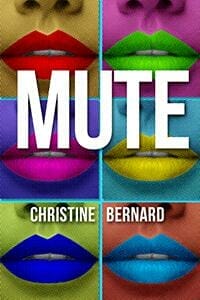
JF: A strong concept that might have worked better with a more sophisticated execution. Still has good impact, especially at small sizes.
Cora Graphics submitted Nailed designed by Cora Graphics.

JF: A lovely and well balanced cover that invites us into the winter street scene. Almost impossible to read the subtitle at this size, and the title itself seems oddly violent for this serene scene.
Cora Graphics submitted Brave designed by Cora Graphics.

JF: Attractive cover with a compelling heroine and distinctive title treatment.
Cora Graphics submitted Accelerating Universe designed by Cora Graphics.

JF: Expert typography on this strong sci-fi cover that, despite everything else seems oddly static.
Darja DDD submitted A Good Man designed by Marushka from Deranged Doctor Design. “Contemporary Romance book cover design by Marushka from Deranged Doctor Design, Handymen Series”

JF: When you know what readers are looking for, it makes sense to give it to them.
Darja DDD submitted The Last War designed by Milo from Deranged Doctor Design. “Post-Apocalyptic Science Fiction book cover design by Milo from Deranged Doctor Design, The Last War Series Book 01”

JF: This strong series design (see the 2 following) shows the dystopian landscapes in which the stories take place. The first 2 are the most effective, giving us a clear focus at the center of the cover.
Darja DDD submitted The Zero Hour designed by Milo from Deranged Doctor Design. “Post-Apocalyptic Science Fiction book cover design by Milo from Deranged Doctor Design, The Last War Series Book 1.5”

JF: This one was my favorite. ★
Darja DDD submitted The Ophidian Horde designed by Milo from Deranged Doctor Design. “Post-Apocalyptic Science Fiction book cover design by Milo from Deranged Doctor Design, The Last War Series Book 02”

Darja DDD submitted Unchained designed by Milo from Deranged Doctor Design. “Paranormal & Urban Fantasy book cover design by Milo from Deranged Doctor Design, Feathers and Fire Book 1”

JF: Great covers for this fantasy series, featuring the attractive action-oriented heroine highlighted by the spectral moon. However, the series brand on the second cover disappears into the background.
Darja DDD submitted Rage designed by Milo from Deranged Doctor Design. “Paranormal & Urban Fantasy book cover design by Milo from Deranged Doctor Design, Feathers and Fire Book 2”

Deborah Coonts submitted Lucky Bang designed by Glendon of Streetlight Graphics.

JF: Strong graphics emphasize the heat and impact of this cover. Instantly recognizable. ★
Diana Morris submitted Lachesis’ Allotment: A Short Collection of Notes, Observations, Questions, and Thoughts designed by London McWilliams.

JF: Murky and indistinct.
Donna Guillemette submitted The Path to My Heart designed by Donna Guillemette. “My book is about becoming whole by finding my pieces while traveling along the path to my heart, which I discover is outside my body. We all cross a bridge at some point in the story to attend a merging.”

JF: An interesting image that deserves much better typography than this bland approach.
Drew Briney submitted Unproven designed by Drew Briney. “Eric Velhagen is the illustrator.”

JF: It’s no longer unproven that a good illustration doesn’t guarantee a strong cover design.
Ebook Launch submitted Dawn of the Hunter designed by
Ebook Launch. “Book 1”

JF: Great design concepts and execution on this series design (2 more following). In each case the dynamic illustration takes us right into the action while simultaneously giving hints to more story elements with the small images combined with the action figures. Powerful title treatments round out the design. ★
Ebook Launch submitted Double Edged Blade designed by Ebook Launch. “Book 2”

Ebook Launch submitted The Storm designed by Ebook Launch. “Book 3”

Ebook Launch submitted The Dragon Knight’s Curse designed by Ebook Launch.

JF: An exciting illustration, not sure the title type is strong enough to balance it.
Ebook Launch submitted Craven Manor designed by Ebook Launch.

JF: Loads of atmosphere and the promise of creepy doings within that building.
Erin Johnson submitted Seashells, Spells & Caramels designed by Erin Johnson. “Just looking for some feedback on my cozy witch mystery book cover. Thanks so much!”

JF: The background image is yummy, the title could be larger as well as the type on the witch’s hat.
Fernando Camargo submitted Shanti and the Magic Mandala designed by Luciana Camargo.

JF: The charming girl meditating rescues this cover from some visual confusion.
G.A. Minton submitted Trisomy XXI designed by Karen Fuller.

Helen Chappell submitted Killing State designed by Helen Chappell. “I worked closely with the author to create a cover which was eye-catching and clearly represented the book as an action-packed, political thriller.”

JF: A really good cover completely undone by those Big Blurb Bubbles. Too bad you couldn’t find a more subtle way to employ those quotes.
Howard Petote submitted The Sins of Maggie Black designed by Glendon Haddix and staff. “A young mother’s attempt to start over is haunted by her dark past, and by the lawman she falls in love with.”

JF: Due to the style of type used, this cover feels unfinished.
Ina Curic submitted Mirabelle’s Forest Garden designed by Ina Curic. “thank you!”

James Egan submitted Dungeon Lord: Otherworldly Powers designed by James T. Egan of Bookfly Design.
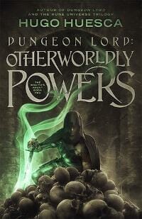
JF: Beautifully atmospheric, terrific type handling and a glimpse into the story make this cover a winner.
James Egan submitted Cold Fear designed by James T. Egan of Bookfly Design.

JF: This incredibly dynamic illustration that integrates the title right into the action almost demands we follow along. ★
James Egan submitted Yellow Sky, Emerald Sea designed by James T. Egan of Bookfly Design.
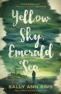
JF: Making the sky the main visual element really works here to create an enticing environment.
Jon Chaisson submitted Meet the Lidwells! A Rock n’ Roll Family Memoir designed by Jon Chaisson. “This cover was created to look a little dated, as the story takes place in the 90s. Same with the flyer on the telephone pole, which is purposely lo-fi and ties in with an event in the story itself.”

JF: You have all the elements of a good cover for this book, but I think the whole things needs to be re-designed to use them to good effect.
Joy King submitted The Abominable Mr. Darcy designed by JD Smith Designs. “Mr. Fitzwilliam Darcy is the hero of Jane Austen’s Pride & Prejudice. This Regency variation focuses on the man himself, how bad first impressions of a ridiculously arrogant although meticulously groomed handsome man can change dramatically in the eyes of our heroine.”

JF: And a meticulous cover, too, with great appeal.
Kai Austin submitted Blood Mark: The Liar designed by Kai Austin. “The main character carries a futuristic khopesh with which he killed his best friend.”

JF: 80% of the cover is black, and the rest rather murky, with the title shoved into a corner.
Kent Rasmussen submitted By Flare of Northern Lights designed by Kent Rasmussen.

JF: Odd color and font choices don’t help this cover emerge from the crowd.
Kent Rasmussen submitted King of the Highbinders designed by Kent Rasmussen.

JF: This one is much better with a simplified layout and larger type with more contrast.
Kimberly Artis submitted Mulatto Blues designed by Fiona Jade Media.

JF: Beautiful artwork, lovely type, luscious textures, what’s not to like?
KK Gould submitted Vengeance designed by KK Gould.

JF: Not very good, I’m afraid. Badly handled type and a snapshot-like visual.
Lars D. H. Hedbor submitted The Darkness: Tales From a Revolution – Maine designed by Lars D. H. Hedbor. “Incorporating Frederick Edwin Church’s 1860 painting “Twilight in the Wilderness,” the cover design for The Darkness reflects the updated branding for the entire series, and suggests both the historical fiction genre and the conflict of the Revolutionary era that the book recounts.”

JF: The self-published look is unmistakable.
Ligia Barao submitted Evidence of Love designed by Ligia Barao.

JF: Keeping it simple really helps this cover attract the eye.
Linda Cross submitted The Art of Escape designed by Linda and David Cross. “I designed the cover using one of your templates and a photo purchased online. The photo is intended to evoke a worried woman on a cruise.”

JF: Thank you. I don’t sell cover templates, and this looks more assembled than designed.
Mark Hollock submitted The Beyond Now Device designed by Joan Parks.

JF: The illustration could have perhaps made an effective cover in the hands of someone who understands typography and layout.
Nancy Roe submitted Black Roses for Cassidy designed by Radjenovic Predrag at 99Designs. “Radjenovic captured the essence of my mystery novel where a young widow receives threatening notes with black roses.”

JF: Obviously a lot of skill went into this cover, but at this size the shapes of the shoe, the box, and the smoke are hopelessly indecipherable. I had to search for a larger image just to see what was happening.
Nathan GK submitted Harry The Happy Mouse designed by Janelle Dmmett. “Hi, My illustrator isn’t always the most confident about her work, and I believe she has produced an absolute classic cover. Would love for her to get some recognition! N.G.K.”

JF: Well, you recognize her, right? I think the cover is delightful and would be improved by moving the cloud away from the mouse’s ear, eliminating the distracting scrap of sun in the top left corner, and positioning the butterfly better.
Ramon Robinson submitted Keep Dreaming designed by Ramon Robinson. “Leron’s Song is a sensitive story that brings to bear the difficult and all too prevalent problem of bullying.”

JF: It’s cute, but I’m sure you realize that at this size all the small type is unreadable, so no one will know it’s about bullying.
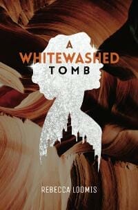
Rebecca Loomis submitted A Whitewashed Tomb designed by Rebecca Loomis.
Rowan Waters submitted Vileness designed by Marlin Riker.

JF: What works well here is the arrangement of the title and author’s name to frame the central figure, and the action she is about to take.
Sarah Page submitted Stealing the Dark Moon: Dragon’s Den Orphanage Volume 1 designed by Audrey Bagley. “I asked the designer to give both the moon and the sword a hint of draconic properties.”

JF: Not sure I believe that sword, and the title is awfully weak compared to the illustration.
Sarah-Jane Fraser submitted The Spanish Indecision designed by Sarah-Jane Fraser via Canva. “Cover designed on Canva.com in part using copyright image of Alliance Images. Many thanks.”

JF: Terrific job using the popular Canva tools, and especially identifying this image with the target-like hat. Would have liked to see the title separate a bit better from the background.
Sheli Kay submitted Great Railroad Series: Our First Locomotive designed by Daniela and Angie. “This delightful book has the look and feel of a classic. Author, Isaac ben Levi, just 16 years old, wanted the cover to please young readers while maintaining a realistic rendering of a locomotive. We believe the talented work of both Daniela and Angie accomplished that goal.”

JF: Glad you’re happy. Locomotives are incredibly dynamic and powerful machines, and I’m not sure you really captured that.
Steven Sullivan submitted My Lady Zane designed by Steven M. Sullivan. “Conceptual image based on two woman in two different era’s”

JF: Ineffective image compositing just confuses us, and the raw typography isn’t helping.
Stewart Hoffman submitted The Bug Boys vs. Professor Blake Blackhart designed by Stewart Hoffman.

JF: I really like the strong graphic look of this cover and the way the designer has included lots of detail around the frame without sacrificing the simplicity of the central image and title. ★
Tamian Wood submitted No More Goddesses designed by Tamian Wood. “A YA novel. The design needed to portray the protagonist finding an ancient Egyptian magical bracelet.”

JF: It does that, and your title treatment is pleasing.
Tatiana Vila submitted An Old Fart’s Tale designed by Tatiana Vila. “A Senior living in Hong Kong with lots of crazy experiences. This was fun to create :)”

JF: This cover made me smile, and I like the way the design lets us know some of the themes we will encounter, like the marijuana leaf reflected in the sunglasses.
Tatiana Vila submitted Just Call Me Bob designed by Vila Design. “A fun, fictional parody about Obama!”

JF: Not sure this makes sense in any way, and the rough title to be honest, made me cringe.
Tessa Griffin submitted Psychopaths and Enthusiasts designed by RizkyNugraha.

JF: Okay, but what’s it about? And how come no one is in the front seat? Leaves us wondering what you’re trying to communicate.
Tracey Ulshafer submitted The Accidental Yogini designed by Tracey L. Ulshafer. “The girl on the cover was co-created by myself and Dustin Mascione. I created the entire book cover myself – front and back.”

JF: A charming idea, but the whole cover looks tentative. Please put a border around your cover for use on the web, it will keep the white background from “bleeding” onto the page, as it does here.
W. E. Wertenberger submitted Serpent’s Pact designed by Shon Watkins.

JF: Lots of black. Lots and lots of it, a lone figure floating in the void. What’s it all about? I don’t know, do you?
Wendy Nikel submitted The Continuum designed by Sarena Ulibarri.

JF: A very cool cover for this time-travel fantasy.
Xela Indurkhya submitted These Lies That Live Between Us designed by Kelly Tinker. “I am the author; Kai Raine is my pseudonym. I told Kelly I had a vision of the two sisters, with the title between them. She incorporated this into her design beautifully, even including the elements of water and fire.”

JF: Unfortunately, the three elements are pretty disjointed with no way to understand the relationship between the two, and running the title between them just seems odd.
Nonfiction Covers
D. C. Morris submitted Confusion and Illusion designed by Michael Ebert.

JF: The distinctive title treatment alone makes this an interesting approach for poetry.
Dan Van Oss submitted Stone in a Sling designed by Dan Van Oss.
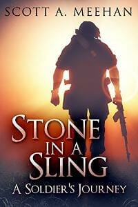
JF: A terrific cover for this memoir of life in the armed forces. It draws us into the story and the colors and weaponry let us know there is danger around. This is a really good use of a stock photo that the designer has retouched to great effect. ★
Ebook Launch submitted Gender designed by Ebook Launch.

JF: Makes its point in several ways.
Ebook Launch submitted The Book Blueprint: Expert Advice for Creating Industry-Standard Print Books designed by Ebook Launch.
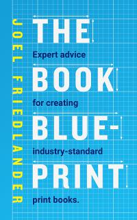
JF: Okay, I’m not going to give myself any stars, but I do think Dane and his crew at Ebook Launch did a great job on this new edition that collects all my writing about print book publishing. I talked in detail about the development of this cover here.
Ebook Launch submitted The Regular Dude’s Guide to Dating and Social Success designed by Ebook Launch.

JF: Clean, amusing, attractive, and appropriate.
Gary Wilhelm submitted Good Afternoon Vietnam: A Civilian in the Vietnam War designed by Pieter Els. “Thank you for considering this submission! Gary”

JF: Interesting idea, needs more contrast.
Kristin Butler submitted The Cats Be Unemployed designed by Noh A. “The cover represents recent un(der)employed graduates as cats.”

JF: I’m completely charmed by this spunky cat and the lovely illustration. Just wish the author’s name didn’t get lost. ★
Lila Holley submitted Behind The Rank Vol 1 designed by Purposely Created Publishing. “The concept of this cover design was to capture an image that depicted the love of country and dedication to service that military women have. We wanted to cover to say ‘it is the heart of the woman that allows her to selflessly serve her country.'”

JF: It’s flag-forward, and that seems to fit, although I find the strong light at the center disconcerting.
Lila Holley submitted Camouflaged Sisters: Revealing Struggles of the Black Woman’s Military Experience designed by Purposely Created Publishing. “The concept of the cover design was to represent military women in a beautiful light so that they no longer feel camouflaged. A lot of thought went into this including the font, font color and especially the image of the military displayed on the cover.”

JF: What a strong series design, taking cues from some fiction covers, to depict these real-life heroines in attractive covers. ★
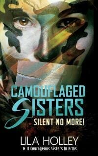
Lila Holley submitted Camouflaged Sisters: Silent No More! designed by Purposely Created Publishing. “The concept of this cover design was to have a strong image that depicted military women who felt their voice was not valued or their story did not matter.”
Patricia Earnest submitted The Face of a Monster: America’s Frankenstein designed by Patricia Earnest. “The Face of a Monster: America’s Frankenstein has been published both as printed and ebook copy with the same cover. Thank you.”

JF: Due to the style it feels a bit awkward, but you get the job done with the visual echo of the monster we know so well.
Well, that’s it for this month. I hope you found it interesting, and that you’ll share with other people interested in self-publishing.
Use the share buttons below to Tweet it, Share it on Facebook, Plus-1 it on Google+, Link to it!
Our next awards post will be on May 28, 2018. Deadline for submissions will be April 30, 2018. Don’t miss it! Here are all the links you’ll need:
- The original announcement post
- E-book Cover Design Awards web page
- Click here to submit your e-book cover (See New Submission limits)
- Follow @JFBookman on Twitter for news about the E-book Cover Design Awards
- Check out past e-Book Cover Design award winners on Pinterest
- Subscribe to The Book Designer Blog
- Badge design by Derek Murphy

