• Skip to primary navigation
  • Skip to main content
  • Skip to primary sidebar
  • Skip to footer
  • Self-Publishing
  • Author Blogging
  • Sitemap
  • Fonts/Typography

The Book Designer

Practical advice to help build better books

by selfpublishing.com

COACHING


PUBLISHING


WRITING


PRODUCTION


FREELANCE


WRITING JOBS

  • Home
  • About
  • Articles
  • Contact
  • Shop
You are here: Home / Cover Design / The Book Blueprint: A Cover Evolves

The Book Blueprint: A Cover Evolves

by Joel Friedlander on April 9, 2018 6 Comments

Table of Contents

  • An “Instant” Book?
  • A Book Transformed

For several years we’ve been giving away The Book Construction Blueprint, an amazingly helpful 37-page PDF with core information about how print books are put together.

It’s a great giveaway, and has been downloaded over 20,000 times.

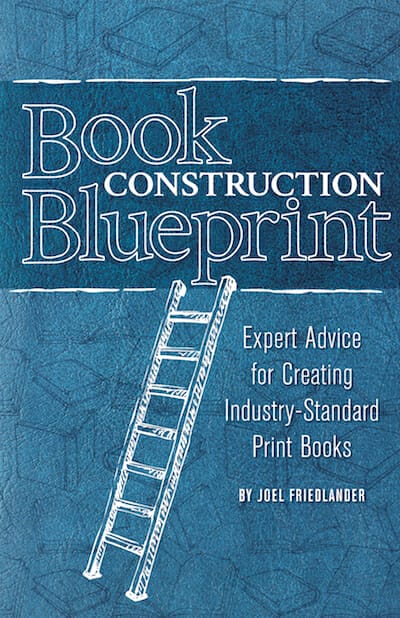
Here’s the cover, devised by our own Tracy Atkins to match the covers of other guides we offer with various digital book marketing products.

cover design

This is a clean and clear cover for a PDF. The style is more reminiscent of report covers than book covers, but it’s a style we’ve used for a couple of years to good effect.

Then, last year when I talked to BookBaby president Steven Spatz at the San Francisco Writers Conference, we came up with an idea that would allow me to collaborate with them on a book giveaway.

This gave me the opportunity to transform the free PDF into a real book, one that would be very useful for any indie author who wanted to produce print books.

An “Instant” Book?

I went back to my blog archives and gathered all the articles I’ve written over the years about creating print books. These articles included almost 100 illustrations, too.

When we edited the articles and swapped out the low-resolution images for print-resolution ones, we ended up with 224-page, 5-1/2″ x 8-1/2″ paperback.

I retained the title and, since the book was basically created for the giveaway, I decided to publish a print edition at a relatively low price ($9.95) to capture any people who prefer print books from the promotion, which ended up giving away almost 9,000 PDF copies.

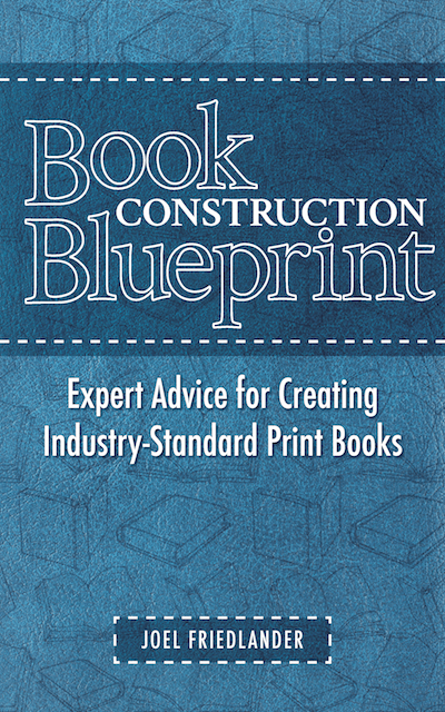
Since I knew that BookBaby has an excellent design department, I asked them to contribute a cover design. Here’s the first one they sent me:

cover design

I couldn’t quite figure out why the book had a ladder on the cover, although I suppose the designer was alluding to the “construction” part of the title. In any event, after talking to my staff, we decided the ladder had to go.

Here’s the final cover we published with:

cover design

A Book Transformed

The BookBaby promotion ended at the end of 2017, so it was time to move on.

After publishing the book I identified a number of areas that needed more information, and wrote another six articles to add fill out the content.

I now had a book that runs 252 pages and is even more useful for indie authors.

This time, I reached out to Dane Low and his team at Ebook Launch to tackle the cover design.

Dane has been submitting covers to our Ebook Cover Design Contest for years, and frequently winning awards, so I knew his studio had the range to address this straight nonfiction book.

Dane came back with several possibilities, but he also suggested a change to the title that made a lot of sense. It’s now called The Book Blueprint.

Here’s one of his early designs:

cover design

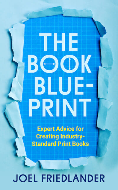
Although this cover is dramatic, I was more intrigued by the “blueprint” look in the background. That’s probably why, in the end, I chose a different concept for the cover:

cover design

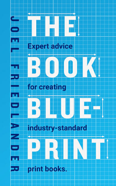
I liked the overall simplicity, the bold title, and the allusion to blueprints (and construction).

However, the cover lacked balance because it was a bit too monochrome, lacking that touch that sets off the other colors. I asked Dane to address this, and to add a banner notifying people it was actually a second edition (since it’s the same book under a different title).

I also asked him to find an accent color to enliven the design, and to remove the period at the end of the subtitle. Titles and subtitles don’t get periods, because they are not sentences, so that’s clearly an error.

Here’s the final version:

cover design

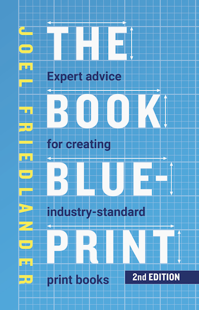
In the paperback full wrap cover, Dane also used the highlight yellow to produce a colorful spine. Just today I was reading in the New York Times about the paperback editions published by the New York Review of Books in their NYRB Classics imprint.

Katy Homans, designer for the series—all of which have colorful spines—said, “If people are interested because they have a red spine, that’s great.” And I agree. This contrasting color adds some excitement and much-needed contrast to the overall design, which now looks to me like it’s ready for prime time.

Here’s the full wrap cover:

cover design

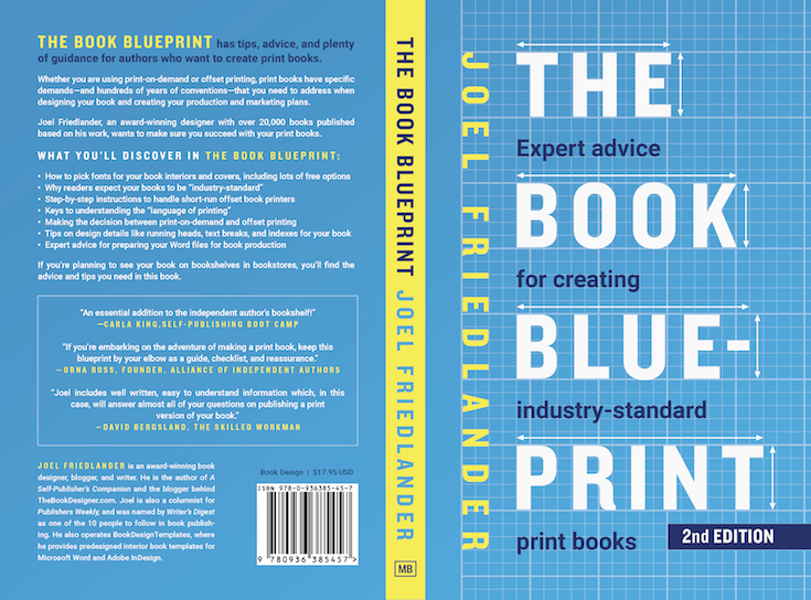
This cover clearly meets the design standard I hold all self-published books to: that they should be as good or better than books from traditional publishers.

I’ll be taking the Book Baby version down since The Book Blueprint will be out in the next couple of weeks. The cover has evolved along with the content of the book as well as and the changing markets to which it is being offered, as well as the context of its sale.

In the BookBaby promotion, the PDF cover was emailed to their list. For retail, the cover will be seen most often on retailers’ sites. Considering this context can make a big difference, don’t you think?

Do you have a cover that could “evolve” leading to better sales and a wider readership? Or to better align with your publishing goals? Look through your backlist and you may be surprised at what you find.

There are affiliate links in this article.

Filed Under: Cover Design Tagged With: BookBaby, Dane Low, Ebook Launch, Steven Spatz

journal marketing

Reader Interactions

Comments

  1. Dane says

    April 19, 2018 at 12:02 pm

    Thanks for sharing your experience, Joel! I enjoyed working with you on this project. Best of luck with the new cover :D

    Reply
  2. Phil Mayes says

    April 12, 2018 at 6:09 pm

    Sorry, Joel, I have to disagree. I have the greatest of respect for your taste in covers, and used several e-book Cover Design Awards pages to choose what I liked and what designers I liked for our last book. (We ended up using Damonza.)

    But I think you missed the best design here. Primarily, I don’t like the interleaving of title and sub-title. Secondly, the double-headed arrows are too many and too distracting. The two together make my brain stutter for a moment as it works out what the title is. I prefer Dane Low’s early design:
    * I like its 3D visual effect: I always find that effect appealing, and it gives the message of breaking through to a consciously-designed product.
    * The 3D image being paper gives it a strong connection to being about books.
    * The arrows are just enough to get the idea across.
    * I would make the Os oval not round because the circles are too jarring to our expectations of a font.
    * I’d add the 2nd EDITION to it.

    Sorry! I have enormous admiration for your work. You are one of only four book blogs in my RSS feed.

    Reply
    • Joel Friedlander says

      April 13, 2018 at 12:30 pm

      Phil,

      Thanks for your thoughtful comment. No worries on disagreeing, cover design isn’t a science, there’s a lot of subjectivity involved in evaluating different designs. What really matters in the end is what readers/buyers think. I liked both designs, so I have nothing bad to say about the “ripped paper” version, but I didn’t feel the torn open paper was really all that appropriate for what is mainly a “how-to” book.

      Reply
  3. Lexi Revellian says

    April 9, 2018 at 12:05 pm

    You must be pleased with the final result. I kept thinking, oh, that’s nice…ah, that’s even better, all the way through the post.

    Reply
    • Joel Friedlander says

      April 9, 2018 at 12:27 pm

      Lexi, yes, I am pleased with it. The cover works well as a paperback, and equally well as a thumbnail due to the strong typography. Now, we’ll see if buyers agree!

      Reply

Trackbacks

  1. Writing Links…4/16/18 – Where Genres Collide says:
    April 16, 2018 at 4:09 am

    […] https://www.thebookdesigner.com/2018/04/book-blueprint-cover-evolves/ “For several years we’ve been giving away The Book Construction Blueprint, an amazingly helpful 37-page PDF with core information about how print books are put together.” […]

    Reply

Leave a Reply Cancel reply

Your email address will not be published. Required fields are marked *

This site uses Akismet to reduce spam. Learn how your comment data is processed.

Primary Sidebar

Get the Advanced Publishing Kit

Topics

  • Audiobooks
  • Author Blogging 101
  • Book Construction Blueprint
  • Book Design
  • Book Printing
  • Book Production
  • Book Reviews
  • Cameras
  • Contributing Writers
  • Cover Design
  • E-Books & Readers
  • Editorial
  • Guest Posts
  • Interior Design
  • Interviews
  • Journey of a Book
  • Legal Issues
  • Marketing
  • Podcasts
  • Project Focus
  • Reports
  • Reviews
  • Samples
  • Self Publishing Basics
  • Self-Publishing
  • Social Media
  • Training
  • Video
  • Webinars
  • Writing
Self Publishing Platform
Self Publishing School

COACHING

Self Publishing

PUBLISHING

The Write Life

WRITING

The Book Designer

PRODUCTION

Make a Living Writing

FREELANCE

Freelance Writers Den

WRITING JOBS

Footer

  • Home
  • About
  • Articles
  • Contact
  • Shop
  • Self-Publishing
  • Author Blogging
  • Sitemap
  • Fonts/Typography
Terms of Service
Privacy Policy
Comment Policy
Guest Author Guidelines
Why?
"Writers change the world one reader at a time. But you can't change the world with a book that's still on your hard drive or in a box under your bed. This blog exists to help you get that book into people's hands."
—Joel Friedlander

Copyright Self Publishing School All Rights Reserved. © 2022