Welcome to the e-Book Cover Design Awards. This edition is for submissions during March, 2017.
This month we received:
97 covers in the Fiction category
12 covers in the Nonfiction category
Comments, Award Winners, and Gold Stars
I’ve added comments (JF: ) to many of the entries, but not all. Remember that the aim of these posts is educational, and by submitting you are inviting comments, commendations, and constructive criticism.
Thanks to everyone who participated. I hope you enjoy these as much as I did. Please leave a comment to let me know which are your favorites or, if you disagree, let me know why.
Although there is only winner in each category, other covers that were considered for the award or which stood out in some exemplary way, are indicated with a gold star: ★
Award winners and Gold-Starred covers also win the right to display our badges on their websites, so don’t forget to get your badge to get a little more attention for the work you’ve put into your book.
Also please note that we are now linking winning covers to their sales page on Amazon or Smashwords.
Now, without any further ado, here are the winners of this month’s e-Book Cover Design Awards.
e-Book Cover Design Award Winner for March 2017 in Fiction
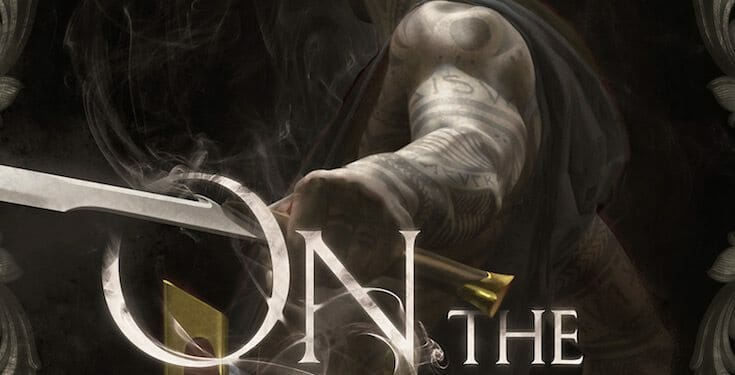
Timandra Whitecastle submitted On the Wheel designed by Tommy Arnold (artwork) & Bookflydesign (Title). “On the Wheel is the second book in the Living Blade series. Just like the cover of the first book ‘Touch of Iron’, this was designed the same way – the artwork was done by Tommy Arnold (www.tommyarnoldart.com) and the title design was created by James T Egan of Bookflydesign.”
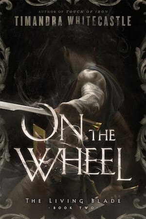

JF: A tour de force of artful action. The introduction of the title into the scene depicted only heightens the narrative weight carried by the drawn sword. Dim lighting serves to emphasize the bits that are highlighted. Well done.
e-Book Cover Design Award Winner for March 2017 in Nonfiction
Mark Reid submitted Basic Recipes That Are Actually Cheap designed by Mark at Author Packages. “The author wanted to convey that the recipes were very simple, and used ingredients that most people are likely to already have, as well as the fact that they don’t cost a great deal of money.”


JF: Playful and effective, with emphatic type and a clear message that it will deliver on the promise made in the title. A winner.
Fiction Covers
Alexandra Brandt submitted Magic for a Rainy Day designed by Alexandra Brandt. “Trying to indicate light contemporary fantasy, while hinting at the rainy theme.”

JF: Although it’s a bit “raw” it does have an attractive, light, touch.
Alexandra Brandt submitted Sidewynd designed by Alexandra Brandt. “Since it’s a portal fantasy and not too dark in tone, I wanted a lighter, fanciful font to balance out the dark-colored image. But I ran into trouble branding it with my second story, which needed a more modern font to show it was urban fantasy. I compromised with mostly urban + a touch of whimsy.”

JF: Atmospheric and effective. The ornamented title is a nice touch.
Alexandra Brandt submitted The Flat Above the Wynd designed by Alexandra Brandt. “The author (me) gave the designer (also me) an annoying dilemma when two stories in a series had wildly different title lengths (see Sidewynd). Instead of changing the story title, I tried to convey series branding and genre through font choices and color, rather than trying to match the artwork.”

JF: I think it works!
Alexandra Brandt submitted GROND: The Raven High designed by Alexandra Brandt. “The client wanted me to develop a custom typeface for his series branding, something that would be central element on all of his future covers. I created that element by hand in Illustrator. The overall look of the cover is meant to portray space-based sci-fi w/ cyberpunk, for a YA audience.”

JF: Terrific in addressing the target audience with a dramatic sci-fi look.
Amanda Valerie Judd submitted SOUR designed lindagraphicx.

JF: Easy to see why citrus would appeal, but this style of photography almost always says something food-related and I’m not sure that’s what you wanted to do.
Amy Hemingway submitted The Sleep designed by Amy Hemingway.
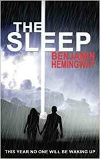
JF: An interesting design, sorry the author’s name was rendered indecipherable.
Amy Hunter submitted Unbound designed by Michael Powell. “The woman on the cover is unzipping her corset and losing her inhibitions. She is becoming Unbound.”

JF: The explosively voluptuous artwork is perfect for this anthology of erotica.
Anike Kirsten submitted Of Beasts and Men designed Anike Kirsten. “The cover is simplistic in order to strengthen the characterization of the story, as it contains aspects of identity conflicts. The cover is a portrait of the main character, Gliese Libra, through whose perspective the narrative is told.”

JF: Well done, although I wish the title had more contrast with the background.
Bella J submitted Blood & Lies designed Q Designs.

JF: Visually very confusion and, therefore, ineffective.
brandon bagley submitted Halley’s Promise designed by Brandon Bagley. “William Halley and his friend J.R. take their motorcycles on an adventurous road trip through the United States and Mexico after escaping death in the Vietnam War.”
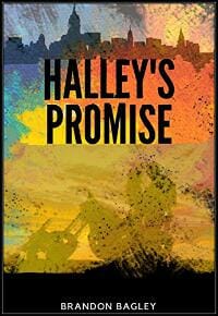
JF: It’s really not bad, despite the odd black band at the bottom.
Brent Jones submitted The Fifteenth of June designed by Victoria Cooper. “Thanks for your consideration!”

brett Davie submitted Love Trev and Jhivana designed brett Davie.

JF: Brett, I seriously recommend that you hire one of the wonderful cover designers whose work you see here; we link to their sites and many are ver reasonably-priced. Seriously.
C. J. Brightley submitted The Lord of Dreams designed by C. J. Brightley. “The Lord of Dreams is a fairytale adventure with allusions to Irish mythology and a thread of romance.”

JF: Okay.
C.A. Huggins submitted A Hard Reset designed by Bookfly Design.

JF: A hard-edged series design with high impact. Typography and imagery are integrated into a cohesive statement. ★
C.A. Huggins submitted Scattered Screams designed by Bookfly Design.

Carey Fessler submitted Foiled designed by Grant Slaney. “Title has three refs: noun-foil(key object), verb-prevent an outcome, noun-MC contrast. Girl holding key object. Kid’s wearing PJs. Constellation Scorpius plays a vital role. Girl’s shoes not hers. Starry sky connects to story. Font style ref to military/wreckage. Kids freeze in look of concern.”

JF: Strong illustration style, and the arrested look of the boy and girl pull us into the story.
CB Archer submitted Patchers of the Code designed CB Archer. “The final cover for my book trilogy comes with both centaurs and advice. Remember to check all characters in a font before you make it the main font for the covers of your series, or you might need to change the name of the last book to make it legible!”
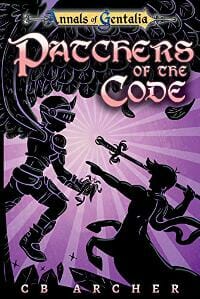
JF: Excellent advice. Not all fonts are created equal, especially display fonts. Love the strongly graphic illustration and the color palette of this cover.
Charlene Raddon submitted The Posse designed by Charlene Raddon.

JF: There’s not much here that says “romance” but anthologies are notoriously challenging for designers.
CL Brees submitted An Unsettled Past designed CL Brees.

JF: Murky.
Collin Earnest submitted The Woebringer Prophecies designed Jennifer Ekrut.

JF: Artful, with lovely typography, and a good solution for co-authors.
Cory Barclay submitted Devil in the Countryside designed by Michael Montemarano. “The cover artist is named Vaughn Mir, or WyldRaven on Deviant Art. I just wanted to make sure he got credit too.”

JF: Spooky and exciting, and a title with a stylish touch.
Cristiano Gentili submitted Then she was born designed by Damon Freeman.

JF: A graphically strong and idiosyncratic cover that alludes to the struggle described in the book.
Dan Van Oss submitted Deadly Dreams designed by Dan Van Oss at Covermint Design.

JF: Interesting visual representation of a dream reality, and the hot color helps make the cover stand out.
Dane Low submitted Dark Heart designed by EbookLaunch.com.

JF: A hot thriller cover with an air of menace.
Dane Low submitted The Book of Moon designed by Dane at CreativIndieCovers.com.

JF: Love how that big, luscious moon with the title over it really focuses this cover.
Dane Low submitted Kindred designed by EbookLaunch.com.

JF: A beautifully composed and executed cover for this fantasy/sci-fi epic.
Dane Low submitted Lucifer Eve and Adam: the absolutely true and completely honest story of Creation designed by Dane at CreativIndieCovers.com.

JF: Terrific textural richness, distinctive typography, and a good sense of humor make this cover for a satirical romance really stand out. ★
Dane Low submitted The Storm Traveller designed by EbookLaunch.com.

JF: Atmospheric and arresting.
Dane Low submitted Queen of the Nutters designed by EbookLaunch.com.
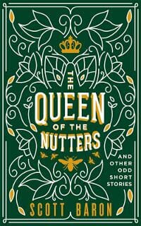
JF: Creative typography and a distinctive graphic design set this cover apart from the photo-with-type approach.
Dane Low submitted The Crown of Light designed by EbookLaunch.com.

JF: Another great example of distinctive typography and great atmospherics. The crown itself is ethereal, and the woman shows just enough to intrigue.
Daris Howard submitted The Last Gift designed by Daris Howard.

Darja DDD submitted Dark Harvest Magic designed by Milo from Deranged Doctor Design. “Mystery & Suspense, Fiction & Fantasy cover design, Ella Grey Series Book 2”

JF: A strong series design for these fantasy novels centers on the figure of a woman and her aura of mystery, and there’s some lovely magic worked on the title.
Darja DDD submitted Stone Cold Magic designed by Milo from Deranged Doctor Design. “Mystery & Suspense, Fiction & Fantasy cover design”

Darja DDD submitted The Piranha Solution designed by Milo from Deranged Doctor Design. “Science Fiction, Action book cover design, Ace of Space Book 1”

JF: Strong genre cover.
Darja DDD submitted A Death Not Foretold designed by Kitten from Deranged Doctor Design. “Mystery, Thriller book cover design”

JF: Lovely and engaging image, but the type is very compressed for easy reading.
Darja DDD submitted Scratching in the Dirt designed by Milo from Deranged Doctor Design. “Paranormal Suspense Fantasy cover design, Written by Birds Book 1”

JF: Another strong series design for these paranormal action books, using changing characters and color shifts to differentiate the individual titles.
Darja DDD submitted Taking to the Sky designed by Milo from Deranged Doctor Design. “Paranormal Suspense Fantasy cover design, Written by Birds Book 2”

Darja DDD submitted Pecking at the Bones designed by Milo from Deranged Doctor Design. “Paranormal Suspense Fantasy cover design, Written by Birds Book 3”

Deborah Coonts submitted Lucky Catch designed by Andy Brown.

JF: To me, a very strange color palette but it matches the rest of the titles in this popular series of mysteries.
Dennis Ganahl submitted Heroes & Hooligans Growing Up in the City of Saints designed Ryan Morris. “The concept is a collaboration between the author and designer. The drum majorette is a historical icon drive-in theatre (Airway Drive-In) sign from the area where the book takes place. One of the chapters is a drive-in story. The book is self-published”

JF: Despite the great neon cowgirl, this is obviously self-published.
Edwina Gustafson submitted Once Upon A Path designed Edwina Gustafson.

JF: An author-designed cover that makes good use of a stock image to achieve a delicate look.
EG Manetti submitted Fortuna: The Apprentice, Volume 4 designed by Jim O’Connor Photography. “Fortuna is the 4th in an SFR/Space opera series where the heroine undergoes a trial-by-ordeal to redeem her honor. The cover is designed to evoke the progress in her trial with it’s openness and storm her ongoing danger. The messenger bag is the symbol of her servitude.”

JF: A compelling image, but I’m afraid that all the type besides the title is unnecessarily distracting and hard to read.
J. Philip Horne submitted Guardian Angel designed by Justin Stewart. “Guardian Angel is the sequel to Joss the Seven, a middle grade fantasy/superhero series. I wanted a sense of story continuity between the two covers, while establishing a unique visual identity, and asserting a strong sense of motion and emotion. Justin nailed it again.”

JF: Well done, with lots of action as we wait to see what that bird in the distance implies.
James Egan submitted The Far Shore designed by James T. Egan of Bookfly Design.
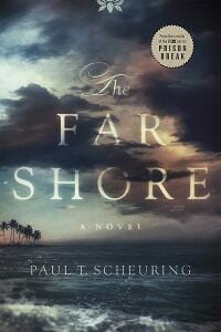
JF: This gorgeous cover combines an evocative image of a quiet landscape and turbulent sky with expert typography that, in effect, becomes part of the design for this literary novel. ★
James Egan submitted Edward Rochester designed by James T. Egan of Bookfly Design.

JF: An exquisite design for this historical novel in which the designer appears to have shifted the entire composition toward the top, truncating the portrait and revealing the mass of roses at the bottom. ★
James Egan submitted Palm Beach Deadly designed by James T. Egan of Bookfly Design.
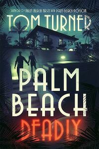
JF: This cover really sets the stage for the story, drawing us in, and uses a perfectly allusive font for the title.
Jenn Crowell submitted The Space Between designed by Damonza. “The designers at Damonza did another lovely job for me on this long-distance love story. As always, highly recommended!”

JF: The design emphasizes the “space” element while also focusing on the couple at the center.
Jennifer Ponce submitted The Bazaar designed Watch This!. “I recently won a 99 Designs cover design contest and was able to get my amazing new cover through one of their designers on the site.”

JF: Congratulations! You got a winner.
Jewel Allen submitted The Spanish Exile designed by Mikey Brooks.

JF: Looks a bit raw.
Jo Michaels submitted War and Pieces ~ Frayed Fairy Tales – Season1 designed Jo Michaels. “Shoes were hand drawn, photographed, and rendered onto the background. Title font was customized. These are fairy tale retellings that we intend to appeal to women who love princesses.”
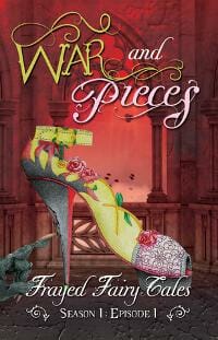
JF: Nice shoe, but the whole thing comes across as very busy, and the distorted type in the title adds to the distraction.
John Talisker submitted Gatc’hh’en’s Rite designed by Terry Belleville. “This is a cross-genre literary sc-fi novel. The cover was designed by Terry based on a US Air Force photograph of an upper atmospheric nuclear detonation as part of the US nuclear weapon testing program during the 1960’s. The photo is in the public domain.”

JF: Interesting image, but I’m afraid you’ve gone too minimal, the the point that you’re not giving much information to browsers who might be interested in your story.
Johnathan Clayborn submitted Starsong Chronicles: Exodus designed by Clayborn Press. “A sci-fi novel about the colonization of an alien planet. I wanted the cover to convey the alien environment in a style that had a retro feel to it.”

JF: The typeface supplies the “retro” look and the image does a good job of signaling the genre, but the effects used on the type reduce it’s impact.
JP Epperson submitted Angelic Anarchy designed by Phatpuppy Art. “Typography: The Font Diva”

JF: An attractive but stressed out heroine, some flames, and a stylish title, what’s not to like?
Kari Holloway submitted Cracked But Never Broken designed Amy Hunter.

JF: A good enough photo, but the rest of the cover looks very amateurish.
Kelly Evans submitted The Mortecarni designed Ashraf E. Shalaby. “The novel takes place during the black death and is the journal of a monk who existed at the time. I wanted the cover to look like that journal, as well as have the medieval and horror elements present. My designer did a fantastic job of translating these into the attached cover.”
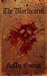
JF: A good concept and design, but the lack of contrast makes the cover rather monochromatic.
Kemdi Ik submitted Not So Fragile designed by Kemdi Ik. “The grey in the cover is supposed to convey the hard times that the main character, Valerie, went through in her past, and the little specks of purple are supposed to symbolise hope for a better tomorrow for Valerie.”

JF: Not so sure anyone will notice or “get” the little bits of purple, but my main problem with this cover is the choice of font and arrangement of the title. It doesn’t say “fragile” or much of anything, and the hyphenated word isn’t helping.
L Henry Smith submitted Life is Like a Parade designed by Deborah E. Gordon. “Deborah’s design truly captures the spirit of this “lighthearted” young adult romance. It’s obvious the hero and heroine yearn for each other but they just can’t seem to connect.”

JF: The tree shedding it’s “leaves” is attractive, but not sure why so many of the elements here are black.
Lara Falberg submitted Yoga Train designed by Allie Lehman, The Wonder Jam. “The image feels familiar, yet one has to really look at it, and let their minds explore to determine what they are seeing versus what they want the image to be. It works because yoga teacher training is exactly like that. The muted yet vibrant colors deliver the contrast that is yoga.”

JF: Sure, that would be great if this was hanging in an art gallery, but in the hyper-competitive space for books, will anyone really put in the time to figure out what’s going on here? I still can’t make it out, and there’s nothing else on the cover to help.
Lynn Fowler submitted Next Year In Huntsville designed Lynn Fowler. “Next Year In Huntsville is my first novel, published under a pen name to distinguish it from my non-fiction writing. After two designers failed miserably to grasp my concept for the cover, I gave up in disgust and did it myself.”

JF: That’s too bad, because you ended up with something that looks like a concept sketch for a cover, not a book cover itself.
Mariah Sinclair submitted Flames of the Citadel designed by Mariah Sinclair. “From the author upon seeing the first draft, “I wouldn’t change a thing to be honest; the symbol is exactly what I had in mind as I wrote the book. Like… this is so awesome I might get it as a tattoo!” My all-time favorite author feedback.”

JF: But that symbol would make a pretty awesome tattoo.
Mariah Sinclair submitted What It Is designed by Mariah Sinclair. “Make a morgue look light and fun for a Chick Lit book” was the author’s direction. Not an easy task.”

JF: But you did it. I wonder about the not very informative title, while the subtitle is terrific.
Mariah Sinclair submitted Dinner with Lisa designed by Mariah Sinclair. “Initially the author wanted a film noir poster look. While I love the aesthetic of film noir, it was a bad fit because the story isn’t a mystery, and it occurs during the Great Depression, ten years before the “film noir” era. We agreed this cover is a better fit for historical literary fiction.”

JF: Right on the money, with lots of interest from the visual and lovely typography in the title “plaque.”
Marisa Shor submitted After The Fall designed by Marisa Shor of Cover Me Darling.

JF: The image is quite murky and hard to make out at this size, although the repeated title was interesting.
Marisa Shor submitted Imposter designed by Marisa Shor of Cover Me Darling.

JF: Solid typography and the texture in the image makes a great background, but the small piece of a swing(?) is more confusing than clarifying.
Mark Polino submitted Woodbooger designed Anne Claire Williams. “Woodbooger is a Virginia regional name for bigfoot. I wanted a cover that could convey that and a little spookiness without being too dark.”

JF: Looks like a leading candidate for “title of the month” but the strong graphic looks more like a logo for an outdoor brand, not typical for book covers.
Mary Roe submitted How Batly the bat became an Air Traffic Controller designed Adriana Tessa – my sister. “children’s book – age 8+”

JF: Talented family. Lovely composition, wish the bats at the bottom and the distressed type showed better against the background, but I’m quibbling, it’s actually rather charming. Since the bats are sleeping, maybe it’s really day time? That would brighten it up.
Michael Dirk Thalmann submitted The 13 Lives of a Television Repairman designed by Tickety Boo Covers. “The Protagonist creates an alternate reality generator using technology available in the 1950s. He has one in his fallout shelter where he lives after the world is ended in nuclear holocaust”

JF: Too many small details distract from the overall message, and the title type is overworked.
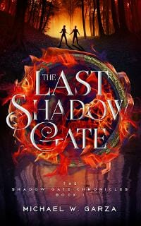
Michael Garza submitted The Last Shadow Gate designed by Ana Grigoriu. “Thank you”
Michael Robinson submitted Dark Grimoires designed Michael Robinson.
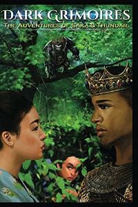
JF: Victim of the dreaded “pasted-on” look.
Miselle Goffman submitted I Absolutely Love My Curly Hair designed June Ares. “This is a children’s book and since the illustration is already busy and colorful, I wanted a design that was simple and classic.”

JF: Cute illustration and good layout, wish the title was stronger or larger or both.
Nate Allen submitted Death is Not the End, Daddy designed self designed. “My aim was to capture the feeling you get when looking at a Frank Peretti/Ted Dekker novel. I wanted there to be both light and dark, both hope and fear. Though it took a while to convey a double narrative tone, I think this cover acts as its own visual synopsis.”

JF: I don’t think Frank Peretti or Ted Dekker use covers with scrawled type and weak photos though, do they?
Paramita Bhattacharjee submitted The Debt designed by Creative Paramita.

JF: Energetic and story-based, I think it works.
Paramita Bhattacharjee submitted To Watch You Bleed designed by Creative Paramita.

JF: At this point, you probably don’t need anything besides this type of mask to say “horror” so the challenge is to not overdo it. Although I like the addition of the figure at the bottom, it creates a problematic relationship with the mask.
Paramita Bhattacharjee submitted Living in the Shallows designed by Creative Paramita.

JF: Would have been better if the title wasn’t hard to read.
Patrice Williams Marks submitted Montgomery Vale: Scorched designed Patrice Williams Marks. “Book 1. This is the 4th version of the book cover. I believe I finally got it right.”

JF: Nice series design. Not sure you needed the flames on “Scorched” since there’s nothing parallel to it on the other cover. I’d watch out that you don’t add too many images: Less is more.
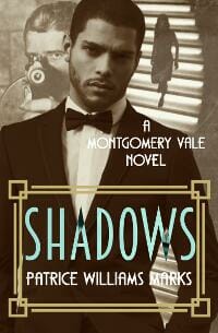
Patrice Williams Marks submitted Montgomery Vale: Shadows designed Patrice Williams Marks. “Book 2.”
Philip Ventrella submitted Max Powers and Project Gemini designed by Damonza. “Damonza did a great job of incorporating the high tech amusement park and mystery aspects of the book. They did a good job of representing the Crystal Tower, which is a very important part of the book, plus a little Easter egg that’ll carry through all the covers.”

JF: Looks like it has everything you need.
Pippa DaCosta submitted Chaos Unleashed designed by Ravven.

JF: Stylish and atmospheric, with an equally stylish title.
Randall Fitzgerald submitted No One’s Chosen designed by Randall Fitzgerald, Anna Dittmann (illustration). “Book one of four. Each cover features one of the four point-of-view characters.”

JF: Well put together. I like the way the title, although very visible, has been muted a bit to allow the engaging woman to be the principle focus.
Renee Topper submitted PIGMENT: The Limbs of the Mukuyu Tree designed Iram Shahzadi. “Note the shape of Africa in the pupils. The colorless skin of the face on this cover reflects the albino skin of the lead character in the novel. The Mukuyu Tree is a major theme in the book, a character even, and is represented as the fill of the main title font.”

JF: A well thought out and artistic cover. Needs a border to keep it from “bleeding” onto white web pages, as it does here.
Sharnai James-McGovern submitted The Devil’s Prayer designed by Sharnai James-McGovern. “The image on this cover relates to the content of the book, which focused on the Semana Santa in Italy. The novel itself is a horror/historic novel.”

JF: Rather murky and monochromatic.
Sheila Martin submitted The Coney Island Book of the Dead, An Illustrated Novel designed Sheila Martin.

JF: Interesting idea, needs a better title treatment.
Shewanda Pugh submitted Wrecked (Love Edy Book Three) designed by Regina Wamba.

JF: The evocative woman is the main draw of this attractive cover, but the careful type handling also contributes to the effect. ★
Stacey Coverstone submitted Journey of the Heart designed by Sheri L. McGathy. “This cover fits the book perfectly, as it’s a collection of historical western romance stories with the theme of Old West transportation. The book includes stories about trains, stagecoaches, wagons, and even a bicycle, which the full spread for the print version shows.”

JF: Well, it says “cowboys” and “romance” and successfully works in all those author names, and that’s not easy. But the visuals and the type need more sophistication for this cover to really shine.
Stacey Coverstone submitted Secrets of Wolf Island designed by Sheri L. McGathy. “With colors that complement and pop, this cover expertly sets the atmosphere for the suspense story that readers will find inside.”

JF: Another potentially interesting visual held back by the unfinished nature of the art and the very awkward typograpy.
Stef Rzysko submitted The Rhino that I Know designed by Stef Rzysko. “I wanted my ‘animal stories’ series of books to stand out from other picture books but at the same time link by design to each other, as a good series of books should. I have therefore gone for a white minimalist design incorporating a watercolour image of the main characters.”
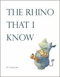
JF: I think you achieved your goal, the cover does stand out but it would be wonderful to see your delightful rhino a little closer.
Stephanie Barganier submitted Perspective designed Mason Boviall. “Thanks”

Stephanie Prichard submitted FORGOTTEN : A NOVEL designed by Ken Raney. “I wanted a cover design that depicted the MC’s struggle with memory loss. Ken selected the location of the story and made it into a jigsaw puzzle with missing pieces. The book is the second in a suspense series.”

JF: The missing puzzle pieces attract our attention, which is then artfully drawn into the cityscape. Nice job.
Sue Dowsett submitted Rescued designed by Scarlett Rugers Design. “explained to Scarlett one scene in the book and she nailed it. i love the cover.”
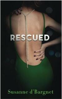
JF: Not sure I understand the font selection, but there’s no denying the attractiveness of this cover, which brings the “back turned to us” meme to a new height. Now, rather than drawing us into the story, the back is the story.
Tammy Seidick submitted Diamond (The Jewels of Texas Series) designed by Tammy Seidick. “Thanks for your review!”

JF: This is a strong cover, but the various “gee-gaws” on it don’t add anything, they subtract from its appeal.
Todd Shuler submitted Dew on Ginkgo Leaves: The Tigress and The General designed Bao Nhi. “Bao designed this breathtaking cover using minimalistic elements to visually captured both the heart and soul of my novel. It is both aesthetically pleasing and stunningly beautiful.”

JF: The illustration work is wonderful and the cover was carefully done, but the type arrangement creates a lot of tension on the cover, exemplified by the completely unnecessary orange circle and the opposition of the two typographic elements.
Tom Tinney submitted Blood of Invidia designed by John Gallagher. “The cover scene is a representation of the prologue, introducing the pre-history elements of the novel (10,000 years ago on a distant planet) before it migrates to modern day Earth. John was able to take my very rough concept layout and create this cover that captures the focus scene”

JF: The image is pretty spooky, but the type scares me even more.
Valerie Brooks submitted Revenge in Paris: first in the Noir Travel Story Series designed by Anna Grigoriu-Voicu. “I sent Anna a mock-up of the cover after studying thousands in series of noir/suspense/mystery. I wanted something that could replicate and brand with a change of photo and color. We came up with a font for my name I could replicate for other promo. I take the cover photos.”

JF: Sleek. I’m not sure you needed both images.
Valerie Thomas submitted Ashes to Ashes designed Valerie Thomas.

JF: The eye is an interesting design idea, but the title needs to be much stronger for this to work.
Warren Adler submitted Heart of Gold designed Alexia Garaventa.

JF: Terrific design that makes the most of the tension in the characters, and promises an entertaining read. ★
Xenia Taler submitted The Amazing Animal Cavalvade designed by Xenia Taler. “An old-style, hand-drawn approach to a children’s book cover.”

JF: Cute.
Nonfiction Covers
Dane Low submitted Limp: A Funny Memoir designed by EbookLaunch.com.
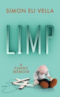
JF: A pretty funny cover, and there’s nothing limp about that title, it’s standing strong, unlike that poor marionette. ★
Lori DiGuardi submitted Anger 101: The Healthy Approach to Being a Bitch designed by Luludotcom. “The book supports women becoming their own superheroes.”

JF: It works.
Lynn Michelsohn submitted Slow Travel–Retired and Loving It! A New “How to” Guide for Retirees Visiting Europe designed Lisa Burroughs. “Thank you for providing this informative and educational program. We look forward to your comments helping us improve this and future covers.”

JF: It would be good for a travel book to show something of the travels.
Mark Polino submitted NetSuite Security and Audit Field Guide designed by Phoenix3 Marketing. “This the first in a series of accounting technology books and for the cover we wanted a modern nod to classic military field manuals.”

JF: Good combination of a “corporate” type layout and an allusion to the military.
Michael Molyneux submitted Letters From A Young Poet designed by Christine Cote. “With thanks, Michael”

JF: This is typical for the very self-effacing kinds of covers poets prefer, but that doesn’t mean you can’t have great typography, so an upgrade is in order.
Niranjanan Prajith submitted The Worlds Unknown designed Niranjanan Prajith. “This book explains the past, present and future of humanity’s interplanetary exploration and revolves around the topics of astronomy, astrobiology and planetary sciences.”

JF: It is dramatic.
Paula Johnson submitted The 7 Keys to Change: A New Approach to Managing Change to Live Better and Work Smarter designed by Paula L. Johnson. “This book is about navigating change. The author spent several years conducting surveys on how people deal with change. One conclusion is that change in the workplace can be problematic because very few people are taught the tools for making lasting change in their personal lives.”

JF: The traffic sign was a clever way to embody the concept of the book, but the red panels may be distracting us, taking away from its impact. This cover desperately needs a border around it so we can understand the layout.
Ray Charbonneau submitted A Perfect Yesterday designed by Ray Charbonneau. “A memoir of an interracial high-school relationship gone bad, with a reconciliation years later. More romantic than gritty, so the racial aspect is shown, but secondary to the signifiers of the genre (sepia tones, ornate font, couple walking on the beach, faint images of younger selves).”

Ray Charbonneau submitted The Dirtbag Handbook: Cheap Nomadic Travel in North America designed by Ray Charbonneau. “Simple cover, simple font for book on simple, minimalist living and travel.”

JF: I like the “peek-a-boo” quality of the photo, like we’re getting a glimpse into the story, and the catchy title and simple typography too.
Richard White submitted What Happened To Me designed by Richard White. “My new eBook What Happened To Me Cover, shows a compelling and intriguing image, that draws you to the book, and in just one simple image shows the darkness that I fight with everyday.”

JF: This is a very strong cover due to the foreboding image and implication of the title. Considering that, I’m not sure I would have used a light blue for that bottom band, and please take that seal off when submitting to a contest like this, it really distracts from the cover. ★
Stephanie O’Leary submitted Parenting in the Real World designed Erika Ruggiero. “I wanted to include reference to kids of different age ranges and also try to present an image that parents could relate to in terms of feeling overwhelmed. There was initially a different “mom” pictured, but I opted to change to the current version to suggest the “juggling” act that parents do.”

JF: It makes the point.
Tim McConnehey submitted The Naked Communist: Exposing Communism and Restoring Freedom designed Jon Bush/Izzard Ink Design. “This was an old classic the author family wanted remade. We wanted the cover to appeal to the younger audience. The book is about the history of communism.”

JF: Although it looks like the cover was designed for a print original, the strong graphic design and careful typography make it stand out even at this size, where the rest of the type might as well not even be there. ★
Well, that’s it for this month. I hope you found it interesting, and that you’ll share with other people interested in self-publishing.
Use the share buttons below to Tweet it, Share it on Facebook, Plus-1 it on Google+, Link to it!
Our next awards post will be on May 22, 2017. Deadline for submissions will be April 30, 2017. Don’t miss it! Here are all the links you’ll need:
- The original announcement post
- E-book Cover Design Awards web page
- Click here to submit your e-book cover
- Follow @JFBookman on Twitter for news about the E-book Cover Design Awards
- Check out past e-Book Cover Design award winners on Pinterest
- Subscribe to The Book Designer Blog
- Badge design by Derek Murphy


