Welcome to the e-Book Cover Design Awards. This edition is for submissions during March, 2013.
This month we received:
96 covers in the Fiction category
16 covers in the Nonfiction category
Comments, Award Winners, and Gold Stars
I’ve added comments (JF: ) to many of the entries, but not all. Remember that the aim of these posts is educational, and by submitting you are inviting comments, commendations, and constructive criticism.
Thanks to everyone who participated. I hope you enjoy these as much as I did. Please leave a comment to let me know which are your favorites or, if you disagree, let me know why.
Although there is only winner in each category, other covers that were considered for the award or which stood out in some exemplary way, are indicated with a gold star: ★
Award winners and Gold-Starred covers also win the right to display our badges on their websites, so don’t forget to get your badge to get a little more attention for the work you’ve put into your book.
Also please note that we are now linking winning covers to their sales page on Amazon or Smashwords.
Now, without any further ado, here are the winners of this month’s e-Book Cover Design Awards.
e-Book Cover Design Award Winner for March 2013 in Fiction
Rachael Preston submitted The Fishers of Paradise designed by Mark Timmings. “Mark Timmings is an award-winning Canadian designer of art gallery/museum catalogues and art books. He chose the archival photograph of a man demolishing the boathouses from a collection I showed him. I asked for a background colour that would make the very masculine image more appealing to female readers. Mark did everything else.”
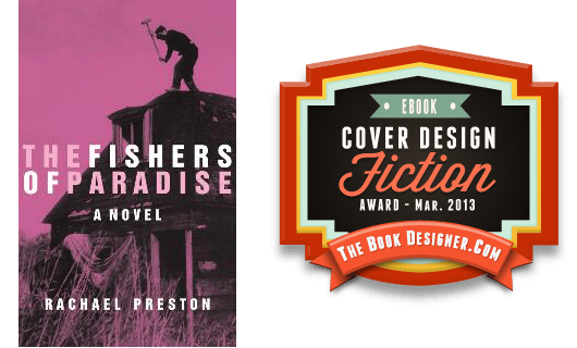
JF: Beautiful, evocative, balanced, and with a great use of color. When a cover is this well balanced, you can’t imagine moving or changing anything that would upset it. Makes you want to read the book, about the best thing a cover can do for you.
e-Book Cover Design Award Winner for March 2013 in Nonfiction
Kit Foster submitted Red Steel designed by Kit Foster.
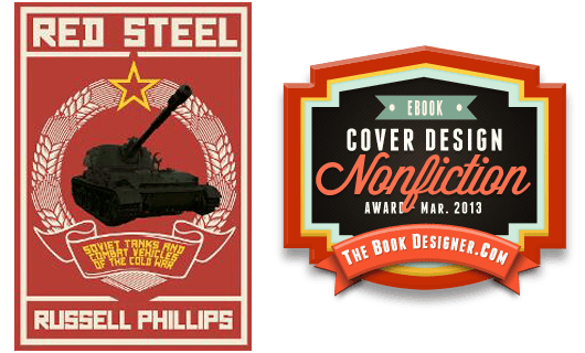
JF: Just a great cover from Kit Foster, perfectly suited to its subject matter. It could be taken up a notch with some careful adjustment to the photo to rescue it from its rather smudgy tonal range. Overall, beautifully matched to its purpose, and a great title to work with.
Fiction Covers
A.B. Whelan submitted Fields of Elysium designed by A.B.Whelan. “Fields of Elysium is the first book of a YA sci-fi/fantasy romance series.

JF: Strange type choice, and the line spacing of the title looks incorrect.
Albrecht Behmel submitted Doktor Faust und Mephisto, oder: Die Teufelsreise designed by Christoph Tänzer, Karsten Sturm. “This novel is about Doctor Faustus who sold his soul to the devil for happiness and power… in this adaptation however, the devil, dodgy extravagant Mephisto, screws up – and the deal goes hilariously wrong. The cover by Christoph Tänzer (lay out by Karsten Sturm) reflects the style of the narration and Mephisto’s attitude perfectly: a vain, playful, flashy, conceited and therefore rather human devil…”

JF: An artful design that will not reduce well to thumbnail sizes.
Allison Moon submitted Hungry Ghost (Tales of the Pack, Book 2) designed by Julianna Parr. “After winning for Book 1 of the series, Lunatic Fringe, I had the same designer work on the sequel. I love her use of hand-painting techniques to create a one-of-a-kind look.”
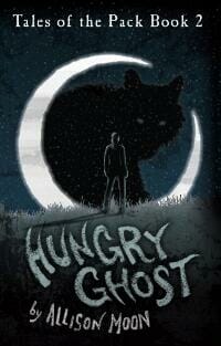
JF: It works, but it’s a bit monochromatic for my taste. I like the continuity of using the same artist, though.
Amanda DeWees submitted Among the Shadows designed by Bookish Brunette, from art by PhatpuppyArt.com (Claudia McKinney). “This is book three in my series of YA supernatural romances. I needed the repeated elements (like the treatment of my name and the “chronicles” line) to be consistent with the previous books. Choosing the image was challenging, since the plot is about alternate realities. I felt that the relatively abstract background and the general sense of turmoil in this image worked well, but it’s still gentle enough to suggest romance.”

JF: An effective cover despite over-ornamented title type.
Angel Lepire submitted Trading Poisons designed by Angel Lepire. “Original photo taken by Carl-Fredrik Runqvist.”

JF: No idea what the crackle texture is doing on this cover. Often you’ll see gratuitous effects like this because the cover just doesn’t seem like “enough,” but simply throwing effects onto either the art or the type on your cover rarely solves more visual problems than it creates.
Barry Nugent submitted Fallen Heroes designed by junbobkim.

JF: Incomprehensible. What genre is this book?
Ben Chaney submitted Son of Sedonia designed by Ben Chaney. “Before deciding to write and publish my own science/speculative fiction novel, I worked as a concept artist and digital illustrator in the video game industry for 5 years. The cover for Son of Sedonia is a mixture of digital painting and photo-texture manipulation. “Son of Sedonia” represents for me the fulfillment of a dream, my chance to say something worthwhile in the world, and the absolute peak (thus far) of my abilities as a writer and artist. The very best I could do. Knowing what that feels like has been its own reward!”

JF: Beautiful piece of artwork well suited to its genre, but the title needs more contrast with the background to really shine, and the author’s name has been reduced to the point of irrelevance.
Beth Carpenter submitted Shades of Sedona designed by Beth Carpenter. “A romance novel”

JF: There are no indications that this is in the romance genre, and that big rock that looks like it’s sticking the poor girl in the eye is uncomfortable. Needs a re-do.
Bil and Bon Franks submitted Hidden by the Rose designed by Marion Sipe. “”A thorn is a weapon, hidden by the rose.””

JF: Compared to the very similar elements in Shades of Sedona immediately above, this cover succeeds much better in signaling the kind of book it is. However, the type treatment is weak and a lack of contrast makes it hard to read.
Bil and Bon Franks submitted Running Over Rainbows designed by Marion Sipe.

Bill Peschel submitted The Complete, Annotated Whose Body? designed by Bill Peschel. “The mystery centers around a body in the bathtub wearing nothing but a pince-nez, so why not use the most famous historical equivalent?”

JF: Then why not show the bathtub? The type alone on this cover would scream “self-published” and that’s not the result you want. Besides, I don’t believe Marat wore pince-nez.
Bronagh Jervis submitted Cigarette designed by Bronagh Jervis. “Cover for Jason Purdy’s first crime fiction novel, Cigarette.”

JF: Okay, stained acoustical tile. Am I at the dentist? Just don’t get it.
C. R. Everett submitted Love, Carry My Bags designed by C.R. Everett.

Carol Fragale Brill submitted Peace by Piece designed by Createspace. “I asked the designer for cover that conveyed, women’s lit, love story, and the beach as an important theme.”

JF: I bet the book is much more interesting that this cover, which communicates virtually nothing except the heart in the sand. What are we supposed to take away here?
Caroline Doherty de Novoa submitted Dancing with Statues designed by Scarlett Rugers.

JF: But what does it mean? I have no idea.
Charles Ray submitted Deadly Paradise designed by Charles Ray. “Cover for my most recent mystery novel. Artwork combined with format from CreateSpace’s cover design utility program. The Yin-Yang symbol, combined with bullet holes to symbolize the theme of the story, which is set in the Chinese community in Hawaii.”

JF: My recommendation, if you are not a professional cover designer, is to avoid vertical titles. They only subtract from the impact and message of most book covers, and take some skill to pull off well. Despite a workable concept, the title treatment combined with a lackluster palette and a crude drawing, I don’t think this succeeds very well.
Charles Ray submitted The White Dragons designed by Charles Ray. “The cover painting is acrylic, using CreateSpace’s cover design utility for the text. Painting by Charles Ray.”

JF: An example for all of us how not to combine text with images, since the only really interesting part of this drawing is obscured by the title. Also, you can eliminate the word “by” in the subtitle, it’s understood.
Christine Leov-Lealand submitted The Secret Empire designed by Nils Dannemann. “Nils Dannemann of www.fireflycovers.com is a gifted designer whom I discovered while he was touring NZ. He has created a series of covers for the series of Steam Punk adventure romances we are writing. This is the first and he incorporated a photograph of Michael Burton as the hero Klaus with a mix of fantasy backgrounds. My fave part is the heroine Helena standing with her back to us, poised on a high building – her life in danger, blown by the winds of fate… will she survive Atlantis?”

JF: A well-composed cover with an interesting type treatment, but authors need to realize that although they may know the story, we don’t, and trying to include specific story elements on the cover can end up in incomprehension.
Damon Za submitted A Dirty Shame designed by Ranilo from Damonza.com.

JF: Usually covers from the designers at Damonza’s studio are coherent and focused, but there are simply too many elements to make sense of and a typeface switch in the title that appears to serve no purpose whatsoever.
Damon Za submitted Dirty Little Secrets designed by Ranilo from Damonza.com.

Damon Za submitted Everville: The First Pillar designed by Damonza.

JF: Nicely balanced fantasy cover with a rather quiet title treatment.
Damon Za submitted Providence designed by Damonza.

JF: One of Damonza’s greatest strengths is focus—almost effortlessly drawing the reader to the point of the cover’s maximum impact, and this is a fantastic example. Spooky and intriguing all at once.
Damon Za submitted Some Are Sicker Than Others designed by Kate from Damonza.com.

JF: A very strong composition with confident type handling. The muted palette is atmospheric, but little things can have big effects in the content-rich confines of a book cover, and here I wonder how different this would look if the author’s name was placed differently. In this treatment it has created a virtual line, making the top of the cover almost irrelevant. And although I was drawn to this right away, I have to admit there is very little to tell us what kind of book this is. Adventure? Romance? Nonfiction?
Damon Za submitted We All Bleed Neon designed by Kate from Damonza.

JF: Kids, don’t try this at home, because you need the confidence of a type pro to pull off a title like this one. I just wish the background image wasn’t quite so busy.
Dan Pitts submitted Dark Star designed by dan pitts.

JF: If the book is as good as its blurb, it deserves a cover that actually makes sense, and this isn’t it.
Dane Low submitted Dismal key designed by Miguel at Ebook Launch.

JF: A strong ebook cover that’s appropriately creepy/scary. Nicely done.
Dario Ciriello submitted Sutherland’s Rules designed by Aurelia Shaw (artist) / Janice Hardy (layout). “Since founding Panverse Publishing (https://panversepublishing.com) in 2009, I’ve taken pride in the quality of our cover artwork. For the first two Panverse anthologies, as well as the “Eight Against Reality” anthology, I found existing artwork and negotiated direct with the artists for licence to use. Both the “Panverse Three” cover artwork, as well as that for my own novel, “Sutherland’s Rules,” were created by Aurelia Shaw with some Art Direction from myself. Janice Hardy did all the graphic for our covers.”

JF: A bit of a train wreck caused, once again, by an author trying to squeeze lots of plot points and characters onto a cover when a single, representative image would work much better. And why, pray tell, is one word, “Rules,” set at an angle?
David Anderson submitted Charlie Sparrow and the Secret of Flight designed by David Anderson.

JF: Primitive illustration can be charming if done well, or it can be simply primitive, and that won’t help. If you really love the idea of this image, consider hiring an artist to draw it for you.
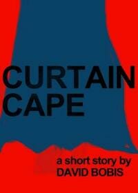
David Bobis submitted Curtain Cape designed by David Bobis. “This is the cover I designed for the award winning short story, Curtain Cape.”
Donald McGill submitted Deadly Vision designed by Donald J. McGill. “I wanted to have a cover that would echo one from an old pulp magizine.”

JF: It does have a “pulp” look, but the color scheme is working against you if you’re going for a mysterious or frightening or suspenseful tone. These colors tend to be restful, which is working against the other elements of the cover.
Douglas Ocean submitted The Travel Club Series #1: The Invitation designed by e-bookcoverdesign.com. “”The Travel Club Series #1: The Invitation” is the first of several books in the “Travel Club Series”. Each of the subsequent designs will use the same overall layout. However, the color scheme for each installment will be different. I wanted a design that would be recognizable as a series, and I think this will work well as I complete more of the books. The title and installment number are clearly visible on the cover and will make it easy for readers to identify.”

JF: You might want to re-think this concept before you do all the covers for the series. Why? At first (and second) glance, this looks a whole lot more like nonfiction. And it’s very bland, like it could be the cover for a book about aircraft maintenance. Where’s the drama?
Emily Thompson submitted Clockwork Twist : Waking designed by Emily Thompson. “This steampunk novel follows a clock maker, named Twist, on his first grand adventure around the world in 1878. An introverted and troubled soul, Twist’s closest companion is his pocket watch. I wanted to focus the entire cover design on what is most important and beautiful to Twist, while still beckoning readers in with the deep colors and interesting details. Also, since this is steampunk, I felt I needed to clearly show the time period of the story in the antique design of my clock face.”

JF: There’s so much to like about this design, from the subtle coloration to the beautiful “steampunk-y” details of the clock face and hands. The only part that needs work is the title and series type which could be stronger.
Felipe Adan Lerma submitted Slumming in Paris, Part One designed by Felipe Adan Lerma.

JF: Pretty, with very little impact or implication of what kind of book this is.
Henry Mosquera submitted Sleeper’s Run designed by Henry Mosquera.

JF: This comment is not directed at Henry alone, but here are 2 tips for everyone: 1. Please don’t submit a cover with award stickers all over it, we aren’t judging stickers and they obscure your message. 2. If your book cover has a white background, please put a rule around it so it doesn’t appear to bleed onto the page as this one does.
Inger Iversen submitted Immortal Heart designed by Ana Fagarazzi/Eden Crane. “Ana Fagarazzi: Cover Image, Eden Crane: Typography”

JF: A well-composed cover with an excellent illustration, but the treatment of the author/title block is wildly inconsistent and a bit over the top. Also, I didn’t know that angel’s hearts are on the right side of their chest.
J.P. Murray submitted Archie and the Normandy Assignment designed by Richa Kinra.

JF: A cute illustration crying out for decent typography.
J.P. Murray submitted Archie and the Treasure Map designed by Richa Kinra.

Jaima Fixsen submitted Fairchild designed by Justin Sirois. “Cover photo by Raisa Kanareva, Design by Justin Sirois”

JF: Yep, here’s a designer who really “gets it” when it comes to ebook covers. An evocative illustration, some beautiful but subtle texture, and a strong title combine to make a cover that really communicates at any size. ★
James Lewis submitted Black Sam: Prince of Pirates designed by James Lewis. “This is the third eBook cover I have designed. The second one submitted to this site. Thank you for the time you guy’s spend looking and judging these.”

JF: A good cover that could be improved by getting rid of the bold san serif font used for the author’s name, and which is completely out of character for this book and its genre.
Jane Ayres submitted Beware of the Horse designed by Klaus Hartleben. “I wanted simplicity and directness, with a hint of menace, and love what the designer came up with. Since the book went to the no 9 slot in the top 100 kindle free bestsellers in its category within 24 hours of launch in the UK and no 22 in the USA (it was free for 2 days only), before any promotion (I only told my partner!) and it continues to sell well, I think the cover design has to be a key factor in this.”

JF: I can see why. The designer understands how to use contrast to make the type pop, and focus to lead us to the enigmatic horse, and the whole effect really draws the viewer in. Well done. ★
Jaymie Simmon submitted The God Gene designed by Jessica Bullock. “In keeping with the theme of the story, the conflict between science and faith, Jessica Bullock created a cover that celebrates both the beauty of DNA and the wonder and mystery of God.”

JF: Clean and clear with excellent type, although there isn’t much evidence of conflict, and without that it could just as easily be the cover of a nonfiction science book, couldn’t it?
Jill Sanders submitted Finding Pride designed by Jill Sanders.

Jody Rawley submitted A Slaughter Of Ornithes designed by Jody Rawley.

JF: Strong contender for title of the month honors. Poor type choices and lack of any single focus are clear drawbacks.
Joe Lumley submitted The Blues Detective designed by Joe Lumley. “The cover is set in The Blues Detective’s (Otis King’s) office in Memphis. It’s an older and simplistic setting with little in the way of decoration, but there are things to link Otis King to his personal life. An American banner style Welsh flag, the Author’s very own left-handed Gibson guitar and the pink detective style hat. It’s the first in a series, all running in the same theme.”

JF: A bunch of elements that don’t cohere, and a bunch of colors from wildly different palettes. Doesn’t work for me.
John Picha submitted Dieselpunk ePulp Showcase designed by John Picha.

JF: Wow, great evocation of the pulp era, I love the type, the distressed look, the emblematic fedora and the whole feel of excitement. Nice! ★
JP McLean submitted The Gift: Awakening designed by Viona Halim. “The Gift Awakening is an urban fantasy thriller set in the Pacific Northwest and the forbidding rocky beach plays a significant role. I wanted the cover to convey both the setting and the ominous mood of the book. I’d appreciate your feedback. Thanks.”

JF: Feedback: lovely illustration, weak and confusing type (the gift is awakening? The gift of awakening? The Gift: Awakening?) and not even a hint of “urban.”
K. L. Schwengel submitted First of Her Kind ~ A Darkness and Light Novel designed by K. L. Schwengel.

Karen A. Wyle submitted The Library (a short story) designed by Karen A. Wyle. “I fell in love with the photo, which I found on Shutterstock (and wish I knew more about the mysterious “Robert S.” who made it!), and built this cover around it.”

JF: A lesson in why an interesting photo does not make for a particularly interesting book cover all by itself. What’s the book about? Where is the conflict? What’s the hook that’s supposed to draw us in?
Karl Fields submitted Instant Preplay designed by Rodolfo Reyes. “This cover is for a mid-grade novel about a kid who discovers that his DVR records TV shows before they air. I asked my designer to create an image that gave a sense of the book’s premise and also it’s overall tone, which is fun with a sense of adventure.”

JF: Love it. Clever and intriguing, it makes us want to know more. Although I’d like more contrast for the title, I’m just nitpicking, this is good stuff.
Ken Sonenclar submitted Bombs & Believers designed by Raspberry Creative Type.

JF: Excellent ebook cover that communicates instantly everything we need to know. I especially liked the way the artist has incorporated a border into the art, which helps to focus our attention inside the frame of the cover. ★
Kevin Hosey submitted Gods of Justice designed by Kevin Hosey. “Thanks. -Kevin”

JF: Pretty cool for an anthology, but I can’t help feeling that it would be stronger without the little pictures at the bottom that make it look a bit like a magazine cover.
Kevin Singer submitted The Last Conquistador designed by Matt Piwowarski. “This is a supernatural suspense novel, and it was challenging to tie together three important threads: an American soldier in modern day Germany, a shipwrecked conquistador in the past, and a ghoulish creature linking the two men.”

JF: The title is being overpowered by the art, which is in itself rather confusing. Even though you have these three elements, that doesn’t mean you need to show them all on the cover. A single image is almost always more effective.
Kirk Johnson-Weider submitted Black Throne Conspiracy designed by Kirk and Michelle Johnson-Weider. “We started with a NASA image available without copyright restrictions. We adjusted the coloration in Photoshop to a blood-red to reflect the suspense/thriller nature of the book. Then we superimposed a photo we took of a small black rock brushed with vegetable oil to make it appear wet. The black rock features in the book as an evil artifact, so we wanted it to be both prominent and menacing.”

JF: Despite having the virtue of simplicity, I think this one misses. Is the rock supposed to have the shape of a throne? And the title needs a much better type treatment.
Kit Foster submitted Alex designed by Kit Foster.

JF: Brilliant job by a designer who knows how to infuse a cover with menace without hitting us over the head with it. When you allow the viewer to “fill in the blanks” you get much more engagement, and that’s one of the reasons this cover shines. ★
Kristen Valentine submitted Gone Cold designed by Kristen Valentine.

JF: A solid, atmospheric cover that would be even better without the texture title type. Try it without the texture and see if you agree with me.
Laudea Martin submitted Shakespeare’s Zoo designed by Laudea Martin. “Another in my series (previous gold star winner Shakespeare’s Complete Paragon).”

JF: And again I’m seduced by the beautiful paintings and calligraphy on these covers, but please put a border around the JPGs you use to show the book online.
Laura Amos submitted Exactly Where They’d Fall designed by Laura Rae Amos. “The book is not new, but this cover is. It’s been through about five cover revisions, trying to capture the “mood” of the book while communicating the genre clearly. It’s hard, lol! Some were quirkier, but readers didn’t know what to make of the genre. Some were bolder in color, but that sort of promised more “drama” than the book contains. Others were subtle to the point of being boring. So I wanted something that was quiet but not boring, warm, tender, and a little bit foreboding. This is where I ended up.”

JF: Despite needing just a wee bit more contrast to survive reduction, I think you’ve done what you set out to do. And I especially liked the downward-pointing triangle formed by the title leads the eye right to the figures on the beach. Nice.
Lesa Anders submitted Dead, but Not for Long designed by Lesa Anders.

Louise Findlay submitted The All Gifted Fairies designed by Louise Findlay.

JF: Putting the light-colored type in front of the light-colored moon hurts the legibility of the title, but I’ll have to say that is one sexy fairy and she is what will attract readers.
Louise Gorday submitted THE PICKLE BOAT HOUSE designed by Rados from 99Designs. “I ran a cover design contest on 99designs and thanks to the creativity of Rados, I walked away with this beautiful cover. The challenge in this design was that I couldn’t find a picture of a house that looked like the house depicted in the story. Instead, we concentrated on this evocative picture of a little boy, representing the child the mother in the story grieves over and daydreams about. I love the way the colors pop!”
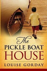
JF: Fantastic. So glad you couldn’t find that picture. Literal representations of plot points rarely result in effective covers, while images that represent the themes or conflicts embodied in the story fare much better, and this is something your designer obviously understands. Combined with a warm color palette and beautiful typography, this is a real winner. ★
Lydia Peever submitted Pray Lied Eve designed by Lydia Peever. “One thing about this project that I am most proud of is that it is my first semi-self-published work. All of the layout, typesetting, artwork and promotion is done by me. It is even a photo of me on the cover. This is not unique, as I did a lot of the same work on Nightface, but this is more me. Published with Hora Morior Productions, I disclose fully that I work very closely with them and am part of the Hora team. I’ll be heading the ‘dark words’ branch.”
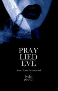
JF: Self-published doesn’t mean you have to do everything yourself. In this case, despite some really good elements, the title makes no sense to the casual observer, and it’s overwhelmed by a sea of black. Good luck with Hora.
Malcolm Garcia submitted Balance Beam designed by Sarah Sullivan. “My story is a spy-vs-spy story set in Taiwan and China, so the cover blends the flags of both into each other showing that the distinction between the two sides is very slight.”

Margaret Pritchard Houston submitted A Merry Requiem: Part I, The Gathering Storm designed by Margaret Pritchard Houston.

Marsha Canham submitted And Then There Was You designed by Marsha Canham. “Probably never guess this is an historical romance *s*”

JF: Yes, we can tell, but the background is distracting and bland at the same time, and the amateurish typography isn’t helping either.
Mary Jo Robertiello submitted The Lemrow Mystery designed by Rita McCarthy. “Rita McCarthy understands the importance of conveying the mystery in the cover. The blood red is good for homicide and also because there’s a Chinese motif in The Lemrow Mystery, underlined by the color and the Chinese goddess to the left of the NYPD badge which casts an eerie light.”

JF: Well, that could be true, and I do like the badge in the background and the colors, but she needs a course in how to use typography because the type here is a disaster.
Matt Hinrichs submitted Trashy Novel: Four College Girls on a Path designed by Matt Hinrichs. “Fun, frothy novel about four diverse college roommates, set in the ’80s. I had fun with the design and illustration, and the author was delighted with the results.”

JF: I love the title of this book and the way the designer has treated the title and subtitle which are really good for an ebook.
Michael Dadich submitted The Silver Sphere designed by Mallory Rock. “I absolutely love this cover design. I have gotten fabulous feedback on it from everyone who has seen it. Mallory Rock did a phenomenal job on this cover. Her work is top notch and deserves to be recognized.”

Michael Mullin submitted TaleSpins designed by John Skewes & Michael Mullin. “This book is a trilogy of fairy tale retellings. The image is from the story of Creepy, the 8th dwarf. It’s become the brand logo, in a sense. Mm”
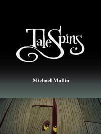
JF: Some of the other covers in this series use these elements to greater effect. And that title looks a bit lost against a huge black undifferentiated background.
Michael Reilly submitted Misisipi designed by Michael Reilly. “Based on original photography- ‘Weeki Wachee Spring, Florida’ by Toni Frissell”

JF: The photograph may be original to the photographer, but I seem to remember seeing it on other book covers.
Michael Siemsen submitted A Warm Place to Call Home (a demon’s story) designed by Michael Siemsen. “After the decision to include “a demon’s story” in the title, my desire was to inform the reader that this is not some scary horror-type of demon, but a love story in which one of the partners happens to be a demon in possession of a human body…along with a nod/wink/smirk to Nicholas Sparks.”

JF: I think it works.
Michelle Woodward submitted The Shannon Novels designed by Michelle Woodward. “This is a cover a designed for Dave Zeltserman for his crime series, The Shannon Novels. I always love working with authors and Dave had a strong vision of what he wanted to portray which made for a seamless workflow. Quick, successful projects without alot of “back and forth”, are hard to come by, so I am very thankful this project came my way.”

JF: Love the illustration but the layout is a bit claustrophobic for me.
Mike Reeves-McMillan submitted Realmgolds designed by Chris Howard (saltwaterwitch.com). “I gave Chris very detailed art direction for this cover. I wanted a cover that looked professional, but that would never be commissioned by a mainstream publisher: one on which a man and a woman were talking as equals. Chris delivered, and managed to make it look dynamic, I think, and to capture the relationship between the characters.”

JF: Really? I thought that was 2 women. And what’s that green thing in the foreground? Some of this is very skillful, but I’m not sure it all comes together in the end.
Misha Burnett submitted Catskinner’s Book designed by Misha Burnett. “I designed this starting with a photograph taken by my partner, Susan Bolhafner. Those are my hands in the picture. I wanted something striking and enigmatic, that would look good in a thumbnail and in black and white.”

JF: Not sure why you choose such a stark style for such a delicate subject.
Nicolene van Staden submitted BITES designed by Nicolene Lorette Design. “Hi there, I did this cover for Ninfa Sferlazzo-Hayes.”

JF: Complete lack of contrast turns this cover into one big smudge.
Nils Dannemann submitted Seeking Angel designed by FireflyCovers. “Detective/Murder story placed in New York. The murder is a female who seduces her victims before killing them with an ice-pick-like knife. I tried to combine both in the main symbol/icon.”

JF: It works.
Pam Stucky submitted Letters from Wishing Rock (a novel with recipes) designed by Pam Stucky. “This is the cover to the first book in my series, all currently available at Amazon and elsewhere in both print and ebook. I’m submitting all three for review. I’ve had many discussions with my readers about my book covers, trying to figure out how to make them more appealing. Some people think I should change them; others wouldn’t change a thing and are very attached to the original covers. In designing the original covers, I wanted to show that the books are light-hearted – thus the fontdinerdotcom font – but also I didn’t want the books to look too chick-lit-y, as they’re not really chick lit. I’ve been told I should make the covers look like chick lit to help them sell, but I don’t want to mislead the reader into thinking the books will be something they’re not. I think people who like chick lit would like my books, but I don’t know that they really fit the chick lit book genre. (To be clear, I don’t have anything against chick lit. I just don’t want to set inaccurate expectations.) The rocks on the cover are “wishing rocks,” but I know not everyone knows this. Some people think this looks too much like a geology book, which I understand. Very eager to hear input!”

JF: Pam, the problem with the covers isn’t the font or the rocks or the borders, it’s that the covers give absolutely no hint of what kind of book we’re looking at. From what you say (“chick-lit-ty”) they are wildly inappropriate.
Pam Stucky submitted The Wishing Rock Theory of Life (a novel with recipes) designed by Pam Stucky. “This is the cover to the second book in my series. In designing the second cover, I cleaned up some elements but knew I had to stay true to the basic design of the first book.”

Pam Stucky submitted The Tides of Wishing Rock designed by Pam Stucky. “This is the cover to the third and final book in my Wishing Rock series (“wit, wisdom, and recipes!), just released a couple weeks ago. Because it’s part of a series, it has to share design elements with the first two in the series. I do now know that I should have put a border around the covers for the ebooks. Obviously I couldn’t do that for the print books, but it didn’t occur to me until they were all out that I could do so for the ebooks. I like the warmth of this cover more than the cold gray of the first in the series, so at least I feel there’s improvement. Regardless, I’m totally interested to hear any input or suggestions. Thanks!”

Rebecca Bielawski submitted All in a Jam designed by Rebecca Bielawski. “Children’s picture book made with Inkscape”

JF: Cute.
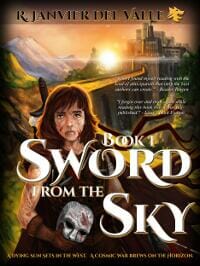
Rey Del Valle submitted Sword from the Sky designed by Cover Art by Ronald Calica; Typography by R. Del Valle. “This is a revamped professional cover replacing original cover.”
Richard Levesque submitted Unfinished Business designed by Mark Walsh. “This novella is a ghost story with a Lovecraftian twist. I asked my cover designer, Mark Walsh at orbitalmindcontrol.com, if he could come up with an image that brought those elements together. I was quite pleased with the outcome, especially the tentacles.”

JF: I really like the title treatment, it’s almost like a brand.
Sandra Ulbrich Almazan submitted Twinned Universes designed by Meghan Derico (Derico Photography).

Sharazade (None) submitted Volksie designed by CoverDomme. “I love the color wash the designer gave this–much of the book takes places in the American West and Southwest, and this captures the mood well.”

JF: It makes its point very effectively, although I think it would benefit from a bit more contrast between the title and the background.
Shaun Hensher submitted The Arkansas Connection designed by Shaun Hensher.

JF: I think the colors are somewhat “blah” but the jug is clever and memorable.
Sherrie Cronin submitted y1 designed by Jennifer FitzGerald. “I turned to Jennifer FitzGerald of www.MotherSpider.com because I couldn’t decide whether to put one or two chameleons on the cover of this story about a young gay genius who teaches himself how to morph his own shape. She substituted in the secretive boy and I loved the idea.”

JF: Too many disconnected images to gain any traction visually.
Stan Kowalski submitted A Way Back Home designed by S.L. Kowalski. “A novel based on actual events.”
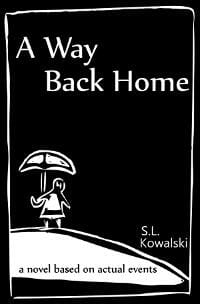
JF: It could be charming, but the black and white color scheme instead makes it severe. I bet that wasn’t what you were aiming for.
Steve Vernon submitted Flash Virus: Episode One designed by Keith Draws.

JF: A designer who knows the genre can help tremendously, like with this amusing cover.
Steven Lyle Jordan submitted Sarcology designed by Steven Lyle Jordan. “My former graphic designer background puts me in a reasonable position to design and create my own covers. Sarcology’s story features a special robotic prototype, so I used an artificial bust slightly augmented to almost subliminally suggest there is more to it than meets the eye.”

JF: Nice job with some lovely and intriguing details and a deliciously creepy feel to it. ★
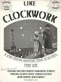
The Contact Robots submitted Like Clockwork Part One designed by Paige Stendy. “Published March 15, 2003. The cover for Part One of Like Clockwork, a six-part serial adventure story for readers aged between 190 and 9, going out in weekly installments for kindle.”
Voynix SF submitted Weltenaufgang designed by VoynixSF. “”Weltenaufgang” is a collection of short stories in the German language.”

JF: Curious minds want to know: why a lizard?
Woelf Dietrich submitted The Seals of Abgal designed by Fena Lee & Woelf Dietrich. “Although the story takes place today there are elements of history in there and I wanted to capture both. I also wanted a minimalist approach and thought the fish image appropriate given the plot. Whether I succeeded is a different story, but I really like the cover. The image was sourced and the textures and layout was done, using GIMP.”
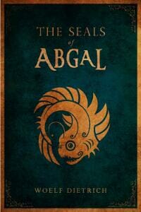
JF: A beautiful design that looks a bit too delicate for the ebook environment because that faint type is going to start to disappear in reduction.
Nonfiction Covers
Agnieszka Zienkowicz submitted Przestraszony umysł designed by E-maginacje Tomasz Zienkowicz.

JF: This book contains actual tips on how to scare people in many specific ways. An interesting “how-to” book from Poland, this cover is really quite amusing when you enlarge it, not sure there’s just too much detail for the small sizes it will typically be seen at.
Augusto Pinaud submitted 4:00 A.M A Productivity Argument designed by Isabel Pinaud.

JF: A strong concept, but in practice the drawings are competing with the type, not complementing it.
C. Hope Clark submitted The Shy Writer Reborn designed by Shaila Abdullah. “The Shy Writer Reborn: An Introverted Writer’s Wake-up Call comes out in the third week in March 2013. I work hand-in-hand with Shaila and we are good friends. She’s a web designer who does a few covers on the side. She took my simplistic concept and made it pop, IMHO. This is a how-to book for introverted writers that I will be using at my conference appearances. The Shy Writer was published in 2004 and has been popular wherever I speak, so I felt the need for a sequel for ebook and print. This is the ebook version of the cover. The print cover is phenomenal, with the back being just as dynamic as the front. Comes out on all ebook formats in March and in print around the 14th.”

JF: A clever visual metaphor makes this cover stand out. Not sure about the choice of a distressed font for the title, or what it’s supposed to add to the idea of rebirth, but overall a solid cover.
Christopher Dunworth submitted 101 Things To Do With God designed by CD (Christopher Dunworth). “Many thanks Joel for your suggestion of the ChunkFive font, which was a boon to a design beginner such as myself. For the cover design I was seeking simplicity, which can serve as a useful backdrop to God & spirituality.”

Cindi Maciolek submitted Divatiel: Reflections of a bird’s companion designed by Shelly Volsche. “Shelly’s done a lot of great work for me, including this cover and the little bird icon that separates text passages within the book. I took the photo of my bird which Shelly embellished with the tiara, so indicative of my little cockatiel’s personality!”

JF: Very sweet.
Erin Kelly submitted Must Love Chickens: designed by Erin Kelly.

JF: Great title and a fantastic ebook cover that makes its offer crystal clear and has a bit of humor, too. And that chicken! ★
Jinjer Stanton submitted The Year of Luke designed by Jinjer Stanton. “Author Sea Raven approached me looking for a cover that would suggest the transformative nature of the book’s content. The idea of a butterfly popped into my head and as I researched the symbolism of the mourning cloak butterfly it reinforced the message because it survives winter in northern latitudes and appears before much of anything has sprouted. I hope you like it!”

JF: I like the idea of the butterfly, but not the dark look to this cover or the type all compressed into the box at the type without any clear hierarchy.
Joe Sledge submitted Did You See That? designed by Joe Sledge / Daniel Norris. “I wanted something fun and entertaining, without looking like the few other books out there for roadside attractions in North Carolina. Both the title and the question mark logos are great for branding my product, and the brown is disticntive compared to other books. While this is for an ebook, I also wanted something that would really pop off the shelves once made into a hardback, even if seen only from the spine.”

JF: In the local books genre, you can’t be too folksy or too campy, it all works. I always make a point of looking at all the local attractions, local history, and local recipe books when I travel. Many of them are self-published, and many have been in print for a very long time. This one will fit right in.
Jordan Taylor submitted Wonder Dogs Special Features designed by Jordan Taylor.

JF: Another case where a professional designer could create an impressive cover with the same ingredients used here to very little effect. Saved by the dog!
Linda Bonney Olin submitted Songs for the Lord designed by Linda Bonney Olin. “I created this cover in Adobe Photoshop Elements 11, from a butterfly photo I took with a digital point & shoot camera. I experimented with the title text quite a bit, thinking drop shadows and outlines would look more sophisticated. In the end, I preferred the clean look of plain black Trajan Pro bold. I used the 1563W x 2500H dimensions recommended by KDP, as I published only on Amazon.”

JF: This is very beautiful, Linda, and you were so right to eschew the type effects. If you want to go a little further, find a color for the title that really sings against the background without competing with the butterfly.
Maria Novillo Saravia submitted Bitch on Wheels designed by BEAUTeBOOK. “This is the true story of a woman that married twice for money and made her lover kill her husbands…”

Maria Novillo Saravia submitted Bitter Almonds designed by BEAUTeBOOK. “This is the true story of of a woman that poisoned her husband by tampering his pills with cyanide to cash his life insurance, and then poisoned other people the same way to mislead investigators…”

Maria Novillo Saravia submitted Cruel Deception designed by BEAUTeBOOK. “This is the true story of a nurse that kept her babies sick by suffocating them almost to dead, to get people’s attention. She ended up killing one of them.”

JF: Great decision on these strongly-branded covers for a bestselling author, especially the second two. ★
Marie James submitted Livestock Guardian Animals designed by Tugboat Design. “Before publishing our first Rural Living Media ebook, we wanted to develop a branded look that could be used for a number of nonfiction books about farming, homesteading, and gardening. Deborah at Tugboat Design created a basic cover style that would look similar even with a change of titles and images. The plan is to use the top photo for the entire series, changing the bottom photo to relate to each title. We are really happy with the cover and the flexibility it offers. Livestock Guardian Animals was published on March 15.”

JF: Very nicely done, and you can hardly go wrong with a dog on your cover. I tend to make “branding elements” small, so it’s interesting you are using 40% of the cover for the barn shot on every book.
Matt Harrison submitted Treading on Python: Volume 2 Intermediate designed by Matt Harrison. “This is the second book in my series on learning the Python programming language. The prior volume had a similar revolutionary war themed snake on it, so it seemed normal for this to follow suit. I tweaked the fonts to use a font from that era and got to learn about layer masks in Inkscape. Oh yeah, the book is based on a popular tutorial I give for teaching Python programmers how to up their programming skills.”

JF: Keeping the theme the same is a great idea for the series. Title could be more prominent.
Rachel DiAndrea submitted The Art of Being a Pet designed by Rachel DiAndrea. “A gallery collection of fine art illustrations, dancing with color and energy by Altoona,PA artist Rachel DiAndrea. The Art of Being a Pet is her first release with a rhyming whimsy, describing wonderful pets and the purposes of why they are so dear to us. The book is vibrant with hues and fosters a feel good feeling with young and old.”

JF: Strong illustrations, weak book cover. You’d be better off picking one great illustration to feature and make the title more interesting.
Saira Priest submitted Zen of Hoarding designed by Saira Priest and Sasha Virjee. “Awesome site. Thanks for contest!”

JF: I’m sorry, I couldn’t even concentrate on this cover when I realized that you are publishing under the name “Niche Publishing.” And that the cover is actually kind of an ad for the publisher.
Seth Rosenzweig submitted On Sacred Ground designed by Seth Rosenzweig / Lois Fein.

Victoria Noe submitted Friend Grief and Anger: When Your Friend Dies and No One Gives A Damn designed by Rebecca Swift. “This is the first in a series of six small books on grieving the death of a friend, covering different situations (such as AIDS, 9/11, friends you work with, etc.). It’s also the longest subtitle. Rebecca and I wanted a clean template adaptable to different colors and photos.”

JF: Really well done, evocative and visually interesting. And I love the clean look, a great way to make books on a difficult subject a bit more inviting. ★
Well, that’s it for this month. I hope you found it interesting, and that you’ll share with other people interested in self-publishing.
Use the share buttons below to Tweet it, Share it on Facebook, Plus-1 it on Google+, Link to it!
Our next awards post will be on May 13, 2013. Deadline for submissions will be April 30, 2013. Don’t miss it! Here are all the links you’ll need:
The original announcement post
E-book Cover Design Awards web page
Click here to submit your e-book cover
Follow @JFBookman on Twitter for news about the E-book Cover Design Awards
Subscribe to The Book Designer Blog
Badge design by Derek Murphy

