By Joel Friedlander
Welcome to the e-Book Cover Design Awards. This edition is for submissions during June, 2020.
This month we received:
35 covers in the Fiction category
8 covers in the Nonfiction category
Guest Judge

We are once again pleased to welcome Tanja Prokop to The Book Designer as a guest judge this month. Tanja was born in Germany, but lives and was raised in Croatia. Her three beautiful daughters and her amazing husband are her biggest inspiration in life. She has an MA degree in German language and literature and philosophy. A few years ago she started her own design company and became a professional book cover designer. She designs covers, and is constantly creating new visual experiences for her clients. Tanja is also a multiple winner of various book cover design contests and has created thousands of covers. You can find her pre-made covers at Book Design Templates, or visit her site at www.bookcoverworld.com.

Comments, Award Winners, and Gold Stars
I’ve added comments (TP: ) to many of the entries, but not all. Remember that the aim of these posts is educational, and by submitting you are inviting comments, commendations, and constructive criticism.
Thanks to everyone who participated. I hope you enjoy these as much as I did. Please leave a comment to let me know which are your favorites or, if you disagree, let me know why.
Although there is only winner in each category, other covers that were considered for the award or which stood out in some exemplary way, are indicated with a gold star: ★
Award winners and Gold-Starred covers also win the right to display our badges on their websites, so don’t forget to get your badge to get a little more attention for the work you’ve put into your book.
Also please note that we are now linking winning covers to their sales page on Amazon or Smashwords.
Now, without any further ado, here are the winners of this month’s e-Book Cover Design Awards.

e-Book Cover Design Award Winner for June 2020 in Fiction
Martin Turnbull submitted The Heart of the Lion: a novel of Irving Thalberg’s Hollywood designed by Damonza. “My book is about the man who was the head of production at Metro-Goldwyn-Mayer in the ’20s and ’30s but who never took screen credit. So I wanted him to be standing in the shadows of a soundstage coupled with a font that looked like the title of a 1930s movie.”

TP: Spot on! Typography at it’s finest. Great job!
e-Book Cover Design Award Winner for June 2020 in Nonfiction
Ebook Launch submitted Interplay designed by Ebook Launch.
TP: I love everything about this cover. A true winner!
Fiction Covers
Ann Warner submitted Memory Lessons designed by Ann Warner. “Memory is constantly both fading and being reshaped.”
TP: This cover design is probably very meaningful to the author, however, the message should be transferred through a professional designer in order to create appeal.
Carol B Allen submitted One If designed by Lance Buckley.
TP: I love every single part of this cover. Perfectly done! ★
Ebook Launch submitted Where There’s Smoke designed by Ebook Launch.
TP: A great cover design where everything is in it’s right place. Well done!
Ebook Launch submitted A Storm of Shadows and Pearls designed by Ebook Launch.
TP: Very well done! I love the typography and the image treatment. Wonderful!
Ebook Launch submitted Silent Child designed by Ebook Launch.
TP: Eye catching and appealing. This is an amazing cover design! ★
Elle Carter Neal submitted The Convoluted Key designed by Elle Carter Neal. “Series title will be the same across each book except for the number. Fonts are modified Tex Gyre Termes and simplified Mutlu. The background evokes themes of time and mathematics, overlaid with stars to reinforce genre. Neat school uniform and traditional witch’s hat is important characterization.”
TP: A nice cover design but in my opinion, too many fonts were used. Other than that, a solid cover design.
Ellie Douglas submitted The Trapper designed by Ellie Douglas.
TP: A very nice and eye-catching cover design. If the typography treatment was a bit better, this would be an amazing cover design.
Enni Tuomisalo submitted A Tiny House on Wheels designed by Enni Tuomisalo / Yummy Book Covers. “The book is set in New Zealand, so it features native plants (silver fern, kowhai tree). The chilli pepper relates to a storyline of the hot sauce business. The font is called Golden Youth.”
TP: A lovely cover. I truly like it! Very genre-appropriate.
Gregory Kopp submitted Her Majesty’s Gold designed by Gregory Kopp. “Cover Images courtesy of Wikimedia Commons.”
TP: The cover lacks a professional touch. A professional cover designer would be able to transfer the message and make it aesthetically appealing.

Hampton Lamoureux submitted Starman’s Saga designed by Hampton Lamoureux.
TP: Great imagery and great typography. Everything works well together.
Hampton Lamoureux submitted Henry Halfmoon designed by Hampton Lamoureux.
TP: Spot on. Very well done! ★
Hampton Lamoureux submitted An Elemental Witch designed by Hampton Lamoureux.
TP: Eye catching and the typography is amazing, very well done!
Jovana DDD submitted Born of Metal designed by Milo from Deranged Doctor Design. “Urban Fantasy book cover design, Rings of the Inconquo Book 1”
TP: Appealing colors and a strong typography approach. Well done!
Jovana DDD submitted Metal Guardian designed by Milo from Deranged Doctor Design. “Urban Fantasy book cover design, Rings of the Inconquo Book 2”
TP: I really like how the series design develops and how you can tell at first glance that this is a series design. It isn’t always easy to achieve that. Very well done!
Jovana DDD submitted Metal Angel designed by Milo from Deranged Doctor Design. “Urban Fantasy book cover design, Rings of the Inconquo Book 3”
TP: Again, a strong cover design with appealing features. Good job!
Jovana DDD submitted The Good Mother designed by Marushka from Deranged Doctor Design. “Thriller book cover design”
TP: I was attracted by this cover at first sight. Very balanced color and typography approach!
Jovana DDD submitted The Guest designed by Marushka from Deranged Doctor Design. “Thriller book cover design”
TP: A nice cover design.
Jovana DDD submitted Shadow Of Angels designed by Milo from Deranged Doctor Design. “Paranormal Romance book cover design, Halfway Between Book 1”
TP: A very strong image and great typography. Nice job! ★
Kassandra Flamouri submitted The Chalice and the Crown designed by Kassandra Flamouri. “The tutu and swans on the cover allude to the ballet element in this YA Dark Fantasy novel. I went with blues and blacks to suit the overall mood of the book as well as the gilded/gold imaging to convey the magical element. The title font is Princess Sophia. It was designed using Book Brush.”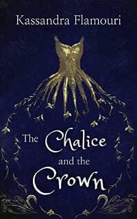
TP: Very interesting and intriguing.
Kayla Krantz submitted Dead by Morning designed by James Price.
TP: The typography lacks a bit of balance and some parts of the text aren’t easy to read. I would suggest a different typography approach and then the cover would have a lot of potential
Keith Steinbaum submitted The Poe Consequence designed by Matt Davies. “The image is of an East L.A. gang member literally running for his life attempting to escape a supernatural entity intent on killing him at 4:00 a.m. This is the reason for the ‘O’ in Poe showing that time.”
TP: I love everything about this cover. Great job! ★
Laura Hile submitted So This Is Love designed by Damonza. “Hats off to Damonza for this gorgeous cover. It’s mind-blowing to me that a graphic artist can take a title — just words on a page — and come up with an outstanding design presentation.”
TP: Very genre-appropriate. A lovely cover design!
Megan Trotter submitted Sigyn’s Song designed by Meg Trotter.
TP: Nice colors and an interesting typography approach.
Nancy Farkas submitted This Nearly Was Mine: A Novel designed by Nancy Farkas. “The cover photo of a typical Mediterranean-style entryway of a lovely home connects to the title and storyline of the novel. One would assume that the author had, at one time, the opportunity to live in this home (or home of this type) had she made an alternate life choice.”
TP: This cover has a lot of potential but it should definitely be designed by a cover designer. All in all, not bad, but it lacks a professional touch.
P.A. De Voe submitted Judge Lu’s Case Files designed by P.A. De Voe. “The Judge Lu’s Case Files is a collection of short stories of a magistrate in early Ming Dynasty China. The owl traditionally represents mystery/secrets & danger. The Author name is a similar font as that used in my other early Ming books. The title font is different from my most recent series.”
TP: The colors are great but the cover overall lacks balance. I can tell that the image of the clouds has been stretched a bit and I would love to see a different typography approach.
PAUL WHYBROW submitted Who Kills A Nudist? designed by PAUL WHYBROW. “The seagull appears in the story as a symbol of the fragility of nature, as well as the hostility of the wild world. The titular nudist victim is discovered by a witness in Chapter who sees a gull land and hop across to peck at his eyes.”
TP: The colors of the cover are very nice, but the choice of fonts isn’t too good. There are too many different fonts that were used and they don’t work too well together. It would also be good to use this image from a different angle maybe.
Peter Rendell submitted Zed: A Wizard’s abuse of Magic. designed by Ian Keiller. “The main image portrays Zed controlling his subject. The background images are Zed’s previous incarnations. The components were generated from DAZ 3D and Dreamweaver Fireworks using multi-layering. The rendering times were horrendous.”
TP: This cover looks very amateurish. It generally lacks a professional approach.
R.L. Syme submitted Vangie Vale and the Larcenous Lava Cake designed by Lyndsey Lewellen.
TP: A solid cover design. The title treatment could probably gain more affection with a different font choice.
Shane Boulware submitted Soulstealer designed by Damonza. “The unusually pale character in the middle is accentuated by a striking array of chaotic red. The red signifies the evil clawing to get out. The SOULSTEALER letters upright and curved, giving a sinister feeling. The reflection is the demon, reflecting the true nature of the character in the middle.”
TP: Every element in it’s right place. A great cover design.
Shawnee Jones submitted But The Sparrow Stayed designed by Yony Madera. “This is a children’s book about the need for courage against bullying. We asked the cover illustrator/designer, Yony Madera, for an illus that would show a lone sparrow standing alone against the harsh elements, a metaphor for bullying. Used a simple font on a detailed illus to stand out.”
TP: The illustration itself isn’t bad, but the cover would love better with a bit stronger and more eye-catching typography.
Shweta Roy submitted The Unexpected Adventures of Remi designed by Ambika Karandhikar. “Details about my children’s book cover design: 1. It outlines the story plot a little especially with my protagonist, Remi. 2. The text connects with the reader’s emotions. 3. The colors are vibrant enough to grab a young reader’s attention. 4. The fonts are uncommon and funny.”
TP: A sweet cover design.
Sue Phillips submitted You Oughta Know designed by Sandra Paul. “Boy and dog are primary to the story that takes place at a summer camp where his mom is a counselor. Banner with name font is author branding across all Sue Phillips books.”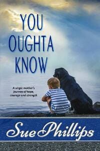
TP: The cover needs a bit more work in order to look more appealing. The typography should be redone.
Thomas Whitmire submitted Flash Point: The Final Conspiracy designed by germancreative and Seunghyean Lee. “The cover is a mockup of the US Capitol building, which represents the setting and theme of the novel. The fiery color palette mirrors the title, implying that the situation is nearing a conflagration. Fonts are: Bison (authors) Robinson Press (Title) IncisionAx (subtitle)”
TP: Very appealing and nicely done.
Vali Benson submitted Blood and Silver designed by Von Lang. “Thank you!”
TP: A nice cover design.
Nonfiction Covers
Amy Oestreicher submitted My Beautiful Detour: An Unthinkable Journey From Gutless to Grateful designed by Amy Lauren Oestreicher. “The photograph is a picture I took while walking a trail gazing at the beloved trees I write about in my memoir. The painting in the center is the first painting I ever created, during an emergency stay at Yale hospital – a “beautiful detour””
TP: The title being white would make the cover less colorful. I would also suggest a very simple title treatment.
Audrey Sauble submitted Can a Spider Be Fluffy? designed by Alaina Arp.
TP: I like the typography treatment but I would, personally, use a different and more appealing color for the title.
Daniel Brooks submitted Understand and Overcome Anxiety designed by Eli Hanks. “Green, white, and yellow were used to establish theraputic/medical help and trust. The image and bold “ANXIETY” represents feelings of overwhelm, uncertainty, and defeat that often accompany heightened anxiety. Notice how her eyes lead to the word “Proven” in the solution oriented subtitle.”
TP: For some reason the image and the rest of the cover don’t work well together. The image might be a bit too strong for the title.
Ebook Launch submitted Keeping His Ashes designed by Ebook Launch.
TP: A very powerful image with great typography. Very well done! ★
Ebook Launch submitted Shine designed by Ebook Launch.
TP: A nicely balanced cover design, well done!
Sara Jordan-Heintz submitted Going Hollywood designed by Larry Jordan. “All 12 celebrities featured in the book are pictured in color on the cover, with he Hollywood sign featured on the front and back covers.”
TP: It isn’t easy to work with so many images in one cover. The color treatment could use a bit more work.
Tasha Brooks submitted Falling Up designed by Vanessa Mendozzi.
TP: A really eye-catching cover design. Very well done! ★
Well, that’s it for this month. I hope you found it interesting, and that you’ll share with other people interested in self-publishing.
Use the share buttons below to Tweet it, Share it on Facebook, Link to it!
Our next awards post will be on August 31, 2020. Deadline for submissions will be July 31, 2020. Don’t miss it! Here are all the links you’ll need:
- The original announcement post
- E-book Cover Design Awards web page
- Click here to submit your e-book cover (See New Submission limits)
- Follow @JFBookman on Twitter for news about the E-book Cover Design Awards
- Check out past e-Book Cover Design award winners on Pinterest
- Subscribe to The Book Designer Blog
- Badge design by Derek Murphy
Designing Your Book Cover?
Stand out from the crowd by grabbing our Book Design Cover Checklist for an amazing book cover!


