By Joel Friedlander
Welcome to the e-Book Cover Design Awards. This edition is for submissions during June, 2018.
This month we received:
68 covers in the Fiction category
8 covers in the Nonfiction category
Guest Judge
 I’m very pleased to welcome Tanja Prokop to The Book Designer as a guest judge this month. Tanja was born in Germany, but lives and was raised in Croatia. Her three beautiful daughters and her amazing husband are her biggest inspiration in life. She has an MA degree in German language and literature and philosophy. A few years ago she started her own design company and became a professional book cover designer. She designs covers, and is constantly creating new visual experiences for her clients. Tanja is also a multiple winner of various book cover design contests and has created thousands of covers. You can find her pre-made covers at Book Design Templates, or visit her site at www.bookcoverworld.com.
Comments, Award Winners, and Gold Stars
I’ve added comments (TP: ) to many of the entries, but not all. Remember that the aim of these posts is educational, and by submitting you are inviting comments, commendations, and constructive criticism.
Thanks to everyone who participated. I hope you enjoy these as much as I did. Please leave a comment to let me know which are your favorites or, if you disagree, let me know why.
Although there is only winner in each category, other covers that were considered for the award or which stood out in some exemplary way, are indicated with a gold star: ★
Award winners and Gold-Starred covers also win the right to display our badges on their websites, so don’t forget to get your badge to get a little more attention for the work you’ve put into your book.
Please note that each winning cover is linked its sales page on either Amazon or Smashwords.
Now, without any further ado, here are the winners of this month’s e-Book Cover Design Awards.
e-Book Cover Design Award Winner for June 2018 in Fiction
James Egan submitted Bed of Flowers designed by James T. Egan of Bookfly Design.


TP: Such a beautiful cover! A winner at first sight. The colors are so amazingly combined and the typography is perfectly integrated into the image. Amazing! Just amazing!
e-Book Cover Design Award Winner for June 2018 in Nonfiction
Cathi Stevenson submitted The Way There designed by Cathi Stevenson. “Absolutely loved working on this project. The print cover was a very important factor in the promotion of this project, so the colors had to look as rich and appealing in print as they did online.”
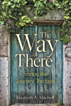
TP: A beautiful cover. I really like the simplicity and the composition. Very well done!
Fiction Covers
Alanna Mackenzie submitted The Jade Rebellion designed by Alanna Mackenzie.

TP: I love this cover. The image treatment is very interesting and it somehow promises the reader an exciting story. The simple typography works well with the overall concept.
Amanda DeWees submitted A Haunting Reprise designed by Keri Knutson. “I asked Keri to rebrand my Victorian mystery series to connect it to the current trend of women sleuths in historical mysteries while capturing the whimsy of the books and making them stand out from the crowd. This is the third in the series.”

TP: The color of the design stands out and the typography is very readable. Very genre-appropriate.
Amanda Linehan submitted Bored To Death designed by Amanda Linehan.
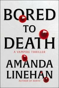
TP: The designer tried to keep the design clean, bold, with minimal usage of imagery, which is great. I think the idea was amazing, but it could use a little bit more work to make it messier and more realistic, given that this is a vampire thriller.
Angelica Jackson submitted Crow’s Rest: Faerie Crossed Book 1 designed by Kelley York of X-Potions Design. “I did a private shoot at Preston Castle for the series covers; Kelley York took my photos and made them into a cohesive whole. In this first cover, I love how the MC has her feet planted in one world but her attention turned to another.”

TP: A nice cover art and calming colors. The subtitle is a little bit hard to read.
Angeline Janeiro submitted Hotter than Desire designed by riobookcoverart.com. “This is Book 2 of Lelani Black’s Tamed by the Bachelors series.”

TP: Overall a nice cover. The main focus is set on the stock image and my attention is strongly drawn to the stripe over his head, which is pretty distracting.
Angelique Bochnak submitted Fortitude Rising designed by Angelique Bochnak.

TP: The designer has used strong design elements and did a good job in dividing the two main images, with an appealing feature. I personally think the title would work better if it was all in the same color, or in white, but the overall concept is very eye-catching.
Angie Flores submitted Cub’s Wish designed by Yidan Yuan. “The cover of Cub’s Wish depicts the sweet moments of bonding and conversation while Papa panda and his Cub wish from the heart.”

TP: A sweet illustration. The title is very prominent and readable, however, the subtitle is completely unclear, which is a shame, given that there is enough room for a better placement.
Angie Grigaliunas submitted Sowing designed by Kat Mellon.

TP: An appealing cover with beautiful design elements. The typography treatment is also gorgeously done. I love the colors and overall appearance.
Athena Daniels submitted When Darkness Follows designed by Athena Daniels.

TP: I like the colors used on this cover. The designer has nicely separated the two images with the title. In my opinion, it is always better to keep it simple by using only one, or two font styles at once.
Bill Peschel submitted The Casebook of Twain and Holmes designed by Bill Peschel. “The cover shows the art from the seven stories on the wall behind a modified and colorized illustration by Sidney Paget.”
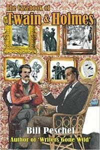
TP: The illustration used on the cover is very nice per se, but in combination with the typography it doesn’t work too well. The title should be more prominent and in a different color, maybe.
Brigitta Moon submitted A Husband’s Will of Fortune designed by Brigitta.

TP: The image appears to be a little bit stretched and the whole cover looks somehow amateurish, but for some reason, very eye-catching.
Chad Stambaugh submitted Contagion designed by Chad Stambaugh. “I needed something that related my story “Contagion” which is a killing virus, so my wife helped me come up with the picture of the young girl with a breathing mask on. I think it makes the cover look ominous and gets the point of what the book is all about.”

TP: The image used on the cover is very strong, but the typography should be handled differently and with minimal effects and colors. This way it is a bit messy.
Craig Lea Gordon submitted The Machine designed by Craig Lea Gordon. “For The Machine, I wanted a big bold cover that helped convey the horror, and unnatural science theme, of this science fiction short story. I went through multiple iterations of this cover before settling on the nixie tubes, and used them as its primary focus.”

TP: I really love this cover. The image is strong, it conveys the message and the title is placed perfectly. Even though it’s a bit small, the subtext is still readable. ★
Dan Van Oss submitted Contagion designed by Dan Van Oss.

TP: The typography works well with the colors and image choice for this cover. The woman’s face should be a little bit more intriguing. Her facial expression is somehow obscure.
Darcy Deming submitted Sage Stone – The Magic Between the Worlds designed by Darcy Deming. “I decided to create an original painting for my Book cover. As this is the first book in the series, I wanted strong branding that could be carried forward both on future covers as well as my Website, thus the cave motif/background.”

TP: This is a very nice illustration, but in my opinion, it contains too many elements. The author probably wanted to tell the whole story with the cover, which usually isn’t a good idea. I had to look again and again to see if I haven’t missed an element of the illustration and if you look at it that way, it does have a certain dosage of appeal.
Darja DDD submitted Before the Season Ends designed by Marushka from Deranged Doctor Design. “Historical Romance cover design by Marushka from Deranged Doctor Design, The Regency Trilogy Book 1”

TP: This is a very appropriate cover design for this genre and it contains all necessary elements for it, while being as minimalistic and clean as possible.
Darja DDD submitted The House in Grosvenor Square designed by Marushka from Deranged Doctor Design. “Historical Romance cover design by Marushka from Deranged Doctor Design, The Regency Trilogy Book 2”

TP:The same applies for this cover concept, as for the prior. The main focus is set on the image of the woman and the combination of the two images used on the cover is excellent.
Darja DDD submitted The Country House Courtship designed by Marushka from Deranged Doctor Design. “Historical Romance cover design by Marushka from Deranged Doctor Design, The Regency Trilogy Book 3”

TP: I love the colors in this cover. This is my favorite cover design of the whole series because of its calming colors and nice usage of imagery. The overall look is beautiful. ★
Darja DDD submitted The Mafia And His Angel: Part 1 designed by Kitten from Deranged Doctor Design. “Contemporary Mafia Romance book cover design by Kitten from Deranged Doctor Design, Tainted Hearts , part 1”

TP: Another amazing cover series. I love the attention to detail and clever usage of colors. Red gives the whole series a very recognizable touch and it is clear that the designer knows how to create an appealing cover. Very well done! ★
Darja DDD submitted The Mafia And His Angel: Part 2 designed by Kitten from Deranged Doctor Design. “Contemporary Mafia Romance book cover design by Kitten from Deranged Doctor Design, Tainted Hearts , part 2”

TP: Again, strong usage of imagery and colors.
Darja DDD submitted The Mafia And His Angel: Part 3 designed by Kitten from Deranged Doctor Design. “Contemporary Mafia Romance book cover design by Kitten from Deranged Doctor Design, Tainted Hearts , part 3”

TP: Very nice as well. I really love the way the branding is embedded.
Darja DDD submitted The Fall of Lostport designed by Milo from Deranged Doctor Design. “Epic Fantasy cover design by Milo from Deranged Doctor Design, A Kinship Thrones Epic Fantasy”

TP: Strong imagery, simple typography and calming colors. A very beautiful cover. ★
Deborah Coonts submitted Lucky Flash designed by Glendon of Streetlight Graphics.

TP: An interesting cover. Very appealing.
Debra Nasser submitted Today, Tomorrow, Forever designed by Debra Nasser. “There are elements in the cover that directly relate to several references in the book, such as: reluctantly returning to his childhood home; the door color; the wreath; wearing his father’s over-sized hat; the briefcase etc.”

TP: The image used on this cover seems a little bit odd and the perspective makes the man’s hands look larger than they should be. Even though the textual parts are readable, the combination of these two fonts doesn’t work.
Diane Gillespie submitted Stories for Getting Back to Sleep designed by Vladimir Verano. “As an author, I submit this because as soon as I show the book to people who have trouble sleeping, they “oohh” and “aahh”.”

TP: I really love this illustration. It is beyond beautiful. The concept would work much better if the designer had kept black as his main background color to complement this beautiful illustration. The font combination doesn’t work too well.
George Padgett submitted Addleton Heights designed by Circus Joe Productions. “Michele Giorgi was my illustrator for Addleton Heights.”

TP: Strong and beautiful illustrations. Appealing colors. Even though it looks a little bit all over the place, everything looks great.
Hargrove Perth submitted Crossing the Vale designed by Dark Water Arts Designs. “I needed something that pulled elements of the book without revealing what the book is about being it’s set in a dystopian vampire world. I feel she nailed the ethereal feel of the book and the attitude of the main character well.”

TP: The designer was able to create exactly what the author had in mind, which is great, however, some images appear to be stretched and there is no contrast between the image and the typography. It would probably look even more appealing with a different, brighter font color.
Jacqueline Church Simonds Church Simonds submitted THE MIDSUMMER WIFE designed by Vagabondae Press/Strange Fictions Press. “I was asked if I could suggest anything to make it better. The line art under the title is meant to represent the MC tattooed (and then real) wings.”
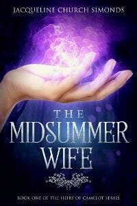
TP: Overall a very good looking cover design. All elements are combined nicely. Beautiful colors!
James Beamon submitted Pendulum Heroes designed by Micaela Dawn. “Micaela designed this cover around the premise that four average guys get pulled into a foreign world and foreign bodies because of a device called the Rift Pendulum. What you see front and center is that device, modeled after a Foucault pendulum.”
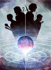
TP: I like the illustration on the cover, however, the textual parts are way too small. All in all, a very interesting and unique cover design.
James Egan submitted The Iron Fin designed by James T. Egan of Bookfly Design.

TP: A beautiful cover design and great composition of elements.
James Egan submitted Symphony of the Wind designed by James T. Egan of Bookfly Design.
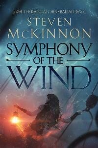
TP: Strong, beautiful typography and great choice of colors.
Jan Moran submitted Sparkle designed by Ginna Moran. “Thank you, first time entry :)”

TP: It is always hard to incorporate different images into one. It doesn’t allow enough room for textual parts and the choice of coloring could be better.
Janelle Garrett submitted Rift in the Deep designed by Susie Poole. “The artist who painted the front cover is JE Purazzi. It’s an original piece.”

TP: The illustration is beautiful and the title is very nicely placed and very readable.
Janelle Garrett submitted Rise of the Warlock King designed by Susie Poole. “JE Purazzi did the original art.”

TP: Again, the title is very prominent and well combined with the artwork.
Jason Wride submitted Manatomy designed by Doug Crookston.

TP: A very interesting design concept. I love the illustration.
Jeff Brown submitted We are Legion (We are Bob) designed by Jeff Brown. “This is a cover for Dennis Taylor’s Bobiverse series. The book happens in space, but has a humorous tone, which I just hinted at with the typography and the bold colors.”

TP: I did not get the humorous tone on the cover, however, the cover looks very genre-appropriate and is nicely combined.
Jeff Brown submitted Daughter of Havenglade designed by Jeff Brown. “This cover illustrates the main characters arriving in the city of Havenglade, with rays of light shining down on the city through the mountains. This is the first book in the series.”
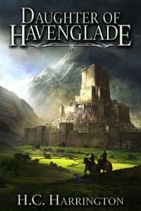
TP: A nice composition. Good choice of font! Well done.
Jeff Brown submitted Darkest Before the Dawn designed by Jeff Brown. “This is the third book in a series for Michael Anderle. The cover illustrates the main character, Michael, in the scene of a destroyed London, with big ben’s clock broken on the ground.”

TP: Clean, crisp and strong. Love the colors. A very coherent cover design, with an amazing contrast between the background colors and the title. Simply fantastic! ★
JL LeGerrette submitted You’re Clear designed by Cheri Lasota. “I didn’t have a way to provide any other URL for the photo. I tried the link to the URL I pasted and it didn’t have the “Look Inside” verbiage attached. Please be sure that it is the E-BOOK cover that I’m entering with the words “An Airport Thriller” above the title. (NOT the print book cover.)”

TP: A little bit too crowded. The title color is pretty heavy, even though still readable.
Josie King submitted Planet Fran – Population One designed by Ana Grigoriu. “The book is a comedy about a business woman (who works in IT and drinks much Prosecco) who is offered the business investment she needs but is set the condition of learning to horse ride to prove her worth. The cover aims to capture all of those elements in one image.”

TP: It is always hard to „show it all” with one illustration. Such intentions usually fail to deliver the right message, even though this one does promise a humorous adventure. The choice of typography should be a little bit different, given that the subtitle is large enough but still unreadable.
Karen Dodd submitted SCARE AWAY THE DARK designed by Sharon Brownlie of Aspire Book Covers. “Initially regretful that I had to switch cover designers from my first book to my second, I was delighted to have found Sharon. I appreciate that she used her own creative ideas, at the same time honoring the design of the first book in the Stone Suspense series.”

TP: Very bold and clear typography. The image is a little bit unclear and I didn’t spot the male character at first. Overall, appealing.
Katherine Luck submitted The Cure for Summer Boredom designed by Katherine Luck.

TP: An interesting and simple cover concept. The font styles should be a little bit more unified.
KD Rose submitted Dream Poem designed by Michelle Rene at Mundus Media Ink.

TP: I love the illustration and the cover overall looks very coherent. I would just like to see more emphasis on the title. Other than that, I really like it.
Kira Shayde submitted Desires at War designed by Kira Shayde.

TP: Interesting choice of imagery. I’m not sure what to think when looking at the images, however, all important elements are clear and visible.
Merlin Franco Francis submitted A Dowryless Wedding designed by Neena Gupta. “I wanted a simple cover design which draws the attention of the viewer to the theme, and Neena delivered it.”
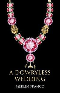
TP: Clear, clean, minimalistic and a good choice of font. Maybe the title should be a bit larger and the necklace a bit smaller.
Michael Tusa submitted A Second Chance at Dancing designed by Cherry Press. “The main character in this memoir is closed off emotionally. The picture captures this isolation and distance from the rest of humanity.”

TP: Simple and readable, but needs a lot of additional work.
Pamela K. Kinney submitted How the Vortex Changed My Life designed by Karen Michelle McNutt-Gillian’s Book Cover-“Judge Your Book by Its Cover”. “The background city is Richmond, Virginia, as the urban fantasy novel is set there, and the woman is my main character, plus the eyeball is Larry, an eyeball demon-secondary character in the novel.”

TP: I have to say that the eyeball is very scary and the image is stretched. The typography should be better. Attention-grabbing for sure, but not for the right reasons.
Patricia Furstenberg submitted As Good as Gold: A dog’s life in poems designed by Patricia Furstenberg. “I tried to create a heartwarming and joyous effect that will suit the book’s theme.”

TP: On such a background it would be good to have a clean, white title that will stand out. This way, all textual parts are hard to read and the whole concept is a little bit over the top.
R.M. Garino submitted The Gates of Golorath designed by Mirella Santana. “The scene from the cover for The Gates of Golorath, is of the two main characters, Angus and Arielle, emerging from another dimension, ready for battle, via The Gate.”

TP: An amazing cover. I truly love every aspect of it. A strong illustration and great typography. A beautiful composition! ★
Rachel Knox submitted House Under the Hill designed by Les (GermanCreative). “The photo was chosen by the author from depositphotos, because it most closely matches the house and one of the characters in the novel. The actual historical house is now a ruin, so could not be used. The designer came up with the masonry and cracks as a filter over the image to depict the decay.”

TP: The imagery is very well combined and I love the typography, however, the word „under” isn’t readable at all, which makes it hard to understand the title, even though the cover overall looks fantastic.
Rachel Pudsey submitted The Faelti designed by German Creative. “This is the second book of the Aronia Series. I am very impressed with the designer’s work.”

TP: A very attention-grabbing and coherent design with great typography.
Rachel Watts submitted Survival designed by Amanda Rainey. “The graphic design by Amanda Rainey was inspired by ink in water and was used to imply corruption or pollution – both of which are themes in the novel.”

TP: Very simple and minimalistic. The title is colorful and playful, which doesn’t usually go with “corruption” and “pollution”.
Rich Amooi submitted Madam Love, Actually designed by Becky Monson.

TP: I’m not a huge fan of such illustrations, however, it is very nicely balanced as it is.
Sabin Duncan submitted Better Left Unsaid designed by Sabin Prentis. “I designed the cover to capture beautiful femininity without sexualizing or objectifying. In a story that covers a love triangle, the cover model conveys the notion of not speaking of the affair through the hush finger.”

TP: I like the emphasis on the word “unsaid”, it really stands out. The subtitle and author name could be a little bit bolder and centered.
Sandra Rostirolla submitted Cecilia designed by Fiona Jayde. “The Wolf Concept Art (which is part of the story symbology) on cover of CECILIA was designed by: Christof Grobelski”

TP: A nice cover. All elements are very clear and readable.
Sophia LeRoux submitted Ashes of the Fae designed by GermanCreative. “I wanted to keep the cover simple, but strong. My goal was for the cover to convey a fiery mystery.”

TP: I think the designer has created exactly what the author wanted. Clear, appealing and strong.
Stephanie A. Cain submitted Circle City Psychic designed by Stephanie A. Cain. “I’m designing my own covers for this series to save a little money. I’m pretty happy with this, though I’m afraid it might be too busy. I’m using the Indianapolis cityscape and the two fonts as series elements for easy identification.”

TP: This composition is a little bit crowded and needs work. The typography is also a little bit unreadable in this size.
Susan Sofayov submitted Jerusalem Stone designed by Elaine Bergstrom. “The cover was done with watercolors, pastel pencils and white gouache on arches hot press watercolor paper.”

TP: The illustration is very nice, but the title placement and coloring should be changed.
Suzanne Dixon submitted Cursed Vines designed by Suzanne Dixon.
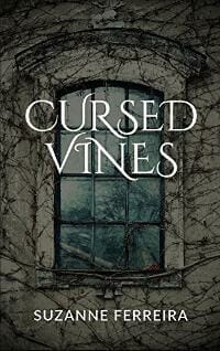
TP: A nice design. I would just change the font from Cinzel to a less decorative font.
Sydney Barnes submitted Magnus the Magnificent designed by Sydney Barnes. “Magnus the Magnificent is a historical mystery set in France about a court jester mixed up in a sinister plot against the throne. The book cover reveals hints of the book’s scenes including rich tapestries, gilded decor, and medieval potions (some that may even be fatal).”

TP: A really appealing cover. The title is well complemented with the image coloring.
Tim McConnehey submitted The Search for Rasha designed by Andrea Ho. “We tried to capture the fact the novel is historical fiction based around 200 AD in Egypt.”

TP: A really beautiful and appealing cover.
Timothy Leonard submitted The Language Company designed by Timothy M Leonard. “The author is also the photographer of the cover image. It was made at a temple in Hanoi, Vietnam.”

TP: This cover could work with bolder typography and better placement of the image. You really have to make an effort to read the title and the rest is completely unreadable.
Valerie Van Clieaf submitted End of Innocence designed by Marcella Reay. “End of Innocence features a strong, caring female lead who survives an abduction and helps Sgt. Alex Desocarras to bring her attackers to justice. Marcella Reay, designer, captured her spirit beautifully.”

TP: I really love the illustration, I would just like to see a different font for the title.
Vic Zarley submitted 444-Holiness Revisited designed by Vic Zarley. “The old radio in the background is a very important plot device. I like the way this turned out and my brother, who is a professional graphic artist, complimented me on it.”

TP: When I looked at the image, I thought I was looking at an ancient door, but then I realized the description said it was a radio. I would be lying if I said that this works for me, but it is definitely very eye-catching.
viel nast submitted high captain designed by viel nast. “i wanted to depict a high elf warrior and warlord that is the protagonist of my book. the last battle is taken in snow covered mountains.”

TP: Beautiful illustration. The color for the author name should be much brighter, because you can’t tell what the author name is.
viel nast submitted hills of the silent cries designed by Zanneta Barbarigou.

TP: A really genre-appropriate background, however, I don’t like the title treatment. The font is good, but the colors of the title and the background don’t work well together.
Nonfiction Covers
Dean Sills submitted UK Horror Scene Interviews designed by Dean Sills. “The cover shows actor and writer Dean Sills interviewing Hollywood actor Tony Curran and this is what the book is all about Dean’s interviews for UK Horror Scene.”

TP: The image seems slightly stretched. I think that this cover should be reimagined from scratch. The idea was right, but the execution not so much.
Fernando Ariel submitted Capital Letters designed by Fernando Ariel. “Collection of newspaper columns (2004-2008) written as letters from Spain’s capital, Madrid, to the ex-pats living on the coast. Combining a typewriter font, Spanish postmark, stamp bearing the author’s picture, and old airmail envelope stripes clues the reader in on what’s inside.”

TP: Simple, eye-catching and beautiful. ★
Janelle Garrett submitted The Survival Guide for Nursing Students designed by Susie Poole.

TP: Spot on. Very clear and genre – oriented.
Jason Blake submitted 101 Things to do with a Dead Body designed by Emily Caesar.

TP: The illustration on this one is really super funny. I couldn’t stop laughing after looking at the title. I don’t know if that was the intention, but if it was, you nailed it! The title needs some work.
Lila Holley submitted Behind the Rank Vol 1 designed by Perfectly Created Publishing. “Our powerful Anthologies tell the true story of real military women and their stories.”

TP: Very eye-catching. A nice composition.
Liza Gross submitted The Science Writers’ Investigative Reporting Handbook: A Beginner’s Guide to Investigations designed by Liza Gross. “I’m the author and designed both the interior and cover of my book. The image is a detail from a microscopy image of green-fluorescent-protein-labeled dendritic sensory neurons taken from fruit flies (Drosophila). Thank you”

TP: Informative and very science-oriented. I think this cover is perfectly balanced for its target audience.
Solène Anglaret submitted Where to Next? designed by Haresh Makwana. “I am so proud of the cover Haresh put together. His talent and dedication turned my vision into this moody, mysterious and elegant cover. I hope you will like it as much as I do and wish you a wonderful ahead! Kind regards, Solène”

TP: Nice concept, but the cover lacks color and balance.
Well, that’s it for this month. I hope you found it interesting, and that you’ll share with other people interested in self-publishing.
Use the share buttons below to Tweet it, Share it on Facebook, Plus-1 it on Google+, Link to it!
Our next awards post will be on August 27, 2018. Deadline for submissions will be July 31, 2018. Don’t miss it! Here are all the links you’ll need:
- The original announcement post
- E-book Cover Design Awards web page
- Click here to submit your e-book cover (See New Submission limits)
- Follow @JFBookman on Twitter for news about the E-book Cover Design Awards
- Check out past e-Book Cover Design award winners on Pinterest
- Subscribe to The Book Designer Blog
- Badge design by Derek Murphy


