Welcome to the e-Book Cover Design Awards. This edition is for submissions during July, 2017.
This month we received:
93 covers in the Fiction category
12 covers in the Nonfiction category
Comments, Award Winners, and Gold Stars
I’ve added comments (JF: ) to many of the entries, but not all. Remember that the aim of these posts is educational, and by submitting you are inviting comments, commendations, and constructive criticism.
Thanks to everyone who participated. I hope you enjoy these as much as I did. Please leave a comment to let me know which are your favorites or, if you disagree, let me know why.
Although there is only winner in each category, other covers that were considered for the award or which stood out in some exemplary way, are indicated with a gold star: ★
Award winners and Gold-Starred covers also win the right to display our badges on their websites, so don’t forget to get your badge to get a little more attention for the work you’ve put into your book.
Also please note that we are now linking winning covers to their sales page on Amazon or Smashwords.
Now, without any further ado, here are the winners of this month’s e-Book Cover Design Awards.
e-Book Cover Design Award Winner for July 2017 in Fiction
Dan Van Oss submitted Red Herrings Can’t Swim designed by Dan Van Oss / CoverMint Design.
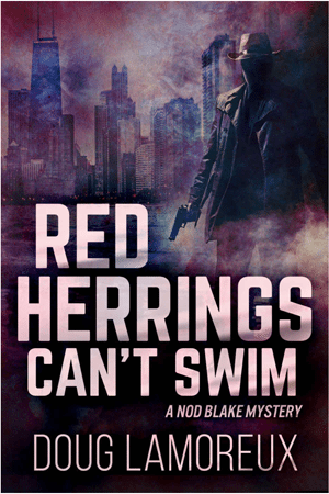

JF: Strong, pure thriller cover that’s got everything going for it, including the promise of a gritty urban setting, threat of violence, and a brooding atmosphere to match.
e-Book Cover Design Award Winner for July 2017 in Nonfiction
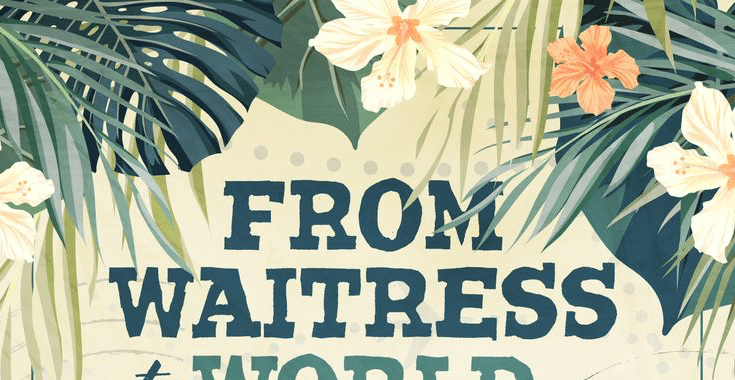
Dane Low submitted From Waitress to World Traveller designed by EbookLaunch.com.


JF: Delightfully encapsulates the fun and adventure of travel and the heroine’s journey. Delicate artwork frames and focuses the cover. A home run.
Fiction Covers
Aarti Patel submitted Screen designed by Pixel Studio. “I wrote this story and envisioned its cover while living in the San Francisco Bay Area, where I watched the screens go by.”

JF: Very effective genre cover.
Alan Parkinson submitted Life In The Balance designed by Alan Parkinson. “I designed the Life In The Balance cover to follow the theme of my previous novels, Leg It and Idle Threats.”

Alexandra Brandt submitted We, The Ocean designed by Alexandra Brandt. “Dark (and sad) contemporary fantasy featuring the deadly kind of mer-people. It’s also told in a literary style, which I hope was conveyed through the cover as well. I thought the image hinted at kelp forests, which are a dominant setting in the story.”

JF: It’s very “kelpy” and the cover has an appealing delicacy to the typography, the color palette, and the illustration. ★
Alexandra Brandt submitted A Curse of Memories designed by Alexandra Brandt. “Book 5 in am epic fantasy series (see The Fallen for series branding). The main issue has been coming up with colors that look good with the very pink feather (an important element for the main character of the series)!”

JF: The typography is careful and appropriate, but the white-on-white effect makes the illustration a bit hard to read.
Alexandra Brandt submitted The Fallen designed by Alexandra Brandt. “With Book 5 in the series coming out, I began a redesign of the series. This is the first book, with books 2-4 also soon to be updated. Epic Fantasy.”

JF: Great redesign, and a strong and well focused cover that leads us right to the visual point the designer wants to emphasize.
Alexandra Brandt submitted Intoxicated designed by Alexandra Brandt. “I redesigned these short story ebooks to have author branding, but still uniquely reflect the tone of the story inside. This story has drugs, deadly disease, and the beating sun. The image draws on all three, and I subtly highlighted “toxic” in the title to show the story isn’t a happy one.”

JF: That emphasis is very subtle, but this cover is exciting anyway.
Angelo Marcos submitted Victim Mentality designed by The Cover Collection. “There are lots of story elements that could have made it onto the cover – jail, OCD, standup comedy – but ultimately the story is about a man’s fight against enemies both inside and outside his mind, so I liked the idea of him standing alone and looking with the reader at something indecipherable.”

JF: This type of composition naturally draws the reader in.
Anita Gallagher submitted The Mcgregor: I. The Lavender Moon designed by Anita Gallagher. “Hi I’m a new author & design grad. This actually was designed to not only be functional for advertising an erotic fantasy romance, but to be sophisticated and sensual. What I love so far is that it stands out in the erotica romance genre listings and its “safe” enough to advertise publicly. Thanks!”

JF: Unfortunately the cover is weak and makes little impact. Considering how colorful your subject is, the book should reflect that much better than it does.
Anneli Lort submitted The Sweet Spot designed by Louise Mizen Ferguson. “Louise is a very talented fine artist and after reading a draft of my novel managed to perfectly capture my vision of the village in just one scene. Her stunning creation has set the new standard for contemporary romance!”

Bob Collopy submitted The Phoenix Cycle designed by Robert Collopy. “I created the cover with the help of a person who knows photoshop professionally. I created all the main images with actors, props, a camera, and green screen”

JF: Some interesting ideas and textures, but a lack of a single compelling image or message.
Brent Jones submitted Fender: A Novel designed by Michael Rehder.

JF: You see the dog is driving the car, right? Brutal typography, but it does put you inside the car with the road spooling out ahead.
Cameron Solnordal submitted The Tears Of Regret designed by Cameron Solnordal. “This book is about our decisions. About what we have to ourselves, by our own hands. How all the force we have comes from directly from us.”
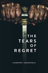
JF: Interesting approach for this contemporary fiction. At a glance the hands seem to be holding a sword, but it’s not. And the type helps place it in the contemporary world.
Charles Conyers submitted The Maximilian Emancipation designed by Charles Conyers, Jr. “I wanted to convey the plot with a minimalistic visual language reminiscent of classic sci-fi covers.”

JF: Doesn’t look like any sci-fi cover I’ve ever seen. Try again.
Charles Dyer submitted Aed’s Journey designed by Charles G. Dyer. “Aed’s Journey is a trilogy so I wanted to have a consistent theme on all the covers. I thought that a leather-bound look fitted nicely with the swords and sorcery fantasy. For the subtitle, tags and authors’ name, I used the Gentium Book Basic font. Penshurst is a nice font for fantasy titles”

JF: Nice idea, could use more contrast between the type and the background, and the central illustration is rather muted.
Charles Dyer submitted After The Cloning designed by Charles G. Dyer. “It was hard to decide how best to approach this dystopian paranormal romance trilogy. I wanted to keep it simple but still fit the genre. The title font is Metal Mania, Subtitle and tag is Gentium Book Basic and the author is in Franchise.”

JF: The problem with this series design is the awkward typography on the large flat color backgrounds, and even the backgrounds aren’t consistent.
Charles Dyer submitted After The Collapse designed by Charles G. Dyer.

Charles Dyer submitted After The Plague designed by Charles G. Dyer.

Charles Dyer submitted Innocent Fugitive – Aed’s Journey Trilogy #1 designed by Charles G. Dyer. “Aed’s Journey is a trilogy so I wanted to have a consistent theme on all the covers. I thought that a leather-bound look fitted nicely with the swords and sorcery fantasy. For the subtitle, tags and authors’ name, I used the Gentium Book Basic font. Penshurst is a nice font for fantasy titles.”

JF: Although I like the idea and some of the details, like the nicely worked medallion, my comments from the first in the series (above) are relevant: titles don’t stand out, and the illustrations are very muted for use on book covers.
Charles Dyer submitted Tragic Events – Aed’s Journey Trilogy #2 designed by Charles G. Dyer.

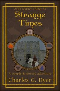
Charles Dyer submitted Strange Times – Aed’s Journey Trilogy #3 designed by Charles G. Dyer.
Chris Lambert submitted Brother James: Growing Up With the Messiah designed by Chris Lambert. “I like it, but I don’t love it. It’s the first in a series and I need to get it right before I publish the rest. Many thanks for what you do, I’ve learned a lot.”

JF: It doesn’t make much of an impression because it lacks drama, the illustration is weak and the typography isn’t helping.
Claire Wildish submitted Tales of My Uncle Bob designed by Claire Wildish.

JF: The collage is totally charming, nice job. Tip: We usually put the author’s name on the cover, too.
Cyn Mackley submitted American Goth designed by Melanie Dunn. “I wanted a play on Grant Wood’s American Gothic, but I wanted it to be modern and graphic. But I still wanted it to clearly represent a farm, a Goth girl in the country, and someone in law enforcement. Melanie did an amazing job of creating just that.”

JF: Dramatic use of silhouettes, and it does echo Grant Wood.
Dan Van Oss submitted Knowledge Revealed designed by Dan Van Oss / CoverMint Design.

JF: Terrific detail and texture, with expert type handling.
Dan Van Oss submitted The Melting Dead designed by Dan Van Oss / CoverMint Design.

JF: Classic horror cover, or destined to be.
Dan Van Oss submitted Dawn Of Rebellion designed by Dan Van Oss / CoverMint Design.

JF: Atmospheric combination of an alluring heroine and strong story elements and a carefully controlled palette give this cover great impact.
Dane Low submitted The Haunting of Blackwood House designed by EbookLaunch.com.

JF: A beautifully rendered and atmospheric cover that sets the stage for the story inside, complete with pro typography. ★
Dane Low submitted Sync City designed by EbookLaunch.com.

JF: Bold and attractive.
Dane Low submitted The Tin Foil Hat Club: And other odd short stories designed by EbookLaunch.com.

JF: An amusing and graphic cover for a book of “odd” stories.
Dane Low submitted Harborwood designed by EbookLaunch.com.

JF: Evocative cover for this romance, and a cover hat locates the main characters at the focal point.
Darja DDD submitted First Command designed by Milo from Deranged Doctor Design. “Historical Fiction, Fantasy cover design by Milo, Deranged Doctor Design. A tides novella.”

JF: A strong series design that features exciting action on the high seas and a dynamic heroine. ★
Darja DDD submitted Air and Ash designed by Milo from Deranged Doctor Design. “Historical Fiction, Fantasy cover design by Milo, Deranged Doctor Design. Tides Book 1”

Darja DDD submitted War and Wind designed by Milo from Deranged Doctor Design. “Historical Fiction, Fantasy cover design by Milo, Deranged Doctor Design. Tides Book 2”

Darja DDD submitted Club Thrive: Compulsion designed by Marushka from Deranged Doctor Design. “Contemporary Romance design by Marushka from Deranged Doctor Design. The Club Thrive Series Book 1”

JF: The steamy attraction of this series is unmistakable.
Darja DDD submitted Club Thrive: Vendetta designed by Marushka from Deranged Doctor Design. “Contemporary Romance design by Marushka from Deranged Doctor Design. The Club Thrive Series Book 2”

Darja DDD submitted Take Me to the Cat designed by Marushka from Deranged Doctor Design. “Psychological Thriller design by Marushka from Deranged Doctor Design.”

JF: A good thriller cover with lots of atmosphere from that lowering sky.
Darja DDD submitted Gods Themselves designed by Kitten from Deranged Doctor Design. “Romance, Fantasy, Mystery cover design by Kitten from Deranged Doctor Design.”

JF: Lots of steampunk-y details on this silhouette dominated cover.
Darja DDD submitted Splinters designed by Milo from Deranged Doctor Design. “Science Fiction, Horror cover design by Milo from Deranged Doctor Design. The Prospero Chronicles Book 1”

JF: A terrific series of three covers for these sci-fi novels with a clever titling scheme. I think I like Slivers best because the beast reaching out towards us breaks the plane of the cover to involve us, too.
Darja DDD submitted Shards designed by Milo from Deranged Doctor Design. “Science Fiction, Horror cover design by Milo from Deranged Doctor Design. The Prospero Chronicles Book 2”

Darja DDD submitted Slivers designed by Milo from Deranged Doctor Design. “Science Fiction, Horror cover design by Milo from Deranged Doctor Design. The Prospero Chronicles Book 3”

Darja DDD submitted Deadly Cargo designed by Milo from Deranged Doctor Design. “Space, Science Fiction cover design by Milo from Deranged Doctor Design. Jake Mudd Adventures Book 1”

JF: Another strong sci-fi series, here for more adventure-based stories. The back-to-us hero involves us in the scene, and the repeating spacecraft becomes part of the branding.
Darja DDD submitted Forced Vengeance designed by Milo from Deranged Doctor Design. “Space, Science Fiction cover design by Milo from Deranged Doctor Design. Jake Mudd Adventures Book 2”

Deborah Coonts submitted Lucky Ride designed by Andy Brown.

JF: A cover with high visibility and an interesting style.
Donna Murray submitted Guilt Trip designed by Dino Buljubasic. “This mystery/suspense novel, (published 2016), had a cover that simply wasn’t working. I held a contest for designers, then before choosing polled a group of readers familiar with my new series character. I’m revealing the design they chose this week.”

JF: Your new cover is evocative, good luck with the change.
E.G. Michaels submitted Before The Clock Strikes designed by Octagon Lab. “Hi, I’ve been studying cover design and typography recently. My early covers were influenced by my author input. I’m wondering if the typography is off for my book series (this is book 1). I greatly appreciate any feedback or comments you can offer on this cover. Sincerely, E.G. Michaels”

JF: The combination of fonts in the title typography is awkward, and the big black space behind it isn’t helping.
Formatting Experts submitted Grave Injustice: An Afterlife Odyssey designed by Formatting Experts.

JF: Good, though generic-looking.
Gary Friedman submitted Frank N. Stein designed by Adam Richardson.

JF: I believe the shape in the upper left is supposed to be a cloud. The illustration style looks more like a rough draft, but the composition is strong.
IOLANTHE WOULFF submitted STAINER designed by JOLEENE ANGELLE.

JF: Seems like an odd use of all those metallic finish effects.
Jacob Fletcher submitted Reincarnate designed by Jacob Fletcher. “A whimsical blend of color that hints at a bit of darkness.”

JF: The “self-published” look.
James Egan submitted High Stakes designed by James T. Egan of Bookfly Design.

JF: Lots of drama and story along with magic and a beautiful type treatment. Sometimes authors leave long notes about what kind of book is show. What I admire about covers like this one is no notes are required: it’s all there for anyone to see. ★
James Egan submitted Veritas designed by James T. Egan of Bookfly Design.

JF: The designer is obviously highly skilled, which makes the empty boast “Award Winning Author” more odd than usual. My tip: if you can’t be specific, like “New York Times Bestseller” or even “Marin Independent Journal Bestseller” or if you’re desperate, “Amazon Bestseller” you would be better served by just leaving it off entirely.
Jeramiah Parks submitted Malevolence When the Harvest Dies Series: A Prequel designed by Victoria Parks. “Victoria designs all of her covers, and either one of her books currently in publish should be considered for this award.”

JF: By submitting it here, it is automatically considered for any awards we have available. Alas, in this case, no award will be given for a cover on which we can’t even read the title.
Jeremy Flagg submitted Suburban Zombie High designed by Jeremy Flagg. “The cover image is directed at young adults and more specifically high school students. The stickers along the lockers on the cover are a subtle and playful way of depicting the storyline in a less obvious manner.”

JF: Cute idea and appropriate, but that big maroon block at the bottom is basically a punt (U.S. football term) when you don’t know what else to do.
Jessica Baverstock submitted Neville and the Arabian Luncheon designed by Jessica Baverstock.

JF: Some nice style comes from the combination of the illustration style with a whimsical typeface, but the color of the word “Neville” looks like a mistake to me, since there’s no apparent reason it’s different from the rest of the title.
JL Morin submitted Nature’s Confession designed by J Caleb Clark. “An android looking out at the black hole our galaxy revolves around, Sagittarius A, as it churns out the gamma rays that light up the title NATURE’S CONFESSION”

JF: Good sci-fi cover, even though the foreground figure doesn’t integrate very well with the rest of the cover.
Kari-Jade Brennan submitted Playlist designed by Kari-Jade Brennan. “Images from Canva.com. Thank you, Kind Regards Kari-Jade Brennan”

JF: Confusing and poorly combined images, and the author name looks like it was obscured on purpose.
Katy hackers submitted The carfax chronicles designed by Katy hackers. “The brief was to represent many parts of the story as this, the 1st book, had no “most important” scene to illustrate. Also to create a series brand, so the image can be reproduced in a similar style with different features and colours for the upcoming sequels. Non condescending young adult cover.”

JF: The central illustration is great, but I wonder if your author has been living in a location where they are not inundated with commercials for the CARFAX service? I see them several times a day.
Kellie ONeill submitted Evergreen Avenue – Book One 1970s designed by april twenty designs. “This novel is set in the 1970s. The use of brown and orange is a nod to the fashions of the time. Two images were used to complete the cover – a woman in vintage attire and a wooden bridge suspended over a river. Both images relate to the story and the absence of the protagonist’s face adds mystery.”

JF: I remember that orange all too well, glad it’s gone, but it does have a place on this nicely arranged cover. The title (in the classic Americana font) desperately needs to be kerned better, however.
Leigh (Bella) St John submitted Quantum Lace designed by Leigh (Bella) St John. “This book is set Warrior Square, England in 1895 – & during the writing of the book, I stayed in a Victorian apartment in Warrior Square & incorporated elements of the apartment into the cover – the background is a photo of the wall paneling & the spine is a photo of the lacework around the ceiling.”

JF: I respect the work that went into this cover, but the end result is strikingly ineffective, from the small indistinct visual to the weak typography.
Linda Kendrick submitted Vanity and Vengeance designed by Skylar Faith. “The fact that you don’t see their eyes communicates the reserve that is so much a part of the Regency Era. The background of a handwritten letter (letters drive the plot). Difference in dresses expresses the difference in their personalities. Clenched fist by the word “Vengeance”.”

JF: This cover has a lot to recommend it, from the juxtaposition of the two women, mirroring the title, to the overall texture that ties it together. Shame you can’t read the subtitle.
LJ Cohen submitted Parallax, Halcyone Space book 4 designed by Chris Howard. “All 4 books in the series have art created by the same artist. All the typography used the same fonts, with the colors varying to match elements in the painted image for solid branding.”

Magali A. Fréchette submitted MY SOUL TO GIVE designed by Jay Aheer. “Celina is torn between her revenge demon’s charms and her loyalty to her late husband.”

JF: An effective cover for this paranormal romance, but I really have to question the wisdom of topping the entire cover with a band identifying the publisher. I mean, who cares?
Mark Reid submitted The Girl and the Clockwork Crossfire designed by Mark at Author Packages. “The author had some very specific ideas in mind for the third book in her steampunk series, so there were some elements, such as Macak the cat, which had to be present. We wanted to capture not only the theme, but also a sense of despondency and of being hunted, without being too bleak.”

JF: Although the woman looks bleak, light streaming through the windows implies hope. Very effective illustration combined with expert type handling.
Mark Reid submitted Happily Ever Not designed by Mark at Author Packages. “The author’s book was pitched as being a romance novel, but it soon became pretty clear that it wasn’t quite a typical one. It was more a story of one-sided love, heartbreak, and learning to love yourself and move on. We thought a chick-lit feel with romance elements would suit her story perfectly.”

JF: Interesting layout that attempts to draw us into the story, but I have to admit I’m not a big fan of the very attenuated, “loopy” fonts like the one used for the title.
Mary Ann R Unger submitted Cathy’s World designed by Morpheus Blak for Critical Mass Communications LLC. “While I had a Ruth Gordon type in mind for the title character, former child star and actress “Cathy Britton,” Morpheus convinced me the woman should still be glamorous and sophisticated…surrounded by the darkness that’s now her life. He also designed my last 3 covers.”

JF: No way to understand the incongruous typography of the title, and it may be that you’ve gotten a bit too specific with the photo.
Mary Liwhinky submitted The Messenger Pigeons designed by Mary Liwhinky.
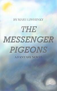
JF: Lacks impact or any perceptible “hook.”
Meridel Newton submitted The Puppet Kingdom designed by Rachel Simko. “The main image is an original oil painting which was scanned and altered digitally. I really wanted this cover to capture the feeling of 90s/2000s mass market SFF, and I think it works beautifully.”

JF: Does nothing for me, the artwork is rough and the title looks like an afterthought that belongs to another book.
Michael Laird submitted The Forged Prince designed by Michael Laird. “I wanted a simple, uncomplicated design that clearly conveyed the kind of book this was (heroic fantasy set in 7th century Celtic and Welsh mythology) and which would stand out from the many cookie cutter covers now used on so many fantasy novels.”

JF: Artless, and relying on a silhouette in this situation really hurts the overall effect. I suggest hiring a designer.
Michelle de Villiers submitted Little Red Brittle Star designed by Michelle de Villiers. “The cover was inspired by the German zoologist Ernst Haeckel’s seminal “Kunstformen der Natur”:https://de.wikipedia.org/wiki/Kunstformen_der_Natur.”

JF: It would be great if we could just grab a title page from 1904 and have it turn into a beautiful ebook cover, but alas, that’s not the case here. Putting aside whether this was a good idea to begin with, the cover has none of the delicacy of the model it was based on and introduces a ruinous illegibility besides. Here’s the original:

Michelle Halket submitted The Goblins of Bellwater designed by Michelle Halket.
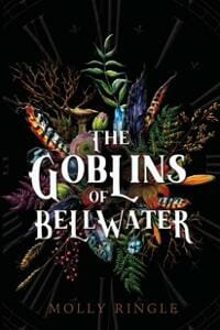
JF: A very effective combination of illustration and typography.
Natasha Snow submitted It Began designed by Natasha Snow. “Thanks!”

JF: Lots of excitement on this cover for a dystopian sci-fi story, and a lot of the heat comes from the color combinations. Also features another back-to-us heroine.
Nathaniel Badertscher submitted The Rage That Follows designed by Nathaniel Badertscher.

JF: The size changes in the title seem gratuitous to me, what purpose do they serve?
Patricia Kirk submitted Martha’s Sister Beloved Prodigal designed by Patricia Kirk.

JF: A good composition that would have been stronger without the top and bottom color panels and the heavy effects on the top line of type.
Patrick Samphire submitted Shadow Duet designed by Patrick Samphire. “Shadow Duet is a historical fiction short story set in England at the end of the eighteenth century.”

JF: Lovely and attractive with both character (the woman) and story (the architecture).
Rebecca Syme submitted Vangie Vale and the Murdered Macaron designed by Lyndsey Lewellen. “Thanks so much for doing this.”

JF: It’s fun to see an accomplished cover designer take on a quirky book like this one and succeed so well. Bleeding macaroons? We’re forced to believe, and that’s the “hook.” ★
Rena Hoberman submitted Quantum Space designed by Rena Hoberman of Cover Quill.

JF: Solid sci-fi cover, and the added detail of the piece of gridwork at the top helps balance the overall design.
Rena Hoberman submitted The Lost Rose designed by Rena Hoberman of Cover Quill.

JF: An evocative scene, especially because the woman’s vulnerability is highlighted by her precarious walk. Overall, might be a bit too quiet for its market.
Richard G. Stevens submitted MiSDirection designed by Richard G. Stevens. “Set in WWII, I set out to depict everything within the book in an Art Deco format, without overtly revealing the main protagonist.”

JF: The really unusual thing about this amateur cover is the panel on the left, which sure looks like the spine artwork for a paperback but which is, in fact, part of the cover design. Go figure.
Robert Brunner submitted Strangeways designed by Neil Jingco. “I love this work. Neil, the designer, captured; the setting (prison), the claustrophobia and pressure, the Norse religious elements, and the main mechanism that kicks off the story. I think it’s a great example of a supernatural thriller cover.”

JF: Nice job, it really puts us into the environment of that cell.
Sarthak Khurana submitted A Teaspoon of Death designed by Author Unlock.

<JF: The odd font choice is only outdone by the even odder color choice. Despite the illustration, it’s rather off-putting.
Sean Keefer submitted The Solicitor designed by Drew Kellum. “The book is set in Charleston, SC so the foal was to capture the city and the feel of the book with the cover.”

JF: A nice idea, but the cover is underwhelming. It’s like someone whispering in a large room crowded with loud talkers.
Tam Francis submitted The Flapper Affair designed by Tam Francis. “Karen captured the romance, vintage feel, and time travel aspect of the novel in muted gold, brown, and yellow tones. The font she choose added a nice hint of the era without overpowering the artwork.”

JF: Artful. I like most everything about this cover, from the great illustration to the subtle image compositing, but the lack of contrast of the title due to the monotone color palette is not a strength. I really think it would be stronger with a title that stood out from the background a lot more, although your font choice is right on the money.
theo waterberg submitted surviving the fatherland designed by akira007. “Hello! I designed the cover for Annette, she gave me some details from book what i could work with, and what she hat from ideas, out from that i designed her cover, custom made.”

JF: The title could be more emphatic, but overall a workable design.
theo waterberg submitted The Grandmother designed by akira007. “Like offen as a designer, you getting very less to work with, in this case a girl with star tattoos, dark, creepy, and something whats looking old, like from your youth…then i created the cover!!”

JF: Best thing is the creepiness and focus on the telephone.
theo waterberg submitted escape from abergris cave designed by akira007. “Joan came to me with many many ideas, what she wanted on the cover, so we hat to cut it a bit down to basics, the story takes place somewhere on a very hot island and is a kind of a thriller etc, so the beauty of the island is in danger,…etc”

JF: Is it “Cave” or “Caye”? Can’t tell, although I admire the focus element that controls the cover.
theo waterberg submitted Sins of my youth designed by akira007. “Worked out from Mary Anns Ideasm there is a scene in the book , what she wanted to have: a dead man with cutted throat on a bank in autum late night, a stripper and blood, that was my directions for the cover…and i then designed this..”

JF: Okay.
theo waterberg submitted The Well designed by akira007. “I designed the cover for Sidney , he didnt give me much info around the story so i hat to read some parts before i came up with this one..”

JF: Odd image combination and type that looks like it belongs on a corporate brochure.
theo waterberg submitted zero designed by akira007. “The book takes place in washington and is one of the typical action thrillers out there, very less time, before it all goes down, last minuts, agent, white house? perhaps a car etc….that was my information before starting the project,,,,”

Tobey Alexander submitted Origins Of The Magdon: Valley Of The Kings designed by Tobey Alexander. “Comprised of own images reflecting the story being set in Egypt.”

JF: There’s nothing the matter with the cover, but it looks more like a nonfiction book or a report on antiquities.
Vrinda Baliga submitted Name, Place, Animal, Thing designed by Manoj Vijayan. “Name, Place, Animal, Thing is a collection of short stories from India. Manoj Vijayan has taken elements from the various stories in the book and brought them all together in a brilliant cover.”

JF: A creative and nicely textured cover for a book of stories, although the words in the title could have stood out a bit more.
Nonfiction Covers
Alexis Dubief submitted Precious Little Sleep designed by Peter Cocking. “This is a book on baby sleep for pregnant families or parents of kids under 2. Books in this genre are universally beige with photos of babies on the cover. I asked the designer to create something that was bold, fun, and captured the chaos of life with a new baby and am thrilled with the result!”

JF: But you do realize there’s a reason all those books have babies on the cover, right? This cover is good, and could help you accomplish your goal, but it does require the viewer to make that extra leap, since there are no babies visible and babies aren’t in the title either.
Bernard Jan submitted A World Without Color designed by Mario Kožar MKM Media. “Thank you for this opportunity and my best, Bernard Jan”

JF: An interesting approach, but the composition never comes together, weakening your message. Although it’s an ebook only, the cover looks like it was designed more for print.
Cathi Stevenson submitted Building Twitter Community designed by Cathi Stevenson. “Had a lot of fun making this cover, because I love to play with colour. The symbols reflect the content.”

JF: A fun and attractive cover just right for this niche, although the fit of the subtitle in its bubble is bothersome: either put it in the bubble, or ignore the bubble, but running right up to the edge creates an uneasy tangent. ★
Connie Bombaci submitted Hogan’s Hope: A Deaf Hero’s Inspirational Quest for Love and Acceptance designed by iUniverse. “The picture of Hogan was taken during a vacation for our dogs. His posture and facial expression captured his new sense of success, freedom, and hope. Rejected at first because of low resolution, rendering it into a painting made it possible to use this one and only picture that the author wanted.”

JF: A handsome dog on an equally handsome cover. ★
Deborah Howard submitted Haiku 52 designed by Fiona Jayde. “The simple and peaceful design of the cover relates to minimalistic form of haiku and theme of nature that runs throughout the book.”

JF: Beautiful and contemplative, an appropriate cover for this collection of poems.
Gisela Hausmann submitted NAKED REVIEW How to Get Book Reviews designed by GISELA HAUSMANN.

JF: Wow, a lot going on here, and the pieces don’t seem to have much to do with each other. While it will get attention, it’s a bit of a mess, from the “ransom note” to the type spread all over the cover.
James Egan submitted Soldiers of the Strange Night designed by James T. Egan of Bookfly Design.
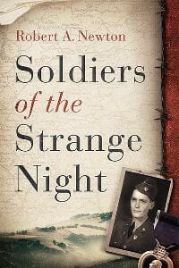
JF: A beautiful cover with many fine details, from the careful presentation of the map in the background to the hint of landscape that helps locate the story, along with careful typography. ★
Nicole Harkin submitted Tilting, A Memoir designed by Ivan Bjørn. “Thanks for your consideration.”
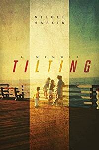
JF: An evocative cover for this family memoir, and the vertical highlight does a good job of making this more than just another author snapshot. ★
Rita Toews submitted Music and Creation designed by Rita Toews.

JF: Considering the subject matter, this is rather lifeless and dull.
santiago ribeiro submitted Philosophy in a Meaningless Life designed by Bloomsbury Academic.

JF: A really good print book cover that uses a surrealistic illustration to play off the theme of the book, but it doesn’t translate well to use as an ebook cover.
Soji Ojeniyi submitted Now That You Are Choirmaster designed by Thinkstock. “As Now That You Are Choirmaster inched closer to press in May 2014, Randy Smith at submissions sent me a link plus pictures. Artists fused spiral music through conductor’s hands with stage curtain.”

JF: Rather dark and, I’m afraid, almost a bit sinister.
Steph Williams submitted How to Be a Good Mom (Or at Least Not an Epic Failure) designed by Tanner Cangelosi. “Tanner Cangelosi is an independent artist and pastor’s wife; she designed the cover of my book at my request, based on preferences I provided.”

JF: A lovely idea, but to be really effective, I’d like to see the lettering and artwork executed in a much better way.
Sylvain Eliade submitted From Ocean To Ocean designed by Sylvain Eliade. “The book is on the first crossing of Australia by bicycle. The choice of photos was quite limited by the fact that there are only two known photographs of the author. I wanted to echo the colors of the dunes in the Australian outback, which vary from light yellow/grey to deep red and pale pink.”

JF: A lovely cover that uses a historical photo to great effect, combined with classic typography to create a clear message about the book inside. ★
Well, that’s it for this month. I hope you found it interesting, and that you’ll share with other people interested in self-publishing.
Use the share buttons below to Tweet it, Share it on Facebook, Plus-1 it on Google+, Link to it!
Our next awards post will be on September 18, 2017. Deadline for submissions will be August 31, 2017. Don’t miss it! Here are all the links you’ll need:
- The original announcement post
- E-book Cover Design Awards web page
- Click here to submit your e-book cover
- Follow @JFBookman on Twitter for news about the E-book Cover Design Awards
- Check out past e-Book Cover Design award winners on Pinterest
- Subscribe to The Book Designer Blog
- Badge design by Derek Murphy

