Welcome to the e-Book Cover Design Awards. This edition is for submissions during February, 2015.
This month we received:
98 covers in the Fiction category
27 covers in the Nonfiction category
Comments, Award Winners, and Gold Stars
I’ve added comments (JF: ) to many of the entries, but not all. Remember that the aim of these posts is educational, and by submitting you are inviting comments, commendations, and constructive criticism.
Thanks to everyone who participated. I hope you enjoy these as much as I did. Please leave a comment to let me know which are your favorites or, if you disagree, let me know why.
Although there is only winner in each category, other covers that were considered for the award or which stood out in some exemplary way, are indicated with a gold star: ★
Award winners and Gold-Starred covers also win the right to display our badges on their websites, so don’t forget to get your badge to get a little more attention for the work you’ve put into your book.
Also please note that we are now linking winning covers to their sales page on Amazon or Smashwords.
Now, without any further ado, here are the winners of this month’s e-Book Cover Design Awards.
e-Book Cover Design Award Winner for February 2015 in Fiction
James Egan submitted Hedon designed by James T. Egan of Bookfly Design.
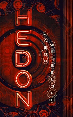

JF: The real role of cover designers is to sell books, and they do it indirectly. The cover of this dystopian psycho-thriller does just that. Before I looked it up I knew it was a gritty dystopian tale, and my interest—and willingness to buy—was piqued. It’s all texture, detail, and focus accomplished with a controlled color palette and artful typography that’s integral to the design.
e-Book Cover Design Award Winner for February 2015 in Nonfiction
James Egan submitted Ocha Teacher designed by James T. Egan of Bookfly Design.

JF: A beautiful and sensitive cover for this memoir that centers around the author’s relationship with her mother. The visual perfectly evokes the tea ceremony, and the care put into the design is evident everywhere.
Fiction Covers
Agatha Styles submitted The International Cafe designed by Natasha Kudaskina & Agatha Styles. “The cover of The International Cafe was created in acrylic paint by Canadian artist Natasha Kudaskina. It captures the mood and the drama of this romantic thriller, with the half-filled (or half-empty) glass standing & the spilled wine like spilled blood. The fonts suggest both romance and realism.”

JF: The illustration style is what makes this cover stand out, although the “Book One” line looks lonely.
Alex P. Berg submitted The Tau Ceti Transmutation designed by Damon Za. “The Tau Ceti Transmutation is a science-fiction private eye novel that pays homage to pulp novels of decades past. Given the pulp flair, I don’t think the designer (Damon Za) could’ve done any better.”

JF: Right on! Tons of style combined with lots of story, and nothing is getting in the way.
Alice Sabo submitted Dark Deeds designed by Alex Storer. “The main character is struggling against addiction in addition to solving his mystery. He is at a turning point in his life where failure will cause him to lose everything he’s earned since becoming sober. I think Alex captured the essence of this struggle.”

JF: Although it looks oversimplified, I think the dramatic illustration makes up for it.
Alicia Rades submitted Where the Darkness Ends designed by Alicia Rades. “The cover photo itself was designed by Melpomene via Shutterstock, but I purchased the license to it and overlaid the text. I hope that doesn’t affect my submission eligibility. Thank you!”

JF: You’re in good company, Alicia, no worries. And you’ve done a lovely job putting this cover together.
Annette Drake submitted A Beautiful Day in Alaska designed by Stunningbookcovers.com. “This cover just seemed the perfect fit for my romantic novella, A Beautiful Day in Alaska. I loved the suspense between the two characters – they’re almost kissing but not quite. I hope readers will too.”

JF: Looks pretty generic, honestly. Is that really Alaska?
Anthony Maldonado submitted The Death Detail designed by Mariann Yattaw. “The last known colony of people are driven underground to escape a biological weapon known as The Agent”

JF: Shows that you can use type effects to create a stylish cover, like here where they are integrated with the entire approach.
Avril Sabine submitted The Ugly Stepsister designed by Caitlyn Petersen.

JF: An unfortunate smashup of weak typography and a not very attractive photo, combined without any balance.
Bella Woodfield submitted The Girl and the Moon designed by Bella Woodfield.

JF: Simple and charming, a good approach for an author-designed cover.
Ben Galley submitted Bloodrush designed by Teague Fullick. “The eBook design was created by myself and graphic designer Teague Fullick. Thanks for the consideration!”

JF: A beautiful design that attempts to rationalize the wildly different strains of this story that’s part western, part magical fantasy. The diagram is a branding element.
Bethany Macmanus submitted Nerve designed by Bethany Macmanus. “Cover photographer: Joyelle Wright, (photographybyjoyelle) Cover model: Amy Barnes”

JF: Created with care, but I don’t think scowling women are that attractive, and the type has a paranoid feeling to it, like a series of white fences.
Caryl McAdoo submitted Hearts Stolen designed by DogEaredDesign Kirk DouPonce.

JF: A solid genre cover.
Cassandra Page submitted Isla’s Inheritance designed by Calliope-Designs.com.

JF: Although the font choices are good, not sure I like all the type squeezed together like that at the bottom.
Child Robins submitted the Stygian wild designed by Child Robins.

JF: You have a lot of latitude when designing covers for books of poetry, but this one clearly has problems. To begin with, “stygian” comes from the river Styx, you know the one at the gates of Hell? It’s a synonym for “dark” but this cover, with its meaningless illustration and wildly inappropriate font, never lets on. Almost a textbook case of what not to do.
Chris Hanada submitted First Fleet #1: Bones designed by Eben Matthews. “This book series is retro-style scifi in the vein of Clarke and Heinlein. To represent that, we wanted the book covers to have a retro, well-loved paperback texture to them as well as a highly graphic look that harkens back to the adventure novels of the past.”

JF: Nicely done, I love the retro, “weathered” look and the throwback typography, but I would have liked to see all those white lines softened so they aren’t as pronounced.
Chris Kennedy submitted Can’t Look Back designed by Lee Dunning. “Lee did an excellent job capturing a “moment in time” from a large combat scene for the cover of this book!”

JF: Pretty basic.
CJ Lyons submitted FAREWELL TO DREAMS designed by CJ Lyons. “When readers asked for more of the Fatal Insomnia story I needed to re-brand the original book, FAREWELL TO DREAMS, which had been intended as a standalone novel. I decided to use bold colors with one iconic image on each cover, in this case a burning door (which is a recurring motif in the book).”

JF: Very cool. The door image is so strong it’s overpowering some of the type, but as a whole it works well.
D. U. Okonkwo submitted RISE designed by F. Banner. “The idea behind this cover design was for an emotional image to capture the heart of this novel.”

JF: An intriguing visual style captures attention for a book on a sensitive subject.
Dan Collins submitted Cartoons That Will Send Me Straight To Hell 3 designed by Dan Collins. “My third self-published ebook of my cartoons and the seventh over all. The cloudy sky was my own photograph taken on a lake I fished on a blustery April day. Worked perfectly here. The cover went through several design changes until the final.”

JF: Love it, funny and perfectly apt, but then you cartoonists have a real advantage, right?
Dane Low submitted Critical Mass: A Doug Shelton Novel designed by Dane & Brittany at EbookLaunch.com.

JF: Solid thriller cover with plenty of menace and just enough story to pull us in.
Dane Low submitted The Heir of Olympus and the Forest Realm designed by Sophia & Brittany at EbookLaunch.com.

JF: Probably the most interesting decision the designer made here was the choice of Copperplate for the title treatment. Common on currency and wedding invitations, here it gives a solid and classical tone to this cover.
Dane Low submitted The Prophecy of Arnaka (The Arnaka Saga Book 1) designed by Dane & Brittany at EbookLaunch.com.

JF: It takes a careful hand to balance these elements, and it’s interesting how the designer has made the medallion at the top the chief focal point of the cover, not the title. Very attractive.
Danny Mims submitted Murray’s Marauders designed by Danny Mims. “As a decorated Viet-Nam vet and now an old Scoutmaster, I use insect characters to tell stories about universal truth, loyalty and honor, even if the heroes and villains are very small folk.”

JF: Hey, I loved Woody Allen in Antz! But with all due respect, I think you should hire a professional cover designer because this isn’t doing you any good at all.
David John Griffin submitted Two Dogs At The One Dog Inn designed by David John Griffin.
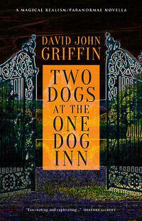
JF: Not bad, and I like the typography.
DB Chenoweth submitted Gaby’s Great Commission: Adventures in Angeling designed by LCC Desings.

JF: It’s hard enough to make sense of the visual without it obscuring the type.
Diane Vallere submitted Some Like It Haute designed by Diane Vallere. “This is book 4 in a series about a former fashion buyer turned amateur sleuth. Arson is part of the mystery. The series is appropriate for ages 13+.”

JF: I like the sass and style of your attractive heroine, but the white circle looks unfinished and I’d rather see a more stylish display typeface instead of this one.
Dianne Lynn Gardner submitted Pouraka designed by Dianne Lynn Gardner. “Original oil painting by author/illustrator Dianne Lynn Gardner, Pouraka is an underwater romance of two merpeople in love and struggling against the invasion of man. Dolphins keep guard over the mers, hence I included a pair of dolphins in the image.”

JF: It’s terrific that you can both write them and create such lovely artwork, too. The missing element is the typography, and here the title is almost an afterthought, playing too subservient a role to the art.
Dr. Orly Katz submitted Busy Dizzy designed by Bijan S..

JF: Cute idea, but the execution lacks impact.
Elizabeth Andre submitted Love’s Perfect Vintage designed by Eden Connors. “I was looking for a cover that would convey sexy, classy, relaxing romance. One of the main characters is a sommelier, hence the wine reference.”

JF: I’m sure you know your readers, but I don’t see much logic to this. “Sexy classy relaxing” = woman drinking wine in her undies? Disjointed and out of balance.
Gabrielle Prendergast submitted The Obsidian Stairway designed by Gabrielle Prendergast. “I loved this image and wanted to use it to convey a bleak near future without screaming it. This is part of a series with a very cohesive look. And I think the black and white will stand out among sci-fi romance, which it the genre.”

JF: An interesting image composite with a hint of surrealism and strong typography make this a winner.
GERARD LASALLE submitted ISTHMUS – A NOVEL designed by GREENLEAF BOOK GROUP. “Isthmus medallion and map design by Randy Mott. Cover design by Neil Gonzalez (Greenleaf Book Group).”
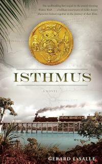
JF: Beautifully detailed with tons of atmosphere, and a train inviting us along for the ride. Top-drawer.
ibitola Ojoye-Adebayo submitted Acceptance designed by Kelly Van Der Weide. “The book cover portrays a young lady who has gone through , love, loss and betrayal.”

JF: Then she deserved better than the put-some-type-on-a-photo-and-call-it-a-book-cover treatment.
ibitola Ojoye-Adebayo submitted Acceptance: Into the darkness designed by Kelly Van Der Weide. “The book cover portrays a young lady who has been thrown into darkness due to betrayals of the worst kind by people she calls family.”

James Curwen submitted Hero Unit designed by James E Curwen. “A cover I recently created for a client. Stock background photo and hand-drawn badge.”

JF: Would have liked to see the title integrate better with the rest of the cover.
James Egan submitted Nashua’s Choice designed by James T. Egan of Bookfly Design.
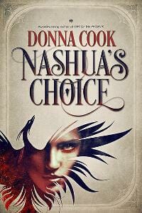
JF: I like the way the two visual layers add depth, and the type shows the designer’s artistry and attention to detail.
Jan Hurst-Nicholson submitted With the Headmaster’s Approval designed by Vanessa Burger. “Thanks for the opportunity to have my cover evaluated. My brief to the designer was that the cover should convey a ‘feel-good’ story that will appeal mostly to women 30+. I did not want it to be mistaken for a romance. The tagline on the cover is for the print version.”

JF: Lovely and effective, although the title looks like it’s being squeezed up against the top trim.
Jan Thompson submitted Jane Austen Upside Down Parody Pack designed by Jan Thompson. “Continuing the whimsical couch theme for the covers in my Jane Austen Upside Down parodies, this is the cover for a two-parody bundle that I squeeze in here and there in my anthology. Hence, the squeezed couch. I believe that creating book covers should be fun, regardless of genre.”

JF: It got a snicker out of me. I instantly remembered the last “couch” cover, too, so the couch thing is working.
John Murray submitted Celtic Justice designed by Phil Poole.

JF: A cover with lots of POW!
Julie Stock submitted From Here to Nashville designed by designforwriters.com. “My debut romance has a country music theme and we wanted the cover to be a balance between both of those elements, as well as setting it against the Nashville skyline. We also wanted it to be a bit different to most other book covers in the romance genre.”

JF: A beautiful cover with typography that evokes the country music theme of the book, and a great color scheme. It sings. ★
Karen Fredericks submitted Mrs. God’s Diary. Creation. designed by Karen Fredericks. “As a child, Bible stories, with their floods, locusts & plagues gave me nightmares! After reading of Abraham agreeing to slay his own son I slept with one eye open from third grade thru sixth. I’ve written and illustrated the book I wish I’d read and hope the cover is reassuring friendly & inviting!”

JF: It’s really quite charming and you’re obviously talented, but the whole title treatment up in the corner is way too small for use on an ebook cover.
Kari M. Knutsen submitted Want a Peek? designed by Kari M. Knutsen. “Welcome to my World! Poetry and More…”

JF: Doesn’t work for me. Which is the title? Awkward.
Karla Tipton submitted Dangerous Reflections designed by PJ Friel. “I didn’t want a cover thrown together with stock photo images. I wanted magical artwork showing my characters in the historic setting of a 1910 townhouse. I went online to find an artist who had a great eye and 3-D modeling skills. Ironically, she lives in my hometown, now 2,500 miles from me.”

JF: The drawing looks lovely, but everything on this cover looks so remote it’s hard to engage with it. And considering the work that was put into the title treatment, the author’s name would have been better left plain.
Kathryn Loch submitted Legacy Box Set designed by Kathryn Loch. “The “cover” of a four volume “box set” that also showed the full book spines for my medieval Highlander romance series. Because books spines had my name on each one, I decided not repeat it a fifth time on the actual image. It seemed to me that keeping the image of the box set uncluttered with only the title and a simple tagline worked the best.”

JF: Dark to the point of being unfathomable.
Katie Stewart submitted Corpse Dust designed by Katie Stewart.
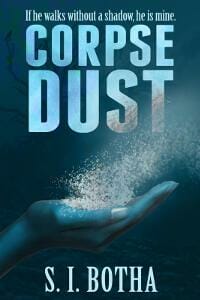
JF: Spooky and solid. Not sure I would have picked blue, but I can’t deny the impact of this cover.
Kay Rennie submitted Triton’s Deep designed by bespokebookcovers.com. “This is a fantasy novel. I hoped the cover image would be intriguing enough to get prospective buyers to look closer. Graphic image by Martin Herbert.”

JF: A lot of skill went into this, but can anyone tell what the metallic shape is supposed to be? I’m stumped.
Kim DDD submitted Hunter Prey designed by Milo from Deranged Doctor Design. “Cover design for intense thriller with serial killer theme.”

JF: Yep, that works.
Kim DDD submitted Malakhim Volume 4: In the Blood designed by Kitten from Deranged Doctor Design. “Design for book #4 in the series, while books 1-3 are planned for re-design. Design was made to fit the horror/occult fell of the story.”

JF: Good fit, looks just right.
Kim DDD submitted Popstars, Friends & Lovers designed by Kitten from Deranged Doctor Design. “Design for book #2 in the YA romance series. The main request by the author was to make it stand out in the crowd of other YA romances.”

JF: I like the style, not sure why “Popstars” is smaller than the rest of the title though.
Kim DDD submitted Rhuna – Keeper of Wisdom designed by Marushka from Deranged Doctor Design. “Cover Re-Design for fantasy Rhuna – Keeper of Wisdom”

Kim DDD submitted The Edith Wharton Murders designed by Milo from Deranged Doctor Design. “Re-Design and series branding of Thriller series ” Nick Hoffman Mysteries” by Lev Raphael.”

JF: I like the way the trees add both texture and a spooky element, although just reading the name “Edith Wharton” in that typeface is disconcerting.
Kim DDD submitted The Floating Girl (A Rei Shimura Series) designed by Kitten from Deranged Doctor Design. “Cover re-design ( and series branding) for l Mystery/Crime novel”
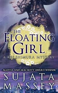
JF: Very nice use of negative space, and the details of the cityscape and texture of the woman’s dress add significantly to the overall atmosphere.
Kit Jenson submitted Stanley Scotch and The Land of Giants designed by Kit Jenson.

JF: An offbeat, unconventional, but totally charming cover for this parable suitable for children.
Lafcadio Adams submitted Lieu designed by Idle Winter Press. “Design created using layered Hubble images”

JF: Clear about the offer it’s making, and that’s a good thing for your readers.
Laurisa Reyes submitted Exile (The Crystal Keeper, Book I) designed by Emma Michaels. “Book one in The Crystal Keeper series, which is also available in omnibus version for digital and print.”

JF: Compare this to the same effect on Nashua’s Choice above, a far more finished, focused, and complex cover.
Laurisa Reyes submitted Betrayal (The Crystal Keeper, Book II) designed by Emma Michaels. “This is book 2 in a series of E-novellas, which are also available in Omnibus version in digital and print.”

JF: Here the shape of the cutout helps the cover hold together and it works well.
Laurisa Reyes submitted Vengeance (The Crystal Keeper, Book III) designed by Emma Michaels. “Book three in The Crystal Keeper series, which is also available in omnibus version for digital and print.”

JF: One of the problems with this series is the lack of continuity with the images revealed by the cutouts. One is a realistic looking drawing, one is a monochrome fantasy-type illustration, and the third almost looks like a photograph.
La’Verne Washington submitted Angels of Dupont Circle designed by Tatiana Vila. “This is my first (debut) novel. A story about DC’s first Af. American female detective team, Jade and Brenda. They are tasked by the Mayor and Chief to find out who is murdering the homeless in the Nation’s Capital. I hope someday that this will be a Television series! Thank you for the opportunity.”

JF: I like the whole logotype treatment at the top, but the rest has that familiar “pasted together” look, and that won’t help.
Lizzie Harwood submitted Triumph: Collected Stories of Gone Girls and Complicated Women designed by Anna Cowie thepixelpusher.co.uk. “I worked with Anna Cowie at thepixelpusher.co.uk on a design to say: These stories are about women on the edge of a breakdown or breakthrough. The colours reflect my New Zealand background and the woman has that look of ambiguity – is she a little messed up or amazingly knowing?”

JF: The image of the woman does capture your theme (the reflection is a bit distracting) so I guess the title and its happy color are intended to be ironic?
Mallory Rock submitted The Futility of Loving A Soldier designed by Mallory Rock.

Maria Bowman submitted Epic of Ahiram: Age of the Seer designed by Maria Bowman. “The weapon on the front was fabricated and forged by my husband, a metalsmith. I photographed the weapon; the fake blood was particularly fun to work with. In addition to designing the cover, I designed the publisher’s logo. (I also photographed the author’s headshot.)”

JF: Some nice elements, but doesn’t blood usually pool, like assume a circular shape? Just wondering. The weapon, impressive as it is, is given too much emphasis on this cover.
Marnie Cate submitted Remember (Protectors of the Elemental Magic) designed by Marnie Cate. “My main character, Mara Stone, had her memories of her magic removed at a young age. The tree and the elements surrounding are representative of her childhood memories of magic and time with the elements. The haze of her blocked past is slowly lifting.”

JF: Completely misses the mark: confusing, illegible, and nowhere near the expectations for this genre.
Mel Corbett submitted Capitol Kidnap: Urban Werewolf Book 1 designed by Mel Corbett. “I wanted to make this clear it was a female protagonist werewolf story in an urban environment (Sacramento). I used the silhouette of a woman so I could repeat that in future books in the series, and included the moon with paw prints, and used tower bridge in Sacramento for the background.”

JF: Somewhat clumsy attempt to “check all the boxes, and the artless typography doesn’t add anything.
Misty Baker submitted Quentin’s Problem designed by K.A. King. “Thank you for this opportunity!”

JF: Could be charming if the title hadn’t been reduced to insignificance by the big “Arrr!”s.
Monica Haynes submitted Elizabeth’s Heart: Book Two designed by TheThatchery.com.

JF: An atmospheric and attractive cover, but I wish I could see what she’s holding in her hand.
Mysti Parker submitted Chances Are designed by Mande Matthews. “Thank you!”

JF: A pretty standard genre cover.
Mysti Parker submitted The Roche Hotel, Season One designed by Mysti Parker. “Thank you!”

JF: This one’s much more exciting, and the retro type and extreme angle of view promise exciting stories to be found inside.
Nancy Chase submitted The Seventh Magpie designed by Nancy Chase & Brian Leavitt. “I wanted the cover to immediately convey the book’s genre (dark fairytale) and also to visually echo the jeweled golden book that figures prominently in the book’s plot. Cover art is by Katrina Sesum.”

JF: The jeweled book effect is terrific and makes the cover stand out, but I don’t know why the title is so weak, especially up against such a strong element as the border.
Nick Marsden submitted The Book of Nepharid designed by Pencastle Publications. “For this trilogy, I tried to make the three books relate visually by using a single, large fantasy element: book, unicorn, and sword, as they relate to the story in each.”

JF: All three covers are effective and keeping the elements to a minimum helps. They still have a bit of an unfinished look to the and I wonder if a border of some kind would help.
Nick Marsden submitted The Unicorn Rider designed by Pencastle Publications.

Nick Marsden submitted The Lich War designed by Pencastle Publications.

JF: … but shouldn’t this read as “The Nlich War”? How can you use it twice and then ignore the “N”?
PATRICIA “PAT” KRAPF submitted GADGETS designed by FIONA RAVEN BOOK DESIGN. “Cover design for Gadgets, book #2 in the Darcy McClain Thriller Series. Our aim was to capture the visual splendor of the Albuquerque Hot Air Balloon Festival, while adding an element of danger—shooting a hot air balloon out of the sky with a high-powered laser.”

JF: It’s a bit busy, and trying to line up the laser beam with the “T” has added some unwelcome rigidity.
Paul Kirk submitted Devastation Point -5 Years Post Viral Apocalypse designed by Damonza.com. “I felt that the work that Alisha at Damonza.com did on my eBook cover art was nicely done and would love to hear your professional take on the cover. Thank you for your time. -Paul”

JF: Hard to see how it could be better. It’s got atmosphere, environmental cues, drama from the figure with his back turned and the strong aura of light around him, and typography completely integrated into the cover. A winner. ★
Peter Fugazzotto submitted The Witch of the Sands designed by Peter Fugazzotto.

JF: I don’t think it accomplishes what it set out to do, and the typography is ungainly.
PJ Webb submitted Iluminati designed by damonza.

JF: Visually strong, and I suspect some of the delicate light effects were added to keep it from appearing over simplified. That’s not how you usually spell “Illuminati” is it?
Randi Everheart submitted Tristan designed by Robin Ludwig. “For this steamy, contemporary romantic suspense series, I wanted each book to get it’s own color but have a uniform look, sexy but nothing to get banned.”

JF: A solid and attractive cover from a skilled designer.
RC Atchisson submitted kick bACK designed by Jessica Sturgeon. “Set on the historic island of Nantucket, kick bACK tells the story of a desperate man pondering the question “What do you do when the bucket kicks back?” Nantucket (or “ACK” to locals and visitors alike) is almost a character in and of itself in the novel providing setting and motivation.”

JF: Clever and well executed design that’s graphically appealing if a bit low-contrast for an ebook cover. Would be even better as a print cover.
Renae Lucas-Hall submitted Tokyo Tales: A Collection of Japanese Short Stories designed by Cathy Helms and Yoshimi Ohtani.

JF: I like the tall format used here and the great anime-style illustration at the bottom, but the floral top half doesn’t seem to mesh that well with the illustration.
Rina Flanagan submitted Jonah designed by M. Flanagan. “I purchased a Stockfresh image with unlimited publishing rights. I extended the background color and added my own text, using an old purchased copy of Photoshop, on my even older Powerbook G4! I hope you like it. (As author name I used only M. Flanagan to eliminate any initial gender bias.)”

JF: Because some initials inspire more bias? Flaming heart is dramatic, but I’m not sure we’re getting any information about the book from this cover.
Scott Harpole submitted Sleepy Beach designed by Jill Read. “Sleepy Beach is a children’s bedtime story. Jill Reed, the illustrator, crafted this book by layering water color drawings to give the idea of depth. The cover shows the entire idea of a Dad putting a child to sleep.”
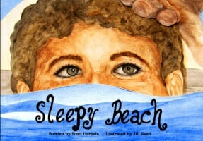
JF: A lovely illustration and the horizontal format alerts us that’s it an illustrated book, but I’d love to see a title treatment with more finesse.
Scott R Rezer submitted The Pawns of Sion designed by Tamian Wood. “Thanks once again to my incredible cover designer, Tamian Wood at Beyond Design International. I told her to surprise me with the cover and she delivered with a beautiful, intriguing image that immediately sets the mood of the story.”
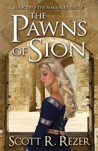
JF: Very nicely done, too. Notice how the window frame in the foreground and arch in the background focus our attention, a lovely device. ★
Sofie Hartwell submitted Waking Up With You designed by Danielle Maait. “A truly romantic cover from the incomparable Danielle Maait.”

JF: You said it. Danielle knows exactly how to elicit a response, and this cover is a good example of fulfilling her buyers’ expectations. ★
Stacy Claflin submitted The Gone Trilogy designed by Cormar Covers.

JF: The bear saves it.
Stefan Barkow submitted In Sickness and in Hell designed by Robin Ludwig Design, Stefan Barkow. “For this collection of dark, philosophical stories, it was hard to think of a startling image that also represented everything inside.Using a scene from the title story, we shot the photo in my house. Then I worked with the designer to get that single image to convey the themes and mood of the whole”

JF: Combine a clever title, a savvy author, and a skillful designer and you get a great cover like this one. The unusual position of the woman’s body—pointing down—helps to produce the overall effect of something unusual going on, and makes us want to find out more. ★
Stefan Michaelsen submitted Dem Selbst entkommen designed by LCT Book Design, Munich, Germany. “The design idea was to have a purely typographical cover and cut off parts of the letters of the book title so that the brain of the viewer would fill in the missing pieces. Kind of like the logo of the arte TV station in Germany and France.”

JF: An interesting idea and one we’re not as used to seeing in the U.S. but it works as you intended. Best to submit these covers to any site where they will appear on a white background with a border of some kind around it so it doesn’t “bleed” onto the background and lose the “book cover” shape.
Sylvia Frost submitted Flight designed by Sylvia Frost of S. Frost Designs. “The author wanted a book cover that evoked the paranormal sensibility of Twilight while speaking the New York setting.”

JF: Very Twilight-esque, so I think it’s working.
Sylvia Frost submitted Flipping For Him designed by Sylvia Frost of sfrostcovers.com. “For this gay YA romance featuring parkor, I (the designer) went with warm tones, the author and I went through many iterations of this cover, but eventually decided on one that was a literal representation of his characters through photo-manipulation.”

JF: The illustration is terrific, not so sure about the pretty rough title type.
Sylvia Frost submitted Protection (Shifters Forever Series) designed by Sylvia Frost of sfrostcovers.com.

JF: A well constructed cover. I have no idea what those lovers have to do with a grizzly bear, but that’s the point, right?
Tamara Leigh submitted Baron Of Godsmere: Book One (The Feud) designed by Ravven. “Once again, I enlisted the talented Ravven to create a cover–this time for Baron Of Godsmere, the first in my new series, The Feud. I love the grunge medieval background and the banner-swirled sword between the hero and heroine that ties in beautifully with the series title. What a designer!”
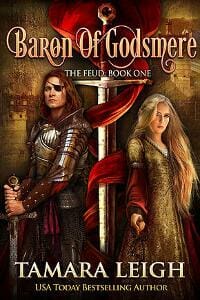
JF: Noteworthy for the attention to detail, custom typography, beautiful textures and for setting the stage for the story inside. ★
Tammy Seidick submitted Everything’s Coming Up Rosie designed by Tammy Seidick. “Thanks for looking!”

JF: Great typography and a sure hand make this a standout. And notice how the designer created more interest with the background texture.
Thom Mark Shepard submitted Puzzle Trees designed by Thom Mark Shepard. “This cover is based on a photograph taken by my father 40+ years ago. I found it in a family album, long after my dad had passed away. Cropping it to capture 3 of the monkeys (there are 5 monkeys in the original), I experimented with many tints & filters in Photoshop to create this scary dreamscape.”

JF: Demonstrates exactly why covers should be designed for readers not to satisfy the author. In the hands of a designer, the photo could well be part of a great cover, but this ain’t it.
Toni Decker submitted Shoalman Immortal designed by Sharon Carpenter.

JF: An interesting concept but the final result, with all the lines, shapes, colors, has so much visual “noise” the message is lost.
Valerie Comer submitted Secretly Yours designed by Hanna at Book Cover Bakery. “Secretly Yours is first in a series of novellas. The flowing shape of the top and bottom sections pays homage to the series title, Riverbend, and will remain the same (with color variations) throughout the series. The photo and hand-lettered title were done by the designer.”

JF: It’s lovely and would be even better if the title wasn’t partially getting lost against the background.
vince milam submitted Evil Runs designed by Slobodan Cedic. “This design was the result of a 99Designs competition. I was very happy with their process. Thank you for your consideration. Vin”

JF: A cool concept, although I might have lightened the sky to overcome the gloomy look which can move towards drab fairly easily.
Von Powell submitted Every Woman Deserves an Accessory designed by Damonza.

JF: Cute and well targeted, but the font shifts make me a little dizzy.
Wendy Dewar Hughes submitted Sweet Christmas Love designed by Wendy Dewar Hughes. “Because this book is an anthology of sweet Christmas short stories, I wanted to evoke a Christmas card look. That watercolour artwork is by Wendy Dewar Hughes, as is the book design.”

JF: Nice idea but it’s so overwrought and busy I’m afraid there’s not really a clear statement. Cleaning up the type at the bottom would be a good start.
Wendy Dewar Hughes submitted Upon a Midnight Clear designed by Wendy Dewar Hughes. “Upon a Midnight Clear is a sweet Christmas short story. My goal was to convey the romance but also use the colours to create the sparkle of a cold winter night.”

JF: It works.
Yvonne Payne submitted Kritsotopoula, Girl of Kritsa designed by SilverWood Books. “This cover conveys the local legend of a young girl from the Greek village of Kritsa, Crete who tragically lost all that was dear to her.”

JF: The Greek key designs add a nice touch to this cover, and this is a great place for a very compressed font, as the one used for the title.
Z. Rider submitted Suckers designed by Damon Za.

JF: I actually laughed out loud when I saw this artful cover, a great fit for a horror story, and I love the moody darkeness too.
Nonfiction Covers
Alexander von Ness submitted Heroes Alongside Us designed by Alexander von Ness | Nessgraphica.com.

JF: You’ve got to like the grit and energy of this cover for a memoir.
Bennett Kobb submitted The Guru-Free Guide to Nada Yoga: Sound Current Meditation for the Rest of Us designed by Bennett Z. Kobb. “Cover illustration by Chris Kalnick, based on a concept by the author.”

JF: A fairly busy, but competent, cover for a book on meditation.
Beth Brown submitted A Guide to Self-Publishing for CreateSpace On-Demand and Kindle eBook designed by Beth Brown. “The cover was designed with simplicity in mind because the book’s goal is to bring “self-publishing to the masses” as the Gutenberg Press made affordable printed materials available to the masses. The font is Bohemian Typewriter.”

JF: I’m a lover of simplicity, but don’t see how using a monospaced typewriter font achieves that, the cover looks more like a sketch than a finish.
Carrie L. Lewis submitted Colored Pencils: The Direct Method Step by Step designed by Carrie L. Lewis. “This is the second in a series of art how-to books describing how I use colored pencils to draw horses. The image on the front of the book is the demonstration piece for the book.”

JF: A beautiful illustration, and the cover tells us what we want to know about the book.
Cathi Stevenson submitted The Essential Fundraising Guide for K-12 Schools designed by Cathi Stevenson. “There’s nothing better than a happy client. “I love this cover! Cathi Stevenson has taken an educational non-fiction book and made it stand out with a cadre of color. Also, the idea that she came up with with for the subtitle is very creative. The book has received rave reviews.” – S. Levenson”

JF: A confident and lively design that looks just right to me. ★
Chris Kennedy submitted Self-Publishing for Profit designed by Lee Dunning. “I love the way Lee Dunning demonstrated how the “old way” of publishing has now become “the new way.””

JF: Problem is the ebook reader is such a small part of the whole that, combined with the “old” color scheme, the whole thing comes across as dated.
Deborah Smith submitted Every Day Is A Gift designed by Deborah Smith. “I made this cover for a family member. The book is a collection of my cousin’s poems and essays on everyday faith. It’s a folksy read, and his main audience is mature women. I tried to reflect that warmth and feminine appeal.”

JF: I like the idea and especially the chairs, but the overworked title doesn’t work, and I’m not sure you even need the big color panel either.
Dr. Orly Katz submitted Peer Pressure vs. True Friendship! Surviving Junior High designed by Uri Fink.

JF: Are they standing on diving boards? Not sure I understand this one. The illustration is cute but the elements don’t seem to come together into a cohesive whole.
Elizabeth DiPalma submitted Traveling Between the Lines designed by Elizabeth DiPalma. “This is a new cover for a previously published book. The original was not at all compelling: my goal was to make all the elements (some new) work to ground the book in time and place, and pique a reader’s interest. The results are on a before-and-after page on my web site—getting great feedback.”

JF: An accomplished cover that really tells the story, and the careful typography is delightful. Note the map that supplies the background texture and adds to the geographical specificity. ★
Gilles Cote submitted Power Reset: 21 Quick, Easy And Highly Effective Ways To Reset Your Brain To Instantly Become More Happy, Motivated, Productive and Successful In Life! designed by Gilles Cote. “Needed a new cover because of a revision update with new title so created this myself using Canva with the intent of making it attention grabbing while keeping it clean and simple.”

JF: An interesting use for Canva, and overall it works although the type is out of balance and the “21” looks like it was tacked on at the end.
Gilles Cote submitted The Missing Link: 18 Power Tools For Maximizing Time, Productivity And Life designed by Gilles Cote. “Used Photoshop. Probably tried at least 6 completely different versions before I settled on this one. Clear, clean and professional is what I was aiming for.”

JF: Looks like a cross between a “book” book and one of those self-help PDFs. The title lacks any impact.
Gregory Schinkel submitted Fusion or Fizzle: How Leaders Leverage Training to Ignite Results designed by Cathi Stevenson bookcoverexpress.com. “Cathi Stevenson did a great job of styling the cover to convey the intent of the title. It has positioned the book well for our industrial audience.”

JF: A bit stark for my taste. Are the fused “U” and “S” in the title supposed to communicate the theme of the book? I expect so, because otherwise Cathi would have kerned them more elegantly.
K. T. Edwards submitted Whatever Happened To Romance? designed by Jeff Byers. “The book cover alludes to the content within the book through the imagery on the cover, the colours and the text used. The book is a satire on modern dating and the cover was specifically designed to draw reader’s in with a relatable image that speaks to the current times we are living in.”

JF: I like the concept but not so much how the satiric illustration is obscured, or the thin type used for the title.
Laura Longville submitted Break Ground Without Breaking Up, Seven Keys to Securing a Strong Relationship While Building or Remodeling Your Home designed by Mill City Press.

JF: Interesting concept for a book that combines construction with relationship advice. The very generic photo is allowed to completely overpower everything else, and thus the title lacks any real impact.
Mallory Rock submitted Discover Your Brand: A Do-It-Yourself Branding Workbook For Authors designed by Mallory Rock.

JF: Clear, strong, and highly focused.
Mario Mammina submitted The Christian’s Travel Journal for Italy designed by Damonza.

JF: Clean design and typography help this cover communicate all the essential information the reader needs to know what the book is about and who it is meant for. What nonfiction covers should aspire to. ★
Masha Shubin submitted Operation Daughters Addicted: Positive Strategies to Overcome the Dual Addiction of Eating Disorders and Substance Abuse designed by Masha Shubin. “One problem with non-fiction cover design is when authors have a l-o-n-g subtitle or a lot of text to go on the cover. Good design is creating a good hierarchy of elements that attracts readers’ interest. Hopefully this cover achieved those goals.”

JF: Well, I’m guilty of often recommending to nonfiction authors that they create l-o-n-g subtitles to improve their discoverability. Here, I love the way you’ve used the light green color to guide our eyes down and into the copy, and the great illustration that perfectly depicts the subject of the book. ★
Melania Chenoweth submitted My Pocket Book of Christian Poems designed by DBC Agency Writers & LCC Designs.

JF: Huh? A bit of the waistband from some jeans and a lot of letters floating on a white background? What’s up with that?
Mitesh Take submitted How to sell more amazon books the right way designed by Mitesh Take. “This is a eMarketing ebook.Only 3 colours are used. Main “Blue” is corporate as well as internet related colour. Black thick fonts used for “Authority”. Title is divided in four line for readability. Only 1 graphic is used which indicates online shopping. Free space is there & fit for thumbnail.”

JF: On the positive side, the title is easy to read. On the other side, it’s exactly what it looks like: three images somewhat crudely pasted on top of each other.
Pat Rigley submitted Notes From An Aging Insomniac designed by Pat Rigley. “The events and relationships that shaped the author’s life and led him to the magical island of Key West. Author provided original image that cover art was based on.”

JF: Essentially a cover that’s been “non-designed” which is common with DIY covers. There’s nothing you can point to that’s incorrect, but there’s absolutely nothing added to the impression either. Any appeal is from the title itself.
Rachel Daniels submitted Something New: The Bride’s Complete Guide to Writing Thank You Notes designed by Joy Miller. “The bride on the cover leaves no doubt about the book’s topic: weddings. Part of the book’s title “Something New” mimics the phrase “something old, something new, something borrowed, and something blue.” Subtle elements create an updated perspective for a topic that many consider boring and dated.”
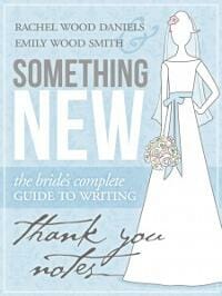
JF: A well-designed cover that’s so lacking in contrast it has become a ghost of itself.
Rankin Cassandra submitted Annie Spruce, The Dog That Didn’t Die designed by Gorham Printing. “The cover photo was a family favorite I took after part of sweet Annie’s ear fell off, and the background image of the spruce tree was a photo taken by son, who was twelve-year at the time.”

JF: A good concept that falls down in the execution. The strength and color of the tree “pattern” are so close to the dog’s photo that it’s in danger of getting lost, but that’s a problem that’s easily solved.
Richard Sullivan submitted Family Tree Secrets designed by Richard Sullivan.

JF: This photo really reaches out and engages the browser, so keeping the type simple was a good strategy.
Susan Williams submitted Planet Ben: Inside the World of a Narcissist designed by Cathi Stevenson, Book Cover Express. “I asked Cathi to design a book cover that depicted the darkness of a narcissistic relationship but also included a degree of humor to lighten that. I think she absolutely nailed it This is a 3 part true story-series, therefore the shattered heart at the top is carried through each book.”

Tom Corson-Knowles submitted Destroy Your Distractions designed by Clarissa Yeo. “Clarissa’s site is: https://yocladesigns.com/”

JF: A very workable nonfiction cover that could benefit from greater contrast and from treating the title type with greater uniformity and better spacing.
Well, that’s it for this month. I hope you found it interesting, and that you’ll share with other people interested in self-publishing.
Use the share buttons below to Tweet it, Share it on Facebook, Plus-1 it on Google+, Link to it!
Our next awards post will be on April 13, 2015. Deadline for submissions will be March 31, 2015. Don’t miss it! Here are all the links you’ll need:
The original announcement post
E-book Cover Design Awards web page
Click here to submit your e-book cover
Follow @JFBookman on Twitter for news about the E-book Cover Design Awards
Check out past e-Book Cover Design award winners on Pinterest
Subscribe to The Book Designer Blog
Badge design by Derek Murphy


