By Joel Friedlander
Welcome to the e-Book Cover Design Awards. This edition is for submissions during August, 2019.
This month we received:
53 covers in the Fiction category
10 covers in the Nonfiction category
Guest Judge
 I’m very pleased to welcome James Egan to The Book Designer as a guest judge this month. James has worked in graphic design for thirteen years in the fields of advertising and cover design. For the last six years he’s been designing book covers for independent authors and small presses through Bookfly Design. He’s had the chance to work with everyone from New York Times bestsellers to first-time authors and has won various book cover design awards. He lives with his family and two dogs on the Oregon coast, where he can often be spotted sketching out cover concepts in the sand.
Comments, Award Winners, and Gold Stars
I’ve added comments (JTE: ) to many of the entries, but not all. Remember that the aim of these posts is educational, and by submitting you are inviting comments, commendations, and constructive criticism.
Thanks to everyone who participated. I hope you enjoy these as much as I did. Please leave a comment to let me know which are your favorites or, if you disagree, let me know why.
Although there is only winner in each category, other covers that were considered for the award or which stood out in some exemplary way, are indicated with a gold star: ★
Award winners and Gold-Starred covers also win the right to display our badges on their websites, so don’t forget to get your badge to get a little more attention for the work you’ve put into your book.
Also please note that we are now linking winning covers to their sales page on Amazon or Smashwords.
Now, without any further ado, here are the winners of this month’s e-Book Cover Design Awards.
e-Book Cover Design Award Winner for August 2019 in Fiction
Gesine Schulz submitted The Greenest Wind – A Summer in Ireland designed by Sam Kalda. “Lucy loves knitting & reading. Visiting her aunt Paula in Ireland, the window-seat in Lucy’s bedroom is her favorite place for reading & daydreaming. Paula is a driftwood artist. The only color in my briefing was the red of Lucy’s hair: Not wanting to go to Ireland she dyed it Irish Red in protest.”
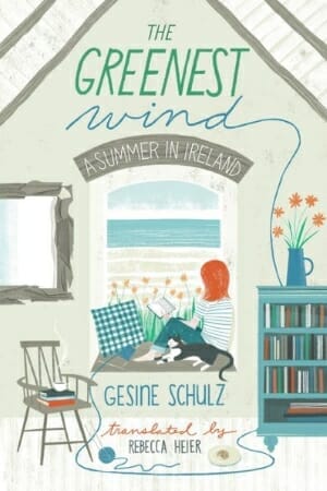
JTE: Between the quality illustration, the smart color choices, and the way the type is integrated into the scene, this is an all-around winner. Every element works well together to make for a cover that’s greater than the sum of its parts. I especially like the use of texture without going overboard.
e-Book Cover Design Award Winner for August 2019 in Nonfiction
Kat Lehmann submitted Stumbling Toward Happiness: Haibun and Hybrid Poems designed by Subhashini Chandramani and Bruce Kaechele. “The cover artwork is by Subhashini Chandramani and the cover design is by Bruce Kaechele. The website is for the artist. I love that the words appear to be raining with the flowers as they turn from seeds into blooms. Thank you.”
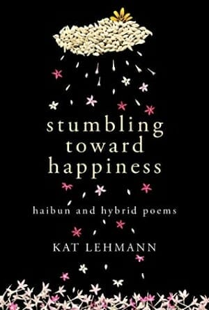
JTE: Love the organic style of this one and the nice use of negative space. The font choice is really solid and the concept is great for a book of poems, not to mention the slick color scheme. There is a whole lot to like here.
Fiction Covers
AD Starrling submitted Fire and Earth designed by 17 Studio Book Design.
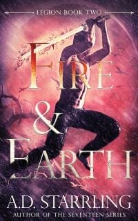
JTE: I’m a fan of the overlaps on the title, though the orange on “Fire” doesn’t jibe with the background color. Good sense of motion and action.
Aldrea Alien submitted Dark One’s Mistress designed by Aldrea Alien.
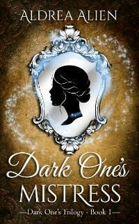
JTE: The magic effects and silhouette are nice, but the disparate typefaces leave me wondering about the genre.
Aleksandra Mandić submitted Death of a Doll designed by Aleksandra Mandić. “The publisher wanted something bold but clean, not violent but unsettling/sinister. Red and yellow colors were used to create a contrast between absence of awareness and a violent crime. A big influence on visual style were movie posters for Alfred Hitchcock movies.”
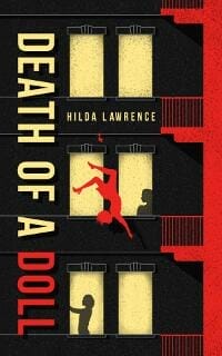
JTE: Love the colors and textured cutout style. Also nice how you oriented the title to mimic the falling character.
Amala Benny submitted Marked Hearts designed by Amala Benny.
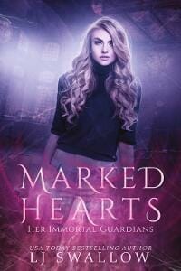
JTE: This one does a great job of broadcasting the genre. I like the textures and subtle touches that add to the design without overcomplicating. Could have used a bit more brightness on the title and subtitle.
Andy Conway submitted The Ghosts of Paradise Place designed by Sean Strong. “The brief was to show a timeslip happening with a modern building and the Victorian building that was there before. This is the latest in a series of time travel historical fantasies.”

JTE: Nice fadeout effect on the type and I like the ornaments on the title. “Ghosts” would benefit from a little more breathing room on the left and right, and the colors on the logo in the lower right detract from the overall impact. Does a good job of communicating the genre.
Anne Riconosciuto submitted Love in an Undead Age designed by Doug Dean. “My book is set in San Jose California. The inspiration for this cover was the parking structure at the San Jose Airport, which everyone agrees looks like a zombie pit.”

JTE: Nice concept and color scheme. Can’t lose with black-white-red. But the white background is sterile (maybe a subtle texture could help?) and the red stripe across the bottom undercuts the simplicity. Since there’s so much going on already, it might have worked better with the title uniformly set in the graffiti font.
Arthur Wiggins submitted Good Will: Shakespeare’s Novel Life designed by First Edition Design Publishing. “The caricature of Shakespeare was drawn by Sidney Harris, America’s premier science cartoonist.”

JTE: Nice caricature, but the heavy paper texture and clunky type treatment get in the way.
Ashley Pagano submitted The Gauntlet: The Soppranaturale Series designed by Najla Qamber.
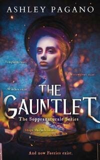
JTE: Hats off to Najla for this wonderful weirdness. The colors, composition, and type treatment are all risky but come together to make a strong cohesive whole that looks good at thumbnail and full size. The scattered tagline bugs me a bit, but this cover makes a great impression overall. ★
Cami Jensen submitted First Earth designed by Sarah Keele. “Agnes, the lead character, in the Fulcrum”
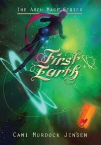
JTE: Slick illustration, but the type leaves me confused about the genre. I like the character overlap on the underline. Maybe this could be applied to the other type as well? The scarf could also look good overlapping a larger, less frilly title.
Chris Grevemberg submitted The Reckoning designed by Chris J. Grevemberg. “My goal was not to interfere with the reader’s imagination. So I used only an “evil” eye of the antagonist to give a sense they are waiting in the darkness. Within the pupil is a human skull depicting their secret intent, death.”
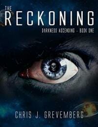
JTE: Simple and straightforward, though the type is a little anemic. The sci-fi elements could be played up to make it clear this isn’t horror.
Dan Van Oss submitted Mayhem: Demigod Daughter Awakened designed by Dan Van Oss at Covermint Design.
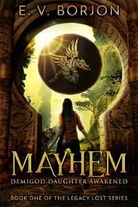
JTE: Really nice photo composite that strikes a good balance between simple and intricate. Unmistakably YA. Probably could have done without the wolf/coyote and type gradients, but neither take much away from the overall impact. ★
Dan Van Oss submitted Witchy Ways designed by Dan Van Oss at Covermint Design.
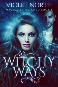
JTE: Slick with cool colors and subtle effects. Does a good job of communicating the genre.
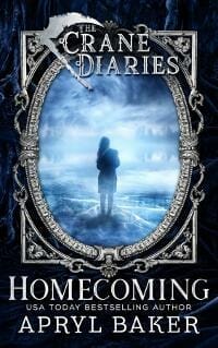
Darja DDD submitted Homecoming designed by Kitten from Deranged Doctor Design. “Horror book cover design, The Crane Diaries book 1”
Darja DDD submitted Dirty Blood designed by Kitten from Deranged Doctor Design. “Horror book cover design, The Crane Diaries book 2”

JTE: There are some cool series branding ideas in the Crane Diaries covers. I like the scythe and consistent framing. The intricate borders somehow don’t quite meld well with simplicity of the central images, but the series has nice consistency.
Darja DDD submitted Stained designed by Kitten from Deranged Doctor Design. “Horror book cover design, The Crane Diaries book 3”

Darja DDD submitted Until Nothing Remains designed by Milo from Deranged Doctor Design. “Thriller book cover design, A Gun Play Novel: Volume 1 Volume 1”
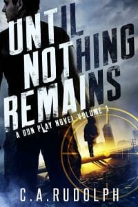
JTE: More nice series branding. The colors and composition broadcast the genre well. The dark/light shift of the title (which is tricky to pull off) looks great on book one but strains a bit in the sequel. The crosshair is a really nice touch.
Darja DDD submitted Everything I Die For designed by Milo from Deranged Doctor Design. “Thriller book cover design, A Gun Play Novel: Volume 1 Volume 2”

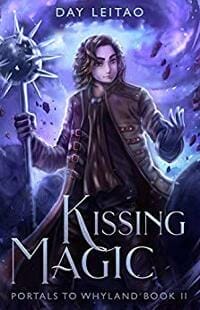
Denise Leitao submitted Kissing Magic designed by Denise Leitao design, illustration by Xilveroxas. “Tricky cover because the series is YA now, not so much upper MG, but I think it looks darker/more mature while keeping the same style. I also wanted it to be darker/action oriented so that readers don’t assume it’s a straight-up romance novel because of the title.”
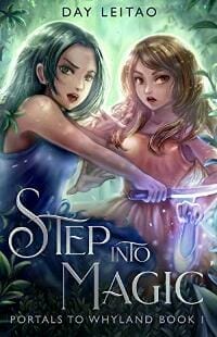
Denise Leitao submitted Step Into Magic designed by Designer: Denise Leitao Illustrator: Xilveroxas. “The illustration was done with room for the title on top but then I changed my mind. The problem was that I had to think hard on how to put the title at the bottom while not covering the shoe. It’s lower YA fantasy.”
Denise Leitao submitted Within Magic designed by Denise Leitao design, illustration by Xilveroxas. “I love how illustration can show a character’s growth. She’s in the same position as in the first cover, but what a difference! I think it’s ok that she’s turned to the right. It’s my favorite and I learned what to ask for in a cover illustration. Also: warm colors! Now I know.”

JTE: Nice choice of illustration and typefaces for a dark YA series. The author name could be bigger, but the imagery is strong. I like how the colors gradually heat up as the series progresses. ★
E. Davies submitted Hard Hart designed by AngstyG. “This book is a feel-good romance set in the fictional town of Hart’s Bay, on the Oregon coast.”

JTE: Nice font choice and genre appropriate layout. The character looks a little tacked on to the forest background and the author name is uncomfortably close to the bottom, but overall it’s a solid cover. Nice to see the Oregon Coast on a romance cover!
Gary Daniels submitted Uleyli- The Princess & Pirate (A Junior Graphic Novel): Based on the true story of Florida’s Pocahontas designed by G.C. Daniels. “Cover art by Santanu Mitra. Story uses spider web symbolism so I chose Spider Type by Filiz Kahin for title. Used childlike font (Curlz MT) to indicate the episode name. Used a comic book style type and text box to indicate the subtitles and author name.”
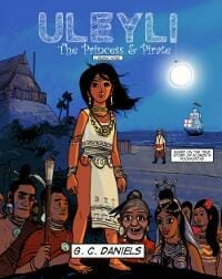
JTE: Nice spider web treatment for the title and it’s cool that it ties into the symbolism of the book. The comic book type helps communicate that this is a graphic novel, but the title and subtitles are crammed in and the Curlz font seems out of place.
Hampton Lamoureux submitted Secrets, Lies, and the Perfect Eyeliner designed by Hampton Lamoureux.

JTE: The color and sparse layout help set the mood and signal the genre. The glass texture on the face on the left throws me a bit.
Hampton Lamoureux submitted Sirens Unbound designed by Hampton Lamoureux.
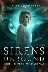
JTE: Great mood and font choices here. I like the touches of magic seeping in the corners.
Hampton Lamoureux submitted Dolgah: As Crônicas de um Escolhido designed by Hampton Lamoureux.

JTE: A nice, straightforward image that stirs interest and reads well at thumbnail size. This is helped by the strong color choices and the restrained swashiness of the type.
Ikenna Ngene submitted The Storyteller’s Student designed by Stephannie Hannus. “The reader or Jack on his journey on stage”

JTE: The head silhouette is simple and straightforward but could use more contrast against the background. Looks like at least five different fonts were used, which makes it unclear what kind of tone is being attempted.
Jason Cross submitted Sons of God: Evil v. Evil designed by Damonza. “Chrissy at Damonza brought together several elements from the novel to convey its spirit.”
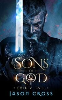
JTE: Very sleek. The type treatment is full of subtle and well-done touches. I especially like the way the ankh is worked into the “O.” A good example of how you can use bevels, gradients, flares, etc. on text without bashing the viewer over the head with them.
Jo Petzer submitted Motor Games designed by Jo Petzer. “Cover image designed from a photograph taken and supplied by the author. Bright colours to reflect the every-changing dynamic of the South African motor industry and the personalities of the main characters.”
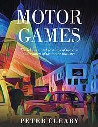
JTE: Nice painting and it was a good call to go with simple white type, though it looks a bit textbooky.
Joshua Spiller submitted The 8th Emotion designed by Victoria Stothard, Megan Lucas, Joe Tabrizi, Niamh Keenan. “Although it may simply appear to be a (hopefully eye-catching) abstract image, it’s actually a tight close-up on a detail from one of the novel’s final scenes. Through it, readers can then deduce the unspoken fate of one of the secondary characters. An experimental Easter egg for the eagle-eyed.”
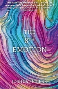
JTE: Appealing colors but doesn’t really say much about what’s in store for the reader. The title and author type could use a little more contrast and character.
K.D. Ritchie submitted The Tainted designed by Story Wrappers.
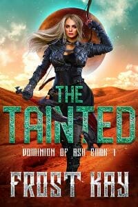
JTE: Quality central image, but the type effects and green color take away from the impact. I usually like when parts of a character overlap the type, but the way the weapon threads through the title hinders the effect.
K.D. Ritchie submitted Rose designed by Story Wrappers.
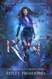
JTE: This one kills it. Strong central image with well-done type. Good strategic use of red for color contrast. The type effect on the title is genuinely weird and cool, though it’s a tad dark. ★
K.D. Ritchie submitted Gears of Fate designed by Story Wrappers.

JTE: Another strong entry that hits the right genre notes and doesn’t overdo the effects. Shows a solid understanding of genre and has a little fun with the title without overcooking it. It was a good call to add that extra blue in the corners. ★
Kelly Evans submitted The Confessor’s Wife designed by Louise Thomas. “The cover is done in the muted moody colours associated with the ‘dark ages’. The crown was copied from the actual crown worn by my MC in a 1000 year old manuscript. The font was selected to evoke a sense of medieval England.”
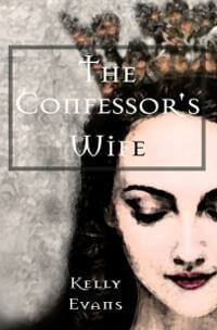
JTE: There are some issues with the title readability and the heavy-handed use of filters gives it a low-resolution look.
Kelly Hendrickson submitted Britfield and the Lost Crown designed by Stephen Silver. “Britfield is an adventure novel for children ages 9 – 12. The story was conceived as an idea while Stewart was sitting in a boring seminar, sketching a hot air balloon with a young boy and girl trapped inside. From this simple drawing sprang the entire concept for Britfield.”
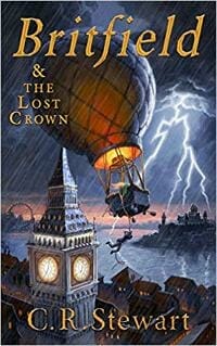
JTE: World-class illustration! The color of the type complements the scene well. The type placement gives it a “locked-in” feeling and undercuts the great sense of motion, though italics were a good choice for the title.
Kimolisa Mings submitted A Very Merry Ex-Mas designed by Kimolisa Mings. “Used literary fiction covers as a reference point but discovered that it does not entirely work for a specific genre. C’est la vie. You live and your learn.”

JTE: The colors are on point, but you’re right that the layout isn’t working. Might have worked better just to lose the white bar, center and lower the house, and plop the title onto the sky.
Kyoko M submitted Of Dawn and Embers designed by BRose Designz (Marginean Anca).

JTE: The dragon is well drawn, but the noisy background sabotages it. Could probably benefit from some simplification to draw attention to the strong points.
Lauren Reneau submitted Neil Down: A Shot at Immortality designed by Lauren Reneau. “The font is a nod to religion. The helmet leaves the reader questioning the fate of a beloved public figure. A light draws the viewer’s eye from the title to the bullet hole. The analogous palette provides an eerie calm in spite of signs of tragedy.”

JTE: A bullet hole in a space visor is a neat concept, but the cartoonish execution combined with the pun in the title gives the impression that this is a dark comedy.
Mark Huebner submitted Voodoo Encounter designed by Mark Huebner. “For the series, I’ve tried to create a consistent look and feel with the title font and the header, while giving each individual book it’s own color treatment based on the selected image. Thanks for the opportunity to submit these … All the best, MarkH”
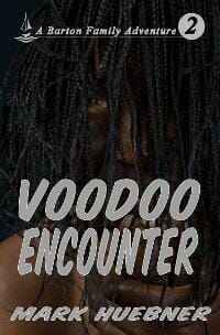
JTE: Hard to tell what’s going on at first glance, though I like the idea of the eye being the only hint of color.
Marri Champié submitted Silverhorn designed by Yael Shahar, Kasva Press. “Kasva Press’s, Yael Shahar, talented designer & writer, created this beautiful cover (& my website) design. She survived all my suggestions & changed the original spring colors to fall colors, creating this fabulous color palette. She spent extra time for author requested details!”
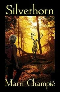
JTE: The straightforward type and simple image read well at small size and you nailed the autumn vibe. Kind of leaves you guessing what the genre might be.
Martin Turnbull submitted Chasing Salomé designed by László Kiss. “My brief to the designer was that this story took place in silent-era Hollywood and was about the making of 1923’s “Salomé.” I suggested we find an image of the movie’s star wearing her iconic headdress. Aside from a few minor tweaks, the first draft of the cover art was what we went with.”
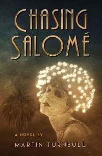
JTE: Nice art deco fonts and muted colors for a book set in the ‘20s. This might just be me, but at thumbnail size the hat appears to be covered in light bulbs, giving it a sci-fi feeling.
Panagiotis Lampridis submitted Still out there designed by Panagiotis Lampridis.
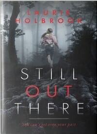
JTE: Sets the tone well with a nice limited color scheme. The reds and grays interact well.
Paula Wynne submitted Flying Without Wings designed by Sara Lee Paterson. “A dark theme fitting with the World War II storyline. A young boy’s face as the story starts with this character who dreams of flying – thus we also had him looking up at the planes in the sky. Barbed wire reflects his broken dreams and imprisonment. Lots more to say but limited here :)”

JTE: Nice colors for a WWII thriller. Though the different images are also genre appropriate, they wind up battling for attention.
Rachel Brown submitted Stranger designed by Augusta Scarlett.
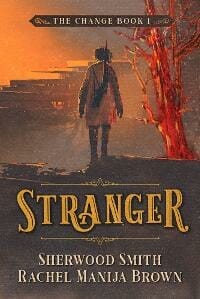
JTE: Nice restrained use of an illustration. The title treatment and ornaments gives it a Wild West vibe.
Sherelle Winters submitted Broken Wing designed by Sherelle Winters. “Aim was to create an eye-catching cover for a contemporary romance that could hint to the story’s theme of healing and the setting, while also dealing with the model limitations of having a heroine with a scarred face.”

JTE: Simple and readable with nice colors. Feels a little undercooked.
Sophie Edwards submitted Mage: The Guardian’s Oath designed by Custom Covers.
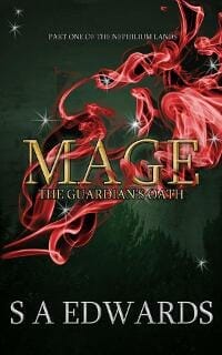
JTE: I like the idea of focusing on a simple effect interacting with the title. There are some rough edges on the magic effects, but it gets the idea across. Nice colors, but a little Christmassy.
Steve Chiasson submitted The Conclave designed by Max Bedulenko / Kirk Shannon. “A good example of international collaboration. The concept artist Max Bedulenko lives in Belarus, while Kirk Shannon, who added font and made small adjustments, is from Canada.”
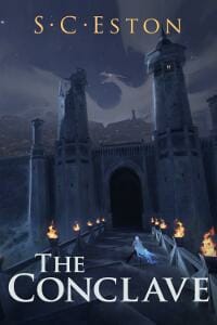
JTE: Great illustration and nice colors on the type. The area between the foreground character and the dragon figure seems to need more going on. Maybe that would be a happier home for the title?
Susan A. Jennings submitted Prelude to Sophie’s War designed by Rebeccacovers through Fiverr.com. “Sophie Series book 1 – Historical fiction 1915 London. A fiery backdrop of a London street during WW1. The woman represents personal promise to help and to serve.”
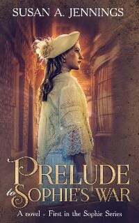
JTE: Nice central image and subdued colors. The title seems a little crammed in, but overall it makes a good impression.
Tom Leveen submitted Heartless designed by Tom Leveen. “Based this design off things I’ve tried to learn from TheBookDesigner.com. There is a small alteration to the splatter near the bottom (that is perhaps too subtle for most people to notice) that relates to the book title.”
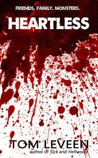
JTE: I dig the colors and the cinematic approach. The white is a little too white (this makes the cover seem unanchored on a white background) and the splatter interferes with the author name to the point where it hampers readability.
Trygve E. Wighdal submitted Jung’s Demon, A serial-killer’s tale of love and madness designed by Christian Ermel. “Demoniacal image on the cover is a perfect reflection of the author’s inner state, as described in the book.”
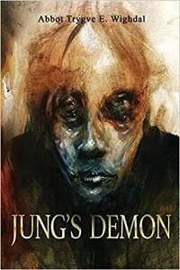
JTE: Nice central image. I like how the chin is casting a shadow on the title, though the shiny metal text effect detracts from the trickery. Author name could be a bit larger and more legible or might be more at home below the title and in white.
Valerie Lioudis submitted The Many Afterlives of John Robert Thompson designed by Valerie Lioudis. “This is a new cover for this book. The previous cover was beautiful, but didn’t really show the readers what kind of book they were about to read. The new cover art was chosen to match the other books in the genre.”
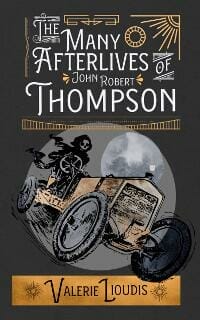
JTE: I like the retro vibe and ornamented type. The colors, though restrained, are a bit scattershot. The main image is strong but needs more oomph to steal some attention back from the intricate type.
Vicki Tashman submitted Dash and Victoria Find True Love designed by Nate Meyers. “The design of this cover reflects the opulence and elegance during the Victoria period. Nate also carried over the “look” of the first book in the series. The illustrations throughout the book and the one used on the cover are guache, painted by hand.”
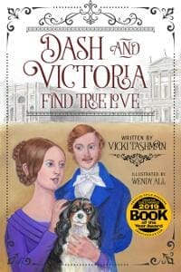
JTE: Swashy ornaments and flowery type are a good choice for a book of this genre, but the transition between the two images is jarring.
Zachry Wheeler submitted Max and the Multiverse designed by Zachry Wheeler. “This cover needed to set the tone for a humorous sci-fi series. The font conveys a sci-fi starkness without being obtrusive. The orange/blue depicts excitement vs. sadness, a major theme of the book. The images convey the emotion baselines of the main characters, i.e. anxiety and indifference.”

JTE: Definitely gives the impression of a humorous sci-fi at first glance. I like the minimalism, but it could use a touch more complexity.
Nonfiction Covers
Gregory Peart submitted You Can Be Funny and Make People Laugh designed by Gregory Peart. “The font style helps communicate the light-heartedness of the book’s core nature. The smile communicates the humor aspect of the book in a simple and zany way. But the serious style of the subtitle reminds readers that the content within the book still means business.”
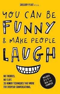
JTE: The yellow-white-black combo works well to communicate levity in a way that’s not overly silly. The floating smile is a good call, but the author name is microscopic.
Jo Petzer submitted The Highs and Lows of my Infertility designed by Jo Petzer. “The design communicates the ups and downs of the author’s surrogacy journey symbolised by a custom-drawn personified uterus on a rollercoaster. Although the design is humorous, the humour serves to ironically highlight the seriousness of the subject matter.”

JTE: Really nice colors, type, and composition. Gives the impression that this will be a lighthearted take on a heavy subject. Wins the prize for best use of an anthropomorphic uterus. ★
Karyn Kloumann submitted FIERCE: Essays by and About Dauntless Women designed by Karyn Kloumann.
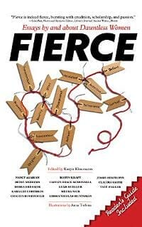
JTE: Solid, clean layout, though the background is too white and the central image doesn’t hit with much of a thud. I like the subtle title overlap and the way the smaller type is organized.
Libby Rome submitted Hotel Sweet Home designed by Theresa Johnson. “An inspiring story of a minimalist & global traveler who lives in hotels full-time: The Art Deco flat poster art style is evocative of the age of travel – a time of adventure and exploration. The pastel color palette, reminiscent of a Miami sunset, represents coming home at the end of the day.”
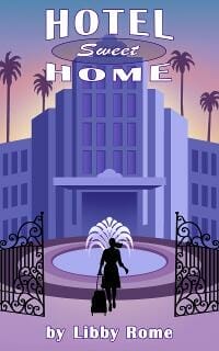
JTE: I’m a fan of art deco style covers, but the type treatment, colors, and style of illustration give it a flat ‘90s feeling. Does a good job of communicating the idea of travel.
Matt Taylor submitted All Things Chocolate: 30 of my favorite chocolate recipes designed by Matt Taylor. “I have a cooking channel on YouTube and this is my first mini-cookbook. I wanted to connect the book with my channel branding wise, which is why I have my logo on the cover. Since this book is all about chocolate, I wanted to show some of the recipes.”

JTE: Good call to focus on high-quality images of the dishes. The branding is a little heavy-handed and there should be more emphasis on the subtitle. Nice move how the color of the logo ties in to the food you chose to feature.
Priya Khajuria submitted The Law of Attraction Game Book: 28 Days of Love designed by Priya Khajuria. “This cover combines a parchment background (alluding to the New Thought genre) with mixed fonts. The Great Vibes font is used for The Law of Attraction (it pairs with the parchment). Modern fonts and colours that pop carry the context over through time and into the present.”

JTE: The colors definitely pop, but something about the pink and textured yellow throws off the genre recognition. There’s also a lot going on font wise and everything seems to be competing for attention.
Sheila Setter submitted Leaves from the Autumns of Yesterday designed by Sheila M. Setter. “The cover image – a bonsai losing its leaves in autumn – serves as a metaphor for the ninety-four-year-old author, whose rich experiences, like the yet-remaining golden leaves on the branch, story the book.”

JTE: Nice minimalist concept. The color of the type is spot on, but it’s a tad too light and gets lost at thumbnail size. Overall it does a good job of setting the right mood.
Siggi Bjarnason submitted Your Safety and Privacy Online designed by Florfi.

JTE: Strong and crisp with a lot of nice contrast. Good choice of imagery and color considering the subject matter. The pure white around the borders throws it off a bit, but overall it sends a lot of the right signals to potential readers while keeping it simple.
Wageedah Salie submitted Starting a Successful Blog designed by Wageedah Salie – One Story Creative.
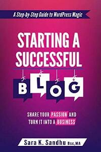
JTE: A handsome layout with nice color choices and appropriate imagery. Clean and professional with a bit of a playful feeling. ★
Well, that’s it for this month. I hope you found it interesting, and that you’ll share with other people interested in self-publishing.
Use the share buttons below to Tweet it, Share it on Facebook, Link to it!
Our next awards post will be on October 27, 2019. Deadline for submissions will be September 30, 2019. Don’t miss it! Here are all the links you’ll need:
- The original announcement post
- E-book Cover Design Awards web page
- Click here to submit your e-book cover (See New Submission limits)
- Follow @JFBookman on Twitter for news about the E-book Cover Design Awards
- Check out past e-Book Cover Design award winners on Pinterest
- Subscribe to The Book Designer Blog
- Badge design by Derek Murphy


