


By Joel Friedlander
Welcome to the e-Book Cover Design Awards. This edition is for submissions during August, 2018.
This month we received:
60 covers in the Fiction category
13 covers in the Nonfiction category
Comments, Award Winners, and Gold Stars
I’ve added comments (JF: ) to many of the entries, but not all. Remember that the aim of these posts is educational, and by submitting you are inviting comments, commendations, and constructive criticism.
Thanks to everyone who participated. I hope you enjoy these as much as I did. Please leave a comment to let me know which are your favorites or, if you disagree, let me know why.
Although there is only winner in each category, other covers that were considered for the award or which stood out in some exemplary way, are indicated with a gold star: ★
Award winners and Gold-Starred covers also win the right to display our badges on their websites, so don’t forget to get your badge to get a little more attention for the work you’ve put into your book.
Also please note that we are now linking winning covers to their sales page on Amazon or Smashwords.
Now, without any further ado, here are the winners of this month’s e-Book Cover Design Awards.

e-Book Cover Design Award Winner for August 2018 in Fiction
Kimberly Coleman submitted One Last Good Day designed by Kimberly Coleman.
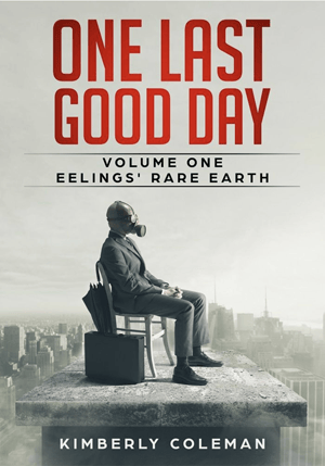
JF: Hits all the bases with an evocative illustration that leads us into the story, clear and readable type, and a cohesive composition.

e-Book Cover Design Award Winner for August 2018 in Nonfiction
Matt Hinrichs submitted To Comma Or Not To Comma: The Best Little Punctuation Book Ever! designed by Matt Hinrichs. “This is a book on all the ins and outs of proper comma use—so of course it has a giant comma! Author was pleased with the eye-catching final results.”
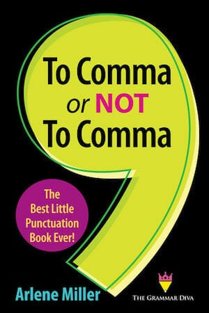
JF: A catchy title, strong and simple graphics, and a specific subtitle combine to make this a winner. Stands out from the usually very dry covers found on most grammar books.
Fiction Covers
Alexandra Brandt submitted A Froth of Starry Sea Foam designed by Alexandra Brandt. “Contemporary literary novella, based on a fairytale.”

JF: A simple yet effective cover. Well done. ★
Alicia Wright submitted Crushed Velvet designed by Alicia Wright. “Crushed Velvet, the title itself refers to the holding down of woman; the pressure women must endure daily with the expectation that she should still be soft and yielding. Just an extreme circumstance, in this lady’s case.”

JF: Although there’s some visual confusion here, the “hook” is clear as day.
Caroline Walken submitted Behind the Fan designed by Talia’s Book Covers. “For years I carried this story in my mind, a tale of a love that transcended time. It was inspired by a sweet story of devotion that I added my own twists. She was amazing, she produced the very emotion of the story! This cover is an example of art meeting writing.”

JF: A visually arresting image that perfectly matches the title, but the font used for “the fan” doesn’t really work.
Chad Robert Morgan submitted The Last Rite designed by Chad Robert Morgan.

JF: More assembled than designed.
Crystal Green submitted Evershade designed by KP Designs.

JF: Does the ornamentation in the corners really add anything to this cover? Title is hard to read.
Dan Cray submitted Piercing Maybe designed by Carl Graves. “I love the way Carl’s cover centers on character while retaining hints of the hidden society that drives the book’s plot.”

JF: The composite is well done, but overall the cover is quite flat.
Dan Van Oss submitted The Bowman Boys designed by Dan Van Oss.

JF: Expert and attractive design that’s very cinematic.
Dan Van Oss submitted Red Lineage designed by Dan Van Oss.

JF: Textures and colors combine to highlight the protagonist, and the title adds impact. ★
Darja DDD submitted Let Sleeping Dragons Lie designed by Fantasy, Paranormal & Urban cover design by Kitten from Deranged Doctor Design. “Fantasy, Sword & Sorcery cover design by Kitten from Deranged Doctor Design, The Modern Dragon Chronicles Book 1”

JF: While this series design has well-coordinated covers, the title seem a bit weaker than they should be to balance the visuals. Cool dragon seal.
Darja DDD submitted It’s a Dragon-Eat-Dragon World designed by Fantasy, Paranormal & Urban cover design by Kitten from Deranged Doctor Design. “Fantasy, Sword & Sorcery cover design by Kitten from Deranged Doctor Design, The Modern Dragon Chronicles Book 2”

Darja DDD submitted You Can’t Teach an Old Dragon New Tricks designed by Fantasy, Paranormal & Urban cover design by Kitten from Deranged Doctor Design. “Fantasy, Sword & Sorcery cover design by Kitten from Deranged Doctor Design, The Modern Dragon Chronicles Book 3”

Darja DDD submitted The Spy in the Silver Palace designed by Science Fiction & Fantasy Mystery cover design by Milo from Deranged Doctor Design. “Science Fiction & Fantasy Mystery cover design by Milo, Deranged Doctor Design, Empire of Talents Book 1”

JF: The design of this series highlights the fact that they take place in two different worlds. Strong atmospherics help give them an attractive atmosphere, although the title typography may be a bit overworked.
Darja DDD submitted An Imposter with a Crown designed by Science Fiction & Fantasy Mystery cover design by Milo from Deranged Doctor Design. “Science Fiction & Fantasy Mystery cover design by Milo, Deranged Doctor Design, Empire of Talents Book 2”

Darja DDD submitted A Traitor at the Stone Court designed by Science Fiction & Fantasy Mystery cover design by Milo from Deranged Doctor Design. “Science Fiction & Fantasy Mystery cover design by Milo, Deranged Doctor Design, Empire of Talents Book 3”

Darja DDD submitted Crushed designed by Sports cover design by Marushka from Deranged Doctor Design. “Romance and Sports cover design by Marushka from Deranged Doctor Design, Slammed Series Book 2”

JF: This effective series design uses strong typography to complement the robust images of fighters. Crushed looks more effective simply because the image is easier to process instantly whereas the triangle created by the man’s arms on Slammed creates some complications. ★
Darja DDD submitted Slammed designed by Sports cover design by Marushka from Deranged Doctor Design. “Romance and Sports cover design by Marushka from Deranged Doctor Design, Slammed Series Book 1”

David Heidenstam submitted Tales for my dog: 80 microfictions from humour to horror designed by Emir Orucevic.

JF: A delightful graphic cover that achieves great impact. Unique integration between visuals and text, although I have no idea why the tragedy/comedy masks are in the corner, they seem to be a distraction. ★
Deborah Coonts submitted Deep Water designed by Glendon of Streetlight Graphics.

JF: Maximum impact, although the squeeze done on the author’s name is less than optimal.
Ebook Launch submitted Hunted designed by Ebook Launch.

JF: Title nicely integrated into the design, and the criss-cross “tape” lends a claustrophobic air that helps sell the story.
Ebook Launch submitted Downswing designed by Ebook Launch.

JF: This series design (continues below) features careful coloring and good font choices, although Upswing seems quite a bit less intense.
Ebook Launch submitted Upswing designed by Ebook Launch.

Ebook Launch submitted Salvation Hall designed by Ebook Launch.

JF: Visually gorgeous and beautifully put together, this atmospheric mystery cover elevates the author’s name over the book title.
F. Barish Stern F. Barish Stern submitted Code 47 To BREV Force: Cracko (Volume 1) designed by F.Barish-Stern. “the cover was designed to represent the 3 aspects of the world of BREV Force: the young members of BREV Force, vs. Controller and its hologram Cracko”
")
JF: This visually confusing cover reminds us that we have to design for people who haven’t read the book.
Felicia Leibenguth submitted The Sanctuary designed by Felicia Leibenguth. “The building on the cover, is a photo I took. Its of the actual building where The Sanctary takes place. I then altered the background with eerie clouds and the full moon. I also blended in the face of the main character into the clouds and added a bit of blood at his mouth to bring more mystery.”

JF: Does a pretty good job of creating an eerie atmosphere.
Hector Melendez submitted Los ojos y el fruto designed by Hector Melendez. “Not any kind of eyes is able to look directly to an Aleph, and survive, two women and a dangerous fight, as if it was a game; and the memory lost, not helping at all.”

JF: Not really what sci-fi or fantasy readers will recognize, and the little pictures are ineffective.
Holly Schindler submitted Miles Left Yet designed by Holly Schindler. “As drivers, we’re all conditioned to stop and pay attention to bright yellow signs, road markings, etc. So I went for the bright yellow on the cover of my road trip book as a way to get readers’ attention as well.”

JF: The interesting visual needs much stronger typography and design to create an effective book cover.
Ihor Tureha submitted Ritualist designed by MiblArt.

JF: Great illustration and strong typography make this cover stand out. Also note the “V” shape that provides an eye-path that leads you to the title.
Ihor Tureha submitted The Dark Sacrifice designed by MiblArt.

JF: Interesting idea, but the execution is rather dull, complicated by the red-on-black problem.
Ihor Tureha submitted Red Tea designed by MiblArt.

JF: The impact of this mystery cover relies almost completely on the colorful illustration/title combination, but it made you look, didn’t it?
Jamie Richardson submitted Free City designed by Jamie Richardson. “My story revolves around three main characters, reflected on the front cover in silhouette. The colour is chosen for the revolution which begins at the end of the book.”

JF: But does it really tell us anything at all about what kind of book it is or who it will appeal to? (White covers like this one need a border to prevent them “bleeding” onto white web pages.)
Jaymes Carnathan submitted Purgatorium designed by Red Sugar Studio. “Purgatorium is a place inside your own mind where you go once you enter into a coma. The people you come across symbolizes different aspects of your humanity. Some good and some bad.”

JF: I’m going to assign this cover to “ebook cover purgatory” for completely dismissing both the title and author’s name, rendering them irrelevant.
Jeanne Felfe submitted The Art of Healing designed by Zackary Capewell. “This cover was created using an actual sunrise photo of the Clark Bridge taken by professional photographer, Garry McMichael. This bridge plays a significant role in this Women’s Fiction / love story, and is a significant iconic location in the St. Louis area, where much of the story takes place.”

JF: It’s a handsome photo with great coloration, but I wonder if it really says “love story?”
Jennifer Lane submitted Of Metal and Earth designed by Jennifer M Lane.

JF: Obviously the work of a non-designer. Maybe think about hiring one of the many professionals whose work appears here.
Jordan (Jes) Smelser (Drew) submitted Castaways designed by Victoria Cooper.

JF: A beautiful composition that would have improved its overall impact with more contrast, like making the title much darker to create a fuller tonal range on the cover and avoid the “washed out” look.
JT Wynn submitted Drawn From The Water designed by JT Wynn.

JF: Very clever illustration that somehow ends up a bit confusing, perhaps because the title is pretty hard to read.
K.C. Orvik submitted The Bacchus Virus designed by K.C. Orvik. “My hope is that it reflects the overall atmosphere that develops as the story progresses.”

JF: Although the illustration looks interesting, the overall design and typography is weak.
Katharine Wibell submitted Issaura’s Claws designed by OliviaProDesigns.

JF: Careful coloration, evocative art, and strong title treatment.
Kathryn Jankowski submitted WORSE THAN WICKED designed by Keri Knutson. “This is a YA fantasy about a young woman who succumbs to the thrall of dark magic after a perilous journey into a forbidding forest. Thanks for your consideration.”

JF: Eerily effective and intriguing.
Katrina Gallagher submitted Fifteen Ascending designed by Clifford Hayes. “I wanted a cover to express in a single look how broken- yet resolute my character is. Understanding her past backwards while going forwards into a destiny of certain death.”

JF: The art is pretty brutal, and I’m not fond of big black panels like the one at the top.
Kimberly Coleman submitted Anthem For What’s Come designed by Kimberly Coleman.

JF: An effective and atmospheric cover. Note how the apostrophe in “What’s” has been clevelry merged into the type itself.
Luana Ferraz submitted Welcome to New York designed by Flavia Andrioli.

JF: Totally charming and unique.
Marie Blanchet submitted The Blood Prince designed by Marie Blanchet. “The cover illustration is by the author and fits illustrations inside of the book as well as the style of the tie-in comic book.”

JF: Very cool protagonist, although I might have made the title a bit larger.
Matty Dalrymple submitted Snakes & Ladders designed by Juan Padron. “As with the first Lizzy Ballard Thriller, “Rock Paper Scissors,” in the cover for “Snakes and Ladders,” Juan has found a way to incorporate the title elements subtly and elegantly into the cover design, creating an atmosphere of danger and foreboding.”

Melika Lux submitted Deadmarsh Fey designed by Ravven.

JF: Spooky and spot on for this genre with a great font choice for the title.
Melissa Faye submitted Clone Crisis designed by Melissa Faye.

JF: Just one of a number of excellent author-designed covers in this month’s collection. Here the designer wisely lets the woman’s gaze provide the “hook” into the story.
Michael Trupiano submitted Alistair and the All-Purpose Umbrella – The Complete Season One designed by Michael Trupiano. “A science fiction comedy book that is the alleged novelization of a tv show from 1978. This cover was designed to look like an over used vhs rental copy from back as far as the early 1980s complete with accurate genre sticker colorations.”

JF: I admire covers that convincingly allude to earlier eras, but not when they result in the visual chaos that reigns here.
Michelle Bolanger submitted Safe Cages designed by Lori Follett Przybranowski.

JF: I wonder if the designer observed or cared about the pointing “f” in “Safe,” or the way some of the white type disappears?
Michelle Rosigliani submitted Darkside Love Affair designed by Damonza.

JF: Luscious color and strong story elements could have perhaps used a stronger title treatment to achieve a better balance.
Norman Whaler submitted Am I Black or Am I White? designed by Jasmine Mills. “Jasmine is well known in the African-American artist/illustrator community and it was such a pleasure working with her.”

JF: Charming and on target for its audience.
rennie walker submitted The Goddess and the Big Bang designed by Katelyn McCarney. “I wanted an illustration that captured the moods and the worlds I was creating. I fell totally in love with Katelyn’s Starry, Starry Sky. I also wanted the image to almost carry “more” weight than the titling; hence the title and author are somewhat at one with the stars.”

JF: Interesting art, but the extraneous font change and rules around the least important line (“Stories”) detracts from the overall effect.
Scot Mackenzie submitted A Espada Dourada designed by Scot Mackenzie. “Portuguese translation of my book ‘The Golden Sword’. A crime novella about the Yakuza and the world Gold price.”

JF: Murky; lacks impact.
Scott Sterling submitted Grail of the Grimoire designed by Betibup33 on thebookcoverdesigner.com. “When I saw this premade cover from betibup33 on thebookcoverdesigner.com, everything clicked in terms of marketing the book. The designer was a pleasure to work with and I’m looking forward to seeing what they can do with the other two books in the trilogy.”

Steven DeGregorio submitted Neversent: Poems by DeGreg designed by Steven DeGregorio. “Cover art is “digitized” version of original woodcut print by the author.”

JF: Looks like the author is more skilled at woodcuts than he is at cover design, unless he wanted this to look like a sketch for a cover.
Thomas Wood submitted The Suicide of Abraham Lincoln designed by Nathan Malvig.

JF: Interesting design idea with great font choices, but I do find the inverted image and the “torn paper” treatment of “Suicide” in competition, and that’s not ideal.
Tim Barber submitted Bridles Lane designed by Tim Barber @ DISSECT DESIGNS. “I like how the cover raises more questions than it answers. Why is she there? What is she waiting for? My brief was a dark/sombre mood so I desaturated the entire cover. I picked the yellow glow from the lamp for the title to tie the elements together.”

JF: Truly a dramatic and perfectly focused piece of art, although you had to work to make the yellow title stand out against the lighter parts of the sky.
Tom Wilinsky Jen Sternick submitted Snowsisters designed by C.B. Messer. “The “snowflakes” in the title are actually the text from the fan fiction writings of one of the main characters.”

JF: Clever and it works. Combines the theme of the book with the graphic treatment of the cover for a unique look, which helps it stand out. ★
Tricia Fox submitted The Tiny Tree designed by Noor Moiz.

JF: Inexplicably uses the title twice. Why? That’s a new one on me.
Tristan Drue Rogers submitted Brothers of Blood designed by David King.

JF: Dramatic and menacing, a strong and consistent message.
William Mitchell submitted Eradications designed by William Mitchell. “Created using a combination of “GIMP” and a self-written 3D rendering program, using open-domain (NASA) lunar images and lunar maps, recoloured and mapped to a sphere. Text then simply superimposed in GIMP.”

JF: Terrific illustration, although I would have liked to see a condensed typeface for the title, which would allow it to balance better with the other elements.
Nonfiction Covers
Allison McKay submitted Delight Thyself Also In The Lord: a simple daily devotional designed by Delight Thyself Design Ministries. “We used a textured gradient to bring focus to the title. This book is targeted to Christian women who desire to grow their walk with the Lord, so we chose a modern design of purple with subtle pink hues to appeal to women.”

JF: Hard to find anything to criticize in this presentation, which seems to be perfectly positioned for its intended audience. While a lack of contrast is a defect in many genres, not so here where the overall effect speaks with a quiet but persuasive voice. ★
Allison McKay submitted Order My Steps In Thy Word: a study of Psalm 119 designed by Delight Thyself Design Ministries. “The subtle arrow implies the progression and movement through the Scriptures in order to grow our walk with the Lord. Our steps are ordered as we delight in the Word of God. Within the book are footsteps to further imply the ordering of our steps.”

Cathi Stevenson submitted Generation of Change designed by Cathi Stevenson at Book Cover Express. “I set off thinking this cover needed a white background, and here we are.”

JF: The visual here perfectly reflects an aspirational world view. The white didn’t work, eh? ★
Christian Bussler submitted No Tougher Duty, No Greater Honor- a memoir of a Mortuary Affairs Marine designed by GySgt L. Christian Bussler. “The cover depicts a fallen service member being carried Mortuary Affairs Marines. It was at first supposed to be carrying the remains to a C130 military cargo plane, but there wasn’t enough room. However the overall message gets through and tells the story before the book is even open.”

JF: I agree that the illustrations tells the basic story, although a stronger title would have balanced the cover better.
Dick Johnson submitted The Unspoken TRUTH About Religion designed by Dick Johnson. “The photo is of the weeping Jesus statue at the Oklahoma City bombing site. In the most ironic way, it symbolizes the inexpressible anguish that invariably results when human beings base their behaviors on a pretense of supernatural knowledge.”

JF: Simple but very effectively reflects the theme of the book. ★
James Hannon Hannon submitted Anatomy of a Cosplayer: Tales from Behind the Mask designed by Angela McKendrick. “Angela McKendrick designed this cover for my book. She is one of my absolute favorite artists.”

JF: Love the illustration style, but the title is hard to read and the detail is getting completely lost at this size.
Kurt Seapoint submitted Twitter: Surviving Change (Rules, Retweets, Responsibilities) designed by Mina at Skorias Books. “Sailing is my passion, it just seemed natural to keep with the nautical theme within my book and for its cover.”
")
JF: The cover is professionally done, yet I fail to see what the connection is between Twitter and seafaring, outside of the author’s name, which is clearly irrelevant.
Linnie Thomas submitted There Is No Hell designed by Dayana Patterson. “The sunset picture was taken by Jaya Thompson. We were trying for something that would catch the eye and simulate Hell.”

JF: Although the author is not listed as the designer, this has the unmistakable “self-published” look.
Lorrie Parise submitted Biography of an Everyday Couple designed by Megan Parise, Lorrie Parise and Don Crouch. “Lorrie Parise wanted Biography of an Everyday Couple to convey a natural, ordinary look. A sketch by daughter, Megan Parise, highlights the main characters. The couple had many inspirational tales around the kitchen table, which Don Crouch conveys with a tablecloth linen in the backdrop.”

JF: I have no objection to obviously amateur work like this IF the book is not intended to compete in the marketplace.
Norm DeWitt submitted Making it FASTER II – The Indianapolis and Grand Prix Cars designed by Norm DeWitt. “Making it FASTER II is self-published as FASTER Publishing. The cover photo is by Neil Leifer, a legend in Sports photography. Cars – A.J. Foyt’s Coyote, Mario Andretti’s Hawk, and Bobby Unser’s Lola. All 3 helped tell the stories behind those cars. Credit Asa Wild – inDesign layout of my design.”

JF: The excellent photo demanded a better design concept and more professional typography, neither of which is evident here.
Simeon Davis submitted Soham Yoga: The Yoga of the Self designed by Brother Simeon Davis. “I tried to aim for simplicity, letting the image carry the cover. I chose a simple but distinctive font with no florishes of shadows. I kept the background a simple gradient, with a little bit of texture to make it less plain.”

JF: Keeping it simple allows the statue to express the theme of the book, and the way the figure seems to be looking at the subtitle helps emphasize it, too.
Sydney Barnes submitted The Paradigm designed by Sydney Barnes. “The Paradigm is the self-help guide of the modern era, so the book cover needed to be modern, clean, and professional. The author requested the cover feature a pyramid representing the book’s main ideology.”

JF: Although the design could work well on a paperback, it has become too attenuated to have much impact at this size.
Well, that’s it for this month. I hope you found it interesting, and that you’ll share with other people interested in self-publishing.
Use the share buttons below to Tweet it, Share it on Facebook, Plus-1 it on Google+, Link to it!
Our next awards post will be on October 29, 2018. Deadline for submissions will be September 30, 2018. Don’t miss it! Here are all the links you’ll need:
- The original announcement post
- E-book Cover Design Awards web page
- Click here to submit your e-book cover (See New Submission limits)
- Follow @JFBookman on Twitter for news about the E-book Cover Design Awards
- Check out past e-Book Cover Design award winners on Pinterest
- Subscribe to The Book Designer Blog
- Badge design by Derek Murphy
